
An MM2 research and design process blog by Hannah Taylor.
Don't wanna be here? Send us removal request.
Statistics
We looked inside some of the posts by fxj8760 and here's what we found interesting.
Average Info
Notes Per Post
2
Likes Per Post
2
Reblog Per Post
0
Reply Per Post
0
Time Between Posts
3 days
Number of Posts By Type
Photo
16
Video
1
Last Seen Tumblr Blogs


Fun Fact
Forty percent of Tumblr users are between the ages of 18 to 25.
Photo
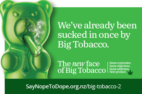
Say No To Dope The Say No To Dope website uses a color palatte similar to mine, which I thought most people would use for anything cannabis related. But they’ve also created this image of an angry CBD gummy bear smoking a joint (which I think is quite clever) that sits next to different slogans. This campaign is also quite effective and also carries several valid arguments on why you should vote no from a health & public safety standpoint. I don’t disagree with the comparison to the tobacco industry! They’re video campaign also focuses on people, using an interview/personal story style. Their campaign uses a lot more dark colors compared to the Yes Campaign video, and has more cannabis related imagery (smoke, joints, buds, etc.) https://youtu.be/UwTdRzvSWCU Neither videos had any animated type I could look at and compare to my finished project. I’m glad I didn’t see either of these campaigns until I had already finished my own project as I think they could have influenced me directly or indirectly in some way when I was conceptualizing.
2 notes
·
View notes
Video
youtube
On Our Terms Advertisement NZ Drug Foundation
This advert was interesting because when I saw it for the first time I didn’t realize it was about the cannabis referendum until they said so. It removes all weed-related imagery and depends more on a variety of kiwi faces narrating why they’re voting yes. Theyre website is also interesting because of the color and type choices are purple unlike the say no to dope ads.
0 notes

Photo


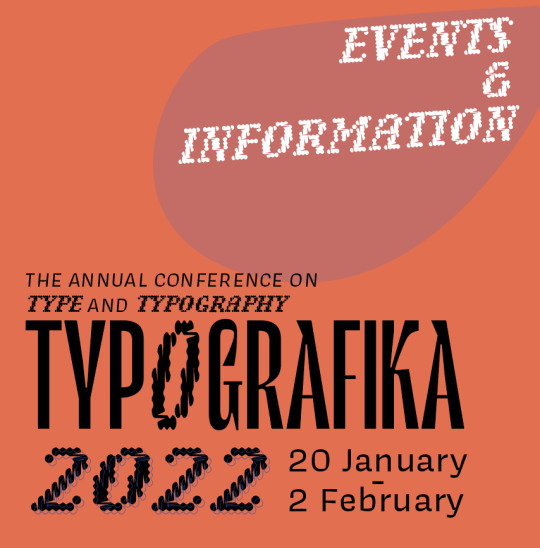


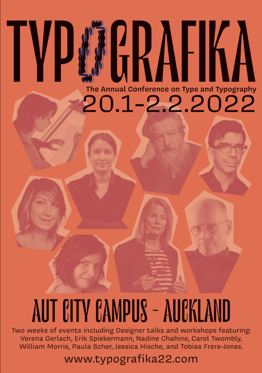
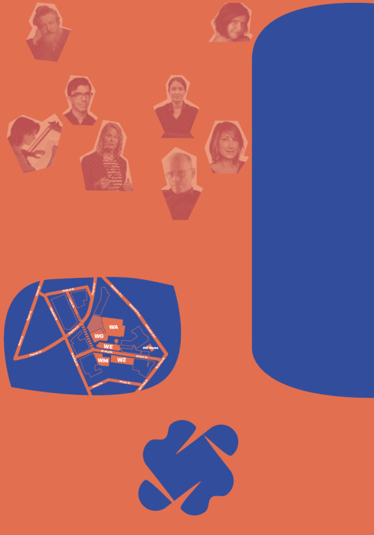
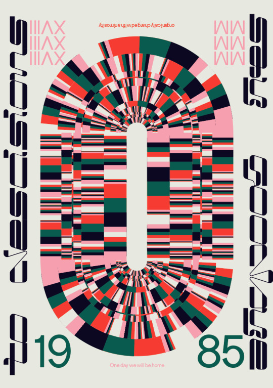
Simplifying the Design
After one-on-ones, one piece of advice I received was simplify the design. Above are some of the changes I made.
- Removed the pink bullet point in the about section - Removed the pink letter shape and changed the events and information type to Le Murmure with an extended R, changing the font size smaller to help direct attention to the Typografika and Event Information I want the reader to be looking at more. - Changed the Timetable from Center-Align to Left-Aligned - Removed the pink shape and kept the background solely for the photographs: this was the only one I was hesitant to change. I liked the pattern it gave to the design and think it enhanced it, but ultimately decided to go with the clean look because I already had my shapes in the timetable for example.
0 notes
Photo
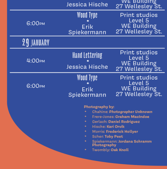

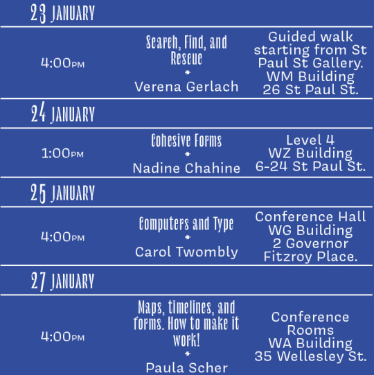
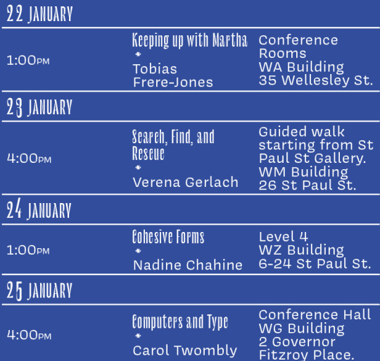
Referencing To properly reference the photographers and their work within my brochure, I listed the photographers names next to the relevant speaker. Originally I had placed it in the bottom of the timetable, but after one-on-ones with Hazel, her advice was to give it “less attention” and suggested I place it somewhere else. I liked this advice and decided to place it in a horizontal line below the map and timetable. When printed and folded, this would be the last part of the brochure you would see - so it makes sense to finish there with a nod to the photographers who had contributed to this design.
0 notes
Photo


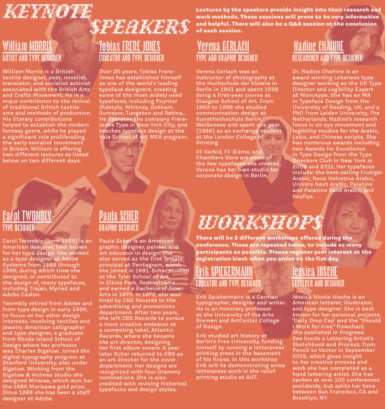
Photograph References These are the links to where I sourced the speaker photographs.
0 notes
Photo

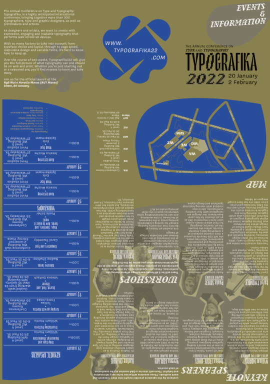
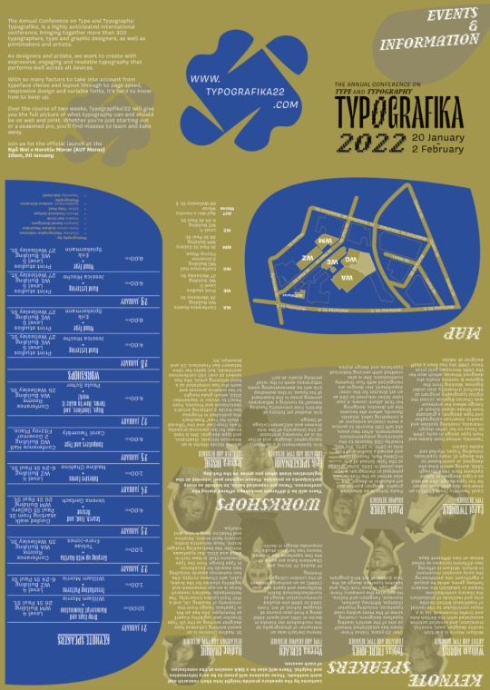
Checking Colors for Colorblindness
I did this early on, but I think it’s worth mentioning because it’s what led me to change my design after the critiques. When I had decided on my color palette, I immediately checked if it would still be visible and have good readability if a viewer was color blind. Not only was it still readable, but I like the mossy greenish color the orange hues turn into.
0 notes
Photo


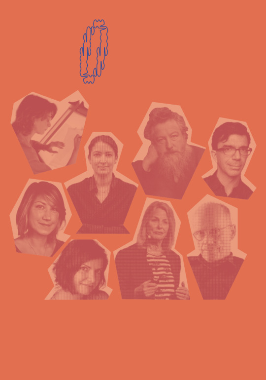
Color Palette
Excluding black and white for the text, I kept the color palette to a limited split complementary color combo (orange & blue). I increased the variation by adding the reddish accent to the standard complimentary orange & blue, and adjusted the tints of the orange to 80% and 50%.
0 notes
Photo


Photograph Treatment
First I masked the backgrounds of all the photographs in Photoshop, followed by switching to black & white before changing the images to halftone tifs. Then I placed the images in InDesign to create the geometric shapes using the pen tool overtop to get the shape I wanted. I then placed the image inside the shape.
Afterwards I played with the color palette of the photograph and background to get different combinations depending on the poster design I was going for. I realized that they looked better when the halftone image was darker than the background.
0 notes
Photo


Halftone & Duotone Inspiration
The photographs I had were all different pixel quality, different styles, color or black and white, etc. So i knew I needed to unite them. Scher’s designs using duotone are graphic, and I liked the idea of making the images more interesting than just black and white. Duotone also meant I could play further with my color palette.
By transforming my photos to halftone, I knew that could also combat against the issue with the photo quality.
0 notes
Photo


Forming the cutout shapes idea
This idea was also spurred by the posters I had already been looking at which were using interesting shapes. Here are a couple that I enjoyed.
0 notes
Photo

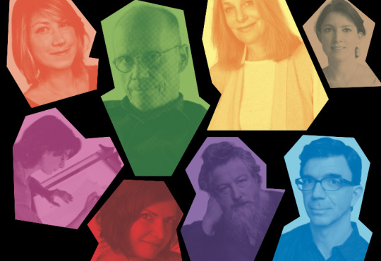
Forming the cutout shapes idea
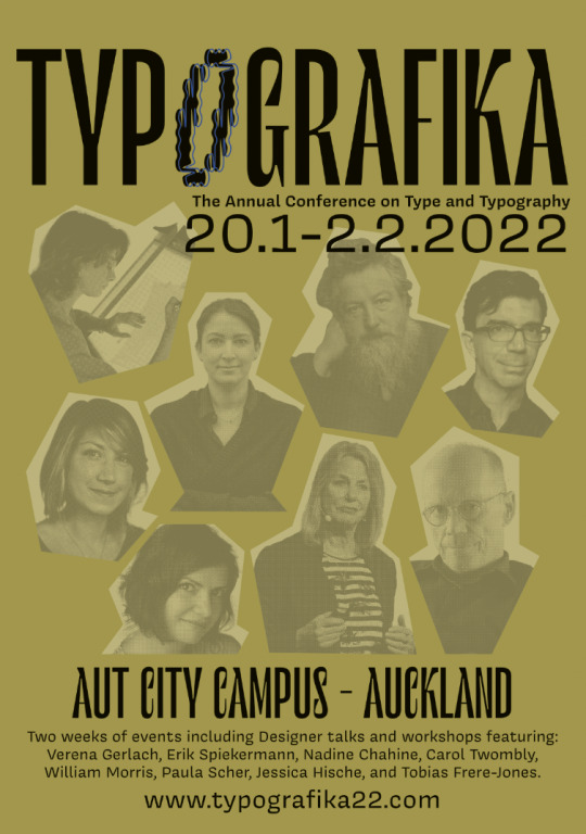
I liked the angular shapes the buildings and the streets created, its random, yet organized. I decided to translate that through by creating cut out shapes of the speakers photographs to bring unity as each of the photgraphs had to be sourced from different photographers the photos themselves did not have a clear unity to them - so i knew unity was something i had to create by way of manipulating the images. The way I chose to create the cutout shape was to follow the basic outline of their body & face, keep each line straight, and make each of them unique from the other. Buildings tend to house companies that focus on one idea, and in a way, each speaker is ‘housing’ their own niche that they’re speaking on for the event. While this is idea has been pushed to the most abstract visually, this was the thinking behind why I did these cutout shapes. I think this look also looks like putting the pieces of a broken vase back together or pieces of a jigsaw puzzle. Each have a distinct role to play and together they make something whole. In this case, the ‘whole’ being the event.
0 notes
Photo
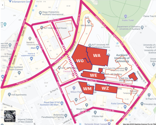

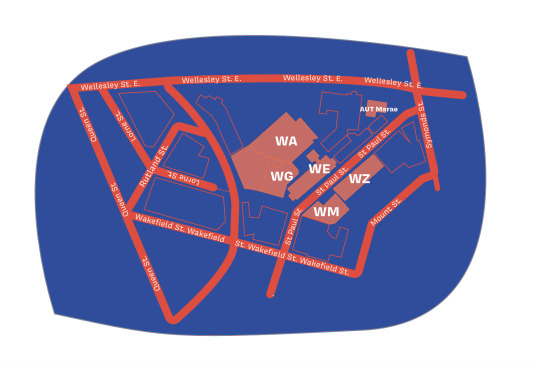


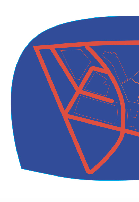
Map Design
Tracing the lines and looking at the shapes of the buildings/how the streets created shapes where the buildings sit inside gave me the idea to make the cut out style of the speaker portraits.
0 notes
Photo

Map Design Inspiration
- bold color palette, duotone, strong lines, lines running off the page
0 notes
Photo


Map Design Inspiration
Color Palatte, simple lines, use of numbering for a key
0 notes
Photo

Map Design Inspiration
color palatte similar to mine, this map takes a more illustrative approach
0 notes

