
Statistics
We looked inside some of the posts by garethleaney and here's what we found interesting.
Average Info
Notes Per Post
25
Likes Per Post
21
Reblog Per Post
4
Reply Per Post
0
Time Between Posts
22 days
Number of Posts By Type
Text
16
Quote
1
Last Seen Tumblr Blogs


Fun Fact
The most popular pages on Tumblr are about Minecraft, GIFs, and David J. Peterson.
Text
Day010: About Time
It’s Day 9 of #GarethsArtAdventure - I’m aiming to post something arty every day for the next year. For more deets, check out my introductory post.
Our theme all this week has been ‘time’. So it seemed right to leave the last work to the most famous time-traveller on the planet, the Doctor.
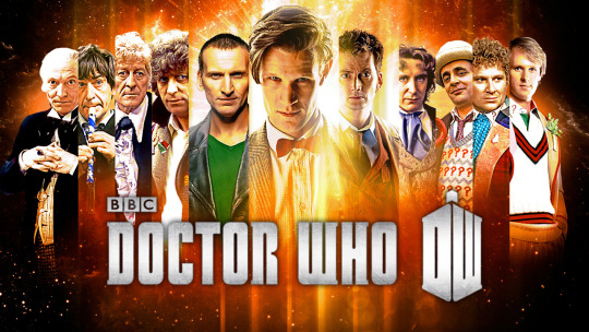
For more than 50 years, Doctor Who has given us a unique perspective on what it means to be human. And here, from the Radio Times back in October, are 17 Doctor Who quotes to live your life by. Enjoy.
17 Doctor Who quotes to live your life by
0 notes
Text
Day009: “Untitled” (Perfect Lovers) (1991) by Felix Gonzalez-Torres
It’s Day 9 of #GarethsArtAdventure - I’m aiming to post something arty every day for the next year. For more deets, check out my introductory post.
Theme of the week: time
One of my hopes for this blog series it that it will prod me to find new art and artists as I reflect on the theme each week. I came across “Untitled” (Perfect Lovers) by Felix Gonzalez-Torres while I was looking for other suggestions for the final post exploring the theme of ‘time.’ I think it’s a great place to end.
The piece is very simple - it involved two very standard shop-bought clocks, set to the same time and placed next to each other on a light blue wall.

When the work begins, the two clocks display the same time, apparently ticking in perfect sync. But over time that will inevitably change. Perhaps one will tick fractionally slower, so that they will begin to show slightly different times and lose their synchronicity. And eventually one or other will stop ticking, bringing the partnership to an end.
Gonzalez-Torres produced this piece in 1991, shortly after the death of his HIV-positive partner. And here he captures the painful reality of love. One way or another, every relationship will end, either as two people grow apart, or as death separates them. The subtitle, ‘perfect lovers,’ makes a huge promise that no human being will ever be able to keep. And time seems to be the great enemy of love.
Which got me thinking about the words of an ancient poet, as he wrote about a different kind of love. The desire for perfect - never-ending - love is more than any human being can bear. But what if there’s a kind of love that does last forever?
“Give thanks to the Lord, for he is good - his love endures forever.”
0 notes
Text
Day008: Marilyn Diptych (1962) by Andy Warhol
Today is Day 8 of #GarethsArtAdventure - I’m aiming to post something arty every day for the next year. For more deets, check out my introductory post.
Theme of the week: time
I’m a huge fan of Andy Warhol’s work. His approach to design was hugely influential, and his critique of celebrity culture now seems weirdly prophetic. Warhol predicted that, “in the future, everyone will be famous for 15 minutes” - today, some people are famous for even less than that. Much of his work employed methods of mass production, such as screen printing or photography, which raised important questions about the nature of art and the role of the artists. Combined with his take on celebrities and celebrity culture, he highlighted the way we treat famous people as products to be consumed and, in the end, to discard.
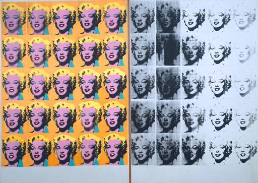
Warhol brought these ideas together in his 1962 Marilyn Diptych, which featured a photograph of Marilyn Monroe (a publicity photo from her film Niagara) reproduced 50 times. In the left grid, the image is flattened and coloured; rather than a realistic representation of Marilyn, elements of the image are heightened to an almost ridiculous degree. The 25 images on the right have the colours removed. And as the image is reproduced she begins to disappear, either obscured by the black smudge of the printing process, or fading into the background.
I think Warhol was capturing something significant about the passage of time in a culture obsessed with celebrity - with beauty, with novelty, with glitz and glamour. He sets up the uncomfortable tensions between what we want to believe, and the reality. For those fifteen minutes of fame, we treat our celebrities as glowing images of everything we want to be. But it never lasts. As time passes beauty fades, novelty becomes run-of-the-mill, and eventually the glitz loses it’s sparkle. Of course, on the production line of celebrity culture, as one celebrity fades away there’s another sparkling, glowing celebrity-product waiting to be consumed.
Warhol’s prediction that everyone would be famous for fifteen minutes may sound great, but it carries a warning, or possibly a threat. You may have your glittering fifteen minutes of love and adoration… but what then?
2 notes
·
View notes
Text
Day007: Pop Thursday!
(It’s Day 7 of #GarethsArtAdventure - I’m aiming to post something arty every day for the next year. For more deets, check out my introductory post).
It’s Pop Thursday, our weekly musical interval. And this week’s theme is ‘time’, there’s really only one choice. The amazing Cyndi Lauper, singing Time After Time.
Speaking of time, it’s hard to believe this amazing song is 30 years old!
Enjoy!
youtube
2 notes
·
View notes
Text
Day006: Time Horizon (2006) by Antony Gormley
(It’s Day 6 of #GarethsArtAdventure - I’m aiming to post something arty every day for the next year. For more deets, check out my introductory post)
This week’s theme: Time
I love Antony Gormley’s work. You may be more familiar with it than you think - he designed the iconic Angel of the North, and installations in several cities and well-known tourist spots. His use of the human figure (usually modelled on his own body) makes his work feel immediately accessible to the casual observer, so it lends itself well to public art. But then he uses that same figure to probe all sorts of ideas about what it means to be a human being existing at a point in space and time.
As we’re thinking about ‘time’ this week, I’ve chosen Time Horizon (2006), which was installed among Roman remains near Catanzaro, Italy. I’ve never been there, and I’ve never seen the work in real life, but here’s a picture:
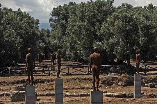
100 figures, again moulded from a cast of Gormley’s own body, are arranged so that they all stand 1.8 metres above the base of the excavated remains; 1.8 metres is the average level of the earth’s surface. Some stand on plinths, others are almost completely buried. It relates the passage of time to a physical measurement, and forces us to think about our position in time, and how our existence in physical space relates to our existence in time as well.
At the same time, as the sculptures are exposed to the elements, the processes of oxidation and decay become increasingly obvious, so that the effects of time become obvious in on the figures themselves.
Here’s how Antony Gormley explains it: “I think of this as a form of acupuncture, activating the living human time of the viewer, the biological time of the trees and the geological time of the earth, using the industrial time of mechanical reproduction."
0 notes
Text
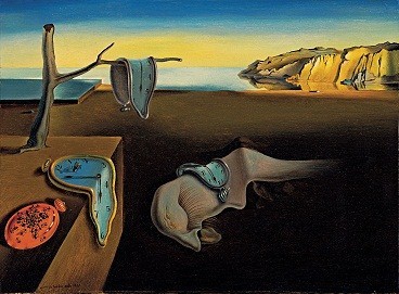
Day005: The Persistence of Memory (1931) by Salvador Dalí
Today is Day 5 of #GarethsArtAdventure - I’m aiming to post something arty every day for the next year. For more deets, check out my introductory post.
This week’s theme: Time
The Persistence of Memory, painted by Salvador Dalí seems like an obvious choice when looking for art on the theme of time, although the meaning of the painting is far from obvious. One commentator, Dawn Ades suggested that Dalí was obviously inspired by Einstein’s theory of special relativity and the notion that time is soft and subjective. Apparently Dalí said he got the idea from staring at some melted Camembert.
4 notes
·
View notes
Text
Day004: A Thousand Years (1990) by Damien Hirst
(It’s Day 4 of #GarethsArtAdventure - I’m aiming to post something arty every day for the next year. For more deets, check out my introductory post).
Today is Monday, so it’s time for a new theme. And as we’re still in the first few days of the new year, this week’s theme is time. And the first piece I’ve chosen is A Thousand Years (1990) by Damien Hirst.
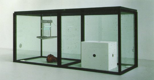
Although he’s best known for his shark in formaldehyde, A Thousand Years is the work that really kicked off his career when it was bought by Charles Saatchi.
It consists of two connected glass boxes; one contains a cow’s head, the other contains a giant die with a one on every side, and an ‘insectocutor’. And buzzing around inside are loads of flies - eggs, maggots, buzzing flies and dead flies. The whole thing contains the remains of thousands of lives lived inside this box; the passage of time is marked by the life-cycles going on within the box, and by the decomposing meat that sustains them. The ticking clock and the reality of life and death are unavoidable. Death actually happens while you’re watching, as every now and again the insectocutor crackles and a fly falls to the ground, it’s time cut short. There’s something about the inevitability of death here too – the idea that death is natural, and that things have to die so that other things can live. The circle of life, if you like. The die, a symbol of luck and chance, gives an impression that the future is uncertain, but in actual fact the result is inevitable, as is the conclusion of our short lives.
When we’re faced with the reality of our own mortality it’s unsurprising that questions about God aren’t far away, and they crop up again and again in Hirst’s work. I think you see a hint of that here – the insectocutor hangs, God-like, over the scene. Occasionally a fly is captivated by it and wanders in, only to die anyway. Death is still inevitable. The warm and enticing glow does nothing to help - in fact, it speeds the unsuspecting fly to its inevitable end.
1 note
·
View note
Text
Day003: My Televisual Highlights of 2015
(Today is Day 3 of #GarethsArtAdventure - I’m aiming to post something arty every day for the next year. For more deets, check out my introductory post).
It’s Day 3 of my Art Adventure, and it’s the first Screen Sunday of the year! As there’s still a new year vibe in the air, I thought I’d share with you some of the telly I enjoyed over the past 12 months.
For your reading pleasure: my televisual highlights of 2016!
10. Dr Who - After a bit of a wobbly start, I think Peter Capaldi really hit his stride this series. The departure of Clara was a bit of a cop-out, and the sonic shades were ridic, but there were some excellent moments.
9. Buffy the Vampire Slayer - A strange one to put on my highlights of 2015, given that the final episode aired in 2003, but thanks to Netflix I’ve rewatched a few seasons of BtVS. Some episodes have aged better than others, but the genius of Joss Whedon is still obvious. On the surface it’s a show about vampires and monsters, but it’s really about what it’s like to make your way in the world as a teenager and then a young adult, when it feels like everything’s out to get you and the world is about to end on a regular basis. It definitely repays a rewatch.
8. Casualty - I know this national treasure of a medical soap gets a bad rap, but it’s been consistently good this year. OK, consistently does mean one every 3 weeks or so, but there are enough likeable characters and interesting medicals details, and an occasional explosion, to keep me hooked in between. And I love it when they let the writers try something random - the Sin City-inspired episode was roundly panned, but undeniably brave. And I loved the House-style medical mystery episode (even though I solved it before the end, mainly because I’d seen the said episode of House…).
7. Operation Ouch! - OK, this one is technically on BBC, but it features real-life doctors (also real-life twins) Chris and Xand Van Tulleken. It’s a combination of intriguing science, useful (and potentially life-saving) health information, and just plain gross, all aimed at kids, and it works brilliantly! I’m amazed by the things the two hosts are willing to put themselves through (highlights have included sitting in ice baths, getting bitten by mosquitos, throwing up and collecting their sick, and even making cheese from the bacteria in their armpits). It’s genuinely funny and genuinely fascinating. You should also check out the special Back in Time episode where the VT brothers investigated health and medicine in the trenches during the First World War.
6. Suits - I LOVE Suits. If you’re not familiar, it’s the story of Mike Ross, a young genius with a photographic memory and a shady past who, despite never attending Harvard Law, ends up working for Harvey Specter, a hotshot lawyer and “the best closer in New York.” The chemistry between the main characters is fun, but what really makes it is the excellent cast of secondary characters. And as all of them wrestle with all kinds of difficult dilemmas, they keep coming back to the same question: what’s important? Money? Power? Truth? Love?
The wait for series 4 to appear on Netflix is, frankly, agony.
5. Sing it On - If you enjoyed Pitch Perfect (and let’s face it, who didn’t?), then you’ll like this. It chronicles the ups and downs, and the occasional bit of bitchy infighting, as 4 real-life show choirs sing their way to the national acapella championships. But watch out for the super intense shock in the penultimate episode.
4. Transgender Kids - Louis Theroux at his charming, disarming best again. He followed the lives and choices of families with kids who believed themselved to be a different gender. Louis gently probed some massive questions: is a child’s gender identity innate, or influenced by their parents? Is it something to be expressed or shaped? If a child identifies as the opposite gender, is medical intervention the right thing to do? And if it is, how much?
3. The Great Pottery Throw Down - Yet another surprise highlight. Following in the footsteps of the Great British Bake Off, and several lacklustre attempts to repeat its success, TGPTD pits 12 amateur potters against each other in a series of clay-based challenges. It sounds lame, but it’s actually fascinating, and occasionally quite emotional. It’s worth watching just to see when judge and master potter Keith Brymer Jones will burst into tears with the beauty of it all (approx. once per episode). Plus, if you thought the innuendo potential was high in the Bake Off, you haven’t seen anything yet, with Sara Cox capitalising brilliantly on all the “pulling,” “the scratched bottoms” and the “nice cracks”!
2. London Spy - I loved the shots of London, and the weird sense of paranoia. Who do you trust when no-one is who they claim to be? Although the plot got a bit far-fetched and the actual ending was lame, Ben Whishaw is a phenomenal actor, and Jim Broadbent is always a treat.
1. Educating Cardiff - the latest of the Channel 4 hidden camera documentaries looking at life in a secondary school, this time Willows High School in, you guessed it, Cardiff. It followed the efforts of Headteacher Joy Ballard, along with some amazing staff and kids, to turn around one of the worst-performing schools in Cardiff. The show featured some brilliant young people, trying hard in spite of some difficult challenged; the staff regularly went above and beyond the call of duty to help them achieve; and I literally cried at the end of the episode. You can still watch this show on Channel 4′s catch up service, and it’s well worth a watch, if only to challenge some of the ways we think about young people and what they’re capable of when they’re given a chance to succeed.
Those were my televisual highlights of 2016. What were yours?
(Honourable Mention: Tattoo Fixers - people come in and expose their stupid mistakes, and a trio of incredible tattoo artists cover them in amazing art. I really like the redemptive aspect of it all. And some of the tats are pretty funny!)
1 note
·
View note
Text
Day 002: Color of the Year 2016!
(You’ve joined me on Day 2 of #GarethsArtAdventure. For more deets, check out my introductory post).
Each year, the colour and printing experts Pantone select a ‘Color of the Year.’ As they explain on their website, the choice represents, “a symbolic color selection; a color snapshot of what we see taking place in our culture that serves as an expression of a mood and an attitude.”
This year, for the first time ever, they selected not one colour, but two. Or, more accurately, a combination of two: Rose Quartz (Pantone 13-1520) and Serenity (Pantone 15-3919).
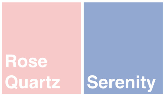

I find the idea of summing up the year in a colour (or even, as in this case, two colours) both fascinating and mind-boggling. How can you possibly try to capture everything about a moment in time – the events, the people, the ups and downs – in a single colour? But at the same time, maybe that’s what makes it brilliant? It isn’t an attempt to symbolise people or events, but a mood. And what better way to capture a mood than with colour?
The choice of two colours is, in itself, also really interesting.
On one level, the combination represents hope. Perhaps not that things feel hopeful as 2016 begins, but because it’s what we’re all looking for. In some ways these two colours feel like opposites, but opposite which find a balance. They could even represent love and peace – not so much opposite as complimentary to each other. And a combination our world desperately longs for.
But on another level, Pantone have captured another profound change of mood with their choice. Pink and blue have long-established associations with genders and the binary distinctions between them (see the ‘new baby’ section of your local Clintons for evidence). But even over the past year we’ve witnessed a momentous shift in attitude towards gender, particularly towards gender boundaries which might previously seemed rigid and unquestionable. So it’s not surprising that this combination of colours has shown up a lot as this shift has impacted our attitudes towards colour and design too.
One example that sprang immediately to mind was the transgender pride flag, of course modelled on the well-known rainbow flag symbolising LGBT pride. The flag uses striped of pink and blue to represent differences in gender, but these are reversed on the top and bottom. The white strip down the centre represents those who feel they don’t fit neatly into one gender category or the other.

In 2015, transgender people and issues have featured in the news and other media more than ever before. As many of the battles for gay rights have been effectively won, the focus has shifted more towards the T in LGBT. Whatever you think and feel about it, there’s no denying we’re at a unique point in history where we’re being forced to face questions about gender and identity we’ve never had to before. So perhaps for that reason too, Rose Quartz and Serenity are good choices for Color of the Year 2016?
You can read Pantone’s explanation for their choice here, as well as some of the previous choices. But I’d love to hear what you think.
What do you think of the idea of a ‘Color of the Year’? How well do you think Rose Quartz and Serenity capture the mood as 2016 begins? Or what colour would you have chosen instead?
* (I’ll be honest, I didn’t know anything about it until it cropped up in a Christmas University Challenge question and I was intrigued enough to find out more).
2 notes
·
View notes
Text
Day001: My Bed (1998) by Tracey Emin
Today is the first day of 2016, which means it’s also the first day of #GarethsArtAdventure! I’m going to be posting short-and-sweet arty ideas and reflections each day for a year. For more deets, see my post from yesterday. Wonderfully, things seem to be going well so far...
Before I kick off my first weekly theme, I thought I’d start with a favourite piece from 2015: My Bed by Tracey Emin, which went on show at Tate Britain back in March.

(Photo taken by me!)
It seems like a good place to start. As I suggested back in May, My Bed is all about rebirth. On one level it’s very ordinary - it’s a familiar scene made out of familiar objects. But it captures a life-changing moment for Emin. After a painful breakup and three days of bed-bound hiding from the world, she realised she needed to move on with life. She emerged to take control of her life and her career, leaving the empty bed behind like a discarded cocoon.
It’s about leaving one life behind and taking up a new one. And don’t we look for the same kind of symbolism each time we celebrate a New Year? We leave behind our old life, the year that draws to an end, and we head into a new one to make changes and to do better. We make our resolutions, we grab the year by the horns, and we make a(nother) fresh start.
Which sounds great to begin with. But then it starts to sound pretty exhausting. I can’t help thinking of friends who will be heading into this new year wondering how they’ll face getting out of bed at all, let alone making the life-altering choice that My Bed embodies.
It reminded me of some words by ABBA:
Happy new year Happy new year May we all have a vision now and then Of a world where every neighbour is a friend Happy new year Happy new year May we all have our hopes, our will to try If we don't we might as well lay down and die You and I
But, wonderfully, and thankfully, maybe it isn’t all about how hard we try? As one writer put it,
“Therefore, if anyone is in Christ, he is a new creation. The old has passed away; behold, the new has come.”
So, on balance,
Happy New Year!
(See you tomorrow)
4 notes
·
View notes
Text
A New Year, a New Challenge!
2016 is just around the corner, and it’s going to be a big year. An Olympic year, no less. A year of passion, a year of dedication and commitment, where men and women will push the very limits of human ability and endurance.
In that spirit, I’m going to resume blogging. But more than that, I’m (somewhat optimistically) aiming to write a short post each and every day, featuring a few thoughts on one piece of art and the artist who created it.
Each week will have a theme; It might be an idea, a style of work or a particular period or movement. Some weeks I’ll stick to the theme quite closely each day, other weeks things will be a little more loose. But as well as helping to vary the kinds of art I mention, I’m hoping it will help us to spot some interesting connections where they might not have been obvious before.
We'll have a musical interlude each Thursday, which will henceforth be known as ‘Pop Thursday’. Maybe something from the charts, maybe something obscure; it might fit with the week’s theme, or it might not. But it will definitely be pop (sorry)(not sorry).
We’ll kick back at the end of each week with “Screen Sundays” and quick look at a film or TV show, plus some of the themes and questions it raises.
I'd love you to join me on my adventure this year. And if you like what you read, I'd also love you to get involved. I'll be on the look out for suggestions for weekly themes, and your recommendations of art that could feature, including your favourite songs, films and TV shows. So get in touch and get involved!
And join me tomorrow for #GarethsArtAdventure!
1 note
·
View note
Text
Modern Art, Truth and Beauty
I’ve written a new blog post for Chrysolis.org, where I share some thoughts on My Bed (1998), the controversial ‘messy bed’ sculpture by Tracey Emin. Here’s a taste...
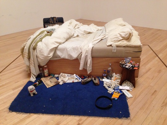
“My Bed presents you with a couple of challenges, particularly if you like your art in beautiful flat rectangles. The more immediate challenge is, what is it actually about? This links with a bigger question: is it really art? And then, inevitably, is it any good? If you’re less familiar with contemporary art, then you would probably ask similar questions about most of the work down one side of Tate Britain (the other side is full of beautiful flat rectangles, which tend to tick the boxes for people in a more straightforward way).
At the heart of it, My Bed is about transition and change. It captures a pivotal moment in Tracey Emin’s life, where she made a decision to get up and move on. In many ways it’s a kind of chrysalis, the hard, ugly shell left behind when a caterpillar goes through the traumatic but transformative process of becoming a butterfly. It’s an experience any observer can identify with: each night we roll into bed tired and weary, and emerge the next morning reenergised to face the day. Emin cleverly represents a point of movement and change by freezing a moment of time that most of us would want to tidy up and leave behind…”
You can read the rest at Chrysolis, and go and see My Bed for yourself at Tate Britain now.
2 notes
·
View notes
Quote
It makes me so angry to see these so-called artists glorifying a messy bedroom. What is the world coming to when a major art exhibition sends out this message?
Mother interviewed in The Sun, October 1999, referring to ‘My Bed’ (1998) by Tracey Emin.
1 note
·
View note
Text
More on Nostalgia
Since my post yesterday, I've been thinking about whether a politics of nostalgia is a bad thing, or not. It occurred to me that, in some way, that's the shape of the Christian hope. Hope informed, rather than replaced, by the memory of how things used to be. Then, as usual, I remembered that CS Lewis already said something similar, and said it better: "Apparently, then, our lifelong nostalgia, our longing to be reunited with something in the universe from which we now feel cut off, to be on the inside of some door which we have always seen from the outside, is no mere neurotic fancy, but the truest index of our real situation. And to be at last summoned inside would be both glory and honour beyond all our merits and also the healing of that old ache." CS Lewis, The Weight of Glory
1 note
·
View note
Text
Art and the Politics of Nostalgia
Ed Miliband keeps trying to sell me tea towels. OK, maybe it’s not actually Ed himself. But since I joined the Labour Party a few weeks ago, I’ve had several emails offering me the chance to buy a tea towel featuring images from the party poster archives.
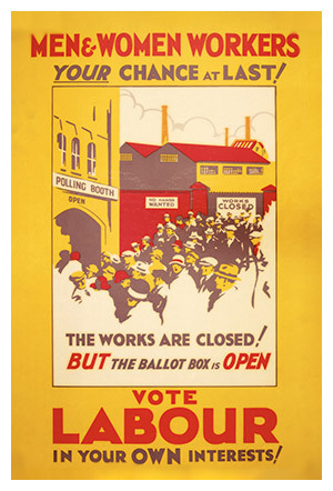
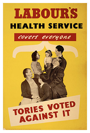
You’ve probably heard lots of commentators describing the kind of politics at play as we heard towards the General Election, or prescribing the kind of politics we need. This week Tory MP George Freeman accused those calling for tighter enforcement of the minimum wage as engaging in the “politics of envy.” And last week Green Party leader Natalie Bennett declared that the “politics of hope” was replacing the “politics of fear” that has held sway in the light of austerity, trouble in Europe and growing terrorist threats. But I wonder if these tea towels suggest another option, the politics of nostalgia.
For what it’s worth, I really like the images they’ve chosen. The socialist in me cheers at the politics, and the psychologist in me is impressed by the propoganda. The messages are clear.
Remember when times were hard in the past? Money was tight, jobs were scarce, but together we changed things!
Remember how brilliant the NHS was? The Tories never wanted it, and now look what they’ve done to it! Labour are the only ones who care about it.
They hark back to a time when politics seemed to matter more than it does today. When real issues were at stake, and real people felt they could make a real difference. The designs are simple and the slogans are no-nonsense; there’s a comforting lack of spin and marketing, just a simple message that equality and prosperity were within reach for everyone. When these posters were first printed it really was politics of hope. But stick it on a tea towel sixty years later and hope gives way to nostalgia.
The politics of nostalgia is, in many ways, a much easier sell than politics of hope. Hope requires imagination and the ability to conceive of things you haven’t seen yet, whereas nostalgia stirs memories you already have. Hope entails risk, but nostalgia feels acheivable because your going back to something that was already acheived. Hope relies on making promises and then keeping them; nostalgia dusts off promises that have already been kept.
Of course, it depends rather heavily on how you remember the past. And maybe someone knows that. This isn’t Labour’s new poster campaign. These aren’t designed to convince the unconvinced. You don’t display your tea towels to win over undecided neighbours, unless they happen to peer over the fence on wash day.
But is the politics of nostalgia really a bad thing? We can learn from our mistakes, perhaps it’s also a good idea to learn from our successes? Maybe nostalgia for the way things were can lift us out of our resignation to the way things are, and inspire us to imagine what could be?
I’ll be interested to hear what you think…
1 note
·
View note
Text
Thinking about Christianity and Creativity
At a church event the other week, a few of us were part of a conversation about Christians and creativity. There was a real range of interests and experience, and although we barely got started we touched on all sorts of interesting questions.
One things we talked about briefly was whether there were any good books or resources for Christians wanting to think more about this. So I thought I’d note down a few here. There are lots more which are probably excellent - I have a virtual pile on my Kindle waiting to be consumed. But here are some I’ve found helpful; if you’ve got other recommendations I’d love to hear them!
Imagine by Steve Turner
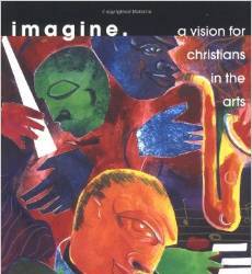
This book basically changed my life. If you ask Steve Turner whether the arts and a Christian faith can fit together his answer is an emphatic yes. Turner gives a great introduction to the ways Christians have approached the arts over the years, and he explores why they play such a small part in evangelical Christianity. Then he suggests that Christians should not just copy the art and culture made by the world, nor should they simply paint pictures of Jesus. Instead, we should be involved in creating the best art which communicates the truth about reality with integrity. This is an easy read and a brilliant starting point for thinking about a Christian approach to the arts.
Art and the Bible by Francis Schaeffer
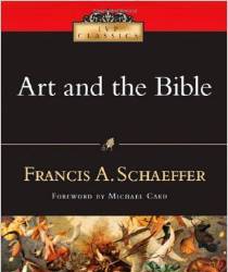
This is a short book on a big subject. Schaeffer has a great way of both looking at culture and of talking about what he sees. This is a good introduction to Schaeffer, to thinking biblically about art, and maybe to thinking artistically about the Bible.
Art & Soul: Signposts for Christians in the Arts by Hilary Brand and Adrienne Chaplin
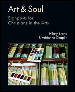
In many ways, this book has a similar aim to Imagine, but in a more indepth way. The book really presents a vision for the way Christians in the arts should think about their work, and how they can communicate the truth through their work. Art & Soul leans heavily on Calvin Seerveld (see the next recommendation), and it was this book that introduced me to his work. A must read for Christians seriously engaged in the arts, whether you're producing art yourself or talking about other people’s.
Bearing Fresh Olive Leaves by Calvin Seerveld
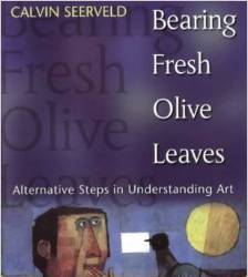
Probably the most ‘involved’ read listed here, but well worth the effort. Seerveld was a lecturer in philosophy and philosophical aesthetics, and lots of Christian artists point to his work as a big influence.
To give you a taster, here’s a quote from another of his books, Rainbows for a fallen world:
“The world we inhabit is more than humans and a subhuman Nature; this world is the stunning theatre, workshop, playground of our Father in heaven, peopled by whatever his creative Word sustains.
That means we must be humble enough to see the grass, dirt, snow, rivers and deserts, rain and sunshine, as the wall-to-wall carpeting of the Majestic One… And the animals, which we eat and humanize into pets, all by themselves delighted God no end before we were even on the face of the earth, says Job (38-39)… Owls and spiders and wolves testify, witness to the extraordinary, provident care of the Almighty One who judges, loves, agonizes, joys over the sparrows and lilies as well as the Sons of men.”
“It puts us in our place to realize every creature is made to praise God. All things are transparent manifestations of his power and wisdom. It is the very nature of creation that the whole world is like a burning bush – even though we walk around all the time with our shoes on.”
“Without this vision of creation, God’s people dry up and perish. With it, it is a natural step for the believer to engage in art, an exclamatory praise response to our faithful God. A deadly serious step, however, because we may in no way ruin the testimony built into the Creator’s workmanship.”
Finally, the L’Abri Ideas Library – is a treasure trove of great talks from L’Abri, which was set up by Francis Schaeffer to help people to find honest answers to honest questions about life and faith. Basically everything will be good, but look for anything by Andrew Fellowes or Ellis Potter, and Wade Bradshaw’s excellent lecture on Marcel Duchamp.
2 notes
·
View notes
Text
How to DJ a Wedding
Another post from the blog archives, prompted by the wedding I’m going to tomorrow. This post originally appeared at garethleaney.wordpress.com on 30th April 2013. I’ve basically retired from the Wedding DJ game now after nearly getting into a fight at one wedding. But here, for what it’s worth, are my thoughts on how to make the most important party of someone’s life go with a swing…
On Saturday night I had the pleasure of playing the role of DJ at the wedding reception of some good friends of mine. To be honest, the technical side is pretty simple with an iPad and a clever DJ app (I used iDJ, which cost me the princely sum of £1.49). But what you actually play is less straightforward. So, should you find yourself called upon to do something similar, here are my top tips…
You can’t please everyone, so please yourself. This is the key principle to bear in mind. Whatever you play, someone will love it, someone else will hate it. So the person who’s enjoying it may as well be you. Try to include something for everyone – for example, I generously included Killers AND Arctic Monkeys. But as you’ll be the only one on the dance floor all night, you might as well make sure you’re having a good time. Then try to make sure the Bride and Groom are enjoying themselves. Everything else is a bonus.
Start strong. At a normal disco, people take time to warm up to the idea of dancing. At a wedding, everyone dives in after the Bride and Groom have their first dance. So a strong start is imperative. Here’s how I started: 1. “Wouldn’t it be nice” – Beach Boys (the first dance, so I didn’t really have a choice, but it went down well) 2. “I wanna dance with somebody” – Whitney Houston 3. “Blame it on the boogie” – The Jackson 5 4. “Brown-eyed Girl” – Van Morrison
This is an ideal starting line-up. It treads the delicate line between cheese and cool that will stop people from sitting down because they think it’s going to be too cool/cheesy
Don’t worry, you won’t need to give this fine line a second thought once people trust your musical genius. The next two songs will seal the deal. So I went with: 5. “The Shoop Shoop Song” – Cher and 6. “You Can’t Hurry Love” – The Supremes. Enough said. Follow this up with something like “I don’t feel like dancing” and you won’t go far wrong.
People don’t really know what they want to dance to. People will make all kinds of requests of you throughout the night, giving the impression that they know what you should be playing. (The downside to living in the iTunes generation is that everyone thinks they’re a DJ). But the secret of a memorable disco is to play the tunes people aren’t expecting. Essentially there are two kinds of people in the world: people who like dancing to ABBA. Actually, there’s only one kind of person in the world. But some people feel the need to lie about it most of the time, such that the wedding reception is the only place they can comfortably express how they really feel. They’ll keep requesting things like Daft Punk and Killers to demonstrate they’re into ‘decent’ music, but they really want you to play some ABBA (or S Club).
Similarly, think of the kids. I said no to Gangnam Style three or four times, mainly because I didn’t own it. You have a responsibility to educate these young minds (and the older ones too). Where else will they learn all the moves to YMCA, or the genius of Black Lace?
Remember, people might think they know what they want, but you know what they need. Which leads me on to my next tip…
Don’t give in. As the night goes on, people’s feedback will become increasingly robust. Only your strength of conviction will see you through. “Last Dance” by Donna Summer is objectively the greatest possible closing number for a wedding disco (assuming you’ve already been told by the Bride or Groom that the national anthem isn’t appropriate). But it takes about 55 seconds to kick in. Hold. Your. Nerve.
Similarly, when a slightly worse-for-wear party guest hands you an iPhone which is slowly loading a Youtube video of the Tom Jones song you don’t have, this will almost certainly be a disaster. Don’t do it.
Timing is Everything For example, the Black Eyed Peas hit “I gotta feeling” has very different connotations when played at the start of a wedding reception than if you play it at the end. Enough said.
With great power comes great responsibility There are few sights more rewarding than a dancefloor full of sweaty party guests of all ages and backgrounds united in a common purpose, namely, the Macarena. But use it wisely.
Anyone got any other helpful tips?
1 note
·
View note