
Don't wanna be here? Send us removal request.
Statistics
We looked inside some of the posts by gdadp2y2 and here's what we found interesting.
Average Info
Notes Per Post
0
Likes Per Post
0
Reblog Per Post
0
Reply Per Post
0
Time Between Posts
1 day
Number of Posts By Type
Text
17
Last Seen Tumblr Blogs


Fun Fact
Tumblr has 4 main sources of revenue.
Text
Video Plan
What I think our video should be, is a 2 to 3 minute long video showcasing the mechanics we've implemented, like buying and moving furniture, the puzzles we've made, and the visuals/design of the ship.
I thought we could have the music we commissioned playing over the footage, as well as some simple editing, like cutting out unnecessary footage and text, explaining simple things.
0 notes
Text
Ready for GA fest?
I personally think our game is ready for Games Anglia. While it can be a shallow experience, it is one with the mechanics we wanted to have, presented in a way that allows for it to be experienced by someone completely new to it, without the need of someone like me or Tom or Ethan, telling them about the mechanics or controls, and that means it is ready to be exhibited, I think.
0 notes
Text
Buying furniture


With the furniture system complete, items can be bought, picked up, rotated, moved and placed. I think it's a good system, and while it does have a few places it could improve, I think, for a vertical slice, it does a really good job.
0 notes
Text
Puzzles in game
I think the puzzles look good the way they'relaid out ingame, when you select a correct answer, you get a little green flash, and the text is highlighted green, which is a good way to provide feedback to the player.

0 notes
Text
State of Trello - 12/12/24
The project is due in tomorrow, so I just want to show what the Trello board is looking like at the end of the project.

We only have a small amount of outstanding work remaining things like adding some audio to the terminal, or adding furniture to the level.


0 notes
Text
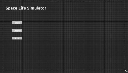
Main menu finished product
youtube
I like how this ended up looking. It's darker than I thought it would end up, due to the post-processing, but it doesn't look bad with it. I would've liked to change the buttons to make them fit more with the background, but it looks fine for a vertical slice.
0 notes
Text
Main Menu design
I laid out the menu a little weirdly, shifted to the left because I want to overlay it on this camera view:

I think the position will look good, because it'll be nicely positioned with the ship in the background. Tom told me to create something like this, as he'd done stuff similar on his older projects and wanted to try it for this project too.
I took inspiration from a couple places for this main menu:

Alien Isolation is the most thematically similar, as it also depicts a space scene, but is mechanically different, as it's a video, not a render, and also very aesthetically different, as our menu is far brighter, using nicer colours instead of Isolation's suspenseful and foreboding palette. I still took inspiration from it, using a similar layout for the text and background.
Dishonored was something that came to mind, but ultimately wasn't really used as inspiration on closer inspection, for a couple different reasons. For a start, Dishonored has a dark atmosphere, and the vistas that are used by the main menu reflect that. Secondly, the background switches every submenu, and I personally think it's a bit too disruptive, and we wouldn't have enough stuff to showcase. Thirdly, the UI is laid over the background quite ungracefully, and I like the idea of the UI merging with the background.
0 notes
Text
Meeting #7- 06/12/24
Members present- AB, TB
Discussed what the main menu could look like. Albie looked through fonts for the title, which made us realise we didn’t have a name for the game. Neither could think of anything unique, and Tom suggested we keep the name we had in our pitch: “Space Life Simulator”. Albie didn’t object and we finally settled on a font: Oxanium.
0 notes
Text
Laying out the main menu background
For the main menu, Tom and I decided that it would be best to have the background be an image of the outside of the players ship, as this would be a lot more visually interesting.
First of all, I had to actually create the outside of the ship, as the actual ship doesn't have an exterior.

Using a duplicate of the ship Tom had made using the PolyGroup Edit tool and its flip function, I had a base to work with.


I started by adding arm/side thrusters to the ship, consisting of two cubes, one cut to give the thruster an aerodynamic look, and two cylinders to act as engines.


I then moved onto the back thrusters, and I wanted to go for a jumble of engines, similar to Star Destroyers in Star Wars.

I don't really like the finished outcome for these rear thrusters, but they probably won't get seen by many, so I decided to move on instead of wasting time refining it.
Lastly, I created a simple particle generator to show the thrusters. It's a modified fountain system, with gravity turned off, spawn rate increased and a reduced lifetime. This create a continuous but short range, fiery burst that I think works well. It uses a luminous, orange material for the particles.


I then added these particle generators to the engines. I originally put generators on all the engines, but later removed all the ones that weren't in the shot of the menu camera, to make it more efficient.

I spent a few minutes trying to position it, and decided on this shot, because it has a nice bit of reflection from the skybox, shows enough of the ship, and has enough empty space to lay out everything for the main menu UI.
0 notes
Text
Playtest feedback: Ship additions
We asked: "The music player is an example of one piece of purchasable furniture. We plan to have more things you can move around, interact and decorate your ship with. Can you think of anything that would be cool/interesting to have on the ship?"
Something that came up a couple of times were pets:
"funky cute lil robot guy that follows you around"
"SPACE FISH TANK"
"pets"
Some people wanted more functional furniture:
"- Television that plays some random capitalism advert in true dystopian style.
- Table, with another option to buy a toaster because why not
- Kettle to make a cup of tea with
- Bed so that the player can rest (maybe pair with a new mechanic - tiredness?)
- Teddy bear in the corner because lonely space men need company
- Fridge containing randomly generated foods"
"Perhaps a musical instrument or some other pieces of music devices."
While some functional things could be interesting, most seem like too much work for not enough payoff, the fridge for example, has no justification for wasting the time needed to make it.
As for decorations:
"TV, soundboard, lights"
"Bed"
"Maybe LED Lights?"
"Paintings" came up twice, which I personally didn't expect.
0 notes
Text
Playtest feedback: Puzzle

The company email is a diegetic tutorial for the player, and while it apparently communicated the rules of the puzzles well enough, people seemed to have had a slightly more complex response when talking about the actual puzzle, not the email:

The blue response is "yes", with the vast majority of these people reading the email. Red is "no". I watched the person who answered no, and they didn't read the email, which makes me think we need to change how this is presented. This is reinforced by green, who said that they weren't told what to do, but managed to guess it. The yellow answer said that they assumed it was only one mistake per document, which can be fixed by a mistakes counter. As for the issue with people not reading the email, they buttons for the puzzles and the email are separate, with the button for the puzzles on the left. I think that this makes people go for the puzzles first without reading the email, which can be fixed by changing the way the buttons are displayed.

The puzzles being on the easier side is what we were going for, given that we want it to be relaxing, but some people would've preferred a more difficult puzzle:
"Maybe too easy, perhaps a timer or higher rewards for faster speed would help."
"could be harder"
despite the initial poll, someone had feedback on the email:
"Also, I did find it difficult initially to realize what the actual objective was - I initially thought that I was supposed to select the document that was wrong, and there was no clear correct information. I realized fairly quickly however I think the E-Mail should be improved/reworded."
Others wanted more variation/more to do generally:
"Wish there was more to it"
"needs more options / variables thrown into the mix when the game progresses"
UI and other related feedback was a theme:
"I do think that the rules of the game could perhaps be more clear."
"I think the design of the GUI on the monitor could be improved significantly."
"i think they should be labeled original/copy above each one."
0 notes
Text
Playtest feedback: Visuals/audio

When asked if they enjoyed the visuals of the game, it was a unanimous yes, which was nice to see.
We asked: "With the visuals/audio of the game, we are trying to create a cozy feel and relaxing vibe. How successfully do you think we achieved this, and why/why not?"
A few people liked the post-processing:
"Visuals were great loves the pixelly effect."
"I really liked the visuals as they are not too overwhelming and I like how it has a 2D Pixel effect and really its a 3D world."
The music was an important aspect for some:
"The audio does create a cozy feel to it."
"the music helped fulfill this goal of yours."
"I think the game was successful with the the cozy and relaxing feel, using the radio music"
But the materials chosen for the walls didn't resonate with some:
"I think the metal walls and dystopian/industrial design feel I think generates a 'cold' environment and makes the game feel less cozy/comfortable..." the lighting did help keep it cozy though, according to them. "... The lighting however significantly improves the feel being warm colours."
0 notes
Text
Playtest feedback: Bugs

While it's good news that the vast majority of playtesters didn't find any bugs on the dev build of the game, but one did call out a song being too quiet on the radio, which we think is an issue to do with the song itself, not the code.
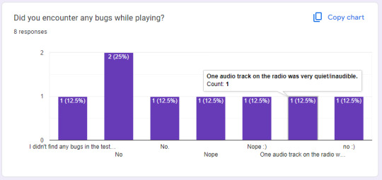
The built version of the game however, did have a game breaking bug, where the buttons on the terminal wouldn't work.

0 notes
Text
Meeting Minutes - 04/12/24
Group agrees that playtesting is a must, so we discussed what we needed to get it there. Tom mentioned that the biggest thing we’re missing is the connection between the Puzzles and Room Building. He stated that to do this, the system to reward the player after correctly completing a puzzle needed to be finished. This required:
A visual element telling the player they got credits when they got a puzzle correct (ker-ching cash register sound)
Letting the player see their credits
Puzzles closing themselves on completion
Adding ambient SFX
Ethan said he could take the first point, and Tom took the second and third.
Tom also mentioned he wanted to add an actual model to the radio, and Ethan shared a resource that he found assets for the game from: Sketchfab. He also added links to specific assets onto the GitHub Repository.
Ethan already started on a playtest form for our playtesters- we agreed the questions should be mainly about the vibe of the game, but we can also ask about the mechanics we have in at the moment.
Albie will work on a third, more difficult puzzle to add to the vertical slice.
0 notes
Text
Tutorial message iterations
I needed to create a tutorial for the puzzles to give the player a basic idea of what they actually need to do, and I decided to write it in-universe/diegetic as well, to make it slightly more entertaining to read.
I thought a message written in the context of a slightly impersonal corporate message would work the best, given as the puzzles are in the context of a freelancing proofreading site.
This is the first version:
Hello! Welcome to Datacom’s Freelancer Proofreading Branch! We’re so happy to have you join us! Here at Datacom’s Freelancer Proofreading Branch, you complete work at your own pace, selecting an work available contract. When you select a work contract, you complete it by clicking on mistakes/discrepancies on the copy of the original, which will later be assessed and redone by one of our industry leading data entry experts. Thank you for helping us make the universe a more organized place, Fred, Datacom Freelancer Proofreading Branch Manager.
I think the first version came out well, me and Tom think that the repetition of the branches full name was a good little joke, and Tom appreciated the fact that it was written diegetically. However, Tom wanted me to revise the actual tutorial part, just to make it a little bit clearer.
The second version:
Hello! Welcome to Datacom’s Freelancer Proofreading Branch! We’re so happy to have you join us! Here at Datacom’s Freelancer Proofreading Branch, you complete work at your own pace, selecting an work available contract. When you select a work contract, you’ll be presented with two documents, the original on the left, and the copy on the right. When you recognise a discrepancy, click on the mistake on the copy, and our industry-leading correction experts will correct this mistake. Thank you for helping us make the universe a more organized place, Fred, Datacom Freelancer Proofreading Branch Manager.
I kept a lot of the same fluff, but rewrote the tutorial part to make it slightly clearer. I think the small revision I made to the tutorial does actually make it way clearer, and the small change from "data-entry experts" to "correction experts" is also a bit funnier.
0 notes

Text
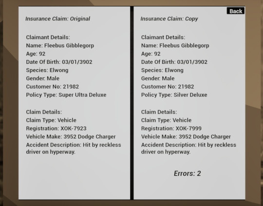
First Puzzle

This is the first draft of the first level/puzzle I've completed. It is in the style of an insurance form, and I looked at a couple different insurance forms online to get an idea of what I should believably include. I also decided to go with some fantastical/silly names to be entertaining and also take advantage of the sci-fi setting.
0 notes