
Don't wanna be here? Send us removal request.
Statistics
We looked inside some of the posts by ggcampbellgrad604 and here's what we found interesting.
Average Info
Notes Per Post
0
Likes Per Post
0
Reblog Per Post
0
Reply Per Post
0
Time Between Posts
9 hours
Number of Posts By Type
Text
17
Last Seen Tumblr Blogs


Fun Fact
The average Tumblr user visits about 67 pages every month.
Text
Overall Reflection
handed everything in and finished my report. was able to hand in to studiosity and get some feedback too. Proud of what I have managed to achieve while balancing other papers. I have found out a lot more about myself as a creative than I would've thought from this project and these 20 objects. I have discovered designers I want to work with and follow. I have noticed my love for pattern and collage-making. I have noticed that there is a very organised yet unorganised way I create work. I have left this with an eagerness to just start creating more and more and make my own briefs and just make stuff!!!! that's all you can do to improve and grow. Looking forward to the summer break and putting together a portfolio while I look for an internship.
0 notes
Text
Final essay/review
GEORGIA CAMPBELL GRAD 604 CRITICAL REVIEW
Repetition, Family, Mental Health, Self-Expression, and Repetition, Influences that Project My Creative Voice.
This report will discuss my journey as a creative, my process/creation, and the creatives that inspire me. I have always been encouraged to express myself freely by both friends and family, whether it be through dance, art, or music. I use art and design to bring joy to myself and others. It’s a tool that is flexible and can be applied to anything. I want to show the beauty of art and design and how I have started to fall in love with it again through this paper.
At the beginning of this paper, I was less certain about design being something I wanted to pursue lifelong. It still interested me, but I felt creatively exhausted. However, going through this paper, I have noticed I am beginning to push back, making design more of a priority. I recognised that if I didn’t put some solid effort into my work, I would continually feel like I am falling short of my potential. I knew I was capable and aware that I needed some gentle self-discipline. If the work did not interest me, I was less inclined to do it. I aimed to hone in on what I liked about projects and go from there, making briefs fit my interests and not someone else’s. I started to do my best to reignite the spark with art and design and put effort into making things fun. This paper has made me realise things about my chaotic creative process and has given me a kick up the behind to sort myself out, figure out my strengths and put even more time into my weaknesses. I also recognised one of the reasons why I wasn’t putting more into this degree was because I was in a long-distance relationship. I was constantly wishing I was somewhere else rather than in Auckland. After a healthy break-up, I felt as though I could fully throw myself into this paper. I focused on myself and my needs and gave as much time as I could towards design and it has paid off tremendously.
Currently, as a creative, I do the work and then refine it. I don’t always have the most efficient process but it eventually works out in the end. I create several versions of the same thing and restart it over and over until I am happy with it. Like this report which I have restarted 5 times (and counting.) I wrote it all out first then rewrote it again more concisely then again and again until I felt it was somewhat coherent. I do this with most of my work, it has been a theme since I began art in general. I used to restart paintings all the time until it felt right. I have interests in illustration, collage, photomontage, and acrylic painting. Anything that scratches the itch in my brain and stops me from scrolling on my phone. I let the pen drive itself on the paper and see what I come up with. My work can range from a sweet minimalist illustration to something that has a more chaotic, explosive energy to it. I like mixing old with new, recycling previous works, and creating something completely different from them. I love using music as a tool when I am creating. I find that an instrumental playlist of classical or jazz helps me focus best when I am writing. When I am creating art, whatever music I am in the mood for helps me be in the zone. I also collect through photography. I take images of anything that inspires me from type to texture. I keep banks of things that I know I will use in the future. I have started collecting and organising all my inspirations on Miro this year which has made a huge difference in efficiently finding my inspiration. I value self-expression in my work. I value randomness. I believe that is more than enough for art and design to exist for my own and other people’s visual pleasure.
This semester has unleashed a world of creatives for me. Going to the AGI Open boosted my motivation for design. Astrid Stavro (Fig.1) was a speaker that resonated with me. She says, “Doubt is the catalyst of growth.” “To keep doubting, to keep learning.” She spoke about how doubt invites curiosity. I could see this being true when applied to my own life. I had doubts about design and if it was my career path, but by throwing myself at it wholeheartedly I have discovered that it most definitely is what I want to do. I used this curiosity and doubt which led me to discover the next creatives that inspired me, hip-hop duo Joey Valance and Brae (JVB) (Fig.2). I was listening to a lot of the same music and wanted to expand my horizons. I knew one of JVB’s songs and decided to curiously discover more of their sound. JVB is this awesome mash-up of 90’s hip-hop and modern-day music. They are Beastie Boys reminiscent but with their own modern flavour. They make great songs but most importantly they have fun. They say stupid things and make themselves look silly. They are so talented in my eyes because they are just themselves. Something I aim to be in my work. Let my personality shine through.
Fig.1. Astrid Stavro via Semi-Permanent Fig.2. Joey Valance and Brae via Eugene Weekly
Another creative who inspired me from the AGI Open is Ahn Sang-Soo (Fig.3). I resonated with his approach to life. His life peace symbol (Fig.4) is something I love. It shows the sky, the sea, the land, and humans all in one mark, a symbol of how we are all connected. He runs a school in Korea called Pati. Where they meditate and it’s more individual-based. I am a bit of a spiritual person when it comes to meditation, and I find interest in the mind. That curiosity of the mind comes through in the way I create my work randomly. See what I come up with first with no boundaries. Then look back and refine. Sang-Soo also said in his talk “Competition suppresses creativity.” Which I think is true. When we try to be the best at everything and constantly compare ourselves to others our work is not a true reflection of who we are. This further reinforces why I believe that you should make whatever you want, however, you want, and then refine it. Your pen will not even hit the paper if you are too scared or stressed about what others will think or what others have done.
Fig.3 Ahn Sang-Soo via Adobe Fonts Fig.4. Life Peace Symbol Ahn Sang-Soo Image via Kocis
Paul Boudens,(Fig.5) another from AGI. He is my spirit animal. If I was a middle-aged man, I would be exactly like him. He’s all over the show and I love it. He gets up there and is completely himself and does some amazing work (Fig.6). His work is so obviously an extension of his wild personality and that is something I always aim to do. Our personalities are intangible and the way we present and create work is what makes them seen. The temporary of us as humans can be expressed semi-permanently through art and design. Leaving behind something that will stay a little longer than us. He spoke about how he still feels lost which made me feel better about the design journey I am on. He’s been a designer for decades and he still feels lost. He spoke about how nobody knows what they are doing really and so all you can do is have fun with it. That is the main idea behind all the creatives I gravitate towards. To have fun. Have fun and let your mind speak. I think that art is the expression we give to the things inside of us eager to get out. These things cannot always be condensed down and intellectualised. However, they can be enjoyed and they can be fun and that can be enough.
Fig.5. Paul Boudens via The Post Fig.6. ‘Not Dead Yet’ via Paul Boudens
These creatives have had an impact on me in the way I approach art and design. Their philosophies and the way they carry themselves through their work. Their work is amazing but what makes them even more inspiring is themselves.
The creative community, everyone is trying to find their people. It is constantly an evolving journey. You may specialise in something but that can change and develop as life happens and you discover more about yourself. I thought design was this big scary thing when you go out into the ‘real world’. That it’s these intimidating-looking business people and these strict studios who will barely acknowledge your existence. Discovering a new world of creatives through this paper has made me realise that this is not the case. That there are designers out there who have the same goal as you. To create cool stuff and have fun while they do it. To have that balance of professionalism and play a true skill I want to master. These doubts and fears were just a lack of information. People I would want to work with in the future are João Incerti, a Brazilian artist who loves to create art from feelings (Fig.7). Connor Pritchard (Fig.8) a young videographer of our time and someone who grew up in my home town (Napier.) I would like to find a balance between working with experienced designers and fresh ones. My career goal for the next 3 years is to wildly experiment and create as much awesome stuff as I can.
Fig.7. João Incerti via Gitano Fig.8. Connor Pritchard via cnrpr
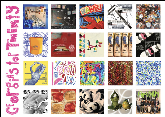
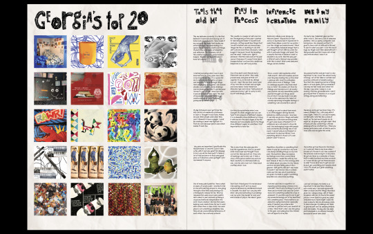
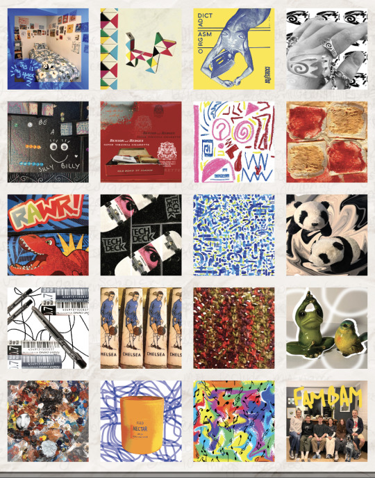
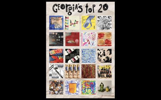
My poster is based on my love for music. It is my dream to create album covers for musicians and I thought why not practice some of that with these objects? I love music but I cannot play a single instrument to save my life. I have unintentionally made the poster so it is ordered like a day in my life as I create a piece of work. From waking up to what is subconsciously influencing me as I create, like my family and upbringing. Pattern and repetition is something I have always known I create and do in my life but these objects have made it more obvious to me. I repeat things in all areas of my life. Re-start, redo, re-try I can’t really explain why but it is something I have noticed I do. I love routine and repetition. Partly that need for control with anxiety but I am still somewhat sane so I guess this isn’t such a bad trait. My poster is like a love letter to myself. An appreciation for the people and things around me. The 20 objects are significant too as I turn 20 in less than a month. Like a final send-off to the creative process of my teens, something I can look back on and see how far I’ve grown. I have discovered that I absolutely love photo collages and combining analog and digital and look forward to creating more things like this in the future.
Overall, from this paper, I have learned many things about myself as a creative person. I have been shown mounds of research resources I can use in the future from The AUT Google Scholar to Jstor. Instagram has surprisingly been a huge help with this paper. I have found so many artists and creators I like. Instagram gives me insight into the artist’s process which I have found I value a lot. Especially João Incerti who documents his process a lot. It is very fluid and soothing. He takes his time to come up with things and doesn’t go guns blazing. I think that’s something I would like to work on. I think my process is very intense and chaotic because I don’t always have much patience so I throw everything at it. I want to try to be a bit calmer but stay true to the wild nature of my process. What was challenging about this project was trying to balance this paper with the studio paper. I have done my best in both but feel as though I could have gotten even more out of them if I only had to focus on one paper at a time. When I approach the 704 internship course I will seek out designers or design groups that have fun and are multi-media based. People like Alt-Group and Paul Boudens. I do not want to be sat designing branding and documents all day. I want to be hands-on and involved in the making process, not just digital. I will most importantly be looking for people who know how to have some fun.
References
CNRPR | Film Director. (n.d.). CNRPR. https://www.cnrpr.co.nz/
User, G. (2021). JOÃO INCERTI x GITANO MIAMI ART WEEK — GITANO. GITANO. https://www.gitano.com/happenings/dancing-with-my-eyes-closed-by-joo-incerti-gitano-miami
The post. (n.d.). The Post. https://www.thepost.co.nz/a/style/350072620/legendary-graphic-designer-paul-boudens-has-some-bold-advice
- - AGI Open. (n.d.). AGI Open. https://agi-open.com/speakers/paul-boudens
KOREA webzine _ People. (n.d.). https://www.kocis.go.kr/eng/webzine/201802/sub05.html
Ahn Sang-soo ���상수 | Adobe Fonts. (n.d.). https://fonts.adobe.com/designers/ahn-sang-soo
Kennedy, W. (2023, February 23). Joey Valence & (Brae)kbeats. Eugene Weekly. https://eugeneweekly.com/2023/02/23/joey-valence-braekbeats/
Astrid Stavro | Semi permanent. (n.d.). https://semipermanent.com/profiles/astrid-stavro
AGI Open Aotearoa New Zealand 2023 - AGI Open. (n.d.). AGI Open. https://agi-open.com/
Rubinstien, R. R. (2007). EVERYTHING BELGIAN IS NEW AGAIN. Article, Print. May/Jun2007, Vol. 61(Issue 3), p62-69. 8p. 3 Black and White Photographs.
Alt Group. (n.d.). http://altgroup.net/
0 notes
Text

final printed poster with the type justified and rewritten so they are all covering the numbers behind them. Printed on some nice paper I had left over from a previous project. I think it's 160gsm but it made the colours pop really nicely and im glad I have kept the background white because the colours have turned out a lot truer so I think a background would've been too much. Now just need to finish the Essay/report and hand everything in! whoop whoop!
0 notes
Text


Still struggling with the type and tried to make it bigger but my mates still thought it felt disconnected and like a mistake that some of the writing was shorter than the rest. They said to try at least cover the numbers. so I went in a took the time re-word the descriptions to make them look more vine. Then the viewer can focus on the content rather than the mistakes that stick out. I also noticed in one of my test prints that the titles for the categories were blurry. This was because I had changed some of the letter spacing on Photoshop and not saved it properly so indesign printed it pixelated. Glad I noticed this before I did my final print. this paper also showing me how important it is to sit in the library by a printer so I can just keep doing test prints easily rather than having to wait if I do the work at home.
0 notes
Text


added my name in the corner as that was some of my feedback in the critique as there a multiple Georgia's in the course. Also like how I have put the type sideways as I want the album covers to shine. This landscape way also meant the album covers would have to be smaller if the title was at the top and by putting the title/s on the side I was able to make it bigger. Did some more test prints and made the images ever so slightly bigger to get them to cover as much space as possible.
0 notes
Text

Also got the titles lining up and at the right size. changed some of the wording so they all were the same length. Changed it from 'Tools I use' to 'tools the aid me'. Because that title was too short the other way round and looked a bit weird.
0 notes
Text


Happy with the layout so far now that it is on top of each other. Did a test print with the paper-textured background. Felt like it was taking away from the actual content once printed even with a lower opacity. Did a test print without the paper texture background and looks better. Asked my friends for some feedback and they all said that the type looked a bit off as some of them didn't have as much writing. So back to the drawing board for a bit of reshuffling.
0 notes
Text


Changing the orientation of the poster so that it sits on top of each other. I tried justifying the text and making all the text fit the frame but some of it is hard to read case the leading is too tight and I can't make it fit any other way. I think I will keep it justified but have it all the same size so that it is easier to read. I also added in the numbers in the background in pink so people knew what order to read but I will see if that is what I end up going with once I do a few more prints.
0 notes
Text

Test print of the two posters side by side. Got some feedback from one of my peers and they said it felt a bit disconnected being side by side and to try it two stacked onto of each other landscape way. The albums at the top then the descriptions below to give rhyme more importance.
0 notes
Text


Hand-drawn type I scanned for the headings of the categories. I also changed it so the number 20 was written out instead of the number so it fit better along the bottom.
0 notes
Text


testing out different layouts. Trying to make this type fit without tit looking super tight and rigid. Also changed the title to pink because the black felt un finished and I changed it to pink because in primary school we had to make a poster about ourselves. My mum helped me make it and we made this huge pink poster with heaps of glitter on it so it's a nod to that. Although you wouldn't know unless you read this blog I think it looks nice too. Gonna do a test print to see how it turns out. without the paper background just on white.
0 notes
Text


sorting out the order of things more. treating it like a story and how I create things. Starting with first column of 5. I start in my bedroom in my space I might use my diary to spark something, a tool in my pencil case, a pen of paint something. As I am doing that there are these things around my room or desk I also use as reminders of my creative process. In the second column I might light a candle while I do some art. Use something from the trinket box or play around with my twisty toy for some inspiration. Admire the knife on my desk love the aesthetic of it. Maybe play around with my tech deck while I think. This column is a play and relaxation column. Collum 3 is then as I think of ideas I might look at inspiration from my photo bank of things like this buzzcoks album. Or create something based off feelings I am having like Joao inherit does. play some music to get me in the groove and vibes then create from crotchet to pattern making. Collum 4 As I am doing this I am also thinking of the things that help aid this creation to do with my family and myself. Twist my ring my aunty gave me never sick of admiring the ring love it. Eat some pb and j. cuddle me panda and remember the cool decor m brother gave me then think about my family and how they influence me so much. the bottom layout is the one I have gone with now but as I am writing this I am thinking that maybe I will order it so it shows my creative process a little more logically. like I wake up in my bed cuddle my panda eat pb and j etc but pretty happy with it so far it is getting somewhere.
0 notes
Text


realised I hadn't properly articulated the categorisation of my object yet. Found that I could operate them into groups of 5 so reader has to read down instead of across. I could do 5 across and 4 down with the grid but then the covers wouldn't be as big so I decided not to and to stick with 4 across 5 down.
The categories of 5 going left to right are; tools I use when creating. Trinkets or antidotal stories of significance. Influences and creation and then me and my family.
Order could still change but somewhat happy with it now.
Also made my spacing equal on all sides of the covers so it sat better.
0 notes
Text


In class, we were able to get some feedback on our posters and inventory. I was able to talk to Natalie about my work and some feedback was to see how I could get the text of the inventory to line up with the covers and then there might be no need for the numbers. Also reduce the size of the title and try to let the covers shine more.I may also need to include a key of what order to read the inventory in. Also need to include my last name somewhere as there is more than 1 Georgia. Also, look at making the opacity of the background lighter for more contrast with the covers.
0 notes
Text
Week 12


For class, we had to have our posters printed. This is what I have so far. The font for the explanations so far is Chantal but unsure about the all caps and that is the only case it comes in. Tried playing around with different colours of text and numbers. Was half way through that experimentation and realised I had to print.
0 notes
Text


forgot abou tmy peanut butter and jelly cover and I had already made the 20. Decided to swap it with the shell boxes. these boxes didn't have too much behind them expect me and my sister both have one but I talk both her in another one with the panda so that's why I swapped the. peanut butter and jelly was a must and had to be in there cause its such a part of my routine.
Also re took the image of my paint palette for the bottom left because the other one was too blurry and this one showed the textures better.
Added a bit of a background and some cutouts for the frog and bird on because the background was bending into the paper of the page. tried a bright green background too and green swirls but forgot to take screenshot. The green background didn't work as it was the only bright green thing against the rest if the album covers and took away from the rest so the white was a better neutral.
0 notes
Text


testing out the paper texture against the album covers. found that a darker opacity with the notes in the background of the paper started to take away from the album covers. But having no notes in the background felt a bit empty and random. So far I'm liking the 20% opacity range because it's more subtle and lets the album covers shine. Also have been playing around with type and colour for the explanation page as I have wirtten all the body copy for it. need to problem solve how I will do that.
0 notes