
Statistics
We looked inside some of the posts by giselaaa and here's what we found interesting.
Average Info
Notes Per Post
21
Likes Per Post
21
Reblog Per Post
0
Reply Per Post
0
Time Between Posts
1 month
Number of Posts By Type
Video
1
Text
16
Last Seen Tumblr Blogs


Fun Fact
Tumblr has 411 employees.
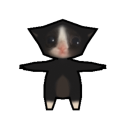
Text
Small process but already starting to animate.

2 notes
·
View notes

Text
Final animation.
250 word reflection:
This is my final animation and overall I am really happy with the outcome. Using my IPad for animating was challenging but in the end became easier to use. I feel like the colours and character designs fitted well with the theme of the story aswell as expressing the tone/emotion of what the character is feeling. I had a lot of fun making the background designs because as well as being into animation, I also like illustrating.
At first I was not going to add a lot of detail to my character designs as I felt it would not fit the concept of my story but by adding specific detail to the background and characters, it helped give more life to the animation. The sound contributed to this too. I did not want to add too many sounds because I felt it would complicate the audience if too many things are happening (the voiceover, sound effects, animation) so I made sure to use important sounds. I feel like I balanced well the use of sound as well as the detail in my animation.
Despite what I did well, I feel like I could have improved on the transitions. Because I used the software ‘Procreate’, there was a limit in how many layers I could use which caused some challenges when transitioning scenes. I also did not end up using my music that I wanted to add (playing the ukulele) as I felt it would conflict with the voiceover and noise of scenery.Besides that I am happy with the outcome of my animation.
5 notes
·
View notes
Text


1 hour paintings.
In my spare time I glued some lined paper around to make it more interesting .
3 notes
·
View notes
Text

These are some drawings I made from a few life poses in a video I watched. In these drawings, I put a lot of detail in tone and shading. I’m not very confident when using pencil to draw which is why I used it to help improve my skills.
1 note
·
View note
Text


30/04/21
Some life drawings we did today. I decided to paint on a random cardboard as I got tired of drawing on the same piece of material. I really like how it turned out as it’s different and the colours I used kind of stand out on the text of the cardboard.
0 notes
Text


These are some watercolour paintings with black pen drawn over. I tried my best to fit everything in the rectangular frame. I also, in the last drawing decided to make it into an illustration which is why it’s not very realistic. For the other drawings, I kind of combined them together by overlapping the other drawings onto one.
1 note
·
View note

Text


Pen art. In these drawings I only used pen. I realise that in these drawings I overlap my pen sketches over each other to create a line. I need to avoid doing this and draw more smoothly.
0 notes
Text


Gouache paintings.
Using only gouache paints allowed the paintings to be more expressive. I think this because the brush strokes i made weren’t following any pencil marks so they came out more natural. I also limited the colour that I used. Red for darker tones and the yellow for lighter.
0 notes
Text


Pen drawings.
I really like drawing in pen because for me it looks nicer. I feel like I should try draw on a bigger scale for next time to try challenge my skills.
0 notes
Text


Life drawings. 23/04/21
My favourite drawing is the 3rd image
0 notes
Text


Digital drawing on my iPad.
3rd image has an overlapping of drawings together. The others are unfinished.
0 notes


