
Statistics
We looked inside some of the posts by gnagoh and here's what we found interesting.
Average Info
Notes Per Post
2
Likes Per Post
2
Reblog Per Post
0
Reply Per Post
0
Time Between Posts
7 days
Number of Posts By Type
Text
11
Last Seen Tumblr Blogs


Fun Fact
Tumblr has 411 employees.
Text
Final Project

Before I proceeded, I took down some key characteristics about myself so that I could go about presenting my authentic self in my logo. I consider myself as someone with a warm personality who is sociable and optimistic. I love green and neutral colours like brown, beige and gray. I love the sea because of how therapeutic and peaceful it is, and the nature as it always reminds me to take a step back and relax myself occasionally. I'm also someone who likes to keep things simple and appreciate the little things in life. I find myself to be interested in line art as it's simple yet aesthetic. As someone who loves line art and connecting with nature, I did research on line art designs which incorporate the nature elements in them. I especially love line art as it communicates simplicity and minimalism, but still encapsulates the core identity of the subject.
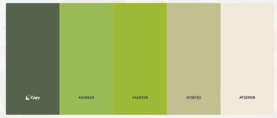
The colours I chose consist of earthy, warm and natural tones, which exude warm and reassuring vibes. They are also colours associated with nature. I decided to also use yellow white and dark grey so I have more neutral colours that will show more contrast from the orange and green.


I took inspiration from my research and drafted my 3 logos as such, incorporating nature (leaf/my birth flower) as well as the first letter of my name 'G'.

I went ahead with the first logo as my preferred choice as I wanted to work with abstract shapes and vectors for my name card and resume and the shape of the leaf would go well with that idea. I also think that the first logo best represents me as an individual as it signifies my 'immersion in nature'.
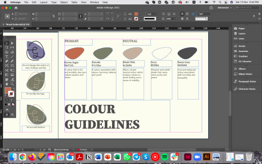
Moving on to my name card, I decided to use #fefdee (ivory) for the background as the neutral colour would allow my primary colors #7c7d6a (xanadu) and #b47153 (brown sugar) to stand out more. I used abstract shapes, lines and vectors in the background. The abstract shapes I have drawn using the Pen Tool resemble that of what we see on shore (waves, stones/pebbles, sandy areas). I have also added elements such as waves and leaves using wavy lines.

The challenges I faced here were my pursuit to add more variations of shapes and elements to my name card, which I gradually overcame as I thought about what represents me as a person and embodies my interests. I also made sure that the shapes I drew would be of contrasting colours (no same colour beside each other) and shapes (using different levels of curves).
On the back of my name card, I added the abstract shapes only to the 4 sides of the card and left the middle section empty to make away for my contact information. I felt that having too many elements might compete for the reader's attention and divert attention away from the main point of the card. I ensured that greater emphasis were placed on what is in the centre of the card.
My resume also follows a similar design as my namecard. I included a short profile description about myself, hard skills, languages, work experiences and co-curricular activities, which are essential components of a resume. In my resume, text is left-aligned to increase its readability for readers. For hard skills and languages, I designed a simple infographic to illustrate my proficiency level in each software/language. At the bottom right-hand side of my resume, I decided to draw an outline of a leaf to fill up the space so as to balance the amount of information and visuals.

For my namecard and resume, I have used Source Serif Variable and Avenir typefaces (serif and sans-serif pairing) for simplicity and minimalism. Source Serif Variable Black is used for header while Avenir Light/Medium are used for body text and subheaders.
After Critique
The comments I received from my tutor and peers are as follows:
Resume
1. Include icons under the language section for consistency, similar to the ones in the hard skills section
2. To bold the work titles/CCA titles so they can stand out more at readers' first glance
Brand Guide
1. Name card page: Size of name cards to be made larger, header 'name card' to be made smaller
2. Colour guidelines: Remove the stroke of icons, only leaving the one for Ivory to distinguish it from the background
Following the critique, I made changes based on all the comments that I received.
- I included icons "EN, CN, KR" beside the bars under Language section to symbolise each language
- For work and CCA titles, I changed the font to Avenir - Heavy so they will be slightly more bold from previously and there can be some contrast shown between the title and body text (which I later also added into the Typography Guidelines in my Brand Style Guide)
- Changes to brand guide: Appropriate size adjustments on name card, resume pages & strokes removed for colour icons except Ivory but decreased the weight of the stroke from 1pt to 0.5pt as I felt that it was too thick. Contrast from the background needs to be shown but minimal weight will already tell the difference.


Final Reflection
I am thankful for my journey in NM3217 as it allowed me to explore different techniques using the different software (from a fresh beginner) and the feedback I received from Zicheng and my peers were really useful in helping me to elevate my work as I gained perspectives of different angles from different readers' point of view.
This brand identity project gave me the opportunity to explore myself as an individual based on my personal traits and interests and to express these in visuals.
I learnt the utmost importance of consistency and structure in communication design, starting from conceptualisation to the final product. A consistent look will improve learnability and readability and help to keep readers engaged. I learnt that a brand style guide is essential for a brand in helping to communicate a consistent message to our audience and set forth the design standards and guidelines to follow. This helps establish a strong brand voice which can resonate with our audience and in the long run, build brand awareness and generate brand loyalty (as what we see in big brands like Coke and Apple).
I will surely be able to use this knowledge learned in NM3217 as I explore careers in the marketing and advertising industries. Thank you for all the hard work and efforts put in making each lesson fruitful and enjoyable! :)
Final Look of my Brand Style Guide

1 note
·
View note
Text
Assignment 3
Ideation
In this assignment, I decided to come out with a How-To guide on brewing tea the correct way. This came about as I am personally a tea person and I wanted to also convey the common tea brewing mistakes made by many people, such as steeping tea for too long, having bad ratios as well as missing important steps people do not take while making tea. This infographic will be targeted at people who like to make/drink tea like I do and it will be a clear guide showing the recommended ratios of tea leaves and water to use, water temperature and steeping duration as well as the steps to take.
Planning


Firstly, I wrote out the different information that I could possibly work on on the topic of teas. I went with a 'guide to making tea' which will include types of tea, steps to make tea, as well as ingredients that make your tea better. I initially wanted to include health benefits of tea but it was removed in my final draft as I felt that the guide is targeted at people who like or make tea and should be people who already know the benefits of consuming tea. My guide to teas should therefore be focused on educating people the right steps to take and information they could have been neglecting when making tea.
Before Critique
I searched up information that I would include on my how-to infographic, did a rough sketch and found potential colours to use from Adobe Color Themes.
Tea is commonly associated with the colour green, thus I decided to work on having different shades of green on my infographic. I also worked on finding colours for my different types of tea (green, white, black, oolong).

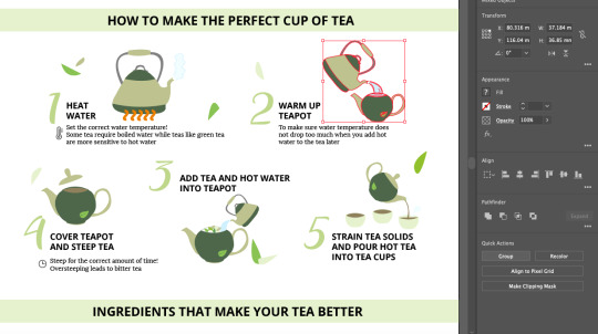
As I began to work on it on Adobe Illustrator, I first decided on the elements/icons that I would need and created a separate template to work on creating my own elements using the Pen and Shapes tools. For my infographic, I selected a Sans-Serif/Serif combination (Open Sans/Lora) for my header and body text. However, I used a slightly more fun typeface for my main title as I wanted to make the words "A guide to tea" look like they were flowing out of the teapot. As for my headers and body text, I standardised them to be left-aligned so that it will be easy to read.


The Eyedropper tool was used for me to extract the colours from the colour scheme/codes I picked earlier quickly and conveniently and it helped me to obtain a cohesive colour scheme for my infographic.
I also found the Group function really useful as it allowed me to combine selected elements together and move the entire group around without misaligning or losing the individual elements.
After Critique
During the critique session, my classmates commented that my idea of the title 'A guide to teas' flowing out of the teapot was not that obvious and suggested that I use the colour of tea as well as connect the last letter 's' to the sprout of the teapot. Zicheng also suggested that I extend the title such that it is not too spacious on both ends. As such, I went to pick another font that is more 'cursive' and the 's' is more stretched out such that it will connect to the sprout of the teapot. I also changed the colour of the title and used the same colour as the body of the teapot.

Some of my classmates were also confused by the sequence of steps, thus I modified it by arranging them in a cycle where steps 1-5 flow in a clockwise direction.
Zicheng suggested a few subheadings design ideas that I could incorporate to add some style to my subheadings. I decided to maintain the colour used and created a tag-style design.
Additionally, I drew (using the Pen tool) and added in more ingredients to the last segment to fill up the empty spaces.
Last but not least, I removed the black outlines (remove stroke) of the icons in the first and last segment to be consistent with the ones I had done for the second segment. I also changed the colours of the honey and lemon icons to that of a lower contrast as Zicheng commented that the colours were more striking than the colours I adopted for the rest of my graphics.
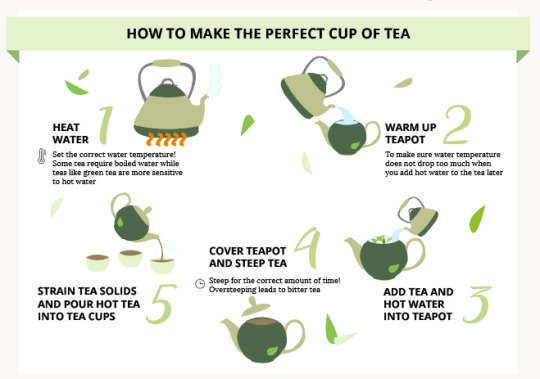
Final Look!

My takeaways from this assignment are selection, organisation and visualisation of data, most importantly making sure that information is presented in a way that is well-organised so that the audience can grasp the ideas instantly when skim reading. I also learnt that a good infographic is one that has a good balance of visual information and has visual consistency.
0 notes
Text
In-lecture Exercise G
I created this wave pattern using the elements of design.

For the lightest, a few curvy lines are drawn and are further apart, creating white spaces and lighter areas. As it gets darker, the lines get closer together and more curvy lines are added. The areas get darker eventually, reaching the final stage (darkest) where the lines are close together with little/no space.
0 notes
Text
Assignment 2
Ideation
With the pandemic, more and more people than ever before are experiencing feelings of stress and anxiety, and kindness is key to overcoming this pandemic. With this, I decided to narrate the act of kindness, which is something that we should work towards to. What does one mean to be kind? To me, kindness means being aware of people around you and reaching out with empathy. It also means being willing to help others in need even when it does not benefit you. I thought of the idea of giving - using what we have to help those in need. With this, I wanted to portray a schoolgirl who feels empowered to help others with what she has. Here she meets a kind passer-by who volunteers to give her a helping hand when she faces a problem.
The storyboard started with the girl receiving a donation envelope from the school. Knowing that she actually owns this power to improve the lives of others', she is really excited to fill up the envelope with her little savings. However the next day, she lost the envelope on her way to school and met a passer-by who approached to help. As he found and opened the envelope, the envelope was already empty. In order to console and reassure the girl, he then takes money out of his own wallet and put it into the envelope. In the last frame, he returned the envelope to the girl.
This story aims to show how one act of kindness leads to another.

Before Critique

After Critique
From the critique session, I was given useful feedback by a few classmates that it was confusing as to whether the two characters were putting money into OR taking money out of the envelope, as there seemed to be 'missing actions' between Scenes 5-7. My tutor also suggested to omit the 1st scene so that I could include more scenes which can show that the male character is putting his own money into the envelope rather than taking it out (which changes the entire storyline as he is stealing the money...). To portray this better, I decided to include a shot of the male character taking money out of his wallet as well as an over-the-shoulder shot for the male character in Scene 6 to show the empty envelope more clearly. I also tried to adopt more angle variations for the last few scenes. Some other changes I made to improve the flow of the story include: 1. Envelope drops out of the girl's pocket instead of the bag, 2. Girl walks straight rather than stopping to realise that the envelope has dropped and look for it (here, the girl is unaware).
Updated Storyboard

Curated Photographs


Final Outcome

In order to clearly convey my story, the use of storyboard in the ideation and pre-production stage is important as it can allow me to have a better idea of how each scene flows and supports one another, as well as get some sensing of the shots I want to take and see how the shots work together. The variation of camera angles also helped in enhancing my narrative.
0 notes
Text
In-lecture Exercise F

For this exercise, I used an image I took of the Starbucks container cafe in Taiwan, Hualien. It is designed by Japanese architect Kengo Kuma, and is built from recycled shipping containers. I picked out grey and blue hues for this image.
The blue hues convey freedom, which represents the sky in the picture. It is a calming and serene color and brings peace when we look at it, just like the inner peace and calming effect we feel when we stare at the skies and immerse ourselves in this vastness of space.
Grey is derived from black and white shades and hence signifies a state of equilibrium. Grey hues convey neutrality and balance and can also be associated with being sleek and contemporary, which is expressed by the minimalist architecture of this building.
Both grey and blue go well together as they both relate to the state of tranquility and blend perfectly together. They are a versatile combination that even light blue and dark grey create a contrasting yet cohesive look.
0 notes
Text
Assignment 1

For this assignment, I chose a picture of a flower which was taken at Vietnam. I decided to focus on the hibiscus as the main subject for abstraction due to its detailed elements, although there were also many leaves and another flower surrounding it. The detailed elements are for instance, the petals, the inner part of the petals, as well as the stigma.
For stage 1, I traced out the subjects in the foreground, focusing on the hibiscus and the leaves and other flower surrounding it. The background was not taken into account as I felt that it would not serve any purpose leading to my final stage. I utilised the Pen tool as we did during the tutorial when we learned to trace the fox. To create contrast, I also used different shades for the inner pink portion of the petals as well as the leaves.

For stage 1, I wanted to trace out the subjects in the foreground, focusing on the hibiscus and the leaves and other flower surrounding it. To do so, I placed the original image and adjusted its opacity to 75% so that I could trace the outlines easily. The background was not taken into account as I felt that it would not serve any purpose leading to my final stage. I utilised the Pen tool as we did during the tutorial when we learned to trace the fox. To create contrast, I also utilised the Fill to create different shades for the inner pink portion of the petals as well as the leaves. This also allows me to differentiate the main flower from the rest of the elements.
I also added subtle lines extending outwards from the center to illustrate each petal.
This stage was the hardest for me as it was a challenge to trace every jagged part of the petals and leaves. Moreover, the leaves in the image were blurred out, hence the outlines could not be visualised clearly.

Next, I removed the fill for the leaves as I intended to exclude the leaves.

From Stage 2 to Stage 3, I completely removed all the elements surrounding the flower such that only the flower and its details remain. I also simplified the pistil by removing some of the anthers.
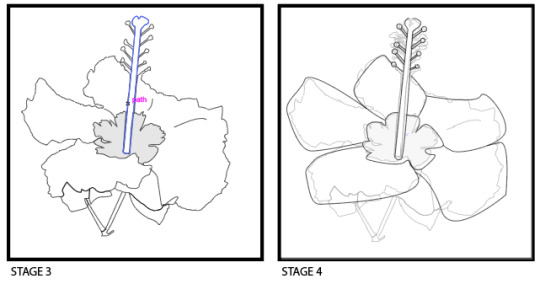
Following that, I figured that the edges of the petals were too jagged thus I smoothed out these edges to make the petals look more rounded. I also made each petal look more obvious by enhancing the lines. I replaced the heads of the anthers with circles by using the Ellipse tool.
Moving to the last stage, I continued to smoothen out the edges of the petals to make it rounder. I experimented with different strokes and shapes and came to the final stage where the stigma and anther was further abstracted, but ensuring that the final design would still convey a hibiscus. I also rounded the inner centre part of the flower.

For the pistel, I united an ellipse (oval) and a cylindrical shape together using Pathfinder > Unite.

The critique was helpful in helping to give me more perspectives from my peers and tutor and consider the details that I have overlooked during the abstraction process.
One suggestion given by my classmate was that from Stage 1 to 2, the leaves could be removed. However, I felt that removing all the leaves would be too much of a drastic change in just one stage. As such, I decided to only reduce the number of leaves.
My tutor also suggested that I retain the structure of the flower such that the pistil is 'coming out' from the centre of the petals as the pistil now looks disconnected from the entire flower.

I went ahead to modify the petals in a way that the petals join together at the centre of the flower and the end of the pistil is joined to the centre so it sticks out and does not look as awkward as before.
From this assignment, I learnt that abstraction allows us to perceive beyond the tangible and extract the important details such that it still serves a purpose for not only the artist, but also the viewer. Through the abstraction process, I felt that I was given the freedom and control over my own piece and it challenges me to think beyond the representational interpretation of the subject.
Final Piece

0 notes
Text
In-lecture Exercise E

The text is center-aligned, which makes it difficult to be read and the starting point cannot be identified. Moreover, the typeface used in the text makes reading arduous due to the caps and hollow letters. The same typeface is used for both the title and text, lacking contrast and emphasis. The title does help to capture the attention of the reader instantly due to the uppercase and larger font size, however it can potentially bring the entire focus away.
A mix of serif and sans-serif can be used to complement the title and text. I will also ensure that only the first letter of the first word in each sentence is in uppercase while the rest are kept in lowercase. As for the title, the first word is capitalised while only articles, conjunctions and prepositions are in lowercase.
Both the text and title should be left-aligned to improve readability. Title should be centre-aligned only if it is the title page and not combined with any body text. Otherwise, left aligned headings should go with left aligned text.
Use of larger titles can be used if the context is bold and more playful, less formal. Under a professional, business context, there should be a low contrast between the title font and content. The Golden Ratio can be used to pick the font size.
0 notes
Text
In-lecture Exercise D
Subject: Grizzly soft toy from We Bare Bears.
Angle 1: High angle shot

This high angle shot is taken where my phone camera points down at the subject (Grizzly bear) from a higher perspective, making the bear appear small, powerless and vulnerable. From this shot, the bear looks innocent and helpless and this can trigger emotional response in the audience, like empathising with the bear.
Angle 2: Low angle shot

This shot is captured below eye line level, pointing upwards to the subject. On the contrary, this establishing shot makes the bear look dominant while positioning the audience as weak and submissive as the audience has to 'look up to' the subject.
Angle 3: Eye-level shot

The next 'neutral' angle shot is taken directly at eye level. Here it gives a familiar perspective to the audience through an eye-level point of view, without implying any status. This shot bridges the gap between the subject and the audience as it is how the audience will see the subject in real life. The audience can relate better with the subject and immerse themselves in the scene.
Angle 4: Rule of Thirds

In this shot, the rule of composition Rule of Thirds is used to photograph the bear sitting on the table. The bear is placed on the extreme left-third. It draws the audience's eye into the picture and places emphasis on the bear.
Angle 5: Close-up shot

The final shot is an intimate close-up shot which helps in bringing greater details to the audience. The shot is taken at a very close range to either draw the audience into the subject's personal space and possibly delve deeper into the subject's emotions or to reveal characteristics or features about the subject which one may otherwise not notice from a far shot. For instance, the bear's face can be observed up close and its tiny details are shown.
0 notes
Text
In-lecture Exercise C

In this Heinz advertisement, the signifier here is the stack of sliced tomatoes taking the shape of a bottle of Heinz ketchup, with the ketchup label and logo printed on it. This resonates with the receivers who see this ad as they will be able to recognise the iconic Heinz ketchup bottle due to their prior knowledge of this brand.
The signified is the representation of the naturalness and freshness of Heinz ketchup. This ad is trying to say that Heinz's ketchup is made up of fresh and real tomatoes, as portrayed in the creative design, showing how it is a natural and healthy option for people looking for condiments or are already consumers of ketchup. The target audience here are these consumers who are health conscious and prefer organic condiments with no artificial flavourings. The colour used in this ad also complements the colour of tomatoes, that is red. The vibrant colour is used to grab the attention and increase sensitivity of the eyes of a potential receiver. Additionally, the green stem end of a tomato is placed at the top of the 'bottle', which further emphasises the realness and freshness of Heinz's ketchup.
The tagline 'No one grows Ketchup like Heinz' conveys the idea that Heinz's ketchup is fresh and grown by Heinz, and there is no other company which offers the same freshness and naturalness that Heinz can deliver. Ketchup cannot be grown but tomatoes can. The tagline is trying to infer that Heinz grows their own tomatoes that are used in the production of Ketchup, which is the product Heinz is known for.
0 notes
Text
In-lecture Exercise B

I will be applying the constructive criticism model in evaluating Mark Tansey's A short History of Modernism which features a series of three oil-on-canvas paintings.
Description
The first panel depicts a woman using a garden hose to wash the windows from outside her home. In the second panel, a man is running head first into a wall at an open field. In the last panel, a chicken stands at the top of a slope, staring at its own reflection on the mirror.
Analysis
The artist uses a sepia tone and the three paintings were of tints of red, blue and yellow respectively. The shadows are also illustrated clearly, presenting a realistic art. The paintings focus on the subjects (woman, man, chicken) and their respective actions. However these illustrations have no relationship with one another and each of the scenarios portrayed in each panel is on its own, suggesting how each panel reveals a different approach and has their own meaning behind it, which have to be uncovered or interpreted by the viewers themselves. For instance, there is no link between a woman washing the windows and a man banging his head into the brick wall. As such, we explore the hidden meanings behind each panel. The name of the painting A short History of Modernism suggests that the three panels are the three different approaches to painting among artists, from modernism to postmodernism. The three panels show the different stages, that is the past, present and future.
Interpretation
For the first panel, the woman washing the windows from outside her home seeks to bring forth the clearest view of the outside world. I feel that the piece may be trying to depict how modernist artists paint a picture (using a brush) and present things in a way that is realistic, accurate and true to life.
In the second panel, the man running head first into the wall serves as a metaphor for the rashness of postmodernist artists. It also implies their sturdiness in resisting change and reluctance to consider or accept new or different ideas, but forcing progress.
The chicken in the third panel looks at itself in the mirror examining its position at the top of the world, likened to the behaviour of the artists now as they contemplate their place in the history of modern art.
Judgement
The painting's visuals are consistent with the artist's other artworks. As I lack knowledge about modern art/Modernism, the interpretation I made was lacking context hence it was up to my own interpretation. The story/meaning behind the paintings were not explicitly shown in the illustrations and they may be misinterpreted by viewers like me who lack context about the history of modernism. The actions depicted in the paintings were also peculiar, potentially leaving viewers confused.
0 notes
Text
In-lecture Exercise A

I was inspired to create this Interactive Canvas from the apps that we use in our day-to-day lives - Pinterest and social media apps such as Instagram. I often find myself going to Pinterest when I need ideas as it is where I am able to gain inspiration from a variety of sources, such as colour palettes, nail art, or even travel or food ideas. Pinterest has become a valuable platform for people from all walks of life to find inspirations through beautiful, aesthetic images with eye-catching colours. This goes to show how content posted by other users or creators play a part in enhancing our own creativity as we are able to think out of the box when we explore more possibilities in what we can do and produce original designs/ideas that would not have occurred to us otherwise.
Collaboration can also boost creative production and encouragement helps people unleash their creative potential, hence I have added in the social element which allows for peer interactions. Creators can 'follow' each other and have access to their friends' projects, where they are also able to give their critiques, encourage and collaborate on one another's existing project.
Functions that the Interactive Canvas has:
1. A panel that detects the category of items based on the sketch you have drawn and shows suggested object sketches e.g. when drawing palm trees, it also shows possible objects under a beach setting such as a beach ball, foldable beach chair, sand pail, starfish...
2. Suggested colour schemes and within each colour shows a possible colour palette you can use.
3. Friends' List: Able to see who is online/working on a project currently. 'Request collaboration' to invite them to your particular project and provide their critiques. Click onto their profile to see their works.
1 note
·
View note