
Statistics
We looked inside some of the posts by gorringe and here's what we found interesting.
Average Info
Notes Per Post
0
Likes Per Post
0
Reblog Per Post
0
Reply Per Post
0
Time Between Posts
2 days
Number of Posts By Type
Text
17
Last Seen Tumblr Blogs


Fun Fact
Tumblr Inc. is using 66 technologies for its website.
Text
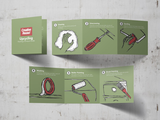
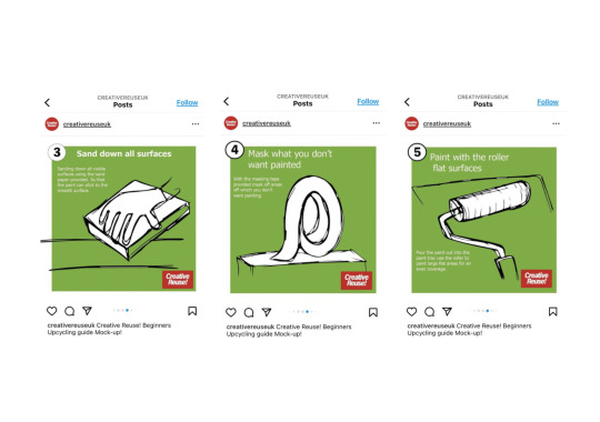
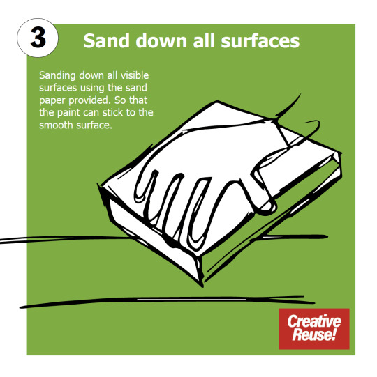
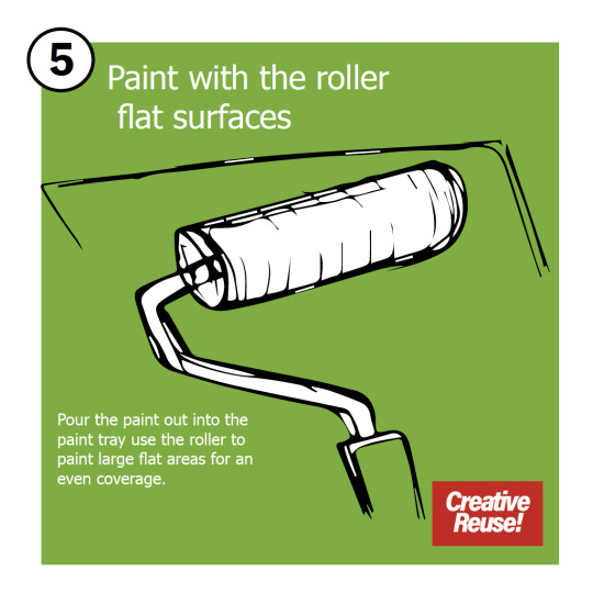
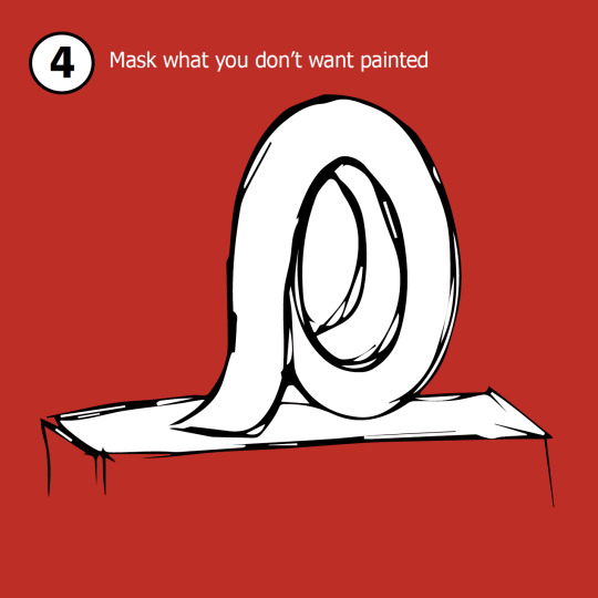
Making final upcycling concertina leaflets
Once the digital version of the concertina leaflet guide was complete. It is now time to focus on the printed version. I used in design and an a3 spread to place all pages except front and back covers as they wouldn’t fit. But they will be stuck separately.
How I wanted to make the guides. To have 2 sides so that once you finish ready one side you can flick over and read the other half of the instructions for your upcycling project.


I folded each page so that the concertina folds woukd work. This was hard to get correct by I managed to get it was nearly as I could. Then I did the same on the back pages and stuck them together. Lining up both sets of folds so that the concertina book would open how I wanted. I wanted the guide to be pocket size and small so that it was easy to carry around and use. As it’s in the same format as the digital version which can be accessed via social media.

I stuck the two sides together using glue. Although this was hard and I wanted the booklets to look as professional as possible. I feel the gluing method is hard to get completely accurate which I found. I did want to make them by hand as I felt that was the best way. I could of printed on both sides and created it that way. But I felt like that was complicated. Although that method may of been slightly neater in the presentation. I feel that overall outcome of the booklets are successful and clear to read. The text is easily read and adding the extra colouring to the illustrations has really transformed the brand identity. Here are some photos of the final outcomes.


0 notes

Text
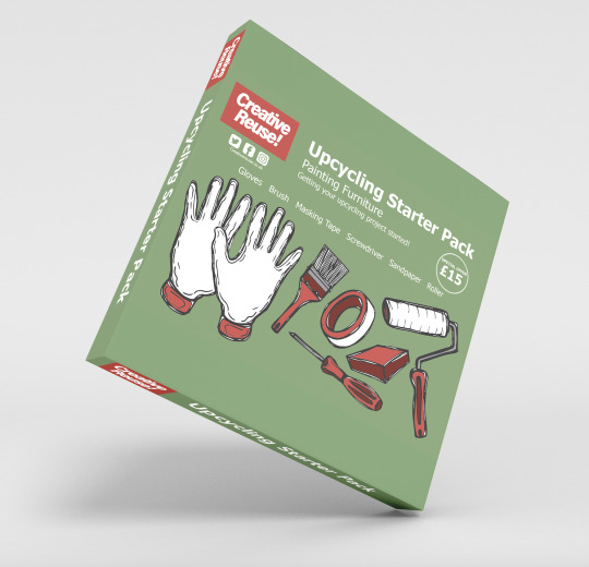
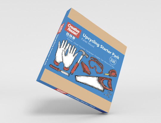
Upcycling starter packs and tool hire poster
From my crit I was suggested to try and use some mockups for the starter kit packaging. As what I created was a label for the front of the kit. also what was inlaced but no overall box combining the two. So I thought of creating a box mockup of the starter pack to show what the product would look like.
I found it hard to find a decent free mock up it took a while to find one which I feel resented the create reuse starter pack. But I eventually found one which I feel works well and would fit all of the products inside. Here are both mockups. But now looking at them. Ive come to realise I don't like how the creative reuse title doesn't match up to the one on the side. How squished everything looks. Due to the rectangular label I have created. I feel if I left the area around the label the cardboard colour it would look a lot better and not so squished. But as the colour is the same it just look like the branding is just squished into the centre with lots of excess room.
However now realising this and already sending off my process book to be printed I feel like I cant do much about it. Although I feel that changing it and using up more the box space will really improve the look of the packaging. I wish I realised this before sending off my process book. As I cant change that now. I am going to tweak these final design so that I am happier with them as final outcomes.
Upcycling pallet wood starter kit
Upcycling pallet wood starter kit
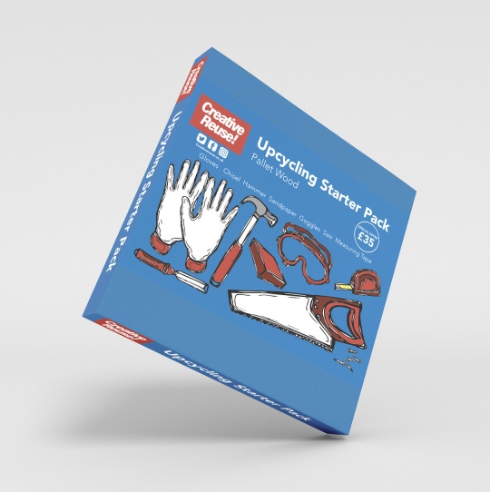
I have played around a little with the box design so that label stood out a bit more and wasnt the same as the colour of the box. making the label looking squished up. So I made the box brown because they are cardboard and overplayed the box with the label.
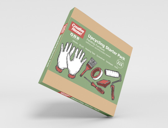
I feel these look a lot better now the label and the box are different colours showing the label as it wraps around the cardboard box. Also having the side branding to match. I tweaked the creative reuse logo so it lined up better with the logo on the front wrap around branding so it flowed better and looks less odd and out of place. This is my final branding for the starter pack I feel that slight tweak has improved the design massively. I think works well as a product which would be displayed.
Upcycling tool hire poster design
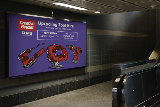
For my final crit, this design questioned in what was it was it a poster, packaging etc. I didn’t make it clear on what it was so I created it into a poster billboard advert for creative reuse. Advertising the tool hire scheme which can be used to rent tools to use with the upcycling kits if the project is bigger and more complicated than first imagined so you can rent these tools so that you can complete your Upcycling project. I feel it works really well within. billboard format. showing exactly what the the tool hire offers.
0 notes
Text
Final upcycling guides
From my tutorial I was suggested to change my font I ws using to something a bit less ordinary and in other words ugly. As there were nicer sans serif fonts around. I picked another of my favourites called Avenir and swapped all of my type from Tahoma to Avenir.
With the guides there wasnt much to change from the crit although I adjusted the layout and generally neatened everything up so that everything was more aligned. Here is the two final guides which I have used a mock up to show how the concertina book will look like. Although I couldn't find a mockup which would have four pages so I had to improvise and use this example. I will be printing out this concertina guide and putting it together with four fold pages which will be double sided with a front and back cover.
Upcycling Furniture concertina guide
Upcycling Furniture concertina guide
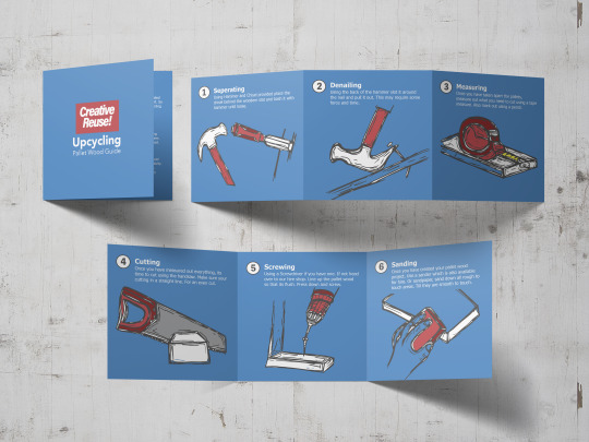
Apart from the mock up not being completely perfect I am pretty happy with how they have come out and look within this mockup. I don't usually use mockups as I've never known how to. But its a lot easier than I first thought. Something else which I noticed which isn't great is how the colours are slightly different to the original. Although this is okay and isn't that noticeable.
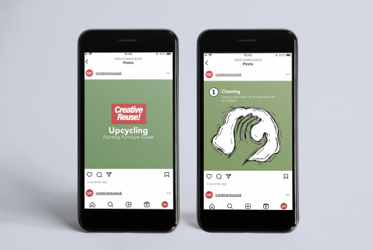
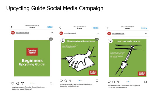
I also created a digital version of the upcycling steps guide. As my target audience is Gen Z I thought it was important to create a upcycling guide which can be accessed via social media. Having the two I thought would give the opportunity for more of Gen z to give it a go.
The idea would be that the guide would be posted on instagram and you were able to see each page by just swiping to see each step of the guide to help you with your Upcycling journey. If you weren't able to get yourself printed version which comes with the starter pack.
Digital upcycling furniture guide
Digital Pallet wood upcycling guide
I feel these mockups have come out really nicely. I have the same issue as with the printed guides is that the colours are slightly off. However that isn't too much of an issue. As they are clear and show how they would look via instagram and how they are used.
0 notes
Text
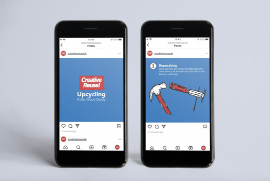
Finalising Pallet wood upcycling starter pack and tool hire
I have followed the same style which I adapted with the furniture upcycling guide. With the pallet wood guide and tool hire.


I have changed the shade of blue as I wasnt feeling it so I made it a tad darker which feel is an improvement. The reds work nicely with the blue background giving everything a place and standing out. This starter pack is a bit more expensive as its got more tools. It was more of a squeeze to fit all of the tools in but I managed it. I have created a larger box for the tools to sit into compared to the furniture starter pack. Also making sure that the scale of each item was also more realistic which I have managed to do.
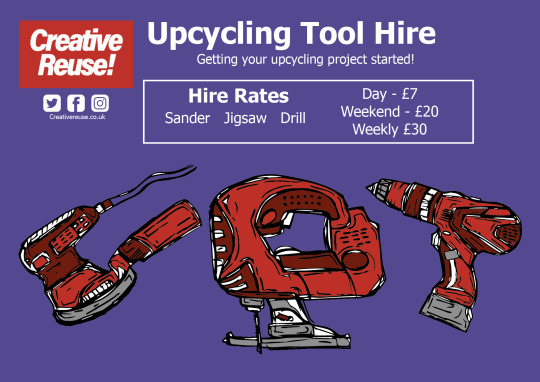


For the upcycling tool hire I changed the colour scheme I was originally going to go for which was orange to purple. As the brand colours didn’t work well with the orange as its clashed. I have added rates where you can hire the power tools which may be needed if the Upcycling job is more than you thought. I have kept the same layout with the tools below and the type up top. Which fits nicely with the starter packs. I am overall very happy how the starter packs have turned out. Adding the red to the illustrations I feel has transformed the Creative Reuses brand identity.


With the upcycling guides I have tweaked the colour of both backgrounds. To match with the upcycling kits. Also added in the red brand identity within the illustration steps. These examples will be printed into a concertina guide so they are available by hand and a digital version which will be available to use on social media.
0 notes
Text
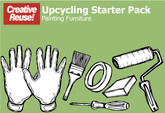
Finalising Furniture Upcycling starter kit
From my tutorial the next steps to focus on is making the illustrations make sense. By framing it and creating the branding for it. I started to play around with some basic layouts. Tweaking and adjusting colour schemes and placement.
I wanted to have the starter pack items together and the main focal point. As that its what your purchasing. I adjusted the green colour background to a lighter one. Although still not keen on it so needs some work. I wanted the font and layout of the typeface to be similar to the upcycling guide so they matched which I have done here.

I thought about splitting up the green background with a white section where the type is. Although I feel the full colour background is more consistent and flows better.

I wanted to make clear what comes within the starter pack. So I added a text box to show you what's included.

After some more adjusting I changed the shade of green. Also added a darker version to the illustrations background. But like before wasnt keen on the two tone. Also added a price tag, which I feel is important to the product. From previous tutorial I remember discussing about having the barcode on the back. As I do feel its is ugly and does draw too much attention. So I have left it.

I rethought what I was actually creating, was I making the packaging or an advert for this Upcycling kit? So decided to create the packaging for it. I felt like I needed to include that the kit comes in. So after quite a few attempts I drew out this box which would act as the tool kit. Which all of the tools would be in.
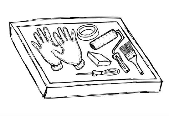
Adjusting the scale of the tools to fit within the box was a task but they fit. Ive also adjusted the scale of each item so they are more realistic looking as it was mentioned in previous tutorial.

Added some colour to the box to match the colour scheme of the packaging and upcycling guide, so they are consistent and match.

From looking at the starter packs and upcycling guide. I realised that the illustrations just a bit bland. So I thought about experimenting with adding some colour to the illustrations. Using red as that's the brand colours of creative reuse. I used two shades of red and a grey. I feel these colours have really brought the illustrations to life a bit more. So I am going to add colour to the rest of the illustrations.

I feel this looks so much better with the hints of red, showing the brand indemnity through the products and packaging. Improving them massively.
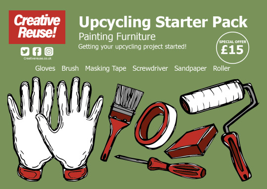
Here is the the upcycling starter pack version I am at now. I feel the red works really well. Even though my style was going to leave the illustration black and white. I feel the colour has really made a difference in creating the brand identity it was previously lacking.
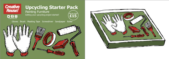
This is how the upcycling starter pack will be displayed showing the packaging of the starter pack on the left and the kit on the right.
0 notes
Text
Tutorial notes and branding
- Possibly think about changing the colours in the backgrounds of both concertina guides, maybe some more pastel shades\
- Branding, making clear what is on offer for gen z to start upcycling
- Scale I need to make sure that the scale of each item is correct not having some too big or too small compared to there actual size.
Now I have got all my illustrations. My next steps is framing it and bringing it all together. By doing this I will need to brand the illustrations and make as clear as possible what I am offering. I had a look at some existing starter packs online to see how they have been layed out and showcased online. Here are some examples.

For the rental hire I could create something like this where you have the prices of how long it costs to rent a drill. Also with a brief description of the drills specs.

Another example showing what the starter pack could look like as a whole having a brief descpriton of what it includes and a price range. Although I do feel like I want to make my upcycling products look a bit better than this and really show them off as this screenshot shows a very small image and isn't that clear.

Here is an example from ikea, showing a basic tool kit with a cheap price. I like the visuals on this example clear and simple. You know what your getting. Although at that price range I cant see the tools being that good quality...

This example I included because the images reminds me of my starter kit as I have laid the illustrations out in a similar style nomad layout. I like how the image and the text and clear and show exactly what your getting. I may play around with this layout.

I also like the look of this one due to the amount of colour and simple layout but is effective in what its showing not over complicated.
0 notes
Text
Major Project upcycling guide 2 & starter kit and rental illustrations
From my tutorial we spoke about adding another version or 2 of this upcycling guides with different topics and different ways of upcycling materials. So I had think about what other upcycling materials I liked to use and what I have previously upcycled. Back in the summer last year I upcycled pallet wood and used it within my van conversion for the cupboards and other decor panneling. So I though why not create a guide on upcycling pallet wood as the second guide.

I drew out a range of illustrations from the steps I initially wrote down. Making sure I focussed on the key important steps which I needed within the process. here are the illustrations which I drew. I also kept to the 7 steps which my other guide has. So they have an even amount.
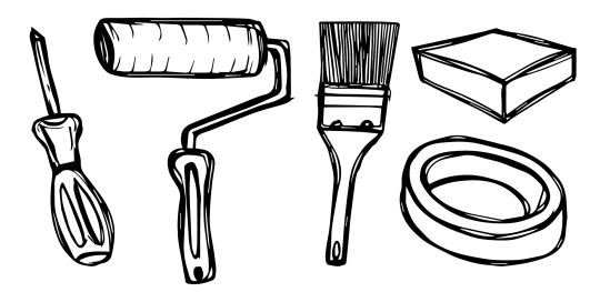
I also illustrated the tools which comes within the starter pack which are needed to upcycle pallet wood. Im still a bit unsure how to brand this part though as the starter pack paint tray I originally had for the painting furniture guide wouldn't work with this starter kit. I want them to be the same packaging and layout so I need to think how i can display and brand them.


Here is my second upcycling guide focussing on upcycling pallet wood in furniture. I really like how these illustrations have come out as I don't usually draw tools etc so I am impressed with how they have turned out. These illustrations were a challenge for me. As I felt the scale was hard to get correct although some aren't fully to scale I feel this adds character and charm to the illustrations.
Upcycling rental hire
I drew out some tools which you may need to hire if the Upcycling job is more challenging. So I though why not create a hire scheme where you can rent tools I still need to brand this and make it clear what it is. But here are the illustrations for it. I also need to brand the starter kits as well making them clear what they are. My next steps are the brand position the illustrations within creative reuse showing what the brand is all about and what it offers within Upcycling.

0 notes
Text
Major Project refining upcycling guide
From my last tutorial we spoke about how I could find tune and improve my upcycling guide. We spoke about creating more than one guide so it could become a series of upcycling guides for gen z.
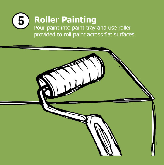
Here is my up to date refined upcycling focussing on upcycling furniture using paint giving an item of furniture a new lease of life.


From my previous tutorial I've improved and adapted areas which we spoke about which have improved the overall look.. But removing the white boarder which surrounded each page. It gave me less space to place the illustrations and text. So removing it as made me enlarge the illustration making it more own the focal point.
Ive have added a page after the front cover to explain why upcycling is important and why its a good thing to at least have a go at. With the help with my upcycling guide and starter kit for gen z. the skills they also learn from upcycling can also be beneficial for the future.
Ive re drawn all the illustrations within the guide as I feel the previous ones I used for the mock ups weren't as detailed and clear in conveying each step clearly to a beginner so I feel the new versions do this better.
Also another pointer which my previous mock top didnt have was on the front cover what this guide is teaching you. I added a small sub heading painting furniture as before I didnt have this and it was unclear.
For this guide there will be a printed out version which will be in a concertina format and a digital version which will be available via instagram. As I feel gen z are very into out tech especially our social media platforms so I thought having the two would be beneficial.
0 notes
Text
Major Project, upcycling guide 2
From my tutorial we spoke about how it would be good idea to make these upcycling guides and starter kits into a possible series. Looking back at wha ti enjoyed researching and what I have had experience in previously. I started to think what sort of second upcycling guide I could create.
What came to mind first was upcycling pallet wood. At one stage within my project I was in two minds whether to choose upcycling furniture in general or upcycling old pallets into new Upcycle items like furniture. So I thought why n to create a guide for both as part of a series targeting upcycling at gen z.
I knew what I needed to include within the guide to do with upcycling pallet wood. But I wanted a refresh into how to do it. So I wouldn't forget anything which may be crucial within the process. So I had a look at some existing articles about upcylcling pallet wood.
1001 Pallets is the best website to do with upcycling using pallet wood as its for everything you need on it. From different types of pallet wood to tools you may need to Upcycle pallet wood.


I found this super useful pallet wood guide with all sorts of helpful tips and tricks. Perfect for what you need to start upcycling. I like the fact that it includes the time it will take and the rough budget also.
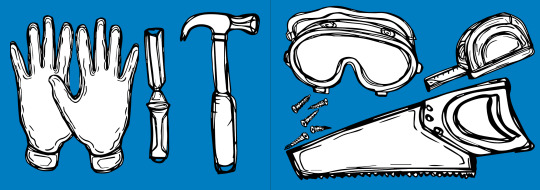
Tools to include in up cycling guide
Hammer
1) Saw / Jigsaw
2) Tape Measure
3) Screws
4) Screw driver
5) Sand paper
6) Safety goggles
7) Safety gloves
Upcycling guide steps
I wrote down the rough steps which I felt were most important when upcycling with pallet wood. So that I could start thinking about wording it within my upcycling guide.

0 notes
Text
Major Project, Refining upcycling sketches for guide
My original set of sketches which I used for my upcycling guide were just rough and weren't as refined as I liked. But as they were only for mockups to create the basic layout. So I have fine tuned them and redrawn a whole new set of visuals to include within the illustrated guide to be included in the starter pack.
I used the same method as before by hand drawing the steps and then scanning them into illustrator. I wanted to see what they would look like with a colour background when I replace them for the old versions in my illustrated guide. I have also tweaked a few of the illustrations so they are more detailed. So that they represent each step, also easy to follow.


I also came up with the idea of creating a visual took kit guide showing what the starter pack includes. which could be used within the guide or within the digital version. I love how these tools have come out especially with the colour background. Although I have just realised that having gloves within this starter pack would also be useful aswell as having paint tray. So I may add these two tools to this starter pack.

0 notes
Text
Major Project Starter pack mock ups, digital Upcycling guide Tutorial Feedback

A couple of upcycling starter kit mockups. I am not a fan of the red one. Although I wanted to invoiced to show the process of how I’ve got to the more refined green version. Which includes more details.
As well as the upcycling handbook I wanted to make a digital version. As I am targeting this upcycling guide at gen z so I thought a version for social media would be a good alternative. The square format of each page works well within instagrams format as well.

Tutorial feedback
- Remove white border from around each page, also remove logo from each page as well for the printed version
- Have the reverse printed on as well so it’s not blank. Possibly making some of the steps on the reverse of the concertina booklet.
- Make 2 other versions of the booklet and starter pack as well as digital versions. With different colourways in background.
- Possibly think about making a pick and mix campaign sorta thing if I have time.
- Make the fonts more illustrated so it fits. Show the illustrations in the type fonts and text.
- Make the illustrations the focal point, which will stand out more with the solid background
- Have a contents page and a how to what the guide is about
- starter kit make the roller tray eco friendly so it’s biodegradable.
I’ve got some great feedback here, which I am going to include within my further development. In improving my upcycling project. My next stage is going to tweak the existing upcycling guide so that for the other versions I will create they will be consistent and match. Then start on the final drawings to put into the concertina guides. So that I can start on the other areas of feedback
0 notes
Text
Major Project concertina guide first draft print out


As I wanted the guide to be small and fit in within the starter pack. I needed to print out a smaller version to see whether the text and illustrations were still readable. I layed out each page and the front and back covers separately.
This print out made me realise that for the concertina book I needed a line so that I could fold it along. So that each page lined up with each other. As without it was hard to get correct. But as it’s an experiment it doesn’t matter much. But for future reference it’s useful.
I feel the green background works well with making the illustrations pop. Although the green background when printed out looks a lot different to the digital version.. The type however I feel needs to be larger as it doesn’t catch your eye enough. Although the main focal point is the illustrations.
Once printed I realised that the backs of the pages of each step are blank. Which doesn’t work if it’s going to be a concertina book. So I need to figure out what should be on the back. I didn’t notice this before. Printing is a great way of seeing flaws within my work.


0 notes
Text
Major project mockup concertina leaflet
I wasn't too keen on the red so I decided to match the up starter kit colour scheme with the green background and red logo icon. Also added a front and back cover to frame the step by step leaflet. These aren’t the final drawings but just used to show what the scale and format will look like. I am in two minds about the border around the edge of each page. So I may decide to remove this.


0 notes
Text
Major project experimenting with concertina mock-up
I wanted to experiment with how my concertina guide would look like in a concertina format. How each page would look positioned together. Getting used to sticking the pages together by folding and gluing to get the folding effect. It wouldn’t have the excess white space of the page as that will cut down. As the book will be a square format.


0 notes
Text
Major Project
experimenting with mock up sketches
I had created a black and white sketches to see how to layout looks for my step by step upcycling square guide. But wanted to see what they would look like with a splash of colour within the background. As thats the style and asthetic I am going for.


I am surprised how well these have come out. With the colour background. Also how some areas stayed white breaks up the illustration really well. Even though this wasn’t done on purpose I think it works really well.
I also thought about reducing the amount of colour in the background by adding a white border around the edge with the step number in between. Which I feel works better. The next step is to add the description for each step so that the illustrations are easy to follow.


0 notes
Text
Major Project Mockup concertina book
From sketching out some small illustrations showing each step. I wanted create some which I could use to make digital mockup. So I had to make some larger versions. They are rough and sketchy and definitely not the final versions. But coming up with a rough style and layout was important for the development of these mockups.


Some sketches I was happy with others needed a bit more work. which I am gong to work on as I come to re draw these as final versions.
I then scanned them into illustrator and created some rough page layouts showing the illustrations in black and white and a simple step number. Next step is to add some colour to the background. As that had been the style I’ve been wanting to experiment with for a while now.


0 notes