
Don't wanna be here? Send us removal request.
Statistics
We looked inside some of the posts by grad503elyahnab and here's what we found interesting.
Average Info
Notes Per Post
0
Likes Per Post
0
Reblog Per Post
0
Reply Per Post
0
Time Between Posts
3 days
Number of Posts By Type
Text
17
Last Seen Tumblr Blogs


Fun Fact
Tumblr has been banned in Indonesia for providing people with access to pornographic content.
Text
Questions for Paul or David
1. How to bring out page numbers in front of imagery/assests
2.
3.
0 notes
Text
Week 9; layout design
first 2 pages. Needs title.
first interview pages.

0 notes
Text
Week 9; Assets
Front cover asset.

Reworked timeline poster.

0 notes
Text
Week 8; Grids
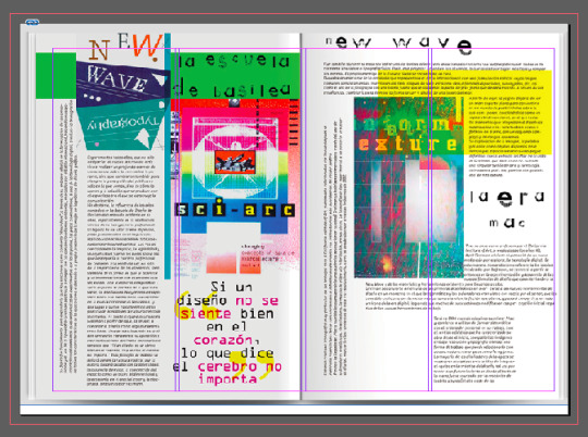
I looked on behance and discovered other publication designs // layouts that have been inspired by my allocated designer April Greiman. I felt inspired by these designs and was curious to see how these designers have used grids in their layouts. It was interesting to see that the grids on indesign did not line up perfectly with the designers work. This could have been because they were not sized perfectly. I also may have not interpreted the grids in the correct way. From this research you can still see that the designers have used grids. Whilst interpreting unique layout styles inspired and implemented by april greiman's design style.


0 notes
Text
April Greiman quotes
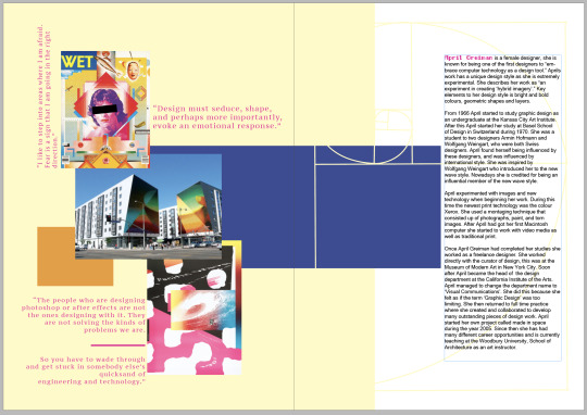
“I like to step into areas where I am afraid. Fear is a sign that I am going in the right direction”
“Design must seduce, shape, and perhaps more importantly, evoke an emotional response”
"Design is not just what it looks like and feels like. Design is how it works."
“it's not graphic design anymore. we just don’t have a new name for it yet.”
“the people who are designing photoshop or after effects are not the ones designing with it. they are not solving the kinds of problems we are. so you have to wade through and get stuck in somebody else’s quicksand of engineering and technology.”
0 notes


Text
Week 8; In Design Experimentation
Above is an image of April Greiman which i have edited and developed on InDesign. This weeks SDL was to develop further resources/research for your allocated designer. Throughout our lesson on friday i found that i learnt many new skills and techniques during the in design tutorial. I wanted to take this further and apply it in a way which relates to my designer. Throughout my research i have found that april loves to play with layering and shapes, these aspects/elements are interesting to me so i have applied them into an asset. ive used in design skills which cover changing opacity, placing an image, sizing the image, creating shapes ect.
This asset could potentially be developed and used as a front cover page design.
It was fun to start using in design and creating digital assets as it inspires me and gives me the opportunity to create and learn new skills within the application.
0 notes
Text
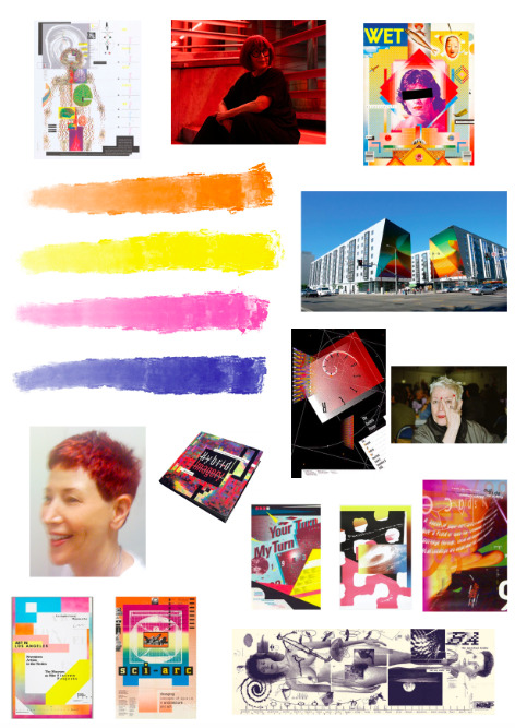
Week 8; Moodboard
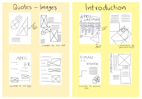
Creating a moodboard helps my ideas to flow. I've created a moodboard around April and her design work so that i am inspired and can recognize key aspects that i am going to bring into my 12 page publication design.
i'm stuck on where to start this has helped me develop ideas and given me the motivation to research different design elements which i am not confident in. An example of this is TYPOGRAPHY. My next step is to research typography and look deeper into how april uses typography.
0 notes
Text
Mid Sem Break SDL
Ive started to look at different magazines and layouts on behance to inspire myself for layout concepts when creating ideas for my 12 page publication design. These images are some of the layouts which have inspired me. I believe the layouts fit in with my designers aesthetic. These concepts will help me to develop ideas and create potential assets for my 12 pages.
In my publication design there will be a feature of;
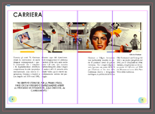
pg 1; Front cover, pg 2; Quotes - images, pg 3; Introduction, pgs 4-5; reworked timeline poster design, pgs 6-10; article/interview, pg 11; references, pg 12; back cover design.


Ive started to develop my ideas and sketch up potential page plan layouts. When sketching up my page plans i've thought about multiple different elements. These elements include April Greiman's design style, layouts, text, type, flow and aesthetic ect. These page plans have been inspired by my gathered concepts from my research. I sketched out my plans and then digitized them.


I need to start developing and gathering my content for my 12 page publication design. This will help me to finalize my page plans. I believe that i've made a good start to different layouts. I need to start thinking about flow and the main cover page.
This SDL has kept me engaged/inspired throughout the break. i havr scrolled through behance and looked at various different google sites to gather my ideas. I'm excited for this publication design as i find layouts interesting. Im also inspired to learn more about grids and type as it is something that im not familiar with.
Paul recommended that we watch the movie ‘Graphic Matters’. This was my second time watching the movie. Watching the movie for a second time gave me a wider understanding of graphic processes in the past. It was interesting how it used to take so much labour just to print text on a page. Printing has developed so much over time which i am intrigued by. Ive found that Kanopy is a great resource for more relaxed learning. I don't usually watch tv or netflix but kanopy is something that i am engaged in.
0 notes
Text
In Design
Ive watched the lecture on the introduction to In Deisgn which i found interesting. i was engaged throughout the lecture and am excited to start using the software. When downloading the file ‘Wheres the grid’ i had to convert it into in deisgn as my computer wont allow me to download the newest version of in design. Im not sure if this is going to be a problem in the future. I was able to complete the ‘Wheres the grid’ task and upload it onto teams. I enjoyed the task and know that i will find grinding helpful in the future.
My next step is to research publication layout designs and find layouts that inspire me so that i can start sketching up and developing potential page layouts for my 12 page publication design.
0 notes

Text
Feedback Reflection
The key points which david discussed in my final timeline poster was
- check the size of my poster (mm)
Ways around solving the problem of my text looking washed out;
- change the opacity of my textured background
- look at changing the colour of my text
- add in solid coloured blocks behind my text (contrast)
potentially could size elements different to avoid busyness and overlapping of text/shapes/texture.
0 notes

Text
Week 5; Further poster development

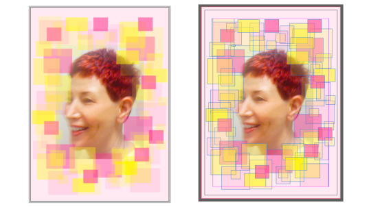
i was not completely happy with my first poster and wanted to develop it further to get a good final outcome. i didn't like the layout at the bottom of the poster as it did not feel/look balanced. i tried to balance it out by duplicating the photo of april and rotating it to the upper right corner. i then added more shapes/lines as well as deleting the image of Aprils book. i was still not satisfied and decided to take a closer look at aprils posters. I noticed that in her WET magazine poster there was an image of a person inside the squares in the center of the poster. this gave me the idea of putting an image of april in the center. i felt as if this would help with balancing out the poster as i was struggling with it. it would also create a center and focus point in the middle of the poster. i edited the image of april similar to the other images of her which are already on my poster. i also played around with the opacity so that it wouldn't wash out the text. Moving on from this i wanted to develop my poster more as the outcome was not what i wanted. i felt as if i needed more contrast on my poster, to add this i layered a white rectangle behind the orange dotted pattern and in front of the background gradient effect. i also found that adding white balanced out the colours in my poster and created brightness. i was not completely sure about having a photo of April in the top right corner so i moved it and decided to use a mirror effect along the bottom. i like how this turned out. i placed the photographs of april's work in the center to show dimension. i also removed some of the shapes and lines as it was looking messy. to continue the mirroring effect i duplicated the image of april in the center. i played around with the opacity of the images as i know april does from my research. Having a lighter opacity helped to show layers within the poster. I will continue to add finishing touches to my poster to create a definite final outcome, these final touches include; adjusting the colours, layout, positioning, and opacity ect.
0 notes
Text
Week 5; Poster development
One of my favourite posters by April Greiman is the poster that she designed for WET magazine. I have been hugely inspired by it and has influenced my poster design.
i started off with multiple draft sketches of potential poster designs. i took my favourite poster sketch and began to refine and develop my ideas further. during this process i looked at other timeline posters, April Greimans posters and posters by designers who have been inspired by April Greiman (discussed on my previous blog posts).

The final draft sketch which i have come up with has taken elements such as shapes, textures, and layout from my inspired posters. The colour scheme i have chosen is bold and bright, i have used popular colours which April uses in her designs; pink, yellow, orange and blue. i edited a picture of april to represent her style, the image features a halftone pattern with the use of pink and white. i've included the skills of layering, opacity, and gradients to create an effect that represents April.

from now i'm going to develop my digital poster design further by taking elements from my research and implementing them into my design.
0 notes
Text
Week 5; refined poster ideas
top left; inspired by Aprils wet magazine poster, as well as a timeline that ive annotated. i want to layer shapes as well as layer images of april and her work. The type face that i will use for the title is Half bold pixel -7 and ill use sans serif for the time line text.
top right; ive been inspired by a timeline poster for this design. i thought it represented aprils work and was intrigued. im going to edit the photos how april did for her wet magazine poster.

bottom left; i want to add shapes and letters in the background with a blurred effect just like in april's word. ive been inspired with one of the timeline posters which i have blogged, this is a developed design from previous drawings. off the timeline will be bold shapes reflecting the information.
bottom right; inspired by Aprils the modern poster, 1988, moma, nyc. Type face that will be used is Earwig Factory -regular. i'm going to use a simple background and layer with transparent shapes and the grid pattern.
0 notes
Text
Week 5; Final text
After researching Aprils poster designs as well as finding inspiration from other designers who have used key elements from Aprils work. I have selected Similar fonts to be used in my poster. The fonts such as Half bold pixel -7, Earwigfactory -regular, and Ayuthaya and fonts which i will use for my main type faces eg. Aprils name. I found these fonts by using the website from ‘what's the font’ i found this helpful as i screenshotted typefaces in April's work, put the image in and similar fonts appeared.
Im using Sans Serif as my main font for my timeline. I found that April uses Sans Serif alot in her work which inspired me to use it. it is also a simple font compared to the other fonts which i have selected.

0 notes