
Don't wanna be here? Send us removal request.
Statistics
We looked inside some of the posts by grad601avarawson and here's what we found interesting.
Average Info
Notes Per Post
0
Likes Per Post
0
Reblog Per Post
0
Reply Per Post
0
Time Between Posts
19 hours
Number of Posts By Type
Text
16
Video
1
Last Seen Tumblr Blogs


Fun Fact
Hackers stole 65M passwords from Tumblr in 2013.
Text
Reflection
By reflecting on this assignment, I feel like I learnt so much and really developed my ability of knowing how to create a publication and working with material created by others that was given to us. I did a lot of brainstorming to figure out what direction I wanted my publication to go in which helped immensely. I really enjoyed interviewing my grandad and learning more about his past experiences. It was fun to dig through old photo albums and articles he had and it was also interesting to read through my peers interviews and learn about the different memories.
I found the formative stage to be very beneficial as I had great positive feedback that made me feel confident in the direction I was going, but I also had helpful advice that I could take on board. I wanted to create a minimalistic theme and work mostly with photographs and simplistic assets that related to each article. I was lucky to be grouped with other classmates who shared a similar theme to me but I still altered it all to fit my vintage minimalistic theme. The weekly studio classes helped me navigate which path I should take design wise and the beneficial tips and lessons made everything run smoothly. I kept researching other publications throughout this phase to open my mind to other styles and inspiration which aided me in figuring out which was and was not working for my own publication.
I tried to keep everything very cohesive throughout the spreads by incorporating columns, margins, same body text, same headings and design styles. I played with the photographs a lot and for the most part kept them to the same margins. I did however experiment with an offset quite a lot with text to create a different look and used layering as a design style. I added grain to a few images to keep with the vintage style and played with different opacity levels when layering photographs over top of one another and behind text.
When it came to printing I opted to use a 170gsm white paper which was not necessary but I feel it added an extra touch of quality to the publication and in my opinion made it look better which I loved. I did have some trouble with the printer not aligning each spread together correctly when I went to put it together but I just had to play around with this until it came out successful. Cutting the pages was quite tricky but I ensured I took my time with this step and tried to keep everything even. Overall the printing and cutting eventually went smoothly and I am happy with the result!
If I had more time to work on this publication I would try to create more design features such as extra sketches and create a hand drawn feel. But I am pretty happy with how this assignment came out. Overall I think incorporating other peoples work and styles with my own and turning it into a cohesive publication challenged me but there were many learning lessons I could take from this experience. Getting constant feedback from my peers and teachers I learnt was very helpful as I navigated each spread and idea. I am very happy with the final result of this publication and definitely think it was fun to complete!
0 notes
Video
tumblr
Final printed publication result. I wanted to print it onto some thick nice paper to get the full effect of the printed publication and I think it turned out great.
0 notes
Text
Final publication


Overall I am really happy with how this publication turned out. I like the theme I created and the minimalistic aesthetic of the layouts. It was challenging to combine all of the articles together and make it one but I think I did well with making it all cohesive and creating a nice flow. It was a fun challenge and love the result
0 notes
Text
Final back cover

I really like this image and the off the page placement. The reason I chose this design is because it connects to the front cover design. When the pages are going to be put together when I have printed and binded the publication they will lead off of one another as it is a full image that is split in half. I really like the black and white photograph and the simplicity of the design.
0 notes
Text
Back cover mock ups


I digitalised my drawings and played with the layout and designs. I like the full image or the one image at a smaller scale but I was not really into the multiple images on the page.
0 notes
Text
Back cover concepts

Rough concept sketches. I just drew some possible layouts and included notes to expand on.
0 notes
Text
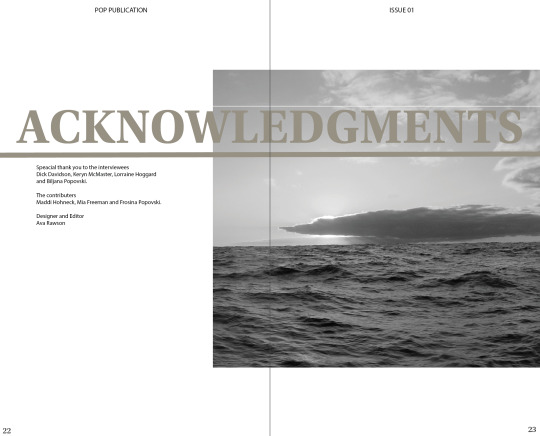
Final acknowledgment page

I liked the centred look the best and the larger scale image. I really like this design and think it is modern and simplistic. It also matches the previous pages which is key.
0 notes
Text
Acknowledgment developments


I really like this layout so I was just playing with scale and making small adjustments to the position.
0 notes
Text
Acknowledgment concepts


Digitalised the sketches I created. I played around with various images, scales and positions. I quite like these images and designs but I have to think about legibility. I am giving acknowledgments to the interviewees, contributors and the designer.
0 notes
Text
Acknowledgment page concepts

Rough concepts that I have sketched. I will now digitalise these and continue to play with it.
0 notes
Text
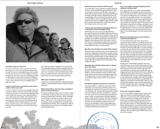
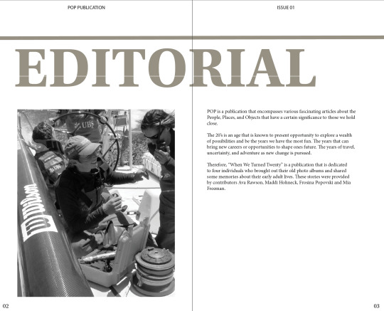
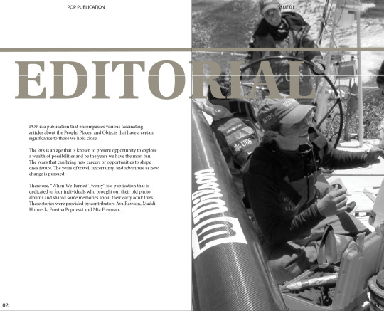
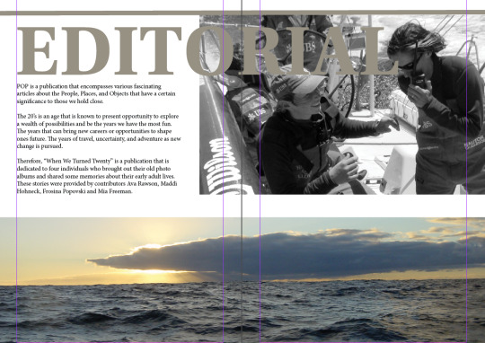
Editorial text
POP is a publication that encompasses various fascinating articles about the People, Places, and Objects that have a certain significance to those we hold close.
The 20’s is an age that is known to present opportunity to explore a wealth of possibilities and be the years we have the most fun. The years that can bring new careers or opportunities to shape ones future. The years of travel, uncertainty, and adventure as new change is pursued.
Therefore, “When We Turned Twenty” is a publication that is dedicated to four individuals who brought out their old photo albums and shared some memories about their early adult lives. These stories were provided by contributors Ava Rawson, Maddi Hohneck, Frosina Popovski and Mia Freeman.
I wanted to keep it nice and simple and not overwrite. I think it is a fun easy to read piece of text that summarises the meaning of the publication well.
0 notes
Text
Chosen final

I decided to go with this design. I like the placement of the image and the off the page look it creates. It is nice and simple and showcases the editorial text well. I love the look of the black and white image as well.
0 notes
Text
Developments of editorial

I really like these designs and the simple modern aesthetic that they bring. It is now about deciding what scale and positioning I like best and what matched my other spreads.
0 notes
Text
Editorial concepts


I digitalised some concepts from my sketches and played with images, positioning and scale to decide what style I liked best. Looking at these I think my overall theme for my publication will be quite a simplistic style so I am leaning towards keeping to one image at a smaller scale.
0 notes
Text
Editorial

I sketched some ideas and possible placements.
0 notes
Text
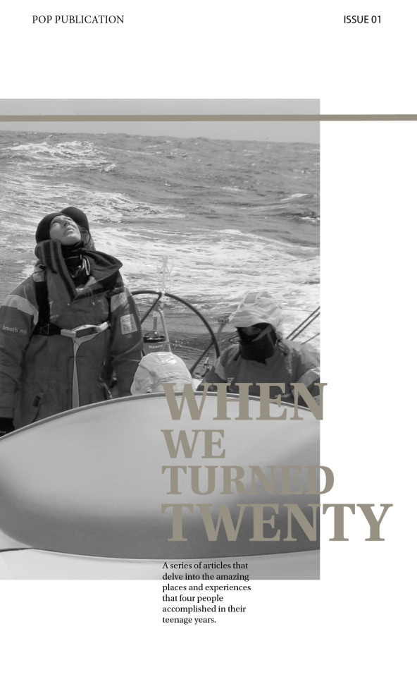
Final cover

I liked this design the best and think it is relevant to the simple modern theme. It is not too cluttered yet showcases key elements of my publication well.
0 notes
Text
Developments of cover


I played around with the image, opacity and scale to figure out what I liked best. I think I like the B&W image best and the full opacity. I just have to position the heading in a way that allows it to be legible.
0 notes