
Don't wanna be here? Send us removal request.
Statistics
We looked inside some of the posts by grad602-yuningzhang and here's what we found interesting.
Average Info
Notes Per Post
0
Likes Per Post
0
Reblog Per Post
0
Reply Per Post
0
Time Between Posts
8 minutes
Number of Posts By Type
Text
1
Photo
16
Last Seen Tumblr Blogs


Fun Fact
After the announcement of the deal with Yahoo!, there were 170K signatures of unhappy Tumblr users petitioning to prevent the sale in 2013.
Text
Reflection
For Design Project 2 and the portfolio, I took the lesson from Design Project 1: DON'T OVER-DESIGN. For these two, I didn't add unnecessary decorations, I tried to keep everything looking "simple and clear".
I used to think that bringing beautiful decoration into a design would make the overall design better. In the past, I sometimes over-designed and brought art into design too much, thus ignoring the design itself, I should reduce the weakening and blurring of the design itself while bringing art into it, so that they ‘fit’ better.
0 notes
Photo
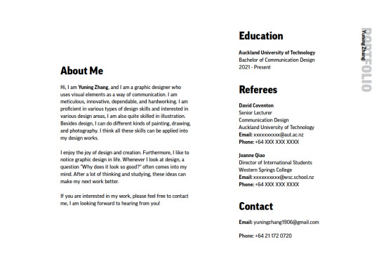
CV Page
For my CV page, I just put the information directly in the page without adding any unnecessary decoration.
For the typeface, I chose the typeface from the awareness campaign, which makes the whole portfolio more consistent.
I added a small decoration on the right side of each page to link the whole system.
0 notes
Photo
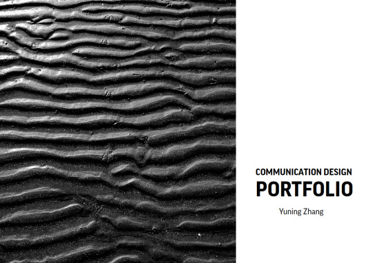
Portfolio
For my portfolio, I decided to make it look very minimal like the brand book, otherwise it would be over-engineered and the system would be more important than the work.
I used a photograph from the book layout as the cover of the portfolio.
0 notes
Photo

Final Brand Book
In this final brand book, I made the system simple and avoid over-designing which would cause the system to stand out more than what needs to be shown. I made small changes to the system and removed some pages in the presentation, such as the research and mood board, to make it look more like a brand book. I redesigned the front and back covers to make the system more consistent.
0 notes
Photo

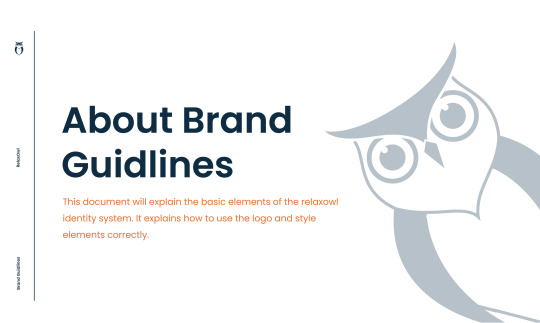
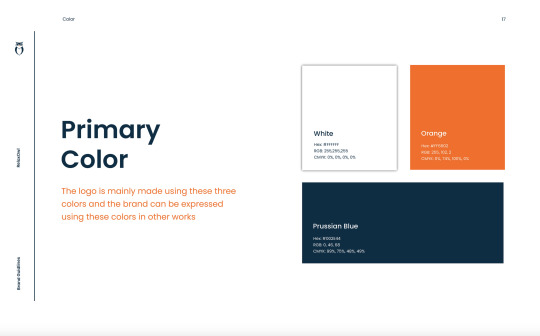
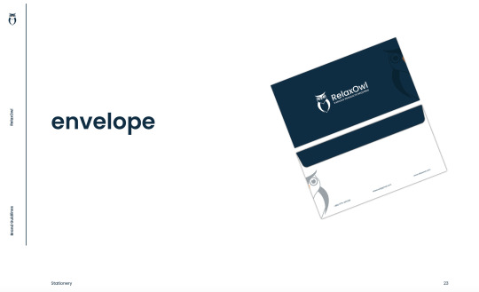
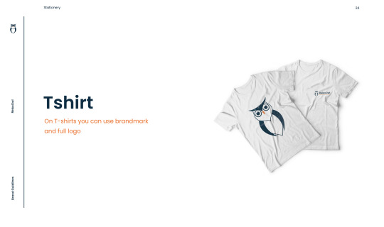
Brand Book Research 3
From: https://www.behance.net/gallery/142064799/RelaxOwl-Brand-Guidelines
0 notes
Photo
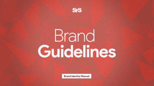
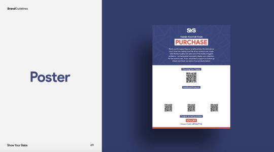
Brand Book Research 2
From: https://www.behance.net/gallery/128348945/Show-your-Slabs-Brand-Guidelines
0 notes
Photo

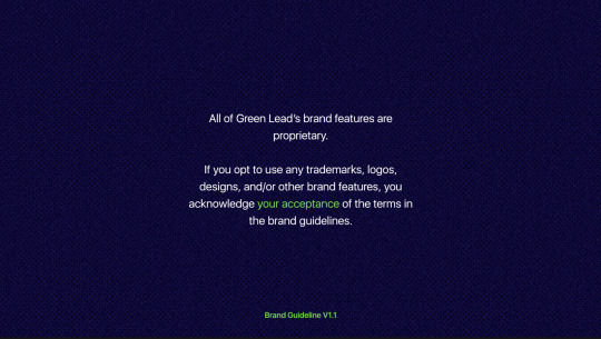
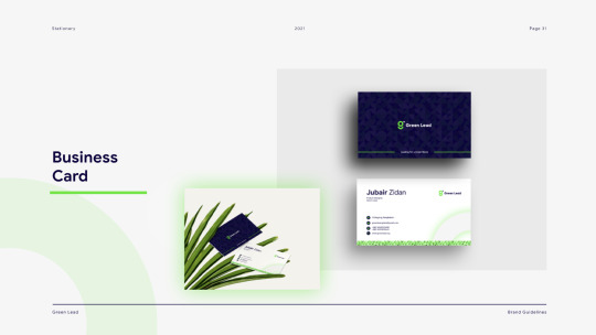
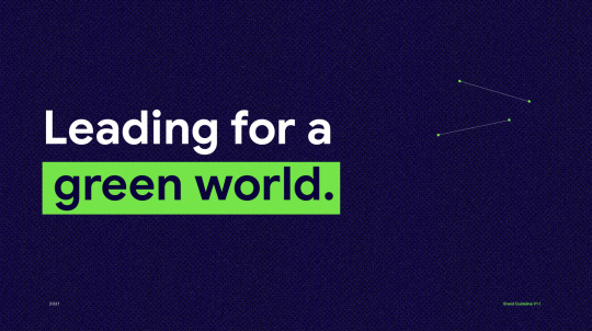
Brand Book Research 1
From: https://www.behance.net/gallery/118561423/Green-Lead-Brand-Guidelines
0 notes
Photo
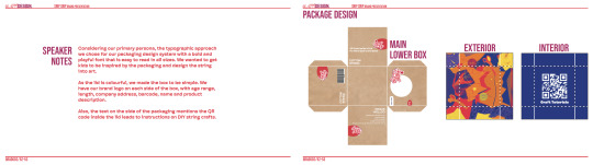
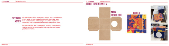
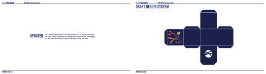
Changes I Made in Presentation (Part 1)
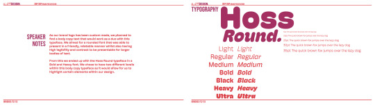
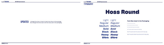
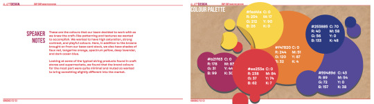
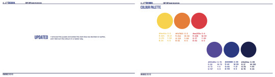
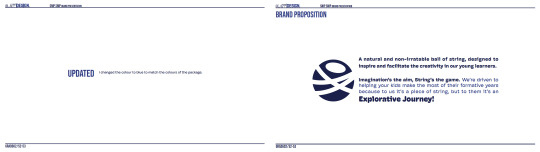
Since my packaging is blue, I changed the colour of the entire system to blue. I only changed the pages that I would put in the brand book and a few important pages, not all of pages.
0 notes
Photo

Advert Design
For my advert design, I was inspired by minimalism and I decided to keep everything simple because adults are busy and they don’t have much time to stop and sift through the important information in the ad, or guess the brand’s intent, so I just wrote two simple sentences, “Want to Do Crafts With Your Children?” This sentence is ‘call to action’, a simple question leads to a simple thought, whether you want to do crafts with your children, and the second sentence, “It Will Be a Good Family Time!” This sentence simply states the purpose of crafting. I put the box directly in the ad, so they can see the box directly after thinking about whether they want to do crafts with their children, and seeing the box directly makes it easier for them to find it in the store. For children, as soon as they see the word children, they will subconsciously think of themselves, and when they see the slogan, they may want to do craft with their parents, and then ask their parents for this string, or remember how the packaging looks like, go to store to buy it by themselves. In this ad, I enlarged the words “craft” and “children”, just to make the two connect and catch the audience’s attention. This ad is simple but functional.
0 notes


Photo
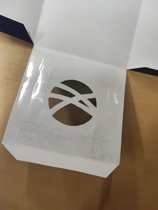
Transparent Film in Windows
I put a transparent film on the window because if kids see the package on the shelf, there's a good chance they'll stick their fingers through the window to play and possibly damage the package, so I added a transparent film that is used for protection.
0 notes
Photo

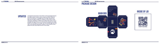
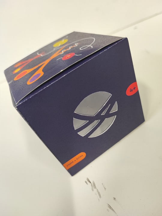
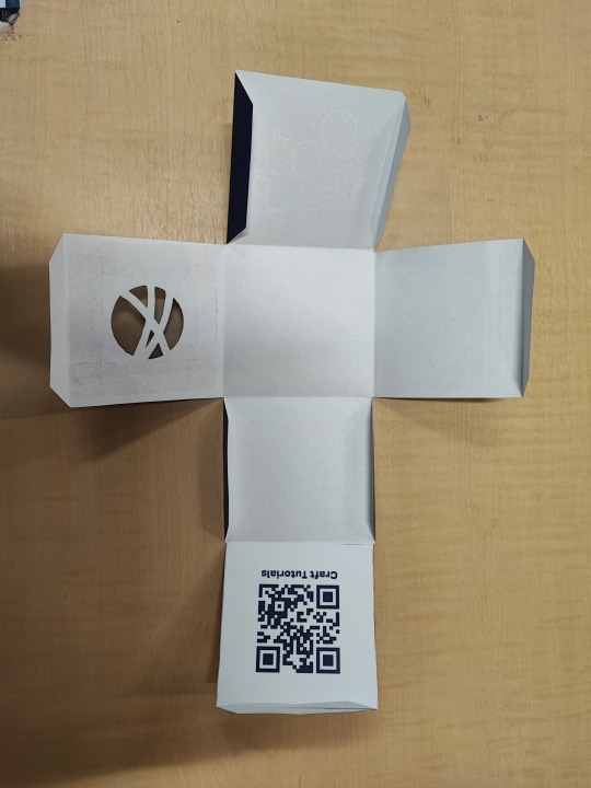
QR Code Improvements
I moved the QR code and text to the center and changed it to blue.
0 notes
Photo
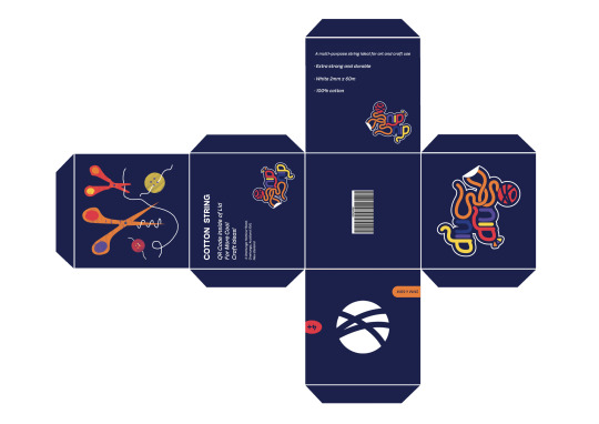
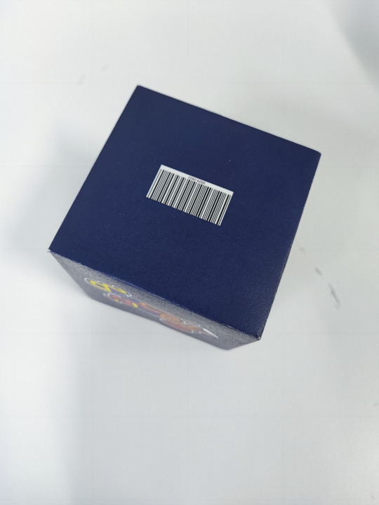
Final Packaging
I improved the packaging following feedback and reflections, and fixed some mistakes in previous copywriting. In addition, I think the previous 1mm width string is not suitable for children, the string is too thin and the children will hurt their hands during use, so I changed it to 2mm.
0 notes
Photo
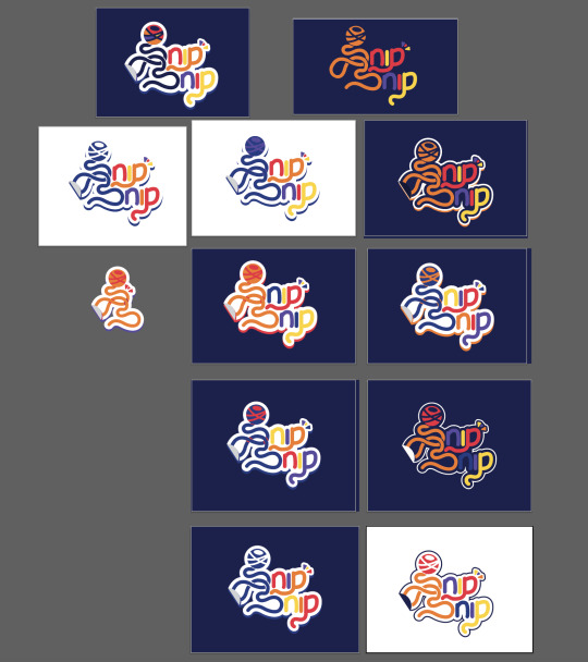

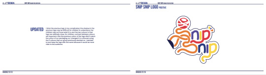
New Logo
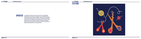
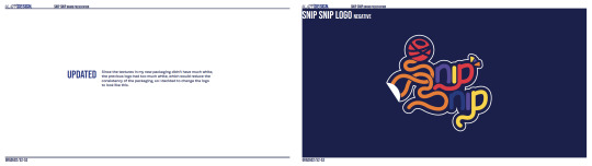
I think the previous logo doesn't match the texture, but I'm not sure why, it just looks weird. After a series of attempts, I found that it was because there was too much white in the logo and not enough white in the texture. I felt that the texture was good for this packaging, so I decided to improve the logo.
I improved the colour of each part of the logo, I changed the background from the previous white to the current packaging background colour, I also changed the string in the ball to the background colour, and changed the ball to red, now there is a clear contrast between the string in the ball and the ball itself. Also, I removed the shadow at the bottom of the logo because the shadow in the logo is a little confusing for kids, the new logo looks simpler.
0 notes