
Don't wanna be here? Send us removal request.
Statistics
We looked inside some of the posts by grad604-poppi and here's what we found interesting.
Average Info
Notes Per Post
2
Likes Per Post
2
Reblog Per Post
0
Reply Per Post
0
Time Between Posts
5 days
Number of Posts By Type
Text
17
Last Seen Tumblr Blogs


Fun Fact
In 2020, 44% of users from Denmark used Tumblr daily.
Text
Final Touches

Unfortunately, I was not able to print this as an A2 as I couldn't afford to go to a print shop. So when I did print it the drop shadow wasn't about to flow across the page.
Reflection:
I love the way this has turned out. I think it is true to its title. It does feel like a framed recollection of who I am as a creative. Looking at now makes me feel emotional because everything within that frame is authentically who I am and what I value the most. It feels personal and like a more refined version of my scrapbook from when I was little.
This was such a great project to get some perspective on myself as a creative. This has inspired me to get fully back into collage and see how far I can take this practice.
I love the tone of language in the element's explanation. I chose to keep it very casual to stay consistent with the personal unfiltered theme.
Next time I would try experimenting with making the imagery look old. I would like to make it feel more nostalgic. The images and cutouts are very clean and look untouched, and to be untouched is to be unloved.
Downfalls:


Unfortunately, I was not able to print onto the paper I originally wanted. I planned on using a 300gsm off-white card to enhance the colours of my collage and give it some texture. However, the AUT printers wouldn't print and continued to get jammed so I had to print onto regular white paper and stick them. This mishap led to me not being able to join the two A3s together to make an A2.
I hope this does not affect my grade but either way, I am still happy with the outcome. If we were able to print A2 at AUT this poster would have been more effective with the drop shadow from the frame giving it more depth But hopefully, the markers can see what the desired effect was through the A2 pdf submitted.
0 notes
Text
SECOND DRAFT
She’s Been Framed: A reCOLLECTION
INTRODUCTION
My name is Poppi and this poster and essay are a representation of who I am through a creative lens. I will be sharing how I found my feet and gained confidence in a creative space, and how the many factors came together to construct who I am now, and who I will grow to be. I want to share the ups and downs and insights of my discoveries as a communication design practitioner and as a human being. To briefly introduce myself as a creative, my most prominent design practice is to work analogue. This practice is purposefully portrayed in my A2 diptych poster. When I sat down to decide how I wanted to approach the brief, I went through my scrapbook to get inspired. It was at this point I realized my scrapbook is who I am as a creative. It is a visual display of the things I love, my creativity and my thoughts and feelings. I collected all the tangible elements in my space that were of great importance to me and broke down how each one shaped me as a creative. Creating the collage was an immensely enjoyable process, both because I love to make collages, but also because it was almost as if I was seeing myself from another's perspective, with my enjoyment, knowledge, habits and hobbies laid out and layered together to form one. Alongside the poster, I will use this essay to dive into three main topics; who I am as a creative, what creations I produce and the creative communities I have discovered that influence my thinking and making and that actively inspire and position my current and future practice.
THE CREATIVE - POSITIONING THE RESEARCHER
Values
I have involved myself in creative practices for as long as I can recall, always painting, drawing and creating. It is something that keeps me sane and is shown in all aspects of my life. Including what I choose to wear, the way my room looks, and the hand-made birthday cards I make for everybody. I have always admired and valued the concept of individuality and the different expressions of it. I am fascinated by how other people's minds work, (I assume this stems from having a psychologist as a mother,) and I think a great way to understand people is to see how they create.
Individuality and Growth
The majority of my growth as a blooming designer has taken place within the last year. For my whole life art in all forms was simply just a passion and an outlet for my thoughts, feelings and personality. Although it is often said that art is subjective, the criteria of university assessments deeply affected my confidence as an artist. I began to question my skills and individuality. The work I was producing became muddled and had no creative direction. After receiving a failing grade for a big project, I realized someone else's opinion does not take away from your worth and talent as a creative. I now understand you can't please everyone, especially in the design world as art is subjective. I learned that this is a common experience for many graphic design students. School’s criteria are based on assessment but creativity can not be assessed in the same way mathematics or physics are. There is no right or wrong when it comes to creativity. I spoke to many of my fellow Communication Design students, who all agreed that being assessed on their creativity knocked their confidence. I hope that the criteria for assessment in universities in New Zealand change so that fewer designers lose confidence in their abilities. Because all breakthroughs in human history have stemmed from someone using their creativity to come to conclusions. Creativity should be encouraged, not penalized.
Influences
Hip-hop has its own attitude. It is expressive and loose, it is strong and unforgiving. I have listened to and danced hip hop since I was 4 years old up until now, so this “attitude” informs who I am as a creative. My interpretation of hip-hop culture is about being unforgiving and unapologetically yourself. These attitudes are reflected in my design through breaking fundamental design principles. Each form of design has an individual set of rules, however, I often tend to bend these rules. This can be seen through my work in ways like layering multiple media together, “incorrect” type layouts, bold colour palettes etc. I value individuality over design principles. Because of my knowledge about hip hop dance styles, I consider the movement of a design. In my mind, I can see the flow of imagery on a page, and I tend to use this thought process to create compositions rather than a traditional grid system. Dance was the first time I was criticized for the work I was producing, it shaped me to take criticism well and not to let it change my self-expression.
Tools Methods and Media - Research tools, contextual processes
In a world where everything is slowly being taken over by tech, I have developed a strong appreciation for working analogue. I have loved reading books and flicking through mum's magazines since I was little, this passion carries through into my design practice now. I love the outcome of connecting and contrasting digital and analogue media. The juxtaposition between the long history of paper and pencil and the new wave of tech holds such a powerful message in itself and contrasts beautifully in compositions. At six years old I was diagnosed with severe anxiety, art has been my escape from this for a very long time. I would use scrapbooking, drawing and painting to distract myself from potential panic attacks. Being creative on a daily basis has been proven to promote mental health, and I have reaped the benefits of this theory.
This is the reason I value creativity so highly. Art and design is more than a passion, it is a practice that brings me joy, and a way to get out of my own head and to connect with myself and others.
CONTEXTUAL REVIEW (CREATIVE POSITIONING)
Being naturally strong-willed and stubborn I refused to look too much into others' creative work when I was younger. I had this idea that if I were to get inspiration from others it would take away the uniqueness of my own work. I now know this isn't the case, and I also realized that I was inspired by a lot of things, I just never actively sought these inspirations out. During my contextual research during this paper, I uncovered a lot of knowledge about myself as a designer through researching other creatives and their creations. Only designing for school projects meant I never took the time to think about what practices/methods I enjoyed the most, in fact, I never even realized how much I loved working analogue until I was actually forced to think about it.
Case Study 1 - Ruby Neagle

Index of Breathe: Ruby Neagle
This is the first of her works I found. I am all for breaking rules, and I resonate with the way she pushes typographic boundaries, and produces beautiful publications. This publication used unique body copy layouts with blue screen printing, which I think contrasts well and is two medias I would love to experiment with together. It is difficult to find much information on Ruby Neagle as I believe she graduated from the University of Technology Sydney around a year ago, meaning she is not a “fully established industry designer,” although you would never know looking at the work produced and the awards for that work.
Case Study 2 - Catherine Griffiths + Designers Speak Up
In my research into the design industry, I found a recurring issue surrounding inequality within the design industry. There is an apparent lack of female representation in the design industry, resulting from women being treated differently from men in the workplace. Catherine Griffiths should be an inspiration to all young female designers entering the design industry, and a reminder that we are just as capable as any man in the industry. I found through my research into the Best Awards, and Catherine Griffiths specifically, that the Best Awards does not represent female talent in the design industry enough, which I did not expect as I thought sexism was becoming less apparent in creative industries. This increased my motivation to continue my work as a designer and made me think about how we can push female representation in the design world further. ‘Designers Speak Up’ is a platform and safe space to allow all designers in New Zealand to have a space to talk and express their thoughts and feelings. Catherine Griffiths describes it as “an open and democratic platform for all designers in Aotearoa New Zealand to have a voice.” She is encouraging designers to express themselves and speak on the topic of the patriarchy in the New Zealand design industry. I would love to follow in these footsteps as I grow as a designer to do my bit to increase female representation in the industry.

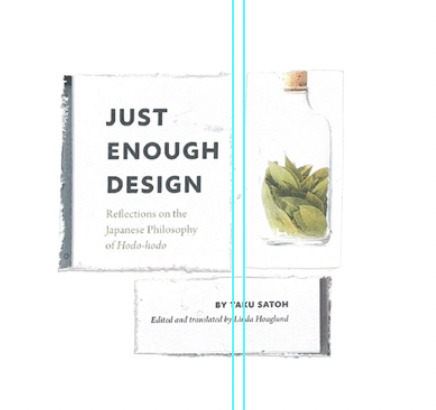
I had the privilege of attending ADI this year which has been one of the biggest learning experiences in my journey of being creative thus far. Here I listened to a talk by Taku Satoh, a talented graphic designer from Tokyo. I bought his book ‘Just Enough Design’, where I learnt more about Taku’s ideology surrounding “Hodo Hodo” which means to not overdo something or to leave space to let things breathe. He believes in the concept of finding an elegant minimum when designing, and not overdoing it. This concept resonated with me immensely. As someone who often gets overwhelmed by the design process and outcome, I love the concept of an “elegant minimum.” I find there is a lot of negative connotation to the word “minimum,” often being associated with laziness or insufficiency. When in reality something can have its most potential at its most minimal. The theme of minimalism is very clear throughout Taku’s work. I applied this ideology to my poster. I left as much negative space as possible around the objects extracted from my collage to let them breathe and to stop the viewer from being overwhelmed. The contrast between the busy collage and the spread-out dissected objects creates a well-balanced composition. An example Taku gave that helped me to better understand this concept was to do with a glass bottle used for straight alcohol. He designed it with the purpose of being reused once its original use was done. He explains that if the bottle was kept in a traditional shape, the possibilities for what it could be used for after were increased rather than a less functional but more “interesting” bottle shape. This is applied to my design practice by reminding me that there is beauty in simplicity, and to consider the overall purpose of what I am creating.
Case Study 4- Laura Letinsky

I appreciate the way she captures the concept of ordinary but extraordinary, she takes everyday things like the mess after a meal and highlights the beauty in these regular processes in our day. I have not yet used her influence in my work, but as I progress my design journey I hope to develop my photographic skills and test my own take on “dream-like” imagery.
IDENTIFYING COMMUNITIES OF INTEREST
Creative Community 1: AGI
I had never heard of AGI before the AGI Open came to Auckland this year, but since attending and researching its background I am now very familiar with the organization. Alliance Graphique Internationale is a member-based association bringing together talented and established graphic designers from all around the globe. Attending the AGI Open was an eye-opening experience in the best way possible. The atmosphere of a room full of creatives felt like home, reassuring me that I am heading into the right industry. It was fascinating to see the different personalities and themes of different graphic designers. Watching groups of designers interact and converse on stage was an example of how special the collaboration of creative people can be, and it gives perspective to how such amazing projects come out of these big design studios. Design is the kind of industry where no two designers are the same, the immense creativity allows for such lively and colourful environments. Reflecting on my new understanding of AGI, I feel that I have much more insight into how the design industry works, and I feel at ease knowing I am entering an industry where individuality is encouraged, creativity flourishes and the opportunity to learn from others is prominent.
Creative Community 2: Alt Group
I attended a talk hosted by the AUT design community where two Alt group members spoke. They spoke about their personal journey from student to designer, as well as the processes that Alt Group have and what they value. Alt Group is known for its modern approach to the workplace. They encourage a healthy work environment and habits and prioritize the employee’s happiness. One of my favourite things about Alt Group is their statement “website” or more accurately, lack of a website. It is an empty page with nothing on the whole website but Alt Group’s contact details and address. They are one of the best in the country, and they are making a bold statement. This is the exact kind of unique attitude I love as a designer. This experience of listening to and meeting Alt Group designers confirmed my feelings of aiming to be a part of Alt Group’s team one day. Their values of community, sharing meals, the importance of the physicality of the work produced and collaboration align with everything I would want in a workplace as a blooming designer.
ASPIRATIONS
In one year, I would like to have a position lined up at either Alt Group or Marx Design. These are my top choices of studios whose values of community, communication, individuality and collaboration align with my own beliefs. I hope to gain knowledge from working in a group setting with established designers. In three years I hope to be in Melbourne. Melbourne is a creative hub with growing job opportunities in the design industry. It would be a great place to learn more about the industry and gain a new perspective on graphic design from a different country. At this point, I aim to have publications of my own. To have my own brand of analogue/tactile work would be a massive goal for me, and I hope to reach that before I turn 25.
REFLECTIONS ON THE RESEARCH POSTER
My approach to this poster was to pay tribute to the individuality I hold as a creative. For a period of time, I lost that sense of self that drove my work, and therefore lost my passion for design and being creative as a whole. For me, this poster was about tapping back into that unfiltered, disorganised raw version of myself that does not have the chance to shine through in my more “formal” design projects. I took this as an opportunity to express myself to others but also serves as a reminder of what I truly love.
Concept:
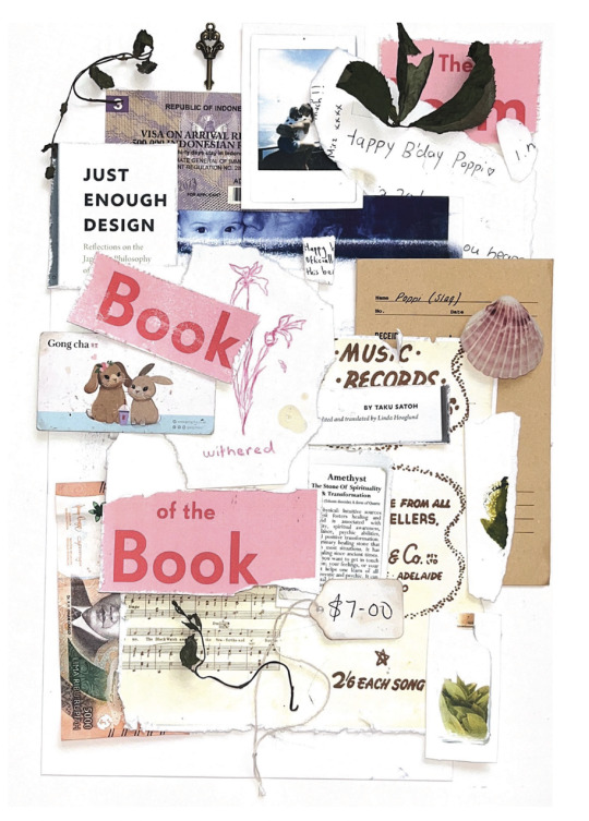
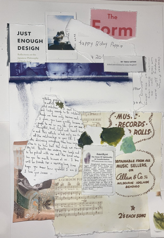
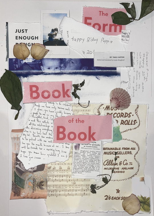
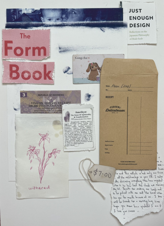
The concept of this poster was to portray the muddle that is my brain (collage) and extract each element that has an impact/influence on me as a creative. Looking at it it feels like opening a scrapbook of my life, isolating each layer, working to understand what makes me who I am. Each explanation is hand-written to stay coherent with the raw design system of the rest of the poster. Each element is sentimental, which was done intentionally because I am a sensitive, emotional and nostalgic person. Scrapbooking was the first form of creative practice for me as a child, around age 5. It is something I still love to this day.
My system was to consider the 20 things I believed were the most important to me, and then figure out how and why they influenced me to be who I am. Once this was established I scanned each element onto a thick textured card because I love working with different paper stocks. I then cut it up and layered it on top of each other, scanned it, and photoshopped it into the photo frame. I scanned each element individually to dissect the collage and dive deeper into the why. I got so much enjoyment out of this project, again showing my love for creative flow and working with tactile media. I love to work without limits, and I find technology can limit a lot, and take away originality. I am challenging the idea of categorizations as I believe all of my elements are equal and are individual influences that do not need to be grouped.
Looking at the finished poster I see that handwritten notes, old pictures and memories attached to objects are the most common elements. This accurately reflects how much I value the connections I have with the important people in my life. This was not intentional during my process of creation but an outcome to be expected as I have sentimental tendencies.
An element that challenged the way I thought was the rupee note. I was uncertain about whether I should include it or not because its importance to me is not the value that it holds financially, but the concept of travel and the contrast between my home versus the places I have travelled to. This concept of adding a deeper meaning to an object is something I tend to incorporate into my practice. I do this by using personal images instead of stock ones to add a little bit of myself into the work I produce.
CONCLUSION
As mentioned at the beginning of this essay, I began this year with a stubborn mindset and no will to expand my knowledge of creative communities. I felt stuck. This paper has allowed me to take the time to research, causing me to reach new understandings, about the industry, design processes, myself and who I am creatively. These are the findings that stand out to me;
Do not overcomplicate the design process
Research and context are vital to informed designs and they make it easier to have effective outcomes
Use your passion to propel your design and use your strengths to your advantage
My message through my poster is to be unapologetically yourself. To not be restrained by creative “rules” and to stay true to the practice you love. In my career, I hope to challenge ideas within the design world and produce work that always engages parts of myself. This research process has enabled me to have a new perspective on myself and shed light on what it is truly love, which should show through more in my practice. It has also inspired me to start collaging again, and possibly try selling my pieces. This research process has reminded me of my love of reading books, before this paper I got my information solely from the internet, but now I feel more engaged by reading books on the design process and learning this way. I can now say that I am more confident in my ability to research, my understanding of design studios in New Zealand and my overall design knowledge. I am feeling much more equipped to enter into an internship with this knowledge.
WORD COUNT : 3300
This word count is way too high and I am going to need to cut out a lot of unnecessary words.
0 notes
Text
Week 12
Poster Layout
Choosen Collage Layout
I chose this layout because it is the most balanced. I decided not to go minimal with the collage because it made it too difficult to fit all the elements in. I will have the other side of the A2 poster minimalistic to allow some space to breathe (hodo hodo Taku Satoh.)
There is only 19 elements within the collage because the final element is the frame that this collage is going into.
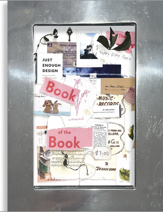
The frame is a family heirloom passed down to me when I was born. Putting the collage within the four walls of the frame is a way of showing the strength of my connection with my family, and I remember that nothing within the frame would have any relevance if it was not for them as they are the people who brought me into this world.
Visually I also love how the tough, sharp and heavy metal frame contrasts with the softens and flexibility of a paper collage. I have talked previously about how I love to contrast two things because they bring out a different kind of beauty in each other when paired together.
I did not want the frame to sit flat so I added a drop shadow to continue the depth and concept of working analogue. I actually wanted to frame the printed A2 poster, but the brief did not allow this so this was the next best option.
Editing in Photoshop:
Brought down exposure slightly to bring the element off the page a bit more and stop it from being lost in the background.
Brought down exposure slightly to bring the element off the page a bit more and stop it from being lost in the background.
I tested using digital type to explain each element. But it just does not work with the nature of the poster. Everything is 3 dimensional and the flat digital text just looks wrong.
I also tried handwriting but my writing is just too messy to read. So to keep on theme but still be functional I found the typeface most like my handwriting and used that.
0 notes
Text
Week 11 - Creating the Collage
Objects


I have added over 20 elements because I am working with collage and could make a mistake or an object could not work with the composition.
Explantions for the objects I ended up using:
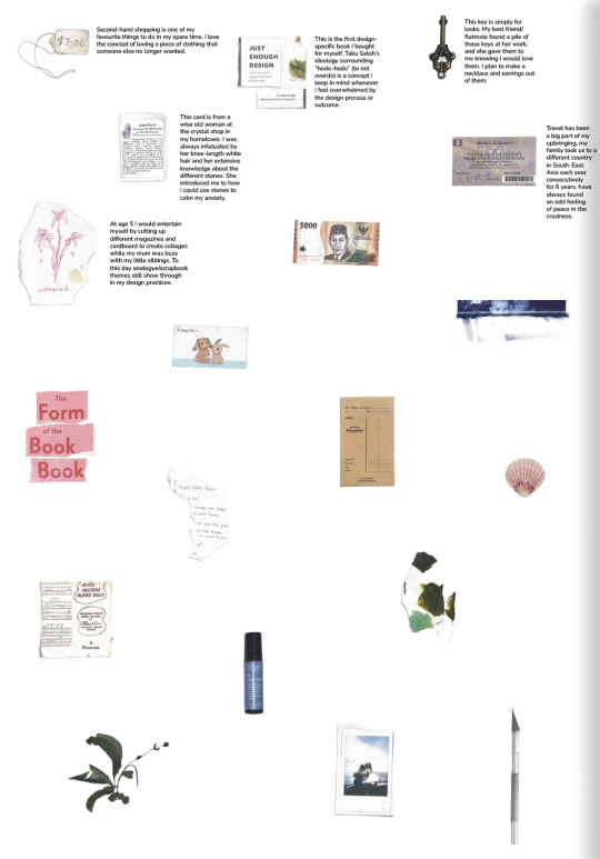
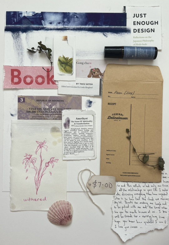
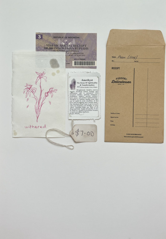
Thrift Tag:
Second-hand shopping is one of my favourite things to do in my spare time. The interesting thing about thrift is it provides opportunities. I buy clothing from thrift shops that I never would have bought new, even if it's at a similar price, just because of the concept of re-using.
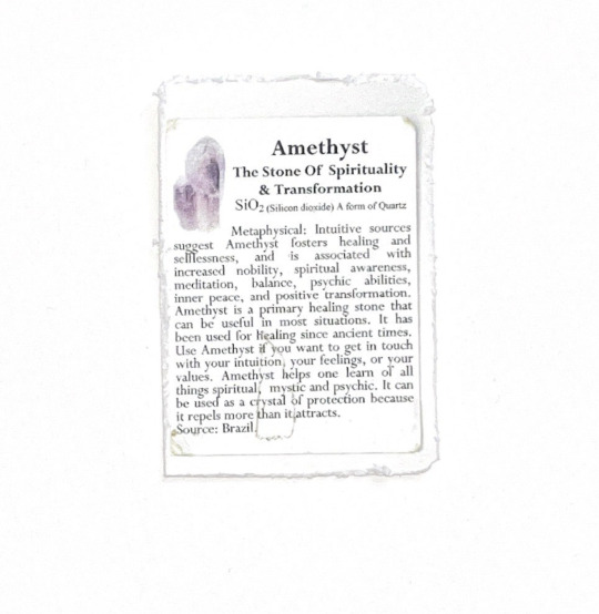
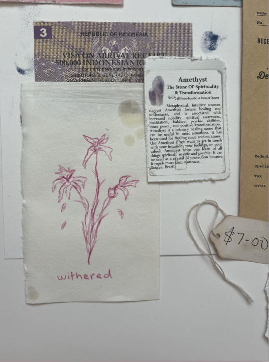
Amethyst Card:
This card is from a wise old woman at the crystal shop in my hometown. I was always infatuated by her knee-length white hair and her extensive knowledge about the different stones. She introduced me to how I could use stones to calm my anxiety.
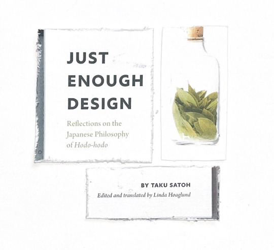
Just Enough Design book:
This is the first design-specific book I bought for myself. Taku Satoh’s ideology surrounding “hodo-hodo” (to not overdo) is a concept I keep in mind whenever I feel overwhelmed by the design process or outcome. The book is specific to me because I bought it the same day I listened to him speak at AGI.
Bali’s Visa On Arrival:
Travel has been a big part of my upbringing, my family took us to a different country in South-East Asia each year consecutively for 6 years. have always found an odd feeling of peace in the craziness. I have taken many
Sketch Book Extract:
I have scrapbooked and sketched since I began primary school. At age 5 I would entertain myself by cutting up different magazines and cardboard to create collages while my mum was busy with my little siblings. To this day analogue/scrapbook themes still show through in my design practices.
Gong-Cha Loyalty Card:
No deep underlying themes here. I love boba tea, I get one almost every day. Sitting in a cool space and being creative with a boba tea is my happy place.
5,000 Idonesian Rupiah
I included this note to represent my dream to live and work in Bali. The money represents my plan to set up a design studio and put Indonesian design on the map within the industry. I believe Indonesia has the creative potential to make an impact in the design world.
Messy Screen Printing:
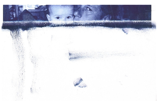
This is an image of my dad holding me as a baby. I have an album of photos that only exist as physical images, meaning there is only one copy. This adds immense value and I protect these photos with my life.
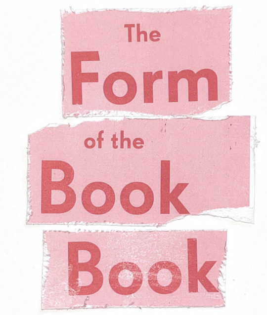
The Form of the Book Book Edited by Sara De Bondt and Fraser Muggeridge:
This is another book I bought at AGI. It explores the history of book design, how it developed and the way it is heading. I felt it important to be educated on the historical fundamentals of book design to remain informed when designing my own publications.
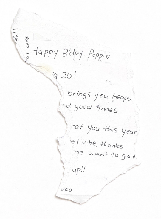
Birthday Notes:
I have kept every handwritten birthday card I have ever received, there is a massive box in my attic full of them. I am an emotional and sentimental person, and I cherish all the sweet words from my loved ones. I hope to make everyone proud with my design career.
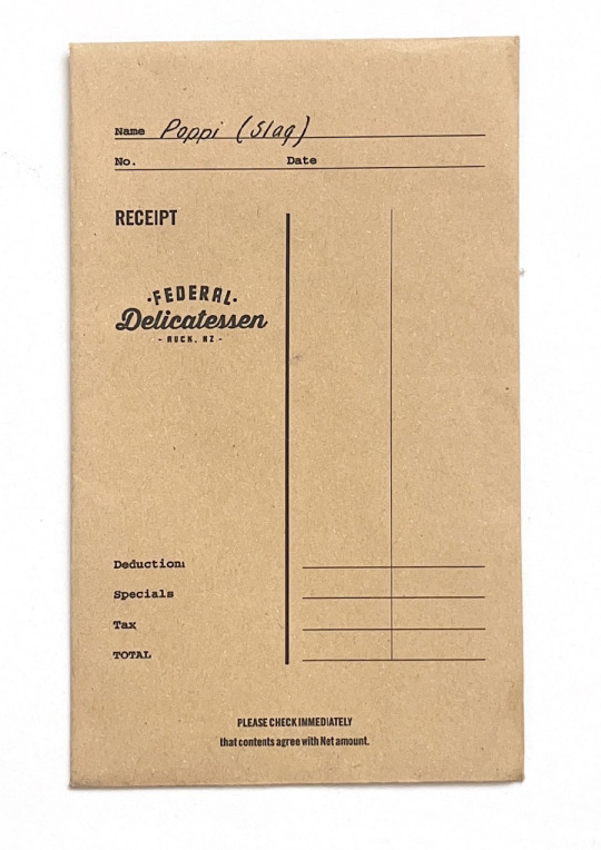
The Federal Cafe Voucher Envelope:
This is my favourite old American-style diner/cafe, I love the atmosphere. This envelope holds the voucher my best friend got me. It makes me laugh because the name she calls me is written on the front. I considered scribbling it out for this poster, but I guess it's authentic.
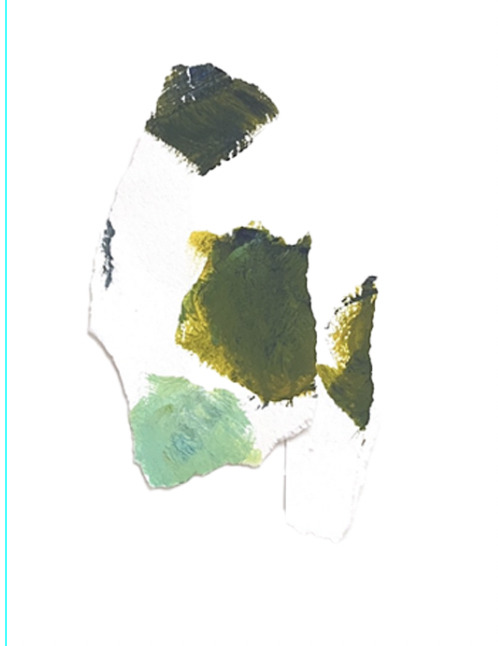
Acrylic Paint Spots:
Painting is a medium I have loved for a long time. It started with realism oil painting classes when I was 8 and has turned more towards surrealism. My painting doesn’t tend to come into my design practice much, it is more of a hobby and something I do to wind down.
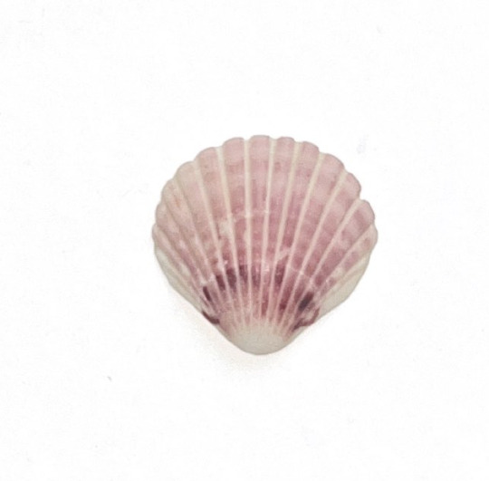
Pink Sea Shell:
I grew up in the mountains and only got to experience the beach a couple of times a year and when I did it was near impossible to get me out of the sea. My dad always called me “his water baby.”
Music Sheet:
My Nana was the first to hold me when I was born which she tells me gives us a special connection. She has a grand piano that she would play for my cousins and I growing up. She tried to teach me but I was never any good.
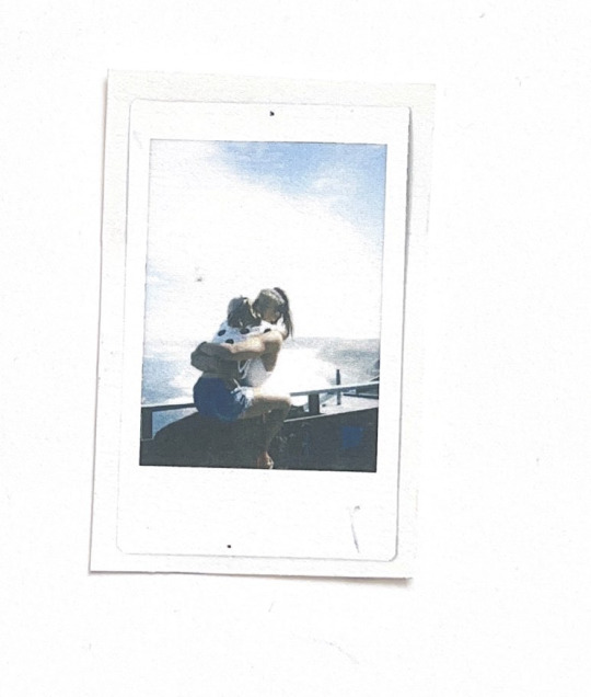
Polaroid Picture:
Photography is a practice I have engaged with since I was young. I have had many types of cameras; Cannon, film, and iPhone but Polaroid is my favourite because it produces a tactile picture. I like that the photos are not available digitally.
Brass Key
This key is simply for looks. My best friend/flatmate found a pile of these keys at her work, and she gave them to me knowing I would love them. I plan to make a necklace and earrings out of them.
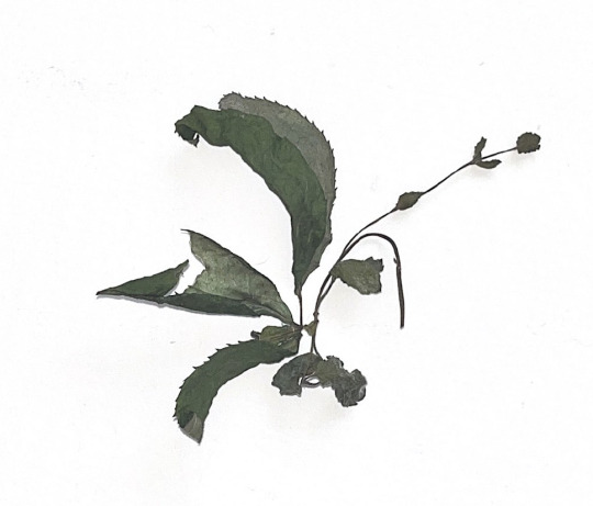
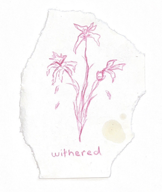
Dried Leaves
A creative practice I do often is drying out flowers. I do this for both aesthetics and sentimental value. In the same way, I collect letters written to me, I also preserve any flowers I receive by drying them out and creating arrangements.
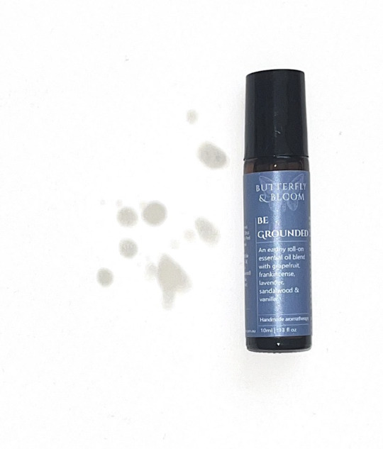
Essential Oil
My mum was always into mindfulness and its practices. She always preferred natural remedies over pharmaceuticals. Even after moving out I still use essential oils and natural remedies to treat sicknesses.
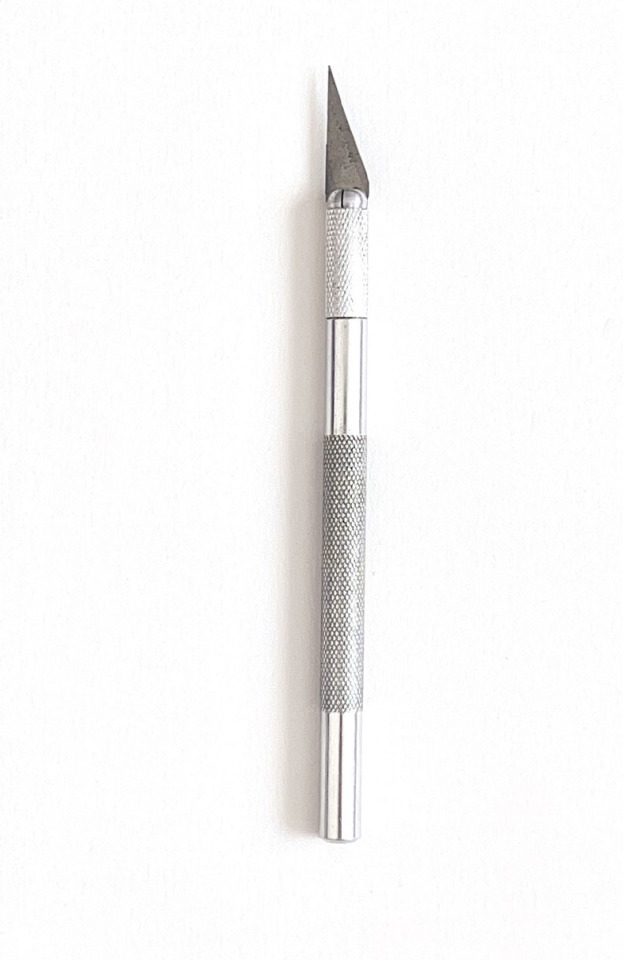
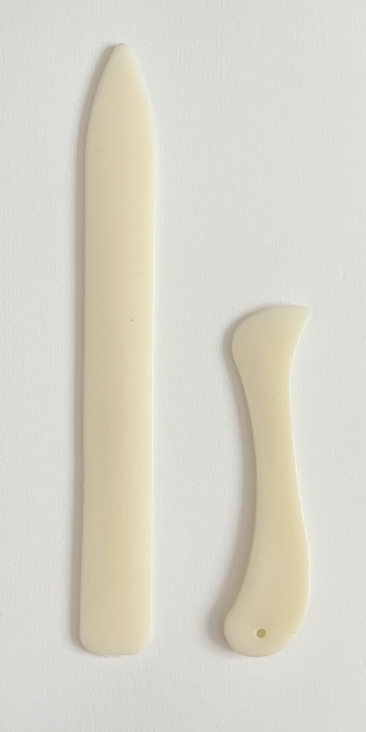
Scalpel
This tool has been used for a wide range of projects but is most commonly used for my collages and cutouts for scrapbooking.
Silver Frame
I was given this frame the day I was born. It was my great-grandmother’s, it has been passed down two generations before it reached me. This frame is only to be used for pictures of family.
Collage Layouts:
A more minimalistic approach to the collage

Busier layouts with more depth.

These are a middle ground between minimal and busy. They are quite linear and lined up horizontally.
1 note
·
View note

Text
Week 10
Type Layout Ideas for Poster


Angled Text


Small condensed text


messy scrapbook-style text
I am unsure of whether to weave my type into my collage or whether to have one side text-based and one size image-based.
FIRST ESSAY DRAFT:
SECTION 1 - She’s Been Framed : A reCOLLECTION
SECTION 2 - INTRODUCTION
This poster and essay are a representation of who Poppi is through a creative lens. I am choosing to share how I found my feet and gained confidence in a creative space, and how the many factors came together to construct who I am now, and who I will grow to be. I want to share the ups and downs and insights of my discoveries as a communication design practitioner, and as a human being. I will do so by covering these three topics; who I am as a creative, the creatives I have discovered that influence my thinking and making and the communities that actively inspire and position my current and future practice.
SECTION 3 - THE CREATIVE - POSITIONING THE RESEARCHER
Values
I have been creative since before I could even speak, always painting, drawing and creating. It is something that keeps me sane, and is shown in all aspects of my life. Including what I choose to wear, the way my room looks, the hand-made birthday cards I make everybody. I have always admired and valued the concept of individuality and the different expressions of it. I am fascinated by how other people's minds work, (I assume this stems from having a psychologist as a mother,) and I think a great way to understand people is to see how they create.
Individuality and Growth
The majority of my growth as a blooming designer has taken place within the last year. For my whole life art in all forms was simply just a passion and an outlet for my thoughts, feelings and personality. But as I hit university, it was up to people I don’t even know to tell me my art and creativity was wrong, and not up to the standards of “industry design.” To which I was tempted to respond “no sh*t I am a first year student,” but I held my breath. It was a massive knock to my confidence, and caused me to question my skill and individuality, and whether it was worth anything. All personality left my work and my creations were driven completely by what I thought others wanted from me, and left my personality far out of it. Interestingly this made things even worse, my work was muddled and had no creative direction. After receiving a failing grade for a massive project, I realized someone else's opinion does not take away from your worth and talent as a creative. I now understand you can't please everyone, especially in the design world as art is subjective.
Influences
Hip hop has its own attitude. It is expressive and loose, it is strong and unforgiving. I have done hip hop since I was 4 years old up until now, so this “attitude” is very much a part of me and informs who I am as a creative. Because of this culture I was involved in, I am confident and unforgiving in my self-expression, and not afraid to step into new territories. Dance was my first experience with criticism, and with people not liking my creativity. At 6 years old I received a bad dance exam result, but my dance teacher told me that other peoples opinions about my dancing did not take away from who I was as a dancer, and I have carried this mindset throughout the rest of my life.
Tools Methods and Medias - Research tools, contextual processes
In a world where everything is slowly being taken over by tech, I have developed a strong appreciation for working analogue. I have loved reading books and flicking through mum's magazines since I was little, this passion carries through into my design practice now. I love the outcome of connecting and contrasting digital and analogue media. The juxtaposition between the long history of the paper and pencil and the new wave of tech holds such a powerful message in itself, and contrasts beautifully in compositions.
SECTION 4 - CONTEXTUAL REVIEW (CREATIVE POSITIONING)
Being naturally strong-willed and stubborn I refused to look too much into others' creative work when I was younger. I had this idea that if I were to get inspiration from others it would take away the uniqueness of my own work. I now know this isn't the case, and I also realized that I was inspired by a lot of things, I just never actively sought these inspirations out. During my contextual research during this paper, I uncovered a lot of knowledge about myself as a designer through researching other creatives and their creations. Only designing for school projects meant I never took the time to think about what practices/methods I enjoyed the most, in fact I never even realized how much I enjoyed working analogue until I was actually forced to think about it.
Case Study 1 - Ruby Neagle

Index of Breathe: Ruby Neagle
This is the first of her works I found. I am all for breaking rules, and I resonate with the way she pushes typographic boundaries, and produces beautiful publications. This publication used unique body copy layouts with blue screen printing, which I think contrasts well and is two medias I would love to experiment with together. It is difficult to find much information on Ruby Neagle as I believe she graduated from the University of Technology Sydney around a year ago, meaning she is not a “fully established industry designer,” although you would never know looking at the work produced and the awards for that work.
Case Study 2 - Catherine Griffiths + Designers Speak Up
Catherine Griffiths should be an inspiration to all young female designers entering the design industry, and I reminder that we are just as capable as any man in the industry. I found through my research into the best awards, and Catherine Griffiths specifically, that the Best Awards is not representing female talent in the design industry enough, which I did not expect as I thought sexisim was becoming less apparent in creative industries. It made me sad, but even more so it increased my motivation to continue my work as a designer, and made me think about how we can push female representation in the design world further. Designers speak up is a platform and safe space to allow all designers in New Zealand to have a space to talk and express their thoughts and feelings. Catherine Griffiths describes it as “an open and democratic platform for all designers in Aotearoa New Zealand to have a voice.” She is encouraging designers to express themselves and speak on the topic of the patriarchy in the New Zealand design industry. I would love to follow in these footsteps as I grow as a designer to to my bit in increasing female representation in the industry.
Case Study 3 - Taku Satoh

Case Study 4- Laura Letinsky

I appreciate the way she captures the concept of ordinary but extraordinary, she takes everyday things like the mess after a meal, and highlights the beauty in these regular processes in our day. I have not yet used her influence in my work, but as I progress my design journey I hope to develop my photographic skills and test my own take on “dream-like” imagery.
SECTION 5: IDENTIFYING COMMUNITIES OF INTEREST
Creative Community 1 : AGI
Introduce:
I had never heard of AGI before the AGI Open came to Auckland this year, but since attending and researching its background I am now very familiar with the organization. Alliance Graphique Internationale is a member based association bringing together talented and established graphic designers from all around the globe. Attending the AGI Open was an eye opening experience in the best way possible. The atmosphere of a room full of creatives felt like home, reassuring me that I am heading into the right industry.
Analyze:
It was fascinating to see the different personalities and themes across different graphic designers. Watching groups of designers interact and converse on stage was an example of how special the collaboration of creative people can be, and it gives perspective to how such amazing projects come out of these big design studios. Design is the kind of industry where no two designers are the same, the immense creativity allows for such lively and colorful environments.
Reflect:
Reflecting on my new understanding of AGI, I feel that I have much more insight into how the design industry works, and I feel at ease knowing I am entering an industry where individuality is encouraged, creativity flourishes and the opportunity to learn from others is prominent.
Creative Community 2 : Alt Group
Introduce:
I attended a talk hosted by the AUT design community where two Alt group members spoke. They spoke about their personal journey from student to designer, as well as the processes that Alt Group have and what they value.
Analyze:
Alt Group is known for its modern approach to a workplace. They encourage a healthy work environment and habits, and prioritize the employees happiness. One of my favorite things about Alt Group is their statement “website” or more accurately, lack of a website. It is an empty page with nothing on the whole website but Alt Groups contact details and address. They are one of the best in the country, and they are making a bold statement. This is the exact kind of unique attitude I love as a designer.
Reflect:
This experience of listening to and meeting Alt Group designers confirmed my feelings of aiming to be a part of Alt Group’s team one day. Their values of community, sharing meals, importance of physicality of the work produced and collaboration align with everything I would want in a workplace as a blooming designer.
ASPIRATIONS
In one year I would like to have a position lined up at either Alt group or Marx Design. These are my top choices of studios whos values I align with, and are some of the best in the country. I hope to have gained some knowledge from working at an internship in a studio during my third year. In three years I hope to be in Melbourne. At this point I would love to be doing freelance, or even be working on having some publications of my own. To have my own brand of analogue tactile work would be a massive goal for me, and I hope to reach that before I turn 25.
SECTION 6: REFLECTIONS ON THE RESEARCH POSTER
My approach to this poster was to pay tribute to the individuality I hold as a creative. For a period of time I lost that sense of self that drove my work, and therefore lost my passion for design and being creative as a whole. For me this poster was about tapping back into that unfiltered, dis-organized raw version of myself that doesn;t have the chance to shine through in my more “formal” design projects. I took this as an opportunity to express myself to others, but also serves as a reminder of what I truly love.
Concept:
The concept of this poster was to portray the muddle that is my brain (collage), and extract each element that has some form of impact/influence on me as a creative. Looking at it it feels like opening a scrapbook of my life, isolating each layer, working to understand what makes me who I am. Each explanation is hand-written to stay coherent with the raw design system of the rest of the poster. Each element is quite sentimental, which was done intentionally because I am a sensitive, emotional and nostalgic person, and it was the best way to portray this. It shows my past, present and future.
I did not want to overthink this project, because it should be authentically me. Scrapbooking was the first form of creative practice for me as a child, around age 5. It is something I still love to this day. My system was to consider the 20 things I considered the most important to me, and then figure out how and why they influenced me to be who I am. Once this was established I scanned each element onto a thick textured card. I did this because I love paper stock, especially textured, so it felt fitting. I then cut it up and layered it on top of each other, scanned this, and photoshopped it into the final element; the photo frame. I also scanned each element individually to dissect the collage and dive deeper into the why. I got so much enjoyment out of this project, again showing my love for creative flow and working with tactile media. I love to work without limits, and I find technology can limit a lot, and take away originality.
This poster has shown the growth in my understanding of myself as a creative. It has put things into perspective for me, and shed a light on what it is truly love, which should show through more in my practice. It has also inspired me to start collage again, and possibly try selling my pieces.
SECTION 7: CONCLUSION
I want to refine my skills in working analogue, to move from more of a hobby to incorporating this into my designs at an industry standard.
SECTION 8: REFERENCES
FEEDBACK:


1 note
·
View note
Text
Week 9
Week 9 Reflection:
Currently I am in the stages of exploring different ideas. I have only just begun narrowing down my 20 elements, and am still not fully decided. I am leaning towards the concept of duality and mixed media, because this represents me best as a designer.
Considering I don’t have enough substance to be grading myself against the rubric, I will work on creating my idea and draft for the poster and then going back and reflecting on where i'm sitting and how I can improve on that.
Inspiration for Poster:
I found some inspiration for the mixed media concept I am exploring. I then annotated them with what I specifically like within each composition and how I could apply this to my own poster with my 20 elements.


Annotated:


Kurt Schwitters: Collage Artist


"After World War I, Schwitters began to collect broken and discarded materials he found on the streets and arrange them into works of art. Born from the rubble left by the war, these works emphasize the fact that art can be made from destruction; that urban detritus could be made into something beautiful." - https://www.theartstory.org/artist/schwitters-kurt/#:~:text=After%20World%20War%20I%2C%20Schwitters,be%20made%20into%20something%20beautiful.
This is such a powerful way to use art for good. This is the exact kind of thing I would love to experiment with. I am considering using this concept of turning destruction into art through a feminist lens. Maybe collecting articles and newspapers about wrongs done to females and creating beautiful feminine collages.
0 notes
Text

Brainstorm for the 3 C's.
Current Elements:

Currently hip hop is the driving element in this project. It involves me as a creative, creations (clothing, music,) and well as creative communities (hip hop groups, 2000's rap, dance studios etc.) I have danced since I was 3 years old, and it is a massive influence on who I am now. I can pull many elements from this concept.
I am not a structured or straight forward person, and I like things done with heaps of personality and no limits. Hip hop is sharp, loud and confident, which explains both my personality and my design style.
I plan to use different mediums and medias to layer and construct this poster. I love to photograph + abstract illustration. I want to see where combining this takes this poster.
New Elements
I have made a bit of a change from the elements listed above. I was going to use hip-hop culture as my main influence on the poster, but it is not a big enough influence to completely stick to that idea. My design process and what I produce creatively don't reflect much about hip-hop culture, so it wouldn't be appropriate to relate my entire poster to one aspect of myself. Hip-hop has an influence on my attitude more than the work I produce.
I had a think about it and the best way to sum up my creative practice is working analogue, and this should be reflected in my poster. I am going to collect tangible elements scan them and create a collage. Just like my scrapbooks when I was little.


elements collected so far
dried flowers
sea shell
frame
essential oil
voucher to cafe
nanas music sheet
amethyst card
thrift store tag
Just Enough Design book
The Form of the Book Book
polaroid
birthday cards
letter from friend
annual birthday note from Nana
scalpal
bubble tea loyalty card
5,000 rupiah
parents photos from the 90's
0 notes
Text
Week 7
After my formative, I felt that I was still lacking in understanding who I am as a creative. I began to think deeper about what informs me in my practice. I asked myself questions as if I was a stranger:
What do you value?
I have always loved painting, drawing and creating. It is something that keeps me sane and is shown in all aspects of my life. I have always admired and valued the concept of individuality and the different expressions of it.
How do you express your individuality?
I have loved reading books and flicking through mum's magazines since I was little, this passion carries through into my design practice now. I love the outcome of connecting and contrasting digital and analogue media. The juxtaposition between the long history of paper and pencil and the new wave of tech holds such a powerful message and contrasts beautifully in compositions. Art and design is more than a passion, it is a practice that brings me joy, and a way to get out of my own head and to connect with myself and others.
What influenced you in your creative practice?
My mum was always a very structured and organised person. She taught me how to be productive through planning. I think this plays its part in my creative process. If I don't have a detailed agenda of how I am going to tackle a design project I become overwhelmed.
I also think hip-hop dancing has affected me as a creative. Hip-hop has its own attitude. It is expressive and loose, it is strong and unforgiving. I have listened to and danced hip hop since I was 4 years old up until now. My interpretation of hip-hop culture is about being unforgiving and unapologetically yourself. These attitudes are reflected in my design through breaking fundamental design principles. Each form of design has an individual set of rules, however, I often tend to bend these rules. This can be seen through my work in ways like layering multiple media together, “incorrect” type layouts, bold colour palettes etc. I value individuality over design principles. My knowledge of hip-hop dance styles causes me to consider the movement of a design. In my mind, I can see the flow of imagery on a page, and I tend to use this thought process to create compositions rather than a traditional grid system.
Moodboard of My Upbringing

Family
Outdoors
Skiing + Snowboarding
Sport
Friends
South-East Asia
0 notes
Text
Week 6 - Creative Communities
Studios I want to work at
Alt Group :
Co funder : Dean Poole, Ben Corban
Opened : 2000
Lunch time : Since its opening Alt Group employees eat lunch all together at one big table, eating the same meal prepared by Aaron Edwards. Poole believes the best creative work happens on a full stomach
Atmosphere: Family-like vibe, open plan workspace
Values : Community, sharing meals, importance of physicality of the work produced, collaboration

If you search up awards given to Alt Group projects, there is hundreds. They work on a massive range of designs, often in collaboration with designers in different areas. This shows why they don't feel the need to display their achievements on their own website, because it is shown in many other places.
One of my favourite projects done by Alt Group is their work on the Fisher and Paykel publication:


I love the minimalism, the clean sharp feel that is reflected in both the photography and the type and layout choices.
Marx Design:


Marx Design is a well-established studio, very prominent in the Best Awards, located in Auckland. It has an open-plan workspace and has done work for some big brands.
Work:


They appear to specialise in packaging and brand design
Formative
Presentation:


Formative Reflection:
Looking at other students' presentations I should have included a lot more about myself and my own practises. I was under the impression this presentation was focused all on other creative influences I have learnt about, but I definitely should have introduced myself and my practice much more.

Main points in feedback
Use better language when describing creative processes
Expand and articulate on ideas
Speak more about myself
Dive into how I approach content
0 notes
Text
Week 5 tut
FORMATIVE
The Creatives, The Creations and The Creative Communities
Presentation --- 3-5 minutes
Blog weeks 1-6

Map or us other graphic systems to present your research findings into creative communities, connecting to you as a creative.
Section 1
What has informed your methodology and why?
What are my main mediums?
My work
Methodologies
Section 2
My research
My findings
Inspiration
Visual Research Inventory
Analysing findings
Studios
Designers
Section 3
5 creatives that I want to explore more + Why

CONTEXTUAL ENQUIRY
Investigating
Linking ideas
RESEARCH SKILLS
Referencing
Annotating
Note taking
Mind Maps
CRITICAL ANALYSIS
Reflections
Comprehending
Informing
Analyse Findings
SYNTHESIS
Integrating research
Present ideas
Task 1
Reading: Materialising Pedagogies: Dr Barbra Bolt

What is Material thinking?
Material thinking is the magic of handling materials in a way where their own intelligence can inform its artists creative intelligence.
2. Choose one of the Creatives from the lecture and describe their material thinking:
Tatiana Taraves uses her culture and religion to inform her work. She uses material thinking to let these concepts and inform her illustrations.
The lecturer let the materials of the weaving in her culture inform her illustrations. She allowed the materials to inform her work in their own way.
3. How can material thinking be seen through my work?
I personally don't have any specific materials that inform my work. I am only starting out and have so far only been designing with the purpose of getting a good grade. This means I am catering to someone else's expectation and not for my own purpose.
This is something that has caused some thought for me. I need to explore more into who I am as I designer. The fact that I can not think of one material that informs my work isn't good enough. I know that I enjoy photography, editorial design and tangible design, but I don't have anything specifically in my worldview that informs my practice.
4. How would you reference the reading from today?
Research author and title.
0 notes
Text
Week 5
Lecture Notes - Methodologies
The Cake methodology:
Cake= Your creative work
Method to bake the cake = Your creative practise
This is a great way to explain the work you produce vs the process of it. I have learnt that your creative practice and your design process are the basis of all work produced. This has also made me realise to really excel as a designer I need to narrow down what my "method for baking the cake" actually is.
The 4 Types of Researchers: Using the Cake Methapor
1. Follows a recipe strictly
This researcher has a well-informed and logical process of research that they will not stray from.
2. Interpretes a recipe
Combines the outline of research guidelines with skills from their own worldview.
3. Focused most on the process of baking, not the measurements
Feels research is about learning, not following a one-size-fits-all logic.
4. Doesn't use a recipe
Bakes the cake blindly, and is focused on experimentation, not a perfect outcome. Is post-critical and innovative
I believe I am currently sitting in the doesn't use a recipe method of research. However, I want to hone in my research process much more because I get overwhelmed with no system.
Research Paradigm = Reasons Behind Your Method
Online Definition: "A research paradigm is a method, model, or pattern for conducting research. It is a set of ideas, beliefs, or understandings within which theories and practices can function. The majority of paradigms derive from one of two research methodologies: positivism or interpretivism."

Information taken directly from:
Lecture Reflection:
In this lecture, I learnt a lot about how your worldview informs your own methodology for design processes. Our backgrounds create different ways of thinking therefore different methodologies.
Another influence on your design methods is your ability and willingness to engage in design research. In the past I have not had any interest in design research, but his paper has shown me the importance of research. I can already see improvement in my practice with the use of research tools.
Creatives Mentioned in Lecture:
Talita Tolutau

"Tolutau’s practice-led inquiry employs the Tongan methodological framework of kakala to consider the stories of four Tongan hou’eiki fafine migrants. It seeks to design a unique, culturally appropriate method and form for sharing stories of migration and loss that engages talanoa and synthesises this into a filmic veitalatala." - https://cdr.aut.ac.nz/veitalatala/
Talita is an exmaple of how your heritage informs your design process. She is heavily influenced by her Tongan culture.
The Tongan methodological framework of kakala:

https://cdr.aut.ac.nz/veitalatala/
Tatiana Tavares

https://tatianatavares.com/about
Tatiana uses her Brazilian heritage to inform her designs. Her intricate collages have hints of her upbringing in Brazil and portray some ideologies within the religions of her country and family.
20 Elements Ideas:

I am unsure if these elements are exactly what I want in this poster. I will go home and photograph some things that are important to me and are in my space and see what ideas come from this.


Images of items of importance to me in my room ^


Experimenting with applying high exposure to the elements
(my mothers wedding bracelet and some keys my best friend gave me)
0 notes
Text
Week 4 - Tutorial
A collection of some of my work that was informed by both school projects, paid work and design for personal use/possible business:

Prints by Poppi
Prints by Poppi is a small business I am working on setting up in my third year. This came about when I was trying to decorate my flat on a budget at the beginning of this year. I could not find any well-priced posters that were actually contemporary and unique. The only option was to try to order them online internationally, which I am too impatient for. I realised this gap I found could be an opportunity to use my design knowledge to create. I want to begin with posters, selling them on Depop, Instagram and markets. I plan to create templates and let people send in images they want to be used in the poster template.
I was planning on having different collections, the first one being 'The Editorial Collection." This editorial-style poster is trending at the moment and I could capitalise on this trend.
Bean Around the World
Is a small cafe at home that I was hired to do some freelance work for. The owner is a family friend and wanted a rebrand for the cafe. It was great to work on my own time but challenged me when trying to get things done with no specific time frame or schedule. This experience was enjoyable and made me excited to involve myself in freelance in the future.
Johnson Witehira
Witehira is a well-known creative in New Zealand, I enjoyed looking into his work and its purpose.
0 notes
Text
Week 4 - Creative Communities
Natalie Robertson - Lecturer + Photographer
Akau
Akau is a place where projects are carried out with Whanau in mind. Akau ensures community projects align with Maori values and makes sure all community members have a say.
Their Design Process:

It was interesting to read this section of the website because I am actively trying to improve my own design process, and the best way to do this is to learn from others. It is also important to understand the roles within a studio to grasp the dynamic that will apply to me when I join a studio myself. Getting this worldly insight into how the industry functions is vital to my growth as a graphic designer.
The Art Foundation
The Art foundation is a community for creatives. It is a platform to back artists in New Zealand.


AGI - Alliance Graphique Internationale
Alliance Graphique Internationale is a member-based association bringing together talented and established graphic designers from all around the globe.

0 notes
Text
Reflection
What am I interested in?
Photography
Mixed media
Hand drawn
Publication design
Activism design
Rawness
Realness
Minimalism
What is an area where I want to expand my knowledge?
Designers and design communities around me
Art history
History of typography
Methods for a design process
Catherine Griffiths - Best Awards / Designers Speak up
^^ Catherine Griffith (typographer and designer)'s response to the male domination in the Best Awards.
Designers speak up is a platform and safe space to allow all designers in New Zealand to have a space to talk and express their thoughts and feelings. Not only is it is a safe space, it is a statement, a message to the design industry, to show the strength of character in designers, and to serve as a reminder that lack of female representation will not be tolerated.
Present Tense : Wāhine Toi Aotearoa -> Designers Speak Up


0 notes
Text
Week 3 Tutorial
Getting Comfortable Using The online libraries.
New Zealand Magazine Design

Aboriginal Body Painting


Typographic laws

google scholar - pdf

0 notes
Text
Week 3
Lecture Notes
Researching
Course resources on Canvas - good resources that are relevant to your course + paper specifically.
Graphic design - Levels 5-6 section 741.6
Utilise the AUT library search - online resources, librarians will help if needed.
Platforms for Broad Topic Searching:
AUT library online search
Hard to narrow down
200+ data bases
AUT google scholar.
Comes from academic origin.
Broad.
Hard to narrow down.
Platforms for Subject Specific Searching
Bloomsbury design library
Articles from design encyclopaedias
Design topics/context
Artstor
part of jstor
image based database
high resolution scans
museum content
design objects
sculpture
International
ACM digital library
digital based
Digital NZ
galleries libraries museums archives
local -> nz based
searches Te Papa + Auckland Museum
interviews
nzresearch.org.nz
thesis
research papers
STEPS:
Build a collection of search keywords that describe or are related to these ideas. (incase the key words you have are worded differently in articles.) example: tactile picture books -> interactive graphic novel
2. Group search phrases using quotation marks. Example: search "picture books" rather than picture books. This prevents the words being used separately and insures they are used as a phrase.
3. Read abstract of each article to see if it is relevant to my search
4. If I find a good resource I can check the references and see where they got their info from. Or see who has referenced the article I like. (only on Google Scholar) (cited by) Once selected you can then search for another keyword within the cited articles to narrow down further. Also, search for other works by the same author.
Lecture Reflection:
I have never been taught these skills of research. I am happy that I now know this and am able to research and reference accurately.
Creatives:


Above are some creatives I found through my research. They are people who create outcomes I am inspired by and that I would like to consider when creating my own work. I found it useful to look into their 'why' and what drives them to produce such incredible things.
My Practice: Moodboard

Collage
Tactile
Fabrics
Painting
Photography
Image manipulation
Editorial
Double exposure
Sketching + Scanning
0 notes