
Statistics
We looked inside some of the posts by graphicnoises and here's what we found interesting.
Average Info
Notes Per Post
102K
Likes Per Post
57K
Reblog Per Post
45K
Reply Per Post
132
Time Between Posts
8 days
Number of Posts By Type
Text
7
Last Seen Tumblr Blogs


Fun Fact
Premium Tumblr themes are available from anywhere between $9 to $49.
Text

Wheezy/whistly laughter is so cool looking on spectrogram.
3 notes
·
View notes
Text
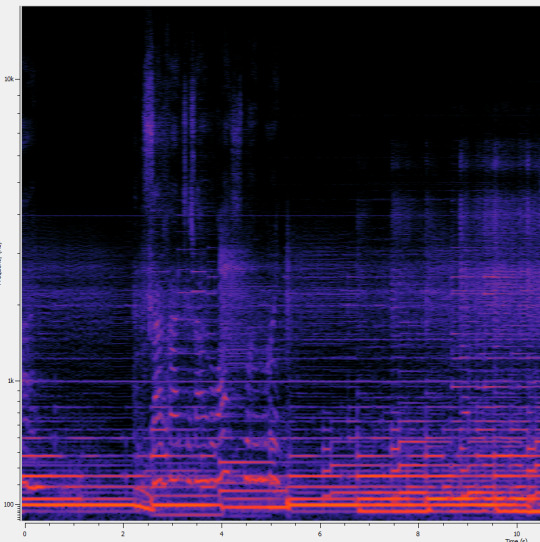
If you've ever wondered how those automatic audio-to-(bad)-sheet-music programs work this is a good chunk of the kind of stuff that goes on in the back end.
Each of these flat lines is long enough to be easily and accurately identified as a specific frequency and duration. Looking at the axes and cross-referencing with Wikipedia, we can quickly identify that faint line that's constant up across the rest as C6 (1046Hz), the lowest line as C2 (65Hz), and strong lines at 98 and 198Hz, which are G2 and G3 respectively. That's a solid indication, absent any other information on the song itself, that it's set in C.
However, we have additional information in this graph. Note the time axis in seconds across the bottom. This could enable a particularly diligent investigator (or, more likely, a program) to track the points in time when notes begin and end, and attempt to calculate common denominators that predict those notes. In this case, a researcher with particular time to kill could mark the individual duration of every single note, and use the running GCD as a point estimate of base note length from which to calculate an estimate of the BPM.
If you want to get an idea on how Fourier Transforms themselves (and by extension, the FFT algorithm) work, I'd recommend looking up a 3Blue1Brown video on them, their work is very good.
Song: Beekeper - Keaton Henson (Spotify)
#audio spectrogram#audio visualization#I promise the ratio of math to cool concept is low! I promise!#this wasn't mean't to be an essay lol I'm just. very.
1 note
·
View note
Text
Choppy distortion effects look so pretty. It's like someone went over the audio track itself with a rake. In the best possible way.
Song: Persona Non Grata - Whale Bones (Spotify)
0 notes
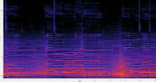
Text

1: I forget the music-y term for it but that fade is so pretty both audibly and graphically (it's accurately reproduced, I'll say that)
2: This graph legitimately makes it so much easier to hear the lower frequency tones such as the bassier parts of the drumbeats. I'll make a point of including something with an actual low bassline later.
Song: The Wolves - JJ and the Pillars (Spotify)
0 notes
Text

I love the silence and prominence they gave the spoons as much this time as I did the first time they did it. It really is such a delicate sound. We also get such a clear look at the overtones themselves.

Also this build into the last chorus is insane. Look at that thing! You can literally see the cone of frequencies expanding outward to catch the rib-shaking beat of the final chorus.

As a bonus have the "YAAAAAY!!! :D"s at the end because watching a ton of people nearly sync up in a slightly falling pitch when they're all celebrating is the kind of pleasure you gotta hold on to in this kind of world
They did it again
101K notes
·
View notes
Text

Strong vibratos are so pretty. I guess it makes sense they'd be pretty on spectrogram as well.
You can also see how it comes out so much more strongly near the ends of held notes, when the singer has stopped holding the note as tightly and loosens up.
Song: I Scare You - Roaring Girl Cabaret (Spotify)
1 note
·
View note
Text

Photography of music notes in a bowl of water.
676 notes
·
View notes