
Statistics
We looked inside some of the posts by greipackagedesign and here's what we found interesting.
Average Info
Notes Per Post
10
Likes Per Post
10
Reblog Per Post
0
Reply Per Post
0
Time Between Posts
6 days
Number of Posts By Type
Text
15
Last Seen Tumblr Blogs


Fun Fact
There were a total of 171.5 billion posts on Tumblr in 2019.
Text
Final-P2


This is the final product! Overall, I am very happy with the outcome. I was able to time manage well during this project so I was able to experiment more with the techniques and finess the final product more. For example, I experimented with the best way to stick on the labels and its positioning.
Unlike my last experience printing with staples, this time went really well. I used a really cool, off-white linen textured paper which gives it more of a rustic feel. They also did a great job with the resolution, even with the small text. The colours came out just how I imagined them which I was really happy with.
To add a layer of texture, I ended up putting a twine fabric on top of the lid. This gives it another element of fun and professionalism.
If I had the money to do so, I think this label would work better as a sticker label. It would help the lids open easier since in this version I curled the paper inside of the tins.
0 notes
Text


This week, I worked towards finalizing my digital and physical design. I started by finding the container I wanted the tea to come in which was a golden tin. I got the dimensions of the tin and started illustrating! I wanted the illustrations to represent the specific animal's environment with the colours and nature. I still have a lot to fix up moving forward. Most notably, I have to make the animals wrap all the way around the tin without overlap and make sure the illustrations don't get cut off at the top. Additionally, I need to add all of the instructions and nutritional information on the bottom of the tin. Overall, I am pretty happy with the vibrancy of the colours and the contrast of the white animals overtop but I would like to incorporate the animals to seem like they belong to the background more. Overall, I am really happy with the direction of my product, they are fun are fun, colourful and eyecatching!
1 note
·
View note
Text
Project 2- Written Rationale Draft
CHALLENGE
For this project, I am redesigning the packaging for David Rio, a chai tea brand. I will be focusing on three of their tea flavours: Tiger Spice, Elephant Vanilla, and Orca Spice. The redesign needs to preserve the freshness of the product while ensuring each flavour has a distinct look, without straying too far from a cohesive brand identity. The challenge is to balance individuality for each flavour with a consistent overall design that ties the products together as part of the same brand. Additionally, I need to keep the target audience in mind, maintaining the current brand’s feel while improving upon it.
APPROACH
I aim to create a fun yet elegant design that uses vibrant colours and playful illustrations to represent unique flavours. I will highlight the animals and their environments to differentiate each tea flavour. The packaging will wrap around the container, providing ample space for design. Since the brand supports endangered species, I plan to emphasize the animals to reinforce this mission.
To improve sustainability, I will propose using glass bottles or small tins instead of the original cardboard tubes. I chose to redesign David Rio because it's a brand I personally enjoy and use regularly. While I appreciate the concept, the original packaging’s colours didn’t feel cohesive, and I believe I can make it more elegant and appealing to the target audience.
OUTCOME
I anticipate challenges in getting the design to wrap around the container perfectly, ensuring no overlap or gaps. Creating illustrations with a consistent style and feel for each flavour will be key, as they must feel part of a cohesive series. My goal is to produce something visually striking, colourful, and memorable—something that stands out on a shelf. Time management will be crucial, especially when perfecting the illustrations and integrating a die-cut label that makes some design elements pop.
1 note
·
View note
Text
Project 2- Planning


In the planning stage, I am getting a strong idea of what I want my product to look like. I decided to ultimately keep the fun, bright colours and plant life patterns. However, I want to make the animals the focus of the design. While creating the mood board, I collected potential ideas for colour schemes, label shapes, and illustrative styles. I used this inspiration to make thumbs. Some for a tin, some for a jar and some for both. I still need to decide if I want to do a milk jar or a tin. I experimented with the shape of the label and the illustrations that will go on it. I am leaning towards the label that wraps all the way around. This way it will be eye-catching from all angles and there will be more space for important information. I drew up a quick sketch of what I think the approximate measurements could be for the labels.
1 note
·
View note
Text
Project 2-Discovery


For my first packaging, I chose a tea company called David Rio which specializes in powdered chai. This packaging is bright and eye-catching but maintains more traditional, elegant elements. This tells us that it is taking something traditional like chai and putting a modern spin on it. The spin is that it’s a powder instead of a tea leaf or tea bag. It also makes it more accessible for those who have never learned to make chai traditionally. We can also tell there is an Asian influence to the designs. It does this by using somewhat traditional patterns in the background but uses a bright, bold colour. The combination of brown and gold stays consistent on all of the packages making the brand seem more fancy and antiqued. The animals on each of the containers are associated with various parts of Asia. The patterns are delicate and subtle but they connect to the animal on the packaging. Each flavour is differentiated by a different animal, a different pattern in the background and a different colour scheme. Each flavour is named after a different type of animal. For example, one flavour uses a tiger for Tiger Spice and there is an illustration of a tiger on the front. Then the background colour and pattern are chosen based on the animal and their habitat. For the tiger, there is a bamboo pattern and the colour is orange. The element that always stays the same is the brown and gold colour scheme.


For my second product, I chose the brand Calypso which makes lemonade and various other pop. From the packaging, I can tell it is a fun, energetic, summery brand that wants to appeal to younger people. It does this by using a vibrant yellow colour and a funky logo. Yellow is associated with fun, sun, happiness and energy. The logo has a lemon slice instead of an O which makes it feel more juvenile and summery. The illustrations on the front are very literal which makes it easy to understand what flavour you are picking up without even reading the flavour. Additionally, they have fun quotes on top of the bottle lids. The flavours are differentiated mainly by the illustrations on the front of the bottle. Of course, they also work with the colour of the lemonade inside. Whatever flavour the lemonade is, they include illustrations of that thing. For example, Southern Peach Lemonade has imagery of peaches, lemons and tropical leaves on the front. Nothing else really changes for the colours or elements of the branding, so the illustrations alone differentiate the flavours.
Market Research
For the package redesign, I am redesigning 2-3 flavours of chai tea from the brand David Rio. I chose to do this brand because recently my boyfriend, who is Nepalese, has been teaching me how to make masala chai from scratch. I like the idea of their brand but it could be refined to something more elegant and traditional while becoming even more eye-catching. There are a lot of different forms that chai tea is sold. It can come as a premade liquid, as loose-leaf tea, as teabags or as powder. It is most commonly sold as tea leaves or tea bags. However, recently, I have noticed it’s becoming more of a trend to buy premade chai as a liquid but this is a less traditional flavour. There aren’t as many people who make chai in a powdered form. It doesn’t have to steep, you just need to add water and milk as you please. This makes it easier to make and have ready without any hassle. Looking through the powdered chai products on the market, there aren’t many with elegant, traditional packaging. Most of them seem quite bland and aren’t beautiful or eye-catching. There is a lack of illustrations, they mostly rely on images.
Their Brand
David Rio is a premium chai company based in America but they sell internationally. It was established in 1996 by Rio Miura and David Scott Lowe. They started off selling specialty tea and coffee which was sold exclusively to Japan, Rio’s home country. They developed their first chai which quickly got sold around the world. They have innovative flavours. They also care deeply about animal welfare which is why each chai in the “Endangered Species Line” is named after an at-risk animal. Among other things, they donate yearly to the International Fund for Animal Welfare to help Elephants and Tigers. Their mission is to be the global chai brand. They want to deliver a rich, indulgent, easy chai experience that keeps people coming back for more. They are committed to creating reusable packaging when possible. They used freshly ground spices and creamer. The spices include nutmeg, ginger, black pepper, cinnamon, cardamom, clove, cayenne and turmeric. They source the ingredients around the world based on seasonality. They were inspired by India’s Chai Wallahs who made chai from scratch but they added a modern twist. On their website, they also give an overview of the history of chai and how traditional chai is made. I found all of this information on their website.
1 note
·
View note
Text
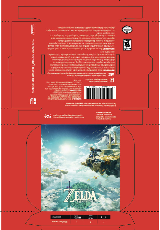
Final Design


Here is the final box design beside the original box! During this phase, I focused on cleaning up the final details. I finished arranging all of the information on the box, fixed the colour and made the inside part of the box that holds the game chip in place. They are made out of 12pt paper that is glossy on one side. The glossy paper helped make the box look much better and it seems to crease less on the corners. It is thick enough to be sturdy and can be stored for a long time.
Unfortunately, I had some issues when printing the final box. The type is blurry, the colour is a bit too dark and some of the patterns in the background didn't show up. However, I really enjoy how the final product looks and feels despite the hiccups. I learned so much during this project and feel ready to take on more packaging challenges with the new skills I have learned through a massive amount of trial and error.
1 note
·
View note
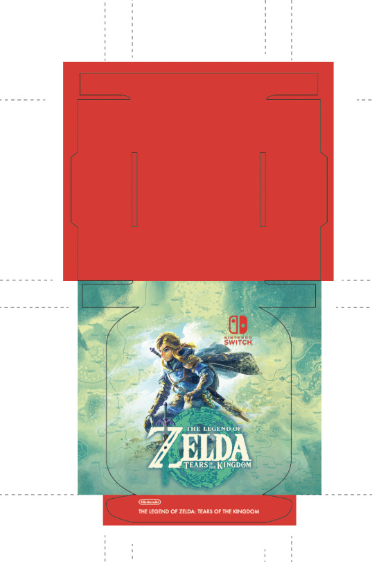
Text


This week, I continued to work on the final version of my box. I added all of the content onto the box and tweaked the box to fit together better. After printing, I realized some of the content was not in the right spot so I updated the design in the working file shown above.
I am really pleased with how the boxes look so far, especially when put side by side. For the final design, I want to add some patterns with the iconic greens of the game instead of just using solid red. I might try just keeping the red on the spine with the Nintendo logo. Additionally, I will try placing the play modes on the side of the box with the age rating and official Nintendo seal.
1 note
·
View note
Text
Application Phase- P1


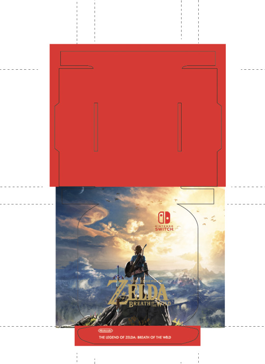
This week, I continued the application phase. I started off trying a new shape for the box. I ended up with a box that doesn't need glue. I did this because of the feedback I got last week. It makes it easier for collectors to take the box apart without destroying it so they can display it.
There are a few changes I need to make to the box, I need to ensure everything lines up better. Additionally, I need to increase the thickness of the box slightly to make it able to stand up. After printing, I realized I wanted the game title on the side instead. so you want to see it when it's standing up. Finally, I need to add the rest of the content to the box and play with the imagery more so everything works well together.
0 notes
Text
Project Rationale Draft
CHALLENGE For this task, I have to figure out how to recreate a product’s packaging more efficiently while maintaining its branding. The goal is to reduce the amount of material you use, reduce the content if needed and find creative solution to the packaging problem. For my project, I chose to recreate the packaging for the Nintendo Switch game called The Legend of Zelda, Tears of the Kingdom.
I think the main constraint I will have to work with is the amount of information on the box and how to put that into a smaller package. I have to consider that these packages are usually made bigger for marketing purposes. I still have to maintain the feeling and vibe of the game while reducing it quite a lot. I also have to consider protectin for the game inside.
APPROACH I plan to create a box that is significantly smaller than the original packaging and that can be kept longer, recycled easily and even collected. Since Nintendo has consistency in their packaging despite what game you are buying, it would be cool if when the boxes were put together, they turned into something that looks good when put together, I could even try to figure out a system where they can lock together.
I want to do this because I find that once you buy the Nintendo games and take them out of it’s packaging, the packaging is not very nice looking. I don’t ever want to keep them around but I do just incase I ever need the packaging again. I also keep them because I am simply not sure how to dispose of them and it feels like such a waste. Nintendo is such a fun brand and I’m sure they could come up with a fun way to treat their boxes that makes them desirable not only just a protection for the game.
OUTCOME I anticipate that I will go with a relatively simple box design and focus on illustration and imagery to market the game. Realistically, I think it might be hard to make a box with a different shape because of storage reasons in the store. I believe I will have to end up making a pamphlet to put inside the box that has some of the information that was on the outside to save space and paper. I want to try to make the box with no plastic and completely recyclable materials.
1 note
·
View note
Text
Creative Phase- P1


In the creative phase, I discovered many things about how I want to approach this project. At first, I wanted to go with a thinner box that was just wide enough to fit the game chip. After making a rough mock-up, I realized that there were a couple issues with this design. First, it can't stand up on its own when it's that thin, making it impractical to display and therefore the package would probably get thrown away. Second, it would be hard to preserve the box when attempting to get the game chip out if it were to be secured in a pocket. I either need to get rid of the pocket that stores the chip or make the box wider. I realized that making the package into a box instead of a case creates a lot more space for details. Since a game case has to open, three sides can't have content. Because of this, I can probably make the box even smaller with the three extra sides.
One thing I wanted to create for the final design but was unable to show in the mockup was little grooves so the boxes can stack together for display purposes. I also want to streamline the design and make it more of a collectible with imagery and patterns that are a signature of the game.
1 note
·
View note
Text
5 Rs Activity


The 5 Rs are Reduce, Reuse, Recycle, Rot and Refuse. I learned a lot from this experiment. It gave me a starting point to get my ideas going. Although most of them are very messy and quick, some of them actually could turn out to be pretty solid ideas. Unfortunately, I had to use a USB instead of a game card but they are about the same size. I particularly liked the ones I created that had unique shapes to them. I know they are not necessarily realistic because the game card needs more protection, but it gave me ideas of what the box could transform into or what could be on the outside for a decoration of sorts. It got me to think outside of the box, literally. Because of this activity, I got more ideas on how to make the packaging into a display piece that consumers will want to keep or even trade.
1 note
·
View note
Text
Project 1- Discovery
In Project 1, we are tasked with finding a product that has an unnecessary amount of packaging and improving it sustainably and creatively.
When I started brainstorming what my package should be, I wanted it to be something I use and find issues with. I was struggling to find something I thought would be interesting to recreate and that I could improve upon. Then I took a break to play my favourite game on the Nintendo Switch. I opened up the case for the game card and realized that the card only took up about 10% of the case. There was so much unused space for no real reason that I could discover. I think it counts as packaging because this is how they are sold in the store. However, they do come with another transparent layer of plastic wrap.
Upon doing research, I found out that it was mostly about marketing. A bigger case allows for imagery to be displayed. This poses an interesting challenge to solve throughout this project. I want to find a way to represent this game with as little packaging as possible. Changing the shape of the box could pose a fun solution.


I was making dinner while watching the documentary The Clean Bin Project. It made me notice just how much unnecessary packaging came with my food. The cucumber comes wrapped in plastic, the tomatoes come in a plastic box, the garlic comes in a small plastic mesh bag, and the chicken has multiple layers of packaging. It made me realize how much waste I made in just one meal. It made me rethink how I can reduce my waste and I will keep that in mind next time I go to the grocery store.
I also learned what it takes to make a good package visually. I was not surprised to learn that a package only has 2 seconds to capture attention and then people will move on to the next thing. Personally, I am always drawn to packages that stand out and that have a great design. It is important to keep the packaging simple and cut down on unnecessary information or else the design will just look too busy and people have to work too hard to filter the information and understand what the product is. I was surprised to find out that branding shouldn’t be at the top of the hierarchy.
1 note
·
View note
Text
Activity 2 Final


I finished replicating the box. Yay! My box (left) and the original box (right), turned out pretty similar. I printed my box through Staples on 11x17 cardstock paper. Unfortunately, I did not get the chance to use the type ruler so some of the type sizes are not exactly accurate. The box is also slightly taller than the original box. If I could reprint the box, I would change the typeface weight from regular to thin for the smaller writing on the box. This is because Staple's printers bloated the smaller text. I would also like to get closer to the original colour of the box.
I learned a lot from this project. Before, I had no clue how to tackle a 3D project like this. Dissecting it and replicating it makes it feel a lot more manageable to do it from scratch. Overall, I was pretty happy with the outcome of this activity!
0 notes
Text
Activity Part 2

During class, I made some good progress on activity two. I started by scanning the outline of my box and then putting it into Illustrator. Although I had the scan and previous measurements, I decided to retake the measurements using the original box. As it turned out, some measurements were a bit off. Using the new measurements I created a rough outline of my box. The test print was mainly to make sure I had the score lines and elements in the correct place.


Unfortunately, the box I printed was too small due to settings on the printer. Despite it's size, all of the pieces seemed to fold together and make a nice little box. I plan to move ahead with these measurements and reprint them when I have exactly replicated the shape of the original size.
While in class I thought it would be useful to find a Pantone colour that matches the colour of the branding on the original box. I found one that was very close and took a picture for my reference when I start designing the box.
0 notes
Text
Activity Part 1
I chose to recreate the box for a face product from the company LA ROCHE-POSAY. I chose this box because of it's simplicity in both the design and the construction of the box. However, even a box which I thought was simple, turned out to be more complicated than I thought.
I struggled with cutting out and measuring the short edges, especially when they were curved or under 0.5cm. I also made a mistake when attempting to separate the glued area of the package. I ended up ripping some of the paper off, making the flap thin and thus harder to trace. Finally, when I was cutting out the top flap of my box, I cut an area that I wasn’t supposed to cut. Luckily the box still holds together but it does not look the same as the original. Although this mistake did provide a good example of how to give the box a different look and way to fold it if I wished.
This activity made me consider what information has to be included in a package and how designers have to work around it. It was interesting to see a 3D design in a 2D form as well. I felt it gave me a more tangible idea of how to approach packaging and it doesn’t feel quite as intimidating.


In the first part of this activity, I had to trace the package on tracing paper. I then had to take the measurements of the box and write the information on one of the pieces of tracing paper. Next, I focused more on the hierarchy of the information and design. I listed them in order based on hierarchy.

Here is my finished box laid flat after I transferred it to the bristol board and drew on the content in some detail. I think it turned out really well despite the fold lines looking a bit rough.


Here is the final comparison of the two boxes! Not perfect by any means but I am surprised with how similar they are considering my lack of experience.
0 notes