
Don't wanna be here? Send us removal request.
Statistics
We looked inside some of the posts by hollymountcastlecreatives19 and here's what we found interesting.
Average Info
Notes Per Post
0
Likes Per Post
0
Reblog Per Post
0
Reply Per Post
0
Time Between Posts
18 days
Number of Posts By Type
Text
3
Last Seen Tumblr Blogs


Fun Fact
Tumblr has a 66 index score for customer satisfaction in the US.
Text
Final

My Final Submission - Evaluation
Once I had finally decided on what I wanted to do, after spending weeks planning something Western and suddenly backtracking and deciding to do something modern, based around a film I had watched only a few days before changing my mind, the final idea came to me quite quickly.
Once I had sketched out all the main components I decided it would be a good idea to include Nottingham as the background. Using stock images of the city I painted over them, manipulating it so that the centre of the city is in view in hopes it’d be recognisable, which I think it is (if you look closely). I had to make up a random area for the character to stand on but overall, the scene is accurate.
I had a hard time choosing what style I would use for the illustration. Did I want to use the film style, original comic style or my own? Eventually I decided to use my own but slightly different, such as slightly over exaggerated anatomy, thick lines, black for the darkest areas and many layers of cell shading. Whilst I wasn’t so sure at the time if it’d work, gradually as the process continued I did and am happy I kept with it.
I used very little textures, only using a stone texture on the platform Miles is stood on due to it being in focus, unlike the rest of the city. I really like how that turned out, however I do feel that I should have added some textures to the character to even it out, the platform now looking slightly too detailed against him.
The colour theme was a challenge, originally having decided on making it midday, but I had trouble making the city blend in naturally with the light blues and almost whites of the sky. As Miles’s suit is black it also made him stand out too much against the light background, so instead I chose night, using the light of the sky, moon and stars to reflect onto the city and character. This allowed me to use thick lines for highlights on the character which I really like.
If I were to change anything I’d add extra minor details like adding some blur to the straps on his jacket and the loose part of his hood, to help visualise that he’s up high and it’s windy. Adding some very minor textures might also have helped make it pop a bit more. If I were to re-do the entire piece I might completely change the pose or add extra characters, but overall I like how this turned out and am pleased with it, especially as I have not previously done any Spiderman/Spider Verse art.
0 notes
Text
Design Process
I started off my planning process by writing down a bunch of ideas. Having initially chosen Illustration as the path I would go down, I looked further at what I could do specifically. Environments? Game Art? Character Design/Illustration?

To help narrow it down I went into some of my likes and inspirations. For example, I have recently been playing a lot of Red Dead Redemption 2 and have been enjoying the world it is set in with its vast landscapes, ranging from mountains to deserts. By choosing a theme I could decide if I wanted to do an illustration, character design, environmental or fanart piece.
I came to the decision of creating a full illustration, possibly including new, original characters and a small animation if I thought it do-able. I looked at what atmosphere, movement and expressions I may want featured, creating a list to base my ideas off.

Now, with some ideas in mind I decided to jump right in and start sketching to help me come to a better idea of what I would like to do. I started with environmental sketches, creating landscapes and including notes of what extra I could include like people, buildings and animals.
The first idea uses perspective and foreground/background. At the front is a hill ledge, where a character or animal may stand looking out at the forest, village, river and mountains below/in the distance.
The second sketch features a camp, very similar to what is featured in the game RDR2. In the centre is a fire, surrounded by logs, skins, tents and chairs. From this I could add characters and set an emotion, whether it be happy or sad.
For the next sketch I did a very basic idea, often seen in books and films where the sun is large and either setting or rising in the distance, with characters walking/riding along the horizon. This would mean there would be a lot less detail in characters due to the lighting but it could be too basic.
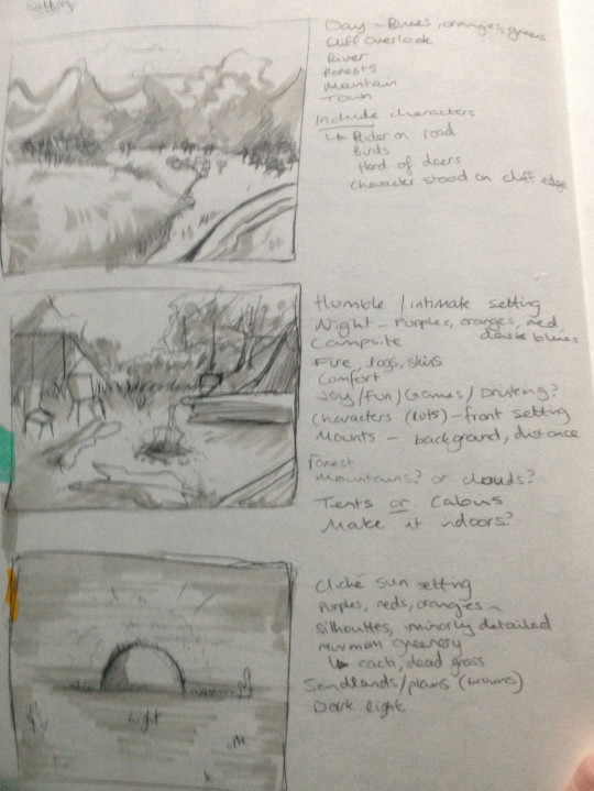
Next I looked more at nature and a different environment, moving up into the mountains where it’s covered in snow and filled with thick pine trees. In the snow could be animal tracks and I could add either animals or characters battling the snow.
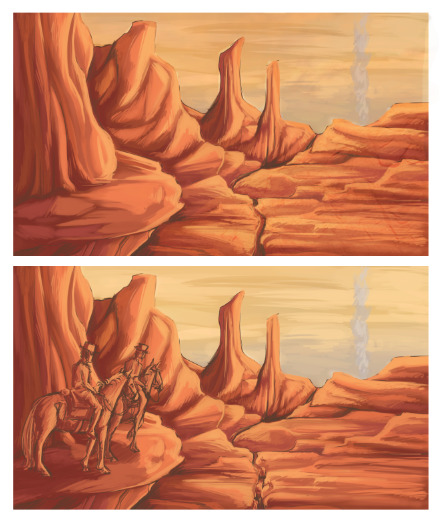
For the fifth, and similarly, sixth and seventh sketch, I looked at rocky environments, similar to places you might find in Arizona, USA like the Grand Canyon. The colour theme would be quite orange but could be edited by setting a specific time of day (morning/afternoon/evening/night). I looked at ways of including characters up close and in the distance, such as higher up on the ledge in the first of this set or following a winding path much further in the distance like the third.
Finally, a river where the point of view is close to the ground, pointing upwards towards a hill that shows a path. Characters could be included going through the water or up the path.

After looking at the very brief sketches I had made I chose some of the ideas that I liked most. For me, it was the final and the ones that included the rocky environments.
Going into slightly more detail and including characters I re-sketched these ideas, combining previous sketches to make a more intricate one, like how I combined parts from each of the rocky sketches into one, by adding the higher grounds with the path below, leading away.

I still wasn’t sure on what I wanted to choose, so to further help me I turned to digitalising these sketches and creating thumbnails for the final piece. By doing so I could add colour and move things around how I like, also allowing me to pick a style to use for the final.
Backtracking I did all three rocky scenes and the river sketch. Whilst both have their benefits, I liked the challenge that came with the two-levelled sketch (bottom left) as it allows me to play with perspective more so than I usually would.

STILL unsure I further finalised the sketches, messily painting over the thumbnails, adding some textures and, eventually, sketching out some characters. Whilst I didn’t go into full colour, I wasn’t 100% sure if I wanted to, at the time quite liking the colour theme. The characters included would be original which if I were to continue I’d need to create simple reference sheets for.
I made sure to include something extra than just a basic environment, in this case the fox in the corner and if I had added more detail there would be prints in the snow.

Eventually, whilst I did like and was very close to finalising the sketch I made for the rocky scene, I thought it over more and realised it wasn’t what I really wanted to do.
I much prefer to include lots of colour in my drawings and was further reminded of this after I watched the film Spiderman: Into the Spider Verse. It easily became one of my favourite films and I quickly lose interest in my previous idea. I wanted to create something with more movement and colour.
As I hadn’t drawn anything similar to the Spiderverse before I started by referencing scenes from the film, sketching the characters and taking note of their body shapes and clothing. My original idea- though I was running out of time by this point- was to include all six spider people in one drawing, but soon realised I wouldn’t have the time nor was I confident enough to do so, narrowing it down between three.
In the end I chose the protagonist of the story, Miles Morales. He had the easiest body shape and I preferred his character design over the others.

The next stage was planning the drawing. I still wanted to create an illustration only this time I would be focusing on the character rather than environment. Spiderman is known for being... well, spider-like, using webs to swing from tall buildings and easily to climb up them with his sticky hands and feet. So, naturally, I created some thumbnails of him featured on buildings or leaping from one (a common occurrence in the Spider Verse film).
I asked the opinion of a friend and narrow it down to the first and last sketch. Finalising the sketches I eventually chose the first one, including Miles’s clothing which he wears on top of his spider-suit which helped add more movement.
Despite the fact there is no theme this year, it’s still the Nottingham Young Creative Awards and came up with the idea of including Nottingham in the background.

0 notes
Text
Research - Design Processes
Waterfall Method
Research
Ideas
Plan
Design
Produce
Evaluate
The Waterfall method is a design process that follows the guide, starting at research and working down to the production and evaluation. It is a good method that’s easy to follow and quick to use. Whilst it does help the planning process there is a fault with such little evaluation between the steps.
What if something goes wrong or a client does not like what has been produced? A lot of time will have been wasted working through the process only to not like the final production.
To make it a much more effective design process would be to evaluate after every step. This way if something needs changing due to preference, not fitting the criteria or just not looking quite right adjustments can be made before coming to a final evaluation and the production.

Linear/Agile Approach
A different method to the Waterfall, the Linear or Agile approach includes a number of different approaches in one.
For one brief you would make a number of different concepts and outcomes that are slightly different. This means that each one would follow the brief but be slightly different in appearance.
For example, if you are given a brief for a form of transportation you could make outcomes like:
Skateboard > Buggy > Bike > Car
Each one looks different but still a mode of transportation. To ensure the outcomes are followed through correctly you evaluate and revisit each step and outcome. However, a negative to this method is if you don’t follow a strict time constraint you may end up spending a lot of time on different outcomes and still not have chosen a final decision. If each step is not evaluated and improved on correctly you may run out of time before completing the brief.

It is up to the designer what method they use as both have their positives and negatives. Overall it is based on preference, but neither has to be used exactly like the diagrams shown. Many designers will follow the basic structure but include their own take. For example, you could use the Waterfall method and included an evaluation in between each step.


My Design Process
For me, the best process that I am most comfortable using and I feel gives the best results is the Waterfall method, but adjusted so that I evaluated after each stage. This way, I can make sure I am on the right track, ensuring the work I am producing is what I want and to the standard that I want.
I will start with coming up with a basic idea before narrowing it down. From this I will sketch out ideas, making numerous ones and developing each one more and more from the last, ensuring I make improvements from the previous one.
By reflecting after each stage and documenting it with notes in my sketchbook, it gives me the opportunity to make changes if I do not like the standard of work or idea.
0 notes