
Don't wanna be here? Send us removal request.
Statistics
We looked inside some of the posts by iasonag-fmp2 and here's what we found interesting.
Average Info
Notes Per Post
0
Likes Per Post
0
Reblog Per Post
0
Reply Per Post
0
Time Between Posts
7 hours
Number of Posts By Type
Text
17
Last Seen Tumblr Blogs


Fun Fact
Kazakhstan’s Minister of Communications and Informatics has blocked the Tumblr site because it contained 60 sites of terrorism, extremism, and pornography in 2015.
Text
Project Evaluation
I started this project by keeping focus in Unreal Engine, I learnt a lot about the ins and outs of Unreal and all the different aspects of Games Design in just a few weeks, I did a lot of research into the Blueprints feature and learnt more about how nodes work and their applications, I then translated this into my own work by using the motifs of some code in my own features, which is a big change compared to my last projects in which I didn’t learn too much in Unreal, but I feel like I’ve had a better experience this project and in future I would like to try and follow guides less and build a better understanding of the Engine on my own using my knowledge.
I dabbled in the Widgets and HUD aspects of Games Design, which also moved into the User Experience and gave me the wider view of player audiences and who could play the game, I feel like in future I should learn to keep accessibility in mind during the start of the project and how the game feels for people to play before I start building up the fundamentals, this is because it will let me build the game on top of the accessibility foundations, rather than building the accessibility around the gameplay.
I also used the Material feature a bit during development, and learnt about Instancing and how it can be used to save time and also make changes in-game, I feel like I learnt a lot about the materials in the Engine, but in the future I would definitely like to learn more about how more nodes work and how they can change how a game looks.
I spent some time in Photoshop creating some crude art assets, while I didn’t learn anything I didn’t already know in terms of techniques, I learnt not to spend so much time on assets, as long as they can convey what I want them to in as little detail as possible, then it worked for me. In future, I would like to try to mix gameplay and art together more symbiotically so I can learn more for each and use these skills together.
I spent the last few days of the project in Maya making some 3D art assets, which in the end I wish I didn’t use due to how low quality they are and the lighting issues they caused. In future I have learnt not to spend time on art unless I have enough time to do so, and to make sure I always save old previous versions of my project in case problems like that arise again.
I spent a lot of my time exploring Unreal Engine and it’s blueprint systems so I could make sure that I created a realistic parkour system. I feel like in the future I want to spend more time planning an idea, because in this project I didn’t get my final idea after about 2-3 weeks, but I would like to make sure that I don’t waste time making a game that I won’t enjoy, and end up using less effort in my process and missing out on features.
In the end I felt like I was limiting myself by taking so much inspiration from LittleBigPlanet and felt like I was going to need a lot of assets to make the game fun. I then began looking into a 3D Free Running game in which I paid no attention to art and instead let the gameplay be the main focus of the project. I had a few problems during development, such as being too ambitious with features such as combat and style points, which I realised would not be possible in the time I had, thankfully I didn’t build the game and the levels around these features so cutting them out wasn’t too much of a problem, in future I want to make sure that I allocate more time to each feature so I don’t spend my time doing nothing, but I will also make sure not to bloat my game in future and only make the important parts of the project, and possibly allocate some time to testing newer features.
I think in terms of gameplay, I have met my expectations and at a push, exceeded them a little! I am really proud of how smooth the movement is and the aesthetics of the menus. I learnt to love the developer art that I made in the end and I wish I didn’t try to change it last minute. I genuinely feel like I have fulfilled my project this time and I really would like to work on it in the future.
However, there were a few issues I had with my actual process, I started off with keeping up with 10 blogs a week, but as the time went by I fell behind due to the fact I struggle to work from home, and I was in college less and less due to the unfortunate timings of Bank Holidays and half terms, in the end I fell behind a lot and spent the last few days trying to pick up the pieces. I also lacked a decent amount of research, but this was due to my thought process being extremely sporadic and I find it hard to retrace my train of thought.
In conclusion, I spent a lot of time practically on this project and made one of the best games during this entire course. I actually spent more time than ever on blog posts in this project compared to older projects and I went into a lot more detail than usual, but in terms of quantity, I am lacking. I’ve never found a good way to work from home and it has always been a personal issue of mine. I would like to find a way to fix this in the future because it holds me back and will affect me during Uni.
I also learnt the importance of time management when it came to development, and spent as little time as possible doing art and focused more on how the game plays and feels, this is something I’ve been trying to fix during college and it feels great to know I’m making steps to better myself.
I genuinely would like to continue working on this project in future because it’s been a joy working on it.
0 notes
Text
Maya - The Downfall of My Project
In the last few days of development, I used Maya to model some assets for the game in the hopes the game would be more aesthetically pleasing. Since level 1 is my proudest creation, I felt it deserved to have models made for it.

So first, I created a top view of the game so I could follow it in Maya. I placed this as an image plane and started to outline the level.

In the end, I ended up with a pretty faithful recreation of the level, with mountains and valleys for vertical diversity.
I then made some wooden planks with a splodge of paint, this was to replace the coloured blocks I used beforehand. I placed the material instances on each asset in Unreal so they reflected the correct colours.

After this, I started to import the assets and place them into the world. As I placed them in, I was really glad to see the game with actual assets and it felt more like a game.

It was only until I left the game for a while and came back, I started to notice problems and pick up on things that were standing out. For example, the game has a lot of lighting issues, the shading is extremely flat and doesn’t give the game the detail and edges don’t pop out as much as they should, I tried to build the lighting and started experiencing big issues.

I never learnt about Lightmaps! Which is how models render lights and shading, this caused some huge issues and it looks extremely odd in some areas.

The cave being a big issue, this part of the cave is dark, where as the left wall is extremely bright and is very jarring to look at.
Unfortunately, I had no previous version of the game that didn’t have these assets in place, apart from one I had built out, so I cannot return to the old assets even if I wanted to. In future I want to make sure I have enough time dedicated to the art, instead of throwing it all in last minute to ensure it looks good and also works.
0 notes
Text
Creating A Survey

I made this part of the survey to give players context on my project, since this survey was also distributed to people who had never seen the project and didn’t know what my intentions were.
Unfortunately, I didn’t get many responses to my survey, but I got enough to get a small substance of feedback.
The questions about the animations and menus were up first, because it was the first thing you would see when you started up the game.

I wanted to give the player a few closed questions so I could make sure I got straight answers, I chose to use the scale so I could get a more “analytical” view of people’s views

I then followed up with a more open question for a reasoning for their answer.
The first response wasn’t entirely helpful, because it doesn’t focus on the actual menu design, and instead everything around it. However this may mean it did a good job and the only thing to point out was the lack of additional assets like a background and music.
The second response was extremely helpful, because I don’t have a 21:9 monitor (like a lot of people) I wasn’t able to test it out on different monitors unfortunately, but in future I definitely have to look into testing monitor sizes when making a HUD.
The third response wasn’t by definition helpful, but it was nice to know that my outcome worked well and fit the theme.

I then asked about the controls menu. It should (hopefully) be the second thing a player clicks on, so they can understand how the game works.
The first response was great, and told me that I should be more differential for the controls so players don’t get confused. However, I’m not sure if I would like to support controller in the future due to it’s lack of turning precision compared to mouse and keyboard.
I then asked about the Basic Tutorial and it’s gameplay.

I got one decent response for the people who said no, however “hamburger cheeseburger big mac whopper” isn’t as helpful.

This is an interesting response, because I thought I did a decent job at showing what each colour meant, but maybe I should telegraph this better by putting the icons ON the materials, rather than next to them.
And again, burger.
I then asked about Level 1, and if the tutorials were succinct but detailed enough for the player to understand how to play.

A lot of the players could sometimes keep momentum, which is good, however I didn’t get a response of yes, which means I may need to work on guiding the player and showing them possible routes. However some people found the lack of direction a good way to let players explore.
I then asked about the player’s overall experience, and if the gameplay felt fluid enough.

Thankfully, the movement got a mostly positive review and everyone enjoyed the wall running system, this is good to know because I feel like the movement is extremely fluid and satisfying. However, a friend found a bug in which you can scale almost any wall by using a bug.
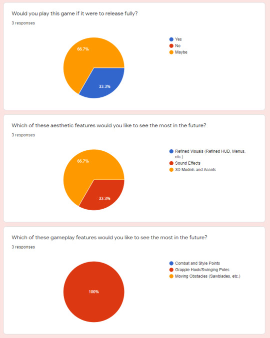
I then asked about any future additions, instead of giving them tickboxes, I let them choose one of the 3 priorities I had in mind. This is so I could put them into a hierarchy. Everyone really liked the idea of a grappling hook!
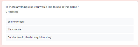
And of course, shenanigans.
0 notes
Text
HUD Elements - Jumps

In the middle of the screen, players have a jump reticle, it represents the amount of jumps a player has to use, and each semicircle is grayed out when a jump is used. I did this because without it, players are not able to see how many jumps they have and when they reset there is no indication, so I added in this.

0 notes
Text
Level 1

Level 1 begins with a blatant first path, but once the player moves ahead, they can see there is a second path to be taken.

This picture shows the route to the right path, which is planned to be in a valley.

This is the lower path which is on the left, it leads the player into a cave/grotto and is close to the water.

When the player reaches the end of the right path, it takes them in towards the caves, but at a higher altitude.

The routes then meet in the middle and the player can then take multiple routes, they can go around the middle and take the wall running option, or if they’re high enough, they can vault through the middle and take one of two paths


On the right, there is a small tunnel which is close to water, which cuts down their time but they must have enough speed to get through without drowning. Or on the left they can take the longer, but safer route.
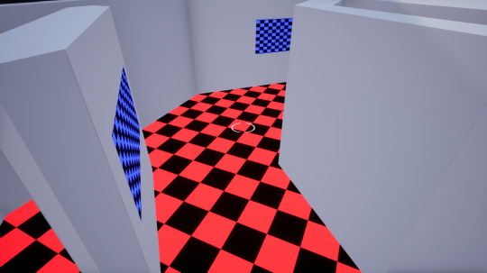

If the player takes the tunnel, they must use a vault pole to get across the gap, but they may lose momentum making such a sharp turn.

Once the players ascend the climbing frames, they can vault straight across, and either take the wallruns or fly over the gap.
It’s planned to have the end of the level overlooking the starting area, to give this a sense of looping and using the phrase of “so close yet so far away”.
0 notes
Text
Advanced Tutorial
As soon as the player loads in, they can see there are two available paths which both lead to the same area, but players can experiment and see which path takes them there quicker.
On the right, the player must run across a wall and then climb up, this means the player keeps their momentum they have kept but will then lose after climbing.

On the left, players must climb first and THEN run across a wall to get to the next area, meaning they lose momentum, but then build it back up after.

After taking this split path, they are met with a vault bar and another split path.

If the player is quick enough, they can split to the left and take a different path, OR, they can take the straight path which will take them closer to the water, giving them less room for mistakes.

If the player takes the left, they will then be able to choose whether they stay above or below the ground. The lower path is closer to the water, and has a focus on wall running. Where as the top path lets you learn the timing to vaulting.
0 notes
Text
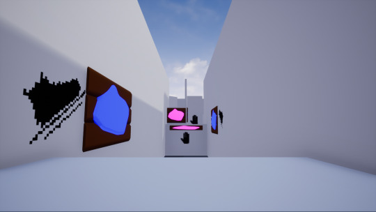
Basic Tutorial
The gameplay of the Basic Tutorial was planned to be set in a safe environment with room for failure, I wanted to make sure it was short and sweet and conveyed to the player how to wall run, vault and climb. I also made sure there were no kill zones so players weren’t punished.
youtube
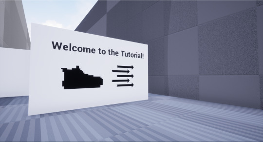
I gave the player a nice welcome, and showed the walking and sprinting icons, so players know they need to move.
Unfortunately I couldn’t use the same font as the menus on the TextRender, but I would like to look into it so I can keep the theme the same throughout.

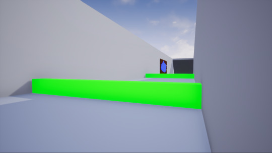
The player’s first obstacle was a big wall that can only be passed by double jumping.
The second part of the wall requires the player to time the jump, so they can get the highest altitude with their jump.

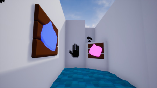
The next obstacle is a wall running section, I used the wall run symbol so people know that blue (or whatever colour is chosen) means the wall can be run on. If players haven’t checked their controls already, then they can check it and see the icon for it.

After this, I then created a larger wall for players to scale, so the player knows that the double jump doesn’t work here, and instead the climb symbol is shown, to show that they can get to higher places by climbing, at the cost of momentum.

At the top of the wall, I placed a vault bar and symbol. The arrow indicates that vaulting moves them up a small amount, but pushes them forward more.
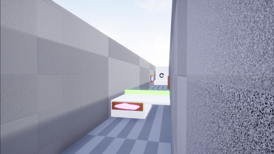
After the player vaults, they take the final stretch, which lets them continue vaulting and also let them run across walls. I also added a small underpass, so if a player doesn’t make it, they can trace their steps and try again.

0 notes
Text
Colour Settings - Accessibility

In the options menu, I wanted to add an RGB slider, this would be done by using the widgets system and the parameter nodes in materials. I would use a scale of 0-255 to let players choose from the 16,777,216 possible RGB colours, giving a sense of customisability. This could’ve been done with both a slider and a text box so players could choose more specific colours.
I never added this feature unfortunately because I never took the time to learn how to change parameters in-game, but it’s something I’d like to look into in the future.
0 notes
Text
Material Instancing

Material Instancing is a great way to have one material with interchangeable variables. I originally planned to use this for my accessibility options, but it has other applications that are extremely useful. Materials have nodes called Parameters, which work a lot like public variables, they can be interchanged to affect other nodes, in my case I used them to change the Red, Green, and Blue values of my materials.
Creating a material instance is as simple as right clicking a material and clicking Create Material Instance.

In the material instancing menu, the parameters become sliders that can be changed from 0-1. For the climbing material I wanted it to be bright pink, so I upped the red and blue values to do so. This made it a lot more saturated, compared to the older colour used originally.

Material instancing is also really helpful when you want to change certain parts of a material without applying the changes and waiting minutes in between. When I made my water material, I was using the World Position Offset variable a lot, and I spent a lot of time trying to get the sweet spot, making this into an instance meant I could change the variables quickly and see the changes happen live.
youtube
I also used the Panner node so I could “animate” the water material to show the flow of it. I used the Parameters named PanX and PanY so I could change these variables on the fly and get the right speed.
youtube
0 notes
Text
Animated Menus
youtube
I wanted to make my main menu as dynamic as possible, so I used transitions that were quick and snappy to capture the energy of the game, and so players weren’t spending half their time waiting for a menu to change. I really enjoyed this part of the game because even though it’s simple to look at, it gives the game character, compared to clicking static buttons.
With the level select, I really wanted to give a preview of the levels before players would jump in, so they can get a taste of what’s to come. Since I never created more than the first 3 levels, level 2 and 3 are blank. But if I wanted to carry on, I would like a Locked Level preview, so players can’t look ahead until they’ve completed the previous levels. However I would keep level 1 permanently unlocked so players can skip the tutorials if they so please.
The pause menu is something I’m very proud of. It conveys all of the controls section while also letting the player see parts of their screen in the background and has buttons to let players return the menu, desktop and (if the feature was added) the options menu, so they can change preferences on the fly.
A menu I would’ve liked to add was a Level Complete menu, which would show up once the player finished a level. It would also show the players time and their best time, so it could be beaten and give the player an incentive to try harder!
0 notes
Text
Pause Menu - Revised

This is the new and final pause menu, it lacks the default buttons from before, and instead the buttons glow when hovered over, to show they have been selected. I also added a trim to the side of the controls menu to transition between that and the paused game.
Another thing I wanted to do was make the colour scheme more suitable for the theme, so I decided to go for a deep red and gold trim, which are regal colours. I also decided to change the colour of the text to white and a black outline, this makes it easier to read against the deep red menu.
One thing I forgot to add in the previous Conrols menu was the reset button, this button is extremely useful for when a player messes up and wants to start again quickly, and when a player wants to improve their speed, they can reset without having to find a cliff to throw themselves off of.
0 notes
Text
Versatile Verbs
youtube
The main button of the game is the Spacebar, it’s used to climb, wallrun, vault and jump/double jump. I did this because having multiple buttons for players to press in a fast-paced game would cause complications of reaching around a keyboard while trying to keep up with the speed of the game.
I also made this choice for comfort, whenever you play a game on PC, your thumb usually rests on the spacebar while your fingers are placed on WASD and/or Shift. This means that pushing space requires no effort!
0 notes
Text
Pause Menu

This was my first mockup of the pause menu, it looks unrefined and I didn’t like the transition from the game to the controls menu, and it without any animations, it felt extremely static.
I used the base Unreal Engine buttons as a placeholder, and was planning on keeping them, but then realised it made it look extremely cluttered and blocky.
Since the game was planned to be set in Feudal Japan, I don’t think that the blue was a suitable choice, so I looked into Japanese colours to use in the final product.
The font I used was one I used a while ago in an older project, and the pixely, handwritten aesthetic is something that I really liked and I personally felt like it fit with the theme.
0 notes
Text
Pause Menu Tutorial
youtube
I knew that once I was making multiple levels, I’d need a way to navigate through to them, so not only would I have a main menu, but I’d also need a pause menu to access during and after levels. This tutorial helped me understand widgets a lot more, and the variety of ways that they can be used.
youtube
0 notes
Text
Accessibility Options
I wanted to make sure I had a wide audience for this project, and since colour was one of the main things the player has to focus on, I wanted to let colour blind players customise the colours of the materials they would be interacting with. I was going to have RGB sliders for each material so players could change the colours in a precise way, because not only does it let colourblind players choose colours that suit them (deuteranopia, tritanopia, and protanopia) and also lets other players customise the look of their game. Players could also use this as a way to challenge themselves by changing all the materials to the same colours.
0 notes
Text
Creating Control HUD Elements
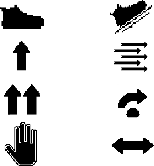
When designing the HUD elements, I took inspiration from Bungie’s UI design. When they create a weapon perk icon, they try to show as much information in the icon so they can be identified and differentiated from. I tried to do this with the walking and wall running icons, the walk icon shows only the shoe, to show movement, I then made the wallrun icon the same shoe on a surface, to show that it’s movement on a surface. I went for black icons to keep them simple and easy to read against the white walls of the tutorial areas.

This sign tells the player to walk and to sprint, without using any words.
0 notes