
Don't wanna be here? Send us removal request.
Statistics
We looked inside some of the posts by iddp-flori and here's what we found interesting.
Average Info
Notes Per Post
17
Likes Per Post
10
Reblog Per Post
7
Reply Per Post
0
Time Between Posts
4 days
Number of Posts By Type
Video
2
Text
13
Photo
2
Last Seen Tumblr Blogs


Fun Fact
Premium Tumblr themes are available from anywhere between $9 to $49.
Video
tumblr


3_ Scenography, dramaturgy and storytelling
Last but not least der letzte Scenography Workshop Tag zum Thema „hospitality“
Schnell entschieden wir uns für den Bereich „Restaurant", da wir dort gleich viele Ideen generierten. Durch die Ideenfindungsphase gab es einige interessante Aspekt und die Entscheidung für eine Richtung gestaltete sich nicht ganz so einfach. Die Grösse des Raumes gab uns viele Möglichkeiten, doch hatten wir aber auch die Sorge, dass wir den Raum nicht ganz „ausfüllen“ würden.
Der Raum sollte während dem Tag und der Nacht verschieden genutzt werden - was durch die Grösse unterstützt wird. Im Gespräch stellten wir fest, dass es nach dem „Ausgang" leider nicht viele Möglichkeiten gibt, etwas essen zu gehen. Die Auswahl beschränkt sich meist auf eine Fast Food Kette oder dem Döner um die Ecke. Schön wäre es doch, die Nacht gemütlich ausklingen zu lassen. Da das Restaurant erst nach 10 Uhr Abends öffnet, kam uns die Idee, Resten aus anderen Restaurants anzubieten. So würde man etwas gegen dem Foodwast machen und im Vergleich eine grössere Variation an Essen anbieten. Im Kontrast dazu würde man am Tag den Platz Künstler aus verschieden Richtungen als Atelier anbieten. Diese Kombination ermöglich einen spannenden Mix aus interessanter Location Kunst und Essen.
Layout Im Zentrum des Raums befindet sich die lange „Bahnhofshalle“ Bank mit Tischen. Rund herum sind verschiedene grosse Atelierräume angeordnet. Gegenüber des Einganges befindet sich der Tressen und die dahinterliegende Küche. In welcher das Essen aus den verschiedenen Restaurants angeliefert wird und ansprechend angerichtet wird. Über dem Tressen befindet sich eine Flughafenanzeigetafel welche den Besucher informiert welche Speisen in welcher Stückzahl angeboten werden. Da logischerweise jeden Abend andere Überbleibsel zusammen kommen.
Material Farbe und Licht - Der Boden der Halle soll im Original Zustand belassen werden. Die Atelierfronten sind aus semi Transparent Wellblech welches in der Nacht mit verschiedenen Farben beleuchtet wird. Es erzeugt eine einladende Atmosphäre und ermöglicht den Besucher einen Blick in die Ateliers zu werfen. Kombiniert mit klassischen Thonet Bistro Stühlen. Die öffentliche Zone des Restaurants ist farblich gekennzeichnet. Durch den Tag wird die Fläche durch das grosse Oberlicht erhellt. In der Nacht wird der Raum mit Neonröhren in violett beleuchtet. So entsteht eine gemütliche Atmosphäre in welche man gerne die Nacht ausklingen lässt. Präsentation - Auch in der Präsentation versuchten wir das „Publikum“ in die Stimmung von einer Partynacht zu versetzen. Im Hintergrund das Video mit Lichteffekten und mit der Tischlampe für die gemütliche Stimmung im Restaurant.
Teamarbeit mit @iddp-flori und @iddp-carina
4 notes
·
View notes
Text
IKEA + ZHdK Pop-UP
Virgil Abloh + IKEA Collaboration
For spatial analysis we had to marry the idea of an IKEA Pop-Up within the ZHdK campus. Once again put into groups and free to choose the type of intervention we wanted to go for, @iddp-sharon, @iddp-jonty and I went with Virgil Ablohs soon to be IKEA collaboration. Since he markets his collection as “democratic design for the millenials”, we couldn’t think of a better place for visibility within the target-market, then the Cascade-stairs in the middle of ZHdK. While analyzing the campus we looked at feasibility, attractiveness, security and logistical factors as well as foot-traffic. So when looking through the collection we came across the vitrine Virgil designed, a simple square shaped woodenframe and glass door and glasshelved construction with the extraordinary feature being a firey red “nail” handle. Since a vitrine is a place to expose your most priced posessions and seen as a more traditional piece of furniture it was already an interesting choice by the designer to add this to his collection, we wanted to work with that exact challenge. While mulling over many ideas we ended up with the concept of an exact replica that we would then blow up in size, so that you would have the possibility to walk inside. The glass as one of the main materials lent itself very conveniently for the purpose of looking inside the vitrine from all the angles and also from the top of the cascades. The idea is that we create a new temporary place to have lunch, but also having a look at the new collection.


3 notes
·
View notes
Text
ACNE Material Board
For this project we had to create a material board that would match a flagship store of your chosen brand. I decided to go with ACNE- a swedish high-end fashion brand that has designed really amazing stores all over the world already. So it was no easy task to find materials that would create this “Juxtaposition” within the space, that this brand is so known for. I went with very cold and harsh materials without much depth or texture at first glance like polished steel, glassbricks and concrete, contrasting them with sweetly colored shag carpet like tables, to show their merch. We tried matching the physical material board to the digital one, which is not an easy task since unfortunately we don’t have access to as many different material samples as we wished we had.


0 notes
Text
Material Week + Kunstgiesserei St.Gallen
This week with Sebastian Lengenhager from NOSE was very enlightening, for he thought us a lot about the different types materials and were to use the different materials with their individual properties and were they might be less suitable. The nice part about it was that you could tell hews talking from firsthand experience and he had already worked with many different materials for various projects which made it super interesting to listen to. The short stint at the Kunstgiesserei St. Gallen was fascinating as well, while mainly making cast-iron for Art, they also manufacture parts for architecture and interiors. We got to see a great deal, how the process from modelling, creating the cast and even pouring the hot aluminium into a cast works. They have one of the most amazing material libraries I have ever seen and an Art-book library with a state of the art organisational-system, never staying the same because the visitors can “ curate” the library on a daily basis.


0 notes
Photo


Scenography, Dramaturgy, Storytelling
The task was to make a concept for a retailer. We decided to design a flagship store for a swimwear brand with the main focus being inclusivity. So we focus just on a very small color palette but offer a lot of different styles.Our main idea was, that you should feel like in a swimming pool under water when you enter the store.So the walls and the floor of the showroom is completely covered with tiles. The ceiling is a big led-screen which shows an underwater clip were a lot of diverse people swim over you, wearing our swimwear.They showcase just one size of the swim wear and you can find all the other sizes in push to open drawers behind the tiles.If you reached the tile counter on the back of the pool you can go to the left or right to the changing rooms. The changing rooms are quite big and have mirrors on all sides. But also curtains, so you can decide which view you want to have and you are less exposed.Every room has an arty and humorous detail like legs hanging from the ceiling that you can use as hocks. You also have a bathrobe and slippers in your changing room so you don’t have to dress and undress again if you want to try on another size or model and walk into the store.
A project by @iddp-nora, @iddp-flori and @iddp-carina
2 notes
·
View notes
Text
Dichtelust
We visited the Architecture Museum in Basel to have a look at “Dichtelust” which dealt with our urban planning and space shortage in urban settings and how we are dealing with it. Great to see, were all the different models, makes me wish I could learn how to build a model as nice as these.


0 notes
Text
Architecture for the People
The exhibit by indian architect and urban planner Balkrishna Doshi was quite eyeopening and made me appreciate the miniature paintings and weird prespective ground plans even more so. During his 60 year career he has realized a wide variety of projects, adopting principles of modern architecture and and adapting them to local culture, tradition and nature.
“ Design converts shelters into homes, housing into communities and coties into magnets of opportunities.”


0 notes
Text
Vitra Design Museum
On this field trip we went to the Vitra Museum, it was very interesting to see bit of the history of some design classics, as well as get inspired by some designs exhibited in the even more so beautiful Herzog & De Meuron Building.


3 notes
·
View notes
Text
Sketching with Serge
Over all these weeks we have been sketching with Serge we tried out a lot of different techniques and although frustrating at times, it was great fun to explore the old-town of Zurich and having to sketch on command or work for a while on one subject, just really being present and in the moment.


0 notes
Text
Milano Design Week
During our short stay in Milano for the design week, we only got to see a few of the many really impressive and inspiring events that were going on in the city. So I will leave my favourite impressions here.


0 notes
Text
“one space for any faith”
The premise of the first assignment for the Scenography and Dramaturgy course was, to create a Religious-Room.
We, we being @iddp-carina and I, decided to not focus on a specific Religion but rather on faith and how we could bring this element into one space that unites all people with any type of faith that they can practice or worship in the same space, since we think of faith as something that belongs to one self and Religion something you belong to with other people that share the same faith.
This project was to be realized within 1 class and we had to decide on one floorpan that would then be used for the rest of the course. Since our floorpan was quite a basic but big room we gave it a bit of warmth by adding textiles that also act as separators, walls with an added acoustic absorbtion. It encourages flow through the space without exposing the bare walls. The textile could either be hung or stand on frames. We would still work with a centre that acts like an altar having a cone like shape that comes from the floor and from the ceiling, giving you something to focus on while you sit around it on curved benches of different heights you can either sit, lean or kneel on. The floor would be covered with a cork material again to absorb any echo of the big space. The room itself would have subdued indirect lighting coming from behind the textile elements, rather dark but still enough you can navigate the space. The altar would be iluminated by the upper cone.
The people could possibly also have an altered reality experience while wearing a VR- set that lets. them decide what it is that they want to worship, hence the inclusivity and the rather minimal space with the same subdued and calm mood.


2 notes
·
View notes
Text
A week full of textiles
This week we spent at the STF-Zurich-> Schweizerische Textil Fachschule.
We got very much in-depth with the different properties of textiles, as well as weaving techniques. Another nice thing that we got to visit was Kvadrat, which was quite fascinating, especially all the innovations they are working on, such as the MDF like material, made out of recycled textiles and the soundproof panels that can also act as a sculpture in what ever room you add them to. We also had an introduction into leather and all you can possibly make with it, as well as care to avoid too much wear and tear.
We got to work an an existing room and only by changing the fabric of the whole room you had to also change the perception and mood of those rooms.
At the very end we got to see the fabric test-lab, where several machines are used for the rubbing tests as well as tearing and flaring etc.
All together we also worked with a shoe-box model and again, were only supposed to work with textiles to create specific environments.


0 notes
Text
For this project we had to make a study on color but we were free to explore our options.
I decided to focus on a few different topics, first I got inspired by the soft color palette of Sofia Coppolas “Marie Antoinette” and that sweet, soft and decadent mood you get throughout almost all the film. I wanted to see if the mood could be translated into a room by focusing on pastel colours. While creating the space, I had no intention to create a realistic room, rather an open space with walls that do not actually separate the space completely. While painting and trying out I decided to go a step further and create an illusion of a room by color zoning, meaning using a wall with a specific color and painting that through to the floor and walls. As an additional study I tried to see how the reflection of a coloured surface turned towards another white surface would change the color of the room, especially if that coloured wall was not seen from the frontal-view. I used fluorescent yellow and red, but the effect was not as intense as I had hoped for, because the space had no roof, therefore it was more difficult to manipulate a single light source. Nevertheless you can have a little bit of a sense of colore-reflection and what it could do to a room without having to color every wall.
Lastly for my third option I opted for a very intense monochrome space trying to create an illusion of no walls, no real perception of depth and an uncomfortable feeling. By using red, very much inspired by “The shining”, I believe I achieved a room with a very exaggerated and almost terrifying energy.


Here you can see how strong light influenced the perception of the colors


I also tried changing the position of the walls.


1 note
·
View note
Text
KT-Color
We had an eye opening experience about color at the KT-Color headquarters. Learned a lot about the effect colours have on a room, how the light you combine with them is essential and the concept behind matching the colours.

Pure Pigments

Pigments in bulk, but more then 250kg is a no-go

Pariserblau -->Picasso during his blue phase

Licht farben-->tones that appear in nature and look better with light

Schattenfarben --> Colors that look better in the shade , also this is le corbusiers original color documentation

In what light does this “Giacometti” look better? the left one has a bit too much harsh white light in
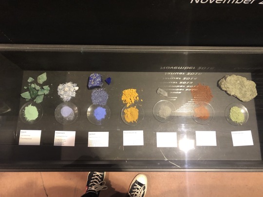
natural resources of the natural pigments

did anyone say Yves Klein?

too many beautiful pigments to choose from...

all rounded up with a more comprehensive lesson on how to combine the different categories of color developed by Kt-Color.
2 notes
·
View notes
Text
“Seeing colors” by Marcus Pericin
What I like most about the light guys ( how we lovingly call Florian Bachmann and Marcus Pericin), is how engaged and into their work and experimenting they are.
Fascinating play with pigment and light in the installation Marcus made in their color lab. Pretty simple with a great effect —> “dunes” made out of pure pigment and a programmed beamer shining on them making the cones appear to change in color and size.


0 notes
Photo


Our first studio project back at ZHDK was a lot of fun since we got to see and plan for a real apartment in Zurich. Faced with the challenge that it was a low-cost refurbishment and no IKEA products were allowed for this project. @iddp-giada and I got to work on this together and it worked out pretty smoothly from start to finish. This whole project entailed a visit to the flat, an analysis of the space and then we went straight into planning. We went on a treasure hunt through several secondhand shops to get inspired and find cool solutions for our family. Great fun and hopefully we will get to work on similar projects in the future.
0 notes