
Statistics
We looked inside some of the posts by illusbylor and here's what we found interesting.
Average Info
Notes Per Post
0
Likes Per Post
0
Reblog Per Post
0
Reply Per Post
0
Time Between Posts
3 minutes
Number of Posts By Type
Text
17
Last Seen Tumblr Blogs


Fun Fact
Kazakhstan’s Minister of Communications and Informatics has blocked the Tumblr site because it contained 60 sites of terrorism, extremism, and pornography in 2015.
Text
Feedback


I received some very insightful feedback that allowed me to think about how I would potentially adjust this project in the future. I think some of my messages came across well, however the link between the salmon and human relationships may need to be stronger to solidify the message. There was also some debate as to whether the fonts I had chosen worked well for the publication. Some people seemed to understand the concept I was attempting: “Deeply upsetting thoughts are being hidden behind the beautiful font” yet others felt the fonts were “visually... inconsistent” and “difficult to read”. Although I was happy with the font chosen, as it reminded me of Anna Fox’s work, I can understand these viewpoints and it is something I would look into further in future edits. Everyone seemed to agree that the use of transparent vellum paper was a successful material choice for the front cover and chapter pages, and that the use of tabs for each chapter was unique and conveyed the notebook concept well. This idea was elevated further by the choice of binding, which supported both ease of access for the reader and diary element.
0 notes


Text
Taking final photos


Final images of my magazine cover below, I used a flash to emphasise the gold and because I love high flash food photography.

instagram
0 notes
Text
Binding my magazine


I used the LCC workshop to print my remaining pages and cut them to A5 size. I then used the hole punch and spiral binding machine. I went for a silver spiral at 6.9mm. The machine was very easy to used once I had been shown by the technitians. I punched each page one by one and was particularly cautious not to break the transparent pages and then I used a machine to press the rings together. I also added one more transparent page to act as a back cover, which was just a simple blank A5 sheet to protect the back of the book. Overall, the spiral binding worked effectively and achieved the desired look for my magazine. I think it was the final touch to making it look more professional.
0 notes
Text
Cutting my chapter pages
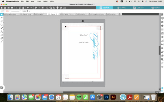
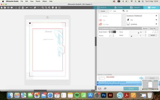


I decided to use my Silhouette cutting machine to cut the transparent chapterpages to achieve the little tabs on the side. I felt that this would create the most professional and accurate finish. Setting up the files were relatively easy as I had created templates in Illustrator which I imported into the software. It took a couple of attempts to get the right cutting depth and then it was smooth sailing from there. I was a little worried that the transparent pages would break as they are quite brittle but it ended up working fine. I have had quite a lot of experience using this machine to make stickers and cut packaging in the past so I found it easy to use without needing tutorials. I think the outcome worked perfectly so I plan to use this more in the future. I felt that the only equivalent in the LCC workshop might be the lazer cutter so I thought this was a slightly better method. It would have been much more difficult and less accurate to hand cut them. Overall, it achieved the effect I was wanting perfectly, so I was very happy.
0 notes
Text
Spray paint experimentation


I used spray paint and paper cut outs to create some simple effects using two main colours. The spray paint was difficult to control but this allowed for some more free looking results. I used one of the phrases ‘pink horizon’ taken from my questionnaire results to test some different outcomes. I also used some fish and wave shapes to create some simple patterns. I added silver spray paint to one which added an extra shine to the piece but I think I will use the piece below in the magazine and it will scan well and its simplicity should compliment the other pages.
0 notes
Text
IVM Mosaic Exhibition


I attended the ‘Mosaic’ exhibition and crit and submitted some of my prints to be displayed. At this stage, the final production of my magazine was very much still a work in progress. I had got caught up with the different methods of production and laying out stage which slowed down the print and finishing stage. I also struggled due to 2/4 riso machines being broken so getting my riso prints done was slow and frustrating. I was unable to do as many riso prints as I wanted to for this project which was upsetting and disappointing. I felt disappointed in myself that I was unable to display my final piece at this exhibition as some of my classmates had said they were looking forward to seeing it. Despite this, I really enjoyed the exhibition as it was very exciting to see what my peers had produced and, as always, I was very impressed by the variety of work. I included some photographs of some of my favourite pieces - the ceramics particularly appealed to me as a budding ceramicist! It was a rewarding day to spend with my friends and share in our successes and we felt relieved to be at this stage of the project.
0 notes
Text
Printing my Riso pages


I used Illustrator to lay out my pages for printing. I made all of the images greyscale and printed each layer one by one, starting from the lightest colour (fluorescent orange), to aqua, and then to black. It took me over an hour to troubleshoot the machine, as I hadn’t used one in over a year and had completely forgotten the settings. I spoke to the technitian about the lines running through my fluorescent orange layer and they said that it is quite common for this colour. No matter how many times I ran the paper through the machine it still came out the same so I left it. I think it ended up looking deliberate so I was still relatively happy with the outcomes. For the fish head character, the layers were slightly missaligned so I printed around 20 copies so that I would have at least one or two perfect ones. After working around the difficulties with the machine, I managed to get the hang of it and was able to print quickly after this. I really enjoyed the process and I’m definitely looking forward to using these techniques more in third year too.
0 notes
Text
Preparing for Riso printing


I set up all the riso files using Procreate. I primarily focused on using 3 or 4 colours that were predominantly mentioned in the questionnaire. I used the ‘Multiply’ blend option on Procreate which allowed me to imagine how the inks may layer in real life. I used stencil.wiki to give me semi-accurate hex code for all of the riso inks.
0 notes
Text
Creating the pages for the magazine
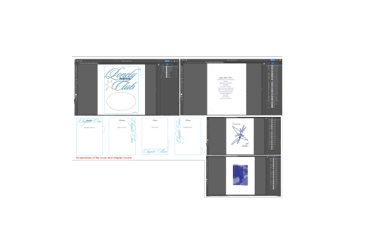
On Illustrator, I created an A5 template for my publication with crop marks so that it was ready to print and cut. On one doccument, I created all the pages which would be printed on transparent vellum paper - the front cover and the chapter headings. I then used another doccument to create every page inside the magazine. Using one doccument allowed me to flick back and forth between pages to check the consistency of colour and type size, so I found this easiest for me. I decided to stick with the colour blue as the dominant colour, as this was the most popular answer in the questionnaire results. I chose the elegant typeface ‘Sloop’ from Adobe fonts, as this was my favourite caligraphic font that I found. It had several weights which added extra curls onto the ends of letters which I found perfect to achieve the intricate, script style that I wanted.
0 notes
Text
Creating a 3D model


I created a small 3D model prototype from air dry clay of one of my characters. To make a stable head, I used newspaper surrounded by a wire frame, created from interlocking circles. Once it was sturdy, I wrapped the clay around to form a base for the head. I then started carving out the features, taking care to consider what they would look like from every angle. After forming the features, I allowed the piece to dry for roughly 24 hours. I then sealed the clay with PVA glue as I was planning to use water-based paints on the piece and did not want the water to damage the structure. I then painted some base coats on the piece. I struggled with this as the PVA resisted the water based paint significantly. I did several thin layers of paint to have a matte surface for the paint to stick to. In the end, I kept the design very simple and based off the character I drew. I then finished the work with an extra layer of PVA to seal the piece and give it a shine. I was considering using resin to seal the piece as I love the strong shine it gives. However, as this was only a prototype and test piece, of which I was not sure if I would use it in my final work, I decided not to. Resin has significant environmental harm as it does not degrade, so I felt that limiting its use would be best for this project. Overall, I was relatively happy with how this piece came out. I found the DAS air dry clay quite difficult to use due to its putty- like texture. I am much more used to working with soft clays used for ceramics so it took me a while to get used to it. I don’t think I will end up using this in my final piece, but if I had more time I could potentially develop this further into full 3D models of my characters, either hand built or 3D printed.
instagram
A friend of mine, Tate, works with his brother to create these 3D printed characters. In the future, I would like to create some work like this, where I mock up my character in blender and 3D print and paint them. I think it creates a really clean and professional finish and brings the work to life. I also love the texture of 3D printing. More of their work can be found at yalocaloffgod and tate.archive on Instagram!
0 notes
Text
Sketches


Based off the research and work completed in Part 1, I started drafting some initial characters and ideas. I took inpiration from the artists Yoshitomo Nara, Charlotte Mei and Ponyo. I experimented with two similar but slightly different styles - one more simplistic and with round features, as seen in Ponyo, and the other more complicated with details and longer limbs. I was really drawn to the sketch seen at the top left, of the child sitting. It felt melancholy and simple yet carry so much emotion, like in Nara’s work. I also drew some fish ideas to be spread throughout the publication and to link to the characters. I think the most successful sketches are the top left and far left works. I feel that they capture the essence and style that I wanted for the publication; childlike, androgenous and thought-provoking.
0 notes
Text
Planning my packaging


The photograph below was some packaging spotted at Gail's.


I discussed with my tutor about how I may package and display my magazine once it is finished. They reminded me that often you see gold trays or backing in salmon packaging and that it is usually vaccum sealed in plastic. I thought this would be an authentic way to tie the concepts of my project into the packaging itself. Below I sketched a rough idea of what the packaging may look like, with a resealable plastic pouch so the magazine can be removed.
0 notes
Text
Planning my magazine


I made some plans for the layout of my magazine. On the right I planned the overall composition of the magazine including a rough colour scheme and how many riso pages I would want to include. I also drafted the idea of how I may use page dividers for the chapters. The main concept was to make the magazine have a similar feel to a notebook or office contract, playing off the idea of relationships/ marriage being a contract. I also wanted it to feel personal like a diary, since I was basing it off my own experiences and those of others. In the plan above, I made a slightly more detailed idea of how I may lay out the text and images. At this stage, I was uncertain as to whether I wanted to go for a maximilist or minimalist approach. I knew I wanted some larger scale illustrations. From these plans, I was able to start making and see where the work led me. These plans allowed as a very unconstraining reference, purely there to remind me of the page count or the order of each piece which allowed me to wander through different ideas in the making stage.
0 notes
Text
Writing the Brief


This brief sheet completed in class allowed me to consider the exact direction of my project. I was able to develop a proper brief for my project through answering these questions.
Below is my developed brief:
I aim to create a magazine that delves into the intricacies of human relationships, drawing parallels between the instinctual behavior of salmon and the human urge to find love. Through this project, I will explore a diverse spectrum of emotions experienced in relationships, from heartbreak and resentment to fulfillment and deep connection. By intertwining these themes with the natural behavior of salmon, I will illuminate the complexity of human relationships in a lighthearted and unique perspective, offering readers a contrasting lens through which to relate and view their own experiences and emotions.
My magazine will appeal to people of my age group and older, regardless of their experience with relationships. I believe that the audience will find elements in each section of the magazine that they can relate to, and I hope that the overall theme and composition will provide comfort and a new perspective.
To achieve this, I will:
- Foster a deeper understanding of the multifaceted nature of human relationships.
- Provoke thought regarding the parallels between human behavior and natural instincts.
- Provide readers with a platform for reflection and connection, encouraging dialogue and exploration of their own emotional experiences.
- Showcase the interconnectedness of seemingly unrelated phenomena, fostering appreciation for the intricacies of the natural world and human psyche.
I will use research methodologies learned in SSP Unit, Part 1 to conduct in-depth interviews and surveys with individuals across different demographics, gathering insights into their experiences and perceptions of relationships. This qualitative data will inform the narrative structure and focus of my magazine.
Drawing on the knowledge acquired, I will explore how these emotions can be translated into pieces of artwork or photography, both literal and abstract. I will integrate a variety of creative making methods to produce diverse textures, representing the varying experiences of relationships. This interdisciplinary approach will provide a holistic perspective and enhance reader engagement.
Finally, I will use feedback from peers to assess the effectiveness of the magazine, informing iterative refinements to ensure that the final product resonates authentically with the audience.
0 notes