
Don't wanna be here? Send us removal request.
Statistics
We looked inside some of the posts by illustrationcoursework and here's what we found interesting.
Average Info
Notes Per Post
2
Likes Per Post
2
Reblog Per Post
0
Reply Per Post
0
Time Between Posts
7 hours
Number of Posts By Type
Text
17
Last Seen Tumblr Blogs


Fun Fact
Tumblr was attacked by a cross-site scripting worm deployed by the Internet troll group GNAA on Dec 3, 2012.
Text
Evaluation
With this project, I couldn’t finish my concept or outcome. I believe this is in part due to being overwhelmed by setting myself too much work to feasibly do within the timeline of the project, as I had planned and worked on coding my own website and blog alongside the project itself which ended in neither outcome to be finished to a presentable degree at the end of the deadline. I also didn’t fully flesh out my concept or composition within reasonable time, meaning that I couldn’t reasonably portray my ideas within the time I had left till deadline, leaving most of my pages as sketches and mock-ups.
As well as this I feel like I spent too much time worrying about what and how I would portray my topic instead of experimenting with visuals and composition. As the topic I chose is very important to me personally, I wanted to put a lot of effort into fully articulating my points and views, however due to this I neglected a lot of the illustrative elements which is most definitely the most important part of the project. I believe if I spent more time on visuals and experimenting within that area, I would’ve had more fun within the project, allowing me to be more motivated to complete it instead of being bogged down by the pressure of having to fully write out and explain every detail of what I am doing, which was unneeded.
There are elements that I enjoyed within this project, that being the experimentation I did with photography on printers and the collage work I did with the metal scraps and found objects; however, I wish I had given myself more time to fully use all the assets I created for this project within the outcome. For the next project, I intend to plan out my weeks and workload ahead of time so that I can delegate myself more time to experiment like this so it can be developed further within the outcome.
Another place I believe caused my project to standstill in development was in part A, as I spent too much time researching and explaining each artist, even after the stated hand-in time for part A. This was unnecessary and in future I believe I need to take more care into assigning reasonable time to all sections of the project depending on their importance to the overall grade, as artist research is only important to your project if it affects your outcome and, in the end, not a lot of the artists I initially looked at did.
I am planning to get specialist mentoring through the university which can hopefully help me balance my workload and time management with my impairments for future projects, as my previous projects have both not been finished to completion or to a standard I had hoped.
Overall, this project has been incredibly disappointing within its outcome, as I believe I could have done a lot more if I had given myself the time and space to do so, however through this project I have done a ton of research and thought into my topic that I would hope to explore further within the future.
0 notes
Text
Final Outcome


Back and Front Cover
Within my final outcome, the only pieces which are fully finished are the front and back cover designs of the zine.
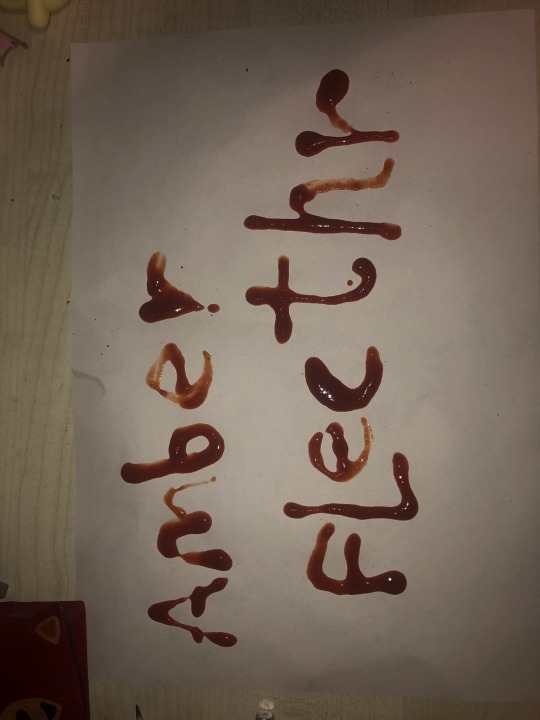
These were made by a scanner, the background is by moving my face alongside the scanline as to make an amorphous, flowy, fleshy design. Overlayed on top is the title 'Luddite' spelt out through metal scraps, screws and bolts.
I tried this approach as I was inspired by the work of Chris Cunningham who often makes work directly based on the contrast of humanity and technology/mechanics in special effects to a grotesque effect. I believe this visual style works well with the topic of the luddite movement as it is about the struggle of working alongside and against advancing technology.
Additionally, for the back cover I added an overlay of one of the metallic scrap collages I made, as to give the impression of flesh indented of burned from metal.
For all of the writing, I handwrote it all myself and digitally edited it as to be concise and crisp.


Due to poor time management, I wasn't able to finish all of my pages to completion, but page layouts and planning can be found here

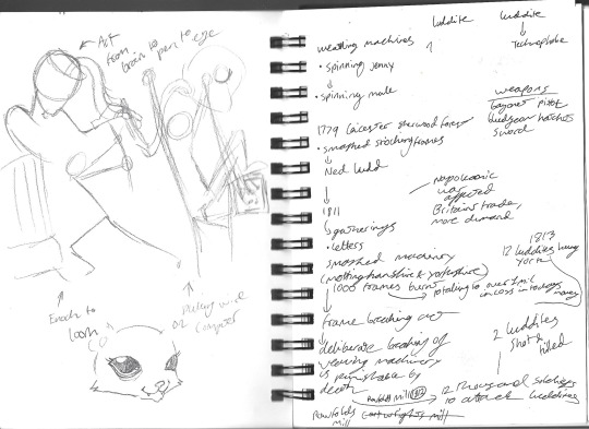
For the first page layout here, I wanted to display an illustration of two weaving mechanisms detrimental to the livelihoods to the workers who would later become luddites, being the spinning mule and spinning jenny. I was able to make some sketches of the spinning jenny here


These would be put alongside each machinery's origin date and its productivity statistics, as to show the risk they posed to peoples jobs.

With this page layout, I wanted to satirise the nature of those who utilise Ai and their reasonings for it.
It a finalised design, I would definitely flesh out the composition, but with my concept here, I wanted to make the work produced as soulless as possible, coming from a cold and sharp server tower and churning out ugly, glossy, inaccurate and objectifying art
My intent behind this is to show the unnecessary nature of generative AI and how it is utilised by massive companies so that they can cut back on paying employees suitable wages, similarly to how business owners at the start of the industrial revolution substituted artisan workers for large factories and cheap labour creating worser quality products for more profit.
If I were to develop this concept further, I would want to cover how AI inherently needs to steal from others in order to function, be it writers, artists, musicians, etc, without their knowledge or permission AI is trained off their work in order to produce something similar in quality. This practise is not only unethical but it also harms artists livelihoods as it makes their work commodified where any other company can imitate them.
I would also like to talk on the dangers of AI in how its harms the environment and can be used for nefarious reasons. AI servers require a staggering amount of electricity and water to function, only furthering the acceleration of climate change through CO2 emission. AI has also became so advanced it has been used already to fake criminal evidence and create pornographic imagery of people without their consent.
It is with this comparison to the luddites struggle I want to convince others to stop using Ai in everyday life, as it not only harms many artists livelihoods but also accelerates and promotes global warming and the spread of misinformation.

With this two-page spread, this was intended to be the first contents within the zine, giving a brief overview and definitions to the two sides of the phrase 'luddite' which I intended to cover within the zine.
On the left with the historic definition, I intended to decorate the page with fabric scraps and fish-net textures, as to denote the origins of the luddites within the weaving industry, notably with stockings.
Alongside this, I would've wanted illustrations of luddites smashing weaving machines as to illustrate the definition.
On the left with the more modern derogatory definition, I intended to decorate the page with a collage of computer parts, such as keyboard keys, wires, motherboards, microchips, USBs, etc to show the contrast in eras in which each term derives from.
Like the other side, I would intend to accompany this definition with an illustration of people smashing computers and computer servers, as to act as a comparison between each definition.
1 note
·
View note
Text
Project Manifesto
Idea
With this project, I am hoping to make
Audience
Intent
0 notes


Text
Sriracha font experimentation
Due to the limitations to solely handwritten text for the project, I was inspired by the graphic design project by Andrey Azizov which is a type face entirely made through writing each letter in sriracha sauce.

(Andrey Azizov's Type)
For my own experimentation, I attempted to write my own name, so It could be used on the cover. Due to the messy nature of the medium, some letters had to be rewritten multiple times to get the perfect shape.


I then isolated the letters and turned them into solid letter shapes and tested how they appeared on the front cover

Compared to the rest of the cover, I believe the font doesnt match, and doesnt give the right atmosphere I am trying to achieve. With the cover, I wanted it to be gritty and industrial, as to feel like a factory, but the font is too round and playful to match the visual style I am trying to achieve.
With this in mind, I will continue to experiment with fonts and hopefully come to a more clinical outcome to match the rest of the piece.
0 notes
Text
Scanography


I decided to try and experiment with scanners after being influenced by the work of Chris Cunningham. Although he doesn't implement scanography into his own work, I was inspired by this shot in his short film 'Rubber Johnny' in which he deforms a face by squishing it against a clear surface and using natural and SFX elements, such as raw chicken, silicon and egg, to appear as if the face is distorting whilst pressed against the glass.

I attempted this affect with a scanner by moving my face, arms, legs, back, etc alongside the scanner line as to see the results.
I thought of this visual style as the topic concerns a lot about the human condition and the loss of humanity within art and culture, I thought to literally distort the human form to the point its unrecognisable would help visualise this concept.
0 notes


Text
Riso Print/Collage

I signed up for the RISO print workshop where we were instructed to create two artworks that would stack on top of each other to give a screen printed affect.
The first piece I did was a collage where I wanted to contrast humanity and life to machinery and technology, I did this by finding images of humans and animals, especially scientific diagrams and metallic looking textures.
I wanted this approach as to me it symbolises the divide between humanity and technology when it comes to the discussion on the luddite movement and AI.
The outcome and other artwork I wasn't able to retrieve, the other artwork was a rushed illustration of a group of people holding weapons and hammers, intended to be a group of luddites.
The outcome in my opinion wasn't affective as I made both artworks too busy, making the final print too busy and the design illegible
0 notes
Text
luddites Research


These notes are taken from various documentaries and articles that can be found below:
youtube
youtube
0 notes


Text
PART B
Part B refers to the development and research into the design of the zine outcome
0 notes
Text
Website Work


Website screenshots


Logo gif designs


Favicon and website banner


Homepage toolbar and background texture
(Original website link can be found here: https://funny-animal.neocities.org)
Initially, I intended to host my blog on an independently run website, however due to time this wasn't possible to be achieved and ended up hindering a lot of the progress needed for my zines development.
Despite the failure to complete this within the deadline and the time it ended up wasting for the project, I still intend to complete coding and designing this website as I would like to build my identity and business within the industry in a way that is independent from large website making companies that rely on professionalism instead of personality.
0 notes
Text
Part A Evaluation
Overall, I enjoyed researching into editorial illustration as I found a lot of unique artists work that I am excited take inspiration from and experiment within my own projects. It was also very helpful for each piece to be categorised as it allowed me to evaluate each work according to this specification, doing this allowed me to assess these works in a higher calibre than I would've otherwise and allowed me to gage a higher understanding and appreciation for their work. Through this, I have gained a wider understanding and viewpoint on how editorial design can be done in effective and unique ways that I hope to implement into my own project.
The elements that I believe I will take most into inspiration for my own zine would be the typographical designs as within my own project, I intend to educate and persuade the audience which will require a fair amount of text.
Despite the positives, in the future I believe I could be more brief in my evaluations of each piece, as it ate up a lot of my time within this project and caused my development of my zine to be significantly delayed. For later projects, I will keep better eye on this and spare longer evaluations for artists which are more influential and important to my overall project.
0 notes
Text
MAGAZINE TOPIC/GENRE
IndustrialnatioN


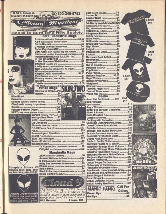


(All pages taken from issue #12 of IndustrialnatioN (1996), can be read here: https://archive.org/details/IndustrialNation12)
IndustrialnatioN was an American independently run magazine focusing on industrial music and the subculture around it starting in 1991 and ending production in 2005.
The visual style of the magazine varied alongside its production, getting a higher budget during it’s lifespan after garnering more subscribers and incorporating glossy and coloured pages.
However, the specific style I will be referring to is its earlier and more synonymous style being it’s original xerox print form. This technique adds a lot of unintentional style to the magazine as it adds a graininess and texture to the print, fitting in with the aesthetics of the industrial music scene.
The magazine’s visual style is very evocative of most DIY fanzines of the time but still sets itself apart through it’s use of original illustrations and designs that are spliced into large walls of text as to visualise the surrounding text and to make the page generally more visually interesting.
Another visual aspect I like particularly in this selected issue is the use of minimal colour. Although brought upon by cost issues, I believe the scarce use of red is incredibly affective within the magazine’s design as it successfully emphasises the issue’s most important pages, being the interview with the band, ‘Ministry’ and the subscription sign-up sheet for the magazine.
The most interesting aspect of this magazine for me is how it documents the industrial music scene of the time. Due to industrial not being recognised much within the music or subculture scene, not a lot of care has gone into archival and documentation historically, however this magazine is a large contributor to documentation throughout the 90’s to early 2000’s.
The magazine takes a lot of space helping advertise underground musical artists, independent businesses selling products and services linked within the scene (tattoos, piercings, body modifications, etc) as well as publishing various readers stories and music recommendations.
Another inclusion in the magazine that I love is the ‘Zine Review’ section, this section gives publicity to other independent zines linked to industrial music, including international publications which may have not seen an audience overseas overwise.
This aspect of the magazine feels the most special to me as it shows how the people behind the magazine really did care about the fan base and the scene itself, promoting other works and businesses related to industrial and electronic music.
Within my own work, I would aspire to achieve this amount of respect and understanding to my chosen subject as fanzines such as this achieve as I believe they have such a unique earnestness in their approach to documenting their respective music scenes.
1 note
·
View note
Text
MAGAZINE TOPIC/GENRE
Send Back My Stamps!

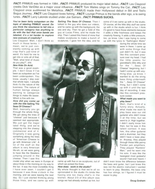

(Website can be found here: https://www.sendbackmystamps.org) (left to right: Diarium Autopsia # 2 (Finland) 1992, Pit Magazine #8 (Colorado, USA) 1992, Wounded #4 (lithuania) 1993)
‘Send Back My Stamps!’ is an Independently run website which archives various zines from across the world focusing on hardcore/rock/heavy metal music from the 80’s to 90’s
Due to ‘Send Back My Stamps!’ being purely an archival website, each fanzines visual style varies, however the examples I have chosen display a variety of compositional and artistic choices that I believe are interesting and affective. The article on ‘Mr Bungle’ is artistically distinct as the interview is interspersed by original illustrations of clowns, this is a clever aesthetic choice as their debut album that they’re promoting here, ‘Mr Bungle (self-titled)’, not only has a clown on the album cover but the whole track listing has a clown theming and carnival-ish sound. The illustrations not only decorate and fill the space within the page but also set up the band as having a goofy and nonsensical style.
The article on ‘Primus’ is also visually distinct in the way it is composed, circling a picture of Les Claypool performing with an interview with him. Lastly, the article on ‘SWANS’ is also eye-catching in it’s use of colour contrast, by using harsh black and an extremely high contrasted image of the band members, it easily draws the readers eye to their article, the composition of the text works in favour too as it perfectly frames the image and band logo, drawing more attention to the photo.
As well as these examples, many fanzines hosted on the site share very similar design characteristics. Such being that most were made via xerox, as most fanzines of the era were, allowing the zines to have an unintentional grimy texture to them. Additionally, a fair few have intentionally very gory, dark or upsetting imagery intending to be as shocking and provocative as possible, emulating a lot of trends seen within heavy metal visuals and album covers.
This website has a ton of helpful resources when it comes to looking for both fanzine design inspiration and historical documentation on the heavy metal subculture and that is something that I find commendable as it is fairly hard to find accessible zine archival both online and offline.
0 notes