Don't wanna be here? Send us removal request.
Photo

Final version chosen, have to admit it was in the deep end with this assignment with illustrator!
0 notes
Photo

Earthtones version of oval typeface following the curves. This version also made it to the final selection. The earthtone palette was an alternative to the gemstone/crystal palette, another source of inspiration that reflected the company values.
0 notes
Photo
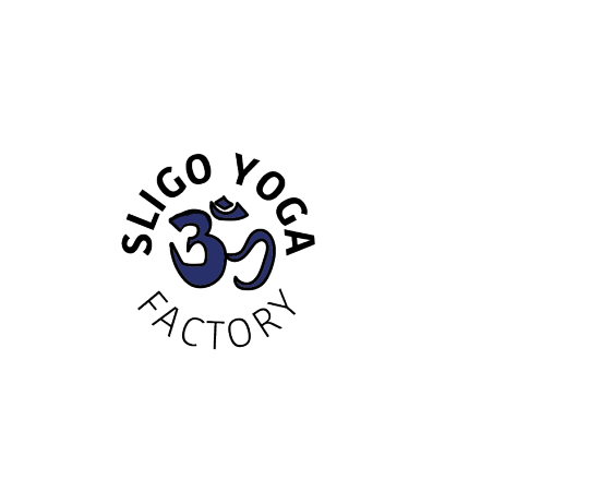
Well the concept made it through, but the actualisation of an OM symbol proved a bit more challenging that my illustrator skills allowed. In this iteration using a purple fill and a strong stroke. Did like the look of the circular text with the OM symbol though.
0 notes
Photo

The version of the OM symbol in black using semi-circular text Kohinoor typeface
0 notes
Photo

The first concept Knocknarea in this variation trying the look for semi cIrcular text above and straight below.
0 notes
Photo

Variation on first idea, Knocknarea semi-cIrcular text all the text above the fold.
0 notes
Photo

First variation on the Knocknarea image using circular text. Concerned this iteration might bring to mind the SLC competitor’s logo for potential local audiences.
0 notes
Photo

Sunrise/sunset sun salutation infinity circle with yellow red gradient, monument extended typeface - two inverted Gs No dropshadow
0 notes
Photo
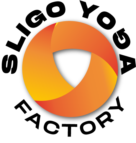
Sunrise/sunset sun salutation infinity circle with yellow red gradient, monument extended typeface - one inverted G and dropshadow
0 notes
Photo

Sunrise/sunset sun salutation infinity circle with yellow red gradient, monument extended typeface
0 notes
Photo

Curved Gobold Bold text curved above using one inverted G and Gobold lite straight below, jade and amethyst oval with a heavy black stroke to define.
0 notes
Photo

Jade and garnet oval straight GObold text above and straight GObold light below. We felt that the two rows of text seems out of symmetry with the mark.
0 notes
Photo

Jade and garnet oval with semi-circular text above straight text below with inverted G
0 notes
Photo
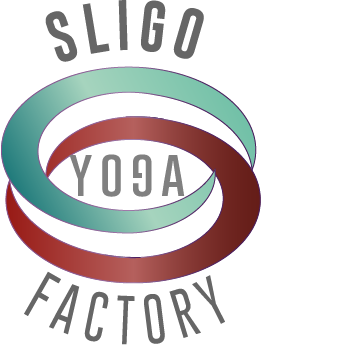
Jade and garnet split oval with GoBold grey text with inverted G. This actually seems a bit out of control. We had wanted to loosen it up a little to see the effect, but it actually loses integrity and starts to dissipate. But you don’t know if you don’t try.
0 notes
Photo
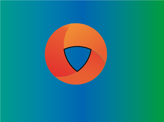


Variations on the infinity circle, using different gradients to try and create an optical illusion of infinity. Trying with red/ purple gradient reflecting harmony between opposing forces and with yellow/ red gradient. The latter reflecting the sunrise/sunset to connect to the sun salutation
0 notes
Photo


Variationson Jade and Garnet oval (split, heavey stoke), earthtones infinity oval and jade and purple with a heavy stroke.
0 notes
Photo
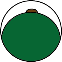


First ideas for logo marks Knocknarea, Om, a broccoli gradient earth, mountain, sky and an upright oval. Have to say I love the idea of using a broccoli gradient.
0 notes