
Don't wanna be here? Send us removal request.
Statistics
We looked inside some of the posts by industryskillsdeantemjit and here's what we found interesting.
Average Info
Notes Per Post
0
Likes Per Post
0
Reblog Per Post
0
Reply Per Post
0
Time Between Posts
12 days
Number of Posts By Type
Text
17
Last Seen Tumblr Blogs


Fun Fact
The total number of visits Tumblr.com received during January 2021 is 327 million.
Text
Task 3: Final Evaluation
What was your final idea?
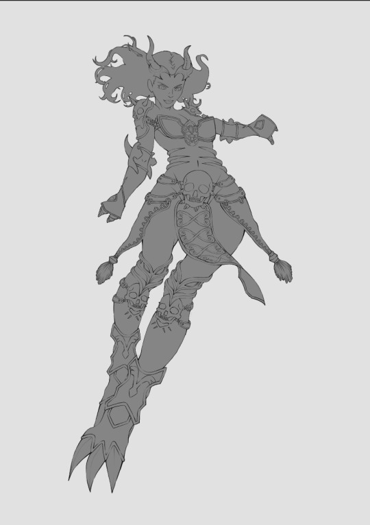
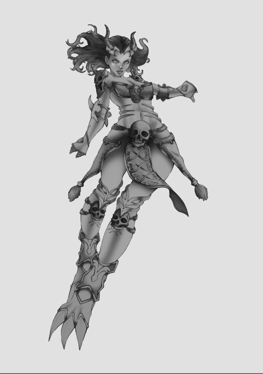
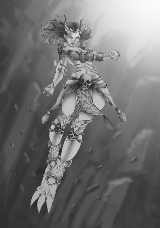
My final idea for this project was to create concept art of the mythological Greek god - Hades. I did research about Hades’ backgrounds and the story behind how Hades became the god of the underworld. These are all of the information that could help me to create a concept for the character Hades which is supposed to be a game character concept art.
How did you arrive at this idea?
I initially wanted to do concept art for Poseidon as it could be interesting to draw the character under the water and a technique that I’ve never tried before. However, instead of drawing Poseidon, I decided that I really wanted to draw the underworld, skulls and flames. The best character that fits this description was without a doubt - Hades.
What inspired you?
My inspirations came from the PC game called ‘Smite’. It’s a game that I used to play 2 - 3 years ago. I can still remember waiting on the loading screen with beautiful concept art, it totally blew my mind away. I was fascinated with the levels of details that the drawing has and how beautiful and fitting it was for the game.
What went well during the final production stage?
I’d say that I did well for painting colours over the greyscale. This was a technique that I’ve never tried before, but I saw many artists uses this technique to find if the values are correct and easily establishing light and shadow.
What issues did you encounter along the way?
My only issues with this project were that I’ve changed my minds over many times during the final production stage. This isn’t a necessarily a bad thing as I am striving to find the best design for the character to make the work look stronger. However, it took time to find references and re-designing the whole idea for the final character.
What have you learnt during this project?
There were many things that I’ve learnt during this project, but the one that I am delighted to have discovered is painting in greyscale and painting colours on top of values. These were the techniques that I’ve never tried before, but I am thrilled to have figured a way around painting with values.
Painting with greyscale is the most important process of creating successful paintings. However, there are also some pros and cons for using it as well, for example, the pros for painting in greyscale is that you’d be able to establish light and shadow faster and it’s also very quick to change from a greyscale painting to colours easily.
Now the cons for this is that although it is easy to get the colours down on a greyscale painting through adjustment layers or blending modes, I’ve noticed that there will be some grey colours still peeking through the colours layer. It makes the painting looked weird, and the colours are also off.
Which is why I tried to use the gradient map on my painting to give some colour information on the painting before putting colours on. This improves it a little bit but not to the point that it makes the colours a little less weird. There will always be more adjustments and colour tonings as this is to our own preferences as to how the character tones should look.
What would you do differently if you could do this over again?
If I could do this all over again, I’d start my sketching as I am now and keep developing ideas the organic way. However, as for the painting, I would like to try painting with colours straightaway as this would improve the amount of time that I took to create this concept art significantly.
What do you like about your final concept art?
What I like about my concept art is that I was able to achieve the results that are what I expected within the amount of time that I had. I also like the ideas generations that I’ve come up with as I do think they all would look great on the character and I would like to implement that if it’s not too much on the character.
What don’t you like about your final concept art?
What I don’t like about my concept art is that it is a little bit flat and I feel like the proportion is a little off. If I do have the option to improve this, I will try to focus on drawing only half of the character as it doesn’t have to be a full body version. Furthermore, the background doesn’t have enough details into them, so it doesn’t tell the viewers where the character is as there are no interesting thing going on in the background and it’s also flat to look at.
Evaluate the use of graphic media, techniques and technology in your own work?
In my work, I created the concept art all in Photoshop, this also includes the sketching process and finalising my idea. The process of creating the sketching and finalising was lengthy as I have to re-create some of the features many times to get to the final results that I believe are suitable to the character. Moreover, there are many techniques that I have used for this process, and to name a few - it's idea generations, painting on a grey scale and painting colours on top of a grey scale painting.
Evaluate the suitability of selected materials, techniques and processes in your own work?
Working in Photoshop was the right software choice as I am more familiar with the software as opposed to other software, namely, Krita, Corel Painter or Autodesk Sketchbook. In addition to that, Photoshop has also been used by many professionals in the industry and many artists.
When it comes to materials, I didn’t use too many brushes for my process as I didn’t need that many brushes for this particular work. There are 2 brushes that I used, which is the inking brush for the outline of the character and the concept texture brush that I both downloaded online. Excluding the inking brush for the outline, the painting was created using just one brush. The reason why I used it was because it has some textures, the edges is a little blurred out, and the shape of the brush is excellent for painting.
I hesitated about the choice of my technique at the beginning as it was my first time painting on greyscale and painting colours over the greyscale which are both equally challenging to apply to the painting. The issues also did occur during my production process as when I tried to applied colours over the greyscale painting, it turned into weird colours which are not the true value of the selected colour I chose. Moreover, some of the greys peeked through the painting when applied colours to it - making the painting look weird and not pleasant to look at.
However, after searching for some tutorials on YouTube and reading some articles online, why this problem occurred, I finally understood the problem, and it’s also a problem that is hard to try to fix it at this point. The problem was that I didn’t fully understand how the greyscale painting works. I am only focusing on how light should always be white in colour and shadow should always be black in colour. Therefore, shading something accordingly will result in using the opposite side of the spectrum and come out with a muddy result.
It does not mean that it will fix the painting entirely as those are the cons that come with painting in greyscale anyway. However, it’s just another way to make it look a little better and find the values that I am looking for.
The process I used for this project was also quite lengthy as I had to do the sketching process, outline my artwork, painting in greyscale, painting over my greyscale and finally, do the final adjustments to make the values correct. I don’t really need all these processes to create my concept art, but I am taking the long and safer way than sketching a quick concept art and paint colours over it which could mess up at any point in time.
What areas do you need to improve?
The background needs improvements as it’s just a rough sketch of rocks that has been blurred out. Moreover, in the final results, I can hardly see what’s happening in the background or get the feel where the character is. I wanted to create a background that has enough details to show or at least tell a story to the viewers.
How will you take what you learned from this project and apply to future work to make a stronger design work in the future?
All the things I have learned during this project are very valuables as I managed to understand more of how greyscale painting works and how to successfully apply colours over it. However, the next time that I try to create concept art, I would want to try to a quick method and paint colours over it. To prevent the colors being mismatched to the atmosphere and the feel of the background, I’d have to create the background first before the character as I’d be able to pick up some colours from the background and apply it to the skin to create some bounce light and ultimately, to prevent the skin from being too saturated.
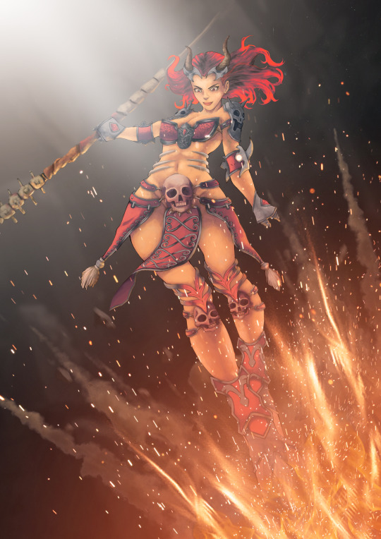
Final results of the concept art:

0 notes
Text
Task 2: Production
After completing the research, creating the mood board and all of the sketches are in place. It is time for the final production. Although I have created the 10 sketches that are already in places, what I usually do is develop more ideas as I go along during the final production. To some people, this may seem like a waste of time and that I should have all of the ideas sketched in the sketchbook before the final production. However, in my case, if I came up with better ideas or designs that I really like, I will change it regardless of the sketches that I’ve already created.
This is a more of an organic approach to doing things, and I preferred it this way rather than being faithful to the original design since I am only focusing on what’s the best thing to do to create an excellent final product.
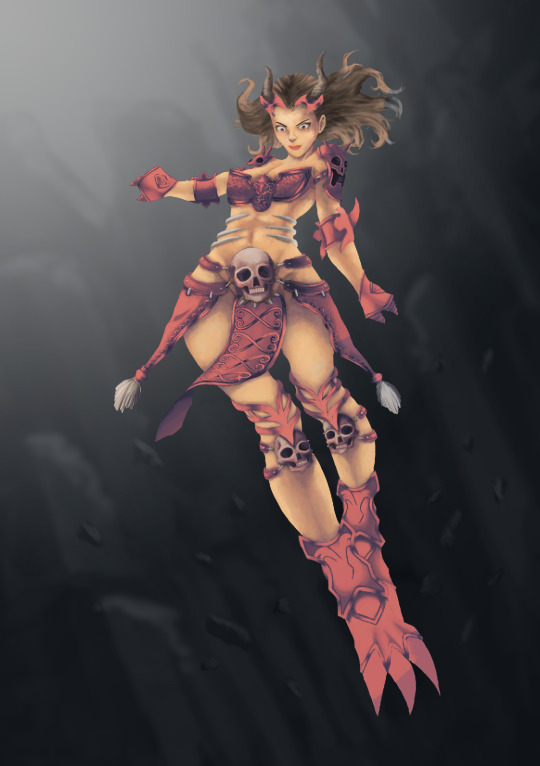
I initially wanted to sketch a drawing of the final character traditionally and was planning to scan in the work that way. However, as I mentioned before, I wanted to push myself to my limit and get out of my comfort zone by doing things. I will be sketching the ideas, do the line work and paint it all in photoshop. However, before I begin sketching, the first step I took for my creation is to plan where the primary light sources will be. In this case, I created a primary light on the top left which came from the light of a portal to get out of the underworld. Another primary light source will be coming from bottom right which is the flame.

After setting up where the light sources are going to be, I then begin the sketch on a new layer. I added features that I had drawn in the sketchbook and implemented to the character to see if I like the look of it.

I then covert the colour from brown to dark grey as I planned to begin doing the outline soon. I’ve also changed the hairstyle as I didn’t really like the short hairstyle I initially created.

Started doing the outline.

Halfway through, I realised that I didn’t like the look of her chest armour so I am trying to think of designs I could create.
I re-designed her chest armour. However, I soon realised that I didn’t like the other parts of her armour as well which I basically ended up re-designed her whole outfit.

I flipped the canvas to get a better view of the character which I then removed her head as I wanted her face to look more mature and as semi-realistic as possible.

I took my time drawing her head which took a lot of time to get the proportion correct. At this point, I had also removed some of her armours and scarf as I do think that there are too many accessories on her which is kind of distracting.

A new design again.
After I was satisfied with how her face looked, I begin to re-designed every armour on her body to create the final sketch version ready to be outlined.

A cleaned outline of the sketch finished.
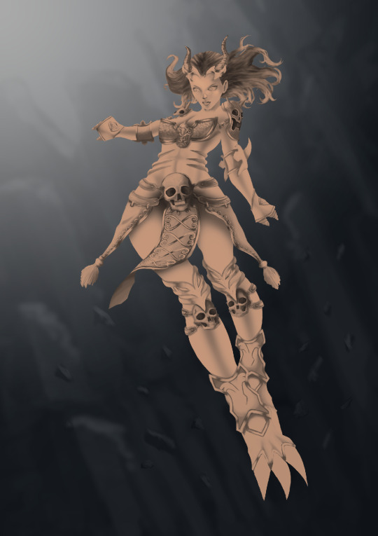
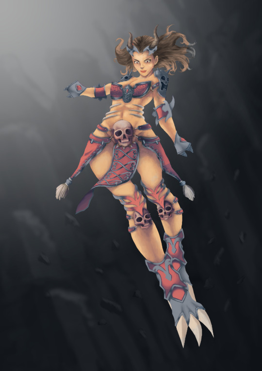
I resized the character to fit the canvas and blocking the whole character with dark grey colour.
There are many ways to approach painting in Photoshop. However, a method which I prefer is painting in values. I believe painting in values is the way to make every painting successful. Colours are just extras. Even taking the colours away, you will be able to read the painting with only values because it is the most important. Moreover, I believe painting in values is easy as I will be able to plan and determine where the lights and shadows. Whereas painting in colours, I will have a difficult time not only trying to paint in lights and shadows but the fact that I have to spend time trying to find the right colour tones as well.

Next, I painted some details on the horns.

I then paint the hair on a different layer as to not mess things up if something does go wrong.

I then decided to re-paint the skin colour of my character as I thought it wasn’t as smooth as I wanted it to be. I blocked out all of the skins using a grey colour which I will then use it as a clipping mask.

The rendering process for the skin is completed - including the face.
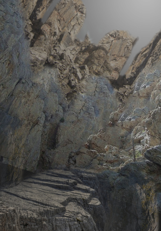
These images are gathered from the internet where I took parts of a particular rock terrain and stitched it together to create the look that I wanted. I noticed that many concept artists used this method to not only get the results that they wanted but to also save time.
I placed the rock images in the place that I wanted to create this slanted rocky hill as it will fade away into the depths.
I painted a rough sketch over the images. It doesn’t really have to be perfect, and I don’t need to put in too many details into it as all of this is going to be blurred anyway.

Applied Gaussian blur to the painting.

I paint some of the small rocks, and these rocks don’t need too many details in them at all.
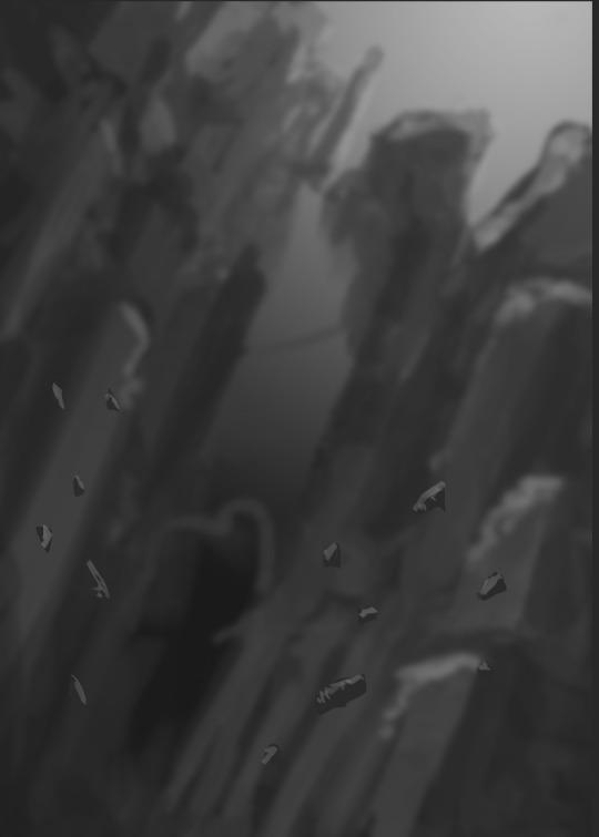
I then applied Motion blur into these rocks as I want the viewers to notice the motion of the rocks where the character is going to be hovering.

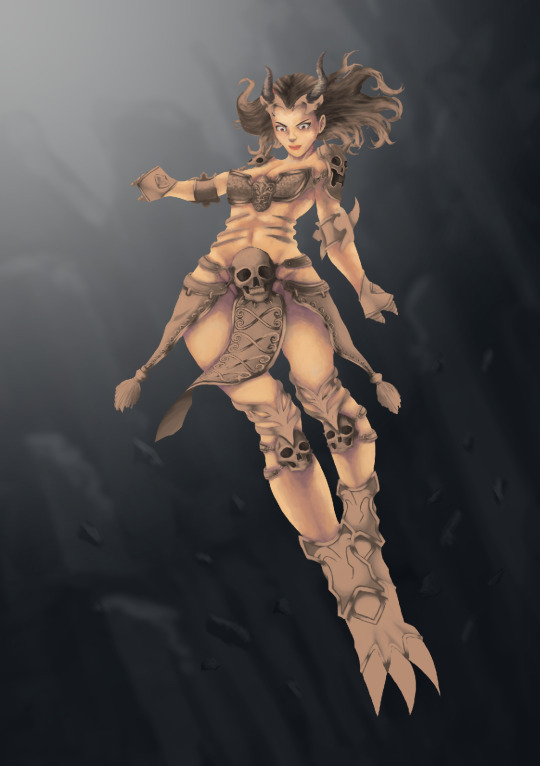
The final process for painting in values where I added the character in and brightens up the scene.
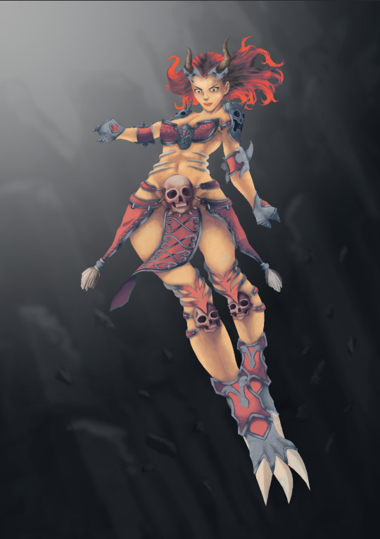
Now that the character has been painted in values and that I have checked that the values are correct. It is now time for me to paint the character in the colours. However, before I begin, since I’m not familiar with how to add colours over the painted values. I did some research by watching Youtube tutorials and see how the artists painted their works.
[video]
One thing I noticed, in particular, is how they keep mentioning that if I just apply colour straight onto the painted values, the colours will look weird and not correct. Therefore, what I did was used a gradient map onto the whole character. This was to give colour information to the painting, and when I do add the colours in, it will look a little bit more natural.
However, there are still a lot more works needed to be done than just adding the gradient map. This was adjusting the tones of the colours, and I will be explaining the process I used to paint my character in detailed down below.
The first step I did was to, of course, add the gradient map. I added the gradient map in separate layers. For instance, the skin, the armour and the hair. To add a gradient map, go to Image > Adjustments > Gradient Map. Furthermore, The reason why I chose this purple to skin tone gradient map was that I wanted the character to have some cool tones on the body parts to show some reflections and bounce lights from the underworld, which is supposed to be purple to cool colours.
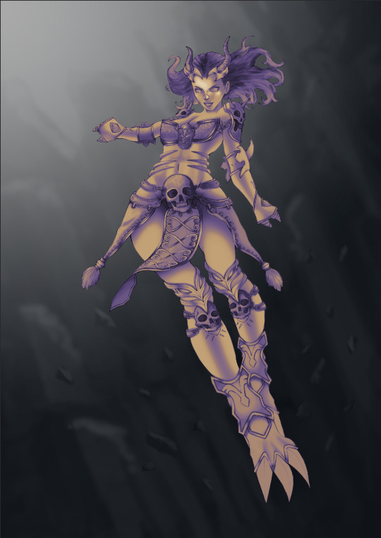
The next step I did was working in layers by layers. I will be starting with the skin tones first and moving my way towards the armour and the hair. For this layer, since I wanted the skin to look a little rough and have this painted feel to it - I decided to paint on top of the gradient map layer. Furthermore, the gradient map provided the best source of colours since the colour was a little purple which is the atmosphere in the underworld that I wanted. All I have to do was pick some purple tones and apply it to the skin to create this bounce lights from the atmosphere.
The next thing I did was adding some highlights to the skin to indicate that the lights are coming from the top left and bottom right.

Once the tones and the highlights of the skin are correct, I then paint another skin layer on top of it to create a more natural skin colour and to add some saturation to it so that the skin tones don’t look weird.
I then paint the armour parts using the brush tool and control select the layer to select all.

I then added a gradient map to the selected layer, and this colour is going to be the primary colour of some of the armour parts.

For all of the white parts of the armour and the clothing, I painted white colours over it but also adding a tint of purple and pink tones onto it to create some reflection.
Next was to add the silver colours to show that it is an armour. The colours I chose was a little darker in blue because of the atmosphere in the background.
I then added a gradient map onto the hair to create this purple to red gradient on the hair.
Although I do like the character without its outline, I believe adding the outlines would make the character look a lot better. However, I won’t be adding all outlines to the character as it’d make the character look unrealistic and flat. I’d just be adding it a little bit so that the form or shape of the character looked better, especially the face.

I then paint a scythe for the character really quickly without the outline. The reason why I didn’t add any outlines was that this was to show the depths that the scythe is farther away from the character. In addition to that, I’ve also set the brush opacity to lower than 50% and painted some areas of the scythe to show that it is faded into the depths.

Next is when I start applying a flame on the bottom right as I’ve initially planned.
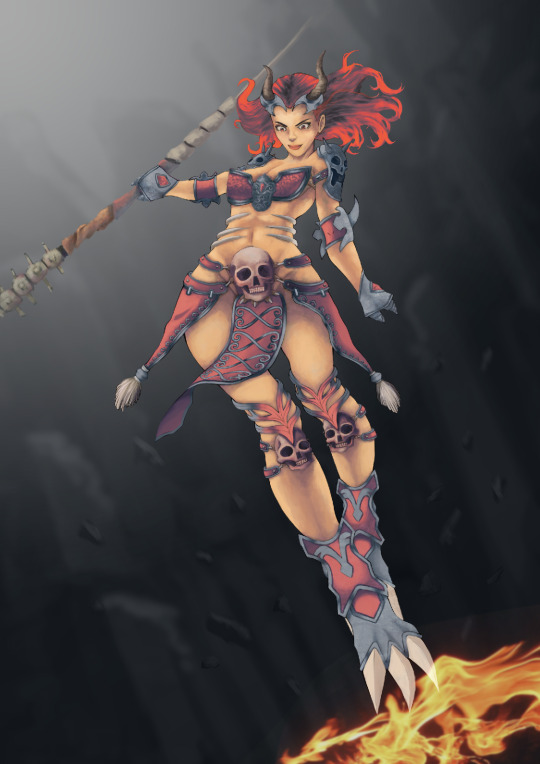
The next thing I did was adding more flames and sparks on the painting to indicate that the character is moving up and by using the flame motion as a guide to where the viewer should be looking.

I then added a warm photo filter to make the skin looked a little warmer so that it would fit with the fire effects. In addition to that, I’ve also made the lights on the top left brighter to highlight some areas on the character.
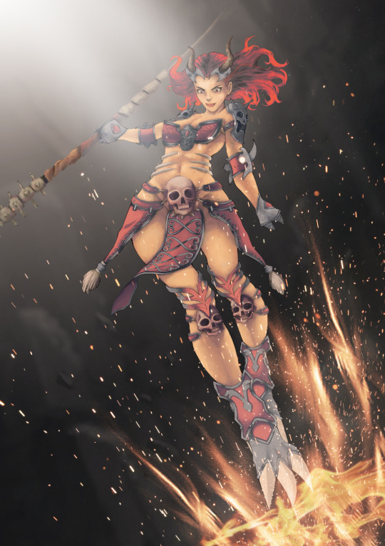
Finally, I then add an orange gradient behind the fire to make the painting look realistic and added a smoke behind it to give some motion effect to the character as if it’s fly through with a heavy explosion. Furthermore, I also added some highlights on the scythe and the character to show some bounce lights from the flames on the object and on the skin to make the painting look better.
0 notes
Text
Task 1: Sketchbook
This is a personal portfolio project which we can choose a project whether it be projects that we’ve already covered or something that interests us, or skills that we’ve already acquired or developed throughout the year and wanted to explore on it further. The task given to us was to explore idea generation for making techniques and ideas in the sketchbook. We are also required to explore on using different materials, visuals techniques and processes.

Before beginning my project, I initially came up with a mindmap - listing all possible ideas I wanted to do. I created the 3 main titles for each category - that is poster design, character design and concept art. Within each of its individual group, I listed all the possible ideas that I personally wanted to do and that it is something I wanted to explore further.
After completing the mindmap, I then decided to go on with concept art because it’s something that interests me the most and something that I wanted to become better at. I’ve only started drawing digitally since the beginning of the year, and I desperately wanted to get better at it since it is a goal of mine. I believe going with the concept art will not only make me improve in my ability in coming with design ideas, but it will also help me push myself to become better at the areas which I am not very good at such as composition, painting with values and getting the overall shape correct.

The list I created is of mythological gods such as Zeus, Poseidon, Hades etc. The reason why I chose to do this is because I am interested in mythological Greek gods and the history behind it. Moreover, I wanted to do it since I thought it would be good concept art for certain video games, and to name one - it would be ‘Smite’. Furthermore, I wanted to see how far I can push myself by doing concept art which I’ve never done before and drawing in a semi-realistic looking character. I am stepping out of the comfort zone to draw something that I’m not very confident at since all I’ve ever drawn was an anime character. However, for this particular project, I will be drawing an almost semi-realistic character as concept art.
Research about Hades:

I then went to research about the chosen character that I am going with which is ‘Hades’ as I thought it would be an interesting subject to choose since its background is amusing. However, the reason why I wanted to do Hades is that I am interested in drawing the underworld, bones and fire which all combine to fit the description of ‘Hades’.
After completing the research, I gathered many images references as I could possibly can such as bones, fire and many things related to ‘Hades’ concerning visualising what my character would look like in the final results.
Mood board 1:

Mood board 2:

Colour palette:


The gathered images in the mood board will then be used as a reference for the sketching process. I sketched out many ideas of what the character will have on its body and what type of clothing will the character be wearing. At this point, I’ve already decided on that the Hades character will be a woman. I don’t want to do a concept art of Hades based on the actual information of it, but instead, I interpreted the information to create a character that I visualised in my mind.
Furthermore, the 10 sketches that I am going to be showing below used a combination of a mechanical pencil of 0.5 mm and different pencils ranging from HB, B and 2B pencil to create the shadings.

For my first page of the sketchbook, I listed items that I’d like to see on the Hades’ character as well as things that are related to death such as fire and skull. These things can easily be incorporated into the designs if need be, but for now, I am just coming up with ideas of how these things would actually look like and designing it to suit my preferences.
I tried to draw an axe but with another blade on another side with designs of mythical beasts embedded on both of the blades. I decided to make the axe as old and to be the style that is similar to Vikings as those axes interest me the most with their fascinating designs. Moreover, I tried to draw a skull using the reference, and this is as a practice since I wanted the drawing to be as close to semi-realistic as possible.
Lastly, I experimented with drawing fire. I used colours to see if the values are what I wanted so that I could incorporate these colours into the final design if I wanted to. For these three colours, I wrote numbers on them to indicate which Copic markers I used.

The second page of my sketchbook includes things like a concept for the character, shoulder plate and armour plate. Since this character concept art is likely will be a game character, the first thing I thought of is the character going into the battle, so it makes perfect sense to come up with armours concepts. I initially was going to go for a male character as that would look more towards being Hades the most and here I tried adding fire to his beards and eyebrows to make him look dominant.
For these shoulder and chest plate, I have drawn them using what I thought was ‘cool’ to add to the design as well as elements from references that I personally think are interesting.

Next, I moved onto drawing dragon heads as I wanted a dragon behind the character, if not is interacting with it. To save time by drawing a full-scale drawing of a dragon, I only draw the head and focusing on the details as I think that's the most important part. I looked at some of the references to get the details I needed for the dragon’s head, and with a little bit of tweaking some of the features, I was able to draw two dragon’s heads that I am satisfied with.

For the fourth page of my sketchbook, I tried drawing various positions of the character looking up and down to see what position I want best in my final design. Moreover, I also started coming up with ideas for my character’s arm. I was going with a scale-looking design that is similar to dragon’s scales or feature that are similar to lava’s cracks as it looked to be something dangerous and powerful. It is something that I wanted to enforce those points into my character design since I wanted people to get those impressions when they first saw the character.

The next page of my sketchbook contains sketches of horns experiments. I used references of goat’s horns as I found the details and shapes of it fascinating. Moreover, I could implement it by designing horns for my character as well.
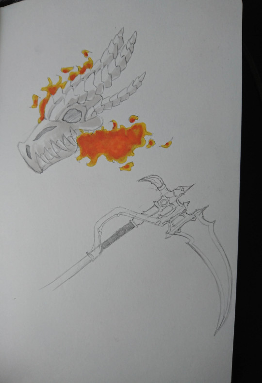
For my sixth page of the sketchbook, I drew another dragon’s head, only this time, I tried drawing a dragon’s bonehead with fire coming out of its mouth. Other than that, I tried to design a scythe which wasn’t exactly the style I wanted, so I didn’t get to finish it.

For my seventh page of the sketchbook, I wanted to draw a full-scale dragon using dragon heads that I previously created as a reference. Moreover, it was more to experiment what colours I wanted to go for when finalising my dragons ideas for the finishing product. I mainly go for the fire colours which I previously experimented as I wanted the fire to be the most prominent central part of the dragon, and it should be the main selling point. The colouring wasn’t the best since I did it very quickly and wasn’t focusing on the details too much and this is all because I wanted to see these colours on the dragon.

The next page contains sketches of small features and designs which would be on the character. Moreover, I tried to design the final scythe which I would use for the final production, and I am pleased with how it turned out.

This page is about experimenting with different types of faces. I experimented and developed a total of six faces that are in the same similar style since I wanted the face to look as mature and as semi-realistic as possible. From the look of the sketches, I may not be choosing an individual face to go forward with, but choosing different features from six of the faces and develop it further during the final production to get the face I really wanted.

For this sketch, I tried to experiment with different types of hairstyles to see which one I would like to implement to my character or choosing the design to go forward with and refining it in the final stage. Some of these hairstyles are from the references from the mood board as I really like the look of it and wanted to use it as part of my development process. Moreover, for the medium, I used a paint brush marker for the hair, and the reason why is because I wanted to experiment with the line weights and the see how they would look.
Overall, I think creating this 10 sketches development was a success and that it is something useful towards creating my final character. It helps me to become more organised, plan and experiment with different design ideas to achieve the final creation.
0 notes
Text
Idea Generation
From looking at my past projects, the techniques that I think best suitable for me to use is creating lists, mood board and sketching. I found it easier to list ideas rather than creating a mind map as I tend to lose my way around of coming up with ideas in mind map. However, on a list, it’s sort of like a bucket list of what I needed or wanted to do and I could create a list of what I should be doing first and so on.
Furthermore, another technique I used is creating a mood board. I often gather image references from Pinterest as I found many great images that are of my interests. Moreover, the sketching part is what I love the most, and maybe it’s because it’s something that I am good at and often found myself wanting to sketch right away whenever I’ve been given a project. I learned this year that a sketchbook should be sketches of quick ideas - it doesn’t have to be perfect, and I could be drawing the same design over and over again to find what’s best for me to use. I used to think that a sketchbook should always contain perfect sketches and it was totally wrong of me to think that it was.
0 notes
Text
Computers in Art and Design
What is a raster image?
A raster image is made up of pixels. These pixels are small squares that can be displayed when enlarging the raster image to a certain extent. The individual squares store information and can be modified with different colours in each square to make up a picture when displayed at a certain distance. Raster graphics are wonderful for rich, full-colour images such as photographs which is why it’s excellent when handling shading and gradients.
The primary factor to identify what a raster-based image is by zooming in and looking at its edges. A raster image will show the image in pixelated or bitmap graphics.

What are the advantages/disadvantages of using this kind of image in graphic design?
Advantages:
Raster graphics are rendered images on a pixel-by-pixel basis; therefore, it can quickly create a sophisticated image with any kind of colour changes and variations.
Raster graphics allow more control during the editing process as it is possible to modify one of those millions of pixel squares. This gives the editor a significant amount of control over the customisation of an image.
Disadvantages:
A raster image cannot be scaled up in size compared to vector based graphics. This is because raster graphics are created with a finite number of pixels and when enlarging the raster image to a certain extent - this will result in the pixel being expanded as well.
Raster graphics are often quite large as it contains all of the information for every individual pixel in the raster image.
What is a vector image?
A vector image is based on mathematical formulas. It’s made up of points, thin lines, and curves which are known as paths. A vector image is always created in computer software, and there is a specific software which is designed to handle vector graphics - Adobe Illustrator.
The primary factor to identify what a vector-based image is by zooming in and looking at its edges. A vector based image will not lose its resolution no matter how much you zoomed in and scaling the size of its original resolution.

What are the advantaged/disadvantages of using this kind of image in graphic design?
Advantages:
A vector based image will not lose its quality when you scale them.
Vector files don’t have a lot of data; therefore, it doesn’t take too much memory space when saving it.
A vector based image has smoother lines with high resolution compared to a pixel-based raster image.
Disadvantages:
Small errors or faults in a vector image can be displayed when the vector image is being zoomed in or enlarged to a certain extent.
A vector image is filled with a solid colour or gradient, and they cannot display multiple colour depth compared to a pixel-based raster image.
What kind of areas of the graphic design/animation industry would you use Photoshop for?
A raster-based graphics will undoubtedly be a good use when designing certain posters or logos where clients demanded complex colours depth that needed to be attributed to the design. This is where Photoshop will come in handy.
Colour correcting photographs could be a way to use Photoshop too as Photoshop allow users to do many adjustments settings to the photographs.
Furthermore, Photoshop is capable of creating elements and exporting it to animate later in After Effect. This is where the users have to ability to choose the different usage of software as Photoshop and Illustrator are entirely two different software, although it does have some similarities.
What kind of areas of the graphic design/animation industry would you use Illustrator for?
A vector based graphics will be put to good use when designing a logo, poster or packaging design for general merchandise. It is a good idea to use vector graphics for developing a logo or poster as mentioned earlier. A vector-based graphics is capable of scaling to at any given size without losing its quality - making it versatile and one powerful tool to use for graphic design.
Furthermore, Adobe Illustrator is a powerful enough tool to be able to export created artwork to particular software such as Photoshop or After Effect. Vector graphics can be easily manipulated and modified which makes it great when using it for a 2D vector or logo intro animation.
What sorts of technologies can you use to work with Photoshop/Illustrator?
There are many possibilities and variations of technologies that can be used and work with either in Photoshop or Illustrator. A camera will work well with Photoshop as it’s a software that handles raster graphics, therefore, allowing the users to put in their photographs that needs colour correcting and adjustments which could potentially make their images better.
Wacom pad or any other connecting tablet devices that are compatible with the machine can be used in either Photoshop or Illustrator. A drawing tablet is one powerful tool as not only does it help with the workflow, but it’s also suitable for doing either vector-based illustration in illustrator or 2D digital painting illustration in Photoshop.
Scanners will also be another technology that can be used in both Photoshop and Illustrator. It allows users to scan their hand-drawn illustrated work to create a digitalised version their work. Moreover, users will also be allowed to scan in their sketches or ideas for their typography or concepts for their illustrations which the users can import the scanned image to the software and be able to digitally develop their ideas further.
How does a camera, Wacom pad or scanner help you develop your creative ideas in software?
A camera allows you to quickly capture your ideas and concept through the lens of the camera and into an image which you can use for a specific software such as Photoshop to develop your work. Moreover, as mentioned earlier, photographs taken by a camera can be easily modified in Photoshop to make the images look better.
Wacom pad is useful in several ways for creative ideas. To be more specific, a tablet will allow you to draw inside the software to get lines that are authentic. Moreover, having a tablet will allow you to expand your creativities as there are many uses for the tablet and how it could improve your workflow at a much faster rate.
The scanner is useful when you want to scan in your hand-drawn work to edit it in a specific software to improve your work or naturally, you want to have you work digitalised and turned it into an image that could work on multiple media.
References: http://chrismalbon.co.uk/the-advantages-and-the-disadvantages-of-vector-images/ https://designshack.net/articles/layouts/vector-vs-raster-what-do-i-use/ https://pixellogo.com/blogs/pixellogo-blog/raster-vs-vector-graphics
0 notes
Text
HERO7
Target audience: Primary school aged students Things that represented Owen: Roses, Bows, Rainbows and hearts.
Upon receiving this brief, I began researching ideas and concepts that revolve around the definition of ‘Hero’. Moreover, I researched the colour schemes and some of the specific design criteria that were given to us to develop a plan for how the final logo is going to look.
There were many definitions of ‘Hero’ and what it meant. It was definitely good research to begin the project as it widens my knowledge of what a ‘Hero’ meant and how I could use some of these definitions to incorporated it into the logo design.
Hero definition:
A person who is admired for their courage, outstanding achievements, or noble qualities.
Brave man
Champion
Man of courage
Winner
Warrior
Paladin
Knight
These bullet points gave me some ideas of what kind of logo I wanted to create. However, before doing so, I researched more of the idea of what a ‘Hero’ truly meant by looking at some images of the word ‘Hero’ and some logo design of it to see every aspect and possibilities for the logo design. I gathered many reference images to create a mood board which I know are going to be useful to use for my logo design.
Mood board:

Colour scheme:
Red
Gold
Orange
Yellow
These are the colours I initially came up with as I do have the freedom to explore my own colours scheme that I can potentially use. However, I wanted the design to have elements that would still represent Owen and his legacy; therefore, I may include some rainbow colours in there as well.
After the researching part is completed, I then begin to sketch out 10 or more ideas of the title ‘HERO7′ - exploring many possibilities and design ideas that would depict what a ‘Hero’ truly meant.
Sketches:


Initially, I developed many plan ideas of how I could use the word ‘HERO7′ to creatively turned it into something that would depict a ‘Hero’. Mostly the designs mainly include how I am going to turn the word into a shield or a sword which would be represented as a hero. There were many fail attempts here, but also some designs which I used to develop further ideas.
Personally, I liked the design idea for the sword as I wanted to use serif fonts to turn the word ‘HERO7′ into a sword. The reason why serif fonts are perfect for this particular design is that I could use the ‘H’ letter and by extending one side of the stem to make it longer which would make it look like a sword handle. Moreover, the serifs in the font are perfect which is used to act as the edge of the sword handle which is why it is ideal for this particular design.

Here I explored different types of typography design and combining it with 3D elements to make the letter stand out. I think it works well and the final production in Adobe illustrator could look much better than this.
In addition to sketching out some initial ideas and concepts, I also would like to expand more ideas by creating it in illustrator which may give me some ideas and colours that I never thought of.

I created this design at the top of my head to quickly generate some initial ideas. I added different variations of colours, but ultimately, it’s the colour of the rainbow which is meant to represent Owen and his legacy; therefore, I would like to stick to that while adding some colours of my own which is to my personal preferences.
0 notes
Text
Typography Terminology
In today’s lesson, we had to create our own typography terminology diagrams using Adobe Illustrator. I created it using a serifs type font and wrote “Typography” onto the art board which are then being used to show the terminology.

What is kerning?
Kerning is a term which is used for the meaning of the amount of spacing between two characters.
What is leading?
Leading is a term used for the meaning of the distance between the baselines of type.
What is tracking?
Tracking is similar to kerning. However, instead of two characters - tracking affects groups of letters rather than individual letters.
0 notes
Text
Glitch Art
What is Glitch art?
Glitch art is a technique which is used to imitate the effect of a corrupting digital data or physically electronic devices.
How did you make your image?
To create this effect, I would first have to find high-resolution images - and to do that, I’m going to use ‘Unsplash’, which has many high-resolution images that are entirely free for use.

After finding the images that I wanted to used and apply the glitch effect on, I then imported the images into Photoshop. On the Channel panel, I selected red layer and press Ctrl + A to select all and Ctrl + T to free transform the image. Enlarge the image as much as you wanted to:

I then repeated the process for blue and green to create a distorted picture. The image should now look like this:
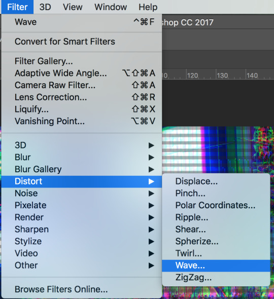
Furthermore, I wanted to add a distorted filter onto the image to make it more interesting. To do so, I would need to go to Filter > Distorted > Wave.
These are the settings I used:

I then went to Adobe Illustrator and create many duplicated horizontal lines. I select all the lines and duplicate the lines onto Photoshop.
In Photoshop, I press Ctrl + T to free transform and resize the lines to make it fit the entire image. I can also adjust the opacity if I think that the lines are too strong.

To make the image even more interesting, I select the rectangle marquee tool and create a small square.

I then fill in the colour in the square selection using the paint bucket tool.

Go to Edit > Define Brush Presets > OK.
Select the smudge tool and change the brush that you’ve created. Smudge certain parts of the image using a variety of sizes to make it looks natural.
Some of the results using the glitch effect:


What graphic design products could this be used for?
Glitch art can be used for implementing it in a GIF or a video to create interesting effects. Moreover, this could be used for a movie poster to create an interesting composition.
0 notes
Text
Applying Rule of Thirds in Designs
In today’s lesson, we were asked to explore the uses of the rule of thirds in a design. First and foremost, we begin this project by using the website called “Coolors” which is a website that allows you to generate random colours and use it for your design.
I picked out random colours that were one of the most popular on Coolors. I then saved it as a PNG, which is later going to be imported into Adobe Illustrator.

In Adobe Illustrator, I created 3 different sizes of artboard to explore the variety of how the rule of thirds is going to be used in the design.
Here are 3 of my designs:
I believe learning the method of using the rule of thirds is constructive in the design, but moreover, it helps make the composition of the design more pleasing and appealing to the eyes of the audience.
Furthermore, it allows me to think differently and approach my design in a different way than I usually does. It's also expanded my knowledge of design and create something that is interesting and also, the fact that I’ve to used a randomly generated colours in the approach of my design, is already improving my ability to understand how each of the individual colours compliments well together.
0 notes
Text
Dragonstone Poster
In this project, we were asked to produce a poster for an author for the book called ‘Dragonstone’ in an A0, A3 and A4 size. The design must include the followings:
Picture of the author
Address
Time
Website address
World book day logo
Nottingham city council logo
Information about the event
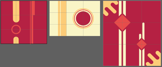
Final design:

The idea behind my concept is to create an imagery of the world in Dragonstone. I created this in the style of a silhouette, but in different tones of colours to make it more stand out. Moreover, I’ve also added a character in the middle of the page to show the epic adventure he’s about to embark on in the world of Dragonstone.
Furthermore, everything in the design is designed by me, thereby I didn’t incorporate images into the design at all. It is designed in Photoshop, and the primary tools that I’ve used to create this design are ‘Lasso tool’ and the ‘Paint bucket tool’. It’s easy to use and efficient when using to create those hills and mountains as it gets the job done fast.
My personal experience for working with a live brief is a little unexpected as I wasn’t expecting the client to, in the later stage, asked us to add more information that is missing on the poster. I’d assume that everything that needs to be added to the poster needs to be given to us the first day we begin designing. Moreover, it gave me an insight into the graphic design world as you will eventually have to work with clients that may ask you to make a few adjustments to the design to suit their needs.
For my particular design, it’s flexible and has rooms for the additional information, so all I needed to do is re-arrange some of the information. However, If the design has little room, I could imagine it would make things a lot harder for me; although it’s possible to resize the size of the text, I wanted to keep it in a format that everyone can notice it from far away.
0 notes
Text
Week 3 - Logo Finalisation
This is the final week for logo creation. As well as producing the logo, we were also asked to provide a MOTTO and present the logo on the following products: T-shirt, cup and wristband.
I came up with a few ideas for the MOTTO such as “Turnaround or shout, the danger lies below”, “Know safety so you won’t have to risk it” and finally I’ve decided to choose “Knowing safety lower the risks”.
The reason why I’ve decided to choose this MOTTO is that it’s simple and straight to the point. As well as that, it’s also easy to remember which is why it is aimed at younger children.
Furthermore, I wanted to go even further and introduce the logo onto some of the products that were given in the brief. For instance, T-shirt, hoodies, mug and wristband. I displayed the products with the logo on it to provide the client with a better idea of how the logo would look on the products that were mentioned in brief.

Mug with the logo.

Wristband with the logo.

T-shirt with the logo.
To use the mockup is very simple. In the folder, there will be a Photoshop document for the mock-up. One of the layers inside of the document will be a smart object. Double-click on the smart object to get a new window where you can replace the logo on there. Click save once finished.
What areas of your design were successful?
I believe I have successfully created a logo that is meaningful and iconic. I’ve also given it a lot of thoughts and deciding what’s best to put into the design as well as the meanings behind them.
For instance, I showed the concept of a wave in the form of a hand to not only send a message of danger but to illustrate the sense that it is something to be aware of as it’s dragging people lives down, and I also used the gradient colour on the wave to show the depth of the water.
Furthermore, the heart is made up of connected triangles to convey the meaning of strength and that it resembles OWEN because triangles are the strongest shape and that it is unwavering to the strength of the wave.
What area do you aim to improve in?
After taking a look at the final design, I can say that I like the way it looks and the reasoning behind it. However, If I could improve the design, I’d use the colour purple more as it is the primary colour that has to be included in the design. I’d also need to add an iconic feature of water safety such as safety ring which should have been incorporated into the design to make it more recognisable to the audience that this is a water safety logo.
What elements of your logo successfully met the audience’s needs?
I’ve incorporated everything that was in the brief. For instance, I’ve used water to represent the wave, heart that has rainbow colours inside of it and the purple colour used for the font.The design of the logo is iconic yet straightforward, which is the look that I am going for.
Furthermore, the design of the logo is friendly as the target audience age is going to be 4-year-old or more. I’ve designed a logo that is clean and is colourful because younger children like vivid colours which are used to grab their attention. Although the lowest target audience is age 4-year-old - they will not understand the concept behind the design and the whole idea of water safety. Therefore, the alternative target is aimed at adults and parents to be able to inform them of the dangerousness of the water. Which is why this logo is suitable for the target audience’s needs as it’s designed to be colourful - which are aimed at younger children while the whole design is friendly and modern which is suitable for teenagers and parents.
What could you have done to meet the target audience’s needs more?
What I would do to meet the target audience’s needs more is using saturated colours for the design. I’ve mainly included tertiary colours into the design because I thought each individual colours complement each other well together. However, it should have been more saturated to grab the audience’s attention, especially if it’s going to be aimed at younger children.
Furthermore, for the younger audience’s needs. I wish I could create character design such as a fish or duck to incorporate in the design to not only make a good impression and easy to remember but a fun way of teaching water safety to the more younger target audiences.

Doing this project really gave me an insight of how working with a client can be a challenging task. My personal opinion of them was surprising since the requested logo was a little unexpected. There were many elements that need to be attributed to the logo which is the challenging part. Moreover, it’s a great experience for me to pitch the concept and ideas behind the design to the client, plus receiving feedbacks from them as well.
0 notes
Text
Week 2 - Logo Design and Production
After week one for idea generations has been completed, it is time to move onto digitalising the logo. I chose to use Adobe Illustrator for designing my logo because it is a vector based software and is excellent for developing logos.
Step-by-step on how I create the logo:
Step 1: Open up a new A4 Illustrator document and set the orientation to horizontal.

Step 2: Select the ellipse tool and create a circle while holding the shift key to make sure that it stays the same size.

Step 3: Duplicate the shape again by holding down the alt key and dragging it. Change the size of the form and place it on the left side of the original shape.

Step 4: Select the pen tool and create a shape that covers one segment of the shape.

Step 5: Select all of the shapes and select the shape builder tool. Now press and hold the alt key to make the minus icon appear.
Click on the area you wanted to remove while holding down the alt key.

Step 6: Duplicate the shape again using the alt key.

Step 7: Select the direct selection tool and click on one of the corners and drag it in to create a curved edge.

Step 8: Place the shape on top of the original shape and keep duplicating the shapes to create a form that looks like a hand.

The reason why I wanted to create a wave that looks like a hand is that it could send a message of danger and that it is dragging people’s lives down.
Step 9: Select the gradient tool under the colour palette to create a gradient effect for the shape.

Step 10: Over on the gradient adjustment panel, instead of linear, select Radial.

Step 11: On one side of the gradient scale, double-click on the downward icon to select a darker colour blue. Select lighter colour on the opposite of the scale.

To adjust the radial of the gradient, merely select the gradient tool which will bring up a scale that you could move and rotate around to get the radial to where you wanted it to be.


Step 12: To create a heart, select the ellipse tool and create a circle while holding down the shift key.
Step 13: Select the pen tool and start from the left side of the circle shape. Draw a curve that makes up half the shape of a heart.

Connect the final line together to complete the shape.
Step 14: Duplicate the shape again by pressing and holding the alt key.
Step 15: Right-click on the shape to get a pop-up menu and select transform > reflect > vertical > OK.

Step 16: Place the other side of the heart shape to align with the original.

Step 17: Use the pathfinder tool to merge the shape together as one.

Note: If you don’t have the pathfinder tool in Illustrator, simply select on Windows > Pathfinder.

Step 18: To complete the heart shape, select the pen tool again and create a curve on the gap between the shapes.

Step 19: Once the heart and the wave has been created, it is time to develop connected triangle shapes inside of the heart. To do this, I’d have to form a mask layer.
The reason why I wanted to create these connected triangles inside of the heart is that the I thought that these connected triangles could resemble OWEN as the strongest shape is a triangle. Furthermore, I added rainbow colours to these shape so that they could be recognised as a prism which in itself, creates a rainbow effect.
Step 20: Select the pen tool and create distorted triangle shapes that connect to each other.

Step 21: Once all of the shapes have been created, create gradients for each individual shapes and adjusting which colours go well with one another from the rainbow colours.

Step 22: After completion, select all of the shapes and right-click to select group.

Step 23: Move the grouped shapes behind the heart shape. Then select all of the shapes together and right-click to select make a layer mask.
It should look something like this:

Step 24: Now place the heart shape inside of the wave shape.

Step 25: Before finishing up the vector logo design, I didn’t like how the excess sharp edge is coming out. To remove this, select the pen tool and click on the corner which should show the icon of a minus. Click on it to remove it. However, I didn’t want to eradicate the effect. Therefore, I’ve left out one of the sharp edges on there.
Step 26: I then created a text for the name of the charity “OWEN”. I used the font called ‘Novecento sans wide’, which I thought it’s a strong and bold looking font to attract the viewers’ attention.

I’ve also added the colour purple to the font to fulfil the given brief as it is Owen’s favourite colour.

Step 27: Finally, I created the meaning of the abbreviations of “OWEN” under. I used the font called ‘Hero light’. However, I decided to use a light version for this because I thought it would work well with a bold font.

Final results:

Process:
For week one of idea generation, I didn’t design this logo in the sketchbook at all because the idea wasn’t coming through at the time. However, after creating many concepts of the same logo that I’ve sketched, it gave me a plan to develop this final piece. You can see the developing ideas down below:

I’ve generated many plans during the process, and I’ve created these many logos to know whether I like it or not and if I should pursue the design in the final results. During the process, I thought that one of the logos is good enough to be in the final design. However, after taking a hard look and give it a lot of thought if it would meet the client’s needs or not, I’ve decided not to use it and keep developing many ideas as much as possible.
I believe it’s a great idea to follow and be faithful to your idea from the beginning as you will have more time to plan and improve your idea that way. However, I like the organic approach which sometimes ideas naturally came to you even for the last minutes - and this is precisely what has happened. I didn’t initially planned for this idea to happen and is something that pops into my head the day before the logo was to be submitted.
I had a look at the many different versions of the logo that I’ve previously designed. None of them really gave a look that could be used for water safety. Personally, I think it looks nice. However, considering this is going to be about water safety; I see no relation to water safety from the logos at all. I noticed that I created something that would be of convenience to fit the given brief, but I wasn’t looking at the picture that this is for water safety and there must be meanings behind what I’ve created.
0 notes
Text
Week 1 - Idea Generation
In this week one for this project, we were asked to design a logo for OWEN (Open Water Education Network), which is set up by Owen’s family. We were asked to create a logo that has the following attributes:
Water
Rainbow/ Rainbow colours
Owen’s signature or initials that he wrote himself before he passed.
Colour purple (Owen’s favourite colour)
Hearts, roses and bows which represents Owen.
We were also asked to come up with a MOTTO as part of the design. Firstly, to begin the project, I find the connections between the given list and decide what would be the best option and solution for the design. However, I needed to do more research first before I begin the sketching phrase.
I researched the ideas around logos that has water. This is to get the general ideas and inspirations towards my design as I try to come up with an original idea as much as possible. I started making notes as I go along, coming up with ideas and annotating some of the meaning behind the logos as well.

I do the following for rainbow, hearts, roses and bows to get the general ideas I needed. I then begin to make notes of the associated meanings behind different colours. However, in this particular design, the task was to design a logo to the given attributes, but usually, on a logo, it’s best to keep the design simple and colours limited to no more than three. In this case, I’d have to include the colours of the rainbow, which is a total of 7 colours while adding the purple colour and adding other attributes to the design as well.
After all the notes are written and knowing what I’ve to do, I begin the sketching phrase. This part of the process is usually fun and free from stress, and that’s the reason that people can come up with great ideas generation. I try to do light sketches as it doesn’t have to be a perfect drawing. One design after another and trying to see what would work and what would be the best option for the design.


The images above show the steps and developments which I have developed during experimenting. I decided to go for a heart that represents Owen. The reason is that I believe I could use a heart as a design to interpret the meaning of life.
I decided to use this to portray the meaning of the logo since I wanted the logo to have a purpose and that people should know straight away that this is a water safety logo.
I developed many ideas as I go along, some may look similar, and some will seem completely different. I usually try to draw each design, roughly around 4-5 minutes since I don’t want to spend a lot of time trying to make it look perfect. I’ve used the brief given with the attributes to the following designs to find the final results that I liked the most. I combined water, rainbow, purple and a heart into the developed ideas. However, because many things are going on, adding all of the above would just be chaotic for a logo.
Therefore, I tried my best to combine, but also eliminate some attributes at the same time as well. For example, the rainbow colour already has purple colour so adding another purple colour to the logo design would just be too much. I solved this by using the rainbow colours but highlighting the colour purple as a main to solve the problem.
Furthermore, I noticed that the developed designs have successfully managed to follow the given brief. However, as someone looking at the design, one would probably wouldn’t know what the logo is designed for.
I scratched the ideas and created a more simplistic but meaningful logo instead. The last design that I did shows a droplet with a hand inside grabbing a heart. The message indicates that this logo is about helping people to stay safe in the water. I really liked the design and might use this as a final result as it’s met the given brief, but also have a meaning to it as well.
I then went on to develop ideas for a MOTTO and the final version that I’ve decided to go is “Know safety so you won’t have to risk it”. I tried to keep it as simple as possible as I wanted the message to go to people that it is essential to know the safety first.

The two primary colours that are associated with this logo design is blue and green. This design of the logo is generally representing ideas of safety through the related meaning of colours. I noticed how the colour gradient changed from dark blue to lighter green. This could generate an idea that from darker colour blue to lighter blue is represented as the depth of the water. The colour green can be associated with life, energy and safety. It has been cleverly used to describe the idea of safety from dark blue to the green colour in the measure of dangerousness.
Furthermore, since the associated meaning of the colour green is safety; it can have a conveyed meaning in the logo itself since the dark blue and green colour has been gradient together. For example, the left side being the non-safety while moving along to the right, the tone changes from light blue to green, which explains the danger of the water. Moreover, the typography is aimed to be swerved and move in unpredictable directions to represent the idea of a wave.
Finally, I noticed three different things that are cleverly being represented here in the logo. Firstly, I noticed that the letter “i” is in the shape of a human form. Secondly, the colour of the letter “i” is completely in green without the gradient. Lastly, The direction of the letter “i”, which is being represented as human – turned in the left direction. Based on what I’ve analysed before, this could mean that they are warning people to stay safe before going into the water or perhaps, always make sure you’re safe while going into the water.
There are also two primary colours in this logo design as well – blue and red. This design is a more simplistic design but enough to portray the image that this is a water safety logo. I noticed that the typography “Swim” is swerved in a particular direction such as the wave. It’s cleverly used the represented idea of the wave and transformed it into a text.
Furthermore, I noticed that the letter “i” is in a different colour, red. The colour red is generally associated with the meaning of danger and warning. As I mentioned before that the letter is moving like a wave, the letter “i” can be represented as a person is swimming in the right direction. However, not only does the letter “i” can be visualised as a human but it’s also in the red colour. This could send the message that there are many dangers in the water and that people should be careful.

What I’ve noticed that are common among these water safety logos is the colour. They seemed to have a limited amount of colours used in the design and that the design is simple and minimalist. This logo design is pretty much straightforward, there is no hidden lettering or graphic to portray a message as the image graphic used on here is self-explanatory. The colours associated with this design is only orange and dark blue. The colour orange can have associated meanings such as joy or encouragement. However, there are more to it than that. The colour orange can be iconic since it is the colour of life jackets which could be presented as help, and the dark blue colour can be shown as deep water.
The logo design revealed 2 hands in different colours – blue and orange. Blue, appearing to be drowning as the other hand, orange, appeared to be helping. Moreover, I noticed that there is an orange circle line over both of the hands. I believe it can be portrayed as the associated meaning of the colour orange – encouragement. It could have a meaning that there’s always help and hope around us.
0 notes
Text
Perspective Grid Tool
How does it work?
A perspective grid tool is used to create 3-dimensional work. It can be done using the 2 vanishing points that intersecting each other - it is then use to act as a guideline to create a 3-dimensional work.

Here’s what the perspective grid tool looks like when it is being used. This is called 2 point perspective and as mentioned before, it is used to create a 3-dimensional work. Furthermore, you can see that there are 3 different colours for the grid - this is because it makes it easier for us to recognize which line is from which vanishing point.
In order to use the perspective grid tool, it can be complicated and fiddly at the beginning since you’d have to change from one guideline to another. For example, to distinguish which position of the object you wanted to place, you need to change between the number 1, 2 or 3 on your keyboard.
Number 1 on the keyboard allows you to place your object in the blue guideline perspective. Number 2 allows you to use the green guideline which act as a base. Finally number 3 on the keyboard allows you to use the orange guideline. It can be complicated at first changing between guidelines. However, once you’ve got used to it, it’s easy to manipulate and create something cool.
What could this be useful for?
The perspective grid tool can be useful for creating a digital background for various of works. Furthermore, it can also be use as a concept before beginning to create work that are related to 2 point perspective - this can be for architecture work or for background artists that needed the concept first to get the ideas first before beginning the project.
Final results:

0 notes
Text
Image Trace
How did you image trace a drawing?
Before I could begin image tracing on Illustrator - I first need to begin sketching some drawings first. The idea for my character is a combination of the characteristic of a scarecrow, elf and clown. Using these three as a reference in mind, I begin sketching my ideas on my sketch book. Once the sketch is completed, I begin to go over the drawing again with an ink pen. This is because it makes it easier when I begin to image trace on Illustrator.
I took a picture of the finished piece and imported it to Illustrator and click on Image trace.

Once this step has been completed, I go to Object > Expand to make it into a vector shape.
What could this be useful for?
This could be useful for making cool illustrations or typography which you can quickly trace it onto Illustrator in seconds. However, if you have a detailed drawings, you could use it for poster designs or album covers that needed an illustrations on it.
Final results:

0 notes
Text
Tutorial Channels
School of Motion

Why do you like this channel?
This channel is consistently teaching people how to use and create cool effects on After Effect. The tutorials are well explained to the details, making a beginner like myself; know how to use the software more effectively. Moreover, not only this channel teaches you about motion, but they also teaching the process before animating which is creating characters in Photoshop and Illustrator. This is helpful as it helps me to understand the process that are going through before animating.
What do you want to learn from this channel?
What I wanted to learn from this channel is character rigging, including lip sync. The reason why I wanted to learn this is because I don’t understand the process that going through to create an animated mouth in After Effect and how to make the animation translate smoothly in the final results.
Motion Science

Why do you like this channel?
Even though this channel doesn’t have many tutorials available. However, the tutorials that are available is extremely useful and more advanced than any other channels that I’ve seen. The channel teaches you advanced to professional methods in motion basing on After Effect. Furthermore, the person that are teaching the tutorials is a professional of 15+ years of experience and have worked in the industry before, which overall would make people want to learn from a professional and the methods that he uses.
Moreover, he is selling tutorials on his website which some are less than $80. It can be expensive and you might be wondering why would you spend money when there are free tutorials on YouTube to watch, but learning it from a professional and see his workflow is something that I think is worth the money. Besides, his video quality is high quality and it definitely takes time to produce one video.
What do you want to learn from this channel?
I just wished there were more tutorials available regardless of it being free or paid. As long as there are more tutorials, I can feel like I am becoming more advanced in the techniques and skills used in After Effect. However, if it’s something I wanted to learn from this channel - it has to be more of using the 3D layers in After Effect. I want to know how to create cool animation not only 2D but 3D elements as well.
Swerve Designs

Why do you like this channel?
This channel teaches you typography, Illustrator and Photoshop. The video are short, well explained and get to the point. The style in which he creates is unique and stylish which made me want to watch these tutorials. He teaches from creating a logo to teaching you how to illustrate flat designs on illustrator as well.
What do you want to learn from this channel?
What I wanted to learn from this channel is motion design using After Effect. It interests me as to what kind of tutorials he will create using his techniques and styles.
0 notes
Text
Spirograph Pattern
Step-by-step on how to create a Spirograph pattern:
Step 1: Open up a new A4 Illustrator document.

Step 2: Make sure that the fill is none and that the stroke is on.

Step 3: Select the ellipse tool and create a vertical oval shape.


Step 4: Go to object > transform > and select rotate.
Step 5: A new menu will pop up and select preview to see how your object changes. Now select the degrees for your object to rotate.

Step 6: Once you’re happy with the degree angle, click on copy.
Step 7: The original shape will now be copied with the settings that you’ve just made while keeping the original shape in position.

Step 8: Next is to press and hold the ‘Ctrl + D’ to duplicate shapes in anchor point.

Keep pressing and repeat until the shape is completed.
Experimenting the technique:

Final results:

What kind of graphic design product can this be used for?
The Spirograph pattern can be used for T-shirt designs as well as graphic design for music album covers. Even though the pattern is repeatable but it’s amazing how this repeatable design can be dynamic and memorizing.
0 notes