
industryskillshollymountcastle
Starting out in Illustrator | Holly Mountcastle
26 posts
Don't wanna be here? Send us removal request.
Last Seen Blogs
thestarsanctuary
The Black Space
ifangirlalot
⸝⸝˚₊・Zee, Zen, & Filth
theresnosafeharbor4myships
There's No Safe Harbor For My Sailing Ships
benimdunyamf
benim(acı dolu)dünyam
Text
Final Evaluation

What went well?
Generally, when creating similar work of my own I often forget to properly plan out my ideas and experiment during the process. I think having used my sketchbook to come up with different ideas, designing clothing and a character bit-by-bit using different websites such as Pinterest and using artists on deviantART and ArtStation as inspiration went very well as it really helped come up with my final design.
What areas you need to improve?
Time management is something which I need to seriously work and improve on. Whilst I finished my final piece by the given deadline I still rushed and didn’t finish with something that could have been more. If I had managed my time correctly and started development within two weeks I would have much more time to create and finalise my idea, being able to fully render and possibly create a fully illustrated piece and digitally paint it.
Along with this, I think I need to work on how I create characters. I feel I should have gone into the development much more as characters are fairly limitless. I wish I had experimented a bit further with outfits and overall how the character looked.
How will you take what you learned from this project and apply to future work to make stronger design work?
This project has taught me to make sure that I plan out my characters and scenes before I fully delve into the final illustration. Working on the character separately significantly helped as rather than coming up with one on the spot, with the planning that I did with her appearance and story it helped me further develop a final idea. Even the smaller objects that she wears on her person such as the extra parts to her belt helped further develop her story. This also goes for the thumbnails that I did. Whilst I still did not fully use any of them they still greatly helped in how the two characters would interact with one another and how they’d fit in the environment. For the dragon due to his long body I needed to plan out how he’d look in a comfortable position and considering his body shape it was quite tricky to do but eventually with the rough sketches I came to a final conclusion. Each of these planning steps greatly helped and I will definitely be applying it to future work.
0 notes
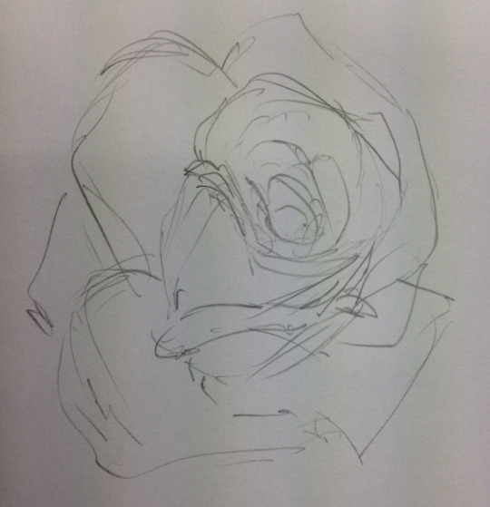
Photo

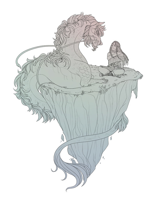


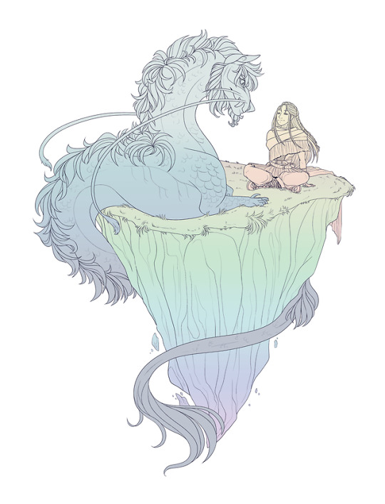

I didn’t want to keep to my first idea and stick with it, originally being to have a simple monotone gradient. Going from this first idea I experimented with different colours, using different grey tones for the characters and objects and different types of bright colours. The example in the middle I added a thicker border to the lines but felt it made it too bulky once viewing up close. For the different colours I mostly used the gradient tool and the rain coloured option and adjusted the opacity so it appeared lightly over the grey base. Whilst the last two examples look the same, I changed the black outline to a shade of dark blue/purple to not make the lines quite so sharp.
0 notes
Text
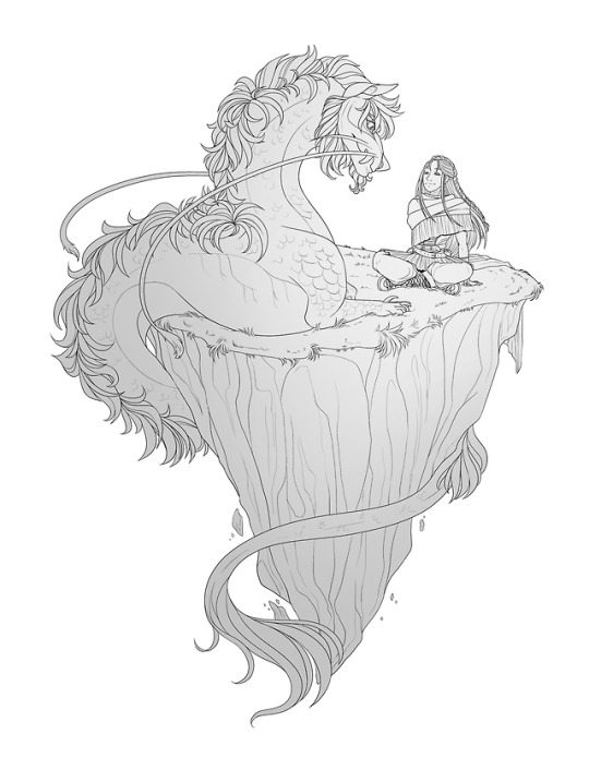
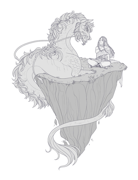
Illustration and Creation
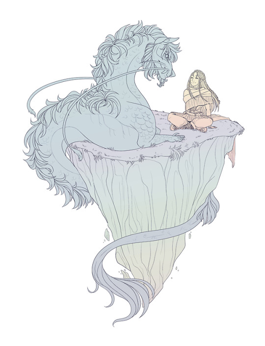
The process for the final illustration was very similar to the creation of the character. Using the different concepts that I had previously come up with, I combined some of them together but rather making it into a full illustration I sized it down and created a small scene on an island with an interaction between the dragon and its body curled around the rock.
The lineart turned out better than I had originally expected. Whilst I followed the sketch there are still some clear differences, such as with the dragon’s mane and parts of the rock. I wanted to have the island interacting with the characters as much as possible, not making either of them looking too idle, so I am happy with how I used the grass over the characters lines to show that they are on a softer surface which they partially sink into.
I made sure to add quite a lot of detail with the lineart. Whilst I would like to fully render the piece due to limited time I couldn’t be certain I would be able to, so I added more detail than I normally would if I were adding shading or eventually painting a piece. For example, the way I lined the marks and dents in the rock, or the dragon’s muscles and scales. I added little bits of rock off the bottom of the main rock as a little extra added effect like the rock, whilst having a magical element to it and floating is still slowly crumbling. With a lot of animals that have scales or hard surfaces usually have soft bellies, usually being their weakness so I wanted to show this on the dragon by keeping his underside bare with no extra pencil lines which could been counted as scales, like I have done on the rest of his body.

The original grey colour I used as a base before experimenting with a variety of different colours and shades. I originally planned on keeping it a simple grey before realising that I could do much more with the colours, making it much more interesting and less bland.

0 notes
Text
Planning for Final
The next part of this project was coming up with an idea for the character I have created and putting her into an illustration.
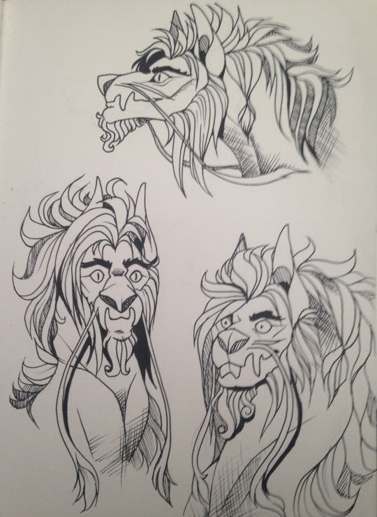
I had already decided that I wanted to include her interacting with one of the ‘beasts’ of her world, in which case I chose an already designed dragon character which I own. He is a large, serpentine species resembling that of east asian dragons (e.g. Chinese and Japanese dragons) with whiskers and a mane of hair trailing down his back to his tail. Whilst he doesn’t have horns he instead has large ears that are on the top of his head, large eyebrows and a long beard. His colouring is unusual, featuring bright greens and dull browns in a sort of chimera marking over his body, like two different markings have been merged together and are spread and cut around his body.
Concepts and sketches
I wanted the two characters to be interacting in some form of way, not being aggressive but perhaps not being friendly either. I don’t want them to be too close but not too far either, somewhere lying in between uncertainty and trust. So, having these ideas in mind I sketched out a couple of thumbnails. I wanted the main focus to be on my main character as she was specifically designed for this project so I had to try and find a way to keep her as the center despite the beasts large size. I tried to aim for around 3-4 sketches but fortunately came out with 5, even though some are only head shots. Each of the thumbnails are kept small and simple with loose lines to keep the image flowing without any abrupt stops.
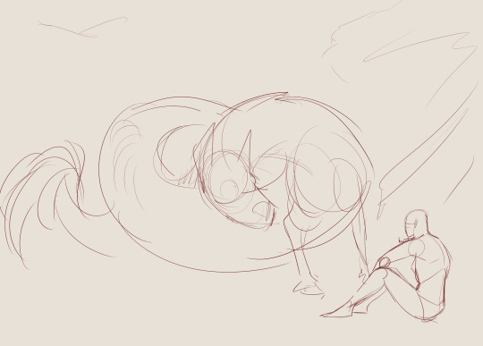
This idea would focus a lot on perspective. Whilst not a fully rendered sketch and only quickly done the perspective would show the character up close from the back with the dragon being large from the front and slowly going smaller and smaller the further down and further away his body goes. The composition allows the viewers eye to wander but follow the lines, likely starting at the tail tip and spiraling around with the dragon’s body, ending with the line of sight being on the main character.

This sketch would solely rely on perspective. The composition would focus on the dragon would be the largest object in this if I were to complete it, obscuring most of the image. The viewers eye would focus on the dragon and secondly the character but would clearly the show what the main focus was being the interaction between the two characters.

This idea was one which I would definitely fully render by digitally painting if I were to choose it. It’s a close scene with the two characters face-to-face. It would be a piece that holds lots of emotion and I could work with light, adding extra lighting to make it quite an intense scene around parts such as their eyes and work on the lighting composition, whether it be the bottom of the thumbnail being dark and gradually brightening up the higher it goes or the opposite way.
composition thumbnail layout
The final two thumbnails I did are the ones which I am the most happy with but if were to be chosen would take a lot more time than some of the other ideas as they include a full scene behind them.
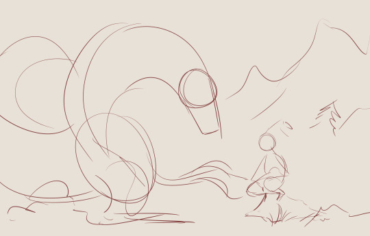
This thumbnail includes a background and foreground, having the characters up the front and a large scenery behind them. The positioning of the dragon could either be long and spread out of tight and coiled like in the example, making sure I kept loose and curved lines to try and show that, ending with his tail besides him as indicated by the lines next to the human sketch. For the main character she would be perched on a rock, bringing herself up higher to the dragon’s gaze.

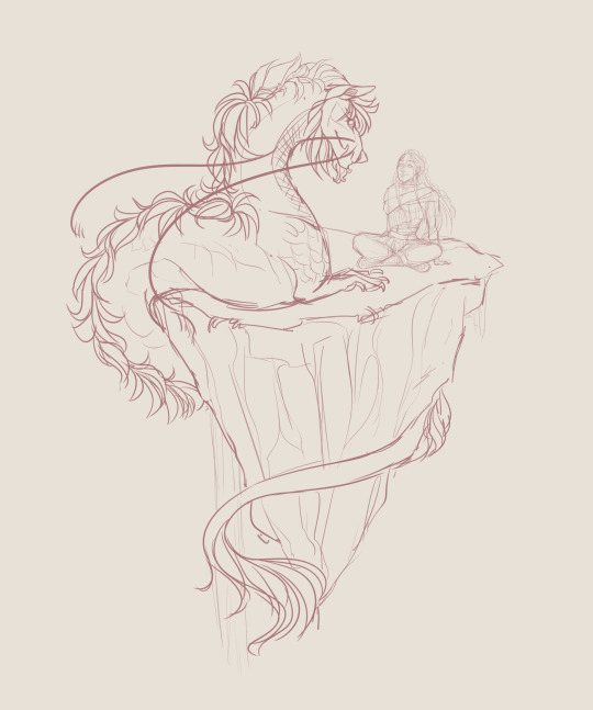
The final choice, and the one which I eventually decided on and took inspiration from along with the opinion of a friend. The composition for this thumbnail is very large and directs the viewers eye more to the dragon, however it once again captures the viewer’s eye and allows them to follow the curls of the body until you reach the head and find where the character is looking. The background with the mountains, fields and clouds would be distance and lightly blurred but still clearly visible whilst the two characters would be fully in detail with only some aspects of the background up front such as the grass and possibly a rock or two.
With the opinion on a friend they mentioned how they like this sketch the most due to how “relaxed” the scene feels and “comfortable”, the two sitting calmly besides one another with less stiffness, like a bond could be forming.
In the end, whilst I didn’t fully use any of these sketches, I took the most inspiration from the final thumbnail and used the ideas such as the way the main character is sat and the lose posture of the dragon into my final piece.
0 notes
Text
Character Creation
For this part of the planning I turned to digital. Whilst I could continue to sketch ideas in my sketchbook I find myself to be much quicker using my Wacom to draw digitally and I also wanted to use some stock images to make the process quicker. Rather than drawing freehand with a reference image, using layers helps speed up this process.
For this project I mostly used Clip Studio Paint Pro along with my Wacom Intuos Art medium, the tablet which I favour out of the two I own (the previous and most recent model) due to its slim and light weight and light pen, which although still thick is light and easier to grip and move freely.
Usually I would use Paint Tool SAI but due to it being unreliable as it often freezes and I much prefer Clip Studio’s crossover look with SAI and PS I decided to not use SAI for this specific project. Photoshop is a common program used among artists but personally I do not like it much, especially for lineart due to its lack of stabilization, never making the lines as neat as they could be.
Poses
To start, I needed to come up with anything between two or four poses. As this isn’t the only part of my personal assignment I didn’t want to add TOO much detail on this part that I lose time on the final illustration.
Rather than trying to think off the top of my head I knew of a stock artist that I could use to help come up with different poses. Using their photos I placed the image on a layer and turned down the opacity, adding another layer on top and briefly sketching out the outline or where different joints would be to later connect them.
Their website: http://www.senshistock.com/
Their deviantART: https://senshistock.deviantart.com/
I mostly chose front facing poses but found some sideways, mostly facing back and some to the side. Having the poses facing different ways let’s me develop the character from those different angles.

I kept the shapes simple and used the guidelines that I know of to help for sketches and when developing the sketch further such as the line down the middle, v-line, ribs, face guidelines (eyes, nose, mouth) and different circles for various joints. These help with anatomy and making it easier to draw the character from different angles as I know that the line down the middle is the center, so anywhere from the middle of the neck through the belly button and down to the crotch should all follow that middle line.
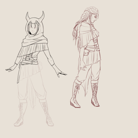
I decided to use the first and fifth pose. The first pose is almost looking forward but adding character to the pose with the hands facing out whilst the fifth pose shows more of the right side of the character but still with the body slightly turned as to not be boring.
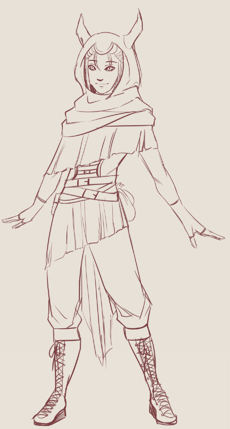
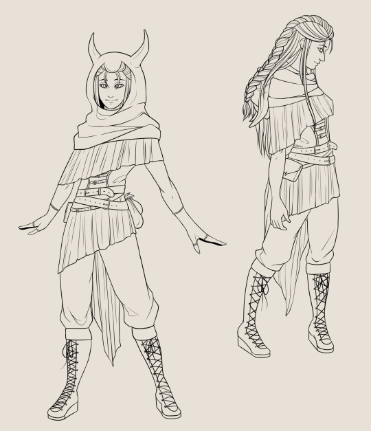
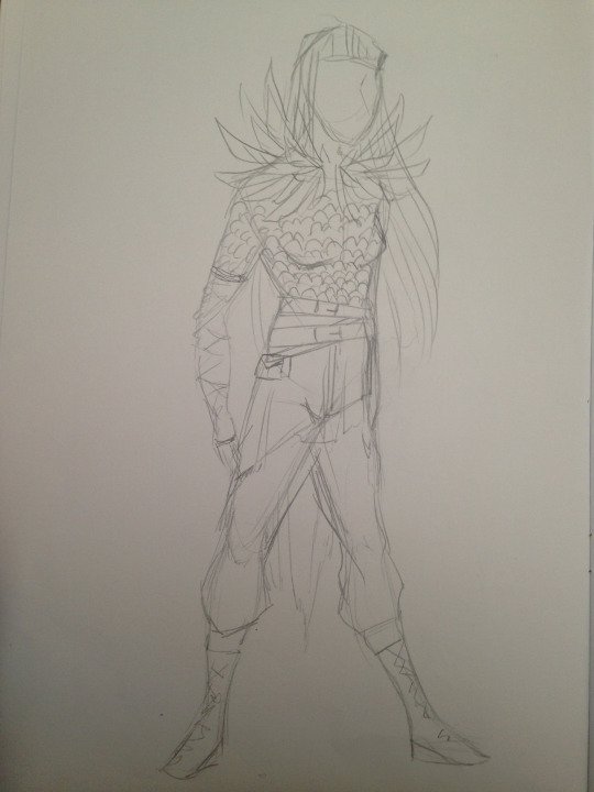
Next was transferring my ideas onto the sketch and giving life to my character. I wanted one pose to feature the hood up in what would be classed as “full gear” and another with the hood down, featuring her hair style and colour. To do so, on top of the pose sketch I added another layer and simply sketched the outfits and face. I wanted her to have happy/neutral facial expressions to show a glimpse of her personality.
I added some things which are not featured in my sketchbook such as the small pouches tucked behind her left side and added extra detail to the skirt-like design and belts around her waist and up her middle.
The second sketch features the same outfit from a slightly different angle, showing off the pouch on her right side and a bit of how the “skirt” falls at the back. Along with this is her hood which is instead down rather than up and her hair let loose from the confinement, trailing down her front and back. I want it to look natural still so whilst I wanted to show the hair bunched together I knew over the folded hood it would be more spread out so I made sure to show that.

Lining
Again, adding another layer on top of the sketch layer and lowering the opacity on the sketch layer I could start lining the outfit. I split the two full bodies into separate folders as to not cause confusion and keep them apart in case I decided to colour them differently or simply to be organised.
For the lining, rather than the pen tool which I find can be quite sharp I used the pencil tool as I think it is much smoother and doesn’t have such sharp edges.
[insert image of layer and tool settings]
The lining consists of a number of layers to start with, such as for the belts I’d create the basic outer lines on one layer, add another layer for the buckle and another layer on top for where the belt hangs off slightly. Going back between the layers allows me to delete the lines underneath others and is much easier and causes less problems than what it would if I had kept all the lines on the same layer.
[add photos of this process?]
Lining is the most time consuming part, especially as I wanted it to be clean which will help in the future when colouring as the closed lines will be easier to pick with the wand tool. Due to the large size of the canvas it also means that I can work on finer details such as the eyelets and belts and when it comes to colouring is less likely to have any colour running over the lines.
Once satisfied, having looked at the sketch layer and line layer, making sure I included everything and didn’t miss something, I was happy and continued onto the next part.
Colouring
Colouring, in a sense, is a pretty quick and easy step. Due to the neat lines filling areas is much easier by making sure my bucket tool “refers to all layers” so whilst I’m colouring on a separate layer to the lineart, it still recognises the lineart layer and keeps to it.
To start I darkened my background colour and chose a lighter colour than the background. Selecting the outer outlines with the wand tool and selecting “invert” I coloured the inside of my linearts with the colour.
Zooming in, due to the contrast in colour of the base and background I made sure that no colour had gone over the lines, making sure it’s all neat and compact.
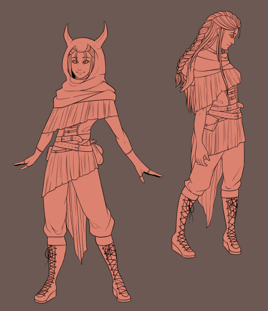
I wanted to go with natural colours for her design. Whilst she lives in a world filled with mythological creatures and some weapons and vehicles surpass that of our own time, their clothing style is still out dated to our own in the real world. For this I kept to mostly browns and beige's, not too dark but not too light. It’s clothing which can be made from any material, whether that be animal skins or cotton, silk and other materials and helps her blend in with the different environments she explores. Another reason to keep her clothing colours bland would be too not draw attention to herself, as the lighter the colour she wears the higher likelihood it is for someone to recognise her, even within a crowd.
For certain materials, such as the softer one that comes off her hood and waist, I wasn’t sure which colours to go with, whether to go light or dark. To help me come to a final idea I used both colours and placed them side-by-side. This allowed me to view them together and see which I preferred, eventually choosing the darker colour to fit her overall theme. To add a bit more texture I added gradient to this part, using the airbrush tool on a soft density and using a darker colour at the top and a lighter colour at the bottom.
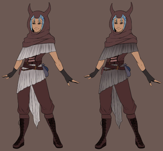
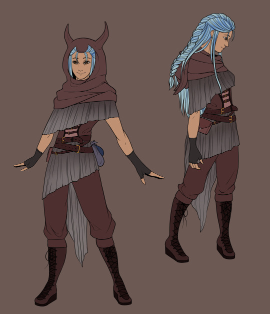
Final Character Design
0 notes
Text
Character Design
About - Clio
Due to my interest in fantasy I already planned that I wanted my character and the scene to be based around that area. I find a great interest in mythological creatures such as dragons and Cerberus, the three-headed dog, which are often explored in the world of fantasy. This gave me an idea about including one of my already designed and current dragon characters alongside the character made specifically for this project.
I have decided to make my character female, mostly as I am more confident with the female anatomy than I am the male along with looking through Pinterest and DeviantART and other sites that include art and other forms of inspiration I found inspiration in certain hairstyles and outfit designs which fit more of the female form than male.
My character will be young in their mid to late twenties but filled with experience, so perhaps featuring some scars along her body and/or face to show some of the events she may have gone through due to the world she lives in and the job she has chosen. This being that of a hunter of sorts, whether that be a bounty hunter or beast hunter is up to her and what others ask of her. As long as it brings her enough money to live her day-to-day life she is not too bothered about the details.
Following on with the mythological/fantasy theme I wanted to find a name that had meaning behind it and was linked to that era and theme. I found a number of names that interested me and had connections but settled on Clio. It’s very simple and truly doesn’t have much history such as names like Acantha or Andromeda, which I think adds more character to her. Clio was the name of the ancient mythological muse of history and heroic poetry in ancient Greek which I find fitting for my character that will be quite a loud and heroic figure, with a strong and snarky attitude making people believe she may fail a mission or cause harm but truly knows what she’s doing and becomes quite serious when needed.
Outfit and Character Designs
For outfit designs I took to Pinterest to find some inspiration - my board used: https://www.pinterest.co.uk/wolv31000/inspo/
I looked at a lot of Elven style clothing as elves are greatly involved in many fantasy books and films such as Lord of the Rings and Eragon. Along with this I looked at steam punk, various styles of armour and what might be classed as maritime Piracy.

I liked the idea of scarf/shawl types of clothing which mostly cover the upper half and often times have options of turning into a hood. I feel this adds some mystery to a character when they cover themselves so much. Another idea I had in mind was clothing made out of scales. As Clio is meant to be a hunter I found it fitting to have her dress up in some of the scales/skin of her kills like in example six. Like Vikings who often wore heavy and large skins around their shoulders as a way to show their leadership and power, I thought I could carry this through to Clio but instead use feathers to show her strength.
I varied between more traditional women’s clothing such as the laced corsets and extending out to different types of armour.
I didn’t want to add a lot of detail to these outfits but I still wanted to show some colour, so using some coloured pencils quickly went over with what colour’s I thought would be fitting.

I experimented with what I had an combined some of the examples together to make a full outfit. Again I really liked the idea of something covering both or just one shoulder and coming down, mostly hiding the chest and torso. I followed this through to what could be classed as a skirt over her trousers which seems to be a common occurrence in steam punk styles, some pirate styles and assassins - assassin styles taken from the game Assassin’s Creed, which although not totally historically correct still have some outfit designs which I took inspiration from such as Edward Kenway’s robes from Assassin’s Creed Black Flag.
The heavy boots, baggy trousers, loose fitted belt around his waist for ways to add extra items and equipment, the hood and long sleeves with the final addition of a sort of cloak around his mid section going to his knees all heavily inspired me.
With the second I experimented with the scales again but this time making a full upper half and putting laced gloves on, covering all of the arms. Along with the trousers and boots, very little skin is shown in this version which both serves as armour and perhaps a disguise OR hiding something beneath the clothing such as scars or tattoos. A consistent look I kept was the belts as they can be used to attach different bags to for carrying coins and other needed small items.
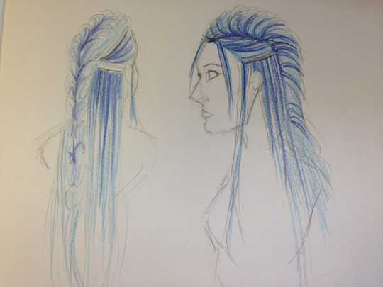
I wanted my character’s hair to be something that stood out the most on her. Something which gives her an image for others to recognise when they see her.

Using this image which I found on Pinterest I decided that I wanted to go with a similar colour and style. Redrawing it in a simple sketch out of pencil I marked out the different areas that split the hair apart, noting that these areas would be where the darker hair colour is most visible. Along with following the hair style I added a few extra bits of hair, such as some fringe having broken away at the top of her parting and some hair going down in front of her ear. Whilst I really liked the colour in the example image I didn’t want to copy it exactly and it uses quite a few different shades. Instead, using coloured pencils I went with a light blue and with a dark blue made quick strokes going from the roots and down, slowly fading into the original light blue at the bottom.

I used pictures from pinterest to help with earring ideas as it holds a lot of intricate and interesting ideas. I liked the idea of what looks like a small wing on the ear as I find it very fitting for the fantasy/dragon theme I want to go with.

I was still unsure about the upper half of my character so continued to look for inspiration. A lot of ideas include belts and corsets, so I decided to incorporate that into a design but with the added shawl effect to still hide part of the chest, shoulders, arms and neck. To further add to this I thought about adding a hood with horns to the top as a type of disguise, used mostly for hunting and it also gives other surrounding people an idea of what her job may be.
Characteristics
Clio is a fairly young female who although didn’t grow up alone instead decided to leave her family at a young age as she found an interest in the different beasts that live across their land. Due to her constant travels she has a slim but fit body with some muscle and lies in between tall and short, standing at around 5′5″. She keeps her eyes dark and decorated or partially covered by her hair as a form of disguise in case she has to go undercover for certain missions or hide from people that may be after her but uses her brightly coloured hair as one of her main characteristics, a form of symbolism of who she is so the people around her will spread the word of this hunter.
Her personality is quite loud and boisterous and holds her head high around those she knows could not best her. However, she holds a lot of respect for the beasts that live across the world as although she is titled a hunter she doesn’t always kill and has befriended a number of different beasts during her travels. She can read many creatures well by their slight movements and the flickers in their eyes or tails so knows if they pose a threat or not. She is knowledgeable for her age and she isn’t afraid to let others know about her travels and knowledge.
0 notes
Text
Sketchbook
This whole assignment is based around creating something of your own, a Personal Portfolio Project. This allows me to experiment and creating an outcome of so many sorts that I didn’t want to throw myself into it straight away without narrowing it down what I would like to do.
So, picking a list of three and developing on two this helped me thoroughly think about what I want to do. I narrowed the list down to concept art, character design and illustration. As illustration is so large and you can fit almost every category under it I decided to delve further into concept art and character design.
Environmental (Concept Art)
“Concept art is a form of illustration used to convey an idea for use in films, video games, animation, comic books or other media before it is put into the final product.” - Wikipedia
Concept art is what I believe to follow the most amount of artists that follow that career (or hobby) choice. For example, Sandara, Claire Hummel, Sergi Brosa and an artist that I found through deviantART, Myth-Keeper.
Whilst concept art covers many forms such as environmental and character concepts, I focused on environmental with some side characters, taking most inspiration from Myth Keeper. For their concept art Myth Keeper (real name unknown) they can use quite blocky and sketchy styles, totally different to their final and fully rendered style. Here is an example of one of their concept paintings which I watched them work on during a Picarto stream: Evanesce. Their brush strokes are smooth and free and the characters included in the painting don’t hold too much attention and are mostly vague shapes.
Whilst not quite the same I wanted to look into something similar of my own but traditionally on paper. I used some of my own photos that I have taken on walks along with inspiration from Myth Keeper themselves and creating two sketches.
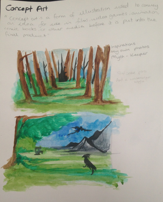
To add some colour and to show practice with other materials I also decided to colour using watercolours. I kept quite free with both the pencil lines and watercolour as it’s a vague concept with nothing fully rendered or decided.
Character Design (Concept Art)
“A character designer is an artist that creates new, original characters for a purpose.” - Tom Bancroft.
Character design isn’t all that different from the previous topic with how characters start off as a concept before slowly becoming developed and rendered with time and different concepts, as goes with most things in art.
Quite a few of the artists which I have previously linked such as Claire Hummel and Sergi Brosa do character design, my favourite being Sergi Brosa. They have to be one of my favourite concept artists due to their anatomy and colours. Their designs are bright and detailed and share the step-by-step process of development. They delve more into their character designs and add extra sheets on the characters, whether it be different expressions, weapons or vehicles. Here is a good example of their process and character design for a character in a story: Atomic Delivery - The Hero, Zia. The artist has included a number of different colour examples to help them come to a final conclusion of what they think fits best. Over on their Behance they include the process for some of their characters such as Igor. They show their initial sketch done digitally and working up with a lineart, colour and shading. For this specific character even though he is wearing what I can only assume is a form of armour, they have still sketched out the basic body that would be underneath before building it up. For their artwork they use Manga Studio and Photoshop.
Whilst I did not delve into character creation and only skimmed the surface at the beginning I still find it relevant.

A character’s personality can be easily captured with their reactions and facial expressions to different events. The eyebrows and mouth often play the biggest part in reading a character, in both real life and not, along with any facial lines.
Characters can be anything. They can be a human, animal, an alien, something with two legs but not human or quite frankly anything. A character can be whatever you see or want to see put down on paper with no limitations.
To capture expressions the character must have distinct features, like how I captured “tired” with droopy eyes and mouth, trying to convey just how tired a character might be.
Illustration
“An illustration is a decoration, interpretation or visual explanation of a text, concept or process.” - Wikipedia
Illustration can be hard to describe. I think almost every form of art (such as concept art and character design) are all Illustration, making it almost limitless but sometimes I think illustration can sometimes hold a deep meaning, as does most forms of art.
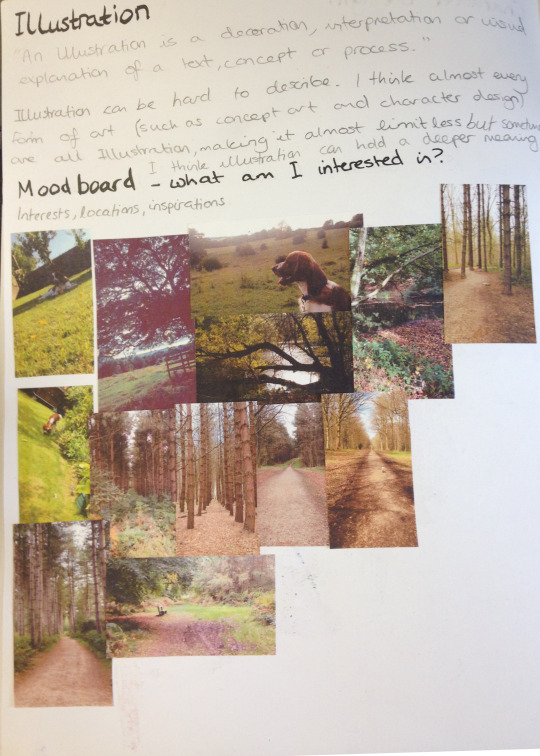
Moodboard - what am I interested in?
To help my process and what to do exactly I created a moodboard. However, I didn’t include interests such as foods, games or films I may enjoy. Instead I included inspirations. A lot of my inspiration, especially for full illustrations come from the outdoors and what I see during my trips out and long walks. I often take photos of where I go even if it only ends up looking like a field with some trees in it to other people, whereas for me I see much more which helps in drawings, such as the way the ground is laid or how the trees are placed or the colours of the foliage and sky. Included in some are dogs I own or have previously owned where a lot of my inspiration also comes from, especially if they are set in the scene correctly. My favourite pictures that I take have to be of trees. Whilst it may seem boring to some, the way trees can grow in odd shapes or how they’ve been purposefully placed can be quite interesting, such as creating a straight line on either sides and directing the viewers eye to a certain point or the way they may have fallen during a storm and lay in such a way that light or water is seen through and creates a pretty image.
It was at this point that I decided that I wanted to create an Illustration of something that has meaning to me but I was still uncertain on what exactly.
Colour Practice
Colour is a difficult thing to use but can be effective in many ways, whether it be because the colours are very bright or very dark. The colour palette can solely tell a whole story and mood, whether it’s good or bad, sad or happy. Colour is important but getting it right can be difficult.
Finding two images from my moodboard I used them to take inspiration and sketch out a scene. I wanted to use these two scenes to create a light and a dark background. I decided to use markers which although I haven’t used that often, it gave a block-y style which I wanted for these quick concepts as I didn’t want to delve into too much detail.

I think it worked effectively and whilst the darker background could’ve used more work, it still helped me come up with an idea and how I would like to present.
I soon decided that not only did I want to include an environment in my illustration but also a character to create a full illustration, perhaps fully painted digitally, but to do so would require more planning and work to finalise my idea.
0 notes
Text
Computers in Art and Design
What is a raster image?
Raster image (or bitmap) is a dot matrix (2D patterned array) data structure. Generally it represents a rectangular grid of pixels or colour which can be viewed on display mediums such as paper or monitors. It consists of many tiny, editable parts called ‘pixels’.
Advantages: It does not use any geographic coordinates other than the origin point (e.g. top left corner) which means that data analysis is usually easy to program and quick to perform.
Disadvantages: Most data is in vector form and so any data input must undergo vector-to-raster conversion. This may cause problems with data not being completed as a whole due to inappropriate cell size and generalization. Commuters have to store information on every pixel which usually means raster files are often large and when resized can lose quality.
What is a vector image?
Vectors consist of shapes called objects which allow the user to edit each object separately (e.g. colour, shape, size). Vector images are generally very small as regardless of whether the vector is large a computer doesn’t need a lot of memory.
Advantages: Often times no data conversation is required as most data is in vector form. When you resize a vector image it does not lose quality, meaning it is scalable and more aesthetically pleasing, however if you were to compare it to raster images it is often used to look like a cartoon rather than realistic.
Disadvantages: Unlike raster graphics, vector graphics are often filled with solid colours or gradients unlike raster graphics which can show depth and shading. Any errors, no matter how small they are will be view able when enlarged.
What kind of areas within the graphic design/animation industry would you use Photoshop for?
Photoshop uses raster graphics so it uses individual pixels. This is best for illustration areas because of the level of detail you can add. Whether you use block-y objects or paint using a graphics tablet you can go further into detail as you edit every individual pixel to your liking.
Another area would be photo editing which can be done in Photoshop. Editing photos in Photoshop allows you to pay close attention to detail and edit the photo with almost no limits to the point you could take a realistic photo and edit it into a cartoon.
What kind of areas within the graphic design/animation industry would you use Illustrator for?
Illustrator is different to Photoshop as it of course it uses vector graphics meaning it is much more difficult to capture details but excels in other ways to Photoshop. Website/layout designers and graphic/logo designers are best suited using Illustrator as you don’t want to delve too much into detail with either of these things. Illustrator uses objects which can be easily reshaped and resized along with being the easiest way to transfer it to different sites and programs without taking up too much storage. The program makes it much easier to create shapes and objects within certain distances and similar sizes to one another due to the built in measurements.
What sort of technologies can you use to work with Photoshop/Illustrator?
You could argue that most technologies can be used for both programs, which is true, but there are different ones that work better with different programs. So, if you were to use a Wacom pad, you’d be more likely to use it with Photoshop due to the raster graphics allowing intricate details which can be captured by using a Wacom pad whereas you have more control using a mouse in Illustrator.
Cameras are useful for both Photoshop and Illustrator. Although you’d be more likely to use it to capture photos and edit them in Photoshop, you can also import them into Illustrator and use them as a base to copy and/or outline, making the process simpler.
0 notes
Text
Dragonstone Cover

I wanted my design to be fairly simple as I didn’t want anything to be distracting the poster from the main point of this poster; advertising an event to meet the author. The most detailed part is the title, using the provided logo and adding a symbol meaning “Fire” (the triangle) along with a sword made in Illustrator as an underline.
I felt creating the banner to add the information on added a bit of a theme. As the story is based around witches and wizards along with the different houses, banners are often used to represent them. So keeping that thought in mind I continued to use the theme colours of burgundy and gold to create the banner.
I added the required information, not too little and not too much to over or under crowd it, along with a provided picture of the author so people are able to recognise him.
The experience was rushed but I still managed to come out with a successful outcome for the poster.
0 notes
Text
OWENs Trust Evaluation

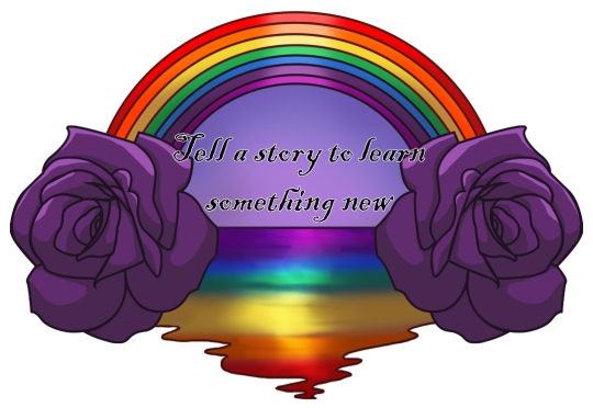
I think most areas of my design were successful. I kept quite closely to the brief to make sure I included what was wanted. The way I shaded each of the different objects of the logo were successful and placed them, not being random and instead being thought out and well placed. The roses I specifically wanted a the bottom of the rainbows as a border - a way to bring them to a stop, whilst I wanted the open water to have a very curvy outline as water has a lot of life to it and I wanted to show that in some way.
I aim to improve in my overall design idea. Considering the design was meant for a logo I don’t think I executed that very well. Instead, it turned out looking more like another type of design such as a tattoo rather than a logo. Although this isn’t a bad thing it’s also not what was wanted of the clients, and so I believe I need to aim to improve in my designing, coming up with more ideas and being more professional about the final outcome.
Most elements of my logo met the audience’s needs. The logo was aimed at a younger audience, ages 4+. With the bright colours and simple shapes and objects I used it certainly met that requirement. It’s pretty self explanatory with no hidden meaning, simple being a rainbow, roses and open water. Regarding the brief I included most of the suggested elements, being the roses, rainbow/rainbow colours, purple and open water. It didn’t include everything such as the bows but it also didn’t include anything not featured on the brief.
To meet the target audience’s needs more I could’ve simplified it even more. Rather it being the detailed shape that it is I could have made it into a circle and still include each of the elements. Perhaps make it much less detailed with less shading and keep it 2D rather than 3D which can complicate it much more than it needs to be for a logo. As it is aimed at a younger audience the text used for the motto could be changed to look simpler as it’s currently quite small and detailed writing, making it difficult to read. So, if I were to use a bigger and bolder font there wouldn’t be any complications.
0 notes
Text
Producing my Logo
I had a pretty solid idea in mind for what I wanted to do so to make it easier for myself I put my sketch on a separate layer in Illustrator and turned the opacity down (Appearance > Opacity > %) so the sketch layer was still visible but didn’t become confusing between the two layers.
The first step was creating the rainbow, doing so by using the Arc tool. As the arc tool only did an arc of a certain length/shape I did one side first, before left clicking > Transform > Reflect > Vertical.

Creating a full arc I could then copy and paste it to create 8 lines to make up the full rainbow, adjusting their size by dragging.

Next, I moved on to creating the outline for the roses. The roses were fairly simple as I made them both the same but reflected so they were facing different ways on either side of the rainbow. So, finding a free to use image of a rose and once again turning down the opacity and placing it on a layer below my lineart layer, I simply used the pen and curvature tool to make the lines. It wasn’t exact but I didn’t want it to be as that could make it too detailed for what it is and I didn’t want to add such little details that it became distracting.

The last line I added in Illustrator was the straight line for the horizon of the open sea. In Illustrator each of the lines (rainbow, roses, horizon line) I kept on separate layers so they wouldn’t interfere with each other and makes it easier to colour in Photoshop. So currently it looks a bit of a mess with the lines overlapping one another but will eventually not be visible once coloured.

Moving on I transferred my lineart from Illustrator to Photoshop. I started with the roses so it would cover the overlong lines of the rainbow. Following the brief which had purple down as one of the colours to include, I decided to go along and use a shade of purple; not too bright and not too dark. I wanted to add cell shading to not make it too harsh on the eyes as I believe that detailed shading can sometimes be too much for some designs. So, going with this I firstly added a layer for the highlights, picking a lighter shade than the rose and adding them to the top side of the petals on the rose to give the illusion of light.

For the shading I did a darker shade of purple and did it to the opposite side to the highlights as underneath would be the darker area. I focused on inside the curled petals and the bottom side of the rose. This created this illusion of darkness.

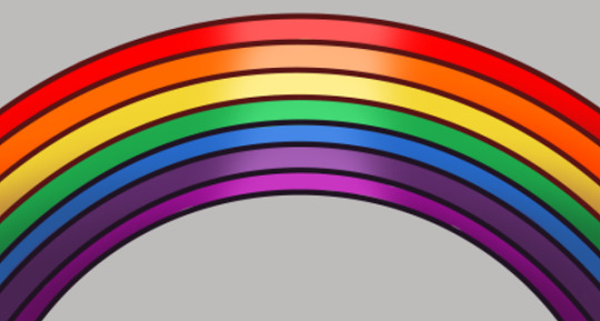
The next part I worked on was the rainbow. I put the seven different colours on seven different layers to keep them separate as I wanted to shade them individually. To make it easier for myself I colour-picked an existing drawing of a rainbow but changed the colours to the shade I wanted afterwards, rather than making it difficult and trying to figure out how I wanted the colours from scratch with no starting base.
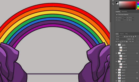
Although subtle I added a clipping mask to each of the individual colour layers and selecting a slightly darker colour I used a soft brush and added some shade to either side of the rainbows, making the middle the main focus point where it’s brightest.
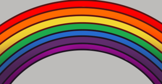
The further emphasis the middle being the brightest I did the same by adding another layer, this time on top of the shading layer and using a brighter colour of each of the original colours along with a soft brush, simply added a brighter colour in the middle of the rainbow.
I did the outline for the ocean part in Photoshop as I found it easier to do it “freehand” with my drawing tablet and the brush tool rather than the line tool in Illustrator due to how bendy and curvy it is.
Colour picking the same colours from the rainbow I used a soft brush to blend all the colours together, before adding a multiply layer to further blend them together and make the sides nearest the roses darkest whilst adding a number of overlay and luminosity layers and adding the light in the middle of the sea, like the rainbow is reflecting onto the open water.
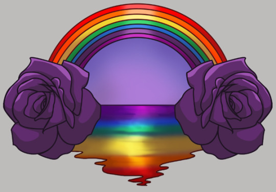
Finally, my completed design with the added motto. I was very unsure what to do for the motto but eventually figured it out, using my own personal thoughts as I believe this is an important event which should be shared.
To see my design on products I took some pictures of shirts and mugs and added my logo design to them as an example of what it may look like printed.

0 notes
Text
Ideas (OWENs Trust)

Trying to set a clearer image for myself I decided to create a small mind map. Mostly everything came back on itself, for example, including bows in the rainbows, and the bows being rainbow coloured. The wide variety of options allows me to interpret a number of the same OR different things into one another.
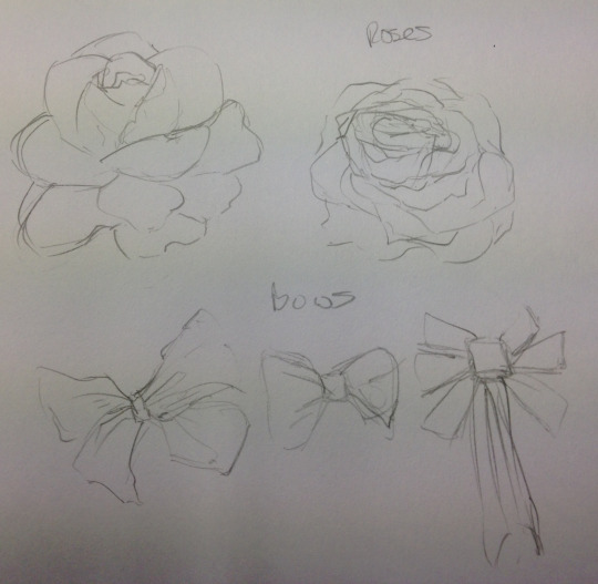
Firstly I did some quick sketches of roses and bows to familiarise myself with them. The two are different things that represent Owen, along with hearts.
So, taking these objects and colours into account I sketched some logos ideas.


The first two ideas are fairly similar, other than the motto location included in one and a change of location for the bow, having it included in the rainbow for one but wrapped around the bottom of the heart in another. In a way, it’s like a small landscape inside a heart, including a rainbow, purple background and bow.
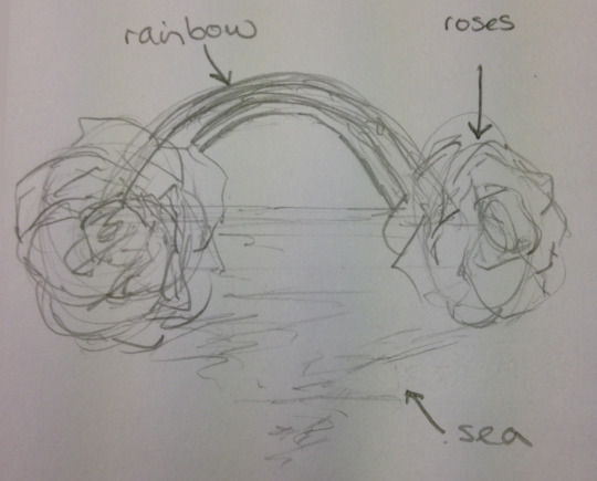
My third idea is in a sense somewhat similar to the first two, however doesn’t include any hearts. My idea for this one is to have a rainbow with the rainbow’s colours reflecting onto the sea with purple roses on either side. The motto can then either be placed in the middle of the sketch in between the sea and rainbow or placed in or on top of the rainbow in a curved shape.
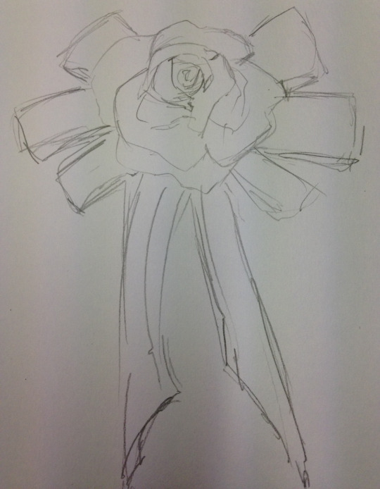
My final idea is much simpler, only featuring a rose on top of a bow. The idea behind this is having a bow, but rather than a button or something of the sort in the middle, it’s replaced by a rose. This idea can also be modified to make it look more 2D, as at the moment the rose is a 3D sketch, adding depth to the petals, but with some modification be much simpler.
With some more edits and rethinking, I decided on using my third idea and develop it in Illustrator and Photoshop.
0 notes
Text
OWEN’s Trust
.Safety organisation logos all seem to share a lot in common, most using blues, reds/oranges and whites and including a character. For example;

“Kiwi” seems to be the name of the character, pictured with a number of different blues included in its design, from light to dark in a circular gradient, perhaps representing depth in water. The same gradient goes for the text, dark blue at the bottom heading upwards into a light blue. Not only does it feature blues, but also oranges, for the characters beak and feet along with more text. The colours between the text and character seem to join and match, further emphasising that they have created a character specifically for this swim safety logo. Creating a character, especially for a younger audience, attracts more attention and can be used again and again in more logos and announcements. The typography is close to capitals, or at least enlarged. It’s clear and the colours are mostly dark so it can be viewed up close and from a distance but the text isn’t symmetrical at all, placed rather vaguely.
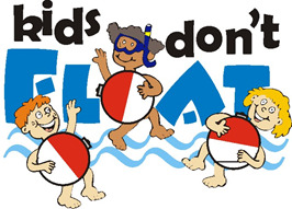
Blue is once again the main colour for the text and lines done as water. Considering the text specifically targets “kids”, the characters included are of course children. Although they don’t quite follow any specific colour scheme, the water floats they are holding however, do. As mentioned above, red and whites are often used, usually representing “RNLI Lifeguards”. The typography is very asymmetrical, looking like it could have been drawn by a child. The letters aren’t straight and are placed rather randomly but the letters are still bold. The colours are flat which for children is acceptable however for adults a gradient would make it more pleasing.
This logo is mostly targeted at boats going out to sea away from shore, however it can still hold a meaning towards anyone entering large areas of open water. Even on a boat there is still the possibility of entering an area of open water whether by choice or not. As pictured waves hold a massive danger. They can upturn boats and push people down into the depths of the waters and in some cases too deep to reach the surface in time. Even small ones which appear at constant intervals can stop the person from reaching the surface. Waves can be underestimated as what you see on the surface can be very different to what they hold underneath. The logo design is very similar to that of a warning sign but with a slightly different layout. It’s a logo/sign that you’d expect to see on a harbour where most people will store their boats or use as a place to set out for sea. For the main logo design it’s only black and white, simple black shapes with a white background and white lines to add some definition to the waves and boat. Although simple with only two colours it still clearly shows what it needs to show. The typography is simple text but big and bold, similar to what it would be on a warning sign as there is very little chance of missing it. Then, the background behind the main logo is a type of blue colour, similar to other logos to represent water.

Here’s a few others that also follow the basic outline with including blues, reds/oranges and whites and including a character.
0 notes
Photo


Perspective Tool
The perspective tool is helpful when trying to do backgrounds and objects which follow a certain perspective.
To use it simply press the “Perspective Grid” which will come up with this:
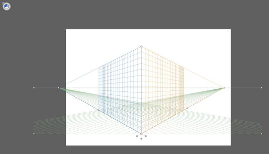
Which can be adjusted by the dots on the end of the lines, such as the horizon line and vanishing points.
Then to use it, using the different shape tools, they will automatically follow the perspective grid when selected.
1 note
·
View note
Text
Walid Feghali
https://www.youtube.com/user/Feroyn/featured
Walid Feghali is a composer, mechanical engineer, concept artist and entrepreneur from Sweden. His channel offers a variety of different tutorials, mostly related to painting backgrounds in Photoshop, but rather than being a simple speedpaint, he speaks over them and includes useful tips throughout as well as showing some of them in real time.
From this channel I use it to help with new brushes on Photoshop and how to use them in effective ways to gain the effect that I want, as well as different techniques such as shaping.
Ross Draws
https://www.youtube.com/channel/UCLEVrhumRsK67JkP3G4w5cQ/videos
Ross Draws is a channel again focusing on speedpaints in Photoshop, but he often collaborates with other people (or himself) where he takes a photo of someone, uploads it to Photoshop and turns them into a character. He shows the entire process, through speedpaint and often speaks over them too to make sure the viewers know what exactly he’s doing.
His channel is really useful when looking for ideas and that even without an initial sketch you can still create something from a simple photo.
Gigantic
https://www.youtube.com/channel/UCX4mqbvv5lGqLpI4FYlJt4w/featured
Gigantic mostly focuses on vector art in Illustrator, creating videos and speedpaints to help others learn how to do it and take on a specific vector style. Other than Illustrator he also includes videos in After Effects and traditional sketching. Again most of his After Effects work is from previous Illustrator works which he continues to animate.
Gigantic has really helped me understand Illustrator more and how I can use my Illustrator works in After Effects. He keeps his style simple but very effect and I’d like to be able to do a similar thing in the near future.
0 notes