infinitenines
will of the fire.
jess - nineteen - in college and surviving - am i talking? formerly an art blog, now an art ref blog multifandom / sideblog.
149 posts
Don't wanna be here? Send us removal request.
Last Seen Blogs
lynnbutlertron
kate-bot 2: the squeakquel
marciusmelus-blog
MelloMello
walmartinez
Mom, Can We Go Home?

imaginairium
Don't just do something; stand there!

fun-datinng
fun-datinng

Text


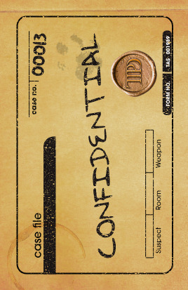
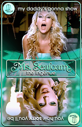
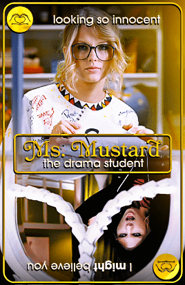

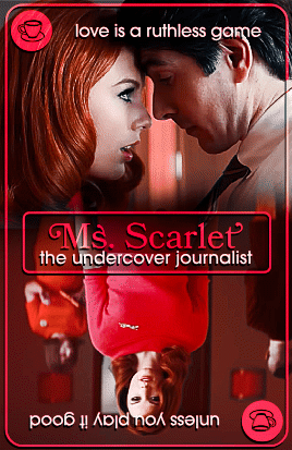
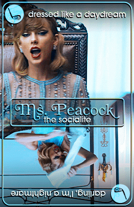

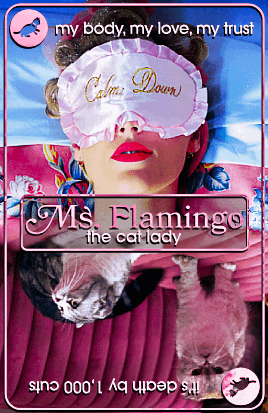


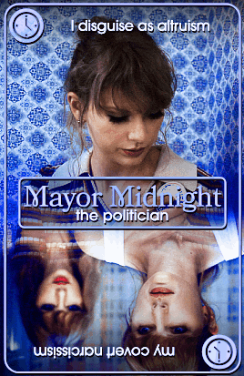
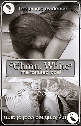
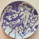
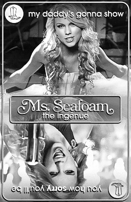
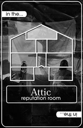
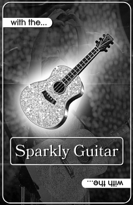
CLUE (Taylor's Version): The Case of Este's Husband
11 partygoers. 8 rooms. 1 mystery.
Trace the evidence, make it make some sense below↓ (flashing gif)
insp. 1 2 3

2K notes
·
View notes
Photo


Olivia Rodrigo | Good 4 U (Behind the Scenes)
2021, dir. Petra Collins
1K notes
·
View notes
Photo

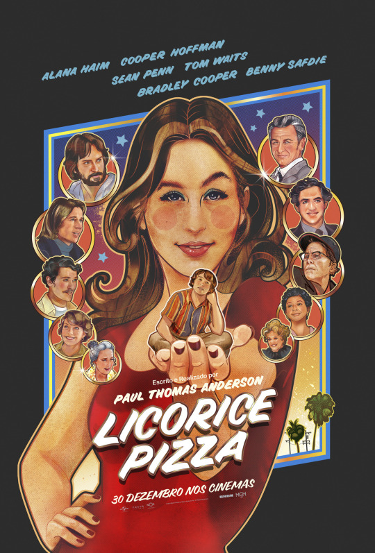

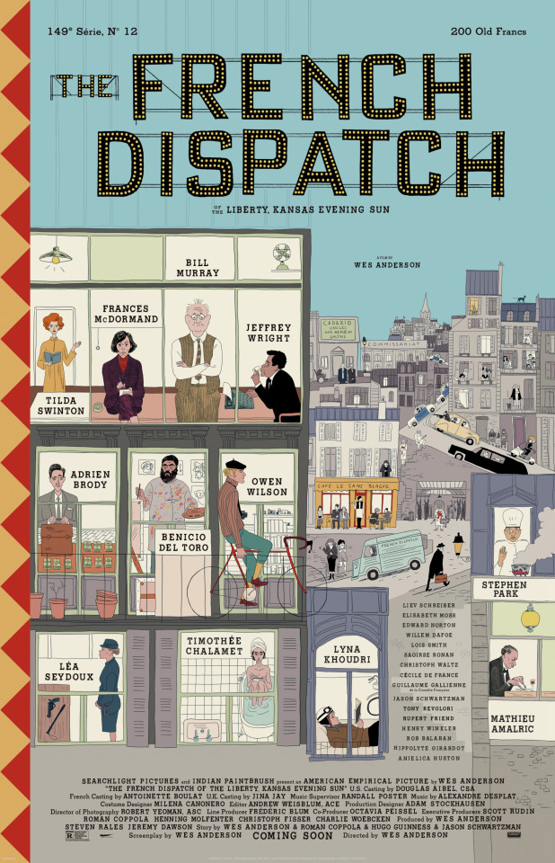
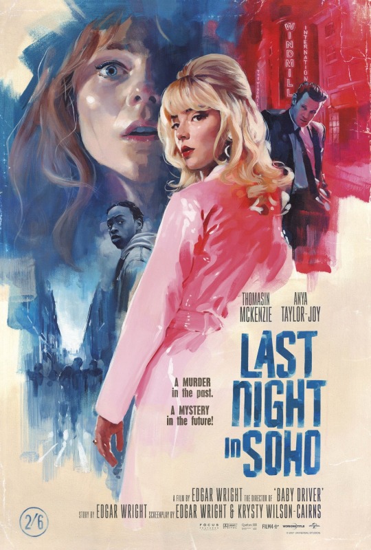
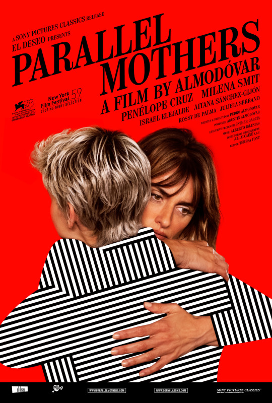
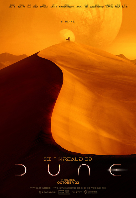
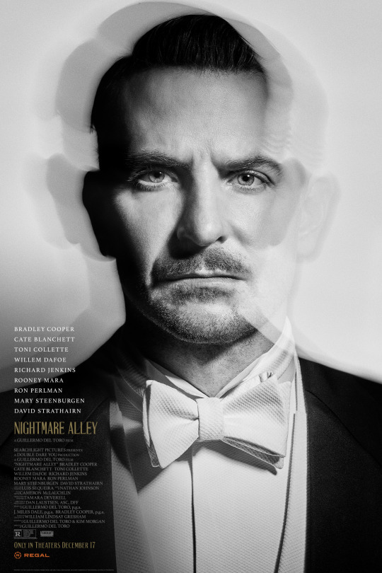


My Best of 2021: Posters
My Best of 2021 is a series of annual lists in which I pick the best of the best from 2021, all leading up to my official picks for My Top 10 Films of 2021.
2021 was a pretty ‘meh’ year for posters, wasn’t it? There are a few hear I love, and some I really like, but for the most part I found myself mostly shrugging as I went through what the year had to offer. Oh well.
Note: As always, these picks have nothing to do with my thoughts or the quality of the films, only the posters themselves and how they sold the films to me.
Enjoy!
-Timothy Patrick Boyer.
Next Up: Best Non-2021 Films.
More of My Best of 2021...
119 notes
·
View notes
Text
teen tv shows with boarding schools be like:


11K notes
·
View notes
Photo


‘Deadly Class’ Character Posters
281 notes
·
View notes
Text
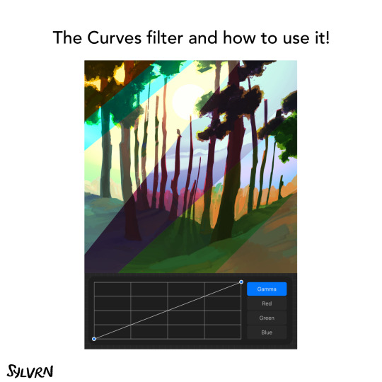
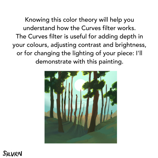
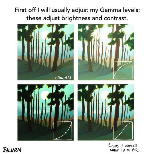
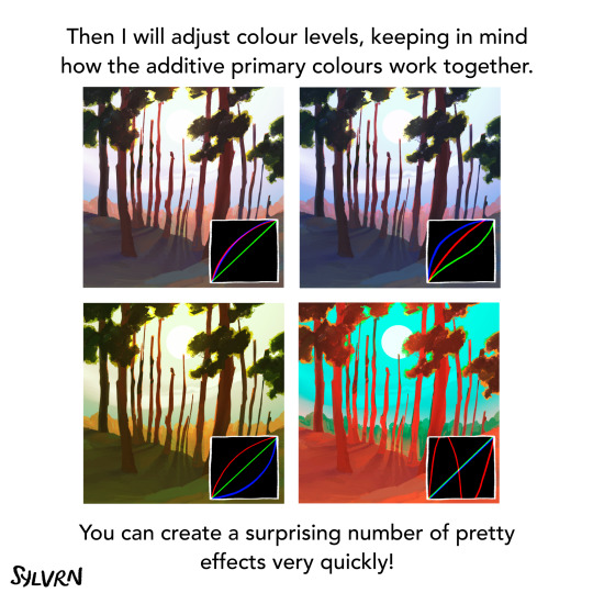
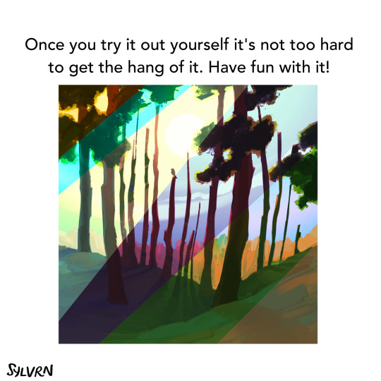
Screentones in Clip Studio Paint - Part 1
Since Clip Studio Paint was made for comics, and originally for black and white comics, they’ve made sure to include screentones. There’s actually a number of different ways to go about it, all of them pretty easy. Which style you like to use is up to you. In this article I’m going to cover one of the ways to apply basic screentones to your work. Keep reading below to see how.
Keep reading
295 notes
·
View notes
Text
How Clip Studio Paint Makes Flatting Your Colors Magical
I didn’t even mention once during the vector layer tutorial that Photoshop stinks sometimes (even though I could have), but I’m gonna bring it up here. Photoshop stinks for flatting. It wasn’t made for it. It was made for photo retouching, not all this illustration business. CSP, on the other hand, was designed from the ground up for comics and then for illustration. You want to flat colors? CSP has you covered. Read below the cut to find out how flatting in CSP is awesome.
Keep reading
857 notes
·
View notes
Note
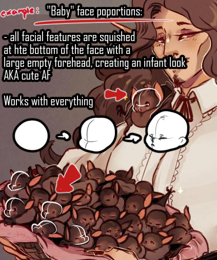
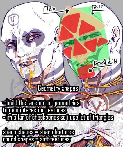
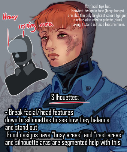
Art tips for facial features?
I would love to help but you need to be bit more specific. “facial features” can mean a lot of stuff.
Most vague tip i can give is uh - silhouette, shapes and proportions: silhouette helps block out unique features, geometric shapes can aid with structure and keeping the same face consistent between drawings, and proportions convey characteristics like age easily to the viewer.
390 notes
·
View notes
Text
Comic Paneling Tools in Clip Studio Paint
This is probably one a few people have been looking forward to. Clip Studio Paint was originally created to handle making comics, back before it could even work in color. So they’ve put thought into making a good working environment to make panels easy for comic artists. In this tutorial, I will be covering the basics of rectangular comic paneling, with a look at what tool settings you need to change to create different panel shapes. For an in-depth look at custom panel shapes, I’ll be making another tutorial later. Read below the cut to find out how to use CSP’s comic paneling tools.
Keep reading
1K notes
·
View notes
Text
Anti-Aliasing in Clip Studio Paint
Okay, so today I want to talk about anti-aliasing in CSP because it’s kind of a lifesaver?
But also I have a super hard time remembering how to do it or that it exists so here we go.
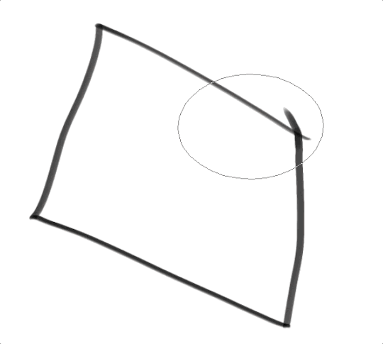
Basically, anti-aliasing helps you color line art without going outside the lines. Here’s a gif of me coloring with my mouse so you can kind of get an idea of what it is we’re talkin’ about here:
So how do we do that?
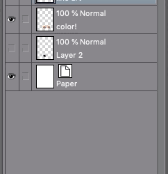
First, select your line-art or sketch layer in the layer panel of CSP. Click on the little lighthouse icon at the top of the panel. When you click off there should be a little lighthouse on the side of your line-art layer! This icon means that is now a reference layer!
Step2:
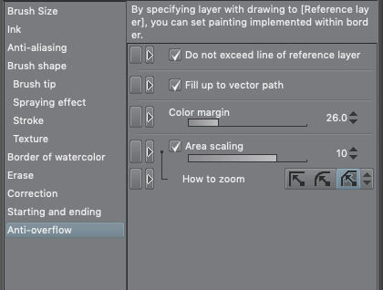
Go into your brush settings and click Anti-overflow! Click “Do not exceed reference layer” to make it work, tweak the other settings till you’re happy. These are the settings I used in the example below to get a cleaner coloring style
Step 3:
Add another normal layer below you line art! Make sure it’s selected and color away! Here’s what it looks like with the settings above:
15K notes
·
View notes
Note
Hi, I recently switched to csp from ps and it's been pretty tough D: would you maybe consider making a tutorial/process with the program(as well as your brush settings and the like)? I would really really appreciate it. Thank you so much!
Hi! I’ve done my best to give an overview of the basics but csp is FILLED with stuff and there’s still quite a bit I’ve never actually used before. I can talk about anything else I’ve said here in more detail and also answer a lot of other questions you might have so if there are things I haven’t covered, let me know and I can do a more specific tutorial! That also applies to anyone reading this! For obvious reasons, i’m putting the rest under a read more
Keep reading
377 notes
·
View notes
Text
Digital Painting: tips for beginners
Heyo! I got asked if I could make a tutorial on digital painting so I’m gonna throw together some advice meant for people who are starting out and want to figure out exactly how this stuff all works. Because it’s hard! What I hope to accomplish here is to make painting more approachable for you.
Firstly, I have put together something like this before, so for archival purposes here it is: http://holy-quinity.tumblr.com/post/89594801811/i-dont-know-how-much-of-this-kind-of-thing-you
For those of you who don’t wanna bother reading that, here are the main points:
1. Learn your program and its tools, from brush properties to layer styles. And I mean learn them. Make a cheatsheet that shows you exactly what each button and scale does, both in isolation and in conjunction with other buttons and scales. Refer to this as much as possible until it is intuitive. The end goal is to know exactly what to do to your brush’s settings to achieve a given effect.
2. It’s perfectly okay to use your sketches, linearts, and other forms of line in your paintings. They can help guide the form and there’s no need to make something fully “lineless”! I never make things “lineless.”
3. Study other people’s art and try to think how they could have possibly achieved the effects they did. You can learn a lot just by observing and mentally recreating the process stroke by stroke—muscle memory is a powerful tool at your disposal. This becomes easier to do once you’ve started doing item 1 above.
OKAY!
So where the heck do you even begin?
What I’m gonna do is try to make digital painting as approachable as possible for someone who’s never really done it. The main idea here is that digital painting is just like real painting. So if you’ve ever done real painting, you already kinda know what’s coming.
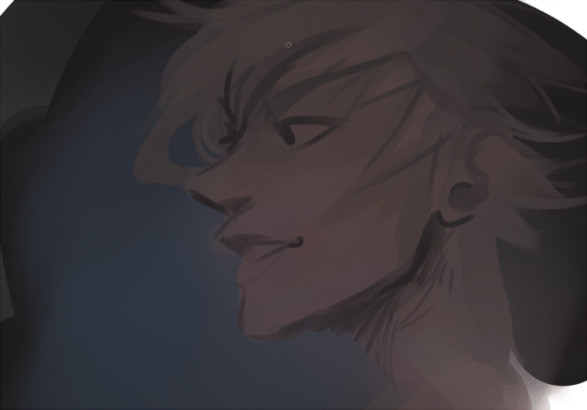
I’m gonna assume you know the basics of digital art: you can sketch, line those sketches using layers and opacity changes, and fill the lines with color, maybe even opting to add some shading…and you’ll get something like this:

You know, cell-shaded, or maybe the shading’s blended, but you’ve still obviously a line drawing with color put down on layers beneath the lines.
The next intuitive step is to try going “lineless”…but when you remove the lines you get this:
idk about you but I’m laughing at how stupid this looks
When I was first teaching myself to paint digitally, I didn’t really know how to deal with this. Without lines, the form of the subject vanished or became a mess like the above. Even if I was meticulous and careful about placing down the color such that without the lines layer turned on, the shapes fit together, it didn’t look quite right. There’d be gaps, I wouldn’t know how to incorporate the subject into a background, the contrast wouldn’t be high enough, or it’d just in general look too much like a screenshot from Super Mario 64.
Painting requires a different process than the above. You’ll have to let go of some of your habits and conventions. Such as staying in the lines. Such as fully relying on the lines. Like, I love my lines, I love my sketches—but in painting, they are guides for form, and are not the form itself. So let me go through how I approach a given painting:

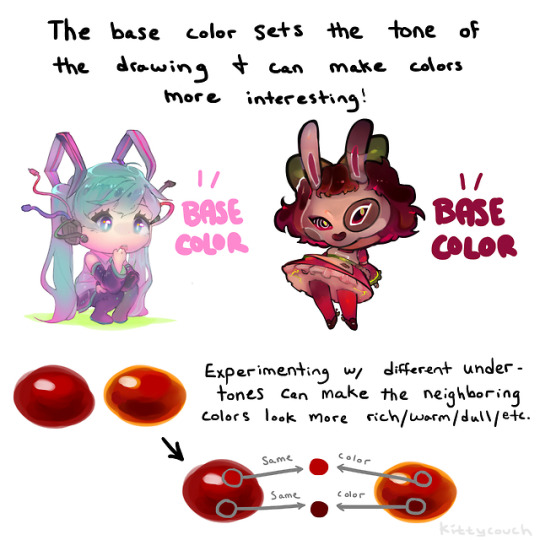
My painting process starts with a sketch (here a boring portrait for demonstrative purposes). I make the opacity of the sketch layer something like 30%, and then throw down my base colors on a new layer underneath. I’m not being meticulous about the sketch itself, because again it’s just meant to guide my placement of color. I’m also not meticulous about my placement of the color.
We’re essentially sketching with color. Because ultimately what we want is for the color to take on the form and shapes conveyed by the sketch.
There’s a lot going into this about how to use value, how to shade, how to use color, etc. that I’m kinda skipping over because it takes a lot of time to explain…but there are hundreds of tutorials out there on those topics so please, google around! I found some helpful tuts that way when I was starting out.
Something I find v useful is to keep selecting colors that already exist in your image for shading and hue adjustment. This is why I start with really blendy, low-opacity brushes when throwing down color on top of the background. I can then select colors within there that are a mix of the two.
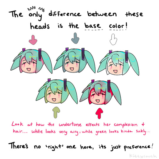
For instance, I’ll select the color of the lines here:

…and use that to shade:

And maybe I’ll select one of the darker shades around his eye, but not the darkest, to make the shading a smoother gradient…and so on.
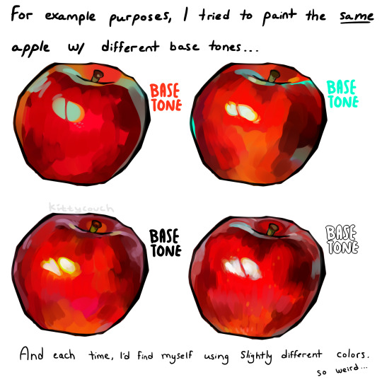
What I do in general at this point is go over the shapes and lines of the sketch. Such that I can turn off the sketch layer and see this:
I’m replacing the lines with shading and value. I’ll continue to do this as I keep adding color.
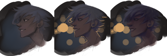
This is all super loose. I am not dedicated to any particular stroke. I just want the colors and shading and light source to be right. I’ll use overlay layers to boost contrast or add a hue.
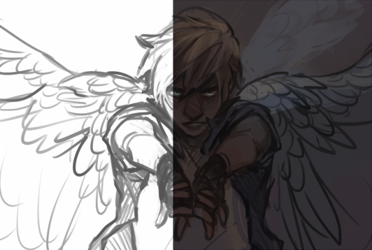
Here are other examples where I used this process:

I am constantly changing brushes and brush settings as I paint. It really depends on what effect I want where. I am also constantly selecting new colors and applying or blending those in. I don’t believe in having some uniformly applied base color and then shading with only one or two…that’s what I’d do if I was cell-shading like the first drawing I showed you here, but painting should be about messing with color and opacity and blending to make millions of hues!
Good rule of thumb: Hard, opaque brushes for applying color. Soft, dilute brushes for blending colors. Sometimes hard, dilute brushes can make some cool blending effects! I personally prefer harder edges on my shading so that’s a brush I use often.
This is getting a bit long so I’m gonna split it up into multiple parts, but really what I want you to get from this is:
1. learn the tools at your disposal until they are intuitive
2. sketch and line are guides for form, not the form itself
3. rather, hue and value will produce the form
And of course, practice makes perfect!!! Every drawing you make, every painting you make, will bring you one step closer to the artist you want to be, and thus every drawing and every painting, no matter what, is a success.
9K notes
·
View notes
Photo
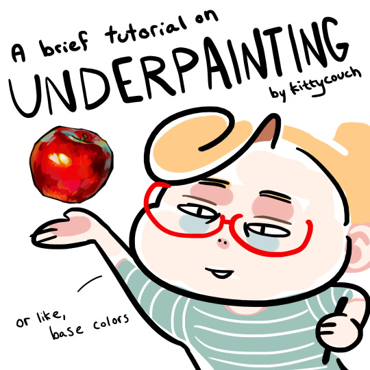
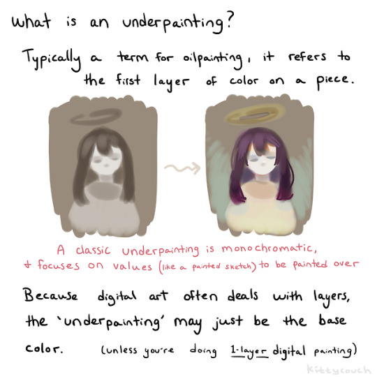
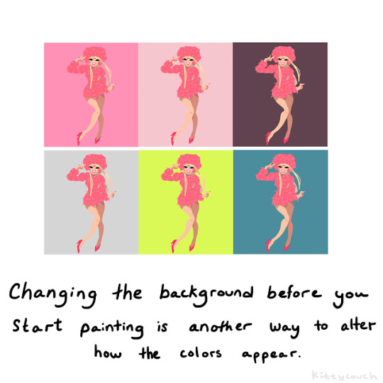
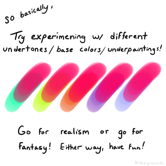
No one asked but here’s a brief tutorial on digital underpainting and how it can add some extra flavor to your art!
(I got asked this a couple times so just to clarify: I used “overlay” in the second slide… but the rest of these examples are JUST painted on, no effects! Try playing with the opacity on your pencil/water/brush tool to allow the base color to show through!)
52K notes
·
View notes
Photo


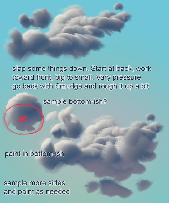
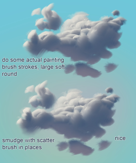

mixer brush cloud painting mini tutorial
not a replacement for actual painting!!!
Brush: https://drive.google.com/open?id=1iNOQmtBqiU1K3MnnUH4fmciUYGjv6Hcm
13K notes
·
View notes
Text
Some Photoshop Tips
I’ve been getting quite a few asks about the process for the patterns in my stylized artworks, so I decided to put together a couple of tips regarding them.
Firstly, what you need are
— CUSTOM BRUSHES —
Most of the patterns I use are custom brushes I made, such as those:
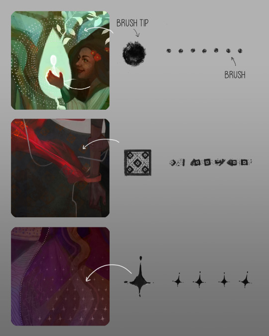
For the longest time I was convinced making brushes must be super extra complicated. I was super extra wrong. All you need to start is a transparent canvas (2500px x 2500px max):
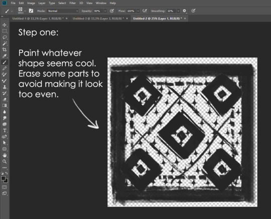
This will be your brush tip. When you’re satisfied how it looks, click Ctrl+A to select the whole canvas and go to ‘define brush preset’ under the edit menu
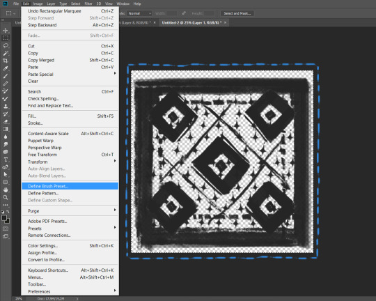
You will be asked to name your new glorious creation. Choose something that describes it well, so you can easily find it between all the ‘asfsfgdgd’ brushes you’ve created to be only used once

This is it. Look at it, you have just created a photoshop brush. First time i did I felt like I was cheated my whole life. IT’S SO EASY WHY HASN’T ANYONE TOLD ME
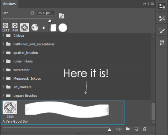
Time to edit the Good Boi to be more random, so it can be used as a Cool Fancy Pattern. Go into brush settings and change whatever you’d like. Here’s a list of what I do for patterns:
- under Shape Dynamics, I increase Size Jitter and Angle jitter by 5%-15%
- under Brush Tip Shape, I increase spacing by a shitload. Sometimes it’s like 150%, the point is to get the initial brush tip we painted to be visible.
- If I want it to look random and noisy, I enable the Dual Brush option, which acts like another brush was put on top of the one we’ve created. You can adjust all of the Dual Brush options (Size, Spacing, Scatter, Count) as you wish to get a very nice random brush to smear on your backgrounds

The result is as above. You can follow the same steps to create whatever brush you need: evenly spaced dots that look like you painted them by hand, geometric pattern to fill the background, a line of perfectly drawn XDs and so on.
BUT WAIT, THERE’S MORE
— PATHS —
But what if you want to get lots of circles made of tiny dots? Or you need rows of triangles for your cool background? Photoshop can do all of that for you, thanks to the magic of paths.
Typically, paths window can be found right next to Layers:

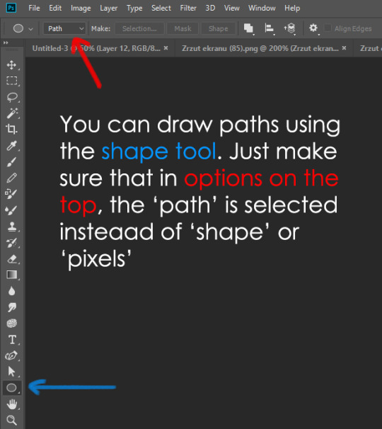
Draw whatever path you want, the Shape Tool has quite a bit of options. Remember, paths are completely different from brush strokes and they won’t show up in the navigator. To move a path around, click A to enable path selection tool. You can use Ctrl+T to transform it, and if you move a path while pressing Alt it will be duplicated.
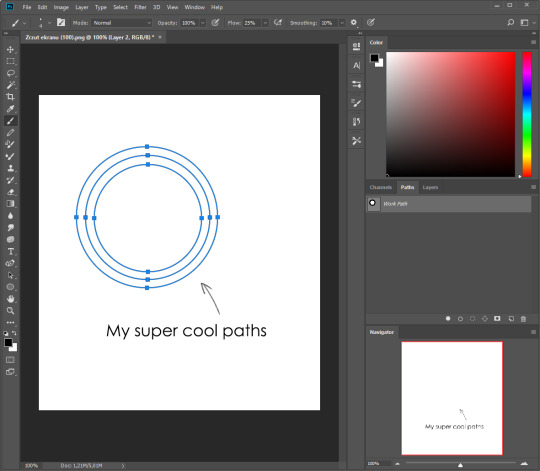
Now, pick a brush you wish really was in place of that path you’ve drawn and go to layers, then choose the layer you want it to be drawn on. Then, click this tiny circle under the Paths window:

Then witness the magic of photoshop doing the drawing for you while you wonder how tf have you managed to forget about this option for the past 2 years
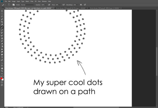
You can combine special brushes and paths for all sorts of cool effects. I mostly use them in backgrounds for my cards, but you can do whatever you want with them.
I hope that answers the questions for all of the people who were sending me inquires about the patterns. If you have any questions regarding this or any other Photoshop matter feel free to message me, I’m always up for complaining about how great and terrible Photoshop is C’:
93K notes
·
View notes