
Don't wanna be here? Send us removal request.
Statistics
We looked inside some of the posts by infographicsdeantemjit and here's what we found interesting.
Average Info
Notes Per Post
22
Likes Per Post
0
Reblog Per Post
0
Reply Per Post
22
Time Between Posts
6 days
Number of Posts By Type
Text
6
Last Seen Tumblr Blogs


Fun Fact
Tumblr is used by 21% of adults online aged 18-29 years.
Text
Week 3 - Final Production
For this final week for the chocolate infographic, we are to keep developing ideas and onto the production in Adobe Illustrator. I’ve got all of the researches completed, and the sketches are done, now it is time for me to create the infographic. However, I don’t want to use the 3D tools in Illustrator as I find it to be quite rigid and it doesn’t have the option for me to edit the shades and tones of the isometric shape freely.
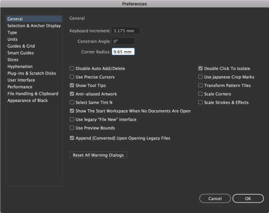
The easiest way for me to go about this is to create an isometric grid. Creating this isometric grid is really simple, I need to go to the Preferences and general. In the general panel, change the keyboard increment to 3.175 mm and adjust the corner radius to 9.65 mm and click OK.
Select the line segment tool to create a straight line. Next is to make sure to press and hold the shift + alt and keep pressing the right arrow key to form equal increments between these lines.

Expand the lines and group them together so that they’re in place. Copy and paste the lines again, and select the rotate feature. Change the angle to 60° and press OK.
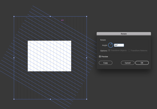
Copy and paste the lines again and reflect it vertically to get the opposite angle.
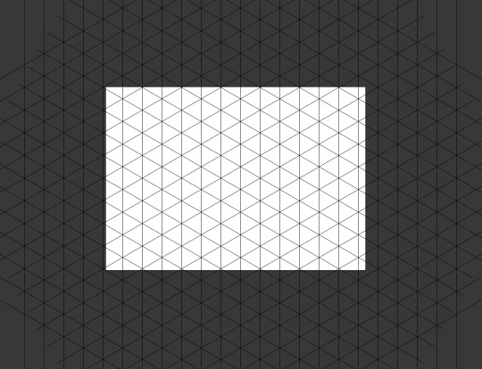
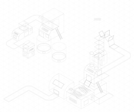
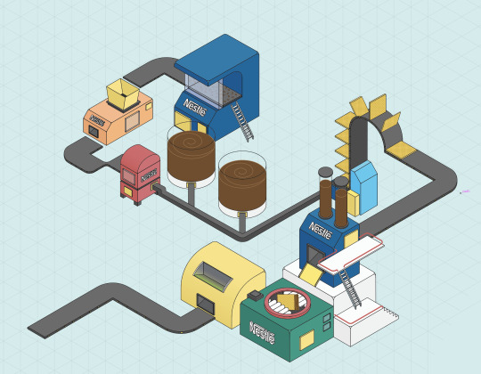
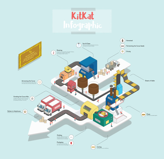
Once the isometric grid is completed, I began creating the first building which I have sketched - sorting and cleaning machine. I have decided not to create machines for the harvesting, fermenting and drying process as it would complicate the infographic. I thought about it, and the approach for me to make this work is by creating a truck delivering the cocoa goods to the factory, and going through the process of cleaning, roasting, winnowing and grinding, etc.
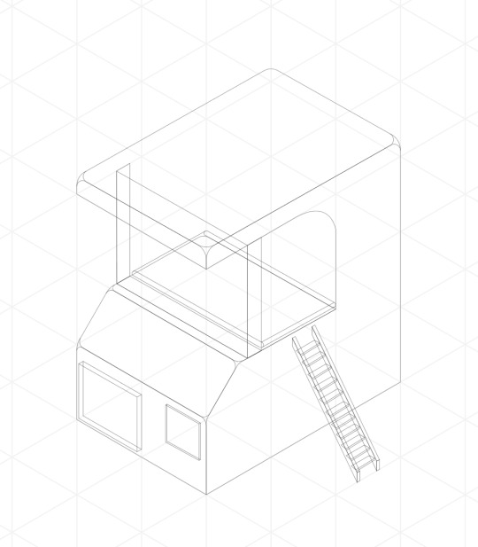
On the other hand, if I do add all of the above into the infographic, it would look really chaotic and too much which in results, could make the viewers confused about where they need to be looking first. Moreover, it would also ruin the layout for this infographic which I had initially planned. Furthermore, To make everything more accessible, I didn’t add colour to the isometric building yet. All I did was use the stroke and set it to 0.25 pt so that I get a clear view of the general shapes of the building. I repeat the process and create the roasting, winnowing and the grinding machine the same way.
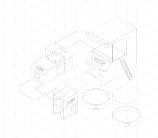
I then repeat the process and create the machine for where the sheets of wafer travelled to and the paste machine which the wafer sheets are pasted together. In addition to that, the cutting machine, molding and packaging machine which all needs to be created. At this point, I already had a clear goal of what this infographic is going to look like, including the general layout of where the viewers should be looking at first.
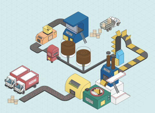
Once the design has been completed, it is time for me to add colours into these building and the process of this is really simple. I created another layer behind the design layer and used the pen tool to fill in the gaps with shades of colours appropriately. Moreover, I created many layers for the colour process as each individual layer would have each building I had designed. The reason why I do this is that it is easier for me to know which layers is which for the colours, therefore, I would always have the ability to change colours if need be, and it just makes everything organised.
Once everything is coloured in, I then add additional objects such as the cardboard boxes, cocoa beans, more wafer sheets, KitKat bars, truck, etc. These items are then coloured in the same way as I did it for the machines and making sure that I create separate layers for these as well.
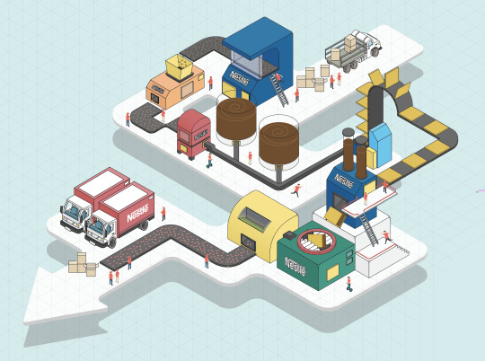
In addition to that, to make this infographic a little more fun and interesting to read, and instead of leaving this as it is - I have decided to add people into the factory to show that they’re working and to make this infographic a little livelier. However, my intention was not only to make it fun, but the uses of these characters were to give a sense of scale to the viewers in comparison to the sizes of the machines.

To make this infographic really pops, I have to add a floor to act as a base for these buildings. However, it isn’t going to be just a plain floor. My intention for this is to create an arrow floor, indicating the directional of where the viewers should be looking first and in which orders.
I finally add the line indicating to these machines and explaining what it does, including the process that it goes through. Moreover, I tried to keep the information as little as possible and leaving the explanation only on the graphic itself. I then added the title “KitKat Infographic,” at the centre top of the page to let the viewers know what this infographic is about.
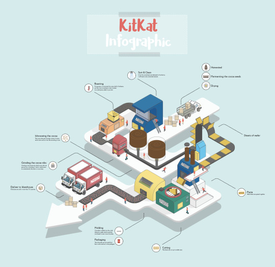
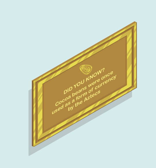
Lastly, to make this infographic fun to read, I have added a golden frame on the left-hand side, with information about how cocoa beans were used as a currency by the Aztecs. This was also associated with how the frame is golden as well as the cocoa beans, as it is an indication of how it was once used as a currency before.
Creating this infographic in an isometric view was something that is new to me, and it was a great experience, plus challenging at the same time to create something this complicated in the amount of one week. However, I have learned a lot from this.
Is the design successful?
From the amount of work that I’ve put into this project, I could say that this design is successful. I had my doubts at the beginning of the project as this was my first attempt to create an infographic in an isometric view. Not only does it turn out well, but I really like the final results.
What went well?
What went really well for this task was that I was able to get to the results that I had in mind at the beginning. Moreover, it also went really well that I was able to connect these buildings and machines together without any problems, as I was bewildered of what I should be doing first and how these are going to be connected to each other.
What didn’t go so well?
Adding the shadows was one of the hardest things I had to do for this infographic. The tools can be rigid in Illustrator, and this is why I had to import a PNG of this infographic to photoshop, and I used the tools in Photoshop to create the shadows instead as it was easier for me. However, it does take a long time to do it, and this is why I left out the shadows for the people as I was really short on time.
What could be improved?
As mentioned above, if I could improve on this, I would redo the shadows entirely and get it as accurate as I could possibly can. Moreover, I’d also like to experiment with more vibrant colours as to what worked well with this infographic.
Why this idea?
Initially, I wanted to just create the process for making chocolate, but I thought that it has been done too many times, so I just wanted to do something a little different by focusing on a chocolate brand and how they’re made.
Final results:
7 notes
·
View notes
Text
Week 2 - Idea Generations
For this week 2, after we’ve completed the research on the chocolate and its origin, it is now time for us to generate initial ideas and develop them. However, before I can begin to generate any ideas, I need to first decide a specific type of ideas and information about chocolate that I am going with. For instance, the history of chocolate, branding of chocolate, the process of making chocolate, etc.
In this case, I have decided to go with the making process of chocolate. After looking at many different brands of chocolate, I have decided to do an infographic about KitKat because I think it is the most popular among other brands. Moreover, I am also curious about the process that goes into making these candy bars.
KitKat bars are not simply popular as they currently hold more than 300 KitKat flavours. However, the reason why I decided on KitKat chocolate bars as opposed to various other brands was that KitKat bars produce a rather exciting way of producing their chocolate bars. I consider the process of making it to be visually astounding, and my intention was to make this into a fun and interesting infographic.
This was inspired by what was created by Irene, as she showed us her infographic at the beginning of the lesson and mentioning the uses of the 3D to turn the chocolate bar into the isometric view. I was also interested in the idea, and I knew that I wanted to use the isometric view to create a 3D version of a mini factory, and showing the step-by-step process of how the KitKat bars are made.
I could have used a flat 2D design. However, I wanted the audience to capture a feel of the process step-by-step through the isometric view as it would be more pleasing to look at, not to mention fun. In extension to that, it was also to test my ability as to how much I can push myself to create something I have never tried before to expand on my knowledge and skills.
I already have the research I did for the making process of regular chocolate bars - from harvesting to the grinding process. However, I needed to do additional research on the process for the KitKat bars. Luckily, I came across a video on Youtube by CNN showing the steps of how KitKat bars are made, and it was pretty clear as well.
youtube
This saved me a tremendous amount of time on the research for how the KitKat bars are made as the video gave me all of the information I needed to create the infographic.
The next thing I did was getting some references and ideas for my infographic, and the best approach for this is to create a mood board. I have gathered a lot of references on Pinterest which potentially could be useful for my final production of the infographic.

I then plan the process step-by-step from harvesting the cocoa pods to delivering to the warehouse, and to make it simple for me to understand - I created a simple flowchart showing all of the processes, and it was also as a reminder of what I need to be creating first.
A list of the process:
Harvesting
Fermenting
Drying
Sort & clean
Roasting
Winnowing
Grinding
Sheets of wafer
Paste
Cutting
Molding
Packaging
Deliver to warehouse

The next step is sketching. Creating something like this as a factory, and not to mention, in the isometric view is very complicated. I have to plan each building carefully and placed them in the position that the viewers can see as well. There are a lot of things to consider, and it initially confuses me since there are a lot of steps that I needed to create.


I drew the buildings for each of the processes while getting image references on the internet of what these machines actually look like in the factory. It gave me some ideas for creating my own designs of the buildings and machines. However, I just didn’t want to copy the machine to be realistic directly, but I wanted to add my own styles into these as this is an infographic and I wanted to express my ideas as creative as possible.

In the sketches, I did not connect this buildings and machines together yet as it is really complicated trying to do so. Therefore, my best method for this is to draw all of the machine and buildings to their finished form individually and decide later in Adobe Illustrator.


Finally before moving onto Adobe Illustrator is to decide my colour palette for this project, and I didn’t want to go overboard and choose many colours, so I ended up with choosing red and white as the base colour as these two colours are the same as the KitKat candy bars package. However, these two colours are not my final choices as it really comes down to what I feel worked well for the infographic.

7 notes
·
View notes
Text
Week 1 - Research
Where did chocolate come from?
Chocolate comes from cocoa beans, which grew on trees in Central America and South America starting at 100 million years ago. Moreover, cocoa trees can only live in hot, rainy environments. The history of chocolate goes way back - including cocoa farming. Cocoa farming spread quickly north to Central America, and by around 2000 BC, pre-Olmec people in Central America (modern Mexico) were grinding up beans and making them into hot or cold spicy chocolate drink.
What was it used for?
There are two kinds of chocolate: cocoa powder and solid chocolate. For instance, cocoa powder is used to make chocolate drinks and some good baked recipes. While solid chocolate, either plain or sweetened, is eaten or used in baking or cooking.
Cocoa powder - cocoa powder can be made into hot or cold chocolate drinks.
Couverture chocolate - Solid chocolate is used in candy making.
Baking chocolate - Naturally bitter baking chocolate is melted and mixed into batters for cakes, pies and puddings.
White chocolate - it only contains cacao butter but no cacao solids. The taste of white chocolate is sweet and bland.
Milk chocolate - Milk chocolate contains fewer cacao solids and more milk and sugar.
Dark chocolate - it contains a high percentage of cacao solids and is very bitter.
When did it get to Europe?
Sweetened chocolate didn’t appear until Europeans discovered the Americas and sampled the native cuisine. By the 17th century, chocolate was a fashionable drink throughout Europe. People believed it to have nutritious, medicinal and even aphrodisiac properties. However, it remained a privilege of the rich largely until the invention of the steam engine made mass production possible in the late 1700s.
How chocolate was used in different cultures?
The Maya - used chocolate in religious rituals; it sometimes took the place of blood. Chocolate was also used in marriage ceremonies, where it was exchanged by the bride and groom, and in baptisms.
Aztecs - The cocoa beans were used as currency. 10 beans would buy you a rabbit or a prostitute. 100 beans would buy you a slave.
Mexico - chocolate is still used mainly as a beverage. Main drinks are Champurrado, which is a chocolate corn drink.
The Yucatan - they used potions that had cacao and mixed spices, honey, pepper and tobacco juice. This was used to treat diseases and skin eruptions.
What are the chemical and psychological effects of chocolate?
Blood pressure - about a 100g of chocolate, each day can lead to a small reduction in blood pressure.
Brain - a regular dose of dark chocolate can improve our brainpower and memory.
Heart - eating dark chocolate can decrease in ‘bad’ LDL cholesterol. One study suggests that bacteria in the stomach ferment chocolate into useful anti-inflammatory compounds that are also good for heart health.
Appetite - Dark chocolate is high in fat, which makes you feel fuller for longer. It might also increase insulin sensitivity, which improves our ability to absorb sugars rather than store them as fat.
Digestion - Chocolate contains caffeine, which can trigger symptoms of irritable bowel syndrome (IBS) as it transits through small and large intestine 4-5 hours after eating it.
Mood - within 1 to 2 hours, the active compounds in the cocoa are absorbed into the bloodstream, boosting out levels of serotonin and endorphins, and giving us a pleasurable high.
References: https://quatr.us/south-america/chocolate-come-south-america.htm References: https://www.ehow.com/facts_5130964_chocolate-used.html References: https://www.telegraph.co.uk/food-and-drink/features/the-science-of-what-chocolate-does-to-your-body/
0 notes
Text
Week 3 Mini Project - Infographic
In this mini project task that was set to us on week 3, we were assigned to numbers ranging from 1 to 4. This number is a representation of the subject we were given to design an infographic specifically on the topic we got.
This is the list of different themes:
Arts/Cultural UK
Food UK
Weird/strange/unknown UK
Historical UK
I was assigned to number 2 which the subject for me is ‘Food UK’. It is a subject that interests me as I am interested in researching more about the UK foods.
First and foremost, before I begin researching or creating the infographic - I must create a mind map first. This should include information that I’m interested in and subjects that I could expand on.

This is the mind map that I created for which contain only subjects that I am interested in. On the right-hand side, I expanded on the topic for ‘Weird foods in the UK’ and made a list consists of only and truly the weirdness.

Furthermore, I expanded on a few more subjects that interest me such as different types of cheeses in the UK, types of bread and popular food in the UK.
In the end, I decided to go with weird food in the UK because I think that is interesting and people should know more about these odd foods. I then begin researching on the subject about their origin, how it’s made and what ingredients actually go into it.
These are the weird foods that I found:
Haggis
Haggis is made by mixing sheep’s heart, liver, and lungs with oatmeal and onions. The origin of Haggis is a Scottish dish and was traditionally cooked in the animal’s stomach. These days, Haggis is made in sausage casing.
Offal
Offal is animal organs and is used in many British dishes, like steak and kidney pudding, which is made with diced beef, lamb’s or pig’s kidneys.
Spotted dick
The name in itself is already weird. This popular dish of sponge pudding made with suet and dried fruit and served with custard.
Black pudding
A blood sausage that was born out of the tradition of butchers combining every last scrap of different butchered animals. It is a breakfast staple in the UK and Ireland, where it is served with toast.
Jellied eels
Do the name sound appetising to you? Chunks of silvery eel coated in slimy gelatine. In the 18th century, not only was eels were cheap, but they were easy to prepare as well. The eels would be chopped, boil them in herbs, and then allow them to cool; the eels would produce enough of their own gelatine so that a soft jelly would form around the pieces.
Stargazy pie
A terrifying looking dish that is made with baked pilchards (a type of fish), eggs, and potatoes as fillings. This gets its name for the way fish heads are baked into the pie, so they are just jutting out of the crust to ‘gaze’ up at dinners.
Periwinkles
This is the excellent traditional foods of Northern England. Periwinkles are very common, and it is a form of sea snail. They are best served with salt, garlic and butter but can also be served soaked in vinegar if a more piquant flavour is desired.
Faggots
A faggot was a meatball made from a bundle of off-cut meats including belly, liver and heart of a pig. The meat mixture would then be blended with breadcrumbs and onions before being packed into a caul.
Faggots became very popular during the hard times of WWII and are still sold in butchers and supermarkets. Unfortunately, the name has also had some problematic associations over the centuries.
References: https://britainexplorer.com/ten-strange-british-foods/ References: https://bestlifeonline.com/weird-british-foods/
Research 2:
Collect 3-5 infographics on a similar subject that you like and briefly explain why:
Infographic 1

The layout and the design of the infographic are rather simple which is why I think it is successful. The beautiful design of a wine bottle in the centre clearly indicates what this infographic is about without having the need to even look at the information, which is one of the reasons why I like this infographic. The tint of green colour in the background used is an excellent choice as it contrasts and makes the clean san serif text to stand out. Information is also in a clear and easy to read layout and are labelled with the coloured dots.
Infographic 2

I like this infographic a lot as it uses minimal text to communicate but focuses more - pictorially. Moreover, the colour schemes of the food/objects balanced really well with the bright and saturated coloured background. Usually, a saturated background wouldn’t be my choice in picking colours as it could make the balance of the whole image looked weird and off as the background stand out more than the image itself. However, the creator did an excellent job at making the colours looked balanced. Information is also clearly labelled, and it uses a clean san serif font which looked really modern and fitted well with the overall look of the infographic.
Infographic 3

Again, this is similar to the one shown above, and it really goes to show how much attention and details the creator has put into these. I really like this infographic as the image are clear and easy to understand. Moreover, information is clearly labelled, which makes it easy to navigate through the infographic without being confused where to look first. The background colour choice is excellent as it balanced it really well with the image and doesn’t stand out too much.
Images source: https://www.pinterest.co.uk/

After the research is completed, I then began planning the title name for the infographic, and I came up with 3 different names such as, ‘WTF UK edition’, ‘Super weird food UK edition’ and ‘Weird UK food’. These are not the final version for my title of the infographic as I could change my mind at any given chance if I prefer another name for it.
Furthermore, I listed out a checklist and a plan of what I am going to be doing in Adobe illustrator as a reminder so that I won’t forget any details when it actually comes to creating it for real. Moreover, I have conflicted ideas whether I wanted to keep it in a minimalist and a vector style or I could draw a straightforward illustration of the food in Photoshop. Since I couldn’t really decide on it yet, I just drew a few drawings of the food in the minimalist style to see how they would look.

Next, I drew 2 small thumbnails of what I wanted my infographic to look like, including the techniques that I wanted to experiment on. These are simple drawings that took me no more than 5 minutes, and it isn’t going to be my final idea either as I could change my mind if I think another look would be suitable.
For now, I came up with 2 thumbnails that are looking similar to one another. The layout is also simple and organised which I think are really important. However, it ended up looking more like a poster rather than an infographic, so I decided to start my idea again.
I thought back about how we can’t use the map in our infographic, but I wanted to have beautiful graphics elements as a centre focal point of it. Therefore, I came up with an idea of putting a food stall in the centre of the page with weird foods surrounding it. This would not only make the infographic fun to read, but it is also to ease off the amount of information that is on the page and make the readers feel less intimidated.

I began to do a quick sketch of the food stall, and it doesn’t need to have a lot of details on it as this is all going to be a vector. Once the ideas are in places, I then do a final plan for the infographic and drew 3 thumbnails in the orientation of horizontal. It would make sense as opposed to going with a verticle infographic.
The layouts for these infographics are basic, and I wanted to keep it that way as to not intimidate the viewers instead make it fun for them to read. In the end, I decided to go with the first design as the layout is excellent and easy to understand.
Furthermore, I also included some ideas for adding a chart showing the percentage of weirdness for the food as well as their popularity to make the infographic even more fun.
I had about 9 weird foods in the UK that I wanted to include in the infographic which are haggis, offal, spotted dick, black pudding, jellied eels, stargazy pie, periwinkles, faggots and liquor sauce. I have also decided to illustrate a drawing of these weird foods in Photoshop and exported it into Adobe Illustrator in the later stage.
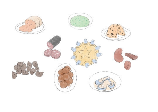
These are the 9 weird foods that I have drawn in Photoshop with each one took me no more than 4 minutes to do as they were really simple to draw. Moreover, the colour schemes I chose in particular for these foods are quite faded since it is the style that I am aiming for.

The process of creating this infographic is also very simple, and it didn’t take me a long time to create at all. Moreover, my colour choices for this infographic are colourful as my intention for this is to make it fun and to stand out. I wanted to mention the structure and layout of my infographic and I will be explaining it in details.

As shown above, the red marker shows an indication of where the readers are supposed to look first, and it’s not that the viewers are forced to read it in this particular way. However, people would always scan information at the top left corner first before beginning to scan to the right-hand side. I took advantage of this and made my heading, ‘UK Food’ on the top left-hand side.
Furthermore, the triangular coloured flag on the rope wasn’t just only there for the look, but it is added as an indication that is meant for the viewer’s eyes to follow - leading it to the word, ‘Weird?’. Below it, there is the down arrow which indicates where the viewers should look next. All of this is intentional, and this is the way that I think most people will follow. However, in the end, whichever ways the readers would read first doesn’t matter as this infographic is designed and meant to be read in both directions anyway.
Final results:

0 notes
Text
Week 2
What is a Venn Diagram?
A Venn diagram shows the relationship between a group of different sets in a visual way. To understand a Venn diagram in a clear, understandable way, it is a way to sort data into two or three circles which these circles overlap in the middle leading to an answer or a solution.
Venn diagrams were named from John Venn who made its uses in 1880 with his paper entitled, “On the Diagrammatic and Mechanical Representation of Propositions and Reasonings.” However, Venn diagrams have been around for much longer. Philosopher and mathematicians have been employing similar diagrams since the 13th century.
The reasons why Venn diagram is useful for its uses is because Venn diagrams allow students to organise information visually to see the relationship between two or three sets of circles. However, over the time, their uses have been adapted from their original function. In fact, I found out that the diagram first appeared on July 22, 2008, on I’d Rather Be Writing, a blog focused on technical writing.

A year later, this Venn diagram showed up on Laughing Squid, a site that features “interesting art, culture & technology.” From 2009 to 2010, humourous Venn diagrams exploded and are popularised all over the internet.

References: https://www.lucidchart.com/blog/history-of-the-venn-diagram
These are the three Venn diagrams that I created:

There weren’t any themes that I was really interested in so I decided to create a humorous Venn diagram that we can all somehow relate to or find it funny at the very least.
For this particular Venn diagram, I created one ring circle to be larger than the others to show how important it was and to emphasise the idea that it was the central circle to look first. All of the rings are pretty self-explanatory, and I didn’t create this with an intent to make it sound depressing, but instead, I wanted people to laugh at it.

This second Venn diagram I created is similar to the first one as I am generally trying to create humorous Venn diagrams. For this Venn diagram, I know I wanted to incorporate school into the middle - the rest was figuring out how to make this funny. Long hours, sleepy and socialise came to my mind when I thought about school as these are the things we can all relate to.

For this final Venn diagram, I got inspired after seeing a Venn diagram on the internet. I thought I found it to be funny which is why I wanted to create another version of my own instead.
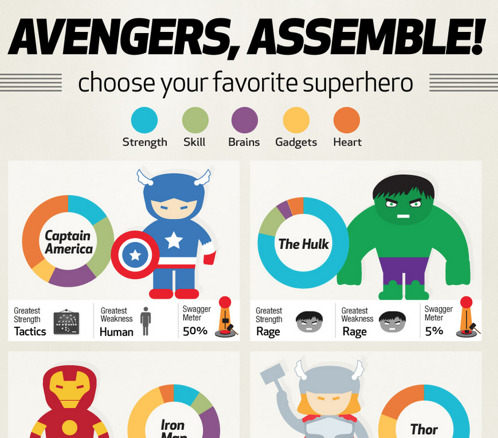
Superhero task
For this task, we had looked at an example of a superhero created with different attributes. For instance, there are 5 attributes in total which are, strength, skills, brains, heart and gadgets. These 5 attributes make up a hero, and we can see their strengths and weaknesses.
Similarly, we are asked to create a hero of our own in Adobe Illustration. However, before that, we were asked to get into a pair, and we must find out and turn our pair into a hero using the 5 attributes.
I originally wanted to let my partner thought up his own strength and what kind of powers does he want to have. However, my pair and I have agreed that we would question each other about our already existed skills in real life, which we will then turn those skills into superpowers.
I grouped up with George for this task and for the brain, George was good at English. Skill is drawing, strength is listening, the heart is being creative, and for gadgets, we just left it as blank as we can imagine and come up with stuff to add to the character.
I then used these strengths of George and turn some of his skills into superpowers. For instance, his skill is drawing - I thought up of an idea of using pencils as a weapon, and what better ways of turning it into a weapon but to turn it into arrows. As for his strength, it was listening. I turn it into superpowers by making his character being able to manipulate sound waves. To incorporate this idea better, I added a headphone to the character to make it somewhat related to that power.
Lastly, for the gadgets, I tried coming up with different ideas for it. However, I thought it was for the best to add robot assistance by the character side to make the hero badass. Whether the robot assistance being there useful or not, I will leave that to your own judgement.
After all of the ideas have been generated, I then turned these ideas into drawings first to see what the character would look like. Moreover, I thought that the superhero in the example looked a little too simple. Therefore, I wanted to create the character in more detail, and the style would be similar to a cartoon character.

Once I roughly have an idea of what the character would look like, it is now time for me to create the character in Adobe Illustrator. Everything is created using simple shapes with a combination of the pen tool to get the desired shapes.
This is the final results of the hero character:

7 notes
·
View notes
Text
Week 1
What is an infographic and what are they used for?
An infographic is a graphic visual representation of information, data, graphical charts, figures, and bars. An infographic is used to present information in clear and understandable ways which are the fun way to learn about information without having to read a ton of heavy reading.
A good quality infographic would have a data-rich visualisation of a story and are presented in a clear layout for readers to quickly follow. In addition to that, people are more likely to read an infographic than a text article.
What context can they use? (where are they used - e.g. factual information/news, retail, catering/coffee shops, travel/airlines, etc.)
Infographic can display any information if needed into fun ways of reading data. For instance, an infographic can be used in a newspaper, magazine, retail stores, hospitals, airport, schools, etc. A magazine can show infographic about a survey or any related information about the society.


These are just some of the examples of where an infographic can be applied to make it fun for readers. However, there are many benefits to using an infographic, for example, it is compelling and attractive. Including facts, figures, statistics and images into an infographic could attract readers more than just a text article.
What is a Venn Diagram?
A Venn diagram is a diagram representing mathematical sets pictorially as circles. In addition to that, A Venn diagram uses overlapping circles or other shapes to illustrate the relationships between the circles.
Venn diagrams are also called Set diagrams or logic diagrams, and they are widely used in mathematics, statistics, logic, and teaching. Initially, people first encounter them in schools as they study mathematics since Venn diagrams became part of “new math” in the 1960s.
Example of what Venn diagrams look like:


References: https://www.lucidchart.com/pages/venn-diagram
Venn diagram history:
Venn diagrams are named after British logician John Venn. He wrote about these Venn diagrams in an 1880 paper entitled “On the Diagrammatic and Mechanical Representation of Propositions and Reasoning”. However, the roots of this type of diagram go back much further, at least 600 years.
There are many purposes and benefits of a Venn diagram and here are a few examples:
To visually organise information
To compare two or more choices
Research what their function is:
Venn diagrams will allow people to organise information visually, so they are able to see the relationships between two or three sets of items. A Venn diagram consists of overlapping circles which each circle is subjected to their own titles.
Research Humourous Venn Diagrams:
A humorous Venn diagram is entirely different from the standard Venn diagrams which could show related information to mathematics or else. However, for humorous Venn diagram - the name itself is explanatory as it is created for fun. There are no right or wrong in the humorous Venn diagram as there can be multiple answers in the rings.
Some examples of the humorous Venn diagram:


1 note
·
View note