
A collaborative effort born on Twitter to debunk viral art, and to offer legitimate critique to artists.
Don't wanna be here? Send us removal request.
Statistics
We looked inside some of the posts by isthisartreal-blog and here's what we found interesting.
Average Info
Notes Per Post
2
Likes Per Post
2
Reblog Per Post
0
Reply Per Post
0
Number of Posts By Type
Text
1
Last Seen Tumblr Blogs


Fun Fact
28.6 is the average number of monthly visits per US mobile user.
Text
Investigation: Lewis Hamilton Helmet by @f1_bea
Investigation participants: Tang, CAT, Muse and NIN. Start date: 30th of June, 2021. End date: 30th of June, 2021. We have been tasked to investigate the art piece done by Twitter used @f1_bea. The original tweet can be found here: https://twitter.com/f1_bea/status/1410281773595082753?s=21 Many people raised issues with this particular piece of art, as there are some design choices that do not match with the rest of the piece’s aesthetic. This Twitter user has no prior history of posting art on their Twitter, which raised some alarms in our heads immediately.
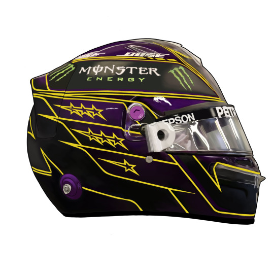
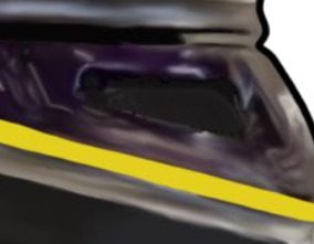
When you look at the full piece, you can see weird artifacting that could partially be due to Twitter’s compression, but our resident AI expert Tang thinks it is due to some filter work. Our primary motorsports illustrator Muse, however, thinks it is due to overzealous use of the blur and smudge tools. Such examples can be seen around the plastic parts near the Visor’s connection, the front of the helmet, and especially around the edges of the tearoffs. Here is a closeup of what we mean:

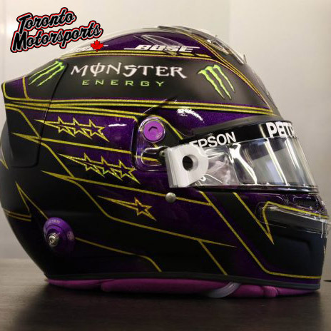
These weird artifacts could be caused by a multitude of things. Tang as our resident AI expert, obviously sees it as an AI error. He stated that it looks very similar to what one of his rather popular art filters struggles with, when trying to apply the look of a brush stroke. The algorithm often loses track of the actual shape, as it stacks stroke after stroke, causing mild distortion to the original shapes of the photo. Regardless he says there is clearly some hand applied brushwork. The illustrators Muse, CAT and NIN seem to have varying opinions regarding this. Muse seems to believe it to primarily be overpainted on top of a photo that has been passed through a filter. The idea here is that a filter was applied on to a photo to smooth out the surface reflections and hard highlights. Then the artist went back in to further blur and smooth the surface, applying paint to make things more uniform, and then blending it in to the surrounding colour. Muse’s primary argument for this is, that the yellow lines are not shaded like the rest of the painting, as the blurring and smoothing would have diluted them out of existence. Thus shading them would have been difficult, as there was nothing to match the colour to. Generally during this technique, colour is blocked into outlines and then blended together Muse also thinks that the fact that parts of the picture have lineart (specifically the back of the drawing), whereas the front has none supports the theory. As the colouration is fairly similar, the blurring and smoothing of the surface would’ve left them difficult to see, and an inexperienced artist would lack the skill to shade them in after the fact, thus resorting to adding harsh lineart instead of attempting to match the front of the drawing. Muse found a photo that seems to be the original. It was the first result of a Google search titled “Lewis Hamilton 2021 Helmet”. The general colour of the light seems to agree with this assessment.
Muse argues that due to the nature of the original photo and the method of accomplishing the task described, a harsh outline was necessary to define the shape of the helmet, as most of it would have been faded out during the smoothing process. Trying to blend in colour to look natural while the rest is feathered away is a difficult task to accomplish, when you lack the artistic skill and experience required. Muse thinks that the software used was likely Krita or Procreate, although states that Procreate often gives you more uniform lines. CAT and NIN on the other hand argue that the whole thing is overpainted. What this means is that it is traced over, and colours are generally shaped in dots over the original image, and then blended together using blur and smudge tools to create a smooth look. As people that overpaint tend to be tediously meticulous about details to get them to appear exact, they ironically often miss small details or holes that often get lost, forgotten, or pixelated, such as this example:
NIN specifically states that she has tried this technique before, and she often forgot to detail, smooth or colour in places as the original photo was laid under and made seeing her own work difficult. Neither of the two have an explanation to why the artist resorted to lineart in some places, where the rest of the drawing used painterly shading. CAT and NIN think the software used was Procreate. During this time, the artist provided a timelapse that could have been achieved by using either technique. One timelapse was omissive, and both Muse and NIN immediately pointed out that it is likely using a technique that is common with overpainters. This is called “omissive timelapse” or “pause timelapse” technique. What this means, is that the timelapse is recorded either in pieces, or edited to clip out parts where the original image lays underneath as reference. During this timelapse, most of the detail is already there, and some colour have been blocked in. Here is a link to the timelaps the artist provided: https://twitter.com/f1_bea/status/1410305202138320900?s=20 Regardless of how you look at it, there is something off with this painting. The design choices within the painting itself collide, such as the choices of soft painterly shading paired with very harsh inconsistent lineart and yellow detail work. A lot of the text is far too sharp, and too perfect when compared to the original photograph. The dimensions essentially match exactly, when the two images are overlayed on top of one another, which is a feat even artists that have been doing photorealistic work for decades fail to accomplish without tracing or extensive measuring. It could be overpainted, which is a technique of tracing that is not deemed legitimate by the general art guidelines, as it does not actually create. It merely copies the original image. Tracing is seemed as appropriate and legitimate only when it is taking the original image to a new direction. Such a technique is often called “additive tracing”, “reference tracing” or “derivative tracing”. This is not such a case. We may be horribly wrong, and the artist may simply have a style that coincides with a lot of illegitimate art that our team has come across throughout our years in the art world. Regardless, we thank you for reading this article! We hope we have managed to bring some insight into this piece of art, and for the methods that could have been used in its production.
2 notes
·
View notes