
Statistics
We looked inside some of the posts by jacquelinenath and here's what we found interesting.
Average Info
Notes Per Post
31
Likes Per Post
13
Reblog Per Post
18
Reply Per Post
0
Time Between Posts
17 hours
Number of Posts By Type
Text
6
Photo
11
Last Seen Tumblr Blogs


Fun Fact
Tumblr has 16.74 million mobile monthly users in the US.
Text
Reflection - overall course
Throughout all the lectures and tutorials in this semester, I have learnt a lot new things about design from historical, now, and future. All these have developed my skills and gain a new knowledges about design world. I had done a lot of visual communication design works before in high school and foundation, but I never have gone a deeper understanding of design theories and movements, how design affect in society, what design do for us. All the lectures were very interesting for me which there were also some workshop for us to help us get more deeper understanding of the topics.
My favourite project in this semester was creating a zine (Ask me Anything), as I never done a published design before. Even though, the process was difficult and I stuck on creating a questions and arranging the layout, but I really enjoy the process. This course also helped me to improve my skills on using illustrator, photoshop and indesign. Moreover, I have learnt how to consider a layout to fit with the topic and build an aesthetic design.
The transition from face-to-face to online class was the most difficult part for me. I felt very awkward in the beginning of few weeks. I couldn’t believe that I have to spend for whole semester in-front of my computer for classes. For design class, I felt that its better for me to do in class as I can ask the teacher directly and shows the physical design works which I don’t need to upload my work in laptop or send through email. But fortunately, It all went successfully for the whole semester. Through online, I could still get feedbacks from teacher and my classmates and got discussed together.
Overall, I really had a great experience and I can’t believe time gone so fast that this already the end of the semester. I’m also very thankful to my teacher, Ben and my lecturers, Andy and Karen for their effort in this course. I hope that I will apply all my knowledges and skills in the future in my study and career.
1 note
·
View note
Photo
LOVE IT!! I like how you have added some elements on your cover which make more attractive and interesting. I also like how you have play with the different composition on each pages. Good work!!


Assessment 3: Ask Me Anything
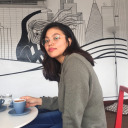
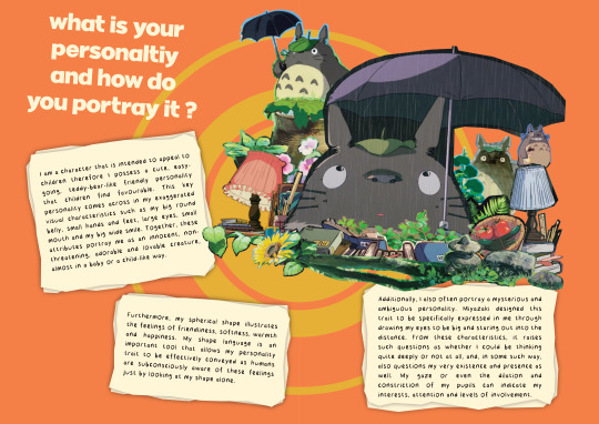
What a wild ride this one was. I had a lot of composition problems before but I finally settled on being a bit more adventurous with the layout. For me, the highlight of this assessment was the research because Totoro has always been one of my favourites so it was great to get a chance to learn about his design. Thank you to classmates that provided me with feedback. It really helped me figure things out and improve on my practice.
2 notes
·
View notes
Text
The video looks so good!! I like how you have edited your video and I realised that you have played with the tone for your sentences which makes the content attractive and engaging.
Project 3 Video

Red Telephone Booth - Giles Gilbert Scott | Hananta Dharma
This is my final work on the video and oh boy that took some time. This was my first time editing a video that is very detailed in all aspects such as sound, graphics, and effects. I found myself enjoying the process because I also learned lots of things in doing it from Google and YouTube. However, it was also quite frustrating and challenging at the same time. There were lots of times that what I did, did not match my expectation and is just different from the tutorials I watched on YouTube. Finding the right theme for this short documentary is quite tricky for me because I never actually made a theme for a video. Another challenge that I had to face was to find the information on Giles Gilbert Scott. There is just not much information about him and just a handful of YouTube videos about him and his works. It felt like the information I gave was very shallow and I did not dig enough. Making the visual effects also took me a long time. I had to make sure that it corresponds to what I am talking about.
All in all, I am happy with what I made and I hope it is informative as well as easy to be understood.
Link to the video on YouTube: https://youtu.be/SnBWlG4f7ZE
5 notes
·
View notes
Photo
I really like how you have create the collage and the way you used the negative spaces. Love with the different style of font and played with the thick and thin of the letter which makes more interesting!

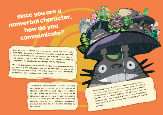
I incorporated the same colour spectrum to suit the aesthetic I was aiming for. This does seem quite plenty to look at, however it was my intention to design a more chaotic dada zine rather than a calm-looking one. As I progressed through designing the pages, I had solidified my decision to stick to a neutral-brown colour palette and included a “Dada renaissance” theme for my zine.
I find that the colour brown suits the concept of dada very well - it was an art movement birthed a long time ago and brown seems like a “mature” colour; a lot of the artworks incorporate faded or pastel colours; generally bright and vivid colours (such as blue yellow pink) are leaning more towards more modern art movements. You might also ask me why I had chosen to create a renaissance-based theme for my zine. Going back to when I first googled about dada, I had been browsing the images to get the basic grasp of what the art looked like, and the first image which caught my eye was the painting of the Mona Lisa with a moustache. I had found it quite comedic and liked the idea of using renaissance paintings to be part of my collages.
5 notes
·
View notes
Photo
I really like how you have explored with different kinds of brushes and love the comic part!!


Project 3
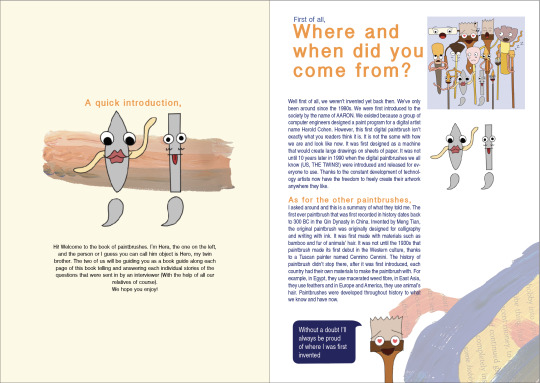
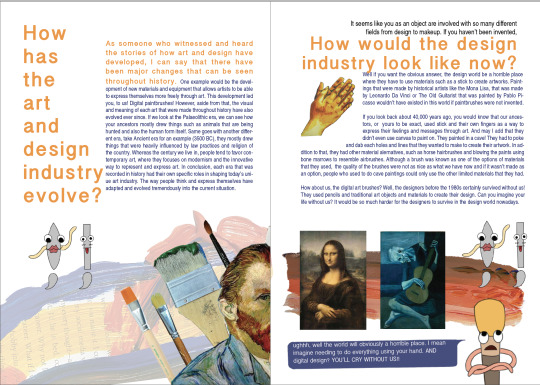
After the consultations and feedbacks I’ve gotten from Ben, here is my final design. I had chosen a natural colour palette to tie the pages all together. In the pages where the interview questions are shown and written, I had decided to keep the background white to represent with the colour of a canvas. This way it’ll represent how each questions were painted and crafted on a piece of canvas. Secondly, I decided to allow the zine to have two particular characters that I am interviewing to represent the rest of the paintbrushes. This way it’ll help the audience to understand the content of my zine better and to prevent the zine being overwhelming to read. Thirdly, to show what paintbrushes create, I decided put a number of different paintbrushes strokes to both decorate the pages itself and to what paintbrushes do and make in the art/design world. Finally, I tried to make my zine to have a fun atmosphere by creating a comic of scenes of what the paintbrushes have to go through every time they’re being used and also short dialogues of the paintbrushes’ opinions in between each questions. This way, it can also show the characteristics of each paintbrushes that I was aiming on showing on my last design.
11 notes
·
View notes
Text
Reflection - Zine
(Saturday,6 June 2020)
This project is my first time creating a self-published zine. At first, I was confused and didn’t know how to start. Thankfully, Ben showed me a lot of good and creative examples during the classes and get me a direction. I really enjoyed making and designing a zine, even tough I felt difficult during the process. In the beginning, I didn’t know what subject should I do, so I did a brainstorm and then I went into my interest part which is typography. I like to explore different and got to understand more of type characteristics. Its quite changeling me to come up with an idea and create an aesthetic layout for the topic. I did a lot of research of my subject, but then I found that there didn’t got a wide information about it, so making question was the most difficult part for me. After I browsed into a lot of website, finally I got deeper understand about the content and became easy for me to create the questions. Overall, this project gives me a new experience in design field!
0 notes
Photo


Last Lecture
In this week lecture, Andy and Karen did a recap on what we have studied in this semester. I have gain a lot of new insight and knowledges form the lectures which is I can applied in my future study and career as a designer. Besides that, Karen were also talked about how female designers in this world are not getting much attention from wide range of people. Then, she gave us a list of different female designers to look at.
I was then realised there was a name which is same with me, called Jacqueline Casey. I was surprised and got attracted by the name, so I did a research of her. She was an American graphic designer and she became best known for the posters she created for the Massachusetts Institute of Technology (MIT). Casey worked extensively in various creative industries such as a fashion illustrator and advertising, editorial, and interior designer. All her works was influenced by the Grid established by the post-war graphic design masters in Switzerland. I really like how she has worked in her poster which is simple and creates an aesthetics of negative spaces. She applied a striking image or bold typography with some small information texts around the poster.
References:
Rochester Insitute of Technology, 2020, “Jacqueline Casey”, RIT, viewed 5 June 2020, <https://www.rit.edu/carycollection/jacqueline-casey>.
Cooper Hewitt, 2020, “Jacqueline Casey”, viewed 5 June 2020, <https://collection.cooperhewitt.org/people/18053543/bio>.
0 notes
Photo


Zine - Final Work in progress
This is how my final layout looks like for my zine after I have discussion with Ben through email and in class. I was quite confident after I get feedback from Ben about my layouts.
During the process for my final, I have changed some of my layouts from previous one as some of them looks lack of elements to support my subject and I felt like something is missing. I changed the arrangement of my elements (geoetric shapes/ lines and typeface) as when I exported my pages into spread pages and I realised that my layouts are not quite attractive. So, in my question 3′s layout, I have added some elements on the right part so it doesn’t look too blank. Same with the layout for my question 4, which I decided to move the ‘Basker’ type into middle so it can fill my entire pages in both sides. I have play with negative space but I didn’t left it a lot, in order not to look boring.
6 notes
·
View notes
Photo

Week 10 Lecture
As in previous lecture, Andy also mentioned about a website called thisfacedoesn’texist.com. This program is created by Former-Uber software engineer Phillip Wang. In this website shows and generated a fictional person that made up by computer code or it can be called as generative adversarial networks (GANs). Every time we refresh the page, it will shows another new face and it goes infinitely. There is a reason why Wang creates this program, he said that he wants to know what GANs are capable of and how it will works to benefits our community. He didn’t create this to enable abuse of others, but he wanted to make the public aware of how far the technology has advanced so quickly. These make me think about where AI and technology will take place in the next decade.
Before I did a research, I can’t believe and confuse why this website was created and shows people faces that don’t actually exist in this world.
Paez, D 2020, “This Person Does Not Exist Is The Best One-Off Website Of 2019″, Inverse, viewed 31 may 2020, <https://www.inverse.com/article/53280-this-person-does-not-exist-gans-website>.
0 notes
Photo


Week 11 Lecture
In this week lecture, Andy and Karen were discussing what is next for design and where it will go, and how communication design in general transforming into new technology which is AI. They showed us many different kinds of design including parametric and generative design.
Parametric design is a paradigm in design where the relationship between elements are used to manipulate and inform the geometric design complex structure. It can be consider as a term used to describe a dimension’s ability to change the shape of model geometry as soon as the dimension value is modified. One of the example that Andy showed is Pepsi. I never know that Pepsi logo created by a basic pen tool or from other technique. So I did a research and get to know more about it. Pepsi logo got redesigned and derives in 2008 by using a set of geometric rules (circle shape). The designer has created different version of ‘Pepsi’, in order to enable each product to have a different permutation of the logo. I found this technique is really good as it can make the brand become recognisable through the used of repetitive exposure. I hope that I can create a logo or something else with this technique when I have time or in future.
Resource:
Davis, D 2020, “Parametric Typography”. Daniel Davis, viewed 31 May 2020, <https://www.danieldavis.com/parametric-typography/>.
0 notes
Text
Week 10 Lecture - Conceptual Art
This week's lecture, we were looking at the meaning behind the designs, how design works, and how design develops each year. Andy gave some of the examples to us and showed how the context of the objects explore their meaning. Conceptual art can be considered as conceptualism, it is an art that the concept/ idea is more important than the finished art. This art movement reaches beyond the two decades from the 1960s and 1970s. Marcel Duchmanp is the first designer who creates a conceptual art 'Fountain', in 1917.

The other example of conceptual art that I found is Pyramid of Oranges. It is a sculpture made by Roelof Louw, in 1967. He has used 5,800 oranges to form the pyramid. I was amazed how he came up with an idea of using fresh oranges to form his sculpture and he allowed people in the exhibition to participate in ‘consuming’ its presence. By taking an orange, each person changes the molecular form of the stack of orange.
How to work Better; Peter Fischli and David Weiss

Peter Fischli and David Weiss has been collaborate from 1979 to 2012. Their works include photographs, videos, installations, and sculptures which presenting a body of work that offers a deceptively casual meditation on how we perceive everyday life. In the image above is one of their artwork called ‘How to Work Better’ which contains 10 list of statements talk about an approach to everyday life as it is about productivity. I was quite amazed when I first look at the artwork during the lecture. They didn’t care about the used of size and where they showed their artwork on one of the building on the street.
Reference:
Tate, 2020, “Conceptual Art – Art Term”, Tate, viewed 30 May 2020, <https://www.tate.org.uk/art/art-terms/c/conceptual-art#:~:text=Conceptual%20art%20is%20art%20for,1960s%20to%20the%20mid%2D1970s.>.
Public art fund, n.d, “Peter Fischli David Weiss : How To Work Better - Public Art Fund”, viewed 30 May 2020, <https://www.publicartfund.org/exhibitions/view/peter-fischli-david-weiss-how-to-work-better/>.
0 notes
Text
Project 3 - work in progress
As I said in my previous tumblr that I’m going to change some of my interview questions of the subject that I chose. Some of those questions are too board so I decided to change and develop them.
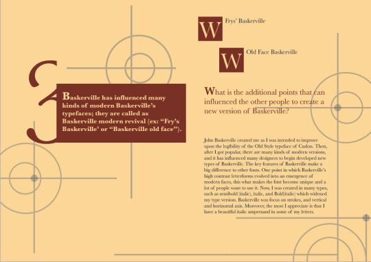
1. There’re 3 types of Baskerville versions; metal type versions, cold type versions, digital versions. Why do you think these 3 types of versions is different from their timeline or their difference in their designs?
2. Baskerville experiencing a revival in their era. What do you think made the revival of the typeface? And how you survive in until now?
3. Baskerville has influenced many kinds of modern Baskerville’s typefaces; they are called as Baskerville modern revival (ex: “Fry’s Baskerville’ or “Baskerville old face”). What are the additional points that can influence other people to create a new version of you?
4. Baskerville has been used for many kinds of brand product designs and publication. Do you think you has different personalities while being used in different kinds of publications? Why?
5. Baskerville is known for its great chance in their consistency in size and form. How do you bring your changes into society?
I have put the supporting point in each question to help the reader easy to understand what the questions are asking about.
0 notes
Photo


Project 3 - work in progress (cover)
In the beginning, I was thinking using between collage and digital for my cover. So I did some experiment on different layouts to see which one is best to represent my chosen topic. The collage one looks good, but then, I realised that the grid one is better as it gives opportunity for me to explore the typeface in my zine (I have posted on my previous tumblr on work in progress).
After I decided to use the grid one, I created different layouts (top right and bottom) and I came to use the bottom one as the top right looks too simple for me. In the layout, I have put some elements that describes the characteristics of Baskerville which include
- different type of fonts,
- “Q” and “G” words (represent the aesthetic of Baskerville)
- Portrait of John Baskerville ( I drew using procreate)
Then, I experiment with the colours which I have used brown and creme to represent the aesthetic of Baskerville. I used the bottom right one as I want to emphasise the elements that I have used especially the portrait on the cover.
0 notes
Photo

Week 9 Lecture
This lecture, we got to know the transitions between premodern, modern and postmodern. Andy stated some examples that related to these movements, such as punk style and Memphis group. Punk first exploded in the 1970s and, at the time, it looked like youthful rebellion. But, it was part of the Postmodern movement which began to have a restriction to the Modernism. Moreover, Punk style ripped up the rules of Swiss minimalism and neutral sans serif typography. As I showed the picture above, they were not respecting the harmonies forms of fonts and arrangement (grid) which I felt its true. When I was first look at the font, it was uncomfortable as they were combining all types fonts (thick, thin, uppercase, lowercase) which created a sense of unbalance.

Memphis group was an Italian design and architects founded by Ettore Sottsass, in 1981. It is consider as a great cultural phenomenon of the 80s that has revolutionised the creative and commercial logic of the design world. But, Memphis has opposite authenticity of modernism which made them become a hated group. Other’s reaction to the Memphis are considered as ‘bizarre’, ‘hated’ and ‘loathed’. We can’t tell what exactly materials they have used in Memphis because it has been eliminated.
References:
Hyndman, S 2019, “How Punk Changed Graphic Design And Is History Repeating Itself?”, Medium, viewed 28 May 2020, <https://medium.com/@SHyndman/how-punk-changed-graphic-design-ad40cb685180>.
Sisson, P 2017, “Memphis Design, Pop Culture, And The Battle Against ‘Good Taste’”, curbed, viewed 28 May 2020,<https://www.curbed.com/2017/6/23/15864234/furniture-memphis-design-ettore-sottsass>.
0 notes
Photo

From last lecture, Andy also talk about another work ‘Design as Art’ by Bruno Munari. He is one of the last surviving members of the futurist generation. In this book that I have put above, he illustrated journey into the artistic possibilities of modern design. Munari has encouraged people to go beyond formal conventions and stereotypes by showing them how to widen their perceptual awareness. I really like how he has illustrated the different faces by using geometrical shapes, curves and patterns. Some of them looks ancient senses, and some are like abstraction.
Penguin 2020, “Design As Art By Bruno Munari”, Penguin, viewed 28 May 2020, <https://www.penguin.com.au/books/design-as-art-9780141035819>.
1 note
·
View note
Text
Week 8 Lecture
This week lecture, Andy talked about Futurism. It is a Russian art movement originated in Italy. He showed some of artworks which is Vorticism and The futurist cookbook. I got attracted by these two artworks as they have their own aesthetics. So, I did a little bit researches and looked into it. Vorticism art movement formed in 1914 by British avant garde. The artworks has combined cubism fragmentation and imagery that inspired from the machine and urban environment. The Vorticist has developed an abstract style in their artworks with bold colours, harsh lines and sharp angles to illustrates the industrial life. Moreover, they not only created an artwork painting but also in many other media, such as sculpture, literature, typography and design which showed how people interact with the world. Unfortunately, Vorticism died due to the First World War 1. Even though the designer has tried to revived the art movement but it didn’t work as there was a horror story of the war.

‘Workshop’, c.1914-1915
This artwork was painted by Wyndham Lewis who is a co-founder of Vorticist art movement. I like how he has used angles and diagonals to illustrates geometric modern buildings and the used of colours between warm and cold colours. Moreover, he has used the thick and thin lines to differentiate the shadows with the original.

Another examples of art movement mentioned in lecture is ‘The Futurist cookbook’ by Filippo Tommaso Marinetti, 1932. During the lecture, Andy was giving a brief information about the book. The book has combined the food with a mass of technologies, machinery and industrialised as Marinetti wants to express its speed, power and movement. For example, spraying perfumes into the room before start eating, and not playing music while eating so it won’t distract the palate. I was amazed that how he can combined both elements which has a big different and brings a relationship between each others.
Reference:
Tate 2020, “Vorticism – Art Term”, Tate, viewed 28 May 2020, <https://www.tate.org.uk/art/art-terms/v/vorticism>.
The Art Story 2020, “Vorticism Movement Overview”, The art story, viewed 28 May 2020, <https://www.theartstory.org/movement/vorticism/>.
0 notes
Photo


Tutorial Week 12
(27 May 2020)
Today class, Ben showed us some more examples of zines to get ideas and inspirations for our projects. He shared us some website links to look at some others people’s zine works. Then, we did an activity on photoshop which we asked to re-design the layout given by Ben. We got to know about iteration of image, text and combination. We were asked to experiment with 3 different layouts by rearranging each elements on the page.
1. focusing the text on the layout
2. focusing the image on the layout
3. Experimental ( I used a grid technique)
I really enjoy this activity as I have played with different kind of filters like I have used in second and third image. The first image, I have used a grid technique that I learnt from previous lecture. During the tutorial, Andy popped in into our collaboration. I found that he is a really interesting and fun person. He talks and shared a lot of information with Ben to us during the class.
0 notes