Don't wanna be here? Send us removal request.
Statistics
We looked inside some of the posts by jaimecontext and here's what we found interesting.
Average Info
Notes Per Post
3
Likes Per Post
3
Reblog Per Post
0
Reply Per Post
0
Time Between Posts
4 days
Number of Posts By Type
Text
12
Video
3
Photo
2
Last Seen Tumblr Blogs


Fun Fact
Tumblr has a low social media market share in South America.
Text
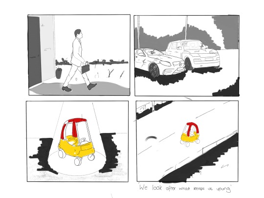
The future, today
‘Don’t dream too big, Brexit’s still real’ is the not the most encouraging thoughts to have whilst concentrating on a flash forward to your future. None the less, eyes closed and mind-open, I began my journey into my future in 5 years.
Our guide, David, began with us imagining where we wake. In a city? House? Apartment? Was it minimalist or messy? Colourful or plain? My future little home was a small 1 bed flat, based in a UK city (London most likely, although its not my desired place to live, it’s the most plausible for a starting designer), painted in a off-white and wooden floors. Weird trinkets stand on floating shelves and a glass coffee table sits at the foot of my queen double bed, design and illustration books sitting on the top. Large windows boost a 6th story view with blinds ready to block out the sun for sleep. The decor falls short of being the most important part of the house, as 12 little paws run around the floor boards; 2 Pomeranians and a lil sausage dog greeting me good morning.
From my house, I hop on a bright orange fixie bike, its slim frame and wheels short enough to fit into the corridor that enters into the flat. Taking it down through the lift and ready to make the 10 minute cycle to my small studio down town (we love an eco-friendly fantasy); two dogs in a doggy-travel backpack and a little, strapped in basket for the 3rd. Arriving at the studio, I let the dogs run up first to a small but cute one room studio with 5 desks, all decorated to the style of its owner. The dogs get greeted first by 2 more office dogs, a little bigger in size this time, before they quickly run to me for some early morning love. After greetings from the small but friendly team, we move to the sea of couches that sit around a small table; all with coffee in hand. Today we begin the planning process for our new outside commissioned motion graphic piece, to animate a stop-frame CGI piece for a new summer ad.
-------------------------------------------------------------------------------------------
Amongst all the detailed, this exercise made me aware that I don’t want to work in a big studio with loads of random people and really want a nice, tight-knit family feel with the people I work with (and a dog-friendly studio). I also want to work with motion-graphics and animation.
This is obviously quite a far of dream atm and I need to take steps towards that:
NUMBER 1: LEARN HOW TO ANIMATE
This is first and for-most. None of the other stuff is possible without that talent and although I don’t need to be 10/10 within the next 5 years, to begin in a studio amongst people that already have the skills, I need to be on a basic/intermediate level with a drive and ability to learn fast.
NUMBER 2: Research small animation studios in Birmingham and London
To find the right studio will be very difficult and theres no-way of knowing if they’ll actually have me. The earlier I make myself an option the more likely I’ll get there in 5 years. Asking for tours and possible shadowing days could lead to future placements and then hopefully jobs.
Number 3: Become knowledgeable about process’
Nobody will expect a new animator to know how to do every single type of motion graphic and animation when starting a new job, but I’m definitely interested in exploring them all. Learning the process’ and watching behind the scenes and ‘how it’s made’ videos will help to increase my knowledge and how my interest to potential employers.
0 notes
Photo


Brianna and Sam wedding
I’ve been designed the Save The Dates for this wedding (excuse the lack of quality in the second two picks, I am trying to get this up for marking and Tumblr is not allowing me to upload higher quality pics), and got a strong responds from them. The thumbs are taken from real prints of the couple and although it look a long while to get it perfect, done by hand and not image trace, I think they outcome was very sweet.
I’m moving on to designing the invitations now and have just begun drawing out the names and putting a very basic mock up design together. (again apologise for the quality, hopefully I can fix that later on when the website isn't playing up). Looking at keeping the ‘gift tag’ theme all the way through. The purples are also consistent, although you cannot tell from this pictures, with the mock not having its right colours in it yet either.
1 note
·
View note
Photo
CVs
I’m really enjoying the theme of these CVs, creating two after some advice from Martin about applying different type CV’s depending on the agency you are going to, ie. one simple and straight to the point, one more chatty. I think there are still a few tweaks to be made and the second one may need a little more information concerning my BA Hons degree but I’m happy with them so far.
1 note
·
View note
Text
Psychoanalysis
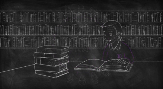
During the christmas period and as I looked into what I wanted to discuss in my essay, I dove into the world of psychoanalysis and more specifically the work of Sigmund Freud. Simultaneously disgusted and intrigued by his work, the subject of ‘the unconscious’ appeared often and the philosophy of its connection to art and the artist sparked an interest in me. I ordered the book ‘The Unconscious’ (published by penguin) which included a collection of Freud’s papers about, and relating to, the unconscious. Although only around 150 words long, the book took a good few hours to complete and really take in. The complexity of the writing and the vocabulary that the scientists of the late 1800s/early 1900s use contains a multitude of words that I relied on Siri and google to explain to me, and their help still didn’t stop me from having to read a few sentence at-least twice. Despite my difficulty, I really learnt a lot from his work and obtained a solid understanding of what he believes to be the unconscious.
There was one specific paragraph of the book in which I found very interesting. Having met and explored the minds of artists, Freud touches on the subject of art being able to express repressed memories, trauma or fantasies. He discuss’ how this bridge between the UCS (unconscious system) and CS (conscious system) is weakened as the artist has the ability to bring the memory or fantasty into reality through the art work (and how people who accept these works often have the same primal fantasies that they’re not aware of). This really got me thinking about surrealism and where the ideas for this pieces come from. If we take Freud’s theory to be truth; we have no contact, let alone control over the UCS but in many ways it has almost complete control over us. As further work, I’d love to delve deeper into the works of some surrealists, most probably that of Salvador Dali as he is one of my favourites as well as having recorded meetings with Freud himself, to see hidden messages and using knowledge of the artists past to see how much the UCS was controlling their art.
I’ve currently bought and am reading ‘Art and Psychoanalysis’ to gain further knowledge of the science in relation to art.
0 notes
Text
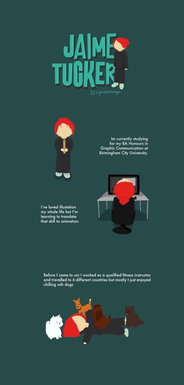
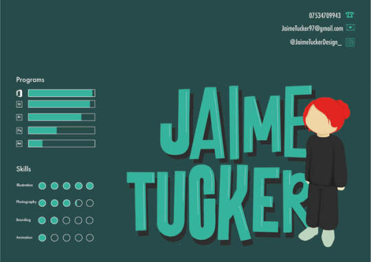
Mini me illustrated ‘about me’, currently working on a website with this theme.
I’m interested in animating short moments with the character and will be looking into how I can incorporate that into an animated online CV/website.
0 notes
Text
Second Home Studios
-Birmingham
‘Second Home, First Love’
Second home studios are an animation studio based on Oxford Street, Birmingham, their work features a wide variety of animation styles and skils as well as a portfolio boasting a wide variety of exciting and eye-catching work.
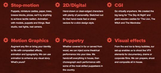
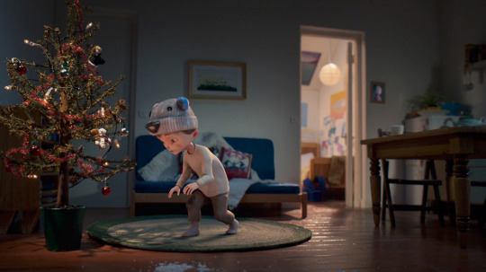
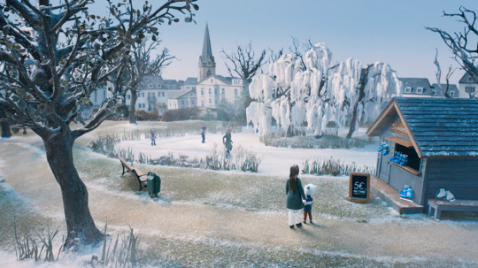
There work varies from captivating, detailed CGI to hand-drawn character. Looking through their work, I found myself in love with their CGI work; a piece called ‘Arctic Christmas’ which was commissioned for a German shop called Penny. It tackles themes and issues surrounding poverty within the country with the message ‘Christmas doesn’t need much, only love’. It’s an incredibly moving piece featuring a single mother and her lack of resources to give her child presents at Christmas. The characters are wide-eyed and created through stop animation made for CG which gives an authentic and warming feel that helps the audience to connect to the piece. The darkening hues change from a warmer colour as it becomes more obvious that she struggles with financially supporting her son, the light darkens and things turn to night as he pushes her away. However as he reaches the shed that she has decorated and enters into the world she has created, bright northern lights fill the space around him and bring the whole piece into a happier, emotional mood. It was very cute and definitely one of my favourite Xmas ads of 2018.
All the different styles of ‘Second Home, Studio’:
I’d be interesting in contacting this agency to see if they offer an opportunities to shadow or visit their studio. A placement would be amazing, but i’d like to work on my skills as an animator before asking this.
0 notes
Text
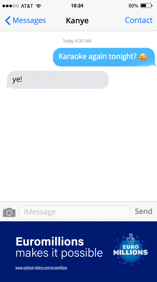
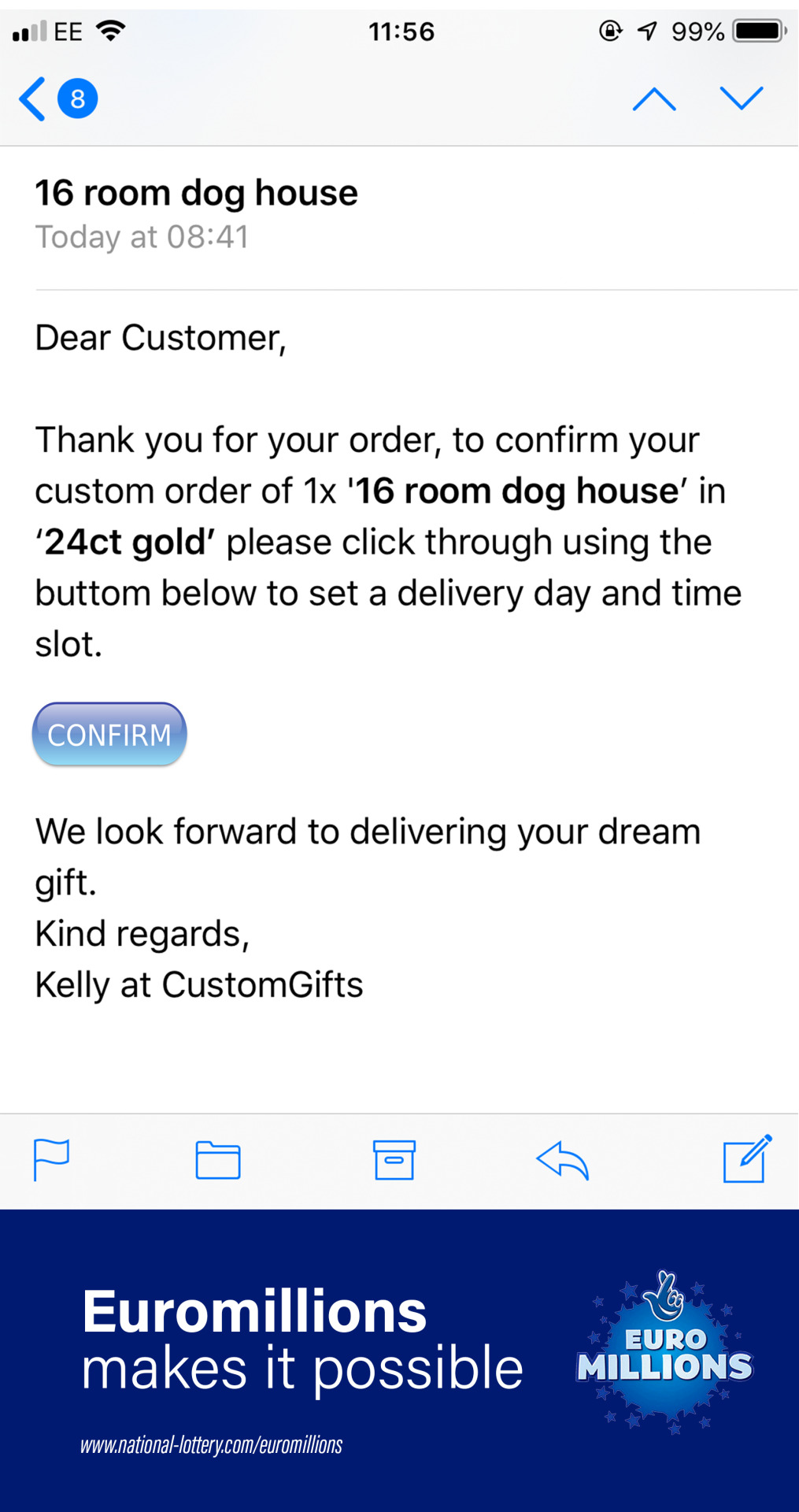
Euromillions makes it possible
A copy based ad encouraging younger people to participate in Euromillions by showing them what it can make possible.
(A one hour brief by Jaime and Emily)
0 notes
Text
‘Stay young with Nivea face cream’
A campaign to advertise an anti-wrinkle cream, with humorous undertones and a feeling of nostalgia to sell the product.
‘Stay young with Nivea’
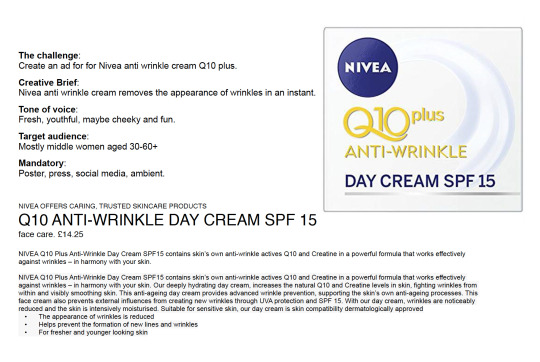
(A one hour brief by Jaime Tucker and Emily Warner)
0 notes
Text
Saatchi&Saatchi: Book Critic
After pairing with Emily at the beginning of our Survival International brief and talking to Chris about what we can do going forward, we set up an initial book critic with a member of the team at their London branch. Going with a very rough and new portfolio, we did not expect much praise when going but came out with a lot of amazing constructive criticism and insight into the world of advertising.
Point 1 - One Concept, multiple executions
One of the main and most important points that was mentioned was the layout of our pieces and how most only had one execution. He spoke about how insetad of having a concept or two for each brief, we could come with one strong concept and then multiple (up to 50!!!) executions of this idea. By this he does not mean the same design in different places, but different ads and different designs and how they would be used in a real life setting. This i found very useful; at uni we only really explored having one final concept execution to show but knowing this now I can expand my ideas when showing outside companies/agencies my work.
Point 2 - 7 to 12 pieces
Although he was aware that we were a month old duo without much work, he mentioned that in future you want to have a minimum of 7 pieces of work in your book. This included a variation of types; copy based, different age ranges, advertising different items etc. Again, this is something interesting to know from an outside agency as I can use this as a baseline ruin for when I go out to have further critics/interviews.
Point 3 - Insight, execution, idea.
When it comes to presenting your ideas, these are the three things its should present. With each piece, you should have a strong and full grasp on what the brief is asking, who it is for and what they want to achieve (insight). Followed by how this would be done, creating a concept for the overall campaign and showing how that can be reached through this idea (execution). Finally, the idea! How the concept would be pushed forward, including multiple ways in which this can be done. If you have all three of these, for each of your briefs, you should be good to go!
0 notes
Video
tumblr
A mini me
created on ‘Animation Desk’ app
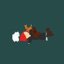
Due to not having my desktop with me over the holidays, I decided to download a stop frame animation app on my iPad to have a go at making small, fun animations over the holiday. Although this doesn’t really pay into my challenge to learn programs like ‘animate’ and ‘after effects’, it does give me an insight into the natural movements that a character should make and teaches me to look into the details more; apart from that its also a lot of fun. I decided to follow on with this small collection of illustrations/animations that I have created and titled ‘Mini Me’.
1 note
·
View note
Text
A decision to animate
Coming into second year I’ve starting to consider what I want to do in the long run of my career. Art direction seemed to be the option that I began to lean towards, I enjoy creating ideas and pushing them forward and it could most definitely lead to a highly successful career. However, after visiting Saatchi&Saatchi for my book crit and discussing that most art directors in the advertising world need to begin their career in London (which is NOT me) and taking into consideration the level of stress vs the level of enjoyment I would personally take out of art directing, I decided that I should also consider other things, as now is the time to develop my skills. (This is not to say that any other career path isnt stressful, I just feel the enjoyment I get from advertising would not be as for-filling, and is also notorious for being high strung and intense)
After deciding this, I looked at the things I’ve always been interested in within the world of art; animation and handwritten typography came to mind instantly. Hand writing type being something that Ive always considered more of a hobby, I really started looking into animation. Ive been inlove with CGI animation but never really considered it a career path, mainly because of how obtained it seems. However, having been shown the basics of animation last year and with Lynda.com Ive started learning how to use programs like Adobe Animate (previous flash, I think?) and Adobe After Effects to begin a journey into animation.
Lynda.com Tutorial
This is the animation I followed, it was extremely informative and was easy to follow as a beginner :
https://www.lynda.com/Animate-tutorials/Exporting-animation/475937/512126-4.html?autoplay=true
and the animation that came from it:
https://jaimecontext.tumblr.com/post/181579395591/first-adobe-animate-animtion
Original reference sketch
Taking me a total of about 6 hours to watch and create, I’m actually very impressed with the outcome of the piece. Although basic, this animation has taught me a lot about how things need to move within animation; looking at things like shape tweens and how to embed each piece that wants to move into layers and objects. As well as this, I discovered how to make movements organic, rather than them looking 2D/flat and unnatural. From here I want to look at making more complicated shapes and designs, looking at creating more detailed drawing. Along side this I’d like to look at Adobe After Effects as a way of creating animation; I feel my passion lies in more hand drawn cartoon work, I am aware of the fact that within the field as a career, working with more realistic design and object work is a skill that is needed. And therefore I need to perfect the art of both programs.
0 notes
Text
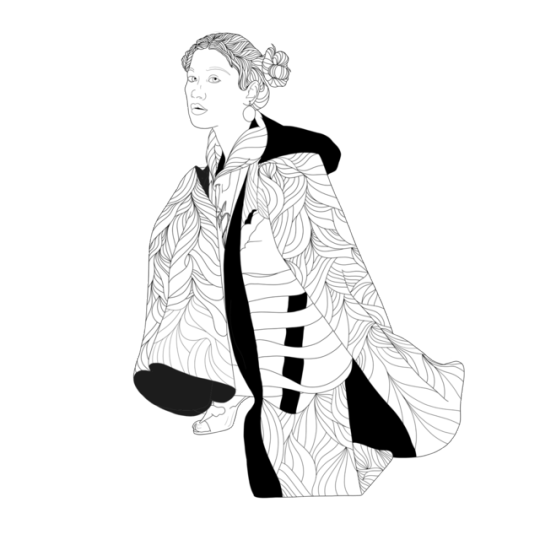
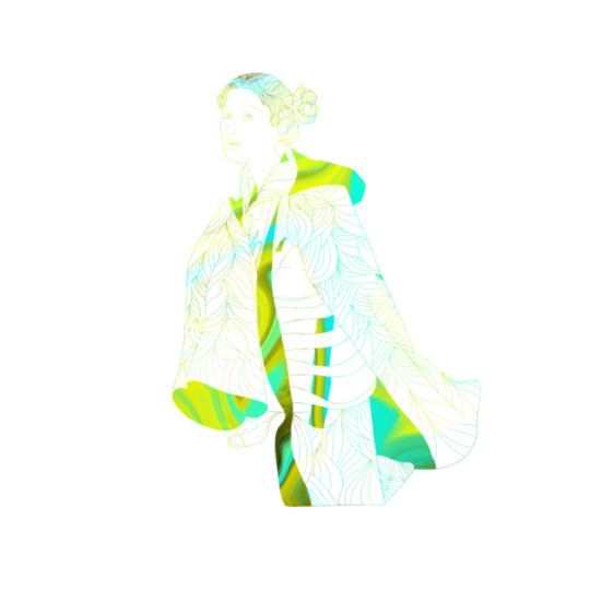
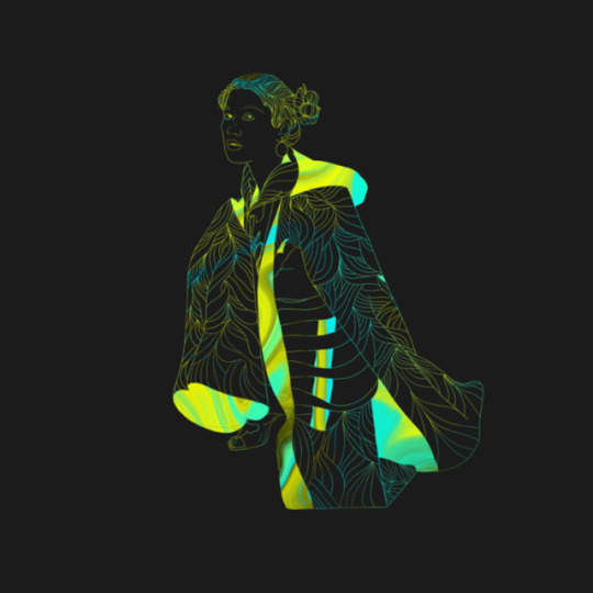


Lookbook illustration
Playing around with illustration for the Lookbook.
Editoral really not being my thing, I decided to do a little bit of illustration to take a welcome break as well as trying to add something of my style into the Lookbook. I played around with colour overlays and just looking at how it looks with a pattern I made using the new Procreate liquify effect and the original pattern design I did messing around at the beginning with pattern.
0 notes
Text
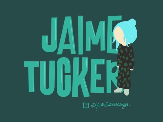
Design page profile picture
I wanted a little illustration to have as my PP to make it a little unique and professional. I wanted it to express me and my style as well as including my name and an Instagram link.
0 notes
Text
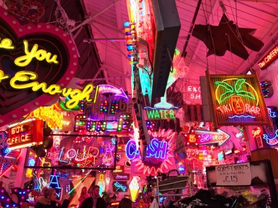
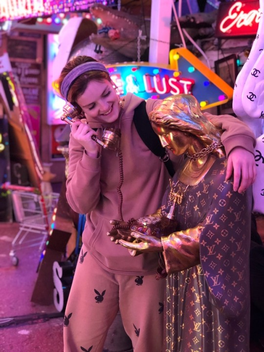
God’s Own Junkyard
a.k.a house goals.
I absolutely LOVED this place and it could spend my life just starting at the neon (and Chanel/Loui V jesus!!!)
I tried to get some nice angels in my photos to really emphasis the magic of the place but you can really capture it in a photo. The colour combos in these photos will definitely makes some good inspiration some time in the future.
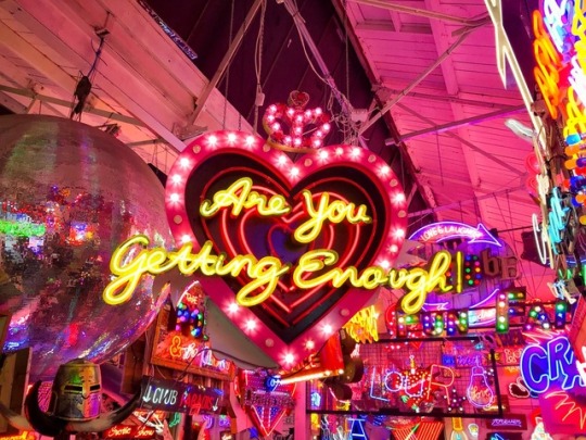


Bonus photo of myself n Loui V Jesus!
0 notes
Text
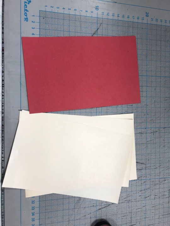
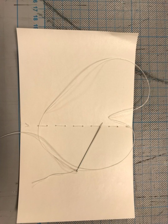
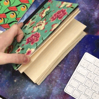
Book binging and handmade books
I absolutely loved the book binding workshop; finding it almost therapeutic and exciting to be creating books (because you gotta love a bit of stationary).
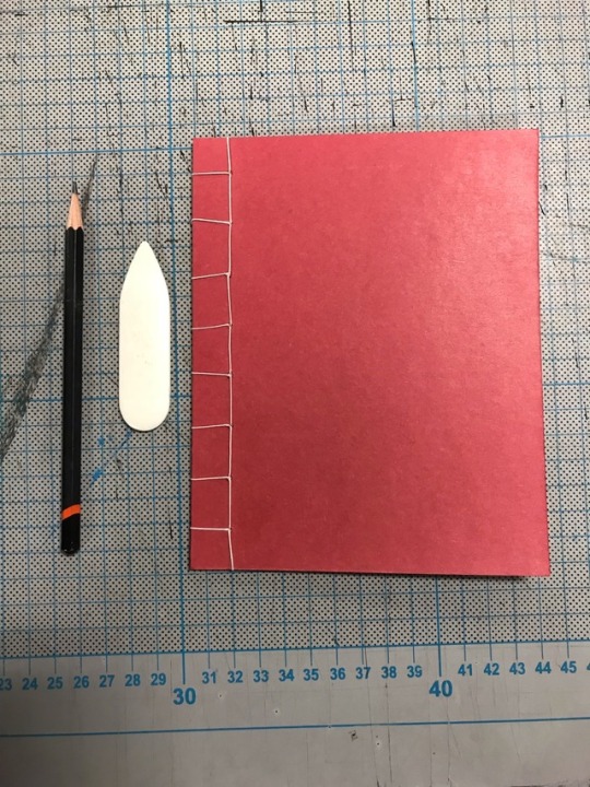
The first one that we did was a saddle stitch, very simple but effective. Having experience with general sewing this is something I found pretty easy, but learnt a lot about the equipment and how to use it. This bind involved using the All (equipment used to make the initial holes) directly down the spine of the pages, that had been folded using a Bone folder (loved this! Such a clean fold).

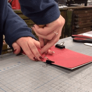
Once the holes are made you just stitched simply through the holes, starting with a little knot at the end of the string, pull it through and knot again at the end.
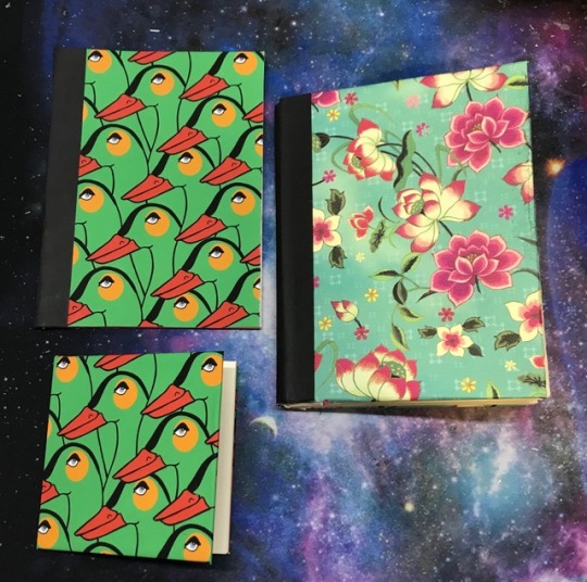
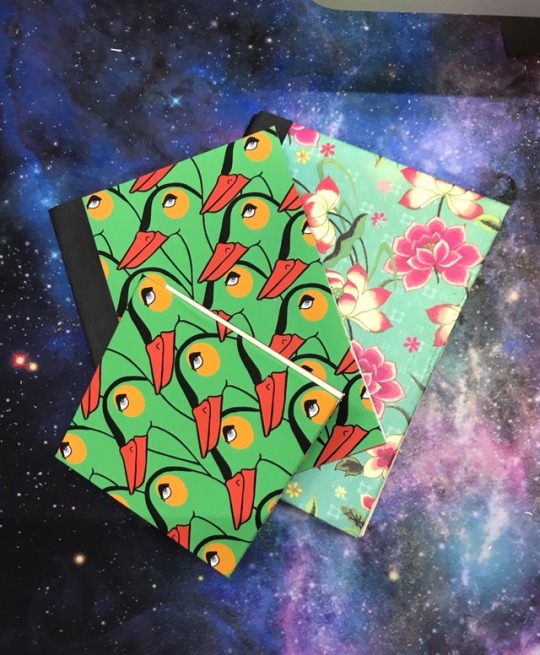
The second one, and my favourite, was the Japanese Stab Binding. This is where you begin to introduce a more aesthetic bind, giving an amazing pattern with the binding string to give the outside an interesting, unquie feel. The one that we did was one of the most simple, understandable as it was a little complex to follow at first, but we were shown how you can do loads of amazing, beautiful looking binds and definitely something that I want to practice with.
Very complex to explain through words but I now know how to do this without instruction.
After this, we were shown how to make covers for out books. I won’t go through how it’s done as it’s basic cut and stick really, but here are some I made later on at home. I used the saddle stitch for the hard backs (the small and flower one) and pinched my Japanese stab stitch from the wordshop to create the paper back one.
I absolutely loved this workshop and never intend to buy a premade book ever again. Also we now know what my mums getting for Christmas.
0 notes