
Photography student at London South Bank university. This is an online workbook of my collaborative practices module.
Don't wanna be here? Send us removal request.
Statistics
We looked inside some of the posts by jamiestevensphotographycollab and here's what we found interesting.
Average Info
Notes Per Post
0
Likes Per Post
0
Reblog Per Post
0
Reply Per Post
0
Time Between Posts
20 hours
Number of Posts By Type
Text
17
Last Seen Tumblr Blogs


Fun Fact
Tumblr was created by web developers David Karp and Marco Arment.
Text
Creating the portfolio for submission
After Andrealetizia sent the images from the final campaign, I decided to create the final body of work in a digital format. I decided to use Microsoft Powerpoint to create the slides where I would then be able to export the file as a PDF for submission. As the images were portrait format I didn’t know whether to create a body of work consisting of a portrait or landscape PDF. I decided in the end to create two to see which works best for the images as presentation is key for delivering the final body of work.
I have included screenshots of the document below with the chosen quotes supporting the images of their responses to our campaign.
Landscape format


Portrait format


From creating both PDF documents of the final portfolio of work, I feel that the portrait version works best due to the larger size of images. I also feel the text worked better under the images. Due to this, I will submit the portrait version as the final body of work.
Both the portfolios and the final timelapse can be accessed in the link below.
https://www.dropbox.com/sh/pcowevj6e4g811v/AAAc6vwo9sXd8xQ8JT5BKSeMa?dl=0
0 notes
Text
Final portrait images from campaign
Throughout the event, Andrealetizia photographed the testers as a way of documenting the event and creating a body of work as a series of portraits. Around 24 portraits were captured in total but not all participants said anything that stood out that we could use. We decided it would be best to narrow it down and select seven portraits from the first session and seven fron the second session.
As no influences were present in the first part of the campaign, they were photographed with the items they thought tasted better in the bowls. In the second part of the campaign when the influences were present such as the brand, packaging and price, they were photographed with the particular brand or item they most liked. I have included the images below.
No influences present


Influences present


These portrait images capture the individuals and their chosen choice very well. To help Andrealetizia, I will be creating the final portfolio where the images will be included with the quotes they mentioned below.
0 notes
Text
Evaluation of final campaign
Overall, I think that our final campaign went very well with all the issues we came across in the campaign all addressed. This helped our final campaign to be stronger and more successful as we had a clearer idea of the final outcome we wanted to achieve by conducting research and thinking of ways to improve. This shows how important it is to rehearse or create several trial runs to refine your idea. As previously mentioned the location was great for us and the earlier start of an hour at 11am made a big difference as more people were walking by to lectures or getting lunch which resulted in people taking part. Another positive for using this location again was there is plenty of room for people to walk passed when people are taking part to avoid any health and safety issues.
The taste test was again very popular and I feel that the signs we created helped attract attention to our campaign as most stalls that are held in the main concourse of London Road are selling of food and products which we wanted to avoid. Even though I previously mentioned in the test rehearsal evaluation that more food might draw people in, I feel that by narrowing down the choice of food helped us concentrate on the areas better. By using snacks and “nibbles” helped draw students, staff and the public in as the majority of them really liked the chocolate. Everyone seemed happy for us to photograph and document them taking part in the campaign where consent forms were filled out to prove this. The voting system worked well last time as it was very simple and we did this again to success.
From the rehearsal we decided to not use moving image as none of us known how to us the editing software such as Adobe Premiere Pro to create videos, place sound on top and export it as a final movie/clip. I feel that we all assigned roles that we were comfortable with and able to put our photography and other skills and apply them to this. I felt in the final campaign we worked well together as a team and we all knew what we needed to do. The time lapse worked as well as expected and documented the event and captured the scene in full slow.
Overall, the final campaign was a great success and enjoyed interacting with many people to take part in our test. I feel we were all presented ourselves in a professional manner and conducted the campaign safely.
0 notes
Text
Research - Gillian Wearing
Gillian Wearing OBE is an English conceptual artist, one of the Young British Artists, and winner of the annual British fine arts award, the Turner Prize, in 1997. In 2007 Wearing was elected as lifetime member of the Royal Academy of Arts in London. Wearing is widely known for her method of documentation of everyday life through photography and video, concerning individual identity within the private and the public spaces, where she blurs the line between reality and fiction.
Wearing first attracted public acclaim when she exhibited a series of photographs entitled “Signs that say what you want them to say and not Signs that say what someone else wants you to say” at City Racing, a small artist-run gallery in London in 1993. She had been using video and photography since the early 1990s, but this was her first significant collaboration with members of the public.
Standing in a busy area of South London, Wearing stopped passers-by and asked them to write down what was on their mind. With their permission, she then photographed them holding their statement. As indicated by the title of the work, Wearing has written that this collaboration interrupts the logic of photo-documentary and snapshot photography by the subjects’ clear collusion and engineering of their own representation. This body of work is comprised of over fifty colour photographs. A broad cross-section of people participated in the photographs and the series provides a fascinating social and historical document and by referring to the economic decline in Britain in the early 1990s, manifested by statements such as 'Will Britain get through this recession?'. However most of the signs express intimate thoughts or personal convictions.


The body of work is very powerful due to the subjects saying exactly what they are thinking which challenges her own perception of the people, and also everyone that sees the images. The images captured by Wearing shows a vareity of images which include humour, stereotypical as well as sad emotions from a variety of people including homeless which we pass on a daily basis in London who would love to live a normal life like the majority of us. What is quite alarming is that many people would most probably write down the same things as some words individuals wrote down such as the image above “Give people houses. There is plenty of empty one’s ok!”. Homelessness is still such a big issue all over the country which needs to be addressed as the individual states there are many that are empty. These issues still haven’t been addressed and many people are still on the street. Also, with Brexit currently occurring and the General Election, there are many changes to come for all of the UK.
Wearings work is also the approach that we applied to our images by writing down what people thought of the food they tested which we are displaying under their portraits.
0 notes
Text
Final Campaign documentation images
Throughout the session Zosia was responsible to capture images as documentation of the event and also to capture the participants considering and trying the food. I have included these below.


0 notes
Text
Research - Psychological effects of colour
According to psychologists, colour can affect us in great measures including our mood, emotions, to actions and words. It is well known that certain colours have certain type of effects and meaning, such as white representing innocence, or that blue makes us calm, or that red makes us aggressive, passionate and alert.
However, not everyone believes this, or consciously notices this. The whole topic of psychology of colour has been used by marketing agencies, supermarkets, designers and many others to influence us. We might think about this and disagree, but when we start to think about it in more depth, we all have been influenced by colour. The colour of the car you purchased, the clothes you wear, how you have decorated your house - we chose these colours as this is what we like, which shows we are influenced by it.
Colour psychology
In 1666, English scientist Sir Isaac Newton discovered that when pure white light passes through a prism, it separates into all of the visible colours. Newton also found that each colour is made up of a single wavelength and cannot be separated any further into other colours. Further experiments demonstrated that light could be combined to form other colours. For example, red light mixed with yellow light creates an orange colour. Some colours, such as yellow and purple, cancel each other out when mixed and result in a white light.
"Given the prevalence of colour, one would expect colour psychology to be a well-developed area," note researchers Andrew Elliot and Markus Maier. "Surprisingly, little theoretical or empirical work has been conducted to date on colour's influence on psychological functioning, and the work that has been done has been driven mostly by practical concerns, not scientific rigour."
Despite the general lack of research in this area, the concept of colour psychology has become a hot topic in marketing, art, design, and other areas. Much of the evidence in this emerging area is anecdotal at best, but researchers and experts have made a few important discoveries and observations about the psychology of colour and the effect it has on moods, feelings, and behaviours.

The Psychological Effects of Colour
While perceptions of colour are somewhat subjective, there are some colour effects that have universal meaning. Colours in the red area of the color spectrum are known as warm colours and include red, orange and yellow. These warm colours evoke emotions ranging from feelings of warmth and comfort to feelings of anger and hostility.
Colours on the blue side of the spectrum are known as cool colours and include blue, purple and green. These colours are often described as calm, but can also call to mind feelings of sadness or indifference. Many will have their own experiences and opinions on how a colour has an affect on them.
Below are reactions by various people who have analysed certain colours and how they feel towards it. - courtesy of https://www.verywell.com/color-psychology-2795824
Black
White
Red
Blue
Green
Yellow
Purple
Brown
Orange
Pink
Colour Psychology as Therapy
Several ancient cultures, including the Egyptians and Chinese, practiced chromotherapy, or the use of colors to heal. Chromotherapy is sometimes referred to as light therapy or colorology and is still used today as a holistic or alternative treatment.
In this treatment:
Red was used to stimulate the body and mind and to increase circulation.
Yellow was thought to stimulate the nerves and purify the body.
Orange was used to heal the lungs and to increase energy levels.
Blue was believed to soothe illnesses and treat pain.
Indigo shades were thought to alleviate skin problems.
Influencing our buying habits
The majority of the purchases we make are based on the visual appearance of the product in question. For example, you wouldn’t choose a damaged package over a brand new one even if the goods are still in perfect condition. Therefore, the physical appearance plays a big role in the retail industry. Moreover, most of the products are red because red “screams” out at you to firstly to grab your attention as it will catch your eye faster than any other product because it invites you to look at it. This colour works best on impulsive shoppers.
On the other hand, the colour green is the opposite. It is used in shops in order to relax the buyers. Green is often related to nature and the environment, hence the relaxing effect. Because of this relation to nature, many environmental organisations have a green logo, like Greenpeace, or the Animal Planet Channel.
Supermarkets regularly use coloured banners above their fruit and veg, not only to draw you in, but for you to pick up the product that is below. For example, when we look at bananas with no similar colours present, we can tell which are green, yellow or starting to go brown/black. Some supermarkets apply similar colours above the items to throw you off from their true colour. For example, some supermarkets will place a green or yellow banner which is a similar shade to the bananas to trick you to think they are riper than they are. If the banner wasn’t there, you would most probably pick up a different bunch of bananas.
Another example is how supermarkets and shops organise their isles. Retail managers understand there is a science behind a store’s floor plan and how consumers shop. Focus groups, sales data and general psychology have helped managers understand shopper habits, which have led to the formulation of effective floor plans and shelf layouts. Supermarkets nationwide use the same basic layout principles to create a general flow to their stores that keeps customers efficiently moving through the aisles and spending money.
Sensory Experience
Most supermarkets welcome shoppers with a full sensory experience upon entering the store. The entrance is designed to be inviting so it reinforces a positive customer retail response. Most supermarkets place their sensory departments, including the bakery, produce and florist at the front of the store. These departments are known to activate the shopper’s salivary glands through sight, smell and taste, which entice them to spend money on things that weren’t necessarily on their list. These departments operate on high margins and depend on effectively drawing customers by stimulating their senses.
Bakery: The wafting smell of freshly baked breads, cakes and cookies causes a psychological reaction that makes shoppers hungry, which often causes them to buy more.
Produce: The bright colours of produce excite the eye and tempt the shopper to purchase more produce.
Flowers: The floral department is nearly always located by the entryway as it boosts the store’s image in the shopper’s mind through the bright colours and fragrant smells.
Stocking the produce, bakery and florist at the front of the store creates the perception that the store is filled with fresh products and encourages shopper confidence in the store. There is no such thing as a quick trip to a supermarket as they usually stock the items shoppers buy most often at the back of the store, forcing them to travel through other tempting aisles to pick up the essentials. Items such as meat, eggs, dairy and bread are strategically placed in the back of the store, making it hard for shoppers to resist grabbing other items when making a quick trip.
Supermarket managers want to maximise your time in their store by having you travel down as many aisles as possible. Crafting an efficient floor plan with an expertly stocked perimeter keeps shoppers moving through the entire store and pausing at strategic stops along the way, including end-caps. End-cap placement usually comes with an additional fee to the manufacturer; however, these manufacturers often see a high return on their investment as these placements encourage the perception of value and prestige in products. Many supermarkets will also locate the one-stop service departments at various locations in the store, including delis, banks, coffee shops and the pharmacy. The convenience of these locations keeps shoppers coming back for the services as well as their groceries.
The centre aisles are the heart of any grocery store and are where most of the general goods are located. The centre aisles help weave shoppers deeper into the store and are strategically stocked to get the shopper to buy costly name-brand goods.
What’s Behind the Shelving?
Shopper psychology doesn’t only lie in the layout of the store; the way shelves are stocked also has tremendous impact on a shopper’s buying habits.
Bottom shelf: Store brands and other generic brands are located on the bottom shelf, the shelf that is out of eye sight. Bulk items also find their on the bottom shelf. Grocery managers know that savvy shoppers will search for a deal so there is no need to waste prominent shelf space on these products.
Top shelf: Local, gourmet and smaller brands are placed on the top shelf.
Middle shelf: Middle shelf space is considered the “bulls-eye zone”, the location that falls perfectly in the shopper’s line of sight. This shelf stocks the leading brands and best sellers. Some groceries will sell this prime stocking location to manufactures for a fee but usually these are the items that get sold quicker.
Kids’ shelf: Grocery managers understand that children often drive a family’s grocery purchases. Kid-friendly products are placed in direct line sight of children. Understanding consumer psychology can help a retail manager increase profits through strategic and efficient floor plans and shelf stocking arrangements.
The importance of colours in branding
Branding one of the most important issues relating to colour perception. The brand will select a specific colour, logo or layout for their product which will catch the eye of the consumer. Many brands will keep the same logo and will make minute changes to enable the customer to recognise that brand as they have bought it for many years and developed a trust and relationship with the company/brand. Many companies make the mistake of changing their logo completely which results in the customer who has built up a strong trust with the brand and purchased the item for years not able to locate the item, which impacts in the sale of the item.
I have included a colour chart that companies have used to target where their logo and brand will go.


0 notes
Text
Research - Living with Practical Realities
Living with Practical Realities is a body of work created by British artist, Stephen Willats. Born in London, 1943, Willats is a pioneer of conceptual art and since the early 1960s he has created work concerned with extending the territory in which art functions.
Stephen Willats is interested in the ways in which people construct their world in relation to the social or physical constraints that are put upon them. In this work, Stephen Willats explores the realities of living in a tower block, investigating how buildings can stand as symbols for our culture. Over six months Willats photographed and interviewed Mrs Moran, an elderly lady who was living alone in the tower block. By giving the viewer an insight into the isolation of living in a tower block, the artist hopes they will look at and understand their own cultural situation. - Gallery label, February 2010.


'Living with Practical Realities’ is the first work in which, as the title implies, Willats used the real environment of his subject rather than enacting or reconstructing events for the photographs in the work. He had been concerned for several years with the ways in which people construct their own worlds in relation to the social or physical constraints put upon them. In this work he was anxious to investigate the way in which buildings represent, or are symbols for, the culture we live in. The tower block seemed an obvious candidate for study. Willats, who was brought up in West London, chose Skeffington Court in Hayes because it was a model development in the local authority's eyes and had been opened by Harold Wilson in a spirit of confidence about this form of housing. It was also close to a high density low-rise development with which he hoped to make comparisons. He began by photographing the outside of the block and through this introduced himself to several of the tenants. (He used this material for another work ‘Vertical Living’ concurrent with ‘Living with Practical Realities’). The theme that Willats had in mind was the discovery and portrayal of the isolation of people within the tower block. He was introduced to Mrs Moran, who lived alone, and who was, in addition, elderly and thus further disadvantaged in relation to the society around her. Willats explained his work to her and began a collaboration which involved him photographing the flat and her, and tape recording interviews: this process continued for six months. Willats evolved a system for analysing his material which divided it into three approximate subject areas, economic, social and physical, each viewed as creators or instigators of the isolation of the subject. He was keen in the recording and presentation not to suggest an overt political or ideological viewpoint; he wished simply to represent the reality of the old lady's position. He wanted to offer the viewer, through the apparently objective imagery, the opportunity imaginatively to remodel the symbolic world that he had represented. He hoped that the work would act as a freeing agent to allow the viewer to ‘reach into the experience’ of isolation in the tower block, and view ‘aspects of their own cultural situation by viewing someone else's’. The panels are divided horizontally into two ‘concept frames’: these consist of photographs of Mrs Moran above four photographs of objects from her environment, with fragments of text from tape transcripts between them. (The importance of the objects to her was discovered through discussion and from the tapes.) The discrepancy between image and text calls upon an active involvement by the audience to reconcile them. This unit is the concept frame; the top unit is the reality as it exists, the bottom (written by Willats) suggests a possible future. The work is read from top to bottom, viz. the title of the work, or ‘area of attention’, the subject of the work (Mrs Moran) and a question aimed at the viewer, and below that the descriptive ‘concept frame’ (the four images) above Willat's prescriptive ‘concept frame’. This is superimposed on a large image of Mrs Moran used for formal reasons. The work was made in collaboration with Mrs Moran from working drawings made by Willats and modified by the subject. Willats intended to show the work to Mrs Moran exhibited in a gallery, but unfortunately she died before he was able to do so. He is anxious that works such as this should be viewed within an art context, feeling that art should be an agent for social change.
0 notes
Text
Research - The Hidden Persuaders
The Hidden Pursuaders is a book written in 1957 by Vance Packard. He was an American journalist, social critic, and author. The book details how behavioural scientists recruited by the American advertising industry were increasingly using psychological techniques to increase sales.

This book is an attempt to explore a strange and rather exotic new area of modern life. It is about the way many of us are being influenced and manipulated—far more than we realise—in the patterns of our everyday lives. Large-scale efforts are being made, often with impressive success, to channel our unthinking habits, our purchasing decisions, and our thought processes by the use of insights gleaned from psychiatry and the social sciences. Typically these efforts take place beneath our level of awareness; so that the appeals which move us are often, in a sense, "hidden." Some of the manipulating being attempted is simply amusing. Some of it is disquieting, particularly when viewed as a portent of what may be ahead on a more intensive and effective scale for us all. Co-operative scientists have come along providentially to furnish some awesome tools. The use of mass psychoanalysis to guide campaigns of persuasion has become the basis of a multimillion-dollar industry. Professional persuaders have seized upon it in their groping for more effective ways to sell us their wares—whether products, ideas, attitudes, candidates, goals, or states of mind.
This book gives a fascinating and eye-opening insight into society, particularly the American society at that time. Smoking was openly promoted as it was a trend despite the health scare as filters were believed to prevent harm. Women had to stay at home while men were the money makers, and the problem of society was how to keep the economy growing. The answer to this was more advertising to encourage people to buy stuff they didn't really need. This was a time when the average American man had fewer than 2 pairs of shoes, and when fewer than 10 million women worked. The housewife, concerned with the home and her husband and children only, had more time on her hands due to freezers washing machines and the like. But to make people want more than what they had was to make people dissatisfied with what they already have.
This was targeted through researching motivation. Packard was rather appalled by all this change, and by the idea that people might be encouraged to buy what they didn't actually need, but even to this day it is still happening where the worlds population is influenced by many factors. The change in fashion or current trends, the latest technology and gadgets on the market, improving TV resolutions, all these products with great advertisement influence us to keep purchasing without actually needing it. Many will replace their items to be with the latest trends or to show others their social class.
Hidden persuaders PDF -
http://www.ditext.com/packard/persuaders.pdf
0 notes
Text
Final Campaign - Taste Test
On the morning of our final campaign (4th May), myself and Lydia went to Tesco and Poundland in Elephant and Castle shopping centre to purchase the items of food we wanted to use for the campaign while Andrealetizia and Zosia were creating and printing signs and notices that would help promote and entice people to take part in our taste test. As previously mentioned this is something we all felt that we needed to do for our final campaign as many were walking by probably thinking we were selling food rather than giving away free food for people taking part.
This time we decided that we wouldn’t buy drinks and avoid using cheese as we had a lot of these items left over from last time and didn’t seem as popular as the chocolate or crisps. The items were purchased were crisps (Walkers & Smiths basics), chocolate (Lindt & Tesco basics), chocolate digestives (McVities & Tesco basics), and some plastic bowls to enable us to place the items on the table and to include the votes. We also decided to split the cost of the bill between us like previously.
The costings were:
Walkers 6pk - £1.50
Smiths basics 7pk - £1.00
McVities Chocolate Digestives - £1.50
Tesco Basics Chocolate Digestives - £0.44
Lindt Chocolate - £1.60
Tesco Basics Chocolate - £0.45
Bowls 25pk - £1.00

Once we had purchased the items, we went back the University where we met up with Andrealetizia and Zosia to give them the prices that the items cost so they could print them out and use for the second part of our campaign when the brand, packaging and price are on display. Once we had printed all the information, we all went to London Road to start setting up around 11:45.
On arrival, we noticed there were no tables or chair present for us but Andrealetizia and Zosia decided to look for some. While they were doing that, myself and Lydia started to organise our own roles for the campaign. I set up the timelapse first to capture as much of setting up and of the day as possible. To avoid students, staff and the public going close to the timelapse I placed one of the large signs that they have in the main concourse behind the camera and tripod (shown below).

It was important to make sure that the timelapse was not blocking any routes or in the way of passing people as this could cause injury. As previously conducted in the rehearsal, I decided to use the 24-70mm lens with a delay of three seconds between each shot to capture enough action.
Once we had located two tables we started to get the space ready. I was responsible for the risk assessment and the consent forms and needed to observe the space at all times to avoid any incidents occurring. Also, when students or staff wanted to participate I needed to make sure that they read and signed the consent form and also making them aware that they are being filmed and recorded for educational purposes. As I conversed with the individuals previously with Lydia, I decided that carry out this roles also by asking people to take part and explain to them what we are trying to achieve.
After setting up the space, we could all recognise that the space was better advertised with the large “free tasting” sign above and also that the food was evenly spread out which looked more presentable and professional. For the first half of the campaign, no influences were present to let the tester to decide for themselves which one they would prefer. I have included a few images below I captured of the space below.


In our preparation leading up to our final campaign, we decided that we would photograph participants with the food that they most liked. To do this, permission would be required before hand by signing the consent forms which I would be in charge of, then ask them to go to Andrealetizia. After discussing the best location/backdrop to photograph them, we decided that we would use the main concourse as a backdrop with a shallow depth of field to put all the focus on the subject. We wanted to try and photograph them all the same to give us a consistent body of work.
As the voting system worked really well last time, we decided we would keep it the same by placing a small piece of paper as your vote into the bowl next to their chosen item of food.
We conducted the first part of our food tasting for the first hour where myself and Lydia would ask people to take part and once they were interested I asked their permission for Zosia and Andrealetizia to start taking photographs. After they had signed and agreed, myself and Lydia started to interact with them by letting them know what they needed to do and what it was for. Once they had voted, Andrealetizia asked the individual to stand in the main concourse with the item of food they had chosen and then their part was completed.
For a period of around 10 minutes which felt very long, nobody took part which was down to coming up to lunch and where students and staff were in lectures, so we were standing about for a while. Other times the space became very busy where myself and Lydia were explaining the procedure to several people at a time which was great to see. As we wanted to include quotes or key words/phrases with the images, we decided that while we were conversing with them, we asked different questions depending on the item they chose such as why did they go for this, why was this one better than the other etc. Once we had received a good amount of people taking part along with quotes and portraits we counted up the votes. The results for the first session where only the items were displayed were:
• Lindt Chocolate – 3 • Tesco Value – 6 • Walkers crisps – 7 • Smiths Value crisps – 5 • McVities digestives – 3 • Tesco Value digestives – 5
As we were documenting the quotes, I have listed a few that were mentioned in the first half of the campaign below.
“This one looks better but they taste the same” “is this a trick question?” “I prefer how this one is creamier” “Can I choose on colour?” “I’m obviously going to go for that!” “I prefer these as they have a longer and better after taste”
It was interesting to hear what they had to say about the products when no influences were present. A few people couldn’t tell the difference between the products which resulted in one tester quoting “Is this a trick question?” when they were tasting them. Some could tell they were different by certain textures and the colour of the item such as the crisps. The Walkers did look crispier and darker shade on the colour. There was quite a mix response with looking at all three the cheaper items coming in 2 to 1. By looking at the results we can also see that not all of them add up to the same amount which was due to some people not wanting to try some products for various reasons including allergens they have which was not a problem.
After a busy first half, we changed the campaign around by revealing the brand, the packaging and the price of the items that were on display. The term we would use for this half f was “which one would you buy?”. The voting system remained the same and we would continue to write down quotes and key words/phrases we could use and follow our roles.


Like we did in the first half, myself and Lydia were trying to entice people to take part which many did soon as we mentioned it was free. Many of the testers decided to go for the more expansive brand and some refused to even try the cheaper one. One mentioned that he doesn’t trust cheap brands but we convinced him to try both the Walkers and the Smiths crisps. On tasting he did admit to both tasting the same but still didn’t trust it which was strange. On observing the contents ourselves, all the guidelines of how much salt, fat, calories etc were exactly the same in both products. This just shows that the product is exactly the same, just packaged different. This proves that this person is influenced by branding and packaging as in the first session that some testers mentioned the products taste the same and thought it was a trick question. Once we had received around the same amount of participants as the first session with quotes and portraits taken, we decided to finish and count up the results and list the quotes which are shown below.
Brands & price displayed
• Lindt chocolate – 5 • Tesco Value chocolate – 5
• Walkers crisps – 5 • Smiths Value crisps – 3
• McVities milk chocolate digestives – 3 • Tesco value chocolate digestives - 5
“I can’t be seen around with this cheap stuff” “I’ll go with cheaper as there is no taste difference” “Walkers all the way” “I don’t trust cheap brands” “I’m obviously going to go for that” “I wouldn’t buy this – It looks cheap” “Based on taste I would buy this, based on looks I would buy that” “They taste the same so for the price difference I will go for the cheaper one” “I don’t need to try; I can just tell by looking at the content” “The packaging does it for me – The name, quality and more”
The results are quite similar to the first session but I do feel that even though the results don’t show it, we felt that the brand, packaging and price did influence people as we can see from some of the comments some people did make such as “Walkers all the way”, “I don’t trust cheap brands” and “The packaging does it for me – The name, quality and more”. As our campaign was carried out in a student environment I feel that many would choose the cheaper product as students are always saying they are poor and have no money, but if it was conducted in a public place in Central London, I feel the results would be different as the target audience would be different.
As the timelapse worked well previously, I decided to create another one to document the event and show the interaction we made with the students, staff and public that were present.
vimeo
0 notes
Text
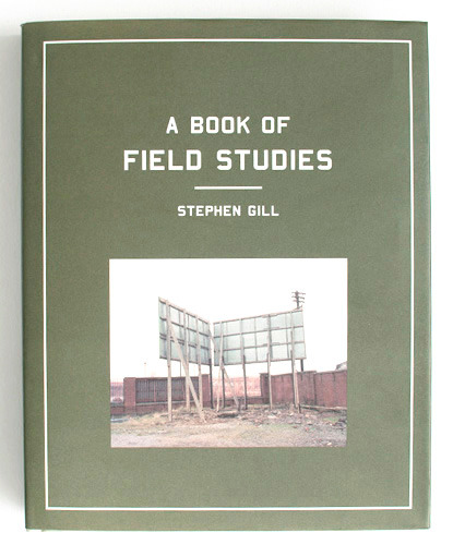
Research - Stephen Gill
As we are required to record the project event and document the audiences responses, either a video, photographic record or online resource, we have decided to create a portfolio of portrait images of the taste testers and include quotes, reactions or key words that show influences next to the image. I have decided to research into Steven Gill and his work as he has created similar bodies of work by linking portraits with words under the images he has captured.
Born in 1971, Stephen Gill became interested in photography in his early childhood, thanks to his father and interest in insects and initial obsession with collecting bits of pond life to inspect under his microscope. Gill’s photographs are held in various private and public collections and have also been exhibited at many international galleries and museums including London's National Portrait Gallery, The Victoria and Albert Museum, The Museum of London, Victoria Miro Gallery, and the Tate.
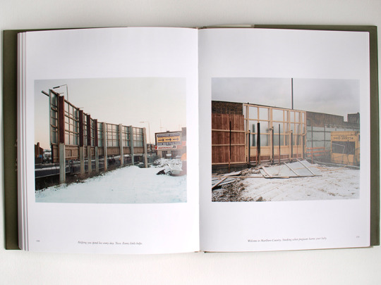
Since 1996, Stephen Gill has been making serial studies of mundane British scenes and objects including cash points, lost people, the back of advertising billboards and people traveling on the London to Southend train. His first book confirms his status as a key young vision in contemporary photography, entitled A Book of Field Studies.

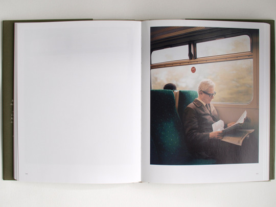
Day Return is a series of portrait images taken on the same train between London and Southend in 2001. In each image the countryside is blurring past and mostly everyone’s eyes are drawn outside the window.
His visual approach is unique, combining conceptual rigour with enormous sympathy for his human subjects, and has already been widely appreciated in Granta and the New York Times Magazine, among others. His book provides an enlightening perspective on the everyday that we simply pass by when going about daily life. Gill opens our eyes to what exists all around us, and provokes us to see what treasures can be found there.
His series of photographs exploring what lies behind billboards is amazingly effective, with the captions actually adding to the compositions. Gill has captured the expressions of train travellers lost in their thoughts on a Kent train, and even the cashpoint shots have a certain beauty in acknowledging the detail in something that we rarely allow a second thought. Many of us will become oblivious to things around us if its in an environment we are used to and take for granted, but it shows that we appreciate an eye-opening view of what lies all around us without us even knowing.
0 notes
Text
Risk assessment & consent Form for final campaign
Below I have included the final risk assessment for the campaign with the updated date for it to be valid with the final campaign taste test.


The consent form has remained the same for the final campaign as we feel we didn’t need to change anything as all the information was present.
0 notes
Text
Preparation for final campaign
For our final campaign, we met up a week before our final campaign and have have created a list of what we need to do and what equipment we need. We also made a list of developments that we think will improve our final campaign which we identified from the rehearsal. These include:
Time-lapse footage will still be used to capture and document the event
Instead of filming the event like previously as none of us know how to use Premiere Pro to edit, sequence and export the file completed, we will capture portraits of the testers that take part with the food that they liked the most.
Write down quotes that the testers has mentioned which can be placed next to the images for the final body of work
Printed signs to make the campaign look more professional and noticable (I feel many walked passed without wanting to take part as they probably thought they had to pay for the food as these spaces are usually occupied by people selling food to raise money for charity)
We decided that we would designate the same/similar roles as previously as we all felt that it went well. The roles are:
Jamie - Risk Assessment, Consent Forms, Time-lapse & communicating with testers
Lydia - Communicator/Interviewer
Andrealetizia - Photographer (Portraits)
Zosia - Photographer (Photographing testers taking part & documenting the event)
We have decided to hire the space between 11am-2pm as we felt when we were previously setting up at 12 for our rehearsal we missed many potential testers as the main concourse was quite busy due to the canteen and lecture halls being located close by. Arriving at 11am would enable us to set up and capture this busy period to draw in more people to take part in our campaign.
I have also included a list of what we need for the final campaign below.
3x cameras - 1x Timelapse, 1x portraits, 1x documenting the event
1x tripod for timelapse
Food & drink, plastic cups, plates
Consent & risk assessment forms
Signs to advertise our campaign
I will print further copies of the consent forms and use the same risk assessment but with an updated date. I feel like I don’t need to add any points to the consent form as everything was covered previously and no further risks were discovered on our rehearsal.
0 notes
Text
Research - Aldi Comparison Adverts
Due to the rising costs of living, we are hoping to buy the cheapest products without losing out on quality especially with food. Over the last decade supermarkets such as Tesco, Asda, Morrisons and Sainsbury’s have been competing against each other giving customers better deals or price match promises to maintain their customers who have trusted their brands and shopped there for many years. Now over the past few years Aldi and Lidl have become more successful in building trust and a strong relationship with customers due to their cheaper prices while maintaining quality. Many thought that these two brands were selling their products cheaper as they weren’t as good and people seemed they were being judged on their social and economic class. It now seems more respectable and “normal” to shop in Aldi and Lidl as they are as good as any other supermarket.
For all of the supermarkets to get their promotional offers seen, there main method is creating television adverts, but one company that has stood out in creating successful and memorable adverts are Aldi. While the ‘Big Four’ have been at each other comparing basket prices and their own brand value ranges, Aldi has been one step ahead with its cheeky comparison advertising campaign ‘Like Brands’. One thing that Aldi do really well with in their advertising is appeal to a wide audience. Promoting products that suit a range of different audiences however keeping them all interesting for everyone with the humour, which is how people remember them.
Their ‘Like Brands’ advertising campaigns started back in 2011 when Jean Jones, 83, from Middlesborough, kicked off the trend by appearing in a comparable tea advert between PG Tips and Red Label. This advert was deemed very successful and has lead to many more ‘Like Brands’ adverts to be created over the years.
youtube
Not only have Aldi cracked it with their brand comparison but they are now entertaining viewers with spoof adverts from some of the biggest brands, like with this spoof of last year’s John Lewis Christmas ad #ManOnTheMoon.
Man on the Moon - John Lewis & Aldi’s Favourite Things
youtube
youtube
Cadbury’s Gorilla Advert & Aldi Easter Gorilla Advert
youtube
youtube
These adverts have been very popular as people are able to identify they have seen the original advert but then get drawn in to the “re-make” of the original which they will remember. These are all successful marketing and consumer buying behaviour tools to enable you to identify cheaper brands without compromising on quality.
For more successful adverts that Aldi have created I have included a link below.
http://talk.fantasticmedia.co.uk/business/top-10-aldi-supermarket-comparison-ads/
It is another coup for the discount brand, which has beaten more upmarket rivals like Tesco and Sainsbury's to sales targets and industry awards amid the rise of the thrifty weekly shop. Aldi's adverts came top of a study by Marketing magazine, which compiles a list every week of how well various firms' ad campaigns are being remembered. The magazine found Aldi's brand was the most consistently well-recalled throughout 2014 as a whole, with an aggregate score of 169 points. It was followed in the supermarket stakes by Morrisons (92 points), Iceland (81 points), Asda (59 points) and Tesco (57 points).The scores were compiled by awarding a brand ten points if it came first in a weekly ranking, nine points if it came second, and so on. Aldi's score meant it hovered on average around seventh place across the year.
Aldi won despite its adverts being banned twice last year by the Advertising Standards Authority following complaints by rival supermarket chains. This shows that adverts do not have to be well-liked to be successful, it is how the customer or viewer remembers.
0 notes
Text
What is Guerrilla marketing?
Guerrilla Marketing is an advertising strategy that focuses on low-cost unconventional marketing tactics that yield maximum results.
The original term was coined by Jay Conrad Levinson in his 1984 book ‘Guerrilla Advertising’. The term guerrilla marketing was inspired by guerrilla warfare which is a form of irregular warfare and relates to the small tactic strategies used by armed civilians. Many of these tactics includes ambushes, sabotage, raids and elements of surprise. Much like guerrilla warfare, guerrilla marketing uses the same sort of tactics in the marketing industry.
This alternative advertising style relies heavily on unconventional marketing strategy, high energy and imagination. Guerrilla Marketing is about taking the consumer by surprise, make an indelible impression and create copious amounts of social buzz. Guerrilla marketing is said to make a far more valuable impression with consumers in comparison to more traditional forms of advertising and marketing. This is due to the fact that most guerrilla marketing campaigns aim to strike the consumer at a more personal and memorable level.
Guerrilla marketing originally was a concept aimed towards small businesses with a small budget, but this didn’t stop big businesses from adopting the same ideology. Larger companies have been using unconventional marketing to compliment their advertising campaigns. Some marketers argue that when big businesses utilise guerrilla marketing tactics, it isn’t true guerrilla. Bigger companies have much larger budgets and their brands are usually already well established. It can also be far more risky for a big business to do guerrilla marketing tactics. In some instances, their guerrilla stunts can flop and ultimately become a PR nightmare. Smaller businesses don’t run as much risk as most people will just write it off as another failed stunt.
Coca-Cola is one of the best-known brands in the world and the world’s sixth-largest advertiser based on dollars spent. While Coke had ample experience getting its brands in front of billions of people, it needed a cost-effective way to build deeper connections with consumers, especially teens, and its flagship Coke product. The company hypothesised that leveraging digital social media would enable it to better connect with young consumers around the globe.
Although teens were voracious consumers of social media—73 percent of online American teens belong to a social network—they were a difficult market segment to reach because they do not share these types of media in traditional ways. Even if teens loved a piece of digital content, they hesitated to post a link to it on their Facebook or MySpace page out of fear that their friends would not approve their choices. Coke found that, rather than risk their reputations if their peers did not think a video/blog/website was “cool,” teens avoided sharing content they loved with their friends and would even subvert their own opinions. In fact, teens only wanted to share content that was already validated by their peers, for instance an Old Spice ad aired during the Superbowl. Adverts during the Superbowl were, by nature, socially validated. Coke also found that teens do not search for content; they find it through their friends. If a teen found content that he/she really liked, rather than posting it to their Twitter or Facebook account, they posted it on their more popular friend’s stream. They used the social currency of a more popular friend to validate and share their ideas.
After spending several months researching and brainstorming, Coke determined that the way to reach teens and young consumers was to build a viral digital marketing campaign around happiness. Coke launched seven different activations that employed various kinds of digital media including two applications for the iPhone and Android-based mobile phones, two applications for Facebook/MySpace/Orkut, one “goodies” package including wallpaper/screensaver/emoticons, one Windows 7 template, and a video. Each piece of content was designed to spread small doses of happiness and appeal to global audiences. While Coke was pleased with all of the projects—users downloaded the “Spin the Coke” iPhone application over 1 million times and downloaded the Windows 7 theme over 2 million times—the video was the company’s most successful activation. The video included footage of a unique Coca-Cola vending machine that the company installed in a cafeteria at a University in New York. The machine was installed in the middle of the university’s final exam period. While the vending machine appeared to be an ordinary soda machine, Coke fashioned it into a “Happiness Machine.” The night before the machine was operable, Coca-Cola set up hidden cameras to record students’ reactions. Students approached the machine thinking their money would buy a bottle of coke. However, the machine dispensed unexpected surprises is made the students very happy. For example, when a student pushed the “Coke” selection they received something unexpected―20 cokes, a bouquet of flowers, a pizza etc. While Coke had designed the machine to dispense little moments of happiness, even the company was surprised by the students’ reactions; they not only loved the surprises, but they shared them.
The company left the machine in the cafe for two days, continually recording the footage. On January 12, 2010 they uploaded the video to YouTube and announced it with a single Facebook status update. Approximately 10 days after announcing the video on Facebook, the video had been seen 1 million times. Within two months, the video had been viewed over 2 million times and, by April 2010, the video had been viewed over 2.2 million times. Almost immediately, the video achieved Coke’s goal of going global. Approximately 50 percent of viewers were from outside the U.S. and over 70 percent of blog posts about the video were in languages other than English.
youtube
There are important conclusions that can be drawn from this and the conclusions can help felicitate further learning in the digital marketing space. First and foremost, with the rise of digital and with every organisation trying to put a foot in the digital space the medium is cluttered with too many messages. In such a scenario for consumers to see the brand’s message and to generate brand recall for the message it is very important for brands to “engage “and to “connect” with the consumers. Cokes “Happiness Machine” video achieved the above two (Connection and engagement) brilliantly. Individuals who viewed the video felt connected to it. The connection appeared to be driven by the happiness brought by the unexpected surprise and the authentic emotion it provoked. Teens, specifically, felt they could relate to the experiences of the students at the University in New York whose video was shown and this strengthened their beliefs that Coke is a brand that creates connection between individuals and inspires happiness.
There have been many other successful guerrilla campaigns from various companies. I have included a few examples below.
Sharpie Guerrilla Marketing Campaign

Unicef Guerrilla Marketing Campaign

Audi Garage Advertisement

The Samaritans

Landmine awareness campaign

I find all these campaigns very effective and successful due to the nature of the marketing campaig either to raise awareness of a particular issue such as Unicef or Landmine awareness campaign, to selling particular products such as the Sharpie campaign. These campaigns need to be interactive and to the point as this will give the viewer/potential customer why it is being conducted.
0 notes
Text
Location for final campaign - Update
Unfortunately after weeks of trying to find a location, we didn’t manage to find one that would allow us to carry out our campaign either due to the use of food or not allowing us to film the public.
We addressed this issue with Adam where he mentioned about securing St. Christopher’s place food complex just off Oxford Street. We agreed that this location would be good for us and Adam tried to contact them as last year one group carried out their campaign here last year which went really well. Unfortunately after several days the location wasn’t possible, which resulted in us deciding to use the same location that we previously used (main concourse in London Road) as otherwise we couldn’t carry out our campaign anywhere.
As I had previously spoke to Mayvelene in estates, I emailed her again to ask if we could book that space on 4th May between 11am-2pm. We decided to do it slightly earlier than last time as we felt we needed to be there over the lunch period to give us a greater chance of gaining more participants.


After receiving no response for several days, I spoke to Adam where he phoned her up and emailed me to say both days were free. I confirmed with him we wanted Thursday 4th May between 11-2.


I am glad that we managed to secure a location even though it isn’t as public as we had hoped. We can now start to discuss what we need to do and prepare for our final campaign that will take place in the main concourse in London Road.
0 notes
Text
Research - Social experiment
youtube
This video from Youtube is a social experiment carried out in a public place where a smartly dressed girl and a homeless looking man are on the streets selling the same item but at different prices. The homeless looking man is selling the bracelets for £5 on a table that isn’t very appealing while the girl is selling the same bracelets at £20 that has been advertised well on the table and on additional signs. The experiment was carried out to see the reactions of the public and how they perceive the two individuals based on their looks and their approach of selling.
The experiment was carried out around an hour in duration where the homeless man didn’t sell any bracelets while the girl sold 7. From watching this part of the video I feel that it wasn’t 100% accurate as the man wasn’t engaging with the public and casually standing there, while the girl was very talkative and interacting well with the general public. I feel this would have been better if they both had been as interactive as each other as this would have made the experiment more accurate.
The experiment was split up into two section where the second part of the experiment the homeless looking man started offering the bracelets to the general public for free. 23 people were offered but none took a bracelet from the man. This part of the experiment shows that the seller can have an affect on the consumer when buying or offering a product. If they don’t look presentable and approach in an appealing manner then the consumer will walk by most of the time.
I have experienced this several times where the sales advisor doesn’t seem enthusiastic in what he/she is doing so I don’t feel like I can engage as much with them. It will make me feel that they aren’t happy in what they are doing or simply not bothered. It can also fall the other way when somebody is too enthusiastic while trying to get you to participate and pestering you to buy the item. I will simply lose interest and walk away as I feel they are being too forceful.
It is important to approach the public in a friendly and positive manner to receive a good response from them.
0 notes
Text
Contacting Elephant & Castle Shopping Centre
After trying to find the best contact for days, I decided to phone the shopping centre management department to see if they could assist me further. The details I found are located in this link below.
http://www.management.elephantandcastle.towntalk.co.uk/
On speaking to a member of the management team, they gave me an email of the best person to speak to. I did ask if they had a number I could call to receive a response there and then but they told me they didn’t have one.
I decided to email them straight away and use the same email as I have previously sent.

Shortly after, I received a response from Harriet stating that unfortunately due to the amount of requests they receive they cannot accommodate them all and therefore we weren’t successful. I have included the response below.

This was frustrating as it still left us with no public location to carry out our campaign and myself running out of possible locations that we could use. I decided that I would speak to Adam about this as all the locations refused to accept us to carry out our campaign either due to the use of food or because we are filming and photographing members of the public.
0 notes