
Statistics
We looked inside some of the posts by jasmine1304 and here's what we found interesting.
Average Info
Notes Per Post
0
Likes Per Post
0
Reblog Per Post
0
Reply Per Post
0
Time Between Posts
3 days
Number of Posts By Type
Text
17
Last Seen Tumblr Blogs


Fun Fact
Tumblr.com is the 103rd most visited website in the world.
Text
Fundies Reflection
Before starting Fundamentals, I went into this class only knowing little about all the different software used. I had used Photoshop and Illustrator before, but not in-depth how we used them during the 9 classes we had. During these lessons, I learnt a lot about each program and had a lot of fun using them more in-depth, along with using software I hadn't used before (InDesign) but thoroughly enjoyed. I learned many new tools I never thought I would use on the software I've used before; this allowed me to appreciate graphic designers and how they create their art using this software. It definitely ain't easy, but it was still fun to apply what I knew to each lesson and learn new skills I can adapt to future projects and tasks.
Illustrator :
Illustrator was the first program we used in class; using the pen tool was extremely difficult, and creating specific shapes with it was hard. As a perfectionist, I tried my best not to let it get to me too much and made it as well as I could while following the instructions. This software was my least favourite, but over time, I will gain more confidence and draw vector shapes more precisely.
Photoshop:
I used a little Photoshop last year when I earned my certificate in Digital Media and Design, but not to this level; I knew a little about the software, so it was interesting to see what you can achieve in Photoshop. I do enjoy editing, so it was a fun experience. Still, since I had also missed a lot of classes due to going away, I wish I had put in more effort and done a better job at following the briefs; some of it I did miss reading, which was my fault, But again I, would have liked to do better next time while using photoshop.
InDesign:
InDesign is my favourite of the three; even though I wasn't in class and had to do this part at home, I found this software more straightforward to understand, and it made more sense to me. I picked up on making a booklet fairly quickly and making margins, columns and page numbers were fun. I have had some things like this before, so using this software wasn't hard to pick up on; I really enjoyed adding in the text and creating columns with text wrap that was interesting and fun; I can't wait to learn more about this software and develop a book out of it.
I had missed out on a large chunk of classes due to going away midway through starting the class; I was a bit disappointed that I wasn't able to do work due to being busy, and this led to me falling behind in this class and having to catch up over the holidays. In the future, I will keep on top of everything and have a plan to help me get through the lectures and tasks I have missed out on.
Overall, I wish I had done better on all my tasks and put more effort into creating them and following instructions properly. This was a setback for me, and personally, I am a little disappointed in myself, but the only way I can achieve this is to not let myself get caught up in the negatives when it comes to tasks using these software's.
0 notes
Text
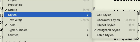
Fundies 09: Software/Pūmanawa
InDesign Page Numbers, Margins & Columns. Illustrator Patterns.
When creating a booklet or brochoure, remember it goes in fours because of its four sides. Please only do a ten-page booklet if it makes things easier.
Creating a cover and back cover pages for the booklet using a text box and text


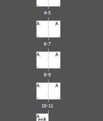
Page Numbers
The picture below shows how you would add page numbers to your booklet. Once you have placed the page number text into your parent folder, it will appear all the same throughout the booklet, so use
Type - Insert special character - markers and the current page number.
This will number all the pages correctly according to how you have the booklet set up.

Margins and Columns
Margins: Boarder around the page Columns: Spaces with divisions to make layout easier.
Both can be custom to whatever you want to achieve in your book/booklet.


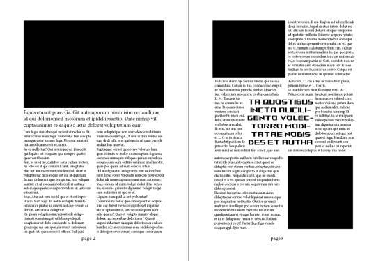
Creating a page with a picture using the rectangular box that will act as a photo before adding a text box placeholding text inside of it, then adding a second text box with more placeholding text and adding a second column to it, making the smaller text appear longer and formatted into a magazine type of style layout.

Playing around
After finishing the first page, we created our second page; I placed two black rectangular boxes at both edges and the text on both sides. I really enjoyed this part of the lesson.

Text wrap
Text wrapping, mainly when used to create a visually appealing layout, can help draw attention to key points or quotes within a larger body of text. By placing the text or quotation in the centre and allowing the surrounding paragraphs to wrap around it, you can create a striking visual effect that guides the reader's focus to the central message. This technique can make important information stand out and enhance the overall readability and impact of the text. Whether designing a webpage, a document, or a presentation slide, mastering the art of text wrapping can elevate your content and engage your audience more dynamically.
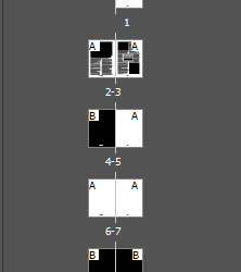
Parent Pages
To adjust numbers on various pages to match the colour scheme of your layout compared to the image or page colour, follow these steps:
Create a new Parent page for the numbers you want to modify on different pages.
Add a layer by inserting "(Page numbers)" before moving the A parent to create a new one, which will be named B parent.
Edit the page numbers on the B parent page, then drag these B parent pages onto the corresponding existing ones below. This action will update them to match the selected parent. This method makes enhancing and refining your booklets more straightforward and more effective.
None Pages
None of the pages are blank pages you place onto pages you don't want anything on. For example, if you don't want any page numbers on a page, you would apply the none page to that specific page, and it will remove it. This is also a no go zone, if you were to put anything in it, it would mess up the system.

Creating a pattern in Illustrator
Transitioning to Illustrator to design a repeating pattern for a page background, I opted for a basic heart shape. This shape was transformed into a pattern within the swatch palette by creating a vector drawing. It incorporated a black box to enclose the image before inserting it into the box and saving it in the patterns palette.

Practice Vector handal practice
I am getting better with the handles. It could be better, but it's better than when I first started using Illustrator. Drawing these vector shapes is still a little complicated, and my perfectionist side kicks in, but I do my best to get it as accurate as possible. Still need a lot more practice.

After filling the selected shape black, click on fill, then click the pattern on the swatches palette, and it will fill the shape in with the pattern you have created.
Once we were finished, we created a hexagon-shaped pattern using the same method as the previous shapes, but we compiled the shapes together. Hence, there were no gaps/spaces between each hexagon before importing it into InDesign and setting it as a page background.


0 notes
Text
Fundies 08: Software/Pūmanawa
InDesign Styles and Image Placement
InDesign combines text, such as web ads, print ads, brochures, books, and PDFs for digital use.
The other two software apps we used, Illustrator and Photoshop, are used for creating images, whereas InDesign is used to assemble pictures and text.
It has similar tools to Illustrator for creating shapes and other things.
Styles allow designers to apply settings to objects and text and save those settings as a style. This can be used for multiple things of the same kind, such as text.
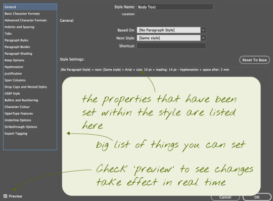
Paragraph styles
In InDesign, a paragraph is the text between two carriage returns. Each block of text separated by carriage returns a paragraph. Text styles can be saved and applied to paragraphs for consistency. Paragraph styles are recommended for longer documents, while character styles can be created and edited for specific text formatting. The paragraph styles menu offers various properties to customize text appearance.

The Paragraph style options
Character styles
When using character styles in a document, it's essential to understand their purpose and their effect on your text. You can use character styles to emphasize specific words or phrases without altering the entire paragraph. This fine-tuned control allows you to highlight key points, add emphasis, or create visual interest within your text. Remember, character styles offer flexibility and precision in your formatting, making your content more engaging and easier to read. So, next time you want to make a word stand out, reach for a character style to make it stand out.
Bullet Points
When setting up bullet points in a document:
Add a carriage return after each item.
Creating a new paragraph style for bullet points.
Access paragraph styles to customize bullet points.
Maintaining consistency in structure and formatting.
You can make minor adjustments to a visually appealing list.

Loading Images into InDesign
When incorporating images into an InDesign document, utilize the "File > Place" function to maintain image separation. Images are inserted into frames of identical dimensions. To relocate images, employ the selection tool by pressing (V) and dragging the image or the circle within the frame.
Text wrapping
When adjusting text flow around an image in InDesign, it is helpful to correctly set the text wrap options for a visually pleasing design. You could place the image within the text area and customize how the text interacts with it by accessing the properties menu?
To access the properties panel, go to Window > Properties. Here, you can choose and adjust the text wrap options to match your design requirements. For example, in the provided instance, the text wrap was set to flow around the frog image rather than placing it behind.
Explore various text wrap settings to achieve the ideal balance between the image and text, resulting in a polished and seamless layout for your InDesign project.
Below is a text wrap I did with a quote, like writing in the middle of the text with a different style and more prominent characters to make it stand out more.

0 notes
Text
Fundies HW: Composting and Adjusting
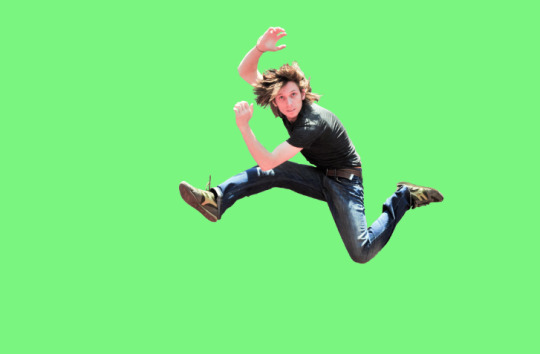
The Brief for the next homework task. For this task, using Photoshop, you are putting more than one image onto a background and using Illustrator to import different shapes into Photoshop to create a whole new picture.

The first image we started with was of a man jumping; we had to select his body and remove the background layer so it was just him.
The tools used for this were:
-Polygonal lasso tool -Quick selection tool -Pen tool Masking layers

The before and after pictures show how the jumping man went from his original photo to a photoshopped version of him in a random location with vector shapes to create a cool and funky visual.

The next part is the homework task: Add two Vector images and two raster images into your photoshopped image.
Below, I will use a sheep and an aeroplane as the images I will incorporate into the jumping man picture. I went with these pictures cause since there is a lot of green, I thought some sheep would look cute in the background and an Airoplane cause of the blue sky would look a little empty so I used it to fill space, to at least add something into the sky to balance out the images on both the ground and sky.


After pasting the image into Photoshop, I used the quick selection tool to get most of the sheep before adding a layer mask, and this helped me to erase what I didn't need with the polygonal lasso tool; once that was finished, I placed the Sheep where I wanted it before duplicating it so there were two in the paddock.
Tools Used Photoshop:
-Polygonal lasso tool -Quick selection tool -Pen tool Masking layers

The next picture I added is the plane, using the same tools as the sheep, but I didn't use the Polygonal lasso tool or the quick selection tool since the shape of the plane was simple and easy to just draw around. Once I had erased what I didn't need, I turned the opacity down a little and placed the plane in its position, making sure I was happy with the position I had chosen.
Tools Used Photoshop:
-Pen tool Masking layers

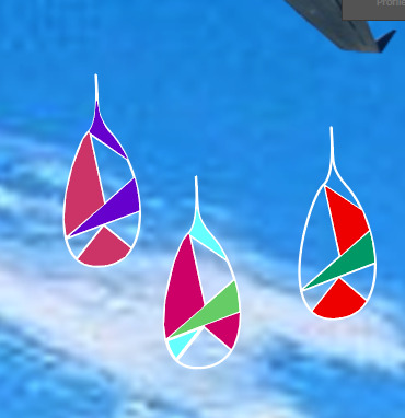
When creating the vector images in Illustrator, I didn't do anything complicated and was stuck with three lightning bolts and raindrops. Using the same tools as the snake, I drew out the shapes I wanted, using stroke when needed, making sure to use my layers and naming them to keep track of what layers I used. Once the wireframes were completed, I chose random yet pretty colours to add to the lightning bolts and raindrops before saving them as images and adding them into Photoshop through placed links.
Tools Used Illustrator
-Layers -Pen tool -Stroke -swatches | System (Macintosh) -Fill and stroke


Finished results
The vector images are microscopic compared to the rest, but I tried my best, considering I wasn't in class doing this project. The process was long, and I enjoyed some elements, but somewhere, I got bored and wanted to be happier with what I had done. If I could redo this project again, I would take my time to consider compositions and make sure things were appropriately scaled. Other than that, I did the best to my abilities and had fun while doing it.

0 notes
Text
Fundies 06: Software/Pūmanawa
Photoshop Composite Images and advanced selecting.
For this lesson, we are learning about composing images using many different methods and techniques, including Illustrator and Photos, and adding them to other images.
The techniques and methods below will be applied to our task.

For this exercise, we had to use the picture given to us for the next exercise, which was of a jumping man. We will be selecting and adjusting the elements surrounding the jumping man.

After using the smart selection tool and the tool on the jumping man, we removed the background, leaving just the man behind and adding a colour background to it; for me, once the background was added, the next part was to use the polygonal tool to fix up the strands of hair, making it a lot more clean and flowy, and making sure the figure isn't missing any parts of his body, if this happens to use the layer mask and select the black to remove what needs to be removed and use the colour white it brings back the areas that are missing on the picture.
After finishing with the tricky hair in Photoshop, move it into Illustrator by saving it, opening the file, and selecting the flatten image option, which opens the image as a single image.

While in Illustrator, we used the pen tool to create an S-looking shape, which we called the snake shape. After getting the shape into the correct position I wanted, I used the stroke panel to thicken the lines and round the ends so they weren't sharp and looked weird.


Importing the snake shape into Photoshop
File placed linked: references a file on a hard drive - a linked version of snake file.
Once you have saved the snake file on a transparent background, how do you add it into Photoshop? You need to make sure you click on the placed linked file; this imports the image from Illustrator and places it in the correct position where you drew the shape.

Moving back into Illustrator to work on the snake shape, creating another layer and this is for the wireframe of the snake, using the pen tool to outline the shape you have made before removing the outline of the main shape and adding in different lines inside the shape which now makes the wireframe of the snake shape.
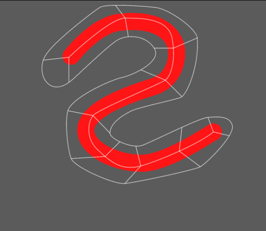

Add a layer and name it fill shapes; this layer is for the colours you have chosen from the swatches palette, filling in some of the wireframes; while doing this, it is also updating Photoshop since both software are linked.
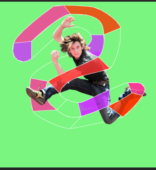

After doing your wireframe and filling shapes, add a background, find a picture online, and copy and paste it into Photoshop. Now you have a background, changing the whole picture and making something new and funky from the original.


Files System

0 notes
Text
Photoshop: Layers, Masking and Selecting HW
The brief for this is to find two pictures, one for the background and the other for the 'Interest'. For my photographs, I chose something simple: a flower and a butterfly.
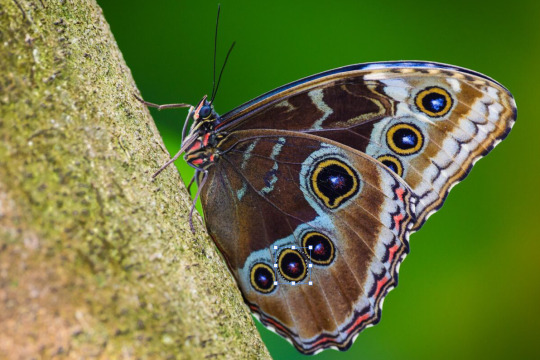

This allowed me to select the butterfly, draw a marque around the butterfly, and get as much of the butterfly as possible. After that, I used CTRL + C to copy the image before switching over to the background and using CTRL + V to paste it onto the bg image. Once I had finished that, I added a mask onto the butterfly layer, which I then used the mask to erase the areas that needed to be cleaned up and to show through so the picture looked cleaner.
Once I had finished editing the butterfly and moving it into the position I wanted, I turned down the opacity to 98% to blend it into the background a little.
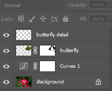
The Layers used for the
Little side note: I did mess up the butterfly wing a little and forgot to select one of the details of the wing, so I had to copy and paste this small detail onto a new layer and add it to the picture, but overall, it doesn't look like any mistakes were made since it all fit seamlessly together.
After I was satisfied with what I had created and some more editing done, I added some curves to the background to make the flower more vibrant and less dull with the butterfly on it.

I could have done better, but I missed this class and had to create something quick and easy to move on to the other classes I missed.
0 notes
Text
Fundies 05: Software/Pūmanawa
05/04/2024
Photoshop Layers, Masks and Selecting

We learned about the basics of Photoshop, how the Layers panel works, and the essential pixel manual selection tools, along with mask layers that help select an image and erase the parts you no longer need to blend into the background image, creating a new picture.
Things we will be learning throughout this section:
Layer palette
Layer transparency
Layer groups with two layers
Masks applied to the layer group
Effects: glow and shadow
Masks
Adjustment layer
Create group layers
New layer -or- drag a layer onto it to copy the layer


Selection tool and how to use it. This is handy for removing an object or part from an image by drawing around the part by selecting it and dragging it away from the object or copying and pasting it into another image.


Layer masks are essential to Photoshop. During this class task, we learned how to apply a layer mask to an image by making a marque around the steamboat and copying and pasting it above the original picture; this is when the layer mask comes in handy; it is like an eraser; but instead of it removing everything lay is on the layer panel the mask allows you to erase what is around the boat you have copied making it transparent as you place it into its position that way you can blend it into the background picture making it look like it hasn't been edited. Once the masking was completed, I sized it down to make it smaller than the one up front and also brought down the opacity to make the boat look further away from the one up front.
Layer Mask: White pixels mean it is visible. Black pixels mean that it is invisible.
A layer mask can only have black and white inside of it. This layer can't have any other colour since it is only a masking layer for images to erase the image that isn't needed.
Black hides what it is on the picture of the layer mask. White brings back the picture of the layer mask.
0 notes
Text
Fundies HW: Software/Pūmanawa
Object Creation
Pick an object of your choice within your skills to make. Draw up your object on paper first before designing it in Illustrator. Document the process of both drawings and hand them in on Tuesday Morning.
Ideas (Mind Mapping)
I first started with a mind map, getting all my ideas out onto paper, I had a lot of influence from The Avatar the Last Airbender since that's what I had watched Friday, and since I love my elements, I wanted to mix it with my culture.

I did a lot of image research to use as references to help me with what I wanted. It took a long process to get what I wanted, but I finally decided on what to do, and I hope it turns out how I want it to.
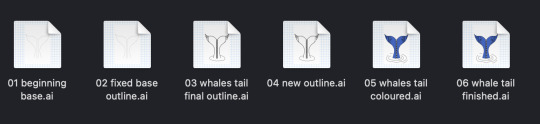
My Object
For my object, I decided to pick something within my culture and chose a whale's tail. This symbolises Protection and Good luck, and it's very meaningful to me. I wanted to incorporate it into this design but keep it as simple as possible without overcomplicating it since I am not confident using Illustrator yet.
Picking my Object/References
These are some reference Images that inspired me to do the whale tail and to help me throughout my drawing process.


My Sketches
These are some images I hand-drawn on paper and used a bit of Procreate to help; I wasn't sure how I would place the colours at this time, but I hope to incorporate the ocean colours into my design.


Illustrator Process

Figuring out the shape of the tail this process was fun but also a little complicated since my snapping tool would stay on, making things a little stressful. Still, after tweaking and being good friends with the A key, I got there in the end and duplicated the other side to make it symmetrical.

The outline of the whale's tail. The design process could have been simpler at first. I was wondering if I could add all the details I wanted, and placing the lines in the middle for the weaving was a little complicated, but it was also fun.

After adding the colour, playing around with the points, and cutting off some of the outlines, I needed help to do what I wanted with my design and make the Koru designs stand out more. So, I stuck with something basic and did my best to make it work.

Finished Results: The final results aint what I had expected; I had a lot of difficulties bringing my design to life and creating something that was within my culture; I didn't expect this to be as hard, but working with Illustrator and learning how to use it was a little hard but in the end, I created something meaningful to me, and I put my best effort into it. I pushed past my boundaries and learned a lot from this; next time, I will be accessible to myself and go further beyond my skill levels.
I also didn't add shadows or highlights in the places I wanted them since I needed more time and had trouble adding shadows since I kept messing up my lines and getting frustrated. With the details, I did my best to make them as accurate as possible and erased the tiny dots, which would make the design more stylish and detailed.
File Process


0 notes
Text
Fundies HW: Software/Pūmanawa
Simple Image Adjustment
For This homework brief, we have to take at least four photos from the internet or use our own, either black and white or unfocused pictures and put them through photoshop, using the tools we had been taught in class Monday afternoon. This little task will help us to understand the different colour contrast and how to use the tools correctly when editing pictures with different hues, tones and values.
Zeus - Dad's dog

Taking away the overexposure to the light and making it darker, I wanted to bring out his fur colour to make it more vibrant and less white.
Curves
Brightness/Contrast
Kevin - Sister's Dog


I took out the white light and made the picture more vibrant with colour. Kevin's face is a little darker in the second picture I edited, but it looks a little more natural colour-wise.
Curves
Brightness/Contrast
Hue/Saturation
Colour Balance
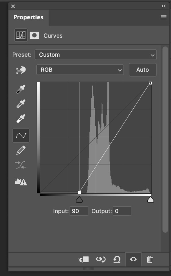
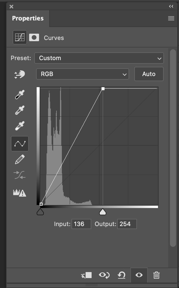
Maori Art - Otago Museum
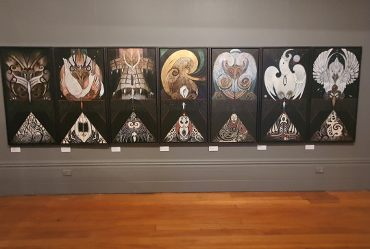
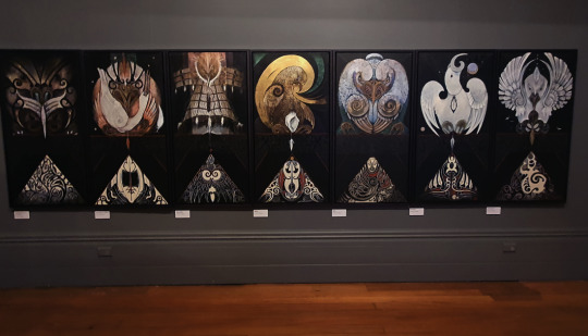
Taking out the exposure, changing the contrast darker to make the colours stand out more and adding a little colour balance to draw out the colours a little more
Curves
Colour Balance
Hue/Saturation
Bluff


I lowered the contrast, making it darker to bring out the blue sky, adding a little hue to bring the blue out in the sky and making it the principal focus along with the water, since in the first picture, it is more white and the second picture its more blue.
Brightness/Contrast
Hue/Saturation
Colour Balance
0 notes
Text
Fundies 04: Software/Pūmanawa
04/03/2024
Illustrator Recap

Today,
We recapped the different points and segments.

These were some of my recap drawings in illustrator using the anchor points, segments and curves.
Photoshop Lecture
Today,
We learned about colour and how to use the tools in Photoshop. I have some experience with Photoshop and colour, considering I did art and design last year, so this lecture on Illustrator was more accessible. Also, I edit pictures daily, so I already know how most of these functions work, not in Photoshop but in other editing apps I use to edit my photos.
Colour Correction
Colour Grading
Image Adjustment
Isaac Newton created the colour wheel as a product of the light and prism experiments he did at his home in 1666 during the plague.


Modern Colour wheel

This is the colour wheel we work with today; it has more colours due to mixing primary colours, which creates different shades and can be expanded. The number one rule with colour is that you cannot mix other colours to create primary colours since it is a main colour and cannot be created using different colours.
Subtractive Colour: The more you combine, the less the colour is.
Pixels are like mosaics, a bunch of colours mixed together to create a cluster of colours.
Hue
What is the colour
main colour
Saturation (Tone)
More: Vibrant, pure.
Less: Muted, dull, grey
Brightness (Value)
Add: Tint (Lighter) Towards white.
Subtract: Shade (Darker) Towards black.
Histogram

This graph helps with the darker and lighter tones in a picture. In Photoshop, this is called a curve; you can use it to balance out the tones and shades within a picture, making it more Black or White or Darker and Lighter depending on the colour photo pallet you are editing.
Brightness & Contrast
Layer adjustment: curves help with the colour.
HDR: high dinamic range
Adjustments used for editing
Photo filter
cuves
colour balance
hue satuation
Self Note: Photoshop is one of my favourite software and is more fun than Illustrator, but I know how to use Photoshop more than the other software apps. I also enjoy editing pictures and would like to develop more skills.
0 notes
Text
How to Edit Pictures in Photoshop
Histograph
Using a histogram to help with adjusting the colour/tones in a black and white picture, making sure not to brighten it too much and also not making it too dark, keeping the highlights at a nice range so it doesn't look oversaturated.


colour adjustment

adjustment Layer


cat


Foggy day


0 notes
Text
Fundies 03: Software/Pūmanawa
01/03/2024
Software Lecture Recap

This Afternoon,
We recapped what we had learned Thursday and ran back over the controls/shortcut keys to help with the next stage in our learning. We also learned some new shortcut keys for Illustrator that would help us through the next task in creating our penguin.
Penguin
The creation of the penguin started out slow and steady. It was easy to follow, and the steps were a bit simpler. As time passed and we neared the end, things started getting more complicated, and I fell behind a bit near the end.
I continued to finish this project at home over the weekend so it could help me with my homework.
Self Note: I wanted to keep my perfectionism from taking over while creating this object, and I felt disappointed with myself for not keeping up; I wished I could have done better and followed along smoothly. This is a learning experience, and I will try harder in the next task and future projects.
My penguin after class: where I had gotten up to before class finished.

Homework
Object Creation: Pick an object of your choice within your skills. Draw up your object on paper first before designing it in Illustrator. Document the process of both drawings and hand them in on Tuesday Morning.
0 notes
Text
Creating A Penguin in Illustrator
Create a circle and split it into two half circles, dragging the second half down while keeping it symmetric until they are at the width you want the penguin to be at.

Selecting the endpoints and joining them together is done by using the V tool to select both points and pressing command J to join both ends together; you can also just draw in the lines, but command J ensures the points are entered correctly.

We moved down to the bottom of the pill-like shape. The tail was created by adding some points and moving them in different shapes, dragging them outwards to make a penguin's tail, which looked a little like a ghost when we started. It looked a little cute.

For the hair strand, we added three points, like the tail, to create the feather, using the top point as a broken point to curve it around.

We started off with a rectangle shape to start the beak off before using the A tool to bring the top line down on a slant and rounding the bottom corners to create the tip of the beak, filling it in with colour and adding shadows by drawing a rectangle inside the beak making sure to use a lighter than the beak colour.

The eyes started off with a circle, adding a base colour before adding the gradient tool; this helps with the two different colours you will be using and also helps with blending the colours together and putting the colours where they need to be. Once that is all finished, you can add in the white highlights or whatever you would like before making them the size you want and duplicating it so you have two eyeballs, placing them in the correct position, and you now have two penguin eyes.


Doing the feet was a little more complicated than I expected. Started off by drawing a long curve before bringing it in and doing another. This creates the top of it. Once completed, you can mirror/copy that, and it pastes symmetrically on the other side. We shrunk the foot so it looked a little more 3d like and not weird and wide before filling it in with a colour; once that process was completed, we duplicated that and removed some of the lines that we didn't need, duplicating that once more before lowering the line so there were not two, it created a slight 3d effect after that was done, we used the command J tool to join the points together, and it made the shape a of weird lines filling that in with a darker colour which created the shadow 3d effect, placing the whole foot on top of the lines and outlining it with a thicker line which made the penguin's foot.


After attaching the legs and feet to the body, we highlighted its top half and tilted it back a little; this helped with slight movement, giving it character as if he were walking.

We added the penguin wing before giving it a full body colour; this could be any colour we liked, so I chose a dark blueish-grey colour.
Self Note: After this step, I had lost where Toby was at since it went fast, so I sat back and watched him add the details and highlights finishing off the penguin.

Shadows and details
(Update when finished)
Finished results
(Update when finished)
0 notes
Text
Fundies 02: Software/Pūmanawa
29/02/2024
Software Lecture Recap

This morning,
We reviewed Tuesday's illustrator shortcut keys, ensuring we remembered what we had learned to apply to the next task; we finished all seven sheets, and the further we got down the sheets, the more complicated it got.
Software Illustrator Arc Curves

Today,
We moved on to the arc curves, learning how to use the pen tools to curve the points and use the handles, making sure each handle is small and not extended or else the curve becomes out of control and more challenging to help form a nice curve.

The difference between straight and curved lines is that a straight line only needs two points, whereas the curve needs three or more points, allowing it to bend and manipulate the line the way you want it to go.
KYHS: Keep Your Handles Short


Understanding the different anchor points and broken points, learning the difference between a straight and curved line and how to create a broken point before adding a second curve.
The anchor point tools help create where to place the correct curve or straight line.
Anchor point tool - shift c


0 notes
Text
Learning arc curves
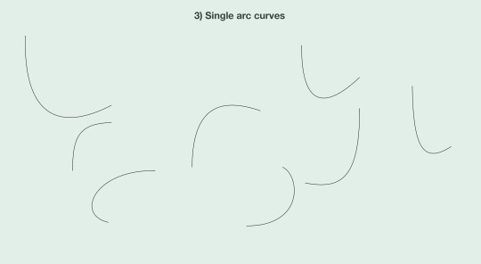
How to create a curve by holding the pen tool down until it shows the handles; this allows you to make the bigger or smaller, but the longer the handle, the more difficult it is to control the shape you have created.
Self Note: Creating the arc curves was simple at first with practice, but the more I followed along, the more complicated it became.

Simple curved lines on paper, easy to draw on paper. However, when applying it to Illustrator, getting the handles and curves accurate on the software was more complex and complicated.

I found these ones difficult with the handles; I made them longer than needed, especially the last two.
Self Note: keep the handles a little shorter, and the same length helps with control and movement of the curve.

These shapes are more complicated curves. These curves required more points and handles to get all the different arcs and curves. It was easier to draw on paper and a little inaccurate, but it was easier than drawing on Illustrator.
Start dragging and hold shift: This allows you to move the curves more smoothly.
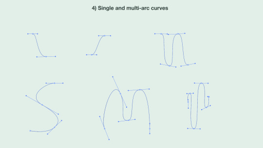
Multi-arc curves
Getting the handles small and manageable for each curve. It was more complicated to get the curves more accurate but slightly more straightforward than I had expected.
Note: keeping the handles short was a little difficult to maintain, I personally had a hard time to keeping these smaller

Closed curves
It took a bit more work to get the curve in the perfect shape and the handles in the correct places. I found this part a little more challenging.

Curves and straights
This is done by drawing a line and then holding the point, making a handle to create the arc curve. While doing this, you can create many different curves and angles.

Curves and straight
This was the last of the seven tasks from the worksheet. This one was much more complicated and diverse from all the practice shapes. Using broken points to cut off the lines, making the handles for the curves to create the round shape.
Self Note: I couldn't get this shape accurately, and it was the hardest; I knew the further down the sheet we got, the more complicated it would get. Knowing I have to create a penguin scares me a little; I struggle with perfection, but I am trying to not let that hold me back.
0 notes
Text
Learning Straight Line Shapes

This is my attempt at drawing these slightly more complicated straight-line shapes. They need to be more accurate, and I struggled a little with it, but I also rushed the drawings.
Self Notes: I still struggle with drawing on paper, but the more I practice this skill, the more confident I will become.

Overall shapes
These are all the shapes I drew in Illustrator after drawing them on paper; I found it a little easier with the direct selection and selection tools; this helps a lot since it isn't easy to move lines on paper and get them as accurate as possible, but Illustrator is also complicated to use, It was challenging at times.
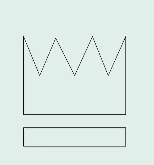
Crown
This shape was the first one on the board to do and also one of the easiest ones. I completed this shape faster than the rest, using the direct selection and selection tools to help with the points to make them symmetrical to each other and as close to it as possible.

This one wasn't the most complex shape to create along with the lightning bolt, but the more I look at it, I realise that my proportions are a little off and that the left side of the shape is a little larger than the right side, it is an easy fix with the direct selection and selection tools.

Lightening Bult
As I had said previously for the shape above, This one was pretty simple, I'm still determining if the points are accurate, but it was fun to draw. It didn't take too much time to get it onto the page before moving on to the following shapes that grew more complicated as you went on.

Dog
This shape, in particular, was the hardest to draw, both on paper and in Illustrator. The hardest part about this was getting the right lines and eye proportions.

Star
I struggled a bit with this star's accuracy. I could improve at drawing stars, but I did my best to get the points and lines as accurate as possible.

Hard Shape
This shape was another problematic shape to draw. It took a lot of effort to keep the points and corners inside the box and make it all even. With some help, I did it as accurately as possible, but it was a fun shape to learn, and I will continue to practice this shape and the others in Illustrator.

These are called direct selection points, and they help you move the points into the places you need them to go to manipulate the shape or help fix up the shape of a little. You can also click lines separately to move them or move two points/lines simultaneously to help get the shapes into the most accurate position for the shape you want to achieve.
0 notes
Text
Fundies 01: Software/Pūmanawa
27/02/2024
Software Lecture

Raster on the left & Vactor on the right
To start the day,
We listened to a lecture about the different software apps we will learn throughout the 9 classes with Toby. We discussed Raster and Vector pictures, how each is applied and what software app to use when creating a graphic image. We also got told about what software we will be learning more about and gaining skills in Illustrator, Photoshop and In Design, which we will be apply to our other classes though out the three years of this Degree program
Raster (Pixels) - Good for more colourful and picture-like designs. Vector - Good for sharp, clean lines.
My notes: During this lecture, I learned more about raster and vector and what software apps you need to use for specific graphic pictures you want to create; I use Procreate since that is the software I'm familiar with, but I struggle a lot with the pixels and how to make it look more crisp and sharp so this lecture helped me more to understand the difference. Hopefully, I can apply it to procreate.
Creating a Tumblr Profile
We created a Tumblr page to document our work throughout the Communication Fundamentals classes; this allows us to showcase our work, notes, feelings, etc.
My Notes: I struggled to create my account on the Macs in class; it wouldn't allow me to create a password. But after I got my account sorted on my laptop, I could start documenting.
Managing Files
Keeping a file structure helps you find your projects more efficiently while managing your files to look neat and clean so you can find your current projects.
Illustrator
We learned some shortcut keys to help navigate the app., making drawing easier without using the side tab to pick the different tools. We started by learning how to control the other tools by doing simple shapes and applying different transforms (Move, Rotate, Scale) to create a different shape from the original.
0 notes