
Statistics
We looked inside some of the posts by jeepersjeeves and here's what we found interesting.
Average Info
Notes Per Post
4
Likes Per Post
3
Reblog Per Post
1
Reply Per Post
0
Time Between Posts
7 months
Number of Posts By Type
Text
8
Photo
5
Video
1
Last Seen Tumblr Blogs


Fun Fact
In 2020, Tumblr had 29.4 million users in the US.
Text
Clarifying Kenshiro’s Imposing Form (3/3)
This is the last of the thoughts I had while cleaning up this sketch.

One thing that sort of bothered me was how muddy the form looked. A couple of years ago, I stumbled upon a post on pinterest that talked about shape clarity.
It’s definitely prevalent in character design, where the aim is to make the silhouette recognizable. This is similar, where the form needs to clearly convey information, even with the details blocked out.
I did some digging, and they’re by a storyboard artist named Sherm Cohen, who worked on shows like SpongeBob and Hey Arnold. This is the original post.

Anyway, I did not achieve that here, as you can see, and would definitely have to rework the pose in order to achieve better shape clarity.

But maybe, I could give the line art on the inside a different color, so that it differentiates the shapes of his hands and of the coffee mug from his body. Based on this mock up(?), I think it would be wise make sure that the line art contrasts with the rest of the form.
Definitely in the future, I’ll make sure to keep this in mind, but for now, I don’t want to spend even more time reworking it. I dunno. Hopefully the alternative isn’t the equivalent of polishing a turd.
1 note
·
View note
Text
Pushing Kenshiro’s Manly Expression (2/3)

So, for the same drawing, while I was cleaning up the face, I tried to really get into what sort of expression I wanted Kenshiro to make.
Initially, his eyes were going to be wide and intense to match the ATATATA thing, and his tongue would stick out, but it didn’t match what I was feeling, so I tried the expression myself. I was able to feel the muscles on my face, which I thought was pretty helpful.
I found that I made more of a grimace — the corners of my mouth were pulled back horizontally, and my tongue was retracted back, away from what burned it, hypothetically.

Oh also, I thought I was crazy, but I actually had forgotten that I’d updated the drawing, so hopefully this is more indicative of the changes that I described. I rose the outer corners of his eyes, and added a little crease under his mouth, to emphasize the bottom lip for more expression. That area around his eyebrows where his forehead and nose meet also leaves a lot to work with (my favorite part of his design). Working with these features felt like molding clay. It was kind of relaxing — not too much calcuation here, just feeling things out.
So, yeah! That’s it for now.
0 notes
Text
Foreshortening Kenshiro’s, uh, Beefy Arms (1/3)
So I have this drawing of Kenshiro and I noticed some things while cleaning up the sketch — too many things, in fact, so I’m gonna try to divide this up into multiple posts ;;;;

The arms feel more like they’re in side-view, rather than along the z-axis, coming towards you, even if slightly.
So while reconstructing the arms, I thought about this video I recently stumbled upon, by the channel, Draw like a Sir.
Draw a big circle, and then draw a smaller, overlapping circle in front.

In this case, I used the big circle for the elbow, and the small circle for the wrist, since the forearm felt too flat for my liking. Don’t know if I misapplied it here, but it definitely gave me more guidance than just drawing a foreshortened tube as best as I can.
Seeing this difference also reminded me that I’m still not quite comfortable with foreshortening. I learned this from another video from Love Life Drawing. They describe five different stages of learning how to draw, and one interesting thing that they mention is the tendency to extend or flatten the figure when the original source is actually in perspective. So, I’m quite eager to delve a bit more into foreshortening forms, particularly arms, which I’ve had the most trouble with for the longest time.
A side note: Love Life Drawing has this interesting video on proportions. Since then, I’ve sought to not get so hung up on achieving exact measurements, especially with more complex poses where those measurements are warped by perspective.
Usually, when the figure is standing upright, it’s easy to know where the elbow and wrists are placed, but, in this case, when the torso is contorted, and the arms are bent, it’s not as straightforward.
So I guess what I’m trying to say is that the circles were a really helpful way for me to approximate measurements in more complex poses with a bit more certainty than I usually have.
0 notes
Text
Sketchbook Excavation Tour 1/??
(Future Note): I'm fortunate enough to still do this! Came back home after spending time out of town, only to get displaced for a month. My sketchbooks somehow survived, though, so I guess I'll just tear through them with a bit less fanfare than this one. There have been bigger fish to fry.
Also, I spent way too much time trying to explain myself, worried that I'd come off as preachy and not really knowing what I'm talking about, and now, the iron is ice cold, and the thoughts shared in this entry are no longer fresh on my mind. So, I'm just going to post this and move on.
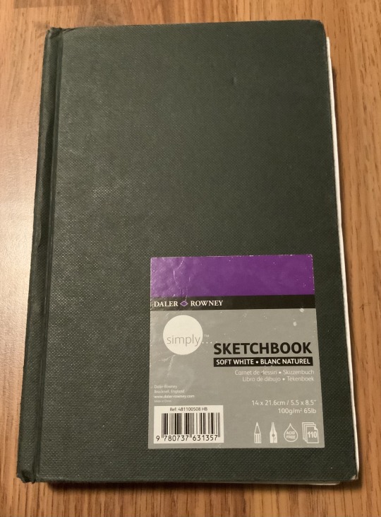
Here's the first of many sketchbooks. This one is from high school. A classmate of mine gave it to me, because she didn't like the paper quality, if I recall correctly.
I vividly remember the feel of drawing in this sketchbook. The pages felt super grainy, like nothing would stick and would just immediately smudge. So, half of the sketchbook is still blank haha

I did this thing where I wanted to journal while traveling, and this page was supposed to be where I kept track of finances.
I rather liked the idea of anthropomorphic(?)finances(?), and I liked their contrasting fashion sense, one being more relaxed than the other, so I thought I'd give these designs some more attention.
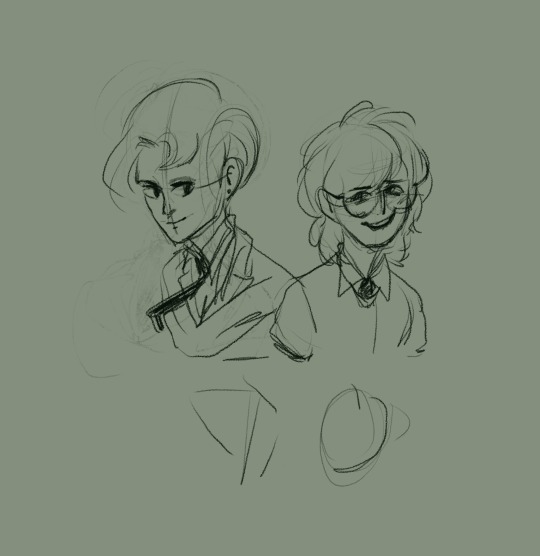

I wanted to emphasize that visual contrast between the two, so I focused on giving them a more obvious shape language, as seen in the first two images.
Retrospectively, after I had drawn everything, I revisited the above image and took notes of what I wanted to keep and what I felt should be further developed or adjusted.
These are things like keeping the contrasting silhouettes of the boots, getting rid of the glasses on the left deign, and putting more thought into the design of the hair. Some of this is reflected in the final image of this post.

I still feel a bit sheepish about this page of sketches, but, I scribbled some forms to get an overall feel of the design, and how the clothing would look from different angles and poses. Also tried to hash out what I wanted the sleeves to look like.
Around this point, I started to visualize them more as bankers, so I thought of their outfits more as uniforms.
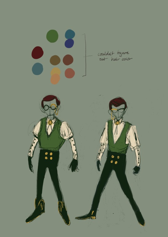
Once I had a series of design elements that I felt I liked, I drafted up these designs to see how they'd come together. I was also pretty excited about color, so I added color too, just to see how it would look.
So this is where I'm at right now. I think there could stand to be a bit more variation. Guy on the left also looks a tad too similar to another design I worked on not too long ago, so I might give this another pass.
Either way, though, it was fun, and I like them well enough. Gotta come up with names.
Extended ramblings under the cut.
Clothing Variations
I still have some thoughts, like, while drawing the guy on the left, I kept Persona 3’s Akihiko Sanada in mind, particularly Sarah Kipin’s rendition of him. In keeping with the round silhouette, I thought of adding round and broad shoulders, which would lead downwards into round fists, making me think of an old-fashioned boxer. And because of this round silhouette, I opted to give him a sweater vest instead of a regular* (?) vest.
The material of a sweater vest is soft, you see, which I thought would help with creating a more round silhouette, and I thought that'd contrast nicely with the sharper feel of a more traditional vest with coattails, but because I wanted to give them a uniform, those two articles of clothing felt too different from each other. I'll have to spend more time with it and do some research, maybe on uniform variations or something. In the back of my mind, I kept thinking about, like, a three-piece suit, but it didn't quite come out that way, I think because I was so set on the vest idea, and was trying to depict two different types of vests, rather than a vest-jacket combo. Mixing up the latter (wearing just a vest, just a jacket, both, etc.) has more cohesion than two types of vests, I would think.
Something Something Visual Tropes
That thing with Akihiko is what I want to refer to as visual tropes. I read it once in the comments section of a video art tutorial, and I think it‘s applicable here. Though I guess “visual signifyer” might be more appropriate. Still, I think ”tropes” gives it that nuance of “design elements that are commonly or repeatedly used to convey certain ideas”.
So, when someone says that a drawing looks like [famous anime character], I think that it’s an interesting way to examine what design elements it might have in common, and even to see where those design elements might trace back to.
I think it’s worthwhile enough for me to start doing more often, so I’ll try it and report back
Design Process
A previous venture in character design led me down a similar mode of thinking while drawing these two, and now I've scrounged together a sort of thought process when it comes to designing characters. I'd distill this down to "ideation then research". Can I say that? Ideation?
Basically, get all the ideas out there first, and then ask questions about what you drew (why did I draw this? what led me to this?) and to research elements that you're not quite familiar with (what does this actually look like/how does it function?). I mean, it all sort of remains in the abstract, but feeling my way around along these parameters really helped me to get the ball rolling, got me excited and curious, and helped me to feel a bit more intentional about what I was designing. I tend to put the cart before the horse, when it comes to both drawing and storytelling, wanting to create something that falls into place on the first try, but I've found more value in working with your gut reaction. You have a more active voice that way, there's more problem solving, you arrive at the result in the literal sense.
Application
So yeah (this is the last thing), I wanted to make them NPCs for a western-themed game idea (will explain later) that I had about a summer ago. The combination of banking uniforms and western-like accessories (the bolero tie, sleeve garters, and boots) had me thinking about, well, westerns.
So that's that! :v
*I did a google search and it seems like most vests were made out of silk. Bless Wikipedia. At a glance, it reminded me of details like single and double-breasted coats, as well as U and V necks. There’s a lot of potential here, and opens up more design options for a vest alone.
0 notes
Text
Okay
Lets try this again
Sketchbook Excavation Tour
I have a ton of old sketchbooks lying around and want to look through them one last time before throwing them out.
I think I can learn some things from them, like, what I was into at the time, or what sorts of mistakes I made, and so on.
I don't think it'll be a series or anything like that, but I'm hoping to go through one sketchbook at a time at my leisure.
Remembering JoJo
Last night I decided to re-watch JoJo Phantom Blood and a bit of Battle Tendency and wow I forgot how good parts 1 and 2 are.
It'd been so long since I'd actually sat down to watch (or read in some cases) JoJo, and seeing it take off without me caused me to kind of admire it from a distance and lose sight of what I liked about it in the first place.
But wow watching it again was like remembering my first love*. It was a lot of fun to recall certain scenes, to quote the characters, and to just stare in awe at the opening sequences.
It was also especially satisfying to notice and appreciate new things about it. That's always the mark of a personal favorite for me, when your appreciation deepens on repeat viewings.
I could gush about Parts 1 and 2, but not now. Someday, though.
*I mean, that's actually Gurren Lagann. Or maybe it's Yugiou... Hm.
0 notes
Text
Woah man I spend 45 minutes writing a post only to loose it all
I don’t feel like doing anything anymore
See you tomorrow :v
0 notes
Text
A long time has passed.
I was looking at some of my old tumblr posts and wow I don’t use this blog at all. Those posts are ooold. Like, another season of life old. 実は、いつも忙しいですが、このサイトを使ったら、心にだめでしょう。I’m kind of glad that I spent some time away. The internet is personally kind of bad for me, and my track record is pretty shady.
それに、日本語を勉強してますけど、皆はこの文を読めません。文法を下手で使います(I’m bad at grammar. ;u;)。
My hope is that I can quietly continue to stumble along in learning Japanese, as well as do a bit more thorough reflection. But, we’ll see. That’s what I always say, right?
0 notes
Photo

Some digital painting practice.
It’s really hard, yo. It’s kind of scary, because I have to paint on top of what I just drew. I feel like I end up losing the essence of the original sketch in the process. It’s like taking a leap of faith. D’:
0 notes
Text
excuse the mess
trying to figure out how to make buttons for a friend’s comic.
The idea itself seems obvious. Usually you just put an image inside of the link. <a href=“link”><img src=“img.jpg”></a>
But now I see that the description box doesn’t work that way. ;;;
I installed a theme specifically for webcomics, and now I’m trying to figure out how to resize the buttons.
0 notes


Video
youtube
Kavinsky - Nightcall
I've been pretty obsessed with this song for the past week.
**Also, I strongly advise listening to this with headphones. I personally think that it's pretty atmospheric.
1 note
·
View note
Photo
It makes me happy that this picture is the first that I see of you since, I guess the last time that I saw you? You look so cool.

Summer self portrait. I should be painting much more. I only have these two small ones on the left and this half finished 2X3 to show for it.
2 notes
·
View notes