
Don't wanna be here? Send us removal request.
Statistics
We looked inside some of the posts by jemimacaleyfmpyear1 and here's what we found interesting.
Average Info
Notes Per Post
0
Likes Per Post
0
Reblog Per Post
0
Reply Per Post
0
Time Between Posts
1 day
Number of Posts By Type
Text
17
Last Seen Tumblr Blogs


Fun Fact
Tumblr has a low social media market share in South America.
Text
EVALUATION
For my Final Major Project i knew I wanted to choose natural and artificial out of the flipside themes as I am very interested in the world around us and issues within the environment, because of this I chose to look at environmental issues caused my man. One of the main problems caused by humans is plastic pollution and fish netting so i decided to investigate that topic further.
At the beginning we all had to think of words that related to our flipside themes such as for natural i thought of particular words which are a complete opposite to artificial like genuine and real and then for the opposite which is artificial I thought of words like, fake, Botox and unreal. I did also look at words which are in the wider world like fossils, growth, foliage, breathable, pollution, manufacturing and landfill but due to my topic of man made structures and products I thought I should stick with the main words of fake and real.
With the help of my own photography and inspiring artists like David Ambarzumjan and Olafur Eliasson I became more confident in my ideas and outcomes. Initially I knew I wanted to do something which would relate to life and death due to man made structures or products, a perfect example of that would be plastic pollution and how it traps innocent animals like fish, dolphins, turtles, sharks, whales, birds and seals. At first I thought of doing a painting inspired by the artist David Ambarzumjan who creates realistic and impressive landscapes which is either natural or artificial and then puts the opposite side on the top with a clean, white brushstroke so you as the viewer can see the clear difference between each side. Another artist who really motivated me was Olafur Eliasson who created real, 3D structures of ice which slowly melted away in the middle of London to create a better idea of global warming for passers to witness, this encouraged me to go for another idea which was to use real 3D resources like fish netting and plastic bags within my outcomes to create a realistic affect.
During my final major project I thought about learning more about disasters which has happened in the world due to humans, so i decided to watch a documentary film about the famous Chernobyl which highlights how nature eventually takes back their community after humans fled there homes. The film talked about how various animals like wolves and wild cats came back to the scenes of the nuclear disaster and reclaimed their positions in the surrounding forests and brambles. The documentary explained how new life and habitat is now living in the sites of the Chernobyl devastation.
After achieving research and various planning for my FMP I decided I wanted to do something more then just a standard painting and I began reasoning with creating a digital outcome so I had both graphic and hand based work to hand in at the end which I hoped would push my grade up. For my outcomes I needed to use material, plastic, thread, pens and photoshop to develop my final ideas into real outcomes.
After reflecting back on all of my work within this topic I think my best work is definitely the digital photo book, which is filled with my own photography as that particular piece of work is extremely neat, professional and stylish so overall that piece was immensely successful.
My initial ideas kept changing right from the beginning as even though I knew I wanted to do natural and artificial I didn’t know what I wanted to include within that topic and at first I thought I would want to do a painting as my main outcome but that then changed later on in the topic. I did achieve the idea of the fish painting underneath the real fish netting to create the illusion of them being ‘trapped’ underneath but I just added it as a practical task as my two other outcomes I believe are better and I don’t think it was good enough to be displayed as an outcome.
At the beginning of our FMP I didn’t think I would design a digital outcome and I was planning on just creating hand based outcomes, I decided to change my mind throughout the project as I thought it was a good idea to do both graphics and fine art, so there is a wide variety of difference between both outcomes.
If I could display my work anywhere in the world I think I would show it in China as they are the leaders of the most plastic producing county in the whole world, probably due to them being the most populated. China produces roughly 60 million tonnes a year of plastic just ahead of the United States. If I had the opportunity to display it in China I would of displayed it in the early 1980s when pollution was getting worse.
If I had to pick a soundtrack to go with my project I think I would pick ‘save the whales’ by Nick Kershaw as it’s obviously about saving whales and one of the lyrics within the song says about men so it really does link to my project which is about men destroying the marine life.
If I could describe my outcomes in 10 words I would say they are both, professional, neat, bold, eye-catching, simple, uncomplicated, tidy, moving, surprising and Impressive.


0 notes
Text
Week 11 reflection
This week I have completed my last outcome which is the material piece, I have also finished another one of my practical tasks which is my fish under netting painting. This week I have completed two really important pieces, unfortunately I didn’t get any research done as I was very busy doing the actual hand based work. Next week is our final week in college so I’m finishing off my online sites such as my project proposal, final evaluation, online portfolio and tumblr work, but all of my final outcomes are now complete.
0 notes
Text
Plastic material - outcome


I have now completed my second and final outcome for my final major project, i decided to do this as its a fine, hand based outcome and i had already done a digital, graphic design for the other. I came up with this idea as i wanted to do something more then just a painting or drawing which i would naturally think of, so i decided to use real resources to display a real life affect, i also wanted quite a big structure so it would be more noticeable to viewers, i decided to use a natural beige colour material in the background so the plastic could blend in like it would do in the sea (like the Tesco bag without the writing) i have also used type to announce what the actual reason is for this outcome so hopefully people get my point. For this outcome i have used thread for sewing, pens, paints, plastics and material. I knew i wanted to use normal, white plastic bags as they are the main problem in our society and there the common plastic that you see. I also used supermarket bags as they are big producers of the plastics so I think it was a good decision to use Tesco as an example as they our the main supermarket retailer which means they produce the most waste. As you can see the Tesco bag is Sewen into so the colours are brighter and bolder. I also painted the world onto the right hand side of the material to show what is really being affected.
0 notes
Text


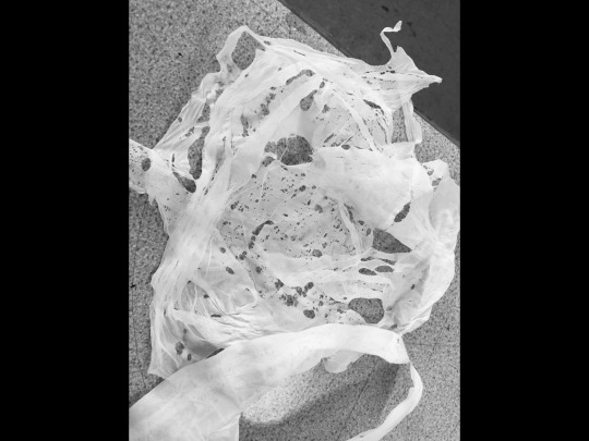
This is one of my other practical tasks which i have been slowly completing for the last couple of weeks, initially I was going to have it as an outcome but then i thought about other ideas like the photo book and the material which made me think of just doing it as another practical task which can be added to my project. The idea really is of fish in the ocean being caught in fish netting along with other animals so that’s why i added the real netting over the top along with fake figurines to create a realistic affect of other things getting stuck within the netting.
0 notes
Text
week 10 reflection
This week I have started off my online site which is our online portfolio, I have included a range of photography and one of my final outcomes. My online portfolio shows off the digital work which I have been producing from the last couple of weeks. I want my online site to be very structural and picture based with only a few sentences describing what my final major project has been all about. for next week I have ordered some plain, beige material which I am going to sew my plastic bag outcomes onto so I have both digital and hand based outcomes so both of my outcomes will be completely finished by next week. this week I have also included some practical work which is the melting down of plastic bags which I found very interesting. recently I have been only posting about my photography and finished photo book but now I have completed that, I am moving onto doing fine, hand based art which I am looking forward to doing. this week I have also reflected on my multiple screenshots of my photobook which shows everyone the tasks of making a digital outcome.
0 notes
Text
Today I melted plastic under a heat press at 175 degrees, if you lay the plastic down under the press and turn it on it melts away bits of the plastic to show a patterned bag afterwards, as I’m going to sew plastic bags onto some material later on this week, i have decided to sew these bits on as well to show more ways plastic can look. My whole flipside - theme (natural/artificial) is now more about the plastic side of life and how plastic affects marine life, so this definitely speaks to the topic of that. This was a plastic bag from a local supermarket and now because of it being under so much heat, it presses all of itself together (like the handles and the inside) so it is difficult to know what the plastic was initially but that’s a good thing as the topic is about plastic not about what is was before. If i got the chance to do it again i would collect different coloured plastic bags so it was more vibrant and noticeable but i do really like the outcomes that i did today with just the white, normal common plastic bag.
0 notes
Text
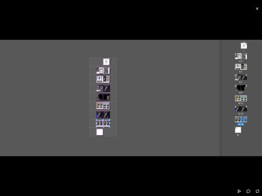

This is some of the processes I had to do to make my photo book on the computer. It is a book layout and on the side of the picture/computer it says the amount of pages, and the width and height of my photo book. This is a screenshot of my computer screen so you can see everything that I was doing at that time. Each square block will have an individual picture in it from my photography so at the end it will look like 2 pages each of photography in my photo book. I have now finished my photo book and it is posted on this blog site but i just wanted to post some screenshots of what i did to get to the finished piece. From the first picture you can see all 15 designs (not including the back cover) layered out ready to be finished. At first i made too many designed for the first layout (second picture) but the first picture is it nearly completed. Once your layout was done all you had to do was to drop your photography images onto the file and then scale it down to size and then it was done. This work is from last week not this week - just posted late.
0 notes
Text


This week i am planning on buying some material (roughly a metre long) and sewing plastics (like bags) onto the material i want to use a wide range of thread with loads of colours to make my final outcome more noticeable, i have been trying to find plastic bags like these but due to their environmental damage there isn’t much around in shops. I also like that look of loose thread trembling down all over the material so that is my idea for how I’m going to do mine. I really love this Tesco plastic bag example and i definitely want to accomplish something similar, the textiled, embroidery makes the whole thing come to life and its a great thing that the plastic is being used for something useful. The artist has used type and wording to tell the audience what there idea is making it even more bolder and noticeable. I am planning on collecting some local supermarket bags like this to use for my project as its a very common product which everyone has seen before, so it can be a very realistic outcome for everybody. If you look closely you can see newspaper articles underneath the plastic bag which is probably on the same topic as they are looking at which i also want to achieve if i can find newspapers relating to my flipside theme. You can also see on the first picture that they’ve embroidered the United Kingdom’s flag which is also something which is related to the artists topic. Tesco is the main leading supermarket in the UK which means they produce a lot of plastic which will be dumped into the sea! The artist has definitely thought about what they want to get from this piece as they have added so much detail, i also like how they’ve used the Tesco colours (blues and reds) - along with black for type and the link between the United Kingdom flag colours and the Tesco colours match so it works to an advantage. Once I’ve finished mind i want to hang it on the wall so you can see the full scale of the piece, - just like they have done. I don’t want to copy there idea but i am definitely inspired by their creation and i know now that i want to make something similar.
0 notes
Text
Week 9 reflection
This week i have accomplished, achieved and fulfilled my first outcome (the photo book) which has come out really nicely and i am satisfied with the performance of it. I have also profited from this week as I have done plenty of research and photography. Next week i am going to start looking at starting my online portfolio which we have only just been introduced to i am also going to starting my last outcome(sewing on material) - i am also going to be painting on plastic and melting it down on Tuesday so that will be another positive but that isn’t a final outcome that’s just going to be some more work which will go on my blog and will hopefully push my grade higher i am also doing that so i have more experience with fine art as I’ve never done that before. problems which i have faced this week have been that i have focused on my photography so much that I haven’t got much else done as i was planning on the layout of my book but at the same time that isn’t a problem as it is one of my main things that i am producing for my project and its good that i took time to plan it all. I also struggled with doing the photography at first (before editing) as they didn’t look professional or superior but as i went on and started editing with filters and colour schemes it all came together nicely. I think my photo book is of high quality as its very neat and professional, which in don’t normally do in my work. I do actually think that this week has been the most successful one so far as I have got a lot done, especially on things that I don’t normally do and it was my first time making a photo book on the computer so it wasn’t easy.
0 notes
Text
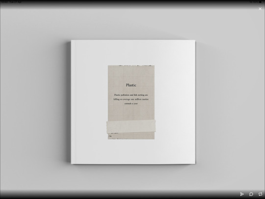


This is my finished photo book outcome which i produced and edited on Tuesday in our digital lesson. I decided to create a photo book as i wanted to show the true affects of plastic pollution/netting and photography is a real source of evidence to show that. I produced roughly 16 pictures which i edited with filters and the help of the app ‘unfold’ which gives you multiple options of backdrops which include ‘plastic’, ‘scrapbook’, ‘digital’, and many other topics, it also allows you to drop pictures within different shapes and sizes like circular, boxed or Polaroid looking styles. I was certain that I wanted to use the ‘plastic affect’ as that was exactly what i was doing for my flip-side theme so it was definitely a positive to use that. I decided to use plastic bottles mainly as they are the main problem in society for pollution especially in the sea. I also bought a dead fish from a supermarket deli and i placed it within a fish net bag so it looked like the fish died due to fishing nets. I also put most of my pictures in black and white so it was more simple and professional, black is also associated with sadness and death so it seemed appropriate. Once i had finished editing my photography with filters, fonts, colours and backgrounds i then went onto photoshop and placed them all onto a photo book, at the end i used a moche up creation which puts your art work onto a slide to make it look super neat, clean and tidy. This is just one of two final major project outcomes, with the other one still in progress (sewing plastics onto plain material) i am very pleased that i decided to do something like this as even though i really enjoy photography I don’t actually do much of it, i also hate digital work because i find it very difficult so I’m proud that i also had another go at it and now i have finished my digital creation which has turned out a success. I initially didn’t think about doing something that includes graphics, digital and computer work but at the moment i think it was a beneficial idea as its good that I’ve got both digital and hand based outcomes so i think I couldn’t of done anymore. For the front cover of my book it has a simple but true statistic which shows what the whole of the book is really about, it is also a damaging and devastating truth so hopefully it has the audience gripped and wanting to see more (which my aim really is.) nearly all of my work has always been fine, hand based artwork so i also wanted to do something which was out of my comfort zone, and i am hoping this has been a positive and a smart move to make. Some pages have a coloured background just to make it more interesting to look at but i wanted to keep most backgrounds plain so the audience could really notice and focus on the actual pictures not the background. In all i produced 14 individual pages (not including the front and back cover) with some pictures multiplying over the pages so you may notice the same picture twice (or more times). I have really tried to make each and every page unique, with a different layout each and every time, my favourite page is defiantly the second and third page as there’s a really efficient setup. I decided to not create a back cover as i want the front cover to stand out more as that’s the bit that should catch peoples attentions. (And the inside) the Moche ups also add a plain background so you have the opportunity to focus more on the actual outcome which i also love, i did have the option to either use the Moche ups or to use a newspaper back drop so it looks like its in a newspaper, even though i liked that idea as well I definitely think that the Moche up was the best idea as its more neat and fresh. To make sure that the book mid centre line was correct all you would have to do is to drag a digital ruler across the page until it says stop so that wasn’t a problem. Some problems that i did face however, was adding the Moche up backdrops to the photo book, that bit was extremely complicated and every time you completed another design you needed to start each area again like the sizing.
0 notes
Text


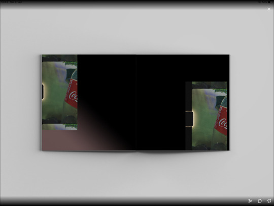
I especially looked at the drink company ‘coke a cola’ which is a huge contributor to the worlds plastic issue. After researching the impacts which coke produces each year it is obvious that the company is an extremely high problem in our society. whilst most companies have now decided to change there ways with plastic, such as all supermarkets charging for plastic bags instead of them being free (as they used to be) due to the huge global impact of plastic and others like McDonald’s now changing to paper bags and paper straws, coke still uses plastic packaging for all of there products. Coke is one of the biggest industry giants around the whole world today with billions of products been sold daily. Coke actually contributes to 3 million tonnes of plastic every year! Which is a devastating statistic, which means that roughly 200,000 coke bottles are being produced a minute, which either goes to landfill dumps, the sea or it’s set fire to which is creating global warming. Last year the BBC reported that coke-cola was ranked the top of the list for the most plastic polluting company in the whole world. Even though coke have made all of there cans and bottles 100% recyclable its still a huge environmental issue which needs to stop! It is also said that every day 1.8 billion coke-cola bottles are made... coke actually started out with only selling 25 bottles a day when they first started selling but now its at 1.8 billion. On average, over 10,000 soft drinks from coke are consumed every second of every day - globally. I have really tried to catch light and shades into my photography so it looks even more realistic and professional and the second picture really shows that off as the black and white filter makes the light shades brighter and more noticeable.
This is the reason why most of my photography includes coke bottles.
0 notes
Text


These were my first bunch of edited photos from the app ‘unfold’ i had a wide range of photography from this app but i decided to pick the best and use them for my final outcomes. I also used the normal filters which you can get on your phone for example i used the black and white and light filter to make the photo appear finer and more professional. I have also recently been to the beach so i took some photos there which also contribute to my photo book as it relates to my my flipside theme topic of natural and artificial. These photos respect both sides of the theme as the water (playing as the ocean) is the natural side and the plastic as the artificial side so i have really thought about both sides of my project. I used the black and white filter a lot as it is a dark an depressing colour and that links to my topic well. In the fourth picture you can also see a black and white picture of a coke bottle lying on grass and that also shows the natural side of it as well as just the artificial.
0 notes
Text

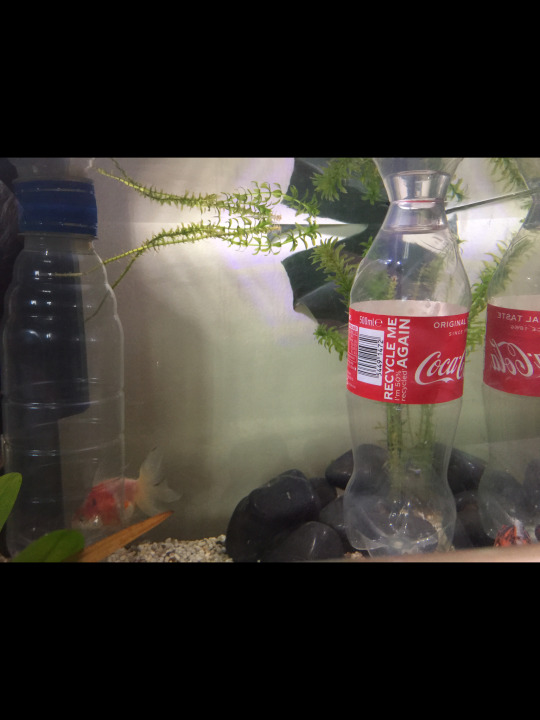


This is the next step in my photography process, these were my initial photos of plastic before i edited them with backdrops and filters, i used a variety of plastics but in the end the plastic bottles worked out the best. I also used other materials like a fish net bag to create elusions of the plastic and to see different Angeles between the plastic photography. As i used my own fish tank instead of the one in college i had the opportunity to get the reads and the lighting right to make it look more realistic and clear. Each photo is unique and shows the topic of plastic pollution (-artificial) causing destruction to marine animals (-nature).
0 notes
Text


This is my photography process “behind the scenes” which i completed on Monday, i have now finished my photo book and waiting for it to be put on my blog. I used plastic items such as plastic bags and bottles to create my photography and i also used a real, dead fish and placed it into a fish net bag so it looks stuck. My fish tank light seemed to work better as it created more of a photographic look, i have now edited all of my photo outcomes by using filters and backgrounds and i also used the app ‘unfold’ which makes your photos appear behind a screen such as the ‘plastic’ filter worked perfect for me as that’s what my project is about, it basically drops your own photos behind a screen which appears to look like plastic so your photo is ‘stuck inside of the plastic’ like what a fish would be like if it got stuck within the plastic. The app ‘unfold’ also lets you have the option to write whatever you want onto the photos so i will write a bit about the plastic pollution around the world and what is really happening to marine life.
0 notes
Text


I especially love the affect of a Polaroid look and a photo booth affect as the shapes of them two are unique and you can really tell what affect they are. I am finding all of these layout ideas on the app ‘unfold’ or on Pinterest.
0 notes
Text


This is the ‘plastic affect’ on the app ‘unfold’ which i think i will be using for my final major project, it basically just puts your own image/photography ‘into a plastic bag’ - which is the affect. This is the perfect filter for me as i am looking at netting and plastic pollution which is like how the fish get caught into the plastic bags and i am going to show that in my photography part of my project. Within the app there are many other filters but this one is the main one i am focusing on due to my flip side theme and project. When I use the filter I’m going to use other effects on my initial photo before using the plastic filter so its effected even more. The app also has a wide range of other filters and affects such as a digital, classic, film, scrapbook and others, i will be using other filters like these not just the ‘plastic affect’ but the plastic filter will definitely work to my advantage. The plastic affect also uses a bar code affect on the top of the photos so that’s also a great thing for my photography as i am going to take pictures of a real, dead fish so it will look like the fish is for sale in plastic packaging and then people might realise what damage that the fishing industry is doing to other marine animals.
0 notes
Text


I am going to try to use a prism to highlight rainbow looking colours into my camera to create this affect on my photos which will look professional, unique, bold and simple. I have already included some images already on my last post of the prism affect but these are some more detailed photos. This isn’t my favourite technique for photography but i do think its a good idea to use multi coloured lighting to focus on the photo.
0 notes