
Last Seen Blogs


ebi-design
EBI

abujaskibidi
Manthob Padu Terbaik Bang

support-groups
SupportGroups.com

ebaycoachpinkhandbaglg-blog
Ebay coach pink handbag - Black white coach rain boots


Text
Mid-century science fiction gave post war america a future to look forward too. The hope was that advancements in nucular energy and space travel would unite humanity. In retrospect, these ideas sound silly; there was no way space travel would ever improve the day to day lifes of civilians. However, this childlike outlook is what makes the genre so charming. As Sean Topham argues: The space age allowed adults to rediscover everyday miracles kinda like a child does [Topham, S. (2008). A question of living tommarrow. In Wheres my Space Age? (pp. 65–66). essay, Prestel.]
Not all science fiction was so optimistic however; many writers believed contemporary advancements in nuclear energy threatened international security. Zines like “astounding sci-fi” were inidated with post apocalyptic fiction and tales of technological uprisings.
Science fiction helped laymen navigate cold war politics in ways actual (political) scienests could not. Said “experts” had no real world reference to which they could compare the contempary nuclear-political landscape. Therefor, in David Seed’s opinion, science fiction writers had an equal amount of athourity. [Seed, D. (1999). Chapter 1. In American Science Fiction and the Cold War (pp. 5–5). essay, Fitzroy Dearborn.]
Ive been a retro futuristic fan since I was introduced to the twilight zone in elementary school. Some years later I discovered the “retro space” line of lego sets. Although these kits released between 1979-1998, the designers were heavily inspired by science fiction of old. The sets were characterized by funky looking aircraft, vauge tech, and a generally cooperative atmosphere. My own lego builds are inspired by the line but also retro futurism in general. As an aside: i love the lego system. Its my main art medium. Ive included some pics down below😋
Throught my project i consulted 3 books, 1 movie, 1 tv show, and 1 zine. The names are as follows:
Books:
“American Science fiction: 1926-1975”: former science fiction writer ______ records the history of retro futurism and what inspired the movement.
“Wheres my Space Age?” A history of the rise and fall of retro-futuristic design styles in the real world
“Science fiction Literature and Film during the Cold war”: ___ explains the historical context in which retro fururism emeraged.
Movies:
FORBIDDEN PLANET:
This 1952 adventure film took inspiration from contemporary science fiction litiuture like “ASTOUNDING SCIENCE FICTION” and “GALAXY”. The film follows a group of stranded astronauts as they navigate a mysterious planet. Good movie.
Zines:
ASTOUNDING(/ANOLOG) SCIENCE FICTION AND FACT :Established in 1930, This monthly zine routinely published innovative Sci-Fi stories along side sensationalized scientific news. The publication was led by renowned writer John Campbell Jr. who, in 1950, began researching psi phenomena (scientific study of physic powers). Campbell’s work inspired fellow artist to write about contemporary psudeo science.
Shows:
THE TWILIGHT ZONE:The Twilight Zone, narrated by Rob Serling, was a revolutionary anthology series that used science fiction to tackled issues of race, religion, oppresion and more. My grandparents introduced me to this show, and by extension retro futurism. To this day the Twilight Zone remains my favorite telivision series. I highly recommend the episodes: “The Monsters are due on Maple Street” and “I Shot an Arrow into the Air”.
(images included in next post->)
0 notes
Text
Vernacular Type Collage
I initially misunderstood the goal of this assignment. I had planned to include contextaul elements (colors, backgrounds, non-vernacular signage, ect.) in my final collage and photographed according. This mishap limited my usable material, which I actually found quite fun.
I forced myself to use my meager photos in extra creative ways. My most inspiring image was of a stained glass “open” sign. The letters were covered in messy-looking faux brush strokes. The “O” is fectured in both collages and the “P” is in “O(X)O”. These curvilinear shapes are underlined by a blocky looking font that i found at an industrial site. The arches in “Arches” also come from this same sign. The textured letters are actually from a nearby fire escape.
Alot of thought went into my color choices. The deep teal color helps to dull the bright yellow color which may have otherwise dominated the composition. Teal also creates an interesting calm effect which i valued. The idental color schemes are meant to unify the formally disimilar collages.


0 notes
Text


Color walk:
I began my walk near JCM at 1:30 pm. The high noon sun casted short shadows across every surface. This lighting made colors look flat and saturated. I noticed this phenomenon when I encountered an electric scooter parked outside the building. The “neck” was wrapped by a deep orange band, which juxtaposed the dull earthy tones that surrounded it, making the scooter look out of place.
The path between JCM and Ingram is flanked by colorful tree blossoms. I really enjoyed two particular trees. The first was mostly dead, save for a single branch. The dead section looked…dead. Bluish gray streaks crawled across the main trunk and most limbs. By contrast, the living branch was solid brown. The tip was adorned with bright pinkish purple flowers that attracted various critters. That branch was thriving despite its harsh circumstances. The other tree was absolutely sprawling with semi translucent white blossoms that caught the sun beautifully. The Low opacity made the blooms look somewhat spiritual/holy. These flowers attracted dozens of delicate little butterflies. The insects danced playfully around the tree, like a small child exploring a playground. Interestingly, these trees were right next to each other. Never was there a clear transition between dead and alive fuana.
I noticed a few color oddities while crossing the bridges near JCM, such as a bright light green cargo truck parked on the street below. A darkened and desaturated blue beverage logo was pasted on the vehicles side. The logo had obviously been neglected, whereas the green paint looked freshly cleaned. I deeply respected the owner’s/driver’s commitment to beautifying our campus for non advertising reasons.
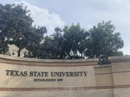
The LBJ visitor center was decorated with bright cyan and bright green TXST signs. Nowhere else have I seen this color pallet associated with the school. It's almost as if the administrators are advertising a false reality to visitors. Or, maybe, these colors represent the future of TXST. Outside the building I spotted a large (school related) construction site covered in tarps of similar blue and green hues.
I noticed an irrigation system that ran alongside E Sessom drive. The site was awfully dead. The still water was colored an uncomfortable green hue, likely because the system was blocked by fallen rocks and other debris. The waterway was flanked by 2 flat concrete walls. I was disappointed by how little graffiti covered this prime real estate. The occasional tag/drawing was mostly desaturated by the passing of time.
0 notes
Text
The Lego system does not have a wide variety of tints and shades. I occasionally use albers theory to expand legos limited color palet. For instance, I once Saterated a brown model by stratigically placing red bricks. The red bricks highlighted the red hue of the brown parts, which drastically improved the models apperence. Albers theory may also be used to desaturate a color (among other things). I was once building a black and red spaceship, but the red cockpit stood out too much, so i added some gold detailing, which made the red look dull by comparison.
0 notes
Text
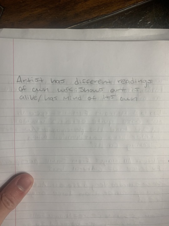
Vera Lutter photographs giant structures made possible by the industrial revolution. Its interesting how she uses the camera obscure (an antient technology) to document such modern subjects. Perhaps she is highlighting the connections between new and old technology.
0 notes
Text
Zeo Leonard “You see I am here after all”: a collection of niagara falls postcards
Q: “This is how I saw it, I took this picture, and what I’m showing you is literally my perspective on something.” For me, these questions—“Where do you look from? What’s your process of looking?”—are inherently political. They are feminist questions because they are about power and agency, about where you stand in the world and what you can see from where you stand.” Bottom of page 3/top of page four
C: Every photograph is, in some way, political. By publicizing an image, you are sharing your perspective, which has (consciously and/or subconsciously) been informed by your environment. Even an inconspicuous collection of Niagara Falls postcards are political.
Many Americans associate Niagara falls with romantic topics including: honeymoons, weddings, virginity, female sexual desire, and love itself. These connections have existed since Europeans first discovered the Falls. There may be several reasons why the settlers considered the region romantic. Perhaps its physical appearance reminded the colonizers of an “ideal” christian marriage. The falls are imposing, yet beautiful. grand, yet quaint. These adjectives can also be used to describe a traditional american marriage or atleast, a stereotypical american marriage.
Niagara Falls is the undisputed “Honeymoon” capital of the world. This industry earns hundreds of millions of dollars a year, which encourages locals to promote this romantic image. This is to say, our view of the region has been distorted by capitalism, which makes these postcards political.
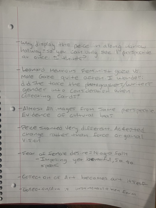
Q:I do not why Leonard displayed her piece the way she did. What does Zeo mean by “perspective is reflected back to you” (pg3 line 16)? Can anyone explain her reasoning in lame man terms?
Q(2): Leonard mentions the male and feminist gaze several times throughout this interview. I wonder; Did she take the gender of the photographer/writer into account when she displayed her collection?


0 notes
Text
Zeo Leonard niagara falls
Q: “This is how I saw it, I took this picture, and what I’m showing you is literally my perspective on something.” For me, these questions—“Where do you look from? What’s your process of looking?”—are inherently political. They are feminist questions because they are about power and agency, about where you stand in the world and what you can see from where you stand.” Bottom of page 3/top of page four
Niagara falls may symbolize several abstract concepts including honeymoons, weddings, virginity, female sexual desire, and love itself. These connotations are informed by many factors. Firstly, the region has a multimillion dollar wedding industry, so influential people are incouraged to promote this romantic perspective. These connotations may also take inspiration from the physical appearance of niagara itself. The falls are imposing, yet beautiful, grand, yet quaint. These adjectives can also describe a traditional american marriage, or atleast, the traditional heteronormative ideal set by churches. It is impossible to photograph niagara falls without subconsciously imposing these ideas.
Q:I do not why Leonard displayed her piece the way she did. What does Zeo mean by “perspective is reflected back to you” (pg3 line 16)? Can anyone explain her reasoning in lame man terms?


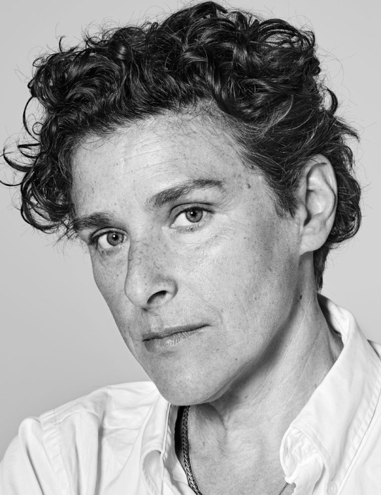
Image 1: Zeo Leonard herself
Image 2: a couple enjoying their niagara falls honey moon
Image 3: you see i am here now by Zeo Leonard
1 note
·
View note