
Don't wanna be here? Send us removal request.
Statistics
We looked inside some of the posts by joseferreira2 and here's what we found interesting.
Average Info
Notes Per Post
2
Likes Per Post
2
Reblog Per Post
0
Reply Per Post
0
Time Between Posts
6 days
Number of Posts By Type
Text
9
Last Seen Tumblr Blogs


Fun Fact
Tumblr is available in 18 languages.
Text
Titanic survivors
This work was done for Data Management and Visualization WK4
Bellow you can find the code for statistical analysis of relation between:
survived, sex, age and class.
The results are present in table and plots:
Code:
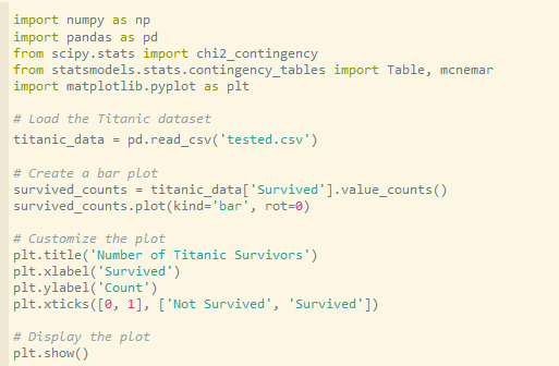
import pandas as pd import numpy as np import random as rnd import seaborn as sns import matplotlib.pyplot as plt %matplotlib inline
print("Results start here")
train_df = pd.read_csv('train.csv') test_df = pd.read_csv('test.csv') combine = [train_df, test_df]
print(train_df.columns.values)
Display statistics for each variable
print("Statistics for Pclass:") print(train_df['Pclass'].describe())
print("\nStatistics for Sex:") print(train_df['Sex'].describe())
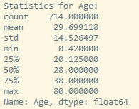
print("\nStatistics for Age:") print(train_df['Age'].describe())
print("Statistics for Survived:") print(train_df['Survived'].describe())
Calculate percentage of survived by class
a = train_df[['Pclass', 'Survived']].groupby(['Pclass']).mean().sort_values(by='Survived') a1 = train_df[['Pclass', 'Survived']].groupby(['Pclass']).count() a['CumulativeFrequency'] = a1['Survived'].cumsum() a['CumulativePercentage'] = (a['CumulativeFrequency'] / a1['Survived'].sum()) * 100 print("% of survived by class", a)
Calculate percentage of survived by sex
b = train_df[["Sex", "Survived"]].groupby(['Sex']).mean().sort_values(by='Survived', ascending=False) b1 = train_df[['Sex', 'Survived']].groupby(['Sex']).count() b['CumulativeFrequency'] = b1['Survived'].cumsum() b['CumulativePercentage'] = (b['CumulativeFrequency'] / b1['Survived'].sum()) * 100 print("% of survived by sex", b)
Drop unnecessary columns
train_df = train_df.drop(['Ticket', 'Cabin'], axis=1) test_df = test_df.drop(['Ticket', 'Cabin'], axis=1)
"After", train_df.shape, test_df.shape, combine[0].shape, combine[1].shape
Create AgeBand and calculate percentage of survived by Age class
train_df['AgeBand'] = pd.cut(train_df['Age'], 5) c = train_df[['AgeBand', 'Survived']].groupby(['AgeBand']).mean().sort_values(by='AgeBand') c1 = train_df[['AgeBand', 'Survived']].groupby(['AgeBand']).count() c['CumulativeFrequency'] = c1['Survived'].cumsum() c['CumulativePercentage'] = (c['CumulativeFrequency'] / c1['Survived'].sum()) * 100 print("% of survived by Age class", c)
train_df.head()
Age class
age_bins = [0, 2, 18, 30, 65, 100]
Age class description
age_labels = ['Baby', 'Child', 'Young', 'Adult', 'Elderly']
Create the AgeGroup column based on age bins
train_df['AgeGroup'] = pd.cut(train_df['Age'], bins=age_bins, labels=age_labels)
Calculate percentage of survived by AgeGroup
d = train_df[['AgeGroup', 'Survived']].groupby(['AgeGroup']).mean() d1 = train_df[['AgeGroup', 'Survived']].groupby(['AgeGroup']).count() d['CumulativeFrequency'] = d1['Survived'].cumsum() d['CumulativePercentage'] = (d['CumulativeFrequency'] / d1['Survived'].sum()) * 100 print("% of survived by AgeGroup", d)
Analyze relationship between Survived and Sex
survived_sex_analysis = train_df.groupby(['Sex', 'Survived']).size().reset_index(name='Count') survived_sex_analysis['RelativeFrequency'] = survived_sex_analysis['Count'] / survived_sex_analysis['Count'].sum() print("\nAnalysis of Relationship between Survived and Sex:") print(survived_sex_analysis)
Visualize relationship between Survived and Sex
plt.figure(figsize=(6, 4)) sns.barplot(data=survived_sex_analysis, x='Survived', y='RelativeFrequency', hue='Sex', dodge=True) plt.title("Relationship between Survived and Sex") plt.xlabel("Survived") plt.ylabel("Relative Frequency") plt.xticks([0, 1], ['Not Survived', 'Survived']) plt.show()
Analyze relationship between Survived and Pclass
survived_pclass_analysis = train_df.groupby(['Pclass', 'Survived']).size().reset_index(name='Count') survived_pclass_analysis['RelativeFrequency'] = survived_pclass_analysis['Count'] / survived_pclass_analysis['Count'].sum() print("\nAnalysis of Relationship between Survived and Pclass:") print(survived_pclass_analysis)
Visualize relationship between Survived and Pclass
plt.figure(figsize=(6, 4)) sns.barplot(data=survived_pclass_analysis, x='Survived', y='RelativeFrequency', hue='Pclass', dodge=True) plt.title("Relationship between Survived and Pclass") plt.xlabel("Survived") plt.ylabel("Relative Frequency") plt.xticks([0, 1], ['Not Survived', 'Survived']) plt.show()
Analyze relationship between Survived and AgeGroup
survived_agegroup_analysis = train_df.groupby(['AgeGroup', 'Survived']).size().reset_index(name='Count') survived_agegroup_analysis['RelativeFrequency'] = survived_agegroup_analysis['Count'] / survived_agegroup_analysis['Count'].sum() print("\nAnalysis of Relationship between Survived and AgeGroup:") print(survived_agegroup_analysis)
Visualize relationship between Survived and AgeGroup
plt.figure(figsize=(10, 6)) sns.barplot(data=survived_agegroup_analysis, x='Survived', y='RelativeFrequency', hue='AgeGroup', dodge=True) plt.title("Relationship between Survived and AgeGroup") plt.xlabel("Survived") plt.ylabel("Relative Frequency") plt.xticks([0, 1], ['Not Survived', 'Survived']) plt.show()
print("Results end here")
The results for each relation are presented on bellow:


The results with count, cumulative count, frequency and cumulative frequency are showed bellow:


Here it was defined class, by age:


In next step, it was analyzed the relationship between survived and Sex, Survived and Pclass and Survived and Age class:

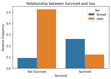
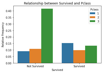
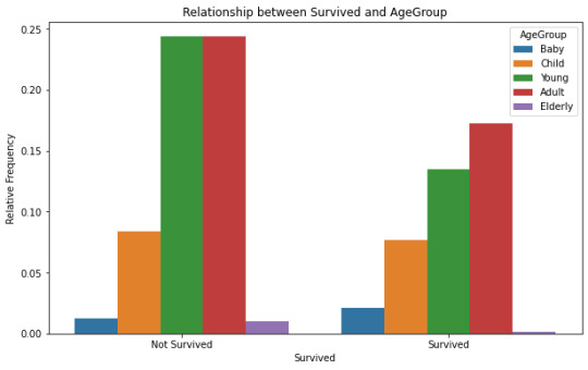
In the Survived: the 1 value is Survived and 0 is not Survived.The results show that female have the high rate of survive when compared with male. The 1st class have a higher rate of rate of survive when compared with other 2, but even in 2nd class, the rate of survive is higher than 3rd class.The agegroup show no correlation between age and survive.
0 notes
Text
Titanic survivors
This work was done for Data Management and Visualization WK3
Bellow you can find the code for statistical analysis of relation between:
survived, sex, age and class.
Code:
import pandas as pd import numpy as np import random as rnd import seaborn as sns import matplotlib.pyplot as plt %matplotlib inline
print("Results start here")
train_df = pd.read_csv('train.csv') test_df = pd.read_csv('test.csv') combine = [train_df, test_df]
print(train_df.columns.values)
Display statistics for each variable
print("Statistics for Pclass:") print(train_df['Pclass'].describe())
print("\nStatistics for Sex:") print(train_df['Sex'].describe())
print("\nStatistics for Age:") print(train_df['Age'].describe())
Calculate percentage of survived by class
a = train_df[['Pclass', 'Survived']].groupby(['Pclass']).mean().sort_values(by='Survived') a1 = train_df[['Pclass', 'Survived']].groupby(['Pclass']).count() a['CumulativeFrequency'] = a1['Survived'].cumsum() a['CumulativePercentage'] = (a['CumulativeFrequency'] / a1['Survived'].sum()) * 100 print("% of survived by class", a)
Calculate percentage of survived by sex
b = train_df[["Sex", "Survived"]].groupby(['Sex']).mean().sort_values(by='Survived', ascending=False) b1 = train_df[['Sex', 'Survived']].groupby(['Sex']).count() b['CumulativeFrequency'] = b1['Survived'].cumsum() b['CumulativePercentage'] = (b['CumulativeFrequency'] / b1['Survived'].sum()) * 100 print("% of survived by sex", b)
Drop unnecessary columns
train_df = train_df.drop(['Ticket', 'Cabin'], axis=1) test_df = test_df.drop(['Ticket', 'Cabin'], axis=1)
"After", train_df.shape, test_df.shape, combine[0].shape, combine[1].shape
Create AgeBand and calculate percentage of survived by Age class
train_df['AgeBand'] = pd.cut(train_df['Age'], 5) c = train_df[['AgeBand', 'Survived']].groupby(['AgeBand']).mean().sort_values(by='AgeBand') c1 = train_df[['AgeBand', 'Survived']].groupby(['AgeBand']).count() c['CumulativeFrequency'] = c1['Survived'].cumsum() c['CumulativePercentage'] = (c['CumulativeFrequency'] / c1['Survived'].sum()) * 100 print("% of survived by Age class", c)
train_df.head()
Age class
age_bins = [0, 2, 18, 30, 65, 100]
Age class description
age_labels = ['Baby', 'Child', 'Young', 'Adult', 'Elderly']
Create the AgeGroup column based on age bins
train_df['AgeGroup'] = pd.cut(train_df['Age'], bins=age_bins, labels=age_labels)
Calculate percentage of survived by AgeGroup
d = train_df[['AgeGroup', 'Survived']].groupby(['AgeGroup']).mean() d1 = train_df[['AgeGroup', 'Survived']].groupby(['AgeGroup']).count() d['CumulativeFrequency'] = d1['Survived'].cumsum() d['CumulativePercentage'] = (d['CumulativeFrequency'] / d1['Survived'].sum()) * 100 print("% of survived by AgeGroup", d)
Analyze relationship between Survived and Sex
survived_sex_analysis = train_df.groupby(['Sex', 'Survived']).size().reset_index(name='Count') survived_sex_analysis['RelativeFrequency'] = survived_sex_analysis['Count'] / survived_sex_analysis['Count'].sum() print("\nAnalysis of Relationship between Survived and Sex:") print(survived_sex_analysis)
Analyze relationship between Survived and Pclass
survived_pclass_analysis = train_df.groupby(['Pclass', 'Survived']).size().reset_index(name='Count') survived_pclass_analysis['RelativeFrequency'] = survived_pclass_analysis['Count'] / survived_pclass_analysis['Count'].sum() print("\nAnalysis of Relationship between Survived and Pclass:") print(survived_pclass_analysis)
Analyze relationship between Survived and AgeGroup
survived_agegroup_analysis = train_df.groupby(['AgeGroup', 'Survived']).size().reset_index(name='Count') survived_agegroup_analysis['RelativeFrequency'] = survived_agegroup_analysis['Count'] / survived_agegroup_analysis['Count'].sum() print("\nAnalysis of Relationship between Survived and AgeGroup:") print(survived_agegroup_analysis)
print("Results end here")
The results for each relation are presented on bellow:


The results with count, cumulative count, frequency and cumulative frequency are showed bellow:


Here it was defined class, by age:


In next step, it was analyzed the relationship between Survived and Sex, Survived and Pclass and Survived and Age class:

In the Survived: the 1 value is Survived and 0 is not Survived.
The results show that female have the high rate of survive when compared with male. The 1st class have a higher rate of rate of survive when compared with other 2, but even in 2nd class, the rate of survive is higher than 3rd class.
The agegroup show no correlation between age and survive.
0 notes
Text
Titanic survivors
This work was done for Data Management and Visualization WK2.
It was analyzed the Survived people according class, sex and age.
Code:
import pandas as pd
train_df = pd.read_csv('train.csv') test_df = pd.read_csv('test.csv') combine = [train_df, test_df]
print(train_df.columns.values)
Preview the data
head = train_df.head() print("Head file", head)
tail = train_df.tail() print("Tail file", tail)
file_type = train_df.info()
print('_'*40) test_df.info()
train_df.describe()
train_df.describe(include=['O'])
Calculate percentage of survived by class
a = train_df[['Pclass', 'Survived']].groupby(['Pclass']).mean().sort_values(by='Survived') a1 = train_df[['Pclass', 'Survived']].groupby(['Pclass']).count() a['CumulativeFrequency'] = a1['Survived'].cumsum() a['CumulativePercentage'] = (a['CumulativeFrequency'] / a1['Survived'].sum()) * 100 print("% of survived by class", a)
Calculate percentage of survived by sex
b = train_df[["Sex", "Survived"]].groupby(['Sex']).mean().sort_values(by='Survived', ascending=False) b1 = train_df[['Sex', 'Survived']].groupby(['Sex']).count() b['CumulativeFrequency'] = b1['Survived'].cumsum() b['CumulativePercentage'] = (b['CumulativeFrequency'] / b1['Survived'].sum()) * 100 print("% of survived by sex", b)
Drop unnecessary columns
train_df = train_df.drop(['Ticket', 'Cabin'], axis=1) test_df = test_df.drop(['Ticket', 'Cabin'], axis=1)
"After", train_df.shape, test_df.shape, combine[0].shape, combine[1].shape
Create AgeBand and calculate percentage of survived by Age class
train_df['AgeBand'] = pd.cut(train_df['Age'], 5) c = train_df[['AgeBand', 'Survived']].groupby(['AgeBand']).mean().sort_values(by='AgeBand') c1 = train_df[['AgeBand', 'Survived']].groupby(['AgeBand']).count() c['CumulativeFrequency'] = c1['Survived'].cumsum() c['CumulativePercentage'] = (c['CumulativeFrequency'] / c1['Survived'].sum()) * 100 print("% of survived by Age class", c)
train_df.head()
Results:

Relations between survived and class:

Relations between survived and sex:

Relations between survived and Age:

0 notes
Text
Titanic survivors
Data Management and Visualization: Week 1
Is the survival of the passengers on the titanic related to class?.
Purpose:
I'm a history buff, and one of the riddles I was most curious about was the sinking of the titanic. From the film to the true story, several points were raised with this accident in order to avoid future events similar to this one.
In this way, I intend to analyze the relationship between the survivors and the ticket acquired according to class (we have three classes), allowing us to analyze the class of society in terms of survival.
Topic Scope:
In addition to the relationship between social class (ticket purchased) and survival, another relevant point is gender and age. In the film, one of the points addressed is that women and children were the first people to board the lifeboats. Following older people. With this analysis we will check if it is true. Whether there is a correlation between gender and age with survival. Did children and women have a higher survival rate than men?
To carry out this study, I will follow the database indicated in the link:
References:
0 notes
Text
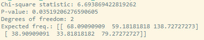
Work 4 - Testing a potential moderator
I have analyzed the relationship between survival status (survived), gender (Sex), and passenger class (Pclass) as the moderator, for Titanic case. I have used a Chi-square test with a moderator.
H0 - There is a significant relationship between survival stat and gender, moderated by passenger class -> if p_value <0.05.
Code:

Results:
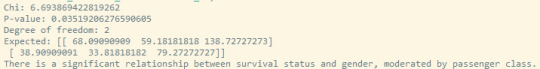
Conclusion:
0 notes
Text
Work 3 - Correlation coefficient
I will continue with the evaluation of Titanic.csv file. In this case it was analyzed the Age and Fare, to verify if there is a:
Positive correlation
Negative correlation
I have calculated the Pearson correlation coefficient and the associated p-value:
Code:

Results:


The p-value is less than 0.05 and the coefficient is near the 0.
Based on these results, we can conclude that there is a positive correlation between age and fare in the Titanic dataset. The positive correlation indicates that as age increases, the fare tends to increase. It is a moderate relationship between age and fare (slope equal to 1.5).
0 notes
Text
Work 2 - Chi square
Case: Relationship between survival and passenger class of Titanic accident.
Null hypothesis (H0): There is no association between survival and passenger class (1st, 2nd or 3rd) on the Titanic.
Code:

P value is less than 0.05 then we can reject the null hypothesis and conclude that there is a significant association between survival and passenger class.
To know that there is an association between survival and passenger class we run a Post Hoc analysis, the pairwise test with Bonferroni correction were performed to determine which groups differ significantly from each other in terms of survival and passenger class.
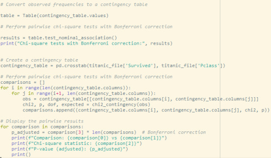
Results

Conclusion: The p-value for 3 class comparing is higher than 0.05 so we fail to reject the null hypothesis and conclude that there is not enough evidence to establish a significant difference between survival and passenger classes.
0 notes
Text
Work 1 - ANOVA
Problem:
Running distance of 4 types of tires: there are differences between the running distance and the type of tire - H0?
Code:
import scipy.stats as stats import statsmodels.api as sm from statsmodels.formula.api import ols import statsmodels.stats.multicomp as multi
We are analyzing 4 treatments (A, B, C and D)
The tire type is independent variable.
4 types of treatments = 4 factor levels
There is only 1 factor --> tire type
H0: there are no differences between 4 types of tires and distance dat end of life.
df = pd.read_excel('test_data.xlsx')
print(df)
df_melt = pd.melt(df.reset_index(), id_vars=['index'], value_vars=['A', 'B', 'C', 'D'])
df_melt.columns = ['index', 'Tires', 'Distance']
print(df_melt)
ax = sns.boxplot(x='Tires', y='Distance', data=df_melt, color=('yellow')) ax = sns.swarmplot(x='Tires', y='Distance', data=df_melt, color=('blue'))
plt.show()
F and p value from f_oneway functions from the group
fvalue, pvalue = stats.f_oneway(df['A'],df['B'],df['C'],df['D'])
print('Fvalue',fvalue) print('pvalue',pvalue)
Least Squares (OLS) model
model = ols('Distance~C(Tires)', data=df_melt).fit() anova_table = sm.stats.anova_lm(model, type=2) print('ANOVA table', anova_table)
The p vale is less than 0.05, from ANOVA analysis, and
therefore,there are significant differences among tire type and running distance
Perform multiple pairwise comparison (Tukey's HSD)
mc1 = multi.MultiComparison(df_melt['Distance'], df_melt['Tires']) res1 = mc1.tukeyhsd() print(res1)
The results show that, except A-C, all other pairwise comparisons for tire types rejects null
hypothesis (p<0.05) and indicates statistical significant differences.
Results:
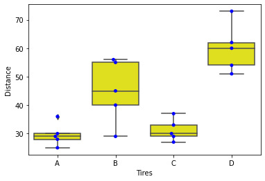
It is visible the differences between tires type and running distance.

Data analyzed.
F and p value for ANOVA:


This p-value is less than α = .05, we reject the null hypothesis of the ANOVA and conclude that there is a statistically significant difference between the means of the three groups.
To see the difference we analyzed post hoc comparison using Tukey’s honestly significantly differenced (HSD) test.
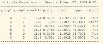
The results show that, except A-C, all other pairwise comparisons for tire types rejects null
hypothesis (p<0.05) and indicates statistical significant differences.
0 notes
