
Don't wanna be here? Send us removal request.
Statistics
We looked inside some of the posts by josh-digitalnarrative and here's what we found interesting.
Average Info
Notes Per Post
0
Likes Per Post
0
Reblog Per Post
0
Reply Per Post
0
Time Between Posts
4 days
Number of Posts By Type
Text
16
Video
1
Last Seen Tumblr Blogs


Fun Fact
Tumblr Inc. is using 66 technologies for its website.
Text
Reflective summary
Student Number: @00548293
Digital innovation and Technologies
500-word reflection
Joshua Elliott
Within this module (digital innovation and technology), I believe I have been able to develop new strengths and improve upon my problem solving. One of the strengths I believe I have exhibited is my work in relation to coding. Before this module I had no experience at all with HTML and CSS formats. Despite this, I believe I have picked up working with code relatively quickly and have been able to produce an effective digital narrative through my website. I was also impressed with my ability to pick up new coding techniques, such as creating parallax backgrounds, and collapsible accordions, and being able to debug my own code and help other classmates with their coding problems. Despite this, there is still much I do not understand with coding and scripting. Coding is now definitely something I want to focus on and strive to get better at. In relation to this, I believe my previous experiences with graphic design were a very big strength during this module, especially in regard to, not only web design, but also my illustration work. Furthermore, through the weekly afternoon workshops, I have felt that I have learned many new skills, such as the basics of 3d modeling in blender, and built upon my current skills, for example, learning how to use the golden ratio to create icons, and how to better edit images in photoshop.
One of the biggest challenges I faced with this module was having to change my narrative focus and idea halfway through the semester due to the ‘Covid-19’ pandemic. This was a decision I came too on my own as, I believed that attempting to work in Animate, a software I have little experience with, to create and website using script, something I have hardly practiced, would be highly stressful on myself since I would not be able to have constant face-to-face help. Consequently, I decided to change my idea to a more HTML and CSS based idea as I was more confident in being able to produce an effective final product. Something that I found more difficult this semester compared to the previous was writing detailed blog posts about the work I had been completing. With my blog, I was able to keep to up to date as I would constantly add new developments and experiments, I had been working on. However, I found it quite difficult to write in detail my process of coding and the code I had produced.
Overall, I feel I have worked effectively through the digital narrative project. I am impressed with my current level of coding, considering I started with no experience. I do wish however I could have worked on my blog to higher standard in regards to posts and explanations of what I was working on.
0 notes
Text
Closing section
For this closing section, I used the same background image as I did on the landing page. This creates the idea of everything coming full circle
This section has nothing special really, just a small conclusion from myself about where I currently am and where I am going with my guitar playing.

0 notes
Text
Hall of Fame section
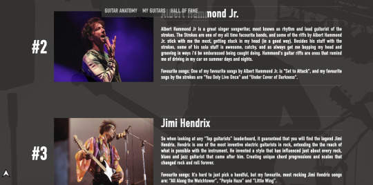
For one of the final sections on my website, I discussed with Kat what would be the best type of layout to go for. Kat gave me a few ideas but we settled on used a table format in an article style. This way it could be viewed and read like a list, but it would also make a larger section on my webpage. We also discussed using the style I have been using in the nav bar and on my accordion buttons, using the same border styles and colours.

Once again, using the trusty “w3schools” i quickly picked up the different table tags to use and what they do. I then began putting together and reviewing my top ten list of musicians and guitarists, and started formulating my paragraphs on each of them and why they are on this list. I also added a “Favourite songs” heading after each entry. More so, the reasoning for the entries on the list differ from my own personal feelings toward the artists music, to a more subjective reasoning towards their prowess as guitarists.
The background image for this section is from the website “Pexels” by ‘Brett Sayles’. I also found images of the artists on my list using stock websites.
The only real obstacle I faced when working in this section was trying to properly size the images of the musicians in relation to the typography around them. The sizes went through multiple iterations, from way too small to just too big. However, I feel I created a nice ratio between text onscreen text and images.

0 notes
Text
Sticky nav bar
`A piece of feedback I received about my website was that “It would be helpful to access the nave bar from wherever you were on the site.” Due to this, i started to look into how to create a “Sticky nav bar”, a nav bar that would stick to the top of the page as you scroll.
Thanks to “W3schools” it was relatively simple to get my head around the CSS. “W3schools” also helped with the scripting, but it still confuses me quite a bit.


To go along with this, I also produced a button that would remain on the bottom left of the screen. When this arrow is clicked it will take you back to the landing page. This button uses the same code that the nav bar does to jump to different sections. One of the problems I faced with creating button was that, after the guitar anatomy section the button would move behind the other sections and wouldn’t be able to be clicked. To fix this, Kat reminded me of the use of the “Z-index” tag and how it works. This really helped as, not only did it fix the problem with the button, but it brought to my attention that when using the z-index you don’t have to give it a value of pixels, this is where I went wrong.

0 notes
Text
My guitar section
I was a bit stuck with how i should design and compose the information and images, so I experimented with a couple different layouts to see if I should just Insert a full body image of my guitar or if I should try and compose them in a unique way.

After working on a few different designs, I came to the conclusion that i should just insert a full body image of my guitar, as this would allow viewers to see the entire guitar clearly.
Another problem i faced with this section was making the images of guitars fit for web use. I used my knowledge i had gained from the workshop we had completed relating to this topic, but it still was quite difficult to make edit these photos and make their backgrounds transparent, especially for my Tobias bass as it is pure white and was on a plain white background.
As for the information included about my guitars, I chose to use 5 specific categories: the first 3 detail some specifics about the guitar; the model, the body shape, and pick-up types. The final two categories are more personal; a rating, which expresses why I love the specific guitar, and finally the “Legend” category. When I say “Legend” I am referring to the story of the said guitar, and further exploration on my feelings toward the said guitar.
The image used in the background of this section is from the stock image site “Pexels” and is by user ‘Rene Asmussen’. However this image was actuallly in full bright colours to begin with. So, in order to make the image match my style, i used photoshop to turn it black and white.

Now using the accordions I coded earlier, i am going to insert each of my guitar fact files into them. I have also used some CSS to alter the look of the closed accordions so that they match my style model.

0 notes
Text
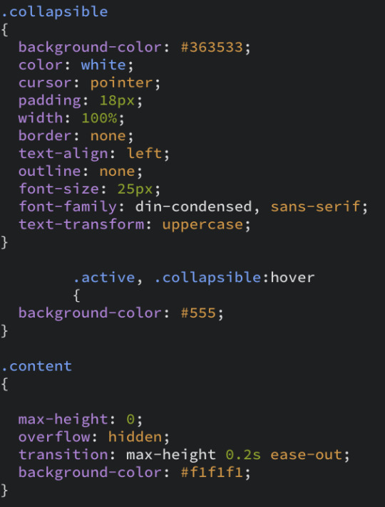
Collapsible accordion
For my next section about my guitars, I want to try and implement a drop down collapsible section for each of my guitars, allowing viewers see the type of guitar i have and letting them choose which to see more information about. However, creating collapsible “accordions” (as i’ve found they are called) was a lot more complicated than I initially thought.
I followed many different tutorials on creating accordions. The first one that worked was super complicated and, a lot of code to produce, and the teacher did not give much explanation on what he was doing with the “Script”. Also, when trying to replicate this code for use in another collapsible, it did not always work.
Due to this I decided to start all over again with my accordion and instead followed a tutorial from “W3Schools” which was also super complicated, but was not as long winded as the first tutorial. I used a similar code for the CSS, but the script was explained a bit better.


0 notes
Text
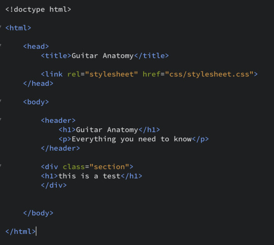
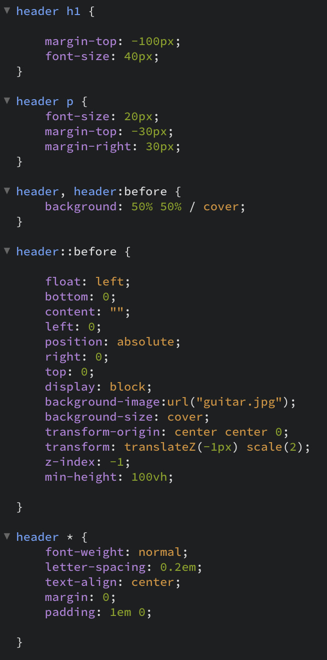
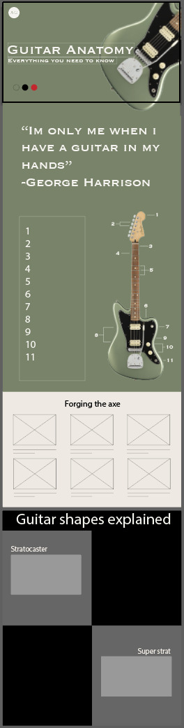
Guitar Anatomy section
For the anatomy section, I decided to use the code we produced in our final session before university closed due to covid-19. Using this code, it placed an image on the right and some text on the left, and then flips this in the next row.

In my initial wireframe I wanted the anatomy section to be in this exact composition, however when adding my images and text to these columns, the content looked too cluttered and complicated. Consequently, I decided to use a traditional column layout to display my content.
Further to this, like my introduction section, I had an image from pexels by photographer “Edward Eyer” spanning the entire background of the section that would move with a parallax effect. I also produced a short paragraph detailing my thoughts on the anatomy of guitars, and what this section will be about.
As a design point, i think i will colour each of my sections using RGBA so that they can be slightly transparent and viewers will be able to see the parallax image behind the content.


One of the biggest challenges I faced with this section was altering the margins and padding of the sections to position the parts of the guitar in the boxes. To fix this I had to implement extra divs and classes into the code.

0 notes
Text
Working on landing page
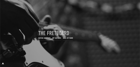
I finally came up with a name for my website; “”The Fretboard” At the moment i am working on perfecting my landing page. The parallax effect is working perfectly now and i am focusing on just producing a functional nav bar.
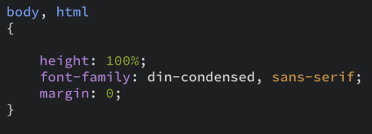
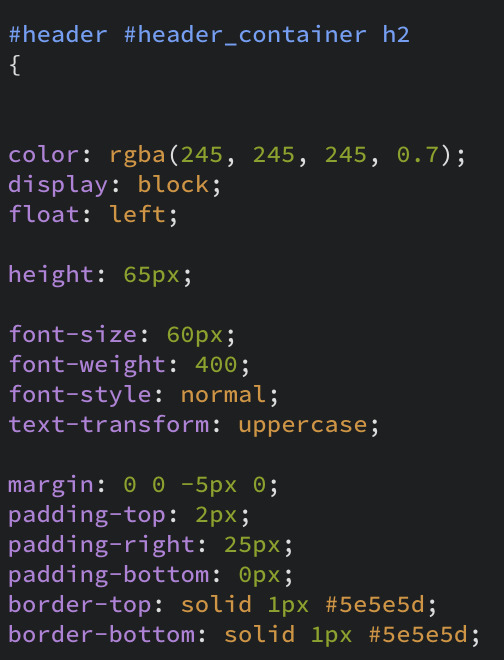
The first thing I began looking into was font choice, to do this I began looking on google web fonts and experimenting with different fonts until I found one that suited the style I am envisioning. The font i chose to use is Din condensed and which have now linked to my stylesheet from my head tag.

For the nav bar, I used the same font as my title and also used the same border style below the titles. More so, i used RGBA colouring on the title and nav bar to make a greyish colour that was a little bit transparent. I got the inspiration for this style from a french website I viewed on the “Site inspire”.
In addition to this, Kat taught me the code that allows you to jump to different sections on the page. To do it, you just need set up a href with an ID that is in the section you want to go to.


After viewing a cool tutorial on youtube, I also added a transition and hover class to the nav bar so that when you hover over one of the titles, the colour becomes a solid white. To do this, I also had to use some “-webkit-” tags in my CSS, something I don’t quite understand yet but was used in the tutorial I viewed. I thought this was a cool addition to the style of the nav bar, as it acts as an indicator of when you move over the headings on the nav bar.

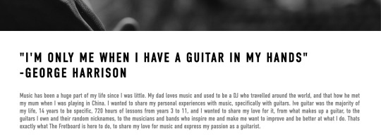
Following this, I began working on the little introduction to my narrative. To do this, i created a single white bar below my hero section. Due to the code I used for my parallax effect, when you scroll down to this bar, the background guitar image stays where it is, whilst the white bar passes over it. In this bar, I wrote a short paragraph about what music means to me, I also used some of the information I from my infographic in this paragraph. In addition to this, i added a short quote by George Harrison above this paragraph as i think it helps with the amount of negative space between the text and my background images.
0 notes
Text
Developing website interface
Following on from my wireframe, experimenting with how I could code the opening hero page for my site. I want to try and implement a parallax effect using photos on this hero page. To do this, I began researching tutorials on how I could do this on my site. The image I used here was found on the website pexels, and user who uploaded it was “Freestock.org”.
I was able to successfully create a parallax effect on my site using the following code:

However, this code was very difficult to work with when trying to make other sections on my site. So I decided to start again and follow a tutorial on “W3schools”. This version my parallax worked much better than the previous.


0 notes
Text
Narrative and Lo-fi wireframing
My new narrative idea revolves around my own journey and experiences as a guitarist. I want to focus on expressing to users 3 specific sections; “Guitar anatomy”, “the guitars I own”, and “my musical inspirations”
I also began sketching out the prototype of my new digital narrative. For this specific style of website I wanted to keep the design minimal and focus more on images and text over illustrations. I think I will keep this website to a single page and work on developing a nav bar that will allow users to jump to the different sections.

0 notes
Text
Developing Guitar narrative
To start developing my new narrative centred around me as a musician, I decided to do some research into other music websites websites that focus on music to see what kinds of things they focus on and what sections they include. One of my favourite websites for this was for “Tula Microphones” which I found on “Awwwards.com”.
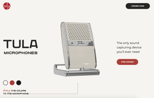
My favourite features of this website were the interactive model and that you could change the colour of the website by selecting a different colour of microphone.
Taking inspiration from this site, I produced a quick mock up resembling its interface to see what I think could work on my site:
0 notes
Text
Webpage content
My website is going to be made up of chatty, colloquial text across multiple sections, each with their own content and focus on my narrative.
Section 1: Landing section
The landing section will function as the introduction to my narrative. This section will be in the style of a hero section; having a prominent image take up the screen with the title of my site over the top of it. In addition to this, I want to attempt to code a nav bar below the title of the site that, when clicked, will automatic scroll the page to that section. Below this, i am thinking of having a small section to close the landing page that will have a short introduction paragraph detailing the narrative I am telling to the audience.
Section 2: Guitar Anatomy
The “Guitar Anatomy” section, as discussed in a previous post, will be used to explain to the viewers the science behind a guitar. I am thinking of carrying this out in a list or table format. To do this, I want to split a guitar into 3 sections: the head, neck and body and then discuss the different features across the guitar and how they work together. I think it would be really cool if once you scroll past the parts of the guitar, they move and piece together. However, I think this would be extremely difficult at my current skill level.
Section 3: My Guitars
In this section of the website, I want to show off my different guitars. I want to do this as, each of my guitars have their own stories to them and are their own side narratives to my experiences. I want this section to be like a fact file, showing off their models but also my own personal ratings of the instruments, as well as the crazy nicknames I give them. I am thinking of styling this section using collapsible accordions to divide the guitar fact files.
Section 4: Hall of Fame
The “Hall of Fame” section will focus on showing off the different inspirations i have had over the years and those I just find to be amazing musicians. I want this section to also show off some of my favourite songs and how my music taste has changed and broadened over the years.
Section 5: Conclusion
For the final section of section of my site, i just want to have a small closing paragraph about my narrative, where I am as a musician and where I hope to go in the coming years. I also want to repeat the look of the first section here to make it come full circle.
0 notes
Text
Changing idea
Due to the current events in the world relating to the coronavirus, i have decided to change the idea for my digital narrative. I decided to make this decision as, I did not feel confident working independently in animate to try and create my parallax website.
As a result, I have decided to focus on one of my other ideas, that being music and guitars. I think this will be a cool idea to explore my life as a musician as a narrative, but also it will be much easier to complete this type of narrative in a traditional, HTML/CSS format. I feel much more confident working towards this idea independently.
0 notes
Video
tumblr
Here is the simple animation I made using my Tyr rig.
0 notes
Text
Tyr rig
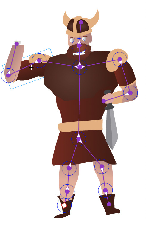
As an experiment, I attempted to rig my vector illustration of Tyr. To do this, i prepared my assets by separating them into individual layers and created symbols out of them. With the file prepared I then then imported the illustrator file into animate and re built Tyr in the software.

Once Tyr was rebuilt in animate I placed circle shapes onto each of Tyr’s joints and connected them using the bone tool. For some reason, my first few attempts at using bine tool were unsuccessful as the bones would not connect to the joints, and when it did work the arms wouldn’t connect to the body. After heading back into illustrator and altering some of the assets and rounding out the arms, I finally was able to rig my character and made a simple animation of him lifting up his missing hand to wave.
0 notes
Text
Blender workshop
In this afternoons workshop, we began working on something I have been excited to use; Blender.
I have a love hate relationship with blender; I tried using the software a long time a go but found it increasingly complicated and hard to use. However, it is still a software I aspire to use as I am a huge fan of what can be done with it. A huge inspiration of mine a YouTuber called “DillonGoo” who makes some awesome Blender animations.
In this workshop, we looked at creating a two 3D models: a rocket and the Earth.
To start off we looked at making the Earth, which was a lot easier than I expected. To do this, we used a preset sphere shape and used a technique known as “Texture mapping”. Texture mapping is a method for defining high frequency detail and colour on a 3d model. Using a texture map, all i had to do was create the sphere and add on the map to get my model of the Earth. The texture map can also be edited to add more or less definition to the model.
Following this, we began producing our model for our rocket. Luckily I remembered some of the techniques to do this from when I attempted to learn blender in the past. The process mainly consists of selecting and editing the polygons and vertexes by scaling, using loop cuts, and extruding them.
Once all of our assets were created, we discussed how to edit and alter light sources and cameras within a scene in blender suing nodes. We then attempted to animate out rocket flying over the earth using keyframes and camera position.
Despite being a bit complicated, I really enjoyed working with blender in this workshop. It made me really want to learn more and get better at using the software, and I hope to practice using it in the coming future.

0 notes
Text
Assets and developing wireframes
Taking all of the assets I had produced, I began developing my wireframes for the webpage. In the end I decided to keep the homepage i designed that shows off different mythologies to explore, but i think when i start developing this I will add a “Coming soon” to them. Also, I started designing a type of profile page that I could use with the gods.


Furthermore, I have begun working on my second character for my norse mythology narrative; this character is the wolf giant Fenrir. I decided to use Fenrir in my website due to his link with my other god Tyr and I think the character i produce from now on will come in pairs in relation to the stories i tell about them, for example, Thor and Loki.
It took me a bit longer to get the design for Fenrir finalised as i have never really attempted to draw cartoon animals before. However, once i got he body shape finalised, I was able to fly through the rest. A funny obstacle i then faced when making Fenrir was that he was too cute; I want the characters to look cute based on the cartoon style i am using, but Fenrir looked too happy for being a villain in his story. To fix this, I had to add some angry eyebrows to the beast. Also, to add to the narrative, when Tyr appears on the website you will see Fenrir too, and if you look close enough, you can see that Tyr’s missing hand is in Fenrir’s mouth.


0 notes