
Don't wanna be here? Send us removal request.
Statistics
We looked inside some of the posts by jseiler3 and here's what we found interesting.
Average Info
Notes Per Post
4
Likes Per Post
3
Reblog Per Post
1
Reply Per Post
0
Time Between Posts
10 days
Number of Posts By Type
Text
11
Last Seen Tumblr Blogs


Fun Fact
130K people were victims of a chain letter scam that affected Tumblr in May 2011.
Text
My Final Art Piece
Growing up I have always been fond of mathematics. The subject was the one I always scored the highest in. Having a definitive answer always proved best for my interests. However when it came to the interpretation of any media such as writing- or in this case art- I always personally struggled to find anything I was looking for. Taking this art course has allowed me to see how beautiful art truly is. Combining my love of math and the beauty it portrays in my mind, I have always loved Fractals. They are patterns occurring in geometry that follow any set of rules, infinitely small. According to the Oxford English Dictionary, "A fractal is a curve or geometric figure, each part of which has the same statistical character as the whole. Fractals are useful in modeling structures (such as eroded coastlines or snowflakes) in which similar patterns recur at progressively smaller scales, and in describing partly random or chaotic phenomena such as crystal growth, fluid turbulence, and galaxy formation." (Oxford 2019). I will label some fractals below that I personally find intriguing.
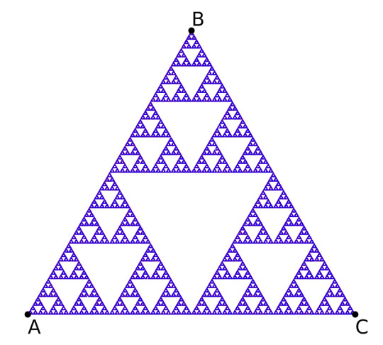
Iterated Function Systems ^
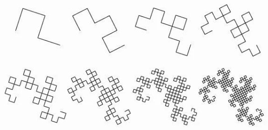
Dragon Curve Fractal ^
These examples are testimony to how creative fractal means can be. For my art piece, my fractal "rule" was to have no lines intersect through one another. I created enclosures that increasingly got smaller (and the lines within changed colors). This artwork was infatuating to me as I could feel the "infinite" effect as I progressed to work through it. With each color I finished, the next one got exponentially longer to complete, as I divided each "crevice" into 2 or 3 more with each line I drew. The medium I used for my art piece was digital oil on canvas. I title my piece "Linear Traffic."

"Linear Traffic" Jackson Seiler
0 notes
Text
Jackson Pollock
Learning more about Jackson Pollock has given me a great grasp of how he expresses emotion through his art abstractly and non-representationally. Originally using abstract imagery, his switch to his famous "drip" paintings was simply a change in a medium in order to better express his emotional message. Painting this style is similar to speaking in tongues. It's the best way to emotionally connect with a piece of work because it is all expressed in how the abstract was made. Seeing videos of him creating these artworks shows the emotion present when creating these works, and these emotions are plastered all over a canvas for onlookers to experience secondhand.

Above is an artwork I created myself. The song it was inspired by was "Runaway" By Kanye West (2010). It's a song about public perception and the misunderstanding of speaking one's mind. The song is almost 9 minutes long and the "outro" is 3 minutes of distorted speech with instrumentals, representing trying to communicate, but not being understood. the lyrics explaining how external pressures are dampening to a delicate mind.
The medium I used was digital art on the application "Art Set."
I do not have a title.
Disclaimer: I do not agree with current statements of Kanye West, This was years before his controversial statements.
0 notes
Text


Arthur Siegel's "Right to Assembly"
What is it made of?
It is a black and white photograph.
How big is it?
40.7 x 34.1 cm (16 x 13 7/16 in.)
(Include details as if you were using words to help a blind person “see” it.)
It is a black and white photograph of a sea of protesters protesting in the The United Automobile Workers' strike against Chrysler's use of faster production speeds. It is a Birds Eye view and consists of nothing but hundreds if not thousands of workers outside in assembly.
What colors and shapes are used?
Since the photo is black and white, only shades of grey are used. As for shapes, they are determined by the subject observed on each individual person, making it difficult to pick any that stand out.
What subjects (if any) are represented?
Hundreds of individuals (Mostly men), gathering outside in Detroit. The art lies in how vast and abstract something that actually happened can appear.
How was the work designed?
The art being a photograph is simple, however choosing a certain time of day and angle dues a great job of showing the faces of the people portrayed.
Is it balanced?
I do not see balance within the art, to me it is orderly, yet chaotic and vast, which makes it beautiful.
What is emphasized? Rhythm? Proportion?
Consistency along with proportion all come together to give a sense of rhythm, even though the subjects come together at random.
Contrast? Does it have unity and variety?
This piece shows unity with a common purpose of protest, yet variety when you look closer, and realize that each person is their own self. Giving a feeling of sonder.
How does the work make you feel? How or why does it evoke these feelings?
A great word to describe how this art makes me feel is sonder. "Sonder — noun. the realization that each random passerby is living a life as vivid and complex as your own." - The Dictionary of Obscure Sorrows. This plays into the trait of variety in this piece. It is intriguing seeing all of these people, with their own lives, all coming together for a common purpose. Being almost insignificant as an individual yet so powerful as a whole.
RESEARCH!!!
What movement is the art work associated with?
What does the artwork say about the artist that made it?
Can you tell what the artist was trying to say?
How clearly does the artist get their message across?
Arthur Siegel (1923-1978) was an American photographer known for his contributions to modernist and documentary photography. He was associated with the New Bauhaus movement, similarly stated by the Institute of Design, explains that The New Bauhaus movement, also known as the Institute of Design in Chicago, was a post-World War II institution founded by László Moholy-Nagy, a former Bauhaus faculty member. It aimed to continue the Bauhaus principles of modernist design and photography, emphasizing interdisciplinary education and a focus on merging art and technology. (Institute of Design). It can be inferred that Siegel was interested in capturing and possibly conveying the significance of the "Right to Assembly" as a fundamental aspect of democratic societies. His work may reflect his engagement with sociopolitical issues and his desire to document moments of social significance. I believe that Siegel was trying to say that there is power in numbers. This saying has been one I have heard constantly in my life. Seeing it materialize in this work of art speaks to me and gives me a great idea of what the artist was trying to say. Going back to the "power in numbers" point I made earlier, "The UAW's sit-down strike across GM plants lasted 44 days. It is considered the most important work stoppage of the 20th century and a turning point in relations between companies and workers in America," (CBS). Knowing how this event changed the dynamic of work relations and how these work relations affected everybody, again shows the beautiful ability to come together for a common purpose. Siegel gets his point across effectively by combining various elements, of balance, unity, and variety. This picture itself feels abstract in how vast the scene is. Looking at something that happened in real life and seeing how abstract it can appear, really questions realism and its impact. It truly is beautiful to see how these components come together to form the artwork of "Right to Assembly." It is a privilege to be able to experience this artwork firsthand, and I hope others come to realize the beauty of it.
“How an Auto Workers Strike 87 Years Ago Transformed America.” CBS News, CBS Interactive, www.cbsnews.com/detroit/news/how-an-auto-workers-strike-87-years-ago-transformed-america/#:~:text=The%20UAW%27s%20sit%2Ddown%20strike,labor%20organizing%20across%20the%20country. Accessed 21 Oct. 2023.
“The New Bauhaus.” Institute of Design, 28 Aug. 2023, id.iit.edu/new-bauhaus/.
0 notes
Text

Mary Corse UNTITLED (White multiple inner band, bevelled). Using implied lines and lack of saturation, this piece shows how little you really need to create something. The lack of colors and subject(s) lead to a great way to demonstrate the type of art medium here, using tiny spheres implanted into this canvas to reflect light differently.
1 note
·
View note
Text
Colors!
Colors are everywhere. They are literally anything you can see. They are an important part of my life especially in terms of being colorblind. One instance is of me on the beach at the ripe old age of five years old. The wind was bad and the lifeguard's tower had a big red flag on it (meaning you shouldn't go in the water!). Im standing a couple hundred yards from it so it's a distant blur. But to my young eyes it was bright green, meaning I should totally go run in the water! I was wrong. If I had a color palette for my life, it would be red, green, and yellow. I chose red and green just to mess with me, and yellow to represent how busy my schedule is. Im all over the place!
0 notes
Text

"Garbhadhatu Mandala" Is an artwork that shows Unity and Variety simultaneously. Through repetition and various styles of the same illustration, we can see similarities and subtle differences at the same time.

"The Ghent Altarpiece" by Jan Vey Eyck shows symmetrical balance, but upon closer inspection it is also asymmetrical as elements are not identical. Balance is the equilibrium between many or some elements of a piece. If something isn't symmetrical then other elements are balanced instead of literally subjects.

"Landscape With the Fall of Icarus" By Pieter Bruegel is a key example of Emphasis and Subordination. By drawing focus to the middle of the scene, it is easily overlooked that Icarus is flailing in the bottom right corner of the image. This draws more attention to the scene rather than the action of Icarus falling.

"The Raft of the Medusa" By Théodore Géricault is a great example of directional force. The composition of the painting creates a strong diagonal line that cuts across the canvas from the lower left to the upper right. Géricault also uses dramatic lighting to further enhance the directional force, again cutting diagonally across the screen.

"Campbell's Soup Cans" by Andy Warhol, is a great example of Repetition and Rhythm. Being set on a grid can make every subject the same size and frequency. The limited color palette also leads to greater repetition. Each can is different but the central idea of each painting is essentially identical.

"The Death of Sardanapalus" by Eugène Delacroix, is an example of scale and proportion. First of all the actual size of the painting is enormous. The king in the middle is proportionally much larger than the surrounding, less important figures as well. The proportion of the architecture in the scene also gives way to the scenes grand theme.
2 notes
·
View notes
Text
Logos
Xbox
Outback
Nike
Crunch
Dell
Apple
Netflix
Hulu
Hollister
Sony
Hyundai
Facebook
Instagram
Twitter
Brooks
Newbalance
I know about these logos because they are all around me. I know they are all around everyone else too as they are common. I had to get new track spikes so I see the Brooks Logo, I have an Xbox in front of me as a type these words, on a Dell monitor. I earned employee of the month at outback so I have my little plaque on my wall.
I understand the value of logos such as these in the sense of why you would want to buy them. We are in an age of oversimplification, for instance the new Kia logo on cars, or how the Pringles man has slowly lost his detail in his face. I understand that how these logos appeal to us affect the sales of the companies they belong to. It is all about how eye-catching it is.
0 notes
Text

This picture of me and my best friend Clay at his moms annual Christmas party represents me as a human being a lot deeper than one may think. The frame cuts out, however we are definitely wearing swim trunks (he's wearing pineapples, I'm wearing watermelons) with genuine blazers and ties. These were the top half of our homecoming outfits. We are also wearing stockings for shoes and Santa hats. It's very confusing because it's so sophisticated yet so casual, so smart yet so dumb, so pretty yet so ugly, so serious yet so silly. I've never been able to pinpoint my personality, as I am quite literally all over the place. The day after this you could find me in the library with my headphones on not wanting to be bothered. And yes, I am also wearing a sombrero on my back.
0 notes
Text
About me
My name is Jackson Seiler, I am a 17 year old male. I was born and raised in the Manatee River area (Lakewood Ranch, Parrish, Bradenton). My ethnicity is primarily German/Swedish. I run cross country and track and field for Parrish Community High School. I have recently joined the American Chemical Society here at SCF. I work at Outback Steakhouse on university with a bunch of my friends. As weird as it sounds, I am unique because I can act so dumb, yet I can speak on topic for hours on end about just about anything. I was/am part of the gifted program (primarily in elementary/middle).
0 notes
Text

This is a Canvas of my stepdads late dog, Cobi. This piece of art hold a special place in my heart as it represents a time in my life marked by various change. I first met this dog when I was 8 years old, 1 year after my parents' divorce. My mom already had a dog at the time, Buckeye, however Cobi was much older than Buckeye (he's still with us at 12!), and was the only dog who would come to see me in my room. He always slept under my desk especially when the weather outside was bad. He was only with me for 1 year but Cobi was a super happy dog, and our family misses him a lot. He was a great transition between me and my current stepdad who we live with today. Painted on canvas by a family friend as a surprise for my stepdad.
0 notes
Text
Woman of Willendorf
Hi, my name is Jackson and one little known fact about me is that I am a second year Dual Enrollment student.
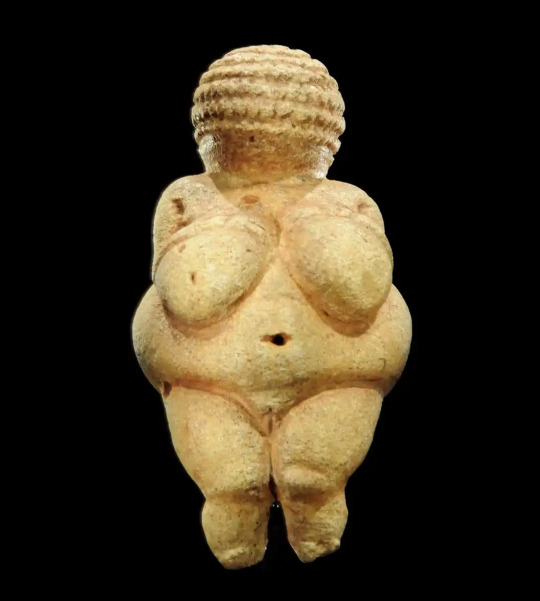
25,000 – 20,000 BCE Woman of Willendorf. Stone sculpture
5 Facts:
1. It was sculpted out of oolitic limestone and dyed with red ochre pigment.
2. Venus is the roman goddess of fertility.
3. The material it was made of is not native to Austria, where it was uncovered. Rather, it is native to Northern Italy.
4. It symbolizes fertility and may have possibly been representing of good luck as well.
5. It is considered Upper Paleolithic art, being created from 28,000-25,000 BC.
When I first saw the artwork my mind immediately went to fertility and possibly wealth. In the past, being heavy was a sign of wealth, as it meant you had plenty of food. My intuition was confirmed however when I did learn it was a work to represent the roman goddess of fertility, hence the prominent breast structure. I see differently now how it could be a charm of good luck and fertility as stated above. Similarly to how some people carry a rosary with them in the christian religion. But instead of representing every positive emotion it only represents a certain aspect of life due to their religion being polytheistic as opposed to Christianity's monotheistic tradition.
1 note
·
View note