
Don't wanna be here? Send us removal request.
Statistics
We looked inside some of the posts by jt-fmp and here's what we found interesting.
Average Info
Notes Per Post
4
Likes Per Post
4
Reblog Per Post
0
Reply Per Post
0
Time Between Posts
11 hours
Number of Posts By Type
Text
1
Photo
15
Video
1
Last Seen Tumblr Blogs


Fun Fact
Kazakhstan’s Minister of Communications and Informatics has blocked the Tumblr site because it contained 60 sites of terrorism, extremism, and pornography in 2015.
Text
Project Report
Summery Of Project
For my FMP I wanted to be able to combine my skills as a landscape photographer with something more personal. I thought including people into the project would separate it from my previous projects and give it the individual significance that it needed. Australia seems like a place so distant to us, being half way around the world, that I wanted to explore it. My project developed into an East Coast Australia road trip, capturing the landscapes, people and towns/cities of this stretch of Australia. For the project I made contact with a custom motorcycle builder, ex-British surf champ, wine maker and wildlife park manager. Four completely different people living up the east coast, all deeply passionate about what they do.
For the trip I travelled with a film crew, who I had worked with before on many occasions. The four of us all travelled in two camper vans, which gave us a lot of flexibility to move around and sleep where we want. The trip was also sponsored by Teamwork Photo, who gave me the latest Phase One medium format camera system for the trip, with two lenses. Lap Foto in Sydney, Phase One’s Australian distributor, gave me a much needed lens for the trip as well.
The film crew filmed the entire trip from Sydney to Cairns with an aim to create a feature length documentary in the future. They also filmed 4 short documentaries of the people that I had found through the east coast. The plan is to include the 4 docs into the feature length to create one large film for the project. I have designed a book as well that includes the images from the trip. The book has a minimalist look that allows the reader to focus on the imagery.
Influencers
One of my main influencers for my projects and especially this one is Camp4 Collective. They’re a production company that started with three guys, Tim Kemple, Renan Ozturk and Anson Fogel. All three are directors and Time Kemple is also a photographer who’s work I admire very much. They create content that focuses on real stories about people from all corners of the world. Camp4 Collective is something that I aspire to do with the production company that I am working with. We all have experience in directing, especially two of the members! We have an amazing DOP, Editor, Drone operator and myself as a photographer and producer. They shoot a lot with a helicopter which is why I wanted the drone operator, to add a different view for the docs.
Another photographer and filmmaker that I have been following for years now is called Andy Best. His landscape photography has a mixture of travel and adventure, which back the films he makes as well. He directs, produces, films and edits by himself; with occasional help with the producing side. Again his films and photos concentrate on people and places, normally taking place in and around the mountains in America. His images are rich in colour, often including the night sky with an array of different tones. I look at his work to see what techniques he has used in his imagery. Whether it’s a long exposure, composite, or a lot of the time, how he frames his work to include a lot of reflection in the water. These things I try and practice in my work all the time.
One more large influence to me is Chris Burkard and especially his latest project. Chris is a photographer and film maker from America. Again like many of my influencers his films and photos concentrate on the world’s landscape and people living in it. His latest project is called ‘Under An Arctic Sky’ follows six surfers trying to find the best wave in Iceland, during the winter months. They film the surfers catching waves at day and at night, under the Aurora lights. With our final feature doc, we want it to include a similar theme. A film that shows the entire journey and behind the scenes, to make it more personal.
The Project
I started the pre production work early for this project as I knew there would be a lot of it. I feel that the production side of a project is one of my strong points, having a lot of experience with interning an established photographer in the summer of 2015. As the project was being held in Australia I had the challenge of arranging everything from the other side of the world. Booking travel and accommodation was fairly basic, it was the organisation of shoots where I had to knuckle down. It involved a lot of emailing companies and people that I was interested in shooting. I had quite a few negative responses, companies not wanting a film crew to document them. However, I did get some good results, leading to the shoots that happened in Australia. A lot of the production work was arranging camera equipment with Teamwork photo. Using a contact from Phase One, a guy called Peter who taught me the POCP, I was put in contact with Steve from Teamwork. I negotiated the latest XF camera, IQ3 80mp back and 2 lenses (80mm and 150mm). As there was one more lens that I wanted, the 28mm, I spoke to Pete again. He put me in contact with Lapfoto in Sydney, who were kind enough to loan me a 28mm lens for free for the duration. I had to arrange insurance for the entire trip as well, as part of the deal. An important side to the project was having a film crew to shoot the entire project when out in Australia. Fortunately I know a group of guys that are starting a production company. They went to Ravensbourne and I know them as I worked on a lot of their FMP projects. I was a gaffer on many of their short films, as I have a lot of lighting experience. I also shot a lot of BTS for them too. I introduced the idea to them and straight away they were interested. They were ready for a large project like this, so the timing was perfect. We had many meetings in person and over Skype to arrange the trip and decide where and who to shoot.
Whilst actually out in Australia I had some ups and I had some downs. When arriving in Sydney I had my first challenge and a big one. My equipment bag, containing all of my equipment excluding the Phase One gear hadn’t arrived in Sydney. I especially paid for special baggage as well, to make sure it arrived safely. I had to spend the next 3 days in Sydney calling and emailing various people from Air China and the airport to try and locate my bag. Of course it was a very stressful 3 days, as I couldn't shoot in Sydney without my tripod at the desired locations. After the 3 days the bag was located and returned to me which meant we could continue the trip. The first shoot with Jeremy went very well. Although we only had around an hour with him to shoot, we got enough shots for a good doc. We asked appropriate questions to get him to tell us about his past and how he got to work for such a prestigious company. This was the first time I shot on the Phase with a person, I found the camera worked very well and I straight way knew I had some good shots.
The next few days travelling towards Byron Bay went as expected. We stopped off at all the planned locations, shooting landscape and BTS for the project. The next shoot would be in Byron Bay with Stuart Campbell. We had originally planned to shoot with him over an afternoon and evening. We met with him at a local beach, went to his house and then drove to the location; filming along the way. I entered the water with my camera and underwater housing. After around 15 minutes in the water a large wave hit me, sending me spinning under water. The underwater casing had opened slightly due the the impact of the large wave. My camera there and then was unusable! I was mostly upset about not being able to get any more surf shots, but knew it wasn't the end of the world and tried to stay positive; I still had the Phase camera. We had arranged to meet Stuart the next day as well to shoot some more and interview him. The following day went very well, capturing a number of amazing shots on the Phase. We interviewed him and shot more for the doc, filming later in the day as well to get some more surf shots. I filmed in the water with my GoPro, knowing this one wouldn't break.
We continued up the coast shooting at the planned locations. Everything was going well and I was getting some great shots, up until we arrived at Noosa; just after Brisbane. We had booked a boat tour through a system of salt water rivers. It was one of the hottest days we had experienced on the trip so far; as Australia was experiencing a heatwave. The Phase was in my bag the entire time, also inside a dry bag. Condensation had built up inside the bag after I had taken it out to capture some photos. The camera didn't turn back on when trying to capture some photos at lunch. I called Phase One to see if there was anything I could try, nothing worked. They made some efforts to try and get another camera to me but because of the Australian boarder, it wasn't possible. This was a very disheartening point of the trip, knowing that I couldn't shoot on any of my cameras any more. However, I tried to stay positive and not let it ruin the trip. I shot the remaining 11 days on the Sony A7s that one of the crew had. It was a big drawback but at least I had a camera to shoot on. I wasn't able to get as many shots as I wanted on the last stretch of the trip, as the camera wasn't sometimes available as we were still shooting for the doc.
The rest of the trip went pretty well. I had one health issue where I got heat/sunstroke towards the end of the vineyard shoot. This knocked me out for the rest of the day but I got over it within 48 hours. We finished the trip off back in Sydney where we had a fashion shoot with a well known Australian model and also an established art director and stylist, who was started a new company.
Costings
I estimated that the project would cost just over £5500 all in. Most of the costs I knew before hand, like the flights, van hire, some of the accommodation etc… It was the spending money where I had to set a number that I was happy spending. I thought that I would spend from £1500-2000 out there. This wasn't a budget but just an estimate. I was happy spending more. All in spending money, I spend around £2300. Some of the costings I didn't include just simply because it was sometimes hard to keep track on everything for a whole month. All in then the project cost me around £5000. The Air BnBs cost a but less than expected and a lot of the days we had minimal spend, as we were on the road.
Future
The project still continues. We still have more documentaries to edit and this thing takes time. There are more people involved like sound design and colourist and the editor. We have the main surf doc out but the other three are going to be finished through the summer. The final feature doc will hopefully be finished after the summer. I am still working with the production company as well as a photographer and producer. We have more projects coming up in the summer. I also have an exhibition in June, where I will feature my book and photography.
Conclusion
Overall I am happy with the way the project went. The images generated from the trip were as expected and beyond. Getting my foot in the door with Phase One was a big aim of mine and hopefully I have done it in a good way; despite the camera breaking. It was an environment that I wasn't used to shooting in. Extremely hot a humid weather made it tough sometimes, especially when trekking with all the gear. I had some bad luck with late kit arriving in Sydney and both my cameras breaking. I’ve never had this happen to me before, even on this scale. But I continued on with the project and still managed to get some good content on the film crew’s camera. The trip was by far the biggest project I had embarked on, being in charge of a film crew and having to organise the whole trip for everyone was an enjoyable challenge. Arranging the shoots from England had its downsides as well. Being able to call them over the phone would have been easier but email and social media had to do and still worked.
1 note
·
View note
Photo


In just half a day the documentary is making its way around the web. Carve Surf Magazine have posted the documentary on their website with an interview with Stuart. They have also posted the documentary on their social media; on Instagram tagging my photography page with the photo I captured. Carve magazine have over half a million likes on Facebook and over 50k on IG.
Devon live have also posted the doc onto their website with some kind words on it as well.
I have been speaking to the guys about trying to send the doc around to get it posted more on other websites and social media. We will also send it around to various film festivals and competitions.
0 notes
Photo


The book has arrived and on first glance I am happy with it! The quality of image is pretty good, the detail is present which is what I wanted. The colours obviously aren't perfect but not noticeable to someone who hasn't seen the original photos. Looking at the front cover you can see that the spine of the book has leaked onto the front cover, which shouldn't of happened as I kept to the template. The white line also is thicker at the bottom than the top. These are the kinds of things that are expected from printing a book over the internet. In the long run I am going to carry on tweaking the book with a print house in London or surrounding areas. These things take time though so it wouldn't of been possible by the time I finished the book. I hope to have a finalised book presented at Free Range. This is then another area of the project that will carry on after the deadline.
0 notes
Video
vimeo
The first short doc is ready. I wanted the surf doc to be edited first as I thought it would be the strongest out of the 4. Callum who is the main editor has spent the last few months editing it, amongst his other work. It has also been sent off to a colourist and sound designer. I’m extremely happy with the final version! The visuals look incredible, the sound works very well with them as well! The next doc to be edited is Jeremy at Deus Ex Machina. This won't be ready in time for the deadline though. These things take time to finish and I knew this project would be something that would go on after the university deadline. The main documentary was the surf one and that it what I will be submitting. In the long run we will have a feature length doc, with the whole trip including the 4 short docs.
0 notes
Photo

For my Free Range display I have decided to display one photo. It is the photo that I printed below of Stuart Campbell on the hand gliding ramp. The photo has a lot of detail all the way to the beach, where you can clearly see surfers in the water. The amount of space I will have is 3m in width and will be over 2m high. I have decided to print the image around 1.5m tall and just under 2m wide. I will have the book displayed underneath on an invisible shelf. Originally I wanted to get it framed, but because of the size I have been advised to mount it instead; using MDF. It will allow the viewer to see the detail and image properly without glass in front of the image. I am probably going to print at Print Space, I’ve used them before and been happy with the result. I went in recently to print some images and looked at what paper they had. I need to choose between the Giclee Epson Semi Gloss or Hahnemühle Pearl which were my favourites. I have estimated the cost on the website to be around £611. As I get 10% student discount, that will make it £550.

0 notes
Photo

I am displaying my work at the Free Range exhibition. This exhibition is set up by students where we can all display our work. I have around 3m of wall to exhibit on and I have chosen to show just one image. I want to get an image printed to a height of around 1.5m and this is the image I have chosen. I have printed a test at uni on semi gloss paper. This image is around a metre high, so a bit smaller that I want for the exhibition. I am looking to print at Print Space or Metro Imaging.
0 notes
Photo
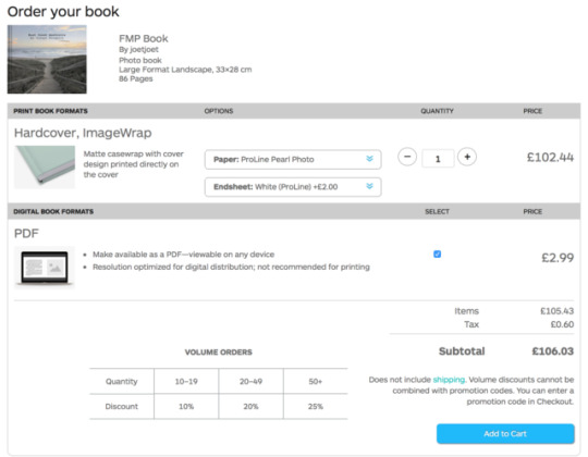
I have sent off by book on Blurb. From In Design I could upload the book straight onto the website and it was ready to order. I have again chosen the ProLine Pearl paper which will offer the best quality in image. I have also added white end sheets. At the moment I am just ordering one book but will want more in the future.
0 notes
Photo

I have created a front and rear cover for the book. I wanted to use the image from Coffs Harbour as the front cover. There was some space at the top of the image for the title. I didn't want that much text on the front cover to leave more space for the image. On the back age I added a portrait of Stuart plus a description of the project. The portrait adds an interesting and personal aspect to the book and leaves the audience to wonder what is inside the book. On the spine of the book I have put the title and my name as well. The template had lines where I should put the text. I have left a gal near the spine as that is where the page will bend.
0 notes
Photo

On the last page of the book I have added a thank you message to the people that helped with the project in Australia. This includes Phase One and Teamwork for the camera gear, also Lapfoto for the lens, plus, the guys who came with me on the trip to film the documentaries.
0 notes
Photo


Here are the changes I have made to the book. I have just shown the changes up to the surfer section to show the kind of changes made throughout the book. On the left is the new and on the right is the old. The fist two images you can seen that images have been moved to the other side of the pages. This is because of where the eye is being led and also an image may convey an end to the series with lines and light. The last image has also been made smaller, as I don't want to use a full double spread too early in the book. I want the first double spread to be a wow factor, so that shouldn't happen too early. The next two image just show a few photos that have been moved around, same with the next two. The main change for the next photos was the fire section. Instead of having the fire section in the Byron Bay area. It now has it’s own title and text. The larger image has also been moved to a double spread. The Byron Bay section has been removed as some of the image weren't strong enough and the section would have been too small. The first image in the surfer section has been swapped with another. The new image provides more of a frame around Stuart and also some more interesting features with the branches. One subtle change to this section was making the water lines level in the water shots.
0 notes
Photo

I have had a meeting with my course leader to show him the book I have created so far. We both went through the entire book and made notes on what changes to include. I was planning on going to a Graphic Designer for advice on the book. However my course leader has a lot of experience with creating photography books so I feel that I won't need to any more. One of the main changes was removing the text form the pages which had the name and camera settings. I wasn't too sure whether I wanted to include them or not so I am happy to get rid of them. It makes a book more professional without the camera settings next to the images. The overall design of the book hasn't changed much. The main difference is where the images are placed in each section. A lot of the images have been swapped around with others because of the way a person looks at a book and where their eyes are lead. Certain images should either be on the left or right of the page as they direct the eye to the next image. Some of the images have also been removed as it benefits the other image on the page to have a clean white page next to it. We also spoke about what text to include when it comes to the people in the book. It was suggested to have quotes from the video we took. Quotes that tell the audience what they do, why they do it and why they love it. Something short and sweet that doesn't need too much text. We both agreed on a couple of images that would make a strong front cover, for me I would like the Coffs Harbour image with the steps leading down to the beach. On the back I could include a portrait of Stuart, the surfer, and have some text next to it briefly explaining the project.
1 note
·
View note
Photo


I have printed off the book up until Fraser Island. This is so that I can see the pages in front of me instead of on a screen. Then I can look for areas that I want to change. I have used my A3 printer so that I could use A3 paper, I then cut the pages using a guillotine to the crop marks; this is so that the pages are the same as the actual book. I have written over a lot of the book, most of the comments are the same throughout so I have only added these pictures.
With all of the full single pages that merge onto the next page, I have decided to bring them onto the next page further.
On the 2nd picture I have decided to swap the images, as I feel the landscape image should be on the left hand side. This is because on the previous page, the landscape is also on the right, so I feel that it should change.
The next picture shows the double page spread. With the text throughout the book, that says the title and camera settings, I wanted it to be moved. In this case I wanted it lower down on the page, this is the same with a lot of the text in the book.
On the next picture I have said that I want the second line in all of the titles to be regular text instead of bold.
The next image is an example of where I want the text moved closer to the image. The image after is where it should be moved down.
The photo after shows where I have used the wrong margin on the right hand side, the page doesn't have an even margin across the page. It’s the same for the next image.
On the next photo I have included 4 images on the double spread, this is for the ship wreck. I have used the same text for all of the images. However I want the title to be on the left page and the camera settings on the right page. Instead of repeating the text on both pages.
Finally on the last image I was wondering whether I should use text on this page. The title and camera settings are on the left page so I should probably put something on this page too.
0 notes
Photo

I am using the same sort of design throughout the book so won't post all of the pages on here just yet, until it is finished. So far I am at around 100 pages and have got to the Atherton Tablelands. I wanted to post this page though as it is different to the other ones. I have included 6 of my favourite images from the Fire Dancers on the left, in a square crop. As there was a gap in the middle I added a black textbook with white text to talk about them. As the black is the same shade as the images it all blends together. I have then added a single page spread on the right with all of them together.
0 notes
Photo


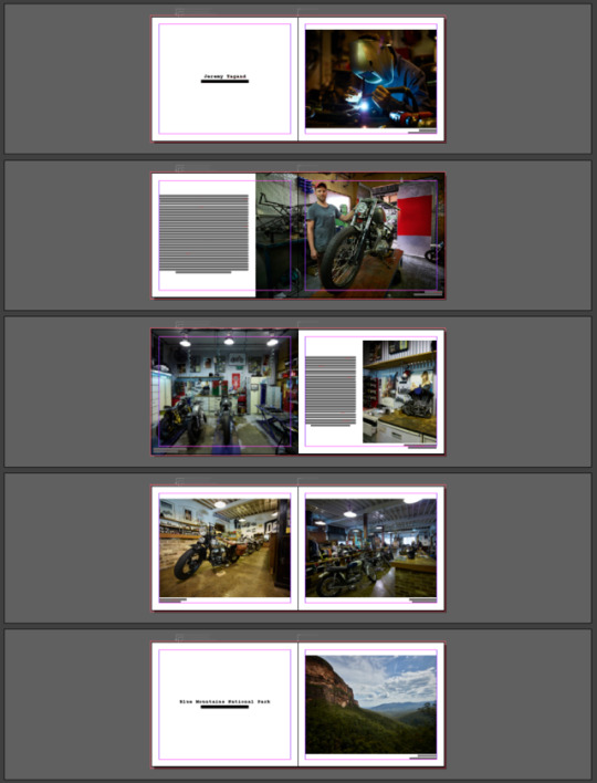
I have started designing the book with this layout. I will then send it to a graphic designer for advice on any changes to make. I have included a number of single and double page spreads that I think will look great in the book with the high quality images. I have used a 45mm margin which was recommended on the Blurb website. I have also used a 3mm bleed so that the images are flush with the page edge. I have included a title and camera settings for each image. The titles may change from what they are now but I think it’s goof that there is something to read on the pages with no text. I have added some random text in the Jeremy Tagand section which is just for the design; I will write the proper text when the design of the book is finished. With each title I have used a whole page, to add a clean a simplistic design. I have then arranged the images based on what goes well together. The first Sydney image doesn't even need a title, people will know it’s Sydney. The next image has been placed on the left page so that it doesn't copy the page before, it then runs onto the next page. Another simple design that allows the image to be blown up bigger. Then the next page has a portrait image to break up the landscape images. Finally the next image is a long landscape of the other side of Sydney. I thought I could make in more panoramic across the double spread. As it was taken on the Phase One, the quality is still there so will look great on a double spread. I will be using a similar layout throughout the whole book. Keeping it clean and simplistic. I will use text where needed, when talking about the 4 people I had arranged to meet. I will also talk about the Fire Dancers and also the Rainbow Temple as that needs an explanation.
1 note
·
View note
Photo


These are two separate books. The first one is landscapes of old rural Britain. Across most of the book it features landscapes at the top of the pages, again leaving a lot of white space. Something that is done with many books it seems. The next book is by the AOP and again places the images off centre to provide some clean space. This is definitely something I will do with my book, I don't want to overground the pages with images so will provide enough clean, white space.
1 note
·
View note
Photo


The next book features 400 photos from Ansel Adams. The book is very minimal inside I think for a number of reasons. As it is Ansel Adams, the photos probably don't need much information; apart from the name or location. Across the whole book there is a lot of white on the pages, which give it a clean look. Portrait images aren't often places in the middle of the page, being off centre is quite pleasing to the eye. I think with mine I would like the images to be as large as possible though, to show the amount of detail in some of the images. However, I do really like the white minimal look. The front cover is quite interesting as well but not something I would want from mine.
0 notes
Photo


I have gone through my photography book collection and picked 4 books where I find the layout interesting. The first is Petrochemical America. The from cover has a neutral green colour across the whole image with a similar but contrasting shade for the text. The spine is white as well which lets the text stand out. This is something that I would like with my book. An images on the front page and a white spine with text. On the inside there are various layouts throughout the book. I think it is good to have a mixture of layouts in a book to keep the reader interested. I would definitely like a few double page spreads in my book, with certain images that would benefit the large feature. Inside the book it has a very minimalist layout, when there isn't any text. Most of the book has an image on the right, with a small boarder and a small amount of text on the left. I really like this idea but feel that it is quite repetitive. There are a few three quarter spreads but are positioned interestingly across the page; with more boarder on the bottom. I would like some three quarter length double spreads in my book but all the way to the bleed, so that the image is bigger on the pages.
0 notes