
juanita5418638
Juanita R
Hoarder of unfinished projects. Constantly tired, will complain about it constantly.
11 posts
Don't wanna be here? Send us removal request.
Last Seen Blogs

divorceddadcore
guess we failed, huh?

excerptsofawanderer
Excerpts of A Wanderer

papercraftemg
PaperCraft EMG

seichuui
moved to @pawppeteer

scripting-life
you should be writing
Text
Week 10 - The End
It is quite crazy to think this class has come to an end, each week was so interesting and immersive that it genuinely just flew by. Not only have I confirmed my love for industrial design through these exercises but I've gained so much essential knowledge that I will definitely look back at.
Through this course I've learnt the importance of reflection and self-evaluation as I am now able to explore my weaknesses and how to combat them in order to find a solution so to improve in the future. I've gone from making shaky lines with a felt tip pen to having a steadier hand and confidence when drawing lines without the assistance of a ruler or guide and my final drawings have never looked cleaner - they almost look printed.
Being new to 3D forms and software, the later weeks appeared intimidating at first glance but as I had learnt in my first weeks -patience is key. Rather than thinking about rushing to finish so I can upload my weekly post in record time, I allowed myself to (somewhat) forget about the deadline and instead focus on completing each step slowly as to avoid making a mistake. Although yes, this meant I spent a total of two hours just playing with the interface of 3ds Max when I first opened it, I saved myself time in future exercises as I now knew how everything functioned.
I also stayed true to my word and worked on my areas of improvement throughout the weeks and will continue to do so. My YouTube homepage is currently flooded with software tutorials and I recently bought a small book full of drawing ideas and have dedicated 10 minutes every day to sketch a page. This has improved my sketching time significantly and my accuracy is slowly getting better too. I'm currently sketching in pencil but will likely move on to pen soon to make further progress.
I can say with certainty that I will come back to this blog frequently to remember the important techniques and guidelines I've learnt until they finally get engraved onto my brain as they are an important stepping stool for future years of study to come. From technical drawings to model making to 3D printing, I greatly treasure learning about the essentials of industrial design throughout this course.
To finish this off, I do want to recognise that the only reason I was even able to learn thus content and execute it so well was due to the help of the tutors. From detailed exercise instructions to frequently helpful constructive feedback, I never once felt hopeless or like I was unable to complete something. The tutorials were also very informative and engaging although I think that's mainly because of Gonz's pink glasses - they're too nice to ignore.
Thank you to Gonz, Rob and Sarah for such a fantastic course and experience these past ten weeks. I wish it would have lasted a little bit longer but I guess it's now time for me to conclude my final post.
Thank you, goodbye and if you can please do write a comment about how much you appreciate Carl the Capybara from my week 8 post.
El fin
0 notes
Text
Week 9 - Preparing a 3D Scan for Printing
(Open the photos for a clearer image resolution.)
Pre-Class: Watching Andrew Simpson's video gave me a better insight into the importance of prototypes and models when creating a product and his mention of using different materials to recreate the size and weight made me realize I never took the weight into account. Although blue foam is a good way to recreate the shape, it is way lighter than the final product which is made up of glass filled up with liquid. As such, it gave me the idea to create my next model out of clay as it is closer in weight and still allows a high level of moldability.
Part 1 - Scanning & Meshing
This week was a fun way to learn how different software programs interact with each other and help produce a model for 3D printing. One main thing I learnt was that using a 2015 MacBook to run Rhino and 3ds Max is an insane choice and possibly an inventive way to cause an explosion.
After many failed attempts to boot both programs, I gave up and decided to complete this exercise at home as I had a stronger WiFi connection and a PC with (way) better specs.
Onto the actual work! After the lovely staff of the MCIC helped me scan my perfume bottle model into a 3D scan saved as an .stl file. [F.1] I got to opening it in Rhino and applying a quad remesh as this allows easier manipulation of the model in 3ds Max. [F.2] As someone who used Rhino previously it was comforting to be using a familiar program and had no issue completing this part.
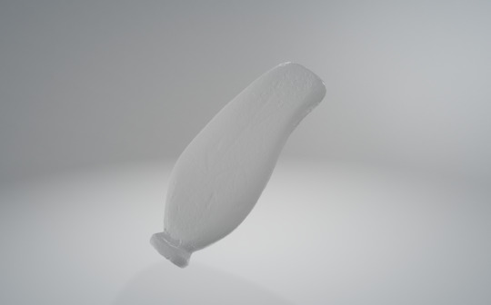
[F.1] Scanned Perfume Bottle.stl
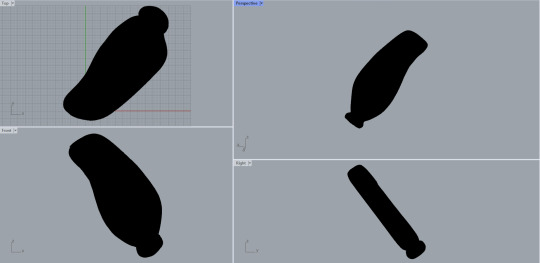
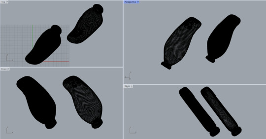
[F.2] Model Before and After Quad ReMesh
Part 2 - Orientation & Modification
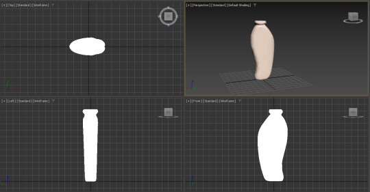
After last week, I dedicated myself to watching tutorial videos on 3ds Max throughout the week so as to get more affiliated with the program which really paid off during this exercise. Once I had the file prepared, I imported it to the program and quickly dealt with the orientation. [F.3]
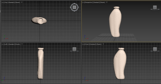
[F.3] Unmodified Model
The modification got a bit tricky after this though as my model had a few bumps around the surface caused by my nails which is less than ideal. The smoothing tool was a great help when combating this issue and luckily the dents were not too deep. I also used the symmetry tool to ensure my front and back view were identical. However, the mirror tool was really tricky to orientate as it is harder to view and the program was lagging heavily. I will look into better options to combat this issue as the lagging should not have occurred at all. Once the model looked ready to print, I saved and exported the file and moved on to Cura. [F.4]
[F.4] Finished Model
Part 3 - Preparing for 3D Printing
With the file ready to go, once it was uploaded to Cura the rest was quite straightforward. I ensured the scaling of the bottle was right and made sure all the edges were nice and smooth. I then sliced it and my model is ready to print. As I do not have access to the printing services right now, I unfortunately cannot print my model but I could at least preview what it would have looked like. [F.5]
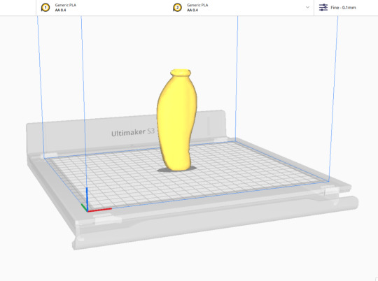
[F.5] Sliced Model Ready to Print
Bonus - Carl Update
Since this exercise did not take too long to complete and I was looking to implement something fun, I remembered how on my previous weekly post I had mentioned that I wished to learn how to 3D print the friend I made, Carl the Capybara. So I decided to do so!
With a quick tutorial, I learnt how to merge together Carl into a singular poly mesh on 3ds Max which meant he was ready for exporting! Once exported, I uploaded him onto Cura and scaled him to a friendly keychain-like size. [F.6]
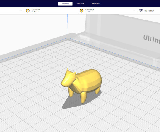
[F.6] Carl
Once sliced, I realised I should add support beams for the stomach and do an infill to ensure the printing result would be sturdy. Once done, Carl was ready to print! [F.7]
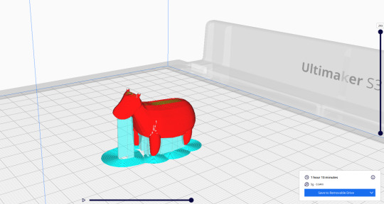
[F.7] Perfection
This week was a fun small activity and I really hope to print off Carl once I am back on campus as a great reminder of what this class has taught me and the progress I have made. He shall keep me company on my desk at home :)
6 notes
·
View notes
Text
Week 8 - Digital Iteration
(Open the photos for a clearer image resolution.)
Pre-Class: Andrew Simpson's razor handle video goes heavily in-depth on the use of a 3D model, showing how unlike a sketch the 3D iteration can communicate important considerations such as weight, size and ergonomics. When he discusses 'low-fidelity' and 'high-fidelity' models, it can be speculated he is referring to the quality of the model and how close it is to the final product. For example, a quick 3D-printed model with the general shape would be 'low-fidelity' whilst an injection moulded handle with greater detail would classify as 'high-fidelity''.
Part 1 - The Basics
This week was quite the puzzle as I am new to the world of 3D modelling software and it can get somewhat overwhelming very quickly. Prior to starting the exercise many tutorials were watched and a lot of time was dedicated to learning how the 3ds Max interface works.
This smaller exercise was a big aid for warming up to the program and found myself messing around with all the settings and endless modifications available. Starting off with my sphere was quite simple and helped me learn how to modify positions and measurements. [F.1]
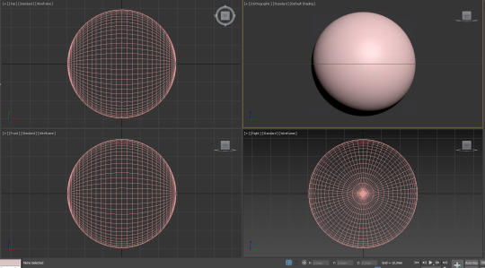
[F.1] The Sphere™
From then on I messed around with colours, modifiers and even different shapes. I made a few abstract and organic shapes which was quite fun and then somehow ended up creating a cartoon-like ice cream; maybe it was the hunger talking. [F.2] I did struggle at first with the layout of the program and finding where the modifiers were and how to toggle them on and off once applied but YouTube was a true friend to help figure this out.

[F.2] Shape Experimentation
Part 2 - Sculptural Forms
Apart from the very random ice cream, I watched the recommended tutorials and began making a few random objects here and there although some looked a bit wonky. I definitely have to get better at using the modifiers to my advantage when creating specific shapes and curves.
Despite the struggle, I challenged myself to create a quick iteration of an animal. Not necessarily realistic, but crafted well enough that you would know it is an animal. I went with a capybara because they have a pretty simple silhouette and before I knew it I had crafted myself a friend called Carl. [F.3]
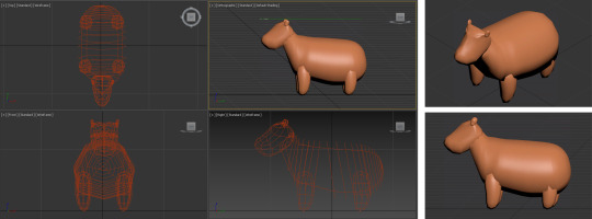
[F.3] Carl the Capybara
Just look at this friendly fella, it radiates nothing but pure happiness! I must admit that I now fear future exercises will never compare to the fun I had creating such a wholesome design. Overall, this week was really entertaining and a good learning experience for someone like myself who was completely new to this program. Hopefully, I can one day I learn how to 3D-print Carl.
6 notes
·
View notes
Text
Week 7 - Model Making
(Open the photos for a clearer image resolution.)
As someone who usually struggles translating 2D sketches and ideas into a 3D model, this exercise was essential to help me develop those much needed skills.
When it came to choosing which ideas to develop into a model, I chose two different drawings where the sketches didn't quite fully express the shape of the bottle. As such, I wanted to explore whether the firm I had in mind would suit the design in mind. I chose two very organic designs: a shell like structure and a wave. Following the instructions, I turned the sketches into a more accurate orthographic rendition.
Model 1 - Shell 🐚
When creating the template, I found that instead of a blade, it was easier to fold the paper in half then cut with scissors as this ensured both sides were symmetrical. This design was then stuck onto the foam with double sided tape and used as a template. [F.1]
I really struggled using the hot wire cutter as it is hard to move the foam steadily so the initial cut came out very rough [F.2] so I cut the foam with a few mm of allowance and sanded it down to perfection.
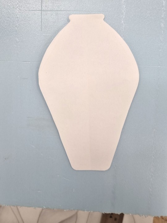
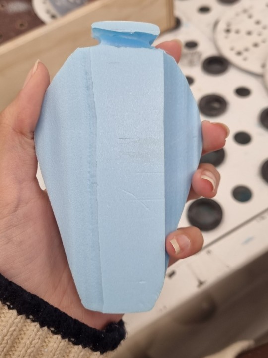
[F.1] Template [F.2] Initial Cut
This bottle had a slightly complicated convex shape I was aiming towards which was hard to capture perfectly with the foam as symmetry could only get so far. When it came to my final product [F.3], it looks a bit wonky as I struggled to maintain symmetry in the side profile. Better planning with specific angles and a negative template might help with this in the future. This model was very helpful as I was able to conclude that although it is a good design, the proportions are not very reflective of the emotion I chose (Serene) so now I can create a new sketch and make adjustments to future models.
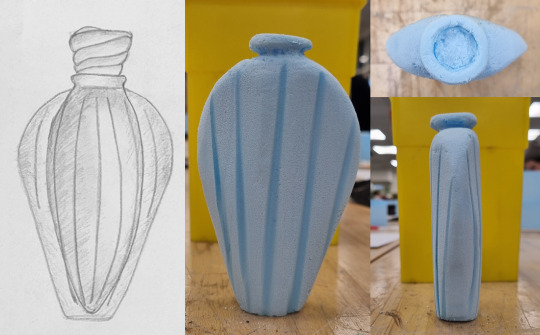
[F.3] Sketch vs 3D Model
Model 2 - Wave 🌊
Although I didn't capture any progress photos for this one, I created a second model of a simpler model that was asymmetrical which I found easier to cut but harder to sand as it had smaller areas the sandpaper could not reach. I followed a weird idea and used a small nail file which worked even better than expected so thinking out of the box helped. Overall, I like the idea of this design and it works well for my emotion, but it might be bit too thick to hold so the dimensions have to be reconsidered. [F.4]
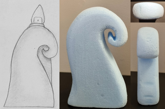
[F.4] Sketch vs Model 2.0
Overall this exercise helped me develop my 3D creation skills greatly and was very fun from start to end although I'm certain I inhaled some foam fumes which would explain how I have no recollection of finishing these. Sanding was definitely my best friend here as my hot wire cutting skills need a lot of refining. I look forward to see what new challenge next week brings - hopefully it is just as fun but with less fumes.
5 notes
·
View notes
Text
Week 6 - Digital Sketching
(Open the photos for a clearer image resolution.)
This was probably the only task where I was never lost during the process, rather I found it quite easy and instead challenged myself further. For my digital sketches, I drew my perfume bottles instead of the moisturizer. As a result, I chose to draw my most organic and complicated ideas while aiming to show a transparent, glassy tone.
Following Rob's videos, I began by making my plan. Although I had a general idea of how I wanted my page to look like, I soon noticed the perfume bottles were far too close together and had to separate them during the final process.

The Final Product
The rendering process did prove difficult as there is a large difference between shading a glossy and matte surface. I found that although I wasn't fully able to achieve a glossy finish, a lower opacity did help communicate the material of the product.
The lids had to be completely hand drawn due to their complexity. Luckily, I was able to use my drawing tablet but overall it was definitely more time consuming than constructing a generic cap. I was heavily confident with the digital components due to previous experience but up until the very end, composition was quite difficult and took me the longest to figure out an appropriate layout I was satisfied with.

0 notes
Text
Week 5 - Sketches
(Open the photos for a clearer image resolution.)
Part 1 - Sketching Drills
I found this week was more relaxed and a nice way to wind down before week 6. The sketching drills were really fun to do and I liked how I could easily do these daily to improve my sketching skills. Since there were 8 different drills, I decided to make a small brief summary of each one individually.

For the straight lines, I definitely struggled and there was various curving as I am more used to drawing using my wrist rather than my elbow and shoulder. When it came to spacing however, I was able to keep it somewhat consistent.

This one was the trickiest one of them all, I genuinely struggled drawing straight lines in different angles and had to instead turn my page a few times.

The circles were fairly easy although a few do look a few more oval-like and the photo turned out quite bad due to me using pencil instead of pen. I do think my contour lines were the best element I created for this page.

It took me a few reads to understand the instructions for this drill since the wording was a bit confusing at first. Even when I first started I didn't know too well what I was doing but soon figured it out, hence why my left side looks better than the right. I would do this exercise again now that I know how I'm meant to approach it.

The cubes were easy to do as if was a repeat of last week's works so there wasn't really any confusion and I drew it quite quickly without trouble.

I had the most fun with this one, specially because of how nice my fruit outlines turned out. I did find it was hard to tell the contour lines apart from each other so I found implementing dashed lines for the back surface was a good solution to the problem.

I struggled with these squares as I couldn't come up with many shading styles and features to apply. I did find cross-hatching is better for adding shading for smaller details.

The last exercise was difficult as I couldn't properly blend the different pencil values together, meaning I either could have used a bigger range or built up the tones better.
Part 2 - Sketching
I liked how this part intersected and helped towards another class, helping us save time whilst also learning valuable skills. I quickly started out by using the given measurements to draw out my guide. I did notice rather quickly that the squares looked rather small, so I decided to double the measurements which had much better results. I practiced my toning prior to this exercise which is heavily evident in my perfume sketches. I was extra detailed as I wanted to introduce all my ideas in a proper manner. My only struggles during this exercise was timing, - I have to become a faster sketcher - and photographing. I have yet to find a proper way to photograph a photo with pencil so I aim to watch a few tutorials during flexi week.


Hopefully in week 7 I will be back with better photographs!
0 notes
Text
Week 4 - Perspective Sketching
(Open the photos for a clearer image resolution.)
Part 1 - 2 Point Perspective
I found myself really looking forward towards this exercise and had much fun with it. I have done perspective drawing a few times before so this was a good way to see how much of my previous knowledge had deteriorated over time. Spoiler alert: I surprisingly remembered a lot.
Using my past knowledge and a bit of help from the reading, I began drawing up all the necessary lines and boxes and had little trouble developing the drawing to its finished state. However, my photography was quite weak and the lines are not as visible as I would like them so I need to perfect my exposure and possibly use a thicker line weight.

Part 2 - Extending Box
This part was definitely trickier. As the boxes piled on, more and more construction lines were made which made it hard to tell which ones I was meant to focus on and connect together. I was only able to tell that I had drawn the wrong line because the box would look very wonky. After a few attempts, I was able to get a nice finished look. Additionally, the top box was very close to the horizon line which made it quite a fun challenge to draw the top face as the lines were very close together.


Part 3 - Perspective Circles
Although I have drawn circles in perspective in the past, this was the first time I had to find the major and minor axis so I found myself referring back to the reading multiple times since I struggled at first to understand how to find them. I had to read the instructions a few times before they made sense. I also do not have the steadiest hand in the world and since you cannot use a compass for a perspective circle, my end result ended up very rough with a few smudges and unsteady lines. I should work on ways to ease up my hand and gain a more steady hold with my pencil as to avoid this in the future.

4 notes
·
View notes
Text
Week 3 - Section & Auxiliary Views
(Open the photos for a clearer image resolution.)
This week's exercise was definitely challenging for me but not for the reasons I was expecting. When it came to drawing the tapered block, I found it fairly easy to draw the different views and all the measurements added up perfectly.
However, I struggled to understand the layout of the page and wrongly projected the auxiliary view when drafting the layout (I projected from the front view rather than section A-A). Not only that, but due to poor placing my auxiliary view was also cut off, as a result it took me more time to implement the required views accurately. [F.1]

F.1 -Layout draft
Learning from such mistake, I approached the final drawing more carefully and asked fellow peers for help with my layout. With the new information, I was able to draft in pencil a better composition and even added a margin. [F.2]
This time when I added the auxiliary view, it was made properly however I struggled creating the slanted lines of the trapezium as I did not know the angle of the line and I do not own a protractor. To combat this, I used a different method where the top and bottom measurements were drafted out using a midway point and then connected. This seemed to do the trick.

F.2 - Final Draft {Pencil}
I soon started outlining everything with ink fine liners (0.5mm for main lines and 0.25mm for sections and finer details). [F.3]

F.3 - Final Draft {Pen}
When it came to adding the final details, I realised I did not take into account the space I would need to add the block's measurements. This ended with the final drawing looking cramped and not very pleasing to look at. [F.4]
Considering all the challenges I faced this week had to do with forgetfulness and composition, in future exercises the creation of a to-do list would be greatly beneficial additionally with more attention paid to the drafting process. This strategy will save time as I won't have to restart and ensured I am producing a drawing at the highest quality possible.

F.4 - Final Product
0 notes
Text
Week 2 - Orthogonal Projection & AS1100 Standards
Part 1 - Box Construction
(Open the photos for a clearer image resolution.)
For this week, my chosen object was a Rubik's cube which upon further inspection was way too easy to draw so I altered the resting position of the cube for an unusual and more challenging perspective to draw. [F.1] & [F.2]

F.1 - Original Rubik's Cube

F.2 - Altered Perspective
This choice however was made after constructing the 5-sided box which meant although it fit the original cube perfectly, the altered cube poked out. [F.4] The box itself was simple and highly enjoyable to draft and cut as all the dimensions were equal so it was a matter of ensuring I had drawn them all the exact same prior to cutting. [F.3]

F.3 - 5-Sided Box Progress

F.4 - Box Covering Cubes
Part 2 - Layout Sketch
The layout sketch was my favourite part of this week's project. I constantly referred back to it whilst constructing the final part. While checking over the standards of AS1100, I made sure to implement them all into my layout sketch for a vague idea of how it will look.
Through this sketch, I was able to realise that if I drew my cube at a 2:1 scale, the top view would not fit within the paper. As the top and side view were similar, I decided to only include the side view. Additionally, I could have used this sketch to its fullest potential by adding more thorough measurements as I constantly had to refer back to measure the cube. This was not fun because I lost it a few times to family members who just had to take it and spin it around without putting it back. [F.5]

F.5- Layout Sketch
Part 3 - Orthogonal Drawing
Now that I had my layout sketch and was confident with it, I began working on my final drawing. With a good playlist and a hot tea, I relaxed and began drawing with light pencil which I struggled to properly capture and edit as they are too light for the camera to properly pick up. I tried a few Photoshop tutorials regarding exposure and levels but even then there was only so much I could do with such light lines. [F.6]

F.6- Orthogonal Sketch
With the construction lines done, I began outlining them with a 0.5mm ink liner which proved to be difficult as I could not get a steady line weight. Additionally, the cube has bevelled edges I had to implement via freehand which was hard to draw consistently each time.
Once I had finished my lines, I decided to further challenge myself by implementing the coloured stickers covering each square of the cube. This was very fun to do although hard as I used a thinner pen which showed even the smallest of quivers when using the ruler. [F.7]
Once this was done, I added my measurements and a title block thus completely finishing the project. I really enjoyed this exercise and hope to do something similar soon in this class again.

F.7- Finished Orthogonal Drawing
0 notes
Text
Week 1 - Drawing Instruments Activity
Part 1 - Circles
(Open the photos for a clearer image resolution.)
For the introduction to this class, I really liked that the first exercise was a nice way to use all of the new tools for the class and learn how to use them properly. When it came to drawing the circles it was fairly easy to use the compass to make light construction lines however I did struggle as the circles got smaller in diameter.
Once I started doing the line art with a 0.4mm ink pen, the star (figure 1) was fairly easy to do as it was just straight lines that could be done with a ruler. In the other hand, the second circle (figure 2) was harder to outline as the inner shapes were organic and could not be traced but rather had to be done freehand. In order to improve this, I should work on refining my drawing skills so as to gain a steadier hand.


Part 2 - Tessellating Pattern
I quite enjoyed making this pattern, I even used coloured paper for a nice twist! For the tessellating pattern, I used a T-square and set square to create the shape which is made up solely of equilateral triangles. The set square helped me ensure every angle of the triangle was exactly 60°.
I cut the shapes out with a sharp blade to ensure an accurate cut however when I went to connect the pieces together, there pattern wasn't flush together; rather there were a few gaps along some of the connecting pieces. Upon further inspection, I was able to deduce the reason behind it was due to me not measuring each shape twice and cutting past the edge. In order to improve this, next time a thinner pen and double checking before cutting will make sure the pattern perfectly lines up unlike this attempt.


9 notes
·
View notes
Text
About Me

Hello! I'm Juanita and I like keyboards and all things design as seen by all my 8000 unfinished projects. The easiest way to find me on campus is by my short hair, red glasses and most often than not very uncomfortable looking boots! :)
P.S. I'm at expert at Tumblr so feel free to ask me for help
4 notes
·
View notes