
juklocad-blog
JUKL
Welcome to Julia Klugas (JUKL's) course diary, im into things like art, design, photography, craft, animation and music.
For OCAD's Communication Design program, Section 10
21 posts
Don't wanna be here? Send us removal request.
Last Seen Blogs

adrienaugust
Adrien AUGreste

doon2
El Don

bbygirlrideordie
Floating Through The Universe

pparqursblog
Peter

smokeasack69
$mocke a $ack
Text
Making the world a little stranger
Source: http://www.stumbleupon.com/su/2TVdLD/bXk$JwZ:fkQSa5MR/wednesdaywolf.com/
Date: Febuary 8th, 2015
Critique: An animation appeal with a dark yet strange twist. Artist that goes by the name of Wednesday Wolf has seemingly become popular on Reddit and our very own Tumblr. I researched him further finding the ABOUT ME blurb to be hilarious. He states “I am a member of the human species, a variant of ape originating on the third rock from Sol. My homeland is Hong Kong, though I currently reside in America completely legally. There is no need to check the paperwork on the matter…I paint with watercolour, ink, spit and blood. Everything on this website, dear reader, is a slice of my mind. If you find anything offensive or profane, I recommend googling small animals. If you find anything arousing, titilating or intriguing, inform me. If you are alone, lonely and isolated in the dark of the night, know I am sitting up with you.”
Wednesday Wolf categorizes his work into four paintings in which I am having trouble understanding, although each page is filled with strange abnormal creatures. The only two pages on his website I can easily understand are the Kultur and Pokedex pages as they refer to Culture and Pokémon. The Culture collection is filled with his strange deformed versions of popular icons in society like superhero’s and characters from movies and television shows. Clearly this artist has a strong passion for Pokémon as he designates a page just to the characters. I was excited when I got to see he had made his own versions od adventure time characters. He is able to communicate a Jake never seen before as on the show he is generally happy, lively and vibrant.


0 notes
Text
no COPYRIGHT

Source: http://www.stumbleupon.com/su/1QuwuW/3FqGzm:l27SOkxg/www.coastalrepro.com/17-beautiful-sites-with-free-stock-photos
Date: Febuary 8th 2015
Critique:
Creative Commons Zero, ever heard of this? I had just discovered these terms when stumbling through the internet and coming across this website with the best stock photos you can use when you just don't have the time to go out and shoot them yourselves. That way if you ever get famous, you wont have to worry about being sued. Just a quick reminder if you didn't know the breakdown:
Creative Commons Zero:
The person who associated a work with this deed has dedicated the work to the public domain bywaiving all of his or her rights to the work worldwide under copyright law, including all related and neighboring rights, to the extent allowed by law.
You can copy, modify, distribute and perform the work, even for commercial purposes, all without asking permission.
Creative Commons Attribution 3.0:
You are free to:
• Share — copy and redistribute the material in any medium or format
• Adapt — remix, transform, and build upon the material for any purpose, even commercially. The licensor cannot revoke these freedoms as long as you follow the license terms.
Under the following terms:
• Attribution — You must give appropriate credit, provide a link to the license, and indicate if changes were made. You may do so in any reasonable manner, but not in any way that suggests the licensor endorses you or your use.
Creative Commons Attribution 4.0:
This version of Creative Commons is the same as Creative Commons Attribution 3.0, but as an international license. Attribution 3.0 is focused on local license, while 4.0 is a more robust international license.
The first website I found had a range of photos generally ranging from landscapes to up-close shots of animals. Each photo ready to be used and easily downloadable, I took the image of the landscape with a volcano in the background as my own. Life of Pix is free to use with no subscription and has no copyright restrictions easily being able to use it personally and commercially.
0 notes
Text

Source:
http://www.stumbleupon.com/su/1IsugU/1BejGu4kg:l27SOkxg/enpundit.com/judith-ann-brauns-fingers-are-magical/
Date: Febuary 8th, 2015
Critique:
Magical to a whole new level, Artist Judith Anne Braun uses only her fingers to create large-scale compositions. Similarly to a Swiss artist I had discovered earlier, although Braun only uses a black medium such as chalk, charcoal or conte to create her free and radiant designs. She had claimed to be called a “realistic finger painter” as she paints landscapes and abstract yet symmetric so called “paintings”. Generally using charcoal, with the pressure of her finger is able to lay down where she needs darker or lighter shades. When examining her compositions, my eye is seemingly never in one place, it moves with the curves and patterns she had laid out for us. It would be incredible to see her work as if you come close you are able to see the underlying details of the fingertip strokes but moving back the image comes to life taking you through soft landscapes and delicate floral in nature. If she ever decides to include color in her compositions, the movement and relaxing appeal will be even more enhanced. Her drawing rules: Symmetry, abstraction, carbon medium.


0 notes
Text
Point/Type


Source: http://www.stumbleupon.com/su/2wSgHu/1qI.owlYJ:l27SOkxg/www.joquz.com/1945/hand-lettering-stippling-technique
Date: Febuary 8th, 2015
Critique:
Would you ever think it was possible to create a typographic composition…only using stippling? Graphic Designer Xavier Casalta experiments with pointillism through hand lettering using only a 0.10mm pen. He states “I have been practicing pointillism for over a year now and discovered this technique by chance while I was learning typography and wanted to experiment with something else other than solid black letters.
I find it unbelievable the incredible neatness to his work while only using tiny little dots perfectly spaced. Even when looking at images shot up close to the work, you can see how carefully he chose the spacing from each dot to portray a darker area or stroke. If this artist started to experiment with more fonts and began tattooing, im sure he would become very successful. The purity of each ink drawing is reflected before I was even able to read the text. As Ink is my go to medium, looking through his work was extremely satisfying as my goals are to achieve such perfection.
0 notes
Text
Painting with Photography

Source: http://www.torifoster.com/primaries/14.shtml
Date: February 8th 2015
Critique: I was lucky enough to have a presentation by my teacher where she was able to express to the class her personal work. Tori Foster, my photography teacher is an exceptional artist and photographer, as this particular collection was the most fascinating for me. Don’t be fooled, you think at first it’s a beautiful painting with rich colors and a impressionistic appeal, instead, this was put together after digitally photographing the certain object by circling it and taking (from what I can imagine hundreds, maybe thousands of images). Attached is the composition that I found most appealing, I am drawn to the colors of the Japanese Maple with the warm tints and tones of red and the cool colors that the green brings fourth. Another one that is beautiful to me is the Weeping Nootka Cyprus, with a cooler color scheme; the tree with surrounding woods creates depth and darkness. Foster describes, “A “primary” is the object around which a satellite orbits. In this series, the photographer acts as satellite while individual trees act as primaries. The portraits that result reveal the essence of a particular tree by rendering it from multiple vantage points simultaneously.”

3 notes
·
View notes
Photo
Source:
http://hifructose.com/2012/12/19/exclusive-interview-with-makoto-aida/
Date: February 8th 2015
Critique: It's strange how I am drawn to such a dark piece, it could be because of the amount of detail portrayed I consider this blender illustration to be exceptional. Not sure what drove artist Mokato Aida to create a horrific scene like this, but it is easy to see he is a talented painter. It is fascinating how he is able to depict grotesque beauty yet simplify its complexities. “His art explores the dynamics of the Japanese psyche, incorporating young girls, businessmen, war and politics.” (Tracy Jones, hifructose.com). As soon as I saw this when scrolling down the feed, I sensed there was also a manga influence; later discovering his work was of strong Japanese inspiration. Another aspect of Mokatos work one can keep in mind is it is difficult to understand, as this piece people first look and think “that’s sick”. Aida stated in the interview “Even if the audience is of Japanese national, some of my works needs explanation. Some of it doesn’t. I am sure they tend to understand them better or more easily than, say, foreigners. To be honest, though, I am not too concerned if the themes or messages in my artworks get lost in translation. At times, I do not even feel that all the people who face any of my artworks must understand what is behind those artworks. I do have a very strong desire for people to look at my artworks, though.”
It would be a privilege to see these massive acrylic compositions, the perfection in his color selection and detail will astonish me along with the powerful messages he sends of his world.
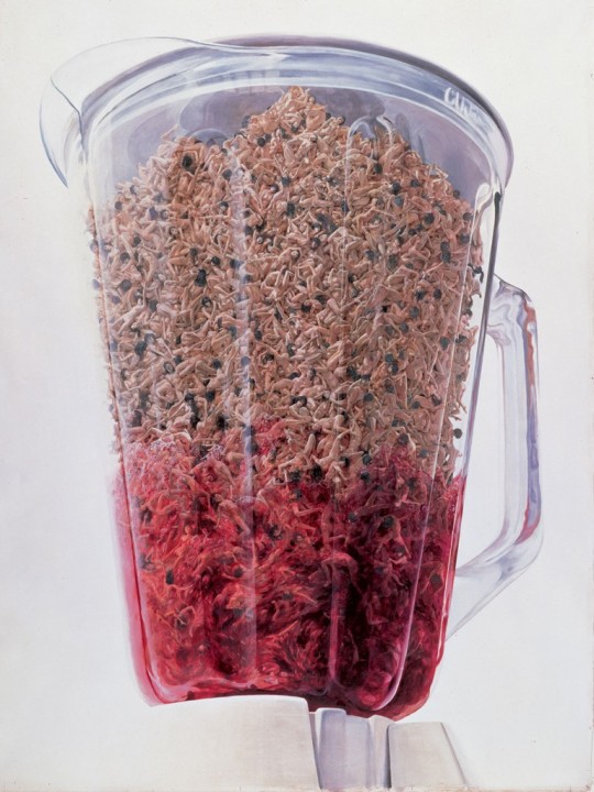


Mokato Aida, “Blender”, 2001, Acrylic on canvas
72K notes
·
View notes
Photo
Source: ^^^
Date: Febuary 7th 2015
Critique: Valentines Day is seemingly around the corner, for some, a miserable time, but looking through some of tumblers’ valentines day cards, its hard to not have a smile on your face. The first link is where I have gotten inspired to make my own humorous Valentines Day card. The Harry Potter collection of cards kills me, my favorite the composition with the great Dumbledore on it. It seems this quick Photoshop made card was the intention of its maker, as this is trending design on the Internet. I am hoping to convey a comedic message using this style when designing one for my boyfriend this month using the newly leaked Photoshop image of Kanye West kissing Kanye. Although taking it one step further, I plan on paying more attention making the card more eye pleasing by enhancing the typography and making sure the image is as crisp as possible.


Valentines day is coming
466 notes
·
View notes
Text
Unique Website Design
Source: http://www.pizzaslime.com/page/2
Date: February 4th, 2015
Critique:
I came across this fantastic website through a friend of mine as he showed me his iPhone wallpaper consisted of the word “butthole” all over the screen in a vibrant, saturated type repeated throughout the composition. I found it hilarious and decided to check out what the website and their art and design was all about. The website background to no surprise is a toilet behind a pink background that looks like an old-school desktop. Each post is an opened window on notepad and offers links to trending songs, humorous videos, and hilarious, mindboggling photos. I believe the overall website design is quite clever, as each folder on the homepage (desktop) is a page in the website. It gets better, the STORE on the website offers apparel that is extremely hilarious on hoodies, shirts and accessories; this is a company I could see myself working for, awesome!

0 notes
Text

Source:
Date: February 6th, 2015
Critique:
I have been longing to get a tattoo, although the dedication can generally talk me out of things. Doing research on tumblr I have come to the conclusion I would benefit from creating a sort of geometric design with a floral touch. Mandela’s are what I was first drawn too, radial designs appeal greatly to me and I could incorporate a geometric appeal to it while including a floral composition. Here are a few images of a recently discovered artists work that inspires me to create my own design. Sara Herzdame from Berlin, Germany was the first I came across when strolling through tumblr. The tattoos are exceptional; she has a certain clean style that is simplistic yet detailed, mastering pointillism. Floral design and art reminds me of positivity, beauty, and nature, and she depicts this magnificently as a triangular geometric frame surrounds the first tattoo. Her work will make you want to start sketching for your next tattoo appointment.

1 note
·
View note
Text
Ken Lye; Sculptor

Source:
http://www.stumbleupon.com/su/3Ic5KQ/1P$YLTyOq:l8eM+IIF/www.thisiscolossal.com/2013/04/three-dimensional-animals-painted-in-layers-of-resin-by-keng-lye/
Date: Febuary 5th, 2015
Critique: All it could take are a few simple tools and materials to make an object seem alive. An artist I had stumbled upon named Ken Lye is the master of sculpture using simply paint and resin. He is the master of perspective as these fish seem life-like. Lye is from Singapore and had acquired the technique from a Japanese artist Riusuke Fukahori that had painted compositions of aquatic life. Although Ken Lye has taken things further and formulated the paintings into real life giving them a new level of dimension. He had started with flat illustrations but wanted to do more with his work he states: “This year, I started on the octopus and it was purely an experiment; I just wanted to see whether I could push this technique to a higher level”. The sculpture I find the most incredible and realistic is the collection of orange fish. How it could even be a painting, the shadows bringing the fish out to life, incredible. The colors he chooses for the details in each sculpture is almost identical to the ones on a real life fish. Even the blue fish in the bowl has an abundance of cool colors radiating out. My question is, how did he create the look of water? Id love to meet the artist one day.

1 note
·
View note
Text

Source:
http://www.stumbleupon.com/su/1bmGzE/rxk0Tpi4:ns+xcGAk/www.shredesign.com/artworks/unbelivable-zaria-forman-artworks
Date: February 4th, 2015
Critique: An artist that takes finger painting to a next level, Zaria Forman, an artist from Switzerland paints incredible large-scale compositions entirely by delicately using her finger for each gentle tint and tone. At first I had thought she used paint, but as I look closely at each image, I believe she is really using some sort of pastel medium. Her work is striking, as it looks extremely realistic, almost like blown up photographs. I am wondering how long a piece would take to finish; my guess is it is extremely time consuming as each stroke needs to be perfected to look realistic. It is said Zaria had become in love and inspired to create these compositions through travel with her parents through worlds most remote and remarkable landscapes. Her mother also has a background in fine out photography, which had introduced her to certain ways one can capture these beauties. My most favorite piece is the ice glaciers that seem to look the most realistic to me. If you click on the source, you are able to see her process as she carefully dabs on cool colors and shades of blue and grey, and you begin to see the piece come more and more to life. The highlights and shadows are extremely believable and you get the beauty and sense of the ice cold glaciers. Incredible talent this girl has!

1 note
·
View note
Text
THINK

Source: http://www.stumbleupon.com/su/1zhmLJ/1CR4dFywu:npJ7we8R/www.filmsforaction.org/articles/25-thoughtprovoking-pieces-from-a-prizewinning-polish-cartoonist/
Date: February 1st, 2015
Critique:
Bringing it to the theme of Cartoon, I have discovered a wonderful Polish Artist that bases his style to the comic theme. His work has won many awards for communicating strong messages without any type. Pawel Kuczynski is a cartoonist who creates scenes and compositions that make us think strongly about the world in which surrounds us. I am generally not a fan of cartoons other then The Walking Dead and an occasional Archie read, the problem is I seemingly get impatient with reading and too focused on the illustration. The piece I admire most are the political pieces that basically say its all garbage. Everything in which the Politicians speak are lies and false hope that Pawel had translated into WASTE. His work will be extremely inspiring for me as it is simplistic and clean work, yet conveys extreme messages about the issues in society and the world.

0 notes
Text
Source:
http://www.stumbleupon.com/su/6dQW1W/evicFlah:flKn5lC6/www.mnn.com/lifestyle/eco-tourism/stories/too-beautiful-to-be-real-16-surreal-landscapes-found-on-earth
Date: February 1st, 2015
Critique:
The world we live in is striking in ways that can seem sometimes unreal. Most are drawn to big cities where there are more than a hundred skyscrapers and attractions, but I believe the cities with the history and nature our ancestors have worked hard to preserve that are still around to this day are hidden for the true explorers to find. Coming from a webpage containing a collection of photos by various photographers capturing landscapes that seem out of this world. I have selected 3 images that had interested me among the rest.

The first one I found most fascinating was taken in Arizona, United States, a bigger city yes, but amongst is lies a nature phenomenon called The Wave. This one is incredible with the warm (red, orange and yellow) tones, and the exceptional curving lines making the compositions appearance surreal.

The second automatically struck me as a painting. Its beauty lies in Cappadocia, Anatolia, Turkey. Almost reminding me of the animated mountains in Disney’s Frozen, the curve like mountains with the sunset hitting certain parts is astonishing. In this composition, the colorful hot air balloon adds a vibrant, radiant touch as it sours through the splendor of Caooadoccia

Now moving to a different region, The image from Leshan, China depicts a Giant Buddha (which so happens to be the name of this wonder). Its size is quite powerful, but what I admire most is the fact that the vegetation is growing around and partially over it. Providing this composition with a peaceful, vibrant appeal, it drives me to travel and feel its energy.
The last is from Klevan, Ukraine in spite of Valentines Day coming around this month. Name: Tunnel of Love.
0 notes
Text
Moleskin Creations


Source:
http://www.stumbleupon.com/su/A8b4Vj/Rb6@g464:qSkiTc0w/www.mymodernmet.com/profiles/blogs/kerby-rosanes-sketchy-stories-moleskine
Date: January 23rd, 2015
Critique:
Wonderful talent from the Philepeanes, illustrator Kerby Rosanes had taken over Moleskin sketchbooks with his lively doodles. His blog called ‘Sketchy Stories’ shows his beautiful doodles in this tiny sketchbook. The detail is what I find the most astonishing part of it all as he is able to generate a doodle that explodes as soon as your eye us on it. Many of his illustrations are composed of hundreds of other tiny illustrations that build up the greater image. If you were wondering, Rosanes uses a few different sized Uni Pin to get the tiny details in each black and white composition. What I admire most about this artists work is he has so much detail all over the two pages; the eye can wander and stumble upon subject-to-subject, discovering different characters and schemes. The piece that appeals most to me is the ship and the lion compositions, although the lion in my opinion is extremely realistic in comparison to the ship illustration. The fierce lion stares out from the page, its mane made up of random objects (too many to describe) but what I noticed was the animated mane apposed to the realistic face of the dragon. In the sailing piece, the drawing is set entirely on the theme of being on water; the fish, waves and splashes go along with the greater image of the ship. One last aspect of his work id like to praise is the cleanliness of his stroke throughout both compositions. The question is did he had plan out the entire piece or if he really was just sketching away, he is a true illustrator.
0 notes
Text
Illustrative Dad
Source:
http://www.stumbleupon.com/su/1AF0hY/D+7hqFq_:noOCB_P5/news.distractify.com/pinar/coloring-like-a-great-dad/
Date: January 20th, 2015
Critique:
Couple posts ago I looked into the loveliest mom on the planet as she turned her kids lunch bags into an art project. Luckily enough, I have stumbled across a father who had turned his kids drawings into beautiful pencil crayon sketches. Artist Fred Giovannitti whom us currently a tattoo artist at ‘Tatlantis’ brought three artists to this world; Sophia(8), Jaxton(5) and Fredrico(9). Every time he would receive a drawing from his sons or daughter, he would be thrilled and inspired to use them further considering his creative side. Children’s drawings can be seen as humorous as it is almost impossible a child of 10 can draw portraits like Michelangelo, the proportions always seem a bit off, and the subjects are generally monsters, people, or landscapes that hold a strong importance to their emotions. What this father did was exceptional because he made each one of these drawings have a greater importance to himself and his work. It seems Giovannitti uses pencil crayon as his medium and is able to keep the drawings looking exciting, youthful and eye pleasing. The piece that stood out to me the most was Sofias drawing of the ‘prom winner’. I am in love how he brought out the childish way of drawing and with color, enhanced the facial features and atmosphere of the comical prom queen. Lovely idea to enhance beauty and meaning to a piece.

1 note
·
View note
Text

Source:
http://www.stumbleupon.com/su/6so9TB/bXyCh9c:h12Z2NGj/www.shockingdaily.com/polish-artist-creates-surreal-paintings-of-dream-like-worlds/
Date: January 20th, 2015
Critique:
I’ve had a surreal experience in regards to this polish surrealist artist Jacek Yerka. His work had been inspired by Dutch tablet paintings while growing up was raised by two artists, its easy to see where his talent had come from. When I was studying a year in Poznan, Poland I had met a friend that had known this artists daughter, apparently gone to middle school with her. She had asked her friend through Facebook if this artist was her father and if there was a possibility of meeting him. It turned out he was the famous Jacek Yerka although the meeting never fell through; I would have definitely gone to meet this extraordinary artist. His work is quite exceptional as he categorizes his paintings as; creatures, imaginary landscapes and four siders. If you’re wondering what four siders are, he claims “These paintings are specials of specials. They show not one world but four and you can hang them on each side and each way will fit perfectly. The 4-siders are perfect for jigsaw puzzles and you can see them on several puzzle boxes available in special stores.” Its extremely strange yet satisfying, I have never seen any other art like this before other then works of Dali, it is extremely realistic and detailed yet completely imagined. My most favored painting of these ‘specials’ collection is the one titled ‘seasons’, accurately depicting the beauty in the changes throughout the year. The composition has beautiful logical colors that are categorized around each season home. The subject is ordinary but the compositional elements in which each season is on each wall opposite of one another works well
0 notes
Text
Greatest Mom draws lunch bag art for her kids!


Source: http://www.stumbleupon.com/su/1IZVlk/DmXyal57:fjUvoOjV/news.distractify.com/avril-simmons/talented-mom-draws-amazing-lunch-bag-art/
Date: January 15th, 2015
Critique:
This right here Is the goal in which I want to obtain as a mother, how cute are each and every one of these lunch bags kids bring to school. Although it seems this mom has loads of time on her hands, each bag, weather it’s a Disney character just a simple typographic design, her work on the bags are clean, lively and energetic. Her kids are some lucky ones that get a lovely surprise every morning after breakfast, with positive messages and desired characters, everyday leaving the house feeling positive and ready for school. My favored bags are the ‘schools out, summers here’ bag, and the lovely bird design with Noah’s (probably her sons) name. The colors she had chosen for the birds are beautiful and warm, along with the textured simplistic scheme. The summer bags are lovely in the aspect of typography, on the left, the bag has a vintage style type, and the one to the right is very childish, bright and lively. Each and every crayon colored bag is a perfect way to communicate positivity to children’s lives.
0 notes