
Statistics
We looked inside some of the posts by k00282801 and here's what we found interesting.
Average Info
Notes Per Post
79
Likes Per Post
79
Reblog Per Post
0
Reply Per Post
0
Time Between Posts
2 days
Number of Posts By Type
Text
17
Last Seen Tumblr Blogs


Fun Fact
Tumblr is used by 21% of adults online aged 18-29 years.
Text
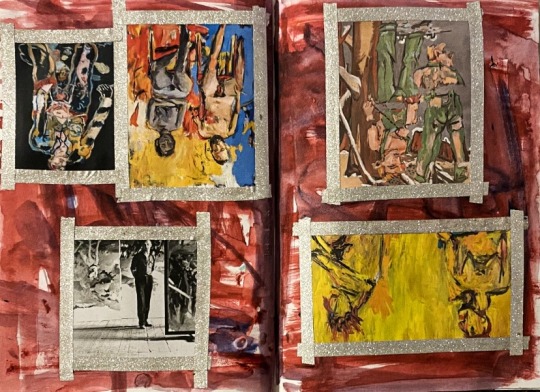
Painting : Life Painting
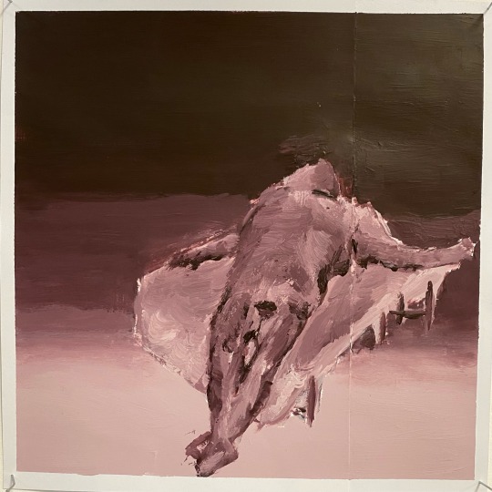
Here I created a life painting depicting a model that was placed in front of me.
I first created an under painting which locked the paint in place and filled the gaps. After this dried I started to blend the background and paint in the model.
Overall, I was quite unsatisfied with how the painting turned out. It’s very smudgy and clearly unfinished in some places. I believe I spent a large amount of time in certain places which made the piece look quite rushed.
Although I was unhappy, creating this painting was a learning exercise and is something I can definitely try to improve and work on in the future.
10 notes
·
View notes
Text
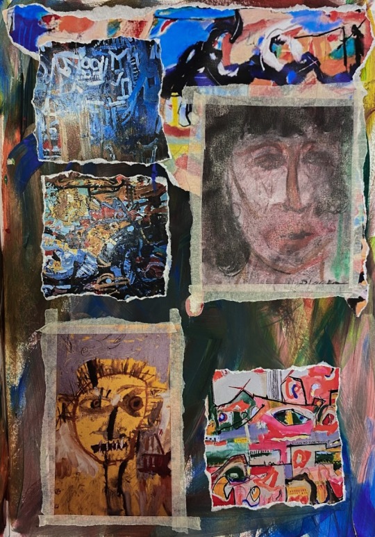
Painting : Final Exhibition & Statement
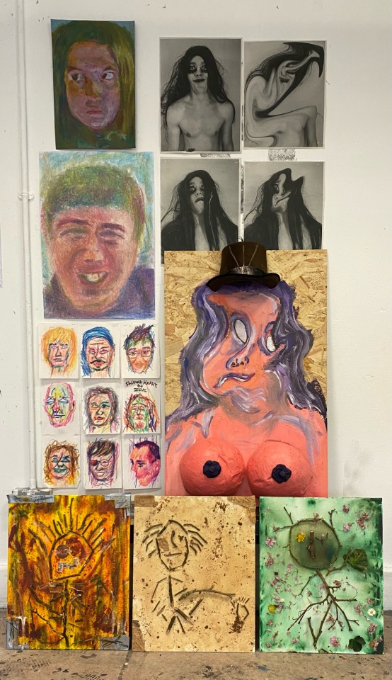
Here is my final first year painting exhibition. My experience with painting was very enjoyable and fascinating. The concept of our final project was portraits and was what we would work with for the last four weeks of the year
I was quite satisfied with this concept as a large amount of my work consists of working with people and creating portraits.
However, I wanted to pieces that were very distinct from one another. I achieved this by using different mediums, materials and a variety of colours.
I went into this project with a cross-disciplinary mindset as I wanted to bring in aspects and ideas from disciplines other than paint such as print and photography. This allowed me to further develop and evolve my painting and portrait project.
When taking a photograph of someone it is easy to show exactly what they wear, how they look, facial features, hair etc
With the art I create I want to show what isn’t there, while also displaying the overall shape and essence of the person. Instead of using basic colours to make traditional looking portraits, I like to use vivid and graphic colours and materials. This allows me to make them look almost unnatural and non humanlike.
Overall, I am very satisfied with the work I created over these four weeks. I was able to successfully display my own art style while also discovering new techniques and methods of creating artwork.
4 notes
·
View notes
Text
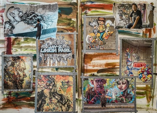
Painting : Portrait Project Artist Research Adam Neate
Adam Neate is a British artist known for playing with perspective in his multi-dimensional collages.
With notable influences from Francis Bacon and from Pablo Picasso, his practice combines street art techniques and materials with traditional methods of mark-making and construction. His work can have two and three-dimensional qualities, as he tears the material, builds it in layers and staples pieces together, mainly making figurative images, which include self-portraits and portraits of friends.
I find his work extremely fascinating as I also enjoy creating 3-dimensional pieces using found objects and materials.
Neate has expressed that “the whole point of being an artist is to be creative and to create, to invent new ways of seeing and showing the world.” I completely agree with this statement as that is how I view art and how and why I believe art should be created.
0 notes
Text
Painting : Portrait Project Artist Research George Baselitz
George Baselitz is a German painter, graphic artist and sculptor. In the 1960s he became very well known for his expressive and figurative paintings.
In 1969 he began to paint his subjects upside down in an effort to overcome the content-driven character of his earlier works and to emphasise surface rather than subject matter.
I admire his use of colour and find his technique extremely fascinating as he creates what he feels rather than what he knows which plays a large role in the artwork I create.
2 notes
·
View notes
Text
Painting : Portrait Project Artist Research Jean-Michel Basquiat
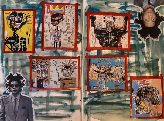
Jean-Michael Basquiat was an American Artist part of the Neo-expressionism movement during the 1980s.
Basquiat’s artwork variously features scribbling, enigmatic symbols, diagrams and iconography such as skulls, masks, and the artist’s trademark crown.
I see a strong resemblance between his work and my own work due to both our uses of primitivism. Primitivism, also practiced by Pablo Picasso was a matter of white culture emulating the products of non-white culture. The portrait pieces I created using sticks were strongly inspired by primitive and tribal art, similar to basquiat’s.
I highly admire basquiat’s work due to his strong use and application of colour, and how he creates what he feels which plays a large role in the work I create.


0 notes
Text
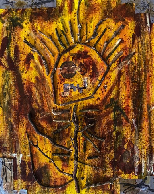
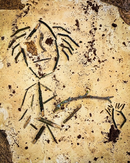
Painting : Portrait Project Tribal Portrait Pieces

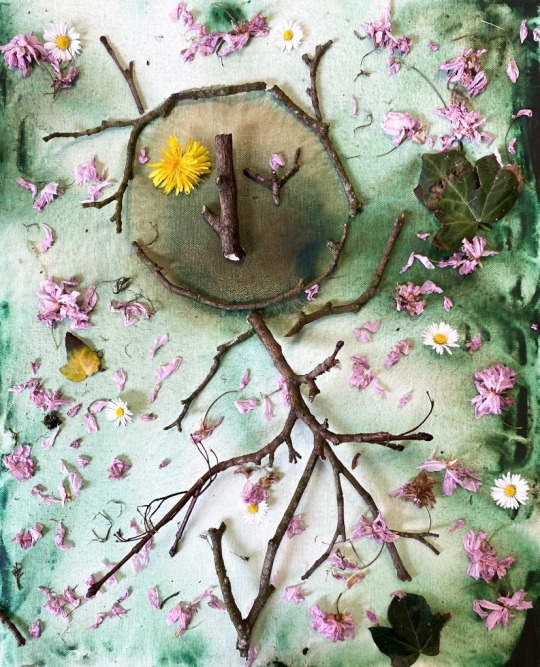
Here I created three primitive and tribal inspired portrait pieces on canvas using sticks and other materials.
In the first piece I used tones of yellow, orange, red and green to create a raw and unsettling background. Over this I used sticks I had gathered. I broke these sticks into smaller pieces and placed them where I felt necessary to create the image I had in mind. I used pieces of cut up duct tape to create a mouth shape. These pieces were also stuck to the corners of the canvas.
In the second piece I utilised wet tea bags to create a brown tone and then cut the bags open to spread the tea particles in various places to create a dirt look. Again, Over this I used sticks I had gathered and placed them where I felt was necessary. I then placed the empty tea bags on the corners of the canvas.
In the third piece I used tones of green and brown to create the background. However, I was quite unsatisfied with its look so I decided to wash it off with water. As I was doing this, it started to create a cloudy and raw look which I was very attracted to. I let this dry over the weekend and then proceeded to place broken up sticks I had gathered. I wanted to make this piece somewhat different from the previous two portraits so I decided to surround the figure with daisies, cherry blossoms and leaves. I also placed a dandelion on the face to create the look of an eye.
Overall, I am very satisfied with how these pieces came out. To me portraits do not necessarily have to depict people and I believe I was able to successfully achieve this.
1 note
·
View note
Text
Painting : Portrait Project Interpretive Marker Portraits
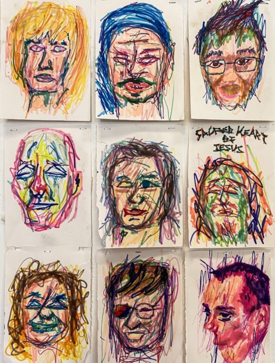
Here I created a number of interpretive portraits using marker depicting images of people I know.
These pieces were quickly made as I only wanted to give the overall shape and essence of the face and not worry about specific details and tonal values.
The markers allowed me to create quick and brash mark makings.
I thoroughly enjoy using vivid colours in the work I create and the markers allowed me to achieve this.
I created a disturbing and eerie look in the portraits as I wanted to display my own interpretation and style of these images.
2 notes
·
View notes
Text
Painting : Portrait Project Chalk Pastel Portrait
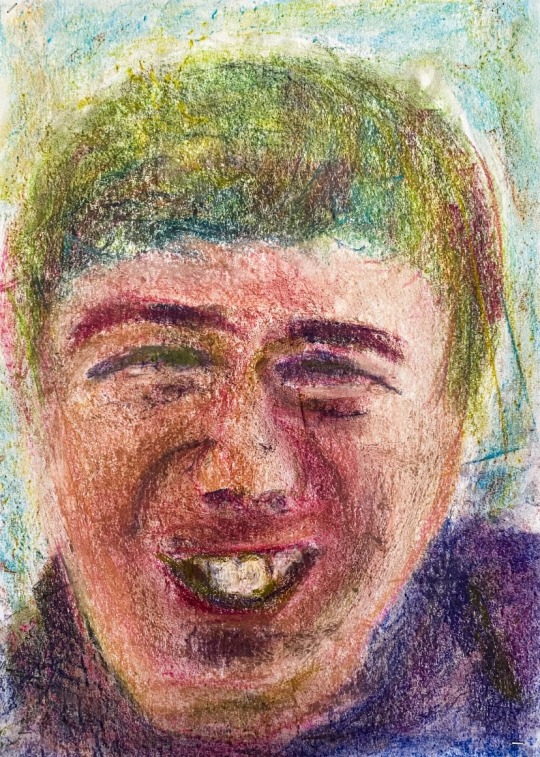
Here I created a portrait piece using chalk pastels depicting a friend of mine.
I chose to use chalk pastels as they give me a large amount of creative freedom.
The chalk pastels allowed me to create a colourful and vibrant depiction and interpretation of this image.
I enjoy using this medium as I am able to create what I feel and see instead of what I know.
This allowed me to further develop my portrait project.
3 notes
·
View notes
Text
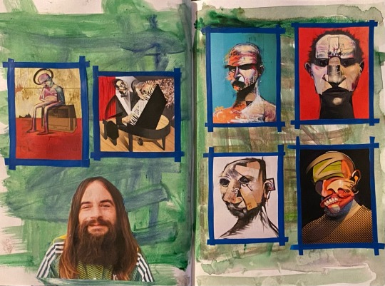
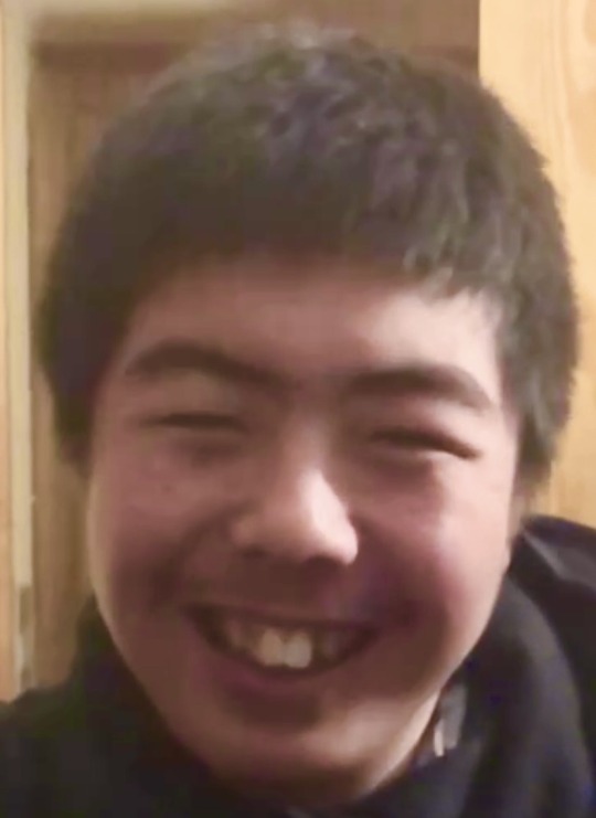
Painting : Portrait Project Interpretive Portrait
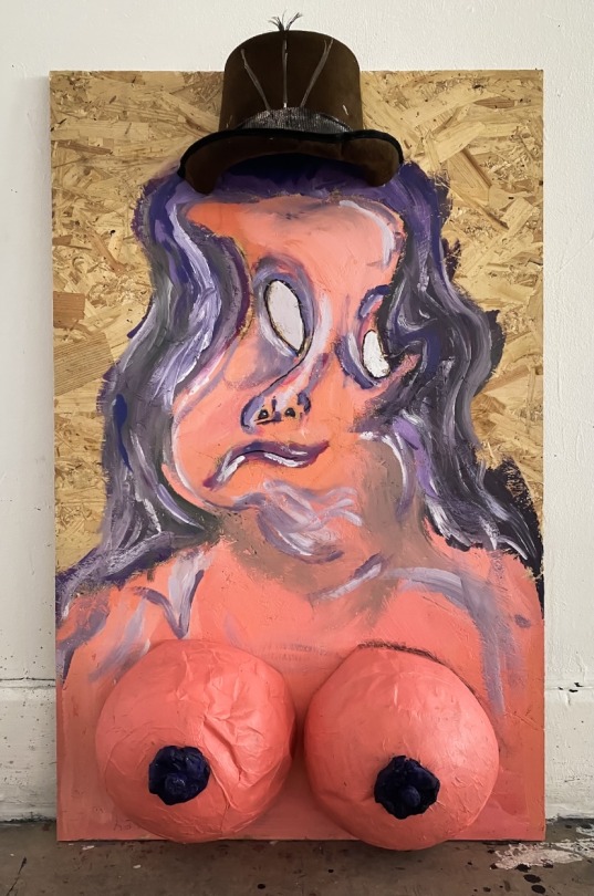
Here I created an interpretative portrait based on images I took of my brother which I later warped. Going into this piece I wanted to combine elements of both painting and sculpture.
I chose to create this piece using a wooden board as I wanted to make work that departs from the use of paper. The texture and look of the wooden board is quite attractive to me as it blends very well with the paint.
I didn’t want to spend an excessive amount of time painting the main subject. This was because I wanted to give a fluid and warped look to the piece instead of focusing on specific tonal details.
I chose to create the piece using only purple and pink tones as I wanted to make the piece vibrant but not too cluttered and take the attention away from what I wanted to convey.
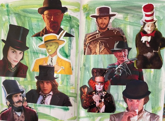
I used a hat from home which I then cut in half to attach the the board.
I wanted to give the portrait an exaggerated look so I created two large breast pieces using a paper maché technique. This was done by attaching strips of newspaper to blown up balloons using wallpaper glue.
Overall I was quite satisfied with the finished piece as I successfully created the idea I had in mind.
Below was inspiration for the hat concept. This includes characters from film and television that wear a trademark hat.
1 note
·
View note
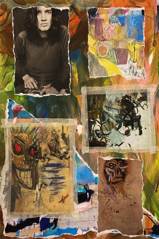
Text
Painting : Portrait Project Artist Research David Choe
David Choe is an American artist, known for his fine art work which has garnered admiration and respect all over the world and in many institutions.
His figurative paintings, explore themes of exaltation, degradation and desire and are characterised by a raw and frantic method that he has called "dirty style."
I strongly admire Choe’s work due to his vibrant, and bright use of colour which reflects the art that I create. I respect how he displays real world problems using his own unique style of art and how he doesn’t only produce what he see’s but what he feels which is how I look at my own work.
4 notes
·
View notes
Text
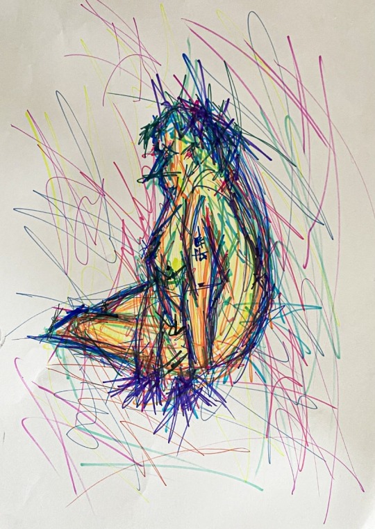
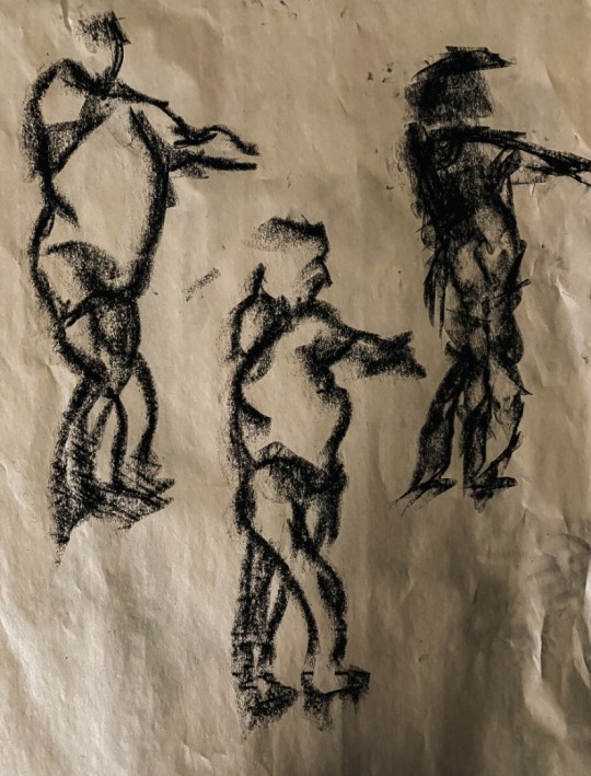
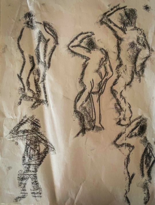
Painting : Life Drawing
30 MINUTE DRAWINGS :
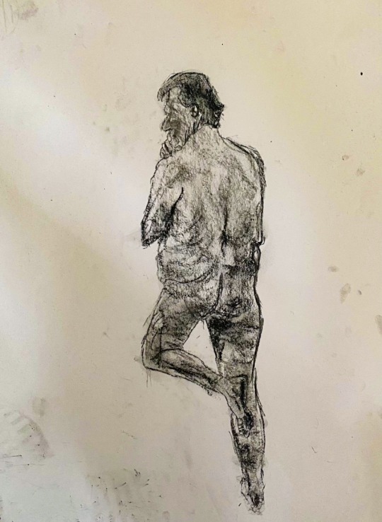
👆🏼(This was created using the first 10 minutes to correct the overall shape and composition)
30 SECOND DRAWINGS :
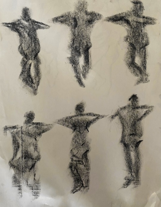
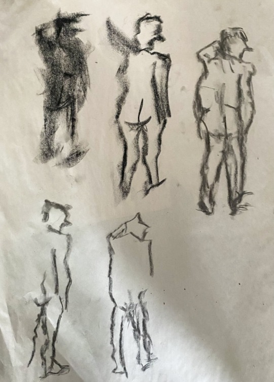
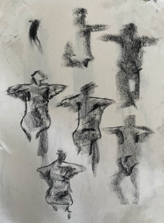
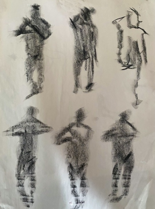
Here I created a number of life drawing depicting a model that was placed in front of me.
First I was given 30 seconds to draw the model multiple times in two different poses. I found this quite difficult, however, as time went on I became more confident and allowed myself to experiment with different mark making techniques.
Then I was given 30 minutes minutes to draw the model twice displaying the two different poses. I thoroughly enjoyed this exercise as I was given enough time to fully correct the composition and overall shape of the model. This also allowed me to experiment with markers. The first time I spent around 10 minutes correcting the shape and composition of the model and then used the remaining 20 minutes creating the main drawing. The second 30 minutes I created the model using markers. This allowed me to utilise my own style of drawing as well as a medium I enjoy working with. I was quite satisfied with the outcome as it not only made the drawings pleasant to look at but gave them a unique and distinct look.
5 notes
·
View notes


Text
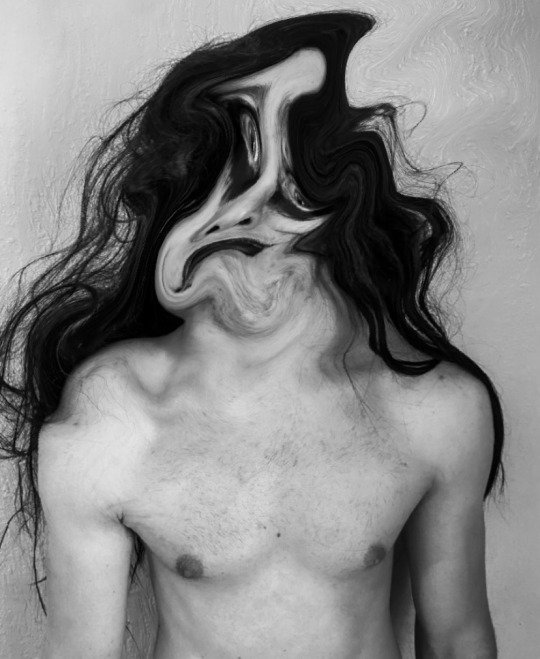
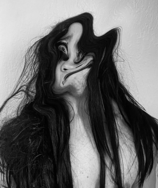
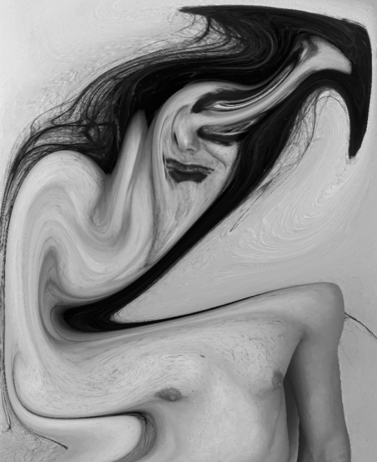
Painting :Portrait Project Mark Makings over Photographs
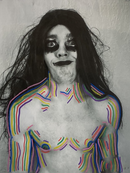
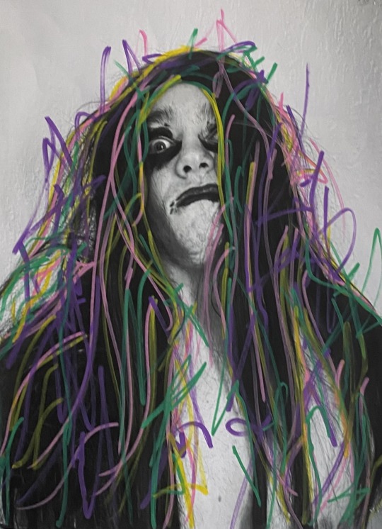
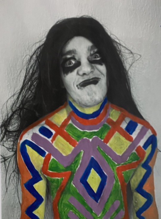
Here I created mark makings over images I took depicting my brother wearing black, gothic make-up and a long black wig.
This allowed me to bring both elements of photography, painting and print into my portrait project.
In the first piece I used posca markers to create subtle and colourful mark makings. I am quite satisfied with how this turned out as both the image and the colours balance out well with each other.
In the second piece I used posca markers again. This was to create more energetic and violent mark makings which highly contrast from the first image.
In the third piece I used paint. This was to create a tribal like design on the figure. I was quite satisfied with this piece as the colours and patterns work quite well with the image overall. This is due to how the dark nature of the photograph and bright colours successfully compliment each other.
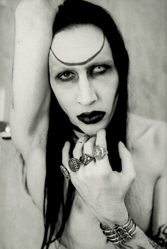
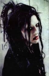
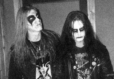
This concept was largely inspired by gothic, metal and alternative looks and ideas worn by artists such as Marilyn Manson, Twiggy Ramirez and Mayhem.
11 notes
·
View notes
Text
Painting : Portrait Project Artist Research John Frusciante
John Frusciante is an American musician and artist most known as the guitarist for the alternative band The Red Hot Chili Peppers.
In the 1990s, during a period spent away from the chili peppers and the public eye, John created quite a number of fascinating paintings which were later photographed during the late ninetees.
John created abstract artworks using paint, chalk pastels, and oil pastels.
I find his work very interesting as he created whatever came to his mind almost inviting the viewer in.
I believe his portraits are quite similar to my own as the figure is created using his own unique style, giving an eerie and disturbing feeling to pieces.
3 notes
·
View notes
Text
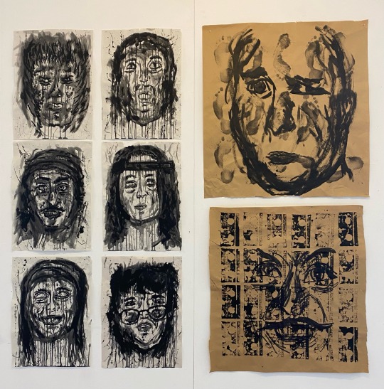
Painting Week II : Interpretive Portraits
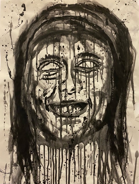
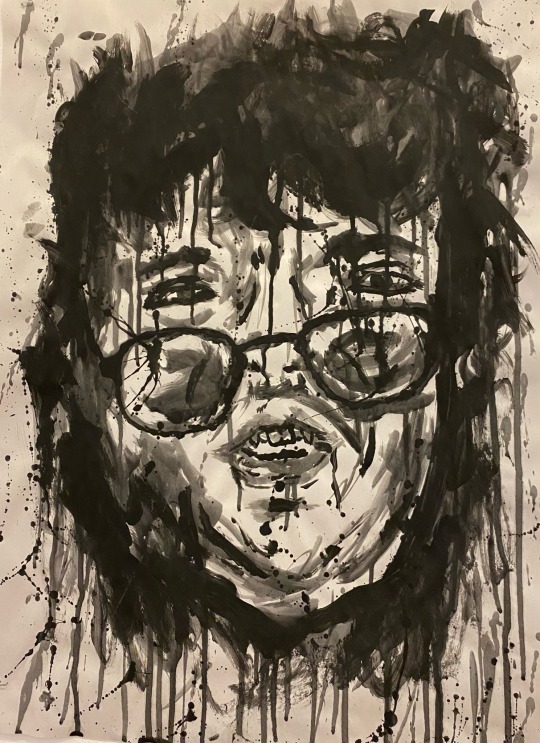
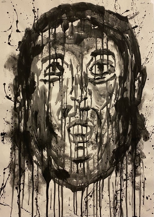
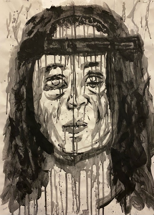
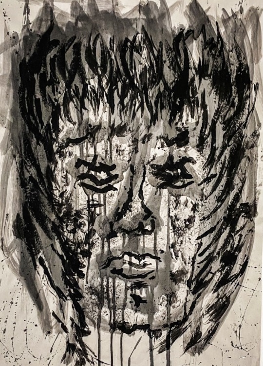
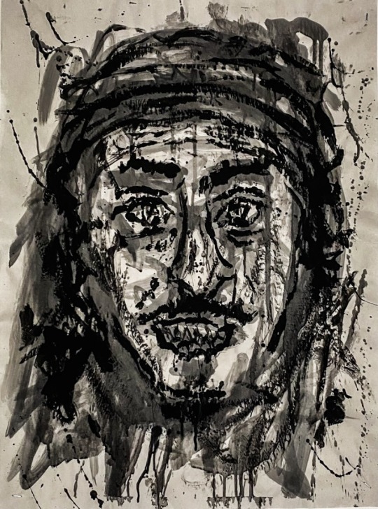
Here I created a number of interpretive portrait paintings depicting people I know.
I painted these using black ink/paint and a flat head brush. First I created an under painting using the black paint mixed with water as I wanted to get the overall essence and shape of the faces. After this dried, I painted in the more finer details using thicker paint without the water.
I wanted to give a disturbing and eerie look to the pieces so the black paint worked out quite well. I didn’t spend to long on these as I wanted to create as many as I could in the time I gave myself.
11 notes
·
View notes
Text
Painting Week II : Life Painting

Here I created a life painting depicting a model that was placed in front of me laying on a plinth.
First I mixed four different colours, Red, Blue, Yellow and White. This created three tones, a light tone, middle tone and dark tone.
Next I created an under painting using the three tones. This created the overall shape and structure of the piece, displaying the foreground, middleground and background
I was quite satisfied with the finished piece as I noticed I had improved since my last life painting and fixed errors I made the previous time.
I believe I should of made the plinth look a little smother, to contrast with the figure because to me they blend in too much with each other.
6 notes
·
View notes
Text
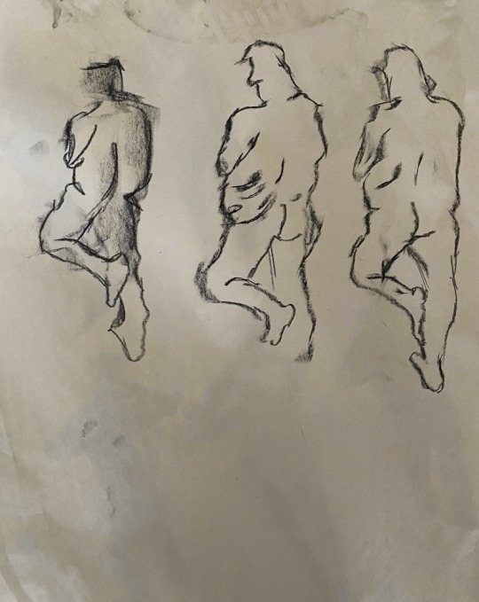
Painting Week II : Life Drawing
10 Minute Drawings
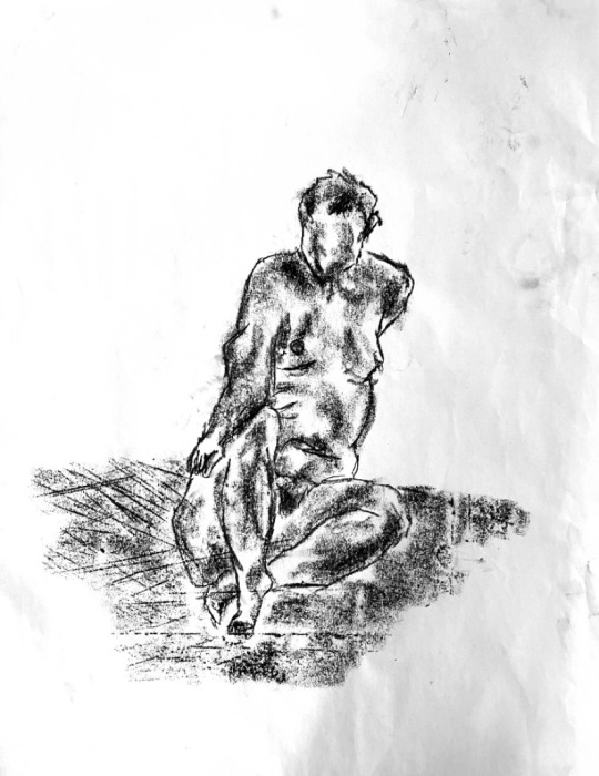
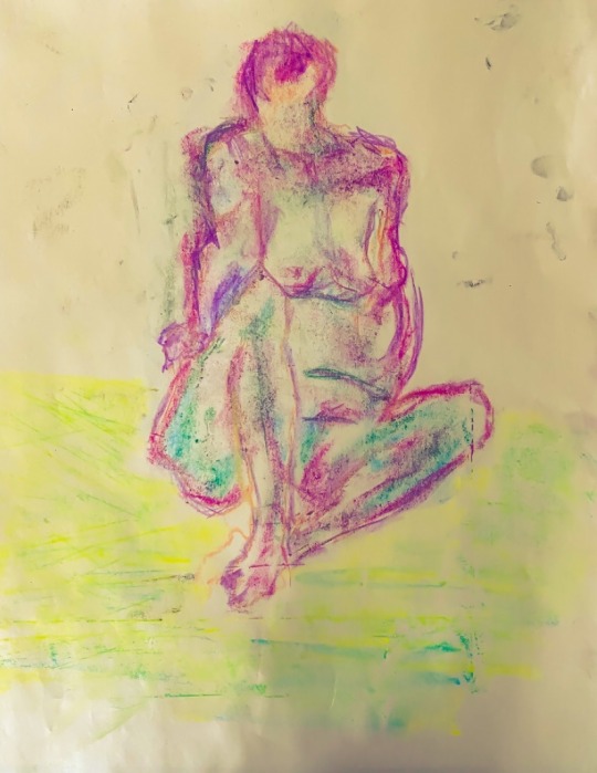
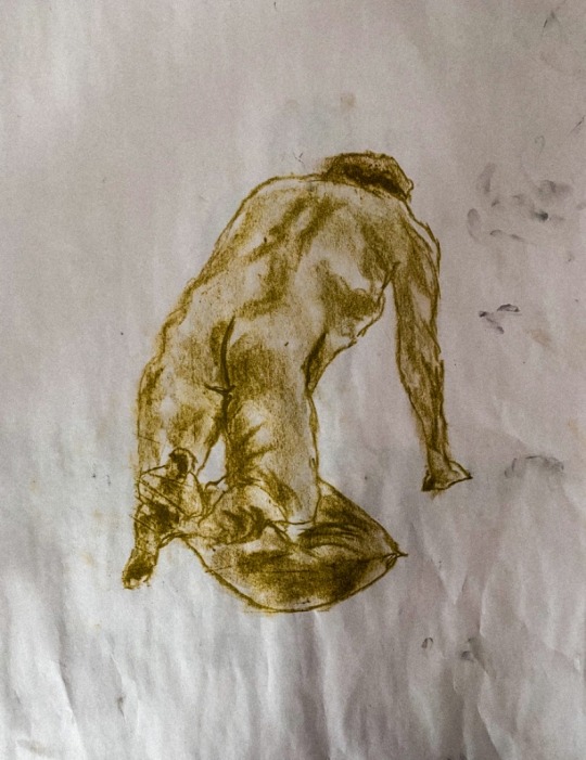
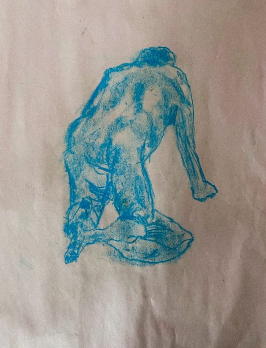
30 Second Drawings
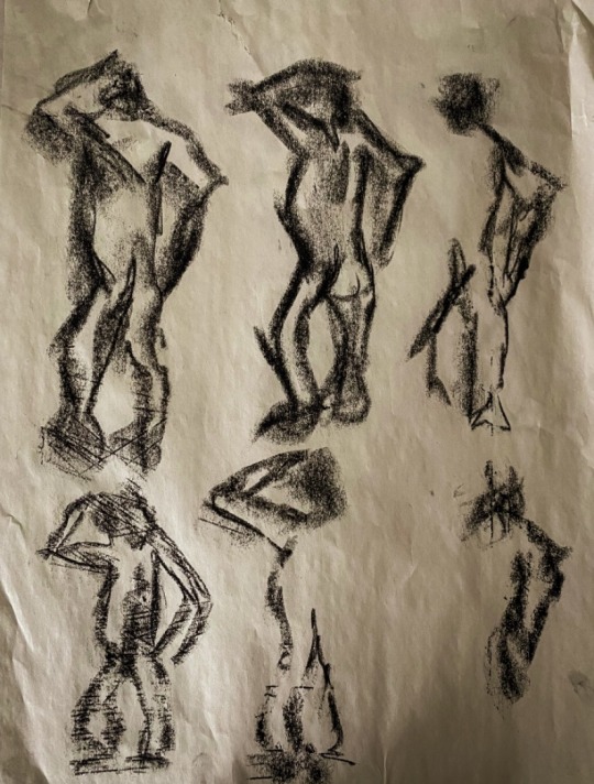
Here I created a number of life drawing depicting a model that was placed in front of me.
First I was given 30 seconds to draw the model multiple times in two different poses. I found this quite difficult, however, as time went on I became more confident and allowed myself to experiment with different mark making techniques.
Then I was given 20 minutes to draw the model twice displaying the same pose. I thoroughly enjoyed this exercise as I was given enough time to fully correct the composition and overall shape of the model. This also allowed me to experiment with chalk pastels. The second time I drew the model displaying the first pose, I utilised purple, pink, green blue, and orange pastels. This gave the drawing a strong vibrancy and contrast from the previous drawings. Both the first and second time I drew the model displaying the second pose, I utilised one colour which was a jungle green and a light blue. I was quite satisfied with the outcome as it not only made the drawings pleasant to look at but gave them a unique and distinct look.
12 notes
·
View notes