
Graphic Design Communication (The One Minute Festival)
Don't wanna be here? Send us removal request.
Statistics
We looked inside some of the posts by k00288088 and here's what we found interesting.
Average Info
Notes Per Post
26
Likes Per Post
26
Reblog Per Post
0
Reply Per Post
0
Time Between Posts
2 days
Number of Posts By Type
Text
17
Last Seen Tumblr Blogs


Fun Fact
The average Tumblr user visits about 67 pages every month.
Text
Final folder
Here are all the collected works I've been working on for the last few weeks for the discipline of graphic design communication. It was a very busy period during which I learned a lot, which was a very valuable experience. Despite a lot of work, I enjoyed new challenges.
7 notes
·
View notes
Text
Another poster proposal for The One Minute Film Festival
25/04/2023
Since I finished the final version of my poster early, Sharon recommended that I make another version and practice my skills in Adobe Illustrator again. That is second version for The One Minute Film Festival:

My second choice turned out to be an idea with a play on words - "short 🩳" as a Short Film Festival. This is a reference to the 60-second films shown at the festival. On the right side of the poster there is the original Polish logo of the festival. Here is the original design idea:

Since the Festival already exists and I am recreating a poster, I decided not to change the original name of the festival, which is "The One Minute Film Festival".
As for the process of working on this version, I decided not to change the arrangement of the illustration and the inscription, because it is the most optimal in this version. The shorts icon was created by me, which I am particularly pleased with. When it comes to the choice of font, the choice fell on sans serif, modernist - Calibri. I thought about the colors of the work for a long time, here are some examples of colors that I considered:

Pastel blue was my final choice. In the final phase I was wondering how I could add character to this version, because the idea itself is film strips, I also got a color reflection, thanks to which the tapes seem more vintage.
In conclusion, I'm happy with the result, I think that the digital design is much better than the analog one, which I'm delighted about because I'm still learning Adobe Illustrator tools.
1 note
·
View note
Text
The final festival poster

24/04/2023
Here is the final result of my poster for polish version - The One Minute Film Festival.
The last stage of the work was printing a poster on A2 format:

As expected, the color in the printout turned out much paler than in the original file. However, despite this, I am happy with my final effect. I believe that I managed to keep the clarity and simplicity of my original idea. I believe that the reference to the Polish School of Posters as my main inspiration is clearly visible here.
1 note
·
View note
Text
Research
Julian Pałka
Born on January 20, 1923 in Poznań, died on June 20, 2002 in Warsaw. Graphic artist. He studied in the years 1945 - 1951 at the Warsaw Academy of Fine Arts, where he graduated in 1952. He was the rector of the Academy of Fine Arts three times, 1972 - 1980. He specialized in applied graphics. He created, among others posters for the films "Comedians" (1953) and "Rome 11 o'clock" (1955). In addition to poster graphics, he dealt with the architecture of exhibition pavilions. He also designed the "Barykada Września" monument in Warsaw's Ochota district. Julian Pałka was a member of the Alliance Graphique Internationale from 1956.

Another artist working in the Polish school of poster art that I decided to be inspired by was Julian Palka. I must admit that the simple forms and colors caught my attention. Subdued, pastel colors and simple forms give his works a unique character.
0 notes
Text
20-21/04/2023
Here is the analog final version of the poster for The One Minute Film Festival, which I chose after feedback.

The next step was to start the project in Adobe Illustrator. Here is the skeleton of my poster. At this stage, I checked and researched the possibility of a version of the layout of the text and illustrations. I have to admit that the original analog version turned out to be the most readable and I liked it the most.

The next step was to find the most optimal font that would suit my idea. I was looking for a modernist font, without the sashes, which would best reflect the simplicity of my poster, and the choice fell on Calibri.

the last stage was the mapping of my idea in the program and the selection of the appropriate colors. In my final idea, the colors were supposed to be sharp, conspicuous. However, when creating my final analog work, I wasn't sure about the background, I wanted to go a different route and choose a more calm, pastel color.
0 notes
Text
Typographic search!
For my poster, I would like to use a simple modernist font that will complete the character of my poster. I decided to use the Calibri sans serif font because it perfectly fits the style of the Polish school of posters and reminds me of the font used by the artist - Ryszard Kajzer.

0 notes
Text
Final work for Anthony Burrill Brief
18/04/2023 part 3
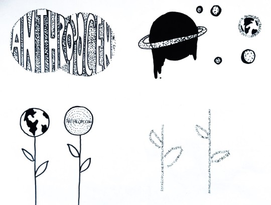
Illustration by Anthony Burill, which I received to work on creating the illustration, inspired by his style and keeping the word given in the Brief - Anthropocene (human impact on the environment).

Here is the final result of my work:

I am satisfied with the results of my work, I think that I managed to preserve the characteristic style of illustration well and show the negative effects of human impact on the environment through the symbol of the earth and withered leaves.
2 notes
·
View notes
Text
Exercise in Adobe Illustrator
18/04/2023
At the beginning of the day, Sharon showed us various features and tools in Adobe Illustrator to help us work on the Anthony Burrill brief. Here is the effect of my fun and learning in this program:

It was an excellent exercise to master the basic functions in Illustrator.
2 notes
·
View notes
Text
Anthony Burrill Brief
17/03/2023 part 2
After feedback, I decided to develop the best ideas, keeping the style of graphics I received at the beginning of the task.


1 note
·
View note
Text
Anthony Burrill Brief
31/03/2023 part 1
Over Easter we received an additional brief. Each of us received different illustrations from the famous artist Anthony Burrill. Our task was to make an illustration based on the one we received. In addition, we were obliged to put the word "Anthropocene" on the illustration. The word implies how humans affect the environment. It was a group project, from which the final result will be a book with illustrations made, which we will give to the artist himself as a gift.
The artist's illustration I received:

At the beginning, I focused on researching the word Anthropocene, therefore I made a mind map with positive and negative effects of human impact on the planet.

Then I focused on making a set of icon sketches:


1 note
·
View note
Text
Propositions for final poster
30/03/2023
Here are some suggestions for The One Minute Film Festival poster based on my earlier selected sketches.


1: The proposal "Do Not Blink" - 1 Min Festival is an extension of my idea that each film at the festival lasts only a minute, it is such a short/fast production as a blink, so don't blink or you will miss the film!
2: The second proposal was to show a vintage camera displaying the inscription "1 MIN", which is an obvious reference to the film.


3: The third proposal was to place the film strip as the main element of the poster.
At the beginning, I made three poster samples with the three best ideas. Then, after the feedback, I made more suggestions of the idea with the slogan "Do Not Blink":


At the end I made suggestions of my other idea using the symbol of shorts as "Short Film Festival".
3 notes
·
View notes
Text
Research
Ryszard Kajzer
Ryszard Kajzer specializes in posters, publishing graphics and drawing, b. Born on February 25, 1973 in Świerczyn near Włocławek. In 1994, he began his studies at the Academy of Fine Arts in Warsaw, graduating with the Rector's distinction in 1999 at the Publishing Graphic Design Studio of prof. Lech Majewski. In the years 1997-99 he was an assistant in the Poster Design Studio of prof. Mieczysław Wasilewski. In the years 2000–06 he was an assistant at the Publishing Graphic Design Studio of prof. Lech Majewski. Winner of numerous awards for his poster work. My most important inspiration is Ryszard Kajzer, an artist working at the Polish School of Posters.

He is an artist belonging to the so-called "Modern Polish School of Posters", due to the dated end of 1999-2000. My particular attention will be drawn to his very simple, yet characteristic of the Polish school of poster style. I would like to focus most on his series of cinematic festival posters. Intense, bright colors, simplified form to the limit, simple sans-serif typography and the transparency and simplicity of the poster itself. These are the characteristics of this series, which made Ryszard Kajzer my most important inspiration. The artist also learned simple forms from excellent artists, in particular Mieczysław Wasilewski, hence the characteristics of the golden years of that period were preserved.
0 notes
Text
Mood board (digital version) for The One Minute Film Festival

28/03/2023
After making the layout earlier, I decided to make the last version of my proposals in Adobe Illustrator.

While creating the mood board, I was still looking for a style in which I would make my final poster. In this case, I decided to use the same color palette that I used for the sketch sets. The main colors are: black, blue, red, orange and yellow, and the secondary colors are pink, violet, gray and white. Starting from the bottom left side of the work, I decided to put the original logo of the Polish version of the festival, because I wanted to focus on this version. My main inspiration is the Polish School of Posters, which is why I selected posters focusing on the simplicity of the message and eye-catching colors. In addition, I added photos of such elements as the vintage camera, which I included in my ideas.
In conclusion, I am satisfied with the end result. Although I would like to keep the look of the poster very clean and simple, I think that the mood board, despite the multitude of elements, reflects the style of my idea, and the elements harmonize with each other.
0 notes
Text
Pages of visuals from brainstorm for The One Minute Film Festival
27/03/2023
Our next task was to make 3 more pages and lead our favorite ideas (from the previous visualization) in other variants. Here are my next three suggestions:

Page 1: I filled out my first page with some of my favorite suggestions. From the upper left corner of the page, I placed a face with an eye, the slogan "do not blink" and a half of the skull with an eye. My main assumption was to emphasize how short the productions shown at the festival are. One minute is like a blink, and in just 1 minute you can tell the whole story. It is worth mentioning that this is a reference to The Polish School of Poster, through a human figure. I was guided by the same idea when creating an old TV set and colored stripes that marked a break in broadcasting. And a movie screen that counts down the minute - this was a reference to the idea from the first series of sketches about the clock. On the upper right corner of the card there is a tape with the number 1440, which means frames that fit in 60 seconds of the film.

Page 2: On my second page, the main idea was a vintage camera and a shadow drawn from it. In my first idea, the shadow made the slogan "1 min", but here I was wondering how I could enrich it. I decided on icons, but I think the original idea was better.

Page 3: On my third page, I was playing with form and icons, I didn't have a specific plan for this page. I placed the time icon, the festival's official logo on the screen, the CD for the pre-festival competition, the film tapes and placed the tapes in the eye.
I think the first page of my ideas turned out to be the most interesting. My next step will be to make a few drawing versions of the poster.
4 notes
·
View notes
Text
Research
Henryk Tomaszewski
Posters by Henryk Tomaszewski, one of the greatest artists in the history of poster art. Henryk Tomaszewski Henryk Tomaszewski (1914-2005) He practiced graphics, posters, drawings, illustrations and exhibitions. He studied painting at the Academy of Fine Arts in Warsaw (1934–1939), graduating in the studio of prof. Mieczysław Kotarbiński. In 1947, he was offered to design posters for Film Polski. At the International Poster Exhibition in Vienna in 1948, five of his posters received first prizes. He collaborated with WAG (Wydawnictwo Artystyczno-Graficzne), CWF (Centrala Wynajmu Filmów), numerous theaters, book publishers and magazines, where he published satirical drawings later published in the album "Książka zażalen", WAG, 1961. In the years 1952-1985 he was a lecturer and professor at the Academy of Fine Arts in Warsaw. From 1958 he belonged to the elite company Aliance Graphique International (AGI). His posters can be found in prestigious galleries around the world, e.g. at the Museum of Modern Art (MoMA) in New York. He won the most important international awards in the field of poster art.

Called the father and founder of the Polish School of Posters. I chose this artist as my inspiration because I think his work is phenomenal. Each poster is an individual approach to the subject, based rather on a simplified form and softer colors. The intelligent use of typography and illustration is what I like the most.
0 notes
Text
Layout for digital mood board version of The One Minute Film Festival

24/03/2023
Here are some of my ideas for making a digital mood-board. My color range is definitely warm tones such as red, orange, yellow and an accent of black. In my layouts, I played with the form, I would like to break the idea of a film poster in dark shades and replace them with color. I am satisfied with the results, the next step will be to create a digital mood-board.
1 note
·
View note
Text
Cocktail mood board
23/03/2023
Our task was to create a mood-board for the previously drawn cocktail name. The only rule was not to use pictures of drinks. My fate was a drink called "Dark and Stormy", here is the result of my first work in Adobe Illustrator:

In addition, we had to create a short document describing the history, origin and ingredients of the drink. This time we could use a photo of the drink.

I must say that due to my lack of experience in this program, creating this map seemed difficult to me. I'm happy with the results because I spent a lot of time learning the tools of the program, but I'm not sure if I managed to convey the feeling of this drink. The classes were very useful and I will use the acquired knowledge in the near future.
3 notes
·
View notes