
Statistics
We looked inside some of the posts by k00292355 and here's what we found interesting.
Average Info
Notes Per Post
18
Likes Per Post
18
Reblog Per Post
0
Reply Per Post
0
Time Between Posts
14 hours
Number of Posts By Type
Text
17
Last Seen Tumblr Blogs


Fun Fact
Tumblr has 411 employees.
Text
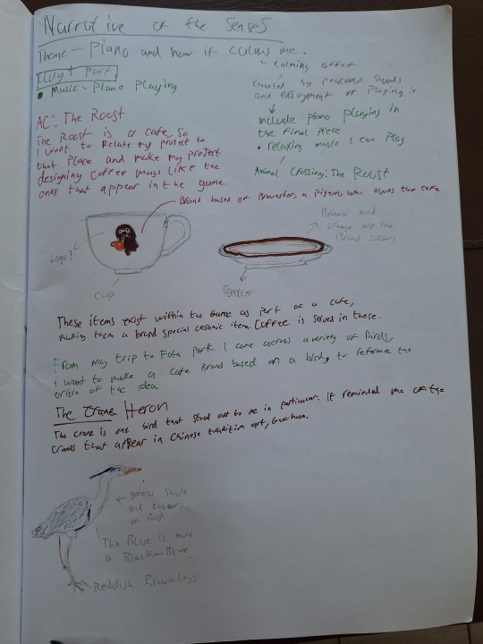
Narrative of the Senses - Artist Statement
For my project, I wanted to convey the calming feeling I get whenever I play the piano.
As a pianist, I like to learn relaxing pieces as I am naturally drawn to them. The music within "Animal Crossing" perfectly encapsulates the relaxing feeling I get when playing the piano.
To convey this feeling, I played the piece "The Roost"; being one of my favourite pieces out of the game, backed with visuals inspired from "Brewster's Cafe".
I based my pottery around a fictional cafe titled "Heronista's", with a focus on birds, echoing Brewster being a pigeon.
I've titled this piece "Animal Cafe" to also reference the title of "Animal Crossing", which can also be shortened to its acronym "AC".
1 note
·
View note
Text
Adding sound to visuals
I took a photo of my cardboard diorama/display and played "The Roost" over it, a song from the Cafe in Animal Crossing, performed by myself. I love how relaxing it sounds, and it is what I had envisioned for the project. I choose not to paint the display as I needed to spend time finishing my project up.

I put up some photos of my sketchbook, photos from Fota park and screenshots of the cafe within Animal Crossing.
1 note
·
View note
Text
Finished Cardboard Diorama + decal printing and application

The cardboard display was able to be finalised, being put on a desk and pushed up to a wall. I decided to tape the wall of the diorama to the wall so it wouldn't lean over.

It worked as I was able to hold multiple cups on the shelves with it being mostly stable.

The glaze firing came out of the kiln. It was mostly a success, I really liked how the pots turned out. Although the penguin pitcher's flippers had lost its detail to the tin glaze. However the crow pitcher had a lot of its detail intact. Tin glaze tends to cover details a lot more than transparent glaze, which I will remember for future use.
Unfortunately both of the spouts do not poor correctly, making them basically unfunctional.


I was able to get the decals printed out without any adjustments as the sizes I scaled them to fit perfectly. I really like how the logo appears on the cups, especially the one cup that survived with the wing attached. I need to wait for them to be fired again for the logo to appear fused into the surface.


Since I had spare decals, I wanted to experiment with my other mug I put decals on previously. I cut up the decals and applied it to create an almost photobashed design. I also applied on the base of the mug.
I'm excited to see the finished results of the decal firing.
2 notes
·
View notes
Text
Glaze Firing and finishing the Cardboard diorama/display
I finished off my display by getting a board of carboard, scoring and bending it in around half. Then I stuck the back of my diorama to it with tape. the bend was able to make the floor of the display. I then hot glued the counter box to both the wall and bottom of the piece, so it was one piece entirely. I am really happy with how it came out.

(picture was taken further along in the process)


(right photo taken after they were glazed)
For glazing, I used one of the broken wings to test out underglaze colours. I glazed most of the pieces in tin, the only one I glazed in transparent was the crow pitcher as I was painting it purely black, with its beak being a pinkish beige to echo the colour of it in real life.
I painted the wings of the cups a blue-black colour to try get the same quality that can be found in heron wings.
I decided to try glaze the wing that feel off, as it fell off in one piece, hoping I could superglue it so it's appearance would look alright, for the display.
1 note
·
View note
Text
Finalising the Shelves and Decal application
I finished off the shelves by adding the sides to them and taping the backs of them to the wall. This gave the shelves good support, although it was slightly unstable, I need to find a fix when assembling it into a display.
I was slightly unhappy with how uneven some of the things came out, however as I didn't have that much time, I couldn't perfect it.


(photo taken from further along in the process)
The bisque firing also came out, with most pieces being intact. Unfortunately the second of my two cups' handles fell off, however the 3rd teacup came out with the handle, which I was glad for. Although they won't be a matching set of two, I'm happy that one finished piece came out in one piece.


I also did some decal application on mugs to prepare me to apply the decals of the cafe's logo. I used printed decals from my pinhole camera photography and went for a more abstract approach.
1 note
·
View note
Text
Continuation of the cardboard diorama/display
As I wanted it to replicate a coffee shop, I wanted to add shelves to the display as well. Which would also allow me to display more of my work.

From the lecturer's design of how the shelves should be assembled, I used that to model the shelves to ensure they would be able to hold the weight of my cups.


These were some proof of concept I quickly came up with.


The top middle part is the shelf in a flat plane. I managed to make both shelves and organize them to see what the final display would look like roughly. I am pleased with how it came out.
1 note
·
View note
Text
Start of Cardboard Diorama


I started on my clay+ element of my project as the final bisque firing was done and we were able to stop working in clay.
For my diorama I choose to do it in cardboard as I enjoyed working with cardboard in my disrupt project and wanted to work with it more. Unfortunately the skills I learned in the cardboard workshop were not applicable to a diorama made to withstand objects being put on it. One of the lecturers taught me how to use cardboard for a functional purpose, which I found very interesting.
First the lecturer showed me how to make a box by scoring and bending the cardboard along the lines of the keyboard.


Then I was shown how to make the sides box, which gave the box a lot more stability, being supported my all 5 faces. The box was able to withstand a great amount of weight, which I was really happy with.


As I wanted to make the box a countertop, by guidance of the lecturer, I measured out the dimensions and scored along the lines to make the countertop to my liking. I am really happy how that came out.
1 note
·
View note
Text
Glaze Firing results and finishing clay work for bisque firing.

The glaze firing came out perfect, I was able to see the results between the tin and transparent glazes. I really loved the pure white appearance the tin glaze gave on the stoneware, so I decided to have my finished pieces be glazed in tin.


(Middle and right pictures are from further along the process as I didn't take pictures at the time)
For the tea cup, when trimming, I accidentally put too much pressure on the base, making it depress inward, thankfully it didn't completely break the pot.
I also attached the other parts to my 2 pitchers. For my penguin pitcher I used the same method of carving the flippers as last time.
For the crow I was encouraged to be more experimental with the design of the feathers, making marks on it with cardboard to achieve this affect.
Unfortunately when transporting my greenware to be fired, one of the 2 previous cups' handles fell off and broke. although I decided to fire them anyway.
1 note
·
View note
Text
Glaze Firing Experimentation


For the glaze firing, I wanted to experiment with the different glazes and underglazes.
I used tin glaze for one of my wing cups, while using transparent for another wing cup, both having their handles underglazed a black-blue.
I experimented with tin and transparent glazes with the vessels that I imprinted notes onto. Some I made to look like a piano, while others I was going for a more abstract appearance.
The penguin pot came out well and I'm pretty happy with the result. I need to fettle the surface a bit more, so the finish is a lot neater.
I also made an extra teacup on the wheel to be ready by Monday for the bisque firing. I wanted to make another one as I thought one of the handles would fall off in the kiln, so I wanted to make a spare.
I also made 2 pitchers based on a crow and penguin, unfortunately I forgot to take pitchers of them to document their full process.
1 note
·
View note
Text
Finished greenware teacups


After I had the saucers trimmed, the teacups were ready to be bisque fired on Friday. I was really happy with how they turned out, although I was worried about their survivability in the kiln.
1 note
·
View note
Text
Further collaging + development and other demos


To start off, I wanted to try experimenting with the crow again. I really liked the idea of having the tail be the handle of the pot, so I'd want to try that out when do make the vessel.
I also made saucers for the cups to sit on. I then turned the cups, trying to get them as uniform as possible. Attaching the handles was difficult as one of the handles refused to stay put. Unfortunately I do not have a lot of the work documented during the process.
I made sure the handles fit comfortably in the hands by drawing my cutout to a smaller scale.


One of the lecturers held 2 demos, which I wanted record here in case I ever wanted to use it in the future.
The first demo was making a vessel out of cube of clay, having to be slammed into shape. The cube of clay needed to be slightly firmer to start the process of making. Then the cube was imprinted with various materials. After the marks were made, you'd hollow the inside out with a scoopy tool. The firmness of the clay ensured that the marks would not be lost as you handled the clay more and more.
The next demo was about slip trailing and making delicate ceramics out of organic materials like cardboard and paper. Places them on slabs was a method of making sure the ceramic didn't crumble in the kiln, and had something to fuse to.
1 note
·
View note
Text
Further Development of "Narrative of the Senses" Project

The bisque firing was a success, only one of the vessels had a crack, which I was content with. The cups with wing handles were uncomfortable to hold, as I assumed they would be, so next time I would try to make the handles smaller to fit into the hand better.


A lecturer blew up some of the photos I had taken at Fota park and encouraged my to collage with them to form new ideas.
I really liked these ideas and made the penguin vessel. I carved the flippers, being inspired by how Charlotte Pack carves her birds.


I then went on to throw the teacups for my project. On the left is my first attempt, with a rounded inside. The rounded shape of the interior made the cups bottom heavy as there was no way to remove the clay from the inside, so I decided to go with a flat base.
After a demo, I made the two teacups on the right, trying to match their size and form. I was really happy how they came out, despite being slightly different.
1 note
·
View note
Text
Artist Research: Charlotte Pack
Charlotte Pack is a ceramicist that focuses on wildlife. I was very interested in her birds that she sculpts on top of her pots.


I really like how detailed, yet simplistic and uniform her sculptures are. She uses a lot of carving to give detail to her pieces, which culminates into a detailed sculpture made from basic carving methods.
I want to try to make my wings of my cups be detailed, yet simplistic like her style.
1 note
·
View note
Text
Experimentation of concepts
From the concepts I outlined, I tried model the handles and experiment with them. I drew a general shape based on the drawings of the handles so I could get them to match.


One of the lecturers demo'd one way I could try detail the wing, imprinting it with a stick to produce an abstract feather look. I wanted to try something different, so I carved the detail of the wing, stippling as well as creating lines.
My first attempt was very flat and appeared just like a drawing, so I tried again, trying to keep in min the 3d form of the handle.

I was really happy how the handle turned out. I made two of the same sort of handle, one being thinner than the other. I found out that the thinner one felt like it was going to fall apart.

I also made a hand-built mug and put a handle there, to be like a penguin. I didn't really like how this looked, as it didn't remind me of a penguin at all.

Then we put our pieces into the kiln for a bisque firing. I have created multiple wheel-thrown vessels for miscellaneous purposes on Monday, as I wanted to get back into throwing after being away from the wheel for 2 weeks.
1 note
·
View note
Text
"Heronista's" concept
After my trip to Fota Park, I came up with an more concrete concept for my cafe. I wanted to focus it on the Heron, as it reminded my of the Siberian Crane or "Báihè/白鹤" which can be found in traditional Chinese guóhuà/国画 paintings.
I also wanted to shift my focus, focusing on conveying the calming feeling I get whenever I play the piano. I want to play me playing the piano over my final piece, to try and convey that feeling of calmness.
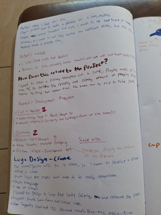
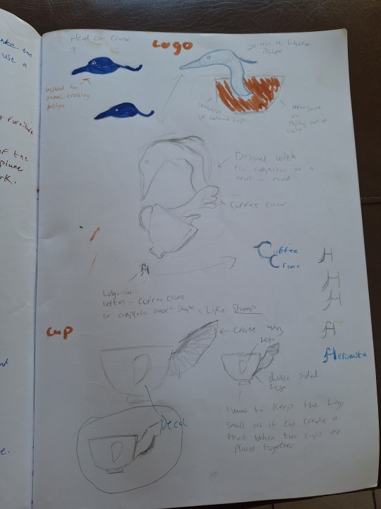
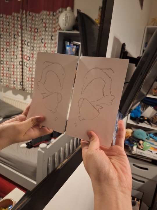
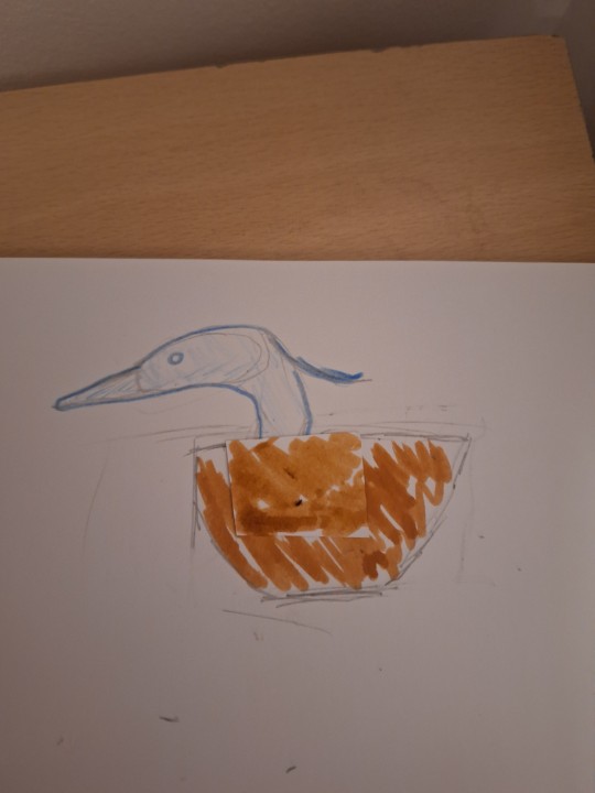
As Brewster's cafe has a logo put onto its cups, I wanted to design a logo I could decal print onto cups. I wanted to go for a design that was memorable and left an impression. I designed the logo in a love-heart composition, so I could flip it and it when you put two opposite facing logos together, they'd create a love heart shape.
For the handle I wanted it to emulate the wing of the heron.
I originally thought the Heron was a crane, which is why the naming convention of the cafe brand was "Coffee Crane", until finding out it was a heron.
For the clay+ element of the project, I wanted to create a diorama, featuring animal characters like in Animal Crossing, however after advice from a lecturer, I decided to only do a diorama of a cafe setting to display my pieces in, as I wouldn't have enough time to complete everything I wanted.
1 note
·
View note
Text
Fota Park Trip
Coincidentally I was planning on going to Fota Park, so I was able to gather primary research on different types of animals. I took over 800 photos, some of my favourite being red pandas, herons, capybaras and penguins.


I focused on the birds in particular as I was inspired by "Animal Crossing". Within the game there is a cafe that is run by a Pigeon called Brewster, so I had thought of making my own version a cafe based around birds.

Other than that I really enjoyed my time at Fota Park.
1 note
·
View note
Text
Narrative of the Senses, Clay+ Project - Initial concept and Experimentation


For my initial concept of narrative of the Senses, I wanted to explore the feeling of playing the piano. I wanted to try to convey the feeling of the movement of my hands and fingers as I played.


One of the lecturers helped to create a "piano" out of wooden sticks, that would leave imprints on the clay, which I found to be quite interesting. Here I took photos of slabs intermittently, trying to explore the imprints left by the keys.
I much preferred the more simplistic pattern of the slab pictured left. so I tried to recreate the same simplistic pattern manually with only one of the sticks onto vessels I'd thrown on the wheel. What really interested me was the staggered pattern of the keys, which reminded me of piano midis, which is another way to write music on a piano.


I also figured I could try use one of the slabs that was imprinted on to form a slab built vessel, and another lecturer showed me a new method of making a vessel, by hollowing it out with a large stick. Although I didn't go further with these concepts.
After a talk with the lecturers, I mentioned the game "Animal Crossing", as I really like the music of the game. They recommended that I should go try and refocus, basing my project around the game. I really enjoyed the idea of focusing on something that went further away from the piano, however my project was still related around it.
1 note
·
View note