
Animation student. Welcome to my art college blog where I will be documenting all of the progress with my projects.
Don't wanna be here? Send us removal request.
Statistics
We looked inside some of the posts by k00295632 and here's what we found interesting.
Average Info
Notes Per Post
79
Likes Per Post
55
Reblog Per Post
24
Reply Per Post
0
Time Between Posts
1 day
Number of Posts By Type
Text
17
Last Seen Tumblr Blogs


Fun Fact
In 2020, Tumblr had 29.4 million users in the US.
Text
Animation
Reinvention in story telling
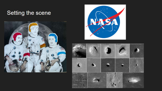
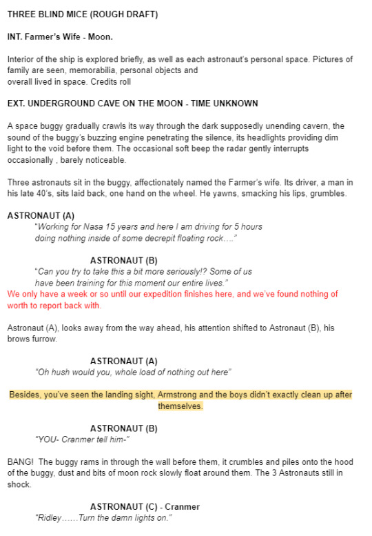
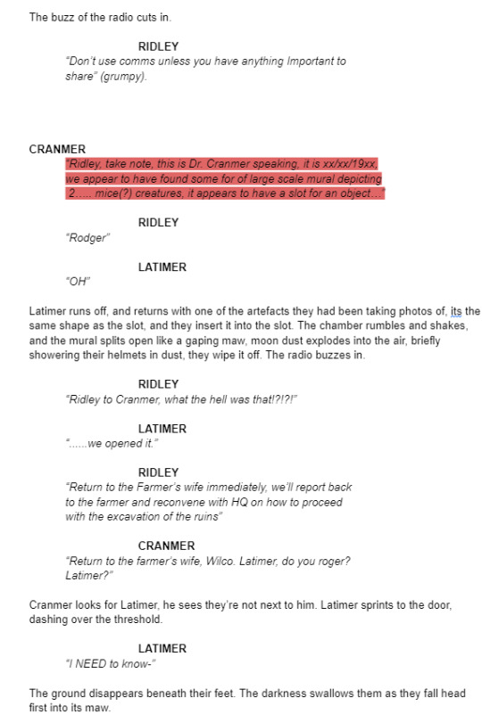
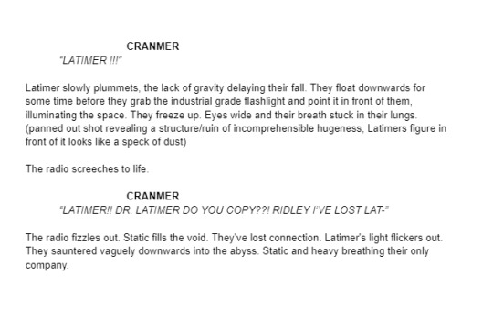
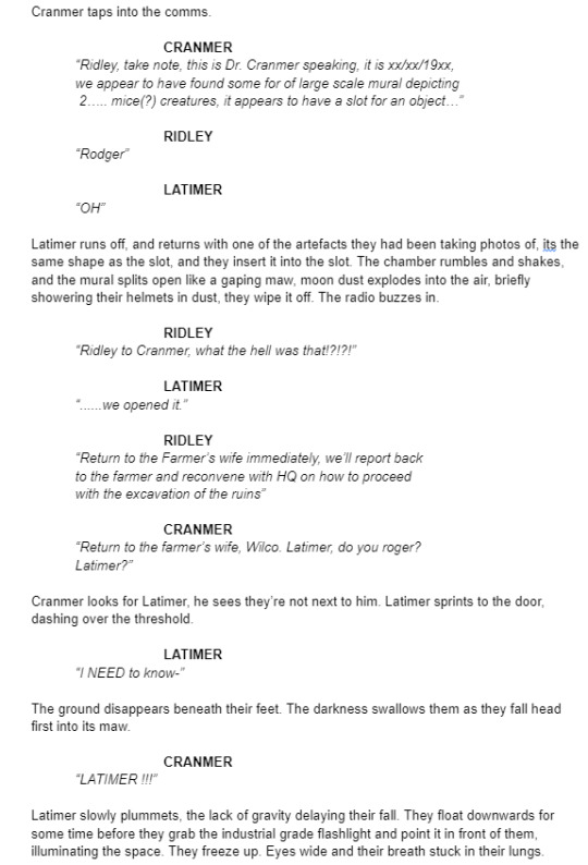
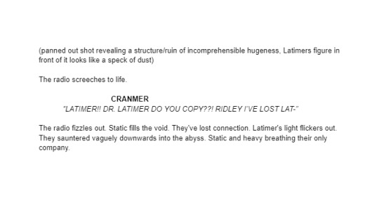
Three Blind Mice, Epic/Historical, Space Age (1957-present)
Week 3, 22-28/04/24
Monday
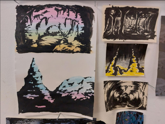
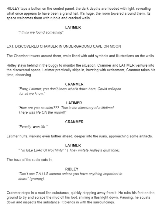
Did a zine workshop during the morning, I made a sad little zine with some bits of rough potential visuals for the project.
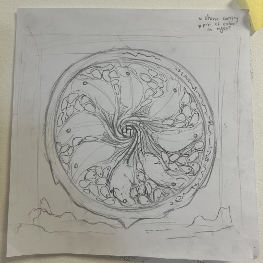
I then jumped straight into creating concept art and trying to figure out how to combine natural cave formations with architectural features. What I ended up doing that day was creating this rough pencil of some stalagmites and drawing arches and doorways on top of it.
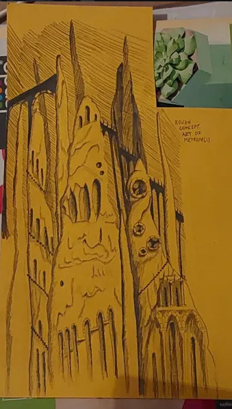
Using this as a starting point I went off and photocopied it a few times, which I then cut up and collaged together on a page to gain a rough idea of what this metropolis could look like.
This is what I ended up with. I love how the buttresses came out but the perspective of the piece looks completely wrong, making it look cluttered without purpose. I tried colouring parts blue and pink to separate it a small bit, but I think the main issue is that all of the structures are the same size even at a distance, in future I'll have to make the ones in the back larger and more hazy looking whereas the ones in front smaller and more detailed. This was just an experiment so its not too important.
Later that evening I did a colour study of scenes from Akira to develop my understanding of cel shading, I also watched a few videos on the production of Akira. It ended up being very useful and I found myself very surprised with Akira's colour palette. I quite literally colour dropped the colours from the scenes and and did rough drawings of the scenes using them, I was really surprised to see that the colour I dropped was the same as the one in the scene. It was absolutely fascinating.
Tuesday
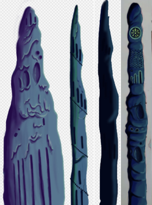
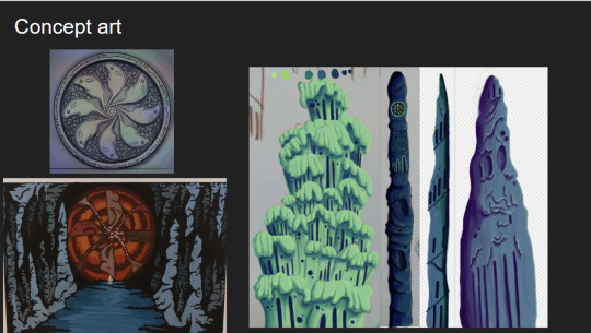
I further looked into combining architecture with cave structures by doing a quick study on Antoni Gaudi's building designs and did a study on different stalagmites.
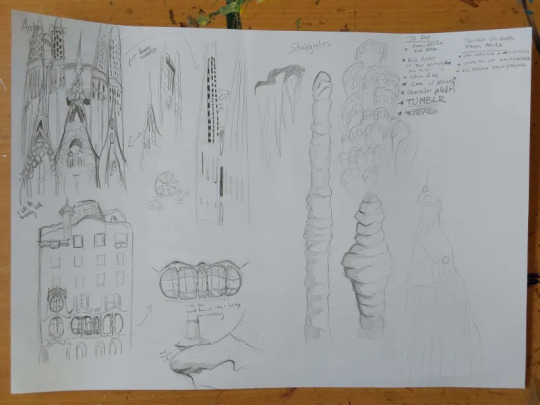
Looking at Gaudi's designs was interesting as he uses lots of organic shapes that almost look like they're melting in a way, and in other works like the Sagrada Familia he has lots of towers with unique features.
I tried combining these features to the stalagmites I studied to gain unique structures that would be believed to have belonged to an underground metropolis. I ended up with some nice designs, I worry a small bit that they might be too detailed but overall I'm happy with them, I still think these designs would have to be further developed but I don't have the time to do so.
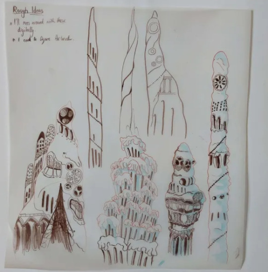
At the moment my plan is to individually recreate these digitally and then photoshop them together in different ways to gain the illusion of having more designs than I do.
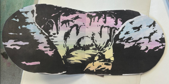
The photo is a small bit fuzzy but this was the first structure I recreated digitally. This took me around 6 hours to do, which was mainly because I've never done a proper digital piece before, so it took me a bit of time figure out what worked best and what short cuts I could take. I actually drew on top of a picture of my original paper sketch instead of redrawing it.
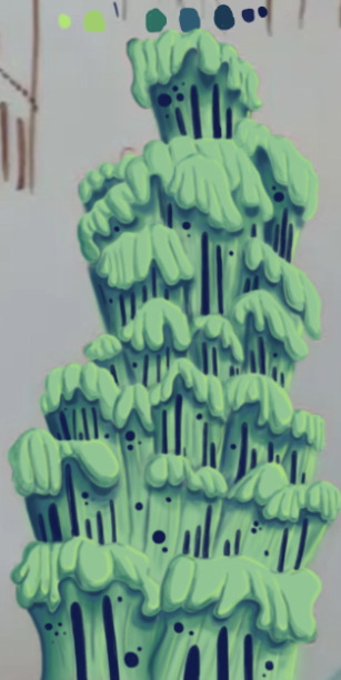
I created this solely using the air brush tool, and I love how it turned out, it looks so drippy. The only thing I can say really is that I wish I got it done a bit quicker, and that the values were much darker on my personal monitor.
I used the background from Akira as a reference for the colours.
Thursday
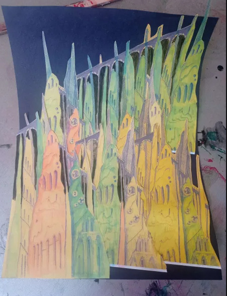
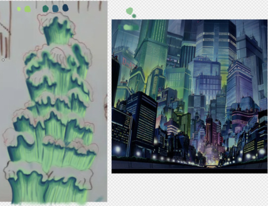
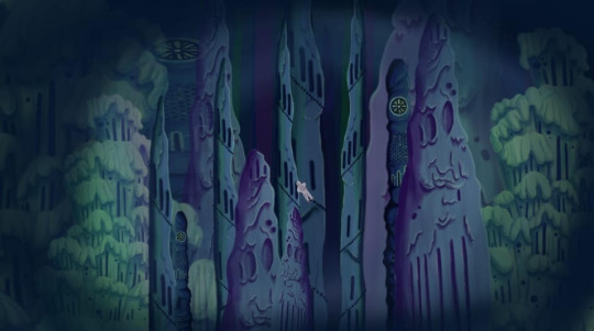
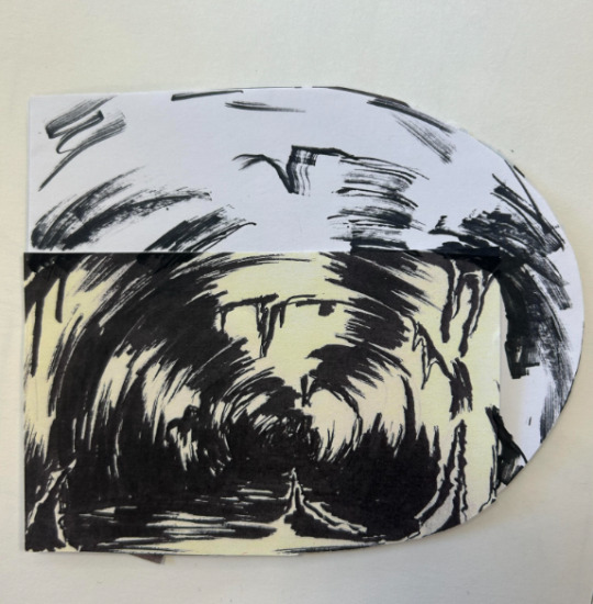
I made 4 more structures, significantly much more quicker too. While I spent too much time on the first one it gave me the experience needed to bang these ones out quickly and more efficiently. These were also done using the airbrush tool. For the backgrounds we actually made it a point to solely use airbrush as a way to commemorate the animations from the 70's/80's.
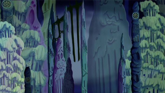
Since most of my pieces were done I got started on piecing them together. I tried making the buildings further back bigger and transparent and the ones closer to the viewer bigger. This was as far as I got on Thursday. If I'm being honest I'm not happy with the layout. I was using the Akira background as a reference but then realised it wouldn't work as the light source in the background is from behind, in my background the light source is from the front. I knew I definitely had to redo the layout.
Friday
We did a pitch workshop with Paul and Yvonne and then as a team discussed how we would go about our pitch . We discussed who would say what, what we thought a funder would want to know before investing in a project, we worked out costs, how many episodes, how many animators it would take to animate it in a year and ect...
We also did a few rehearsals in the studio improvising our lines and timing ourselves to get a feel for it. We decided that I would open and close our pitch, introducing our Nursery rhyme, genre, & time period while also setting the scene for our animatic.

Before work I managed to redo my background, I thought this one turned out way better. The perspective looked way better than last time too. I feel like with more time I could develop this further but I don't have that time so this is what I have and I'm happy with it.
Sunday
youtube
I made the presentation for our project, and the team went on call to rehearse our pitch. We did this twice.
2 notes
·
View notes
Text
Hello you jubilant jaguars!
We've finished our final project and have placed all our things on the wall for assessment on Thursday. I didn't have as much to physically present because I didn't have my larger drawings from the first animation brief.
I've very much enjoyed the animation discipline work we've done and the overall process and pacing of the workflow. It was a little bit jarring in the beginning but once you started getting into it, it felt productive and consistent.
Final Brief "Nursery Rhyme"
I have to admit I was a little hesitant with doing group work that is often either really good or really annoying. I was blessed to be in the former of groups.
In the beginning I was a little withdrawn perhaps because my mind was on CCS and the prompt of
Three Blind mice
Epic/Historical
Space Age
wasn't something that sparked many ideas for me. I don't have a great pool of reference for space themed bits of media so I didn't feel super comfortable coming up with ideas. The first day we were supposed to make draft scripts to which I opted to do some research instead of. In the beginning it didn't feel like I was pulling my weight as such but during the weekend we had a call on Sunday to show off our newly written script, of which I did do.


It was my first time writing a script but I was actually really enjoying it towards the middle. I finished after an hour and didn't really revise it because I was occupied with CCS work I needed to get done. There's a couple of things I learned, from the time I spent.
I'm not supposed to write descriptions of shots. (in the beginning)
My dialogue was really long and wordy. (I wanted to get my ideas of characterization across and didn't give myself time to revise and edit it which I would've done usually.
On Monday we finalized the script after taking different aspects of each of our scripts that we liked. From my script they took:
The beginning shots of the space craft showing characterization through visuals.
"Some of the characterization and dialogue ideas such as "is that Russian?"
I spent Monday working on CCS and then on Tuesday my group had storyboard stuff done but I didn't have much of an impact on it besides revising the argument scene between Ridley and Latimer in the buggy. I found myself although not contributing as many new ideas to a discussion but rather looking at the ideas we had and seeing if they fit in with an overall vision. I suggested having an overall theme for the story as it is an Epic and came up with the idea of blind beliefs and the consequences that can lead to.
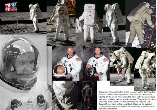
I knew I had to start pulling my weight for the group and we started doing research. I was put in charge of landscapes as well as spaceships and their interior.


I found the Observing the Moon book to be quite useful for looking at the Apollo missions, reasons for its' discontinuation and the geography of the moon. Moonshine was a Dreamworks background art book that more so served as inspiration and motivation for my future background work.
We put together a google slide consisting of the research we did and these were the ones I made.


We then went onto look at style/aesthetic and once again I felt like I didn't contribute much to this discussion although I was okay with going for the Star trek, Akira hybrid we settled on.
We then started going into concept art. I was put in charge of landscapes and backgrounds along with Mik. I focused on the moon surface and the spaceship interior and exterior. I found this youtube video to be quite useful for getting started as I wasn't too confident in my abilities to make background art.
youtube
I found this process quite fun in keeping loose shapes with wide brushstrokes and practising stroke economy which aims to show great detail and imagery to the viewer with implied detail. I also tried playing with values. It was also my first time really using the gradient tool which add a little interest to the sky as opposed to just a flat colour.


I feel like I could've experimented more with composition but I wanted to get more work done so I took one of the compositions and changed the hue/saturation/brightness to show different colours and palettes to see what type of feel we want for the background. I did try and place the ship in different spots to see how it'd look composition wise but that was the extent of it. I settled on a closer view of the ship for my master shot.

My group liked the bottom three particularly the bottom left purple hue. I then took this and fixed the sky to make it pop more with stars.

I also spent time working on the space ship itself. I sketched them out traditionally based off the video I had in my research to get used to the shape and structure of the exterior and then went to do it digitally/. I quickly sketched out my shapes and then went over them with a paint brush. I didn't do line art and kept it pretty basic.

I think I got the basic look of it down here and once again played with the hues/saturation/brightness to see how it would look differently.
I went over it again but took more time to make it fit the Akira aesthetic more. I used airbrushes, with a lack of line and tried to make it more detailed in spots. In the end I finished it early and was mostly happy with the top half.

Before starting my master shots at home, I wanted to look at other parts of the project for my time in college. I felt like we were lacking some of the civilization development and ideas and started drawing up designs for that.

Basing it off roman architecture with elements of irish stone carvings with the idea of rat/mice imagery and looking at how a language could be formed from this with writing. When it comes to writing I knew the writing would be composed of scratches as if done by mice. The writing I thought would look like symbols not too dissimilar to kanji or Chinese characters but in a more primal less sophisticated form.
I knew the pillars would be the most opportune asset in our storyboard to illustrate a culture or some form of civilization. I played with shapes and tried relating them to Ryan's work so they would feel connected. (Ryan's work below).

I then took these designs and tried making very quick digitized versions but I didn't quite like how they turned out. I also tried seeing how their look in a dark environment being lit with flashlights to the same result.


This was all the concept and design work I was able to get done and I was quite happy with the results. If I gave myself more time to work on this I would've liked to have breached out to other parts of the project such as character work, cave interiors and the city itself. I think it would've been interesting to see what we all would have come up with for each part of the project but with the time we were given I would've liked to have experimented more with composition I think.
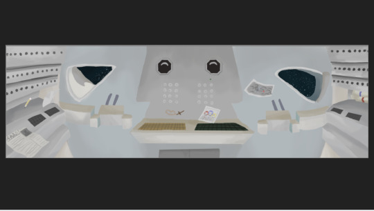
After preparing for the pitch presentation I focused on the master shots I was responsible for. I did the exterior of the ship on the moon landscape in the composition I picked out earlier.

Liberty did the sketch for the interior of the ship taking reference from the video I had seen for research.

I went over this in my style to keep it consistent. I found this workflow to be more efficient.

I think a big thing I learned from doing these backgrounds and something to keep in mind for next time is to use darker colours against the light ones to create more contrast and create depth. I feel in some parts of my work certain things don't pop out as much as I would like them to.
We then had our presentation which went well. I wrote down a scripts and practised it multiple times until I felt confident In what I was saying and could talk around it if I forgot any words. I used a Q card to help prompt my sentences with words that I knew I blanked on during my practises written down. I felt my part went smoothly and I remembered my points. I did speak too early for one of my script lines during the animatic but I don't think it that much of an impact.
Coming to the end of this project I learned quite a bit working with my group. I was quite happy with the work I did do and wasn't used to the actual good communication and enthusiasm my group displayed overall. Although I faltered in the beginning, all members in our group felt they had a moment or moments they weren't doing as much. We still covered for each other and always had new work to look at each day. It was really nice to work on something with people who were equally as dedicated to making something together.
If I had to change somethings for next time it would definitely be how much I contributed to new ideas in the group. I did come up with ideas but I felt I kind of took a back seat and looked at the ideas we already had to see if they would fit without coming up with much of an alternative.
I felt also that there were some things I was thinking that I didn't quite vocalise at times but as I grew more comfortable with the group I was more relaxed in sharing my ideas and criticisms.
This might be my last Tumblr post but thank you guys for the support and love you've all given me throughout this journey.
Signing out,
~K00297230
8 notes
·
View notes
Text
Final Brief 11
Today we had our pitch presentation in front of the class and our tutors. Our group was last to present and I think we all found it neve-racking to watch everyone go before us and waiting a couple hours.
With that being said our presentation went really well. None of us fumbled our words too much and kept in the time constraints we were assigned. We may have been a little off with the timing for the animatic but we still got our ideas across and I think our audience was still entertained.
Our only critique really was that we could've been more concise with our ideas and pushed the logline and marketing of our work more. We had a lot of ideas and work done that we wanted to talk about and present so perhaps we could've cut it down to what was important for our investors so know and let any follow up Q&A questions answer any further things we wanted to say.
Mik also made some merchandise for the group and tutors in the form of two shirts for our tutors and two variants of pins with our art on them.

Yvonne is wearing the shirt below.

7 notes
·
View notes
Text
Final Brief 10
Today we prepared ourselves for the pitch we're having on Monday. Our group divided the topics of discussion amongst ourselves and spaced the order of us saying things so it felt like there was an even distribution of speaking.
Ryan would do the introduction.
Liberty would briefly introduce the characters.
We all contributed to the animatic sequence.
James talked about the tone atmosphere and style/aesthetic.
Liberty expanded on the research for the previous subjects.
Mik also expanded on the research and concept art.
Ryan concluded our talk by discussing future plans.
We were pretty drained by the end of the week so we briefly practiced reading out the animatic script in character.
Mik would narrate what was happening.
James would play as Bennett Ridley .
Liberty would play as Claude Latimer.
Ryan would play as Philip Cranmer.
we spent some time practising later and we had some trouble getting the timing right but figured it was because we had an online practise and it would be easier in person. We proceeded to practise our individual parts until Monday.
We also worked on our master shots to put in our presentation and ended up with 6.
Liberty

Ryan
James


Mik


6 notes
·
View notes
Text
Final Brief 9
Today we went through the different things we wanted to get done by Monday and discussed our pitch a little. We then went on to continue our concept art further as this is the official last college day for the development of our work.
We discussed our master shots and decided which ones we'll try and get done by Monday.
James:
Exterior of Ship on Moon
Interior of Ship (rendering)
Ryan:
End shot of city
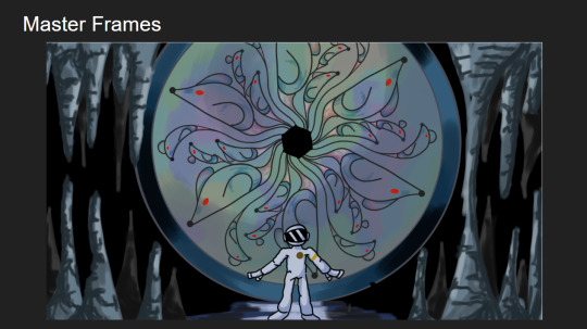
Astronaut helmet reflection
Liberty:
Buggy scene of astronauts
Interior of Ship (sketch)
Mikayla:
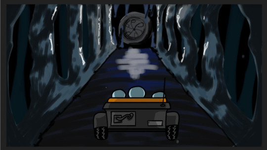
Buggy lighting up hall of pillars
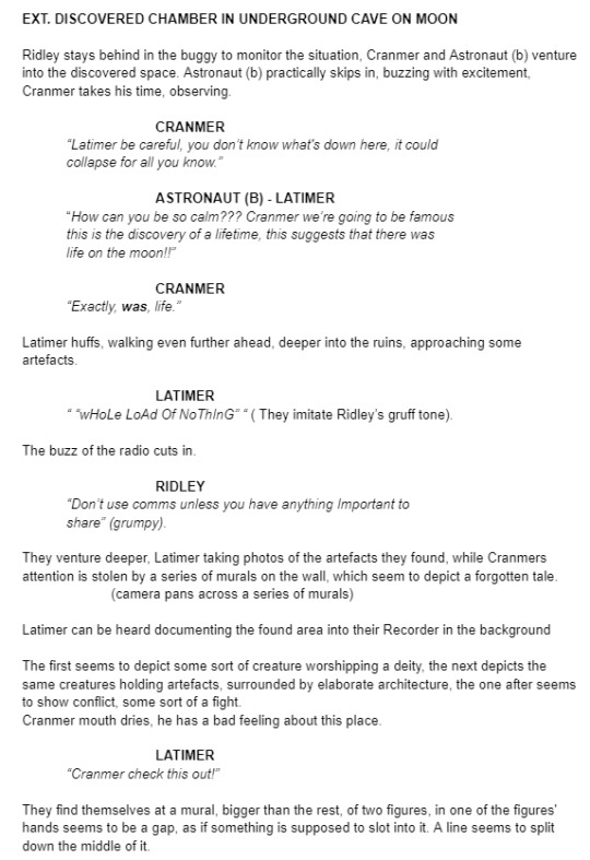
Mural
Paul also had us thinking about sound and using it in our pitch to help sell the atmosphere and tone of our project. We started thinking about it with a list of things that might need sound.
Buggy engine
Wheels on ground
breathing of astronauts
radio static as they talk
stone shifting against stone (mural opening)
rumble of cave
cave ambience sounds (scratches to indicate mice?)
clicking of torches turning on
crash sound of buggy hitting rock
When we were thinking up of sounds we immediately thought of the infamous Minecraft cave sounds that are both creepy and ominous to straight terrifying.
youtube
This is some of the work we got done today.
James


(work of carvings and pillar designs)
Mikayla

(cave mural painted)
Ryan

(still in progress)
Liberty


(Interior of ship and cave mural above)
4 notes
·
View notes
Text
Final Brief 8
Today we all did some concept art in our respective areas.
James continued working on the ship trying to fit it into the Akira style more than before and although the bottom is incomplete it gives a better idea of the desired look.

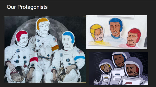
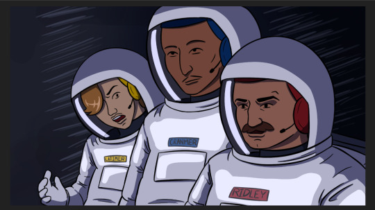
Liberty continued on character design work, and finished the three main characters. We also finally named them fully, whether or not this will have an effect on the pitch or project remains to be seen. They also continued on the final storyboard.
Bennett Ridley, Claude Latimer (yellow), Philip Cranmer


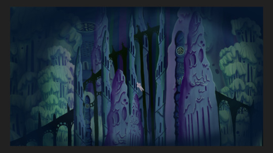
Ryan worked further on the city, developing individual structures to help differentiate the architecture and make it more visually interesting. They did this digitally with air brush with the Akira style in mind.


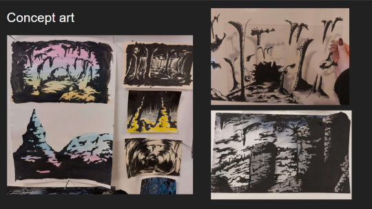
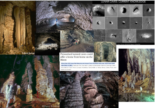
Mikayla also spent more time doing cave work.

6 notes
·
View notes
Text
Final Brief 7
Today we did a Zine Workshop with the Print students and a few others. The purpose of this workshop would be to create a zine to aid our presentations and help sell our pitch to Yvonne and Paul.
A zine is a self published, low cost booklet that can help display ideas, poems or short stories. We went through ideas of what to include in it including; a concept art book, newspaper to help sell the story and or a mission document explaining the details of the story, background information and worldbuilding.
We decided to keep it simple and decided on just including concept art but we haven't ruled out the other ideas perhaps in a different format. We just started printing the work we'd done and collaging it on the page and Paul suggested we mess around with the shape of the actual zine and composition.
This is some of the work we'd done and the process.

Here are some of the pages we came up with at the moment.


Ryan worked on their own idea of a comic based zine, using paper only and some scissors.


We then spent the afternoon continuing on our concept art.
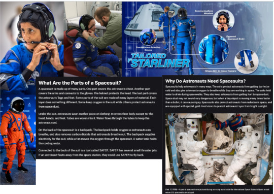
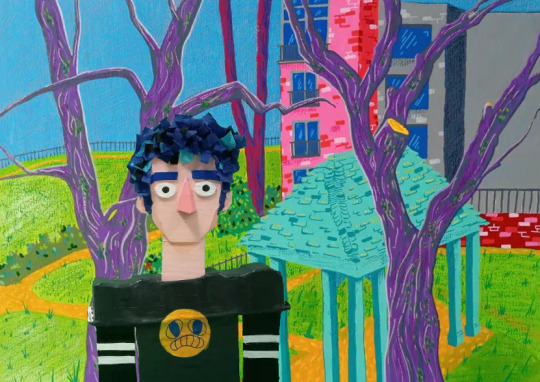
Ryan worked on developing the undiscovered civilization and playing with colour and vector shading with Akira influence. They had also done the complicated space suits for the astronauts and simplified them to suit better in an animated medium.
The architecture for the city was inspired partly by the Spanish Catalan architect Antoni Gaudi, who plays with natural motifs and shapes.


Liberty spent more time doing character work and continuing on making the storyboard look cleaner and better visually. The character work will be shown next post.


Mikayla worked on the cave interiors more, playing with colour, composition and dimension.


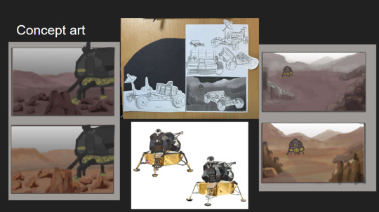
James went on to develop the moon landscape more and played with colour while briefly looking at the lunar module exterior and playing with its' composition in the landscape.


6 notes
·
View notes
Text
Final Brief 6
Today we spent the morning assembling all our research together onto the wall. A lot of the images were from the google slides that we were working on throughout the week.
Before we get into that, the animatic was finished. Before it was 4 seconds per shot but this was adjusted to match the pacing better. We realised that the length of the animatic went to only 2 minutes 26 seconds, which meant we had more room to add to our story than what we originally thought.
youtube
We sectioned off different subjects of research to their own areas for clarity and this helped us figure out where we were lacking in research. One of these areas were style/aesthetic, in which Paul wanted us to have figured out by the afternoon. After taping all or stuff to the wall we started researching different styles.
We started looking at animated cartoons in the 60s and came across the star trek animated series. We thought we could use this style on our characters faces.

We also liked the style of Jonny Quest and Georges Méliès for the characters and the shading and folds of clothes from Akira.

We thought we'd take a more painterly approach to the background art as well, reminiscent to 60s retro posters and playing with an overall greyscale tone with pops of colour to add emphasis or interest.
This is the collection of research we've achieved thus far.


We've started looking at design from the different references we now have to grab from and we are going to make mood boards to help solidify these ideas tomorrow.
5 notes
·
View notes
Text
Final Brief 5
Today we spent our morning going through our storyboarding shots. We stuck our shots onto a larger piece of paper so that we could visually see the animation.
We made some edits and were cautious of the time constraints we had of 3 minutes.


We put our storyboard up onto the wall and planned to research different subjects we saw in the storyboard. We divided up this work amongst ourselves.

Mik was assigned to creating an animatic using the storyboard shots. This will help to time our animation and pace our shots so that the story is told smoothly.
We all went off to our own research and added them onto a shared google slides so that we could see what we're all doing.
James
I found two books that I found were interesting. One was a book of DreamWorks background artists and the other was about all things of the moon. I took some photos of pages I found were interesting.
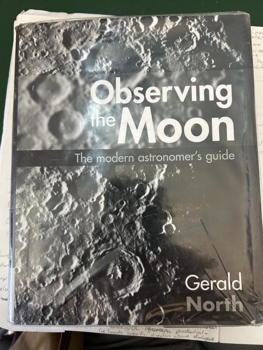


It talked a lot about the previous Apollo missions and how they stopped because of a lack of funding due to less public interest and the geography of the moon, particularly the rock types present on different altitudes on the moo.
4 notes
·
View notes
Text
Final Brief 4
Today we edited the script we formed yesterday to flow better and portray our ideas more clearly.


This is our finalised script that we'll be following as we continue working. We also began to explore storyboarding, looking at shots and composition and ways to construct them.

We would continue to work on the storyboarding process for tomorrow.
5 notes
·
View notes
Text
Final Brief 3
Over the weekend we all wrote our own scripts and came together on a call to read and discuss our stories. These were the new scripts.
Ryan


James


Mikayla


Liberty


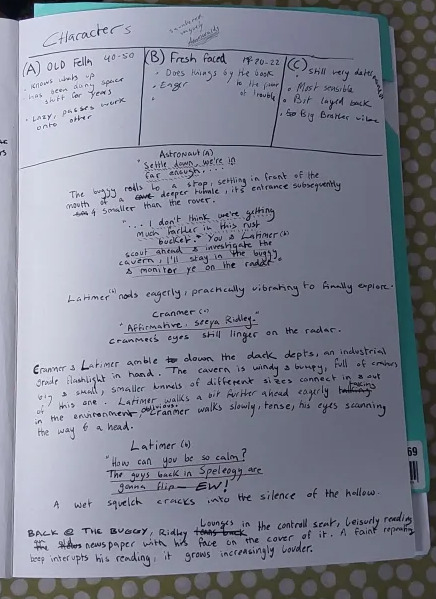
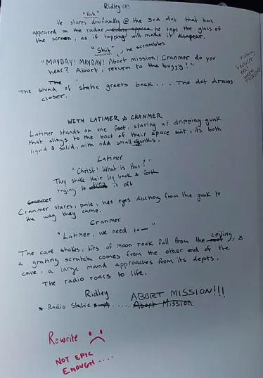
The character names of the astronauts (Latimer, Cranmer and Ridley) are based off the three bishops that Queen Mary I burned at the stake because of their blindness in religion with their Protestant faith.
We talked for a while and decided to merge different parts of peoples scripts into one single rough script that we will edit tomorrow.
4 notes
·
View notes
Text
Final Brief 2
In the morning, different groups were having online meetings with Paul as he wasn't available to come in. With our different scripts and new idea we had a meeting with Paul.
These are the scripts we had come up with.
Ryan


Mikayla


Liberty


Unfortunately, he didn't feel as though the scale was nearly as large enough to fit the Epic genre. After our talk with Paul we decided to change our story idea again. Instead of encountering a mouse creature the three astronauts would stumble upon an ancient civilization shrouded in mystery.
We also wanted to explore this idea of Blind beliefs within our characters, such as blind ambition or blind faith.
We spent more time discussing this idea and dotting down our main story beats. these included
Introduce Characters
Establish Setting
Exploring Cave
Falling Moment (astronauts falls down a hole)
Inclusion of mice (creature)
Wide shot
We took these and went our separate ways to write our own scripts again to see how each of our stories differ and what aspects of them we like and dislike.
4 notes
·
View notes
Text
Final Brief
Today we got our final brief in animation for the year.


For this brief we were randomly assigned to groups of mostly 4, with absentees lumped into their own groups.
I was put into Group 6 which consists of;
James @k00297230
Ryan @k00295632
Liberty @k00296662
Mikayla @k00293579
We would have a team leader that would rotate every 2 days starting with Ryan. We also made a group chat so that we could communicate with each other and share ideas outside of college more efficiently.
In this group we were randomly assigned the following for the project:
Nursery Rhyme - Three Blind Mice
Genre - Epic/Historical
Setting - Space Age (1957 - Present)
We then started coming up with ideas for the project. We started by writing out the nursery rhyme.
Three blind mice.
Three blind mice.
See how they run.
See how they run.
They all ran after the farmer's wife,
Who cut off their tails with a carving knife.
Did you ever see such a sight in your life
As three blind mice?
We took the prompt quite literally and started exploring the idea of three blind mice going on a space adventure.
We settled on an idea of three blind incompetent mice accidently launching into space instead of the other three competent mice. a lot of our ideas were written down below.


We particularly liked the idea of naming the ship the Farmer's Wife to match the rhyme and having their tails being cut off as the door closes on them after they enter the ship, or something along those lines.
We felt pretty confident in our original concept until we had a chat with Paul who brought up two points
There was only so much suspension of disbelief had before realising that the story was flawed. For example, the mice would run on a wheel to power the ship.
It wasn't quite fitting the large and broader scale of what the Epic genre encapsulates.
We realised our idea wasn't going to work so we went back to the drawing board after lunch.
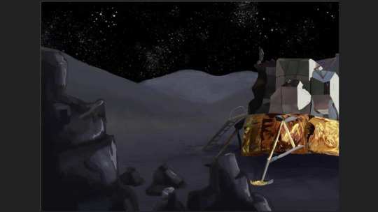
We decided to not make the story so literal and casted humans as our protagonists. The new idea was essentially astronauts exploring a cave on the moon until a mouse like creature chases them out until it's stopped by falling stalactites.
We decided to make rough scripts for tomorrow around this base storyline and reconvene tomorrow to discuss our ideas and have a meeting with Paul again.
3 notes
·
View notes
Text
Animation
Reinvention in story telling
Three Blind Mice, Epic/Historical, Space Age (1957-present)
Week 2, 15-19/04/24
Monday
Monday morning we did a short presentation on our project and our current concept, which was successful, and our official concept. Once that was done we went back to the studio to start storyboarding. While the rest of my team started storyboarding, I rewrote and edited our Frankenstein script into a proper finalised one.
Frankenstein script:

As you can see it was a bit messy.
Edited Script:

Tuesday
We were told our storyboards needed to be done by 12:30, so it was a race against the clock, we went through everyone's storyboards and picked out the compositions we liked and drew up some new ones to fill in the gaps.
As we went storyboarding we ended up editing bits of the script to make the storyboard more cohesive, like removing bits of dialogue and the mechanism of the door.
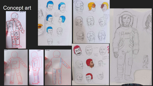
During the evening split again to do our visual research. We assigned ourselves different topics, I went off and researched astronaut suits, cave formations, and architecture.

After a bit of research we started sticking our research on the wall.

Thursday/Friday:
I looked at Gothic and Romanesque architecture to further aid our visual research.
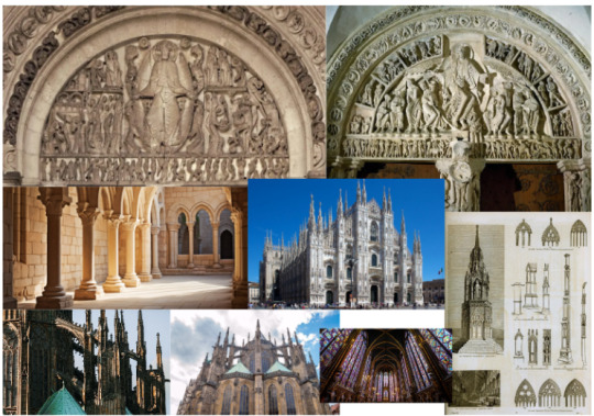
I also looked at Antoni Gaudi's works for their pointed towers and organic shapes.

I also put together a quick mood board for how we want our aesthetic.

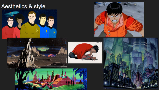
As a team we then had to agree on an art style for our animation, and we knew we wanted a style that commemorated the 70's, which is when we set our time period for the narrative, 3 years after the moon landing.
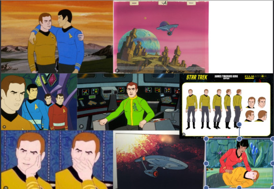

After some consideration we decided to combine Star trek the animated series and Akira together. We want to use the star trek face designs as our base and apply Akira's Cel shading, clothing folds onto the characters, and the cityscapes as a reference for how endless we want the metropolis to be. We think we can achieve some interesting results with it.
We split up again to focus on our individual tasks, mine being the space suits, metropolis designs, and figuring out cell shading.
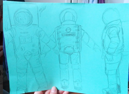
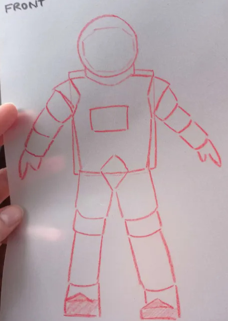

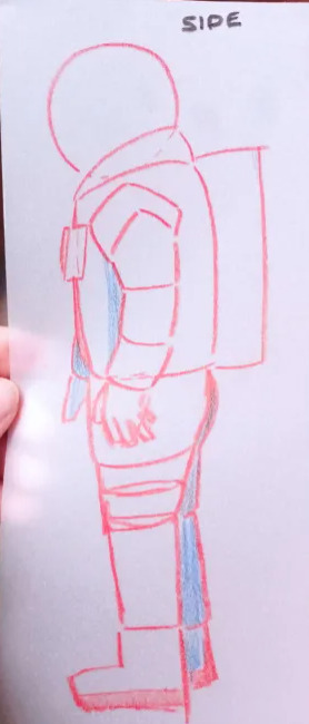

I did some simple sketches of the astronaut suits and then simplified them even further on tracing paper to get the basic shapes. I did this to make whoever is doing the animatics life easier as they'll have a reference point.

I made a rough attempt at cell shading but it didn't turn out the way I wanted. I watched a quick video on it but that wasn't enough. I think the issue lies in the colours. I plan on watching some videos on Akira and how it was made, to get a better sense of it, and some studies on it too.
4 notes
·
View notes
Text
Animation
Reinvention in story telling
Three Blind Mice, Epic/Historical, Space Age (1957-present)
Week 1, 11-13/04/24
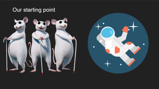
Here is all of our planning and idea development . To start off , as a group we started b rain storming & coming up with different ideas . As team leader I work down our ideas along with my own ones . Initially our idea was to send 3 blind mice in an animal space program to the moon , which was later scrapped .
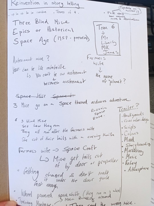
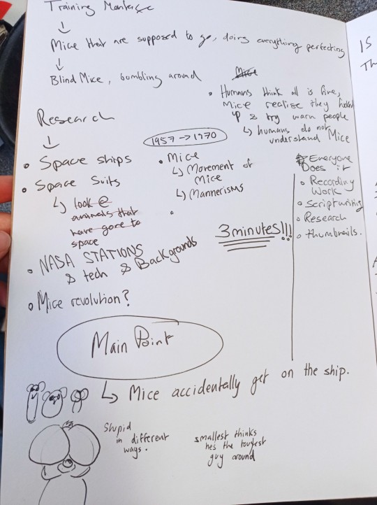
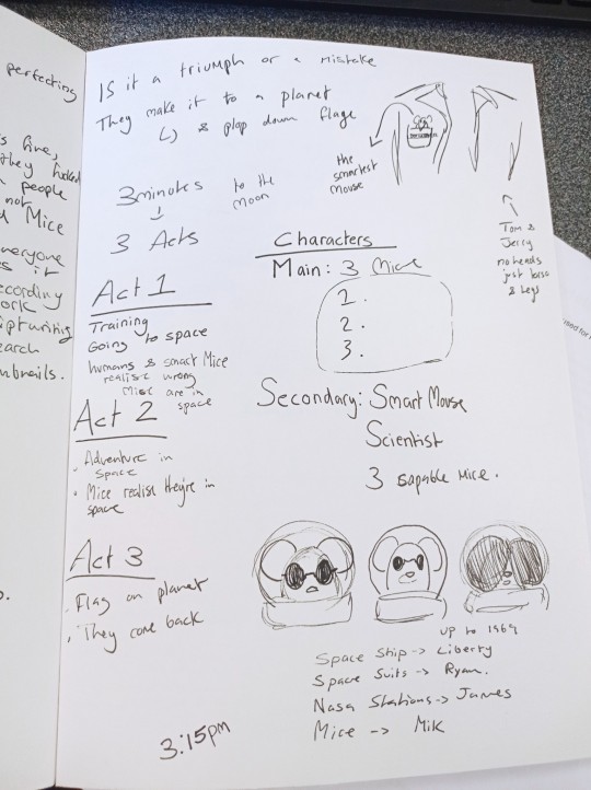

We then split and individually tried to come up with our own narratives, so my second idea for a narrative was for 3 astronauts to be sent in blind to an abandoned space station with no information for what lies ahead, only to discover they've been tricked by their higher ups and sent to die when they encounter the beast, a mouse alien, inhabiting the space station.
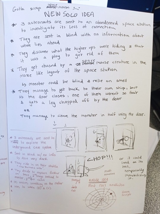
At the time my team liked the idea and we repurposed it into the 3 astronauts exploring an underground cave system on the moon, blind to the danger that lies ahead, where they encounter the mouse alien and are chased by it.

Since my group my liked my concept we diverged once more to write our individual scripts, and would then converge to discuss them and pick the bits we like. This was the script I wrote for this concept.

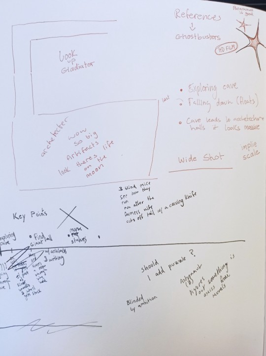


After some discussion amongst ourselves and our lectures, we ended up agreeing that this concept wasn't "Epic" enough, nor "Historical" enough, so we went back to the drawing board. This idea ended up being reinvented so that instead of finding a beast, our protagonists encounter the remains of an abandoned ruin, but there's more to it than meets the eye, when venturing deeper into the ruin they encounter the ruins of what was once a developed metropolis grander in size than anything they could ever comprehend. We're not sure whether we want something to lurk amongst the ruins.

This was the script I wrote for our new concept. For this one I actually read samples of scripts to better understand how to write and format them. I looked at the scripts of JoJo Rabbit, Brave heart which is an epic, and Joker. I had a lot of fun writing this.
My team and I went on call Sunday night, where we each read out our scripts out loud, which ended up being very useful as it helped us figure out what parts needed to be edited, weren't necessary, or were a mouthful. We ended up picking apart our scripts and meshing the part we liked into one Frankenstein script.
4 notes
·
View notes
Text
Class Bonding & Fota Park Drawing Trip Monday/Tuesday 8-9/04/24
Monday
On Monday we gathered and did a series of class bonding activities.
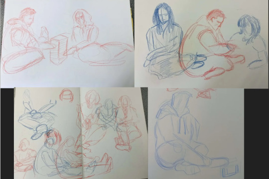
We split into groups and did life drawings of each other playing with toys.

We did illustrations based on our opinions of sandwiches, pets, and airports. we did exquisite corpses with each other, my group was in charge of heads. The skull one is a head I did. We even split into groups to make a mind map on what we think a team should look like.
Tuesday


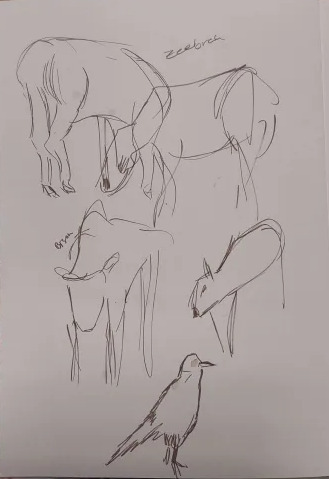


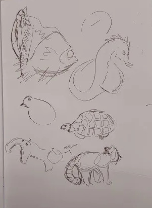
We went to Fota park to draw the animals, these are my life drawings from the trip.

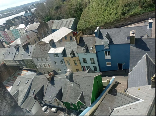


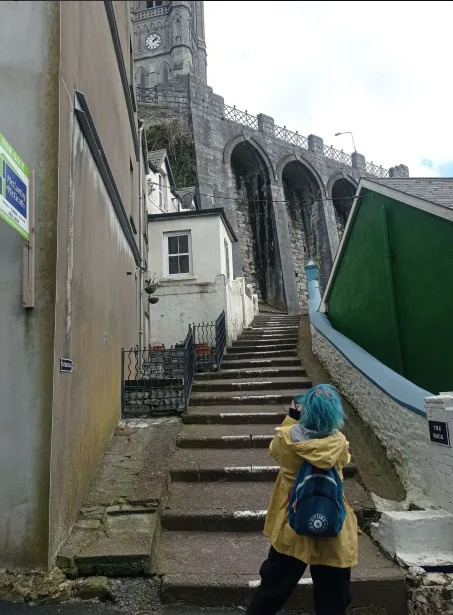
We went to Cobh for lunch and the town was gorgeous. Here are some photos I took. I feel like it would have been really nice to do our world building project in Cobh especially for the buildings and sights.
1 note
·
View note
Text
Brief: World building in Animation.
Week 2, Thursday/Friday , 21-22/03/24
Thursday
So on Thursday we started the day by photographing our finished mini Me's, the mouths, and our finished backgrounds in order to photoshop and edit them for animating on Friday.

First I took a good picture of my finished background.
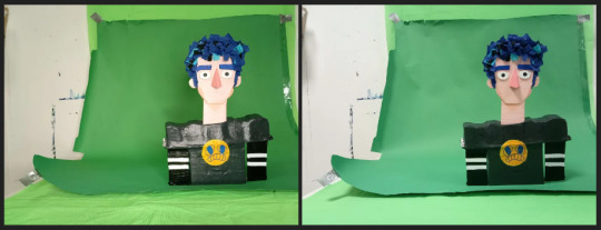
Then, I took 7-10 photos of my mini me against a green background, using different lights to see what worked best. No light ended up working best as I used acrylic paint, which with the lights caused a lot of glare which looked dreadful. I did the same with the mouths.


Next was the photoshop. First we would upload the photos onto the computer and open it onto photoshop, and then select each mouth and paste them individually into different files, using the magic wand and deleting the background. Occasionally cleaning up the edges. The same was done with my mini me.
This was a quick edit I did to get an idea of what my animation would look like.
Friday
With everything prepared we hopped onto adobe animate. I added all of my files onto the library and made the animation the length of my voice line which I added to the timeline. Separately I had to add each phonetic sound to individual frames and then when I lip-synced the mouths to the audios I had to assign each mouth to the phonetic sound. In the end I was successful, an issue I encountered while working on this was the audio playing when the mouth moved, this was fixed by moving the audio to the second frame instead of the first.
If I were to do this again I would probably make the mini me bigger and a use a different program. I'm not a fan of adobe animate and I found that the lip-synch isn't all that accurate, maybe I should've just made more phonetic mouth shapes but I don't think the ai is that good at picking up phonetic sounds from audio.
6 notes
·
View notes