
Statistics
We looked inside some of the posts by k00319458 and here's what we found interesting.
Average Info
Notes Per Post
69
Likes Per Post
69
Reblog Per Post
0
Reply Per Post
0
Time Between Posts
2 days
Number of Posts By Type
Text
17
Last Seen Tumblr Blogs


Fun Fact
70% of Tumblr users say the Dashboard is their favorite place to spend time online.
Text

This poster was made specifically to print for the pitch.
I added the title of the animation, "M.A.R.Y", to the top of the poster, ensuring the font 'Old English' was used to stay with our theme. In addition, I added a glow and some blood to the letters for aesthetics.


While Ríon created the entire composition, base colour, and shadow placement , Daria rendered and added additional shadow and light. Although my contribution was limited, I did give feedback through some of the process.
As Daria created different hues of shadow and lighting that could be considered, I argued towards a green shadow yet warm toned light source. This decision was influenced by our main source of inspiration, 'Bioshock', and the fact that we should keep cohesion of colour throughout our animation.
3 notes
·
View notes
Text

The group decided it would be best to keep the character concepts consistent, so I finalised Terry and the Boss digitally and created a character line-up sheet for scale.


The creation of Terry went through Ríon, Daria, and I before the final design was completed.
The final outcome ensures that Terry appears to be soft and caring as he cares about his daughter Terra. This is shown by the use of round shape language of his figure and clothing.
In addition, I chose a colour scheme to imitate Terra's, hinting that they are related and perhaps matching clothing on purpose - another indication of Terry's true, friendly personality when it comes to his daughter.


We took inspiration from the video game "OFF" and the movie "The Little Prince" for shape language and silhouette ideas, as a floor manager must emit authority and power.


Lastly, I redrew Katie's design of the Boss in the animation's style. We used sharp edges and triangluar shape language to depict a dangerous, smart, and evil personality.
3 notes
·
View notes
Text


Completed master frame based on Daria's storyboard sketch. Her character and expression sheets were immensely helpful in creating this.
I only made a few adjustments to the pose and facial expression to create more tension in the scene. This particular scene was chosen as it is one of the key moments in the story with the most built-up suspense.


The piece is simply made up of line-art, base colour, face shadow, shadow (multiply), and lighting (overlay) layers. This allows for dramatic environments with the least amount of work possible.

The colour and environments are heavily inspired by 'Bioshock', with bright yet soft turquoise lighting and dark shadows.
3 notes
·
View notes
Text


Continued creating more props. Prioritised the props most relevant in the storyboards and animatic as I realised it isn't necessary for every small prop to be rendered for the pitch.
Changed handwriting into cursive and changed fonts to Old English as this was the most popular font to be used during the Industrial Age.
We will be working on the pitch on Thursday, and I'll be creating the master frame.
1 note
·
View note
Text

Work on props.
Feedback from the presentation was very helpful. I will be changing the handwriting on the clipboard to be cursive even if it loses some legibility as people of the industrial age would not have been writing in print.
I plan on changing the font on the calendar to be fully printed using the printing press to keep the readability, but also keep the realism of the time. I will also be changing the slashed / European 7 as this also wouldn't have existed at the time.
2 notes
·
View notes
Text


My group and I decided on my 2nd colour iteration of Terra as blue is an expensive colour to dye clothes (due to needing rare European woad or importing the indigofera plant from asia), contrasting her class from the other kids. Blonde hair is also associated with purity and innocence in many cultures throughout history, traits fitting to the character in our story.
I have fully rendered concept art for our pitch and a separate image attached of a simplified version that will be used to refer back to during animatic / animation stages.
I decided to illustrate 3 common emotions Terra would express in the story. She is upset being lost, happy playing with the other children, and angry at her dad for pulling her away.
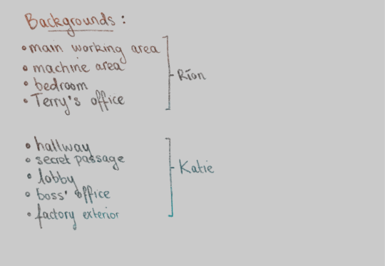
My thought process behind splitting the work of backgrounds and props was to identify the difficulty of each and split it equally. (A basic hallway is easier to design than an area of machinery)
As there were unequal amounts of backgrounds, I gave Katie a hallway and passageway to make up for the fact she had an extra background to do.
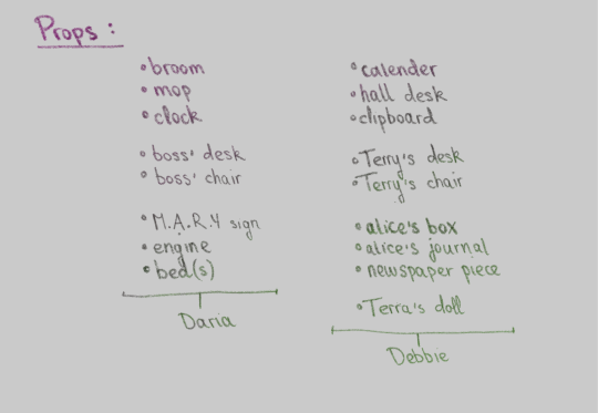
For props, I gave the extra (Terra's doll) to myself as I had already designed Terra. I figured I could bring elements of her design to compliment one of her belongings.
1 note
·
View note
Text


Continuing with our previous plans, we have begun concept designs for each of our assigned main characters. As I was given Terra (upper middle class daughter in the industrial age), I researched paintings and sketches made during those years for fashion and hairstyle references.


Final decisions on character designs are discussed by group members. (e.g ; 1st outfit design was furthered to colour iterations due to Terra being the daughter of the floor manager. Although they are wealthy, they are still within middle class. Hence, the simpler look suits the best.)
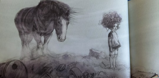
As today's group leader, I decided to settle on an art style all members deemed achievable and suitable for the feel of our animation. This stylised yet semi-realistic style is based on Daria's sketches (shown below), which I also referenced for scaling my character.

My plans for tomorrow and onwards are to make final adjustments and decisions for the character design, make an expression sheet, create a final list of props and backgrounds and divide them (½ props between 2 people, ½ backgrounds between 2 people) to then continue our designing.
4 notes
·
View notes
Text


The group came together and put our previous storyboards in order, critiquing each other and discussing how each of our parts can flow smoother into the next.
The tutors' critique furthered the improvement of our boards, allowing us to put more consideration into the characters' intentions and reasoning for certain actions.
Although only minor alterations were needed, we discussed further and realised our knowledge of the location itself was very limited. After Katie created a floor plan for us, it was much easier to visualise the spaces.
Due to our group critique, tutor critique, and location changes, I decided to make a full second draft of my storyboard. I found that writing each action taken by the character in order helped me focus on each frame, allowing alterations and new ideas to be more easily managed.
However, I would've spread this task across two or more days if I had done this again, as the last few frames weren't as thoroughly considered as the beginning.
5 notes
·
View notes
Text


We developed the story and ironed out details as a group based on our individual drafts from the day prior. We collectively made these decisions and created a basic script.
We then divided the storyboarding into 4 parts, each member taking 1 to complete before the group critiques each other, adds sections in between, and creates changes.
2 notes
·
View notes
Text


Week 1 • Animation • Re-Invention in Storytelling.
Nursery Rhyme: Mary, Mary quite contrary
Genre: Thriller
Time period: Industrial Age (1760-1970)
As my group split the initial research evenly, I explored the various meanings and depth of the English nursery rhyme we were assigned. We decided that the dark themes and the metaphors for torture devices were well suited to our thriller genre.
We brainstormed and discussed the base story as a group (based on our initial research) while splitting the 4 unique drafts evenly between 4 members. We decided we'd take interesting aspects of the drafts made to create our final script.
We were each assigned an aspect of environment/character/time period to research visually. I created moodboards and attached old photos based on the industrial age factory as this is the only place our story is situated.
6 notes
·
View notes
Text


Studying Luke Pearson's art style for "Hilda" and recreating my previous work in his style.
The tree trunks and branches came out very well as I had a lot of references from the book. Although, I wish i had the right coloured brown in the posca pens/paint markers, so I could've had an untextured, vibrant base colour.
My favourite aspect drawn is the tree moss. The moss and the cherry blossoms are both taken from Pearson's flowers and grain drawings. (photo shown above)
4 notes
·
View notes
Text


My next objective was to study the art style of "Hilda." I picked out illustrations of the environment for reference as it correlates with my park studies.
I realised that the colours used in the book are very flat yet vibrant - which doesn't suit the coloured pencil I've been using. I attempted to use watercolour for more vibrancy, but the textures will always remain unique even if I use it as dry as possible.
Tomorrow, I hope to use posca pens to replicate the digitally coloured look of these illustrations. I also plan on using this style to create some concept art using the park drawings from before.
4 notes
·
View notes
Text


These are some of the children's books I looked through and observed before choosing "Hilda" as the main style to study and replicate as instructed.
3 notes
·
View notes
Text


Sketches from life.
I do like the textures I managed to observe and stylise. However, I admit I managed my time poorly and could have gotten a few 1 minute / 30 second sketches in.
7 notes
·
View notes
Text

Today, we started by filming our 'pixilation' stopmotion video based on the storyboard created last week.
We were advised to revise/cut certain scenes as they didn't add any interest to the video. Due to this, we mostly re-shot the first and last scene to be more quirky, as well as having the addition of other characters being switched in.
In the evening, we individually edited the video segments taken previously. Many of the sound effects were difficult to find, so I compromised by using other sounds (e.g; falling granite boulder instead of bag falling).
The comedic music definitely succeeds in giving the mood i envisioned, as well as the smaller sound effects adding to the silly, nonsensical behaviour of the character.
12 notes
·
View notes
Text


Week 1 - Selected Discipline project
My group planned a concept and storyboard, focusing on large amounts of movement and comedy.

Many concepts and notes were also talked through.
5 notes
·
View notes
Text


Work through a tutorial in class.
Learning the tools of Adobe Illustrator and how we can use different features, sizes, compositions, etc, to create logos and posters.
Realised that although typography seems very simple from the outside, it takes a lot of time and small adjustments to appear smooth and clean.

Experimenting with different functions in the program for unique effects
4 notes
·
View notes