
B.ED “Movement” focusing on sighthounds (particularly greyhounds) and how they are exploited for their speed.
Don't wanna be here? Send us removal request.
Statistics
We looked inside some of the posts by k00320225 and here's what we found interesting.
Average Info
Notes Per Post
12
Likes Per Post
12
Reblog Per Post
0
Reply Per Post
0
Time Between Posts
2 days
Number of Posts By Type
Text
17
Last Seen Tumblr Blogs


Fun Fact
Tumblr was attacked by a cross-site scripting worm deployed by the Internet troll group GNAA on Dec 3, 2012.
Text


This is a painting I was doing at home
Not completely satisfied how it turned out I definitely would’ve left out the “friends of the wind” or else have done it differently. I really dislike it feel and I feel it ruined the painting
1 note
·
View note
Text
Personal statement
Movement for me has been an interesting journey. From brainstorming about Drag and Lizards to finally settling on sighthounds. I originally wanted to focus on the physical movement of how they run as it was suggested to me to do a physical movement as we only had a short period of time. But as I went through the project I felt that was not enough to sustain me for the coming weeks and to be honest it didn’t interest enough to keep going with it.
Greyhound racing obviously became a source of research while looking into how these dogs run and as I delved further into this world I came across more and more cases of abuse. I found that this really touched me and I felt really passionate about it as I have owned sighthounds all my life (close cousins of greyhounds) E.g whippets and lurchers. What I have discovered about myself is that I get really bored of my work quite quickly if I am not passionate about it so I knew this was the path to go down.
My electives were Fashion, Painting and Print and I feel I have definitely achieved what I wanted to in painting and print and have certified my love for them. I said I would try fashion as I am a B.Ed student and will not get the opportunity too again. I thought I would love it as I am completely obsessed with clothes but studying fashion is very different. I found it difficult as I didn’t understand the basics and couldn’t grasp concepts. So I did not achieve what I wanted too in this elective but I am glad I tried it and I know now that it is not for me.
Instead of my second week of fashion I went to Graphic Design instead and i absolutely loved it. It really suited the style of art that I am in too and that I create. I especially love the Typeography element and getting to play with words. Although I struggled with the tech side I am delighted to have found a love for a different area in the art world.
1 note
·
View note
Text
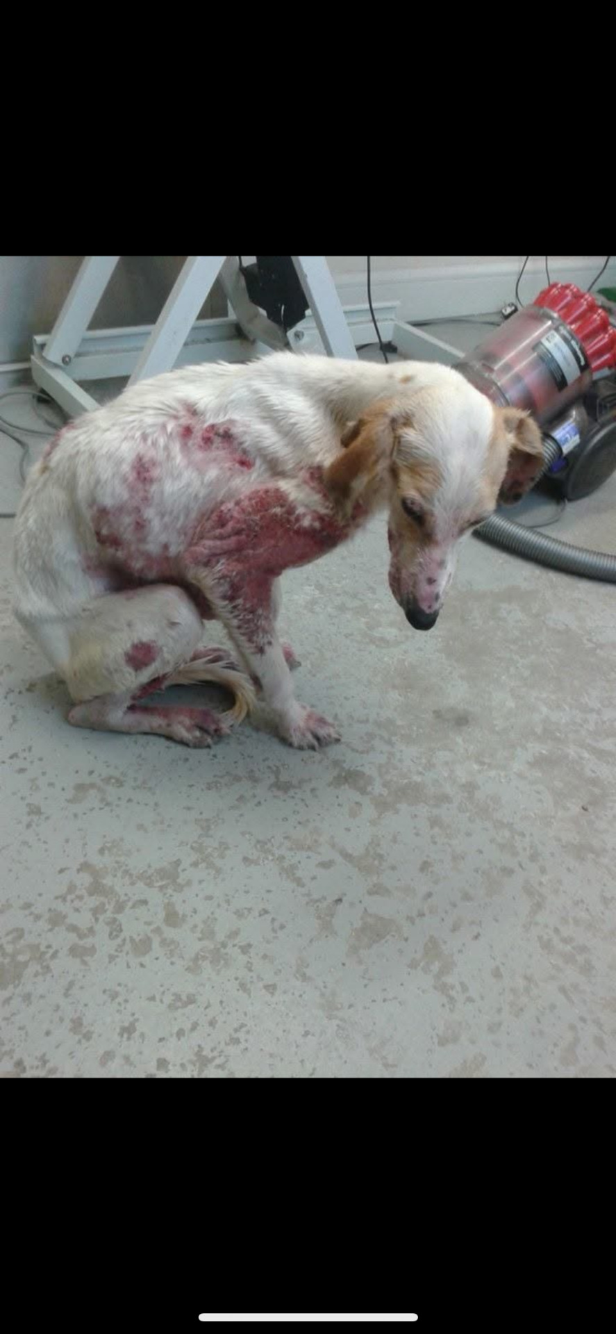
Just another example of the countless cases of the abuse of sighthounds
These three puppies were found dumped and straying in Leitrim on the Dromhair to Sligo Road, WITH COLLARS ON!!
Starved, matted and mange-riddled, god only knows how long these poor souls were roaming for. They are the fortunate ones to have been spotted and rescued by Leitrim Animal Welfare and will be nursed back to health. Hopefully they will be adopted in the future.
These three puppies were found on a main road. I just happen to wonder how many people drove past these innocent babies like they were roadkill ?. Again this raises the question of would it be the same case if it was a beloved golden retriever abandoned at the side of a road ?
1 note
·
View note
Text


Photoshop
Today in graphics we did photoshop. We were instructed to just use random pictures relevant to our project. This is a picture of my old dog buddy who was a whippet.
We were then given the basics instructions on how to import layer and apply text to images and then we were left to experiment however we wanted.
To be honest I felt I really struggled with the computer aspect of this as I feel I am really not a tech guru. For example I had 2 more versions of this picture I created but they were accidentally deleted.
I do like how these turned out though and could be useful reference photos.
#movement
0 notes
Text


Abram Games 1914-1996
“Maximum meaning, minimum means”
Abram Games is a renowned British graphic designer who designed over 100 official war campaign posters during the Second World War.
Some of his clients included the United Nations, London Transport, British Airways, The Financial Times and Guinness. He has also done other work such as designing stamps for Britain, Jersey and Israel.
In the Second World War he was appointed as “Official War Poster Artist” and designed over 100 posters.
Although his work is not related to dogs I admire his simple but efficient way of communicating through his work. He takes the words and concepts in their literal sense, breaks them down and manipulates them slightly to achieve what he wants to say.
My personal favourite out of his work that I have included above is the hand holding the cigarette. Without even using words he has achieved in communicating the message that smoking is bad. The coffin in the negative space of the hand fits in perfectly and speaks 1000 words. This showcases his outstanding talent in creative design and communication. He just keeps it simple.
#movement
0 notes
Text


Graphic design
This week I decided to go to graphic design and try it out as I won’t get an opportunity to do it with teaching and also as I really didn’t enjoy fashion.
We started off by writing down key words related to our topics and breaking them down into a literal sense. I really found this fun as it’s straight to the point, the text communicates well and it’s almost sarcastic.
We were focused on typography today which I absolutely adore and have used countless times in previous works of mine.
We then moved onto printing type. We were able to get creative as we liked and excitement with different words colours and fonts. The process was very similar to print and I really enjoyed what I created.
I’m pleasantly surprised at how much I like graphics and I’m really enjoying it so far
#movement
3 notes
·
View notes
Text


Sally Muir
Recommended to me by one of my tutors in my most recent progress review I looked at the artist Sally Muirs social media. These images are from her instagram portfolio.
She is based in Bath in the UK. Sally is a passionate portrait painter of dogs and landscapes but it was the dogs that caught my interest. She has a rare ability to capture the essence of her subjects with a direct and simple line and expressive line and bold colour. Her work is characterised by her informal and natural poses which add a simple and casual essence to her work which I really love.
She almost portrays the dogs in a goofy manner which captured their personalities.
#movement
2 notes
·
View notes
Text


Painting
This week I went back to painting.
Monday morning we got straight into doing a painting and from my sketchbook I was inspired and I picked the composition of a dog drinking “lean” out of a dog bowl to represent the doping in the greyhound industry. I don’t really like this painting and how I did it but i feel if we had more time I would have approached it differently.
After lunch we then did life drawing. I have done the painting workshop already and I really enjoyed that but I found myself really struggling with the drawing. I find it so hard to master proportions and draw what I see but I suppose it was good practice.
We then did a group painting on a long roll of paper and I really enjoyed this activity. I think it turned out so full of personality and it has elements of everyone’s unique styles.
1 note
·
View note
Text
The Lurcher ~ “The most abused and abandoned dogs in Ireland”
Stated by The Haven Rescue.
I stumbled across this post by Galway SPCA on Instagram and I found their opening statement to be so true. “Another day another traumatised lurcher” Even just from following rescues on Instagram and other social media platforms nearly every second dog is a lurcher/ sighthound breed.
I then was curious to find is there any statistics around this and I stumbled across an article interviewing members of The Haven Rescue in Tipperary. Jenny Nolan says “Out if all the dogs we rescue it’s predominantly Lurchers”
She also stated that “they would have never been seen as pets”
“When people would see them they’d be like ‘oh it’s just a lurcher’ whereas if it was a golden retriever there’d be an outcry.
People don’t see them and greyhounds as pets”
I find this statement to be so true. Coming from being a lurcher owner myself it is almost like they are seen as vermin, like the lower class of the dog breeds. The “mutts”. I can’t help but feel like it’s related to them being owned by people of lower socioeconomic classes and backgrounds especially their close ties to the travelling community.
Speaking from owning these dogs, they are the most gentle, easygoing and placid of breeds. I can see why they are abused so much as they are so non aggressive and can be so timid.
Most dogs that end up in rescues are lamping and hunting dogs left out in fields for days straying, tied to fences abandoned and starved. Their kind nature is taken advantage of so often as they are exploited for their speed and hunting skills. Then they are discarded like rubbish if they beg injured or slow down etc.
Just ask yourself how many times have you seen a golden retriever or a poodle straying ?


0 notes

Text


Development of my print idea.
The more I looked into greyhound racing the more I came access doping in the industry. And drugs such as coedine and cocaine are commonly used.
The pictures above show the primary research I did in my sketch pad and mood board and how the idea developed into printing onto the sandwich bag
I’m not 100% satisfied with how it turned out but Fiona assured me that it came out good as plastic is difficult to print on and I probably wouldn’t get any better.
I will definitely fix up the print and add white powder to represent racing dogs being doped with cocaine.
#movement
0 notes
Text
Finns movements
This video was taken just as I said Finns favourite word “walk”.
This is just another insight into his complex personality and shows the range of emotions that dogs are capable of feeling and expressing. You can literally see his eyes light up as he smiles and jumps for joy.
These are the emotions and expressions that remind us that dogs are beings too, and these are the emotions that are ignored when it comes to racing greyhounds.
The more and more I delve into this project the more I have looked into a researched greyhound racing. I am disgusted with how much abuse I have discovered and how quiet it is kept from the public. In the 2025 budget the government pumped €19.8 million into the greyhound racing industry. This infuriates me as there is so much deep rooted problems in this country that could use that money such as the mental health system and the housing crisis.
I feel very passionately about the abuse of animals and the waste of money that funds blood sports and I feel my project is going to veer more towards this direction.
#movement
0 notes
Text


Screen print day 2
Today I finished off the designs I printed yesterday. And started my second stencil.
I did some research into anti greyhound racing campaigns and organisations and found this quote which I really liked.
I first printed out my stencil which was the greyhound with the racing jacket on. During the process of checking was there any patches on my print by lifting up the screen (which is recommended not to do) my paper underneath must’ve moved. I didn’t notice this until I finished my print and it created this almost shadow. Even tho it was an accident I absolutely loved how it turned out and actually adds movement and dimension to the print.
I then typed, enlarged, cut out then printed the slogan down on top of the prints. I found it very difficult to line up hence the many tries, but I figured it out in the end.
Really satisfied with how these turned out.
#movement
1 note
·
View note
Text


Screen print day 1
This week I stuck with doing print but decided to do screen print instead with Fiona
She got us to brainstorm ideas and wrote keywords down related to our topic to expand our range.
We then picked and drew out one silhouette to cut out into a stencil. I ended up doing two so I could be prepared for day 2 and also to have a trial run as you can only use the stencils once.
Fiona showed us how to prepare the screens which is the most important step as they are delicate and need to be handled with care. We secured our stencils and placed our chosen card colours underneath the screen. She then showed us the flood and print technique. It’s important to keep pressure on the screen and keep the sqeedgy at a 45* angle while moving the ink up and down vertically. This is how you achieve an even print. It took me a couple of times to get used to the movement but I got the hang of it. I’m really enjoying it as once you understand it becomes a really quick process.
We will move onto phase two tomorrow to create more layers
#movement


0 notes
Text


Print week 1
Some prints I did today inspired from drawings from my sketchpad. I did the fashion elective last week and to be honest I really didn’t enjoy it as it is out of my comfort zone but I said I’d give it a try. I felt I had no transferable material from last week to bring into print so the prints are inspired by other work I have done.
The more I create the more I feel I am more drawn to more animation style drawings than focusing on realism and this showed in my work today.
#movement
1 note
·
View note
Text


Finns movements
This evening I just observed my dogs movements. Today he actually got his dew-claw caught in a branch on a walk and it is hanging off which would be painful to him.
Even though this injury is painful we were made sure not to forget about it. He moped around the house limping and whimpering with his head down low looking at the floors as he parks up beside the couch instantly demanding his rubs and scratches. He was in awful form.
Before I went to bed I called into to him as he lay on my parents bed (also his bed) and I captured the first picture of him and he did not look happy whatsoever. He is slightly dramatic but because of this he is a perfect example of how dogs use body language and expressions to communicate their feelings and needs
#movement
0 notes
Text


Thursday 23rd of Jan
Yesterday Sylvia recommended I go down to the photography room and I’m very glad I did.
With the help of Paul and a small and simple drawing I just cut out of my sketchpad, I was able to create these brilliant images
We put the drawing onto clear string and moved neon lights in the shapes we wanted to create in the background. To achieve this look you have to change the shutter speed of the camera so we set it to (shutter speed of 2 seconds) and also a small aperture (f11).
I’m extremely happy with how they turned out. They look like a greyhound running on the track which is exactly what I was going for. This photography style is a great way of portraying movement.
The third picture and just some simple gesture drawings I done with charcoal inspired by the photos taken earlier in the morning. I really love how they almost look animated
#movement
1 note
·
View note