
Statistics
We looked inside some of the posts by k00323463 and here's what we found interesting.
Average Info
Notes Per Post
33
Likes Per Post
33
Reblog Per Post
0
Reply Per Post
0
Time Between Posts
4 days
Number of Posts By Type
Text
17
Last Seen Tumblr Blogs


Fun Fact
Tumblr Inc. is using 66 technologies for its website.
Text
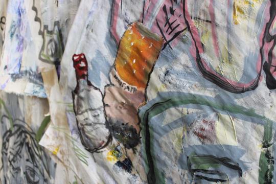
Final Wall For Assessment

My final set up for this short project.
2 notes
·
View notes
Text
Artist Research; Duke Beardsley
Duke Beardsley is a contemporary painter and illustrative artist. His work focuses on the American West, reflective of his life growing up in a ranch in Colorado.

T.Hix 2005
He also grew up in Denver and this dual lifestyle has influence in his work as he blends western iconography with a contemporary art style.


A lot of his work is mixed media and always carry a striking cowboy theme, in his own words he is into "All things cowboy" and his art certainty reflects this.


Many pieces are high contrast or have a limited pallete, his iconic cowboy figures are a repetitive factor of his work, often made into a literal pattern in the backgrounds or as standalone pieces.

@ denver art museum
1 note
·
View note


Text
Week 3; Studio Work
For the rest of this week I went back to Eoin's studio to focus on my own personal work for this project. This was a much needed break for me and it was nice to sit down and focus on my own work.

All three paintings have a bright red underpainting, with spaces intentionally left unpainted to contrast against the green tonal colours on the rest of the pieces.

I then painted over this red with lightening red tones, eventually white, to produce a almost glowing effect.
The above work highlights the nature and life found in the college, a branch reaching out across the sky and roots from a tree disrupting and breaking through a pathway.

The final painting I did this week was of myself in the smoking area. I work a late night job and often have come to college on very little sleep, I wanted to represent the feeling of being physically alive and there but being completely mentally checked out. Since I used the red tones to signify life in my previous paintings, I decided to use that on the body while intentionally avoiding the eyes.
3 notes
·
View notes
Text
Week 3; Figure Painting
On Monday we did figure painting with Sylvia. We mixed up some tonal paints and got started painting a life model.

I'm not confident in my life painting work but feel as though I have improved since my last life painting class. I found this pose much more interesting to paint.

Like last time, we stuck up all the paintings to view our peers' work and reflect on our own painting.
2 notes
·
View notes
Text
Week 2; Collaborative Painting
Learning from our previous painting, we decided on a more cohesive colour palatte for us to all use and focus on.
This helped bring all our separate art styles and pieces together.

We also ended up moving around a lot more on the wall so that someone's art was not limited to one section of the piece.

We kept the messy smoking area graffiti vibe to the whole thing as it was way more energetic and fun than a meticulously thought out, planned painting.


(My contributions)
At the end of the painting we decided to paint the church gallery on top with black, considering our paintings lacked a lot of structural work I thought this was fitting.

Finally we decided to colour match the brown paper we originally started the painting on and paint over the entire thing because we thought it was funny. If you want to be pretentious about it then you could probably say something about appreciating the process and not being overwhelmed by the concept of a finished piece.

Overall this activity was actually really great for getting me talking with my peers, I met some really fun people and enjoyed being able to let go of perfectionism and make friends.
1 note
·
View note
Text
Week 2; Collaborative Painting
For this workshop we were put into groups to create a large collaborative painting. I'm finding it fun communicating with my group and discovering what each of us like and don't like about the work we are making.


We are documenting the process from start to finish, as my group are doing a more abstract, collage-like painting it's likely at lot of this will change over course of the week.


We used different textures and materials to create visual and sensory interest and let each other explore our own parts of the wall under the theme of "LSAD Student Experience"

I'm finding it interesting seeing other artists view of the college and it's a nice challenge trying to merge all our ideas and art into one.


1 note
·
View note
Text
Week One; Exploring the Brief and Primary Research
When I got back to the studio I expanded on the photos I took and sketches I made. I like the chair and the students huddled together the most.


I also did tonal paintings of the smoking area and an ink drawing of the outside of the campus.


I used my photos of branches for reference when drawing a large branch that would be later incorporated into a bigger piece.

Overall it was a good starting point to the project and helped me process my ideas whilst continuing to make work, I also enjoyed painting on different materials and discarded/waste canvas pieces.

2 notes
·
View notes
Text
LSAD Anew Primary Research;
The first week for our new project we took walked around the college campus, I wanted to focus on life and signs of life throughout the college for my project so I started with nature and the outside grounds.


I took a bunch of photos of the nature/trees outside to use for reference, we were sent out to create drawings exploring the campus and the projects theme, so I sat out here for a while and sketched some of the nature and the building.


4 notes
·
View notes
Text
Sketchbook work
Exploring the brief on day one with some sketchbook work. Done outside with a viewfinder on the campus.


1 note
·
View note
Text
Artist Research; Rae Klien
Rae Klein is a fine art painter from Michigan who works primarily with oil paints and tempura. Her work is heavily and meticulously layered to create an eerie yet vulnerable effect.


Her paintings often carry a tense atmosphere, as loose painterly brush strokes are accompanied with strikingly well rendered sections, notably the eyes of the central figures in her work. It adds an uncanny and deeply personal quality to her work that I find very intriguing.

As described by an exhibition she took part in (I Have My Eye On You, 2021) her surrealist paintings seem to question the boundaries between a figure and their surroundings, and how one's self and one's environment can often become blurred.

While her paintings often tackle a variety of subjects matter, what I find most striking about her work is the contrast of soft, vagueness and harsh, confrontational edges.


I found Rae Klien's work through recommendation and continued my research of her work online through exhibition websites and posts about her work.
Her Website
2 notes
·
View notes
Text
Printmaking Elective; Printing on T-shirts
For fun I decided to print my linocut on some t-shirts for me and my friends, I put the large print on the back and the spiral print on the front.


They are a bit messy and the shirts are nowhere near perfect, they are covered in fingerprints and smudges because I moved them while wet and ignored the use of gloves entirely which was a bit stupid on my part.


I probably could have done a better job of this, but I had fun with it and kept my lino pieces so I can always try again in the future. I'm wearing the one that came out the best in the photos, they will need about a week to dry, so I took them home early to post about them.


When the shirts are dry I'll put them in a cold wash inside out and iron them to try set the ink and keep them looking good for as long as possible.
5 notes
·
View notes
Text
Printmaking Elective; Linocut
Linocut is by far my favorite method of printmaking, I spent my last week of the project entirely focused on Lino. I really like the forced contrast and textures that come from the medium.


I created this A3 print as my first lino, I really enjoyed the process and felt very much in my element here. I experimented with different colours and papers, I really like how the red turned out.


I also tried it on some fabric pieces and really liked the old tapestry look it gave, the folds and wrinkles in the fabric really add character to it. This later inspired me to print on clothing which I will post about next.


After I had enough prints of this first piece done I created a secondary lino to print on top as I wanted to add a second color to the print.

Finally I combined the two together into one print, I'm really happy with how this turned out especially considering I've never really done Lino printing before, I'm glad I took a week to focus on it.

As for how this piece relates to my theme; I wanted to include a variety of aspects I explored over the duration of my project. This includes the spiral motif as a representation of continuous movement/growth and life's cyclical nature. The snake is a nod towards the ouroboros and it's multiple meanings (renewal, the cycle of life and death, eternity and the unity of all matter) and the bones within the dog are a tie to the end stages of decomposition, as this piece was made at the very end of my project.
3 notes
·
View notes
Text
Artist Research; Bryan Christie
Bryan Christie is a contemporary artist whose work I came across while exploring my theme online. What I found was his beautiful anatomical art.


At first I thought they were oil paintings, which interested me as painting is my favorite elective. However after reading interviews and his own website I discovered a new process entirely. Christie's work is a blend of encaustic techniques (A form of painting in which pigments are mixed with hot wax) and digital rendering.


I think he explains his process best himself in this answer from an interview, "Using 3D software I create renderings that are visually similar to MRIs. To create the imagery I pose an anatomically correct human model with its internal system in virtual 3D space. I spin the camera around the figure and make renderings at every 30-60º. I then composite 3-12 layers in photoshop. From there I print each individual layer on silk. Covering a panel with encaustic I lay a layer of silk on it and then weld it to encaustic using a blow torch and heat gun. I the add another layer of silk and repeat the process. I don’t use pigment in the wax. All of the imagery is created digitally. "


I find this process super intriguing and it only deepened my interest in his work. It's described as a marriage of the scientific and the spiritual and I wholeheartedly agree. Christie points to Italian Renaissance painters as inspiration for his work. "Da Vinci spent time in morgues dissecting corpses and drawing in minute detail what he saw. This, and his scientific study of light, completely informed every brushstroke of his painting."


The meaning behind this line of his work also resonated with me. Such things include the obscurity of our inner workings and how this relates for our spiritual/physical existence and the connection of our physical forms to human emotion and experience.


This interview is incredibly interesting; its where I found the majority of my information on Bryan Christie, it's a great read and I'd recommend it to anyone interested.
I have also linked his website here;
0 notes
Text
Movement; Statement and Three Electives Reflection
For my project I decided on the movement of energy that occurs during the process of decomposition. I wanted to explore the physical movement of organic matter and also the metaphorical movement that occurs during the process, particularly in reference to the life/death cycle and the constant renewal and flow of energy after death. I wanted to use colors and symbolism in a way that depicted the process process of decay in a more positive light.
I started this project in sculpture where I spent two weeks working on a linear piece with an end goal in mind, it really helped me explore my idea and try new materials while keeping myself focused and working consistently.
I moved onto painting for my next three weeks of work, which included a reading week wherein I mostly focused on my CCS. I completed a variety of work and had fun doing different activities related to my theme. I found myself more personally invested in this work and while I didn't get much studio time with this elective as I would have liked due to some personal circumstances, I found ways to continue my work through other means. This is the elective I would like to pursue at the end of the movement project.
Lastly I did two weeks in printmaking, which is something I have very little experience in. I found it fun and because of the nature of printmaking I got a lot of work out of this week, in the second week I focused entirely on linocut printing which is something I really enjoyed.
Overall I had a good time with all three electives, but I am certain that painting is the one I would like to continue with as I feel it's how I can best express my artistic goals and ideas. It's also something I would like to use to pursue a future career in the art industry.
0 notes
Text
Printmaking Elective; Drypoint
Continuing my first week of printmaking, we began doing Drypoint prints. I found the process of this more interesting than mono and I liked how I had more control over the finished product.

I again used my previous body painting photos for reference and had more time to create a better etching into the acetate. I liked the effect of keeping the acetate sheet a bit dirty with ink and the edges solid as it naturally created a border for my print.


I created multiple of these prints, then I used the Monoprint technique I learned and created large flowing lines to represent the dispersing of energy and organic matter after death. The card wasn't as smooth as the paper I had used to Monoprint so it created a grittier effect.


I also made an A3 Drypoint of a female life drawing figure, I used layers of colours around the body to mimic the stains left by bodies "melting" and releasing fluid into the surrounding area during decomposition.
(I have cropped the following images of my references due to their graphic nature)


I did another print using this same idea, the colors are not as similar as I would have hoped due to my restrictions with the ink colours so I tried to focus more on how the stain spreads from the body instead, creating an aura of organic decay.

I did some watercolor versions of this concept earlier in my painting elective and think I did a better job on it than I did here.
1 note
·
View note
Text
Printmaking Elective; Monoprint
In my first week of printmaking we started with Monoprint, I don't particularly like this form of printmaking and I struggled to keep myself interested during the process, which I think shows in my work.


To get me started I took inspiration from Caitlin McCormack's work and created a print of a decaying animal skeleton. I think the fuzzy/messy quality of Monoprint was really suited to this piece.


I continued with some bug prints, woodlice are a very common decomposer and feast on decaying organic matter so I wanted to include them in my project. I also incorporated the fox from my earlier painting.


Next I used the pictures of painting I did on myself as reference photos and pulled cardboard wedges across the paper for a flowing, moving effect, as if to show energy and matter leaving the body during decomposition. I ended up liking this idea a lot and it carried into my dry point work.
I also created a print of the hibiscus flower vein paintings I did.

While I didn't particularly enjoy Monoprinting, it was a great exercise for getting my ideas developed and in order before I started a more time consuming form of printmaking.
1 note
·
View note