
Don't wanna be here? Send us removal request.
Statistics
We looked inside some of the posts by kamranhaqueunit10 and here's what we found interesting.
Average Info
Notes Per Post
1
Likes Per Post
1
Reblog Per Post
0
Reply Per Post
0
Time Between Posts
3 hours
Number of Posts By Type
Text
8
Last Seen Tumblr Blogs


Fun Fact
China blocked Tumblr because of pornography and censorship problems in 2013.
Text
Task 4 - Portfolio: Geometric Portrait Posters
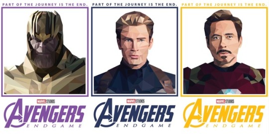
For my last portfolio topic, I decided to make a triptych of portraits using geometric shapes. The portraits I have created is based on Avengers. I made them of Captain America, Iron Man, and Thanos for the next movie - Avengers: Endgame.
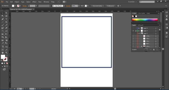
The first thing I did is open a plain white A4 document in Illustrator and add a rectangle with no fill and a thick stroke. I will put the character inside of this rectangle. The colour I chose for the stroke depends on the character in the portrait. In these screenshots, it will be Captain America, so I made it blue.
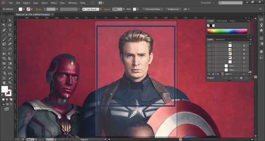
Next I placed my image behind the rectangle and and placed it so that the character’s head is the main part of the portrait but also some of their body. I also made sure my image was high quality so I can get all the details and make it accurate.
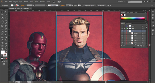
Next, I started illustrating. For this geometric shape art, I made sure to only use triangles, using the polygonal tool, in my art to make up the shape for everything and nothing else. This will allow it to look consistent and unique. After drawing the triangles, I made sure the fill is empty so that I can use the eyedropper tool and select the colour that I traced my triangle over.
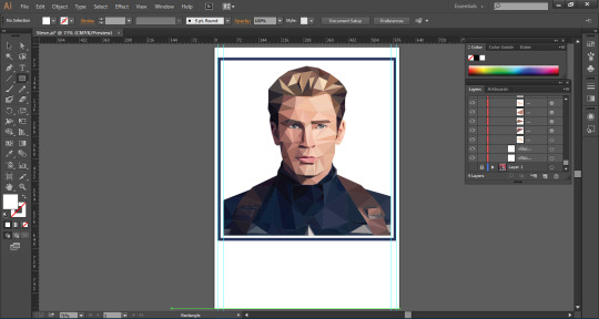
After drawing all of the triangles, I hid the original image layer. I used guides on the sides of my image so there can be a gap away from the border so it doesn’t overlap and look strange.
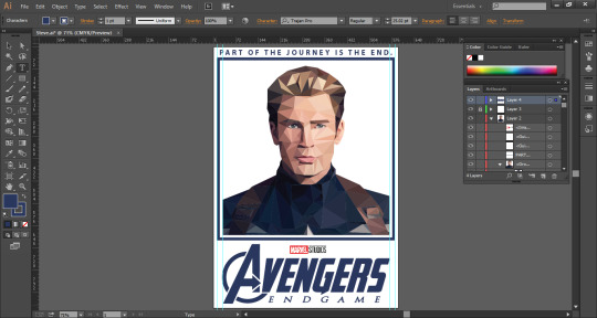
Next, I added the Avengers: Endgame logo. I did this by using an image online of the Avengers logo and recolouring it so that it matches with the rectangle above, and also added the “Endgame” with the text tool and using the font, Trajan Pro. I edited this text so that it is slanted like the original logo for the movie, and also placed an image of the Marvel Studios logo, as the movie title cards always have that logo above it. I also added “part of the journey is the end” at the top. This is a quote from the trailer that I thought could be a nice touch to add to the poster and make it sort of like a catchphrase.
Below is the final poster and the other two posters of Iron Man and Thanos, both done in the exact same way, but different colour themes, a gold-ish yellow for Iron Man and purple for Thanos.

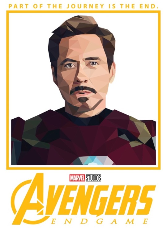
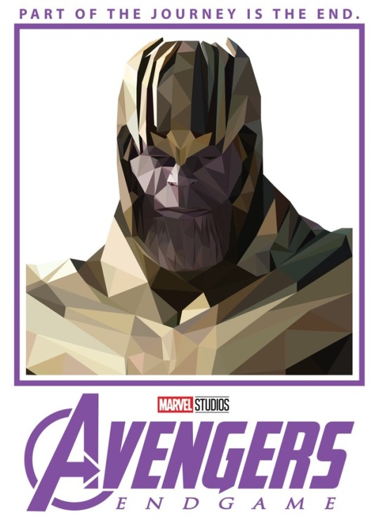
Overall, I think these posters have turned out very well. I am happy with the way they came out and think they are better than I expected. The things I did well on are getting all of the colours and details right. No areas of the portraits look strange or out of place because of a triangle being too big or anything. I made sure my triangle sizes were appropriate depending on the amount of space a certain colour took up. The things I think I could’ve done better are maybe including a background of some sort, but I thought that this would distract from the effect I created, so leaving it plain allows the character to stand out and for the geometric shape effect I created to be noticeable.
0 notes
Text
Task 4 - Portfolio: Sketches
I thought that it would be a good idea for my next project to be purely sketch based. I thought this would be a good decision as sketching is an important aspect of Graphic Design as it is one of the first steps into creating a digital piece of work and is part of the planning. I decided to do some observational sketches and draw random things in my room.
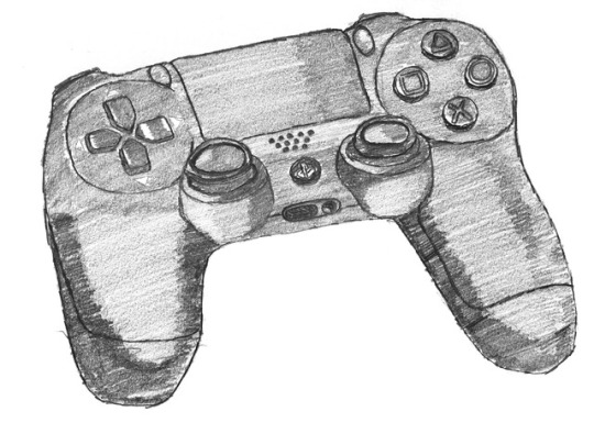
The first thing I sketched was a PlayStation 4 controller. This needed a lot of details as there is a lot going on with the controller, being the buttons, holds and other details.
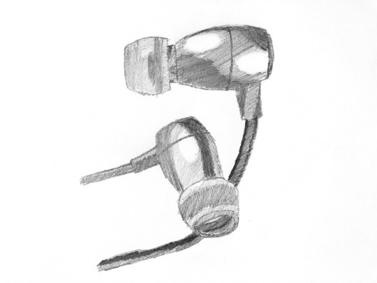
The next thing I decided to sketch were my earphones. This needed less details as it didn’t have a lot of buttons or holes or anything and much just plain spaces and instead just mainly curved edges.
I think overall, my sketches are okay. I think I’m good with the outlines and getting all the details in and keeping things in proportion. My weakness, however, would be the shading. I could use a lot of practice with my shading as it is definitely not one of my strong suits. In some areas, I’m not too bad but most of the time it doesn’t look too good so I need to spend more time practicing shading so that my sketches can look better and more professional.
0 notes
Text
Task 4 - Portfolio: Infographics
Another project I thought would be good to do would be infographics. I thought that this could showcase my skills in vector illustrations and also a bit of typography too. It could also help display my knowledge of colour themes.
Chocolate Infographic
The first infographic is a task I did for World Chocolate Day and I had to create something that represents the history of chocolate. The infographic is based on how the Mayans created xocolatl (bitter water).
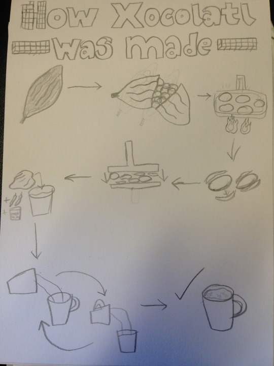
This was the sketch I drew. I tried to keep it simple and clear so anyone can tell what is going on as that’s what a good infographic should do.
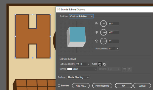
After this, I started creating it in Adobe Illustrator and opened an A4 document and made the background a cream/light brown colour with a dark brown stroke as I thought these are suitable colours to use for an infographic about chocolate. I then created the title using the marque tool and shapes and made my own typeface out of it. From here I made my letters 3D by using Effect > 3D > Extrude & Bevel.
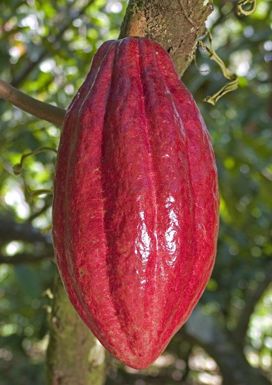
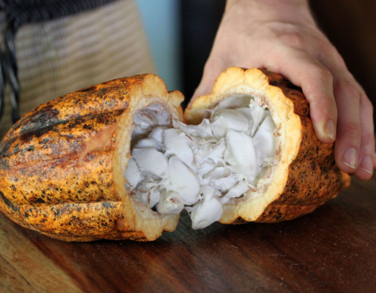
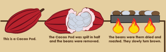
After this I used images of a cacao pod to trace over it with a pen tool to create an accurate illustration of it and used the smooth tool to make the outlines smooth and make sure it doesn’t look rough. I used the pen tool to create the lines inside and changed the stroke profile so it adds more depth to it and makes it look more professional. I used the ellipse marquee tool for the actual beans on the second image and kept duplicating it and rotating it to make it look more like the picture. Next I used the rectangle tool to create a base to show where the beans will be roasted. I used the same shapes for the beans and changed the colour to show it’s been roasted. I used the pen tool to draw the fire and duplicated it and changed the size to add the different colours to it. I added a line behind the illustrations so anyone can tell where it starts and where it ends. I made it the same colour as the stroke on the background so it stays consistent and I’m not using too many colours on it.
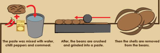
After this I illustrated the next row. For this I didn’t need to use any images as these are simpler shapes that I am more familiar illustrating. I used the same oval for the beans and used the pen tool to draw out the shell around it so it stays accurate and looks like it fits around the beans. I made the beans lighter than the shell to show the difference between the shell and the actual bean inside. Next, I used the same rectangle shape for the base, this time to show how the beans are crushed and used a circle to represent the object the Mayans used to crush the beans. I added a thin layer under the circle to show the area that’s been crushed and a red arrow to show the direction the beans are being crushed just to make sure it’s clear. Then I used the pen tool to draw out the paste and made it the same colour so it matches with the beans. The pen tool was also used for the cup and the ellipse tool for the inside of the cup and water. I used an image of chillies to create the illustration to show other ingredients used for xocolatl. For the cornmeal, I used simple shapes and text to show the pack of it. The brush tool was used for the arrows and plus signs.
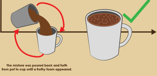
The final two illustrations were mainly duplicates of shapes I’ve already used as it was only cups and arrows. I used the pen tool again to draw the handle around the cup and changed the colour to white to show the difference between the pot and the cup. I also used the pen tool again to show the liquid pouring into the cup. I used the brush tool and tapped on random areas in the cup to show the “frothy foam” at the top of the drink.
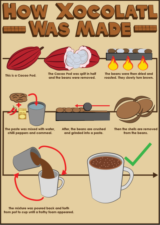
This is the final piece. I added text under each step to fill in negative space and to explain what’s actually going on in case it isn’t clear as I feel like the text would help describing what some of the illustrations even are. The things I think work well in my infographic are the illustrations and the consistency of everything on it. It all has an illustrative design to it with strokes which keeps it matching and nothing looks odd on it or like it’s not meant to be there. I also think most of the illustrations look good, especially the cacao pod and and the cups, as they are the most clear and it’s easy to tell what they are. I think the title also looks good and professional and the typeface I’ve created looks consistent in size and I made sure the 3D was always at the same angle. The things I think I could’ve done better are the lines I tried to make look like chocolate bars in the title. I should’ve added maybe another row or played around with the effects to make it more obvious that it’s supposed to be a chocolate bar, but I thought it might look inconsistent in comparison to the text. I also think the illustration of the beans being crushed could’ve been done better and I should’ve maybe tried making it look more 3D so it’s more obvious what’s happening in the illustration.
Tea Infographic
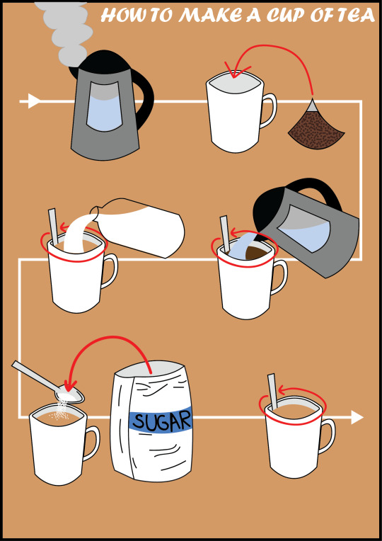
Next I decided to create an infographic of any recipe I want. I decided to use as little steps as possible and no words to show how good and clear I can make my illustrations. I chose to make an infographic on how to make tea. For the whole infographic, I drew my illustrations from scratch as I knew what these things would look like and they aren’t the hardest of shapes to draw.
For these illustrations, I used simple shapes and or the pen tool to create the more unique shapes I would need for some of the steps. For example, with the steam, the pouring milk, the sugar bag etc. I made the background colour try to fit within the theme of tea so I made it the same colour of the tea I used. I added an arrow behind all the steps so the reader would know where the start and end is an what direction to follow.
I think the overall look of the infographic looks good and consistent as it is all illustrations and nothing looks out of place or like it isn’t meant to be there. However, I do think some of my illustrations could’ve been done better, like the cup for example. The top should’ve been rounded better, the pointed edges look strange. But I do think other details look quite good. Like the pouring milk and the sugar being dropped into the tea.
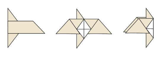
Origami Infographic
The next infographic I made was a step-by-step tutorial on how to make an origami bird.
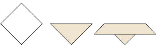
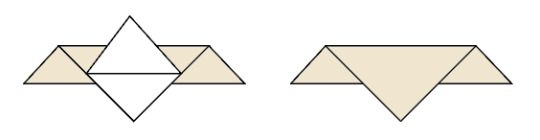
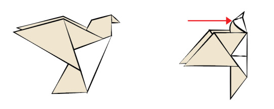
Using Illustrator and images from a website tutorial (https://www.origamiway.com/easy-origami-bird.shtml), I created illustrations of a step-by-step tutorial of how to create an origami bird. I used the pen tool and drew the illustrations based on the images on the website from scratch. I made sure that I used two colours for the illustrations so that the reader will understand that it is different sides of one paper and it will prevent any confusion while the person is trying it themselves.
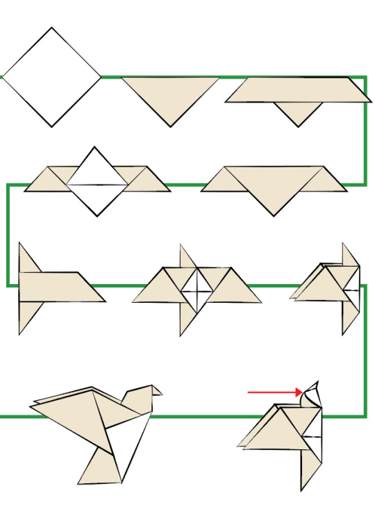
The next thing I did was line all the illustrations up with each other and add a green line behind it to show what order to follow the steps. I also added an additional arrow to make the directions I’ve given more clear for the reader. I changed the stroke profiles of the illustrations to give it a hand drawn effect and make it look like it was painted, like Japanese art.
From here, I added finishing touches onto the document and added text to describe what’s going on in the illustration, in case it’s hard to understand. I also changed the green line at the back to an arrow to make it even clearer that it’s showing what direction it is meant to go. I added a green tick to show it is the final step. I added keys at the top to show which side of the paper is which by colour coding them and put it into a box with the title.
Overall, I think that this infographic looks really good. The illustrations have come out well and I think that choosing to change the stroke profile was a good decision as it made it look a lot more unique and sort of gave it an appealing style. I think I could’ve imporved on some of the colours I chose, like for the arrow. I don’t think green goes with the other colours but it does stand out which is good as it the reader will notice it and won’t be going in the wrong order.
0 notes
Text
Task 4 - Portfolio: Typography
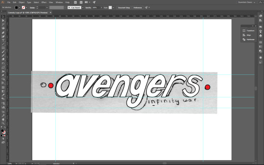
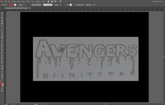
My next project I decided to do was based on Typography. I chose this to show the different styles typography can be in. I decided to do this based on movie genres and chose the movie, Avengers: Infinity War. The 3 different genres I chose were Sci-Fi, Comedy and Horror. To start off, we had to sketch out many different designs for each genre and choose the best one from each. These are my sketches:
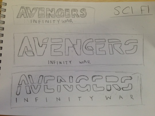
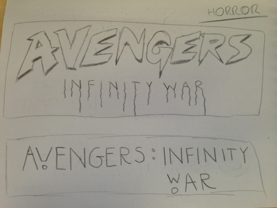

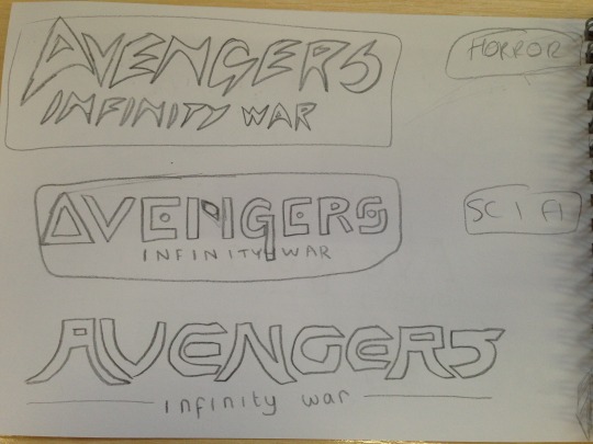
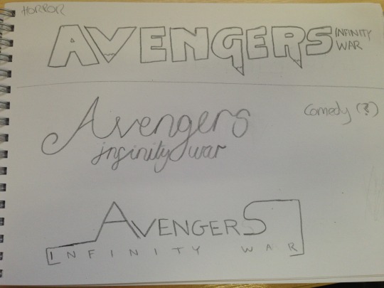
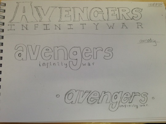


I used visual references for my sketches by looking up movies of the genres on Google. For example, for Sci-Fi, I took inspiration from Tron. For Horror, I looked up films like Scream and The Evil Dead. And I saw that comedy films use a mix of different kinds of typefaces so I sketched out random typefaces. I did 6 sketches for Sci-Fi, 7 sketches for Horror and 6 for Comedy.
For Sci-Fi I decided to choose the third one on the first picture, as I thought I could make it look like a neon logo which is suitable for Sci-Fi because it makes it look futuristic. For Horror, I chose the first logo on the last picture. I think this looks the most like a horror typeface because of the dripping blood. I made the dripping blood look like it dripped into the “Infinity War” text. For comedy, I chose the 3rd logo on the 7th picture, as I felt it looks similar to the Friends logo. I think that this makes it more obvious that it is in a comedy genre.
Sci-Fi Logo
This is the process for my Sci-Fi logo I have vectorized. I did it from scratch instead of tracing over the sketch as I thought it would be easier, the shapes are already in Illustrator and it would look more neat and clean.
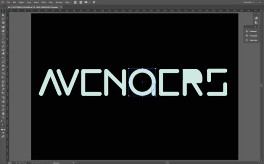
I started by creating the letters from scratch. I did this by using the rounded rectangle tool. I made the R using the same technique and used the direct selection tool to make it into the shape of an R. I created the G using the elliptical marquee tool and removing the fill and then adding the stroke so that it expands from the inner area. I also added another rounded rectangle to add the flick on the G.
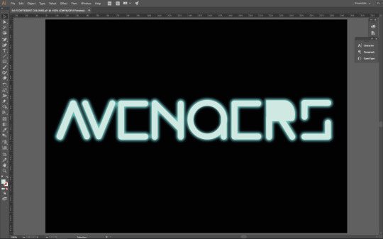
The next step was to add the neon glow. I looked on YouTube for some tutorials on how I can do this. I did it by creating a duplicate layer of the text and putting it under the main layer. From here I selected the text on the duplicate layer and went to Effects>Blur>Gaussian Blur and added a certain amount of blur to it. I made sure the blur was the most vibrant colour and the main text was a lighter version of it, almost white, so that it looks like it is lit up.
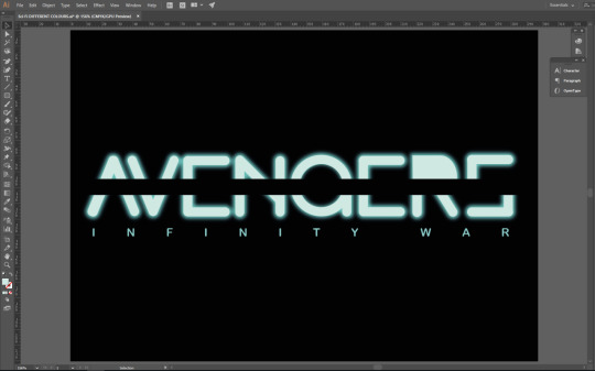
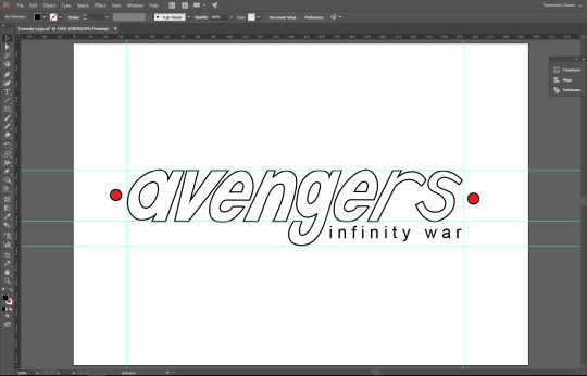
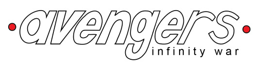
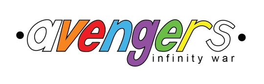
After this I added a black line through the middle to split the text and make it look unique. For this, I just used the rectangle tool and aligned it directly in the middle. From here, I added the “Infinity War” subtitle. I used the main vibrant colour as it looks better and makes it more colourful compared to the main lighter text. I used quite a thin typefaces so the Avengers part is more eye catching as it has the neon glow. The thin text also makes it look more like the Tron logo, like for Tron Legacy.
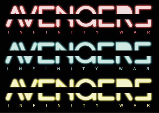
After creating the logo, I duplicated it to test it with different colours. This is what the logo looks like if it was red or yellow.
The final piece has come out the way I had intended it to and I am happy with it. Not much has changed compared to the sketch so it has successfully communicated my intentions. I made sure it didn’t look exactly like the Tron logo as I was just inspired by it, and didn’t want to copy it. The neon glow makes it stand out and gives off the sci-fi vibe I wanted it to. This is also a new skill I have learnt and will remember for if I ever want to add a neon glow to anything else. I wanted to add the neon glow as it would look to simple without it, and it would help to make it look more sci-fi, because it could remind people of light sabers from Star Wars. I added the line through the middle to make it look unique and for some of the letters to be more obvious, like the G looks more like a G with the line through it than without.
Comedy Logo
This is the process for the comedy logo. For this, I used my original sketch and traced over it in Illustrator.
I started by placing my original sketch in a Illustrator document and moving it so that the text is in the centre. After this, I used the pen tool and started drawing over the letters as the writing is italic so it would probably take longer to use shapes for some letters and make it match with the rest of the letters. I used guides to make sure it’s all on one line.
Next, I made the sketch layer invisible and added the Infinity War subtitle and placed it next to the descender of the G, like my sketch. I added red dots on the side by using the elliptical marquee tool.
This is the logo I have made for the comedy genre. I have taken inspiration from comedy films/TV shows like Friends. I added red dots on the side to make it look a little bit like the Friends logo, but not exactly like it. It also makes it look like it is pinned onto something, which makes it look better than just simple typeface. I used thin text for the subtitle for the same reason as my Sci Fi logo, because the main part of the logo is the Avengers part, and I need that to stand out. The logo has come out the way I had intended it to because I just wanted it to be a simple logo as comedy films don’t really have creative or memorable logos like other genres do, so I think it came out well.
I tried adding some colour to the logo to see what it looks like. I added the colours of the Infinity Stones in the movie, but I thought it looks too childish, and the plain white would look better.
Horror Logo
This is the process for my horror logo. For this I used the same technique as my comedy logo, where I open my sketch image up in Illustrator and trace over it using the pen tool.
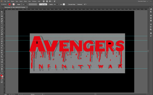
I used the pen tool to draw around the letters and used the direct selection tool to make sure the letters are even and straight. I used the smooth tool so that the edges are smooth and don’t look jagged. I used guides to make sure it is all straight on one line as the original sketch was a little bit bent. I kept it as red so it actually looks like blood. The black background is appropriate as horror films are dark and set in the night, so a brighter background wouldn’t fit.
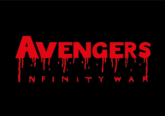
This is the final piece I have created based on my sketch. I have made it look like blood dripping from the logo to form the “Infinity War” part. I decided to make it look like this so that it is clear what genre the logo is, as everyone would see the blood and assume it is for a horror movie. I think that this logo came out well, but there are some issues I have with it. The logo does look how I intended it to, and communicates the genre well, but I think I could’ve done a better job at making the width of some parts of the letters match. I thought the blood dripping to make the subtitle would be a creative way to put it there rather than just typing it out and placing it right under the logo.
1 note
·
View note
Text
Task 4 - Portfolio: Double Exposure
For my portfolio, I decided to base my first project on Double Exposure. I have chosen this topic as I enjoy double exposure and think that it is an attractive and unique effect that catches attention. I also believe that this can showcase some of my skills in blending and using layer masks.
The first step into creating the Double Exposure effect was to open an image of a model in Photoshop, preferable an image with a blank background.
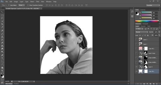
The next step was to crop the image to however I desired, and use the quick selection tool (or the pen tool) and select and mask so that I can cut out the model from the background and make sure it is an accurate cutout. I then held Ctrl and clicked the icon on the layer so it selects my cutout, and then duplicated the layer so that it only duplicates my cutout onto a transparent background. After this, I desaturated the layer using Ctrl+Shift+U and added a new solid colour adjustment layer under my cutout and deleted the original layer I first used.
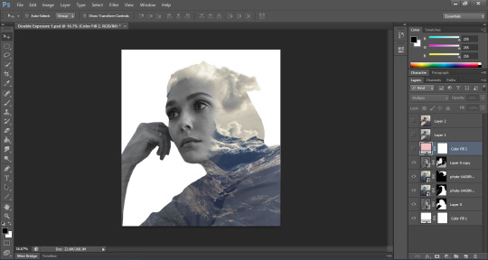
Now onto the blending. I place embedded the image I want to blend with the model and Ctrl+clicked the cutout layer while on the mountain image layer so I can see the marching ants through it. From here, I clicked the layer mask icon at the bottom of the layers panel. This inserts a layer mask allows me to start blending the two images together. But before this, I duplicated the original model cutout and moved it to the top and changed the blending mode to Lighten and reduced the opacity. This creates a cool effect where I can see some of the model image through the mountain image. I inserted a mask into this layer also. I started blending the image to reveal and conceal areas I don’t want of the model, and the same for the layer mask of the mountain image, to a point where I think it looks good.
After this, I changed the colour of the solid colour layer using the eyedropper tool and selected the sky’s colour. I then duplicated the mountain layer and removed the layer mask from it and changed the blending mode to Lighten. This makes the clouds only appear and creates a unique effect on our image. But some areas needed to be gotten rid of. So I used a reverse layer mask using Alt and clicking the layer mask icon so it disappears. I used the brush tool next to make certain parts of the clouds appear through the image.
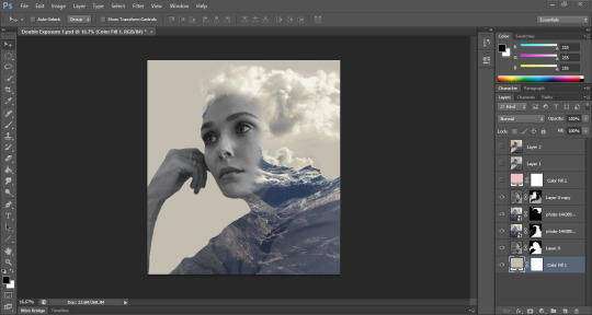
Finally, I added a new solid colour layer as a light pink and changed the blending mode to Multiply and also changed the opacity. Next I held Ctrl+Alt+Shift+E to put all the layers I’ve done into a separate group. On this group layer, I changed the blending mode to Soft Light and reduced the opacity. And that is how I created this Double Exposure effect.
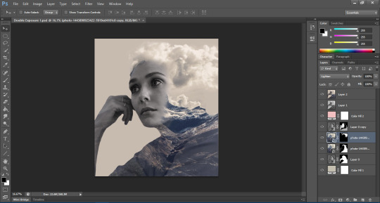
Below is the final piece of the work I’ve shown in the screenshots, as well as two other works I’ve created using the same technique and steps.
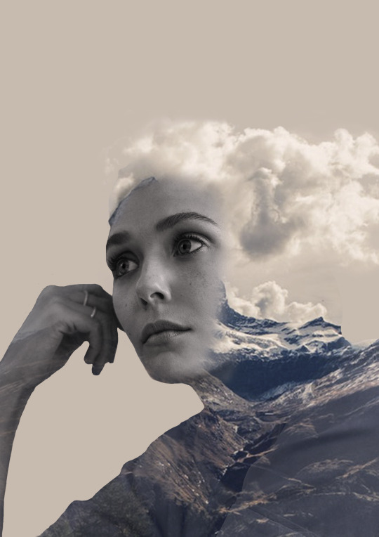
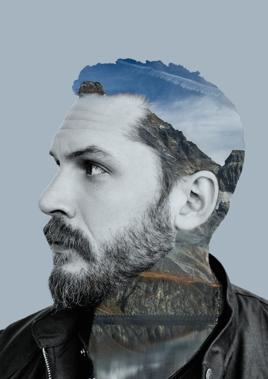
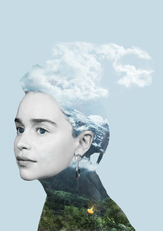
Overall, I think I’ve done quite a good job with this project. I think I’ve done well with the images and the cutouts and blending. That being said, on some areas, I do feel as though it could’ve been blended better, or another image could’ve been used. So my positives are also my negatives. But the three images together create a triptych of artwork which I think would all look good together, as they all fit within the same theme and have blank, dull backgrounds. The double exposure effect stands out against the background and creates a unique effect when blended with the face of the model.
0 notes
Text
Task 3 - Personal Statement
(This is a personal statement that I’ve used to apply to university. I’ve made slight changes so that it can also be applied to a job application.)
Currently, I endeavour to study/work within the Digital and Media industry with the intent and hopes to advance my passion for the subject and the skills I have gained through studying it in college. My time in education and the courses I have studied, as well as personal hobbies within my recreational home life, have resulted in me developing many skills in the subject.
From my current course, Digital Design, I have learnt the basics of designing software within the Creative Cloud such as Photoshop, Illustrator and InDesign. I have also produced multiple amounts of work in these softwares as part of my course within different categories of the subject (Photo Manipulation, Logo Designs, Typography, Digital Art, 3D Design, etc.). Furthermore, I have researched into the history of Graphic Design and studied different art movements as inspiration for some of the work I have created. Additionally, within my previous endeavours, I have maintained skills regarding marketing within a portion of A-Level Media Studies I personally found myself adept at. This supported my personal and professional development in order for me to study Digital Design competently. During the said portion of the course, I have researched the history of media and designed websites (using Wix) and have produced logos and leaflets connecting to the website itself. These activities provided me with versatile skills within Digital Design and further enhanced my interest for the subject by exposing me to things I enjoy.
In my personal time, I often draw and use computer programs to create art, so utilising that hobby throughout a professional environment further grew my love for the subject and allowed me to incorporate my personality within my work. My affinity for art was further explored through GSCE Art, which allowed me to extend my skills in a professional way; this enabled me to intertwine my skills in art with my interest in ICT, thus inspiring me to take up Digital Design. My academic interest is also expressed in my personal time, as previously mentioned, while studying Digital Design in college, I participated in a competition for an academic exercise in which I designed logos for the OWEN Trust Foundation in order to spread awareness about water safety. I am personally supportive of charity work and hope to use my academic skills and interest in order to benefit others, as I hope to do within a future professional career.
My love, interest and dedication to this subject matter will hopefully be enhanced and nurtured through Higher Education/work, granting me the opportunity to develop all established and growing skills further, as well as learning new skills to pursue a career within Graphic Design, allowing me to work effectively and competently while doing the job I love.
0 notes
Text
Task 2 - Creative CV
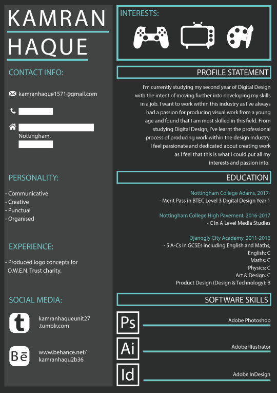
This is the CV that I have created. I created this using Adobe Illustrator and based it off of some of the creative CV’s in my mood board. I made sure that I stayed within a colour theme so it doesn’t look too unprofessional. The colours I have stuck to using are two shades of grey, a lighter and a darker one, white, and turquoise. I decided to use these colours as I thought that they all go well together and the turquoise stands out against the dark, dull coloured background.
To start this, I created a blank document and inserted shapes to make my layout. I put my name in a big typeface in the top left side of the page, as this will most likely be the first place an employer looks, so the first thing they’ll see is my name. Under this, I added a rectangle in a lighter shade than my background as it will be a different section. In the lighter side, I decided to include more social information about myself. I put contact details, social media, experience and also included my personality traits. For my personality traits, I used a personality test online to see what traits stand out the most for me. These are traits that I can use in a professional environment. These are some of the results that I got:
Communication Skills
(Questions 9, 11, 13)
Your score is 11 out of 15
The ability to communicate clearly is key to your success, whatever role you're in.
Time Management
(Questions 1, 4, 6, 15)
Your score is 15 out of 20
Time management is one of the most important career skills areas. Not only does it help you to be more productive; you'll also be much less stressed!
Personal Mastery
(Questions 3, 8)
Your score is 7 out of 10
When you know how to "lead yourself" and make good choices for your future, you'll be that much further ahead when it comes to the other skills areas that we've already looked at.
I implemented these results into the personality section of my CV as it would be useful for employers to see what stands out in my personality but also allows me to develop those traits even more, while improving other traits that may not be as impressive.
For the social media area, I created icons as the logo by tracing over the original logo using Illustrator so that I can create my own and use my own colours that go with the theme of my entire CV. I also did this for the small icons that appear in my contact information area.
In the top right side of my CV, there is an area that displays my interests, being gaming, television/movies, and art. I decided to use icons instead of a list as I felt this would showcase my talents better than just simply listing them. I used the same technique as the icons in my social media area, by using images to trace over and create my shapes and colouring them so they match my theme, while also standing out against the background.
For the right side of my CV, I have included more personal details about myself. A profile statement, briefly explaining who I am and why I want to work within the industry and my education history. I’ve also included an area at the bottom to showcase what software I can use really well, so employers can get an idea of what kind of projects I am used to doing. For this section of the CV, I have used simple shapes like the rectangle tool, and the text tool for all of my text. I have made sure headers stand out by colouring them turquoise in case it ever causes confusion with the rest of the text and have also used boxes for each sub-heading.
Overall, I think I have done a decent job with my CV. I think the things that I have done well are my layout and use of colours. I also thing my icons and illustrations look really good and the use of white was a good choice as it will catch the eye on the darker background and interest the employer because it could be important information to acknowledge. The things I think I could’ve improved on are maybe including more of the things I’ve learnt in my course to better showcase my talent. I feel as though the CV is still quite simple and that if I could’ve been more creative with it, it would attract the attention of employers; this CV doesn’t look like something that would stand out among other creative CVs.
0 notes
Text
Task 1 - Research
The first task into Personal and Professional Development in Art & Design is to research and gather information relevant to my progression goals and present it in a creative way. The first thing I did was create a flow diagram that presents the different options for me to get an idea on how to progress into the future to make sure my skills are developed, both personally and professionally within Graphic Design.
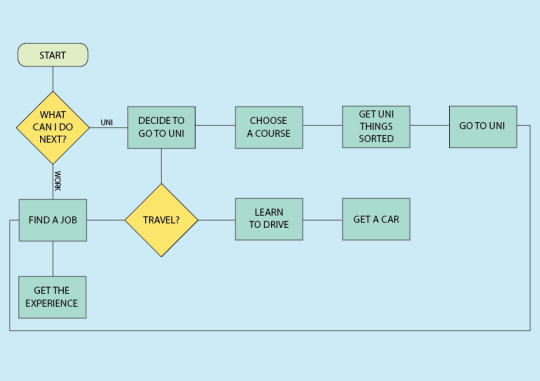
As shown in the picture above, my two options are to either go to university to continue studying Graphic Design and develop my skills, or to get a job and get experience in working in a professional environment so I can progress further into other better jobs and work my way up to being a skilled worker. I also added steps after each option to help myself make sure I do things in an orderly fashion. I also added a section for travelling so that I can get an idea on what exactly I can do to ensure I don’t run into any problems with travelling to my job or to university.
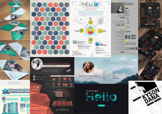
I also created a mood board to get inspiration and ideas on how my CV could look. I looked online for creative CV’s to see what kind of things people do in theirs and how I can incorporate these into my own CV to make it look creative and unique and not like just any CV.
0 notes