Don't wanna be here? Send us removal request.
Statistics
We looked inside some of the posts by katherinebarnesblr and here's what we found interesting.
Average Info
Notes Per Post
0
Likes Per Post
0
Reblog Per Post
0
Reply Per Post
0
Time Between Posts
9 hours
Number of Posts By Type
Photo
8
Text
9
Last Seen Tumblr Blogs


Fun Fact
Women make up for the other 50% of Tumblr’s audience.
Photo
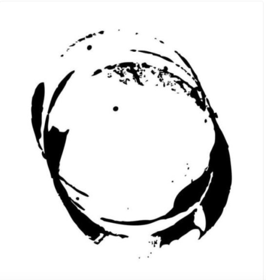
This is our logo for the exhibition. Lauryn made this by photoshop. We had many ideas in what colour we wanted, whether to have our name on it and what shape to have it. By experimenting with different colours we decided we liked it in black and white. This makes it more vivid when its presented smaller such as on Instagram.
0 notes
Text
Images to represent our work in our exhibition
By Anna
By Danni
By Lauryn
By me
By Poppy
These are all images of our best work we have done this term. They are represent the type of photographer we are.
0 notes
Photo
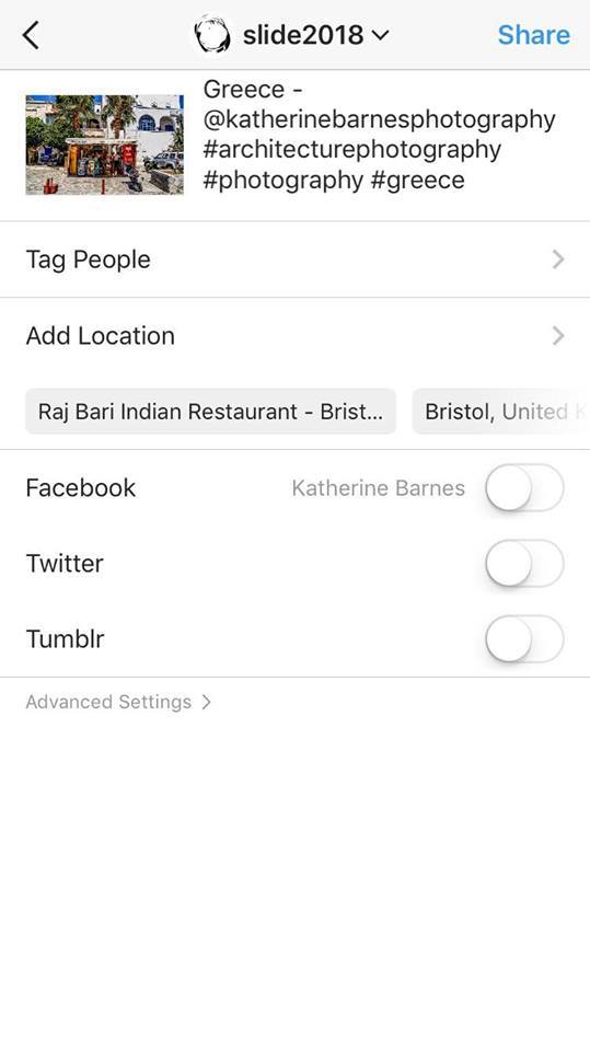
Keeping our Instagram updated with hashtags so more people can view the type of work we produce.
0 notes
Photo
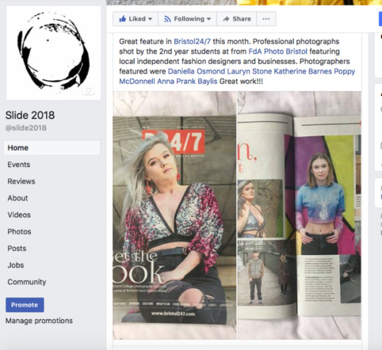
Publishing on our website about our portraits from the independent clothing brands being in the Bristol 24/7 magazine.
This was very exciting for all of us as this was the first time we have had our images in a well branded magazine.
0 notes
Text
Bibliography - Independent Practice
References
Artist, J. (2018). Judy Barrass- Artist. [online] Judybarrass.com. Available at: https://www.judybarrass.com [Accessed 5 Jun. 2018].
Hagan, S. (2018). William Christenberry obituary. [online] the Guardian. Available at: https://www.theguardian.com/artanddesign/2016/dec/04/william-christenberry-obituary [Accessed 5 Jun. 2018].
Helloblue.co.uk. (2018). Hello Blue | Specialist Fine Art & Graphic Print Solutions. [online] Available at: http://www.helloblue.co.uk/ [Accessed 5 Jun. 2018].
Jim Stevenson. (2018). COLOUR. [online] Available at: https://www.jimstevenson.photography [Accessed 5 Jun. 2018].
Kaiwiedenhoefer.com. (2018). Kai Wiedenhöfer. [online] Available at: http://kaiwiedenhoefer.com [Accessed 5 Jun. 2018].
KWMC. (2018). Community Arts Bristol - Knowle West Media Centre. [online] Available at: https://kwmc.org.uk [Accessed 5 Jun. 2018].
Nobuhironakanishi.com. (2018). Nobuhiro Nakanishi|中西信洋. [online] Available at: http://nobuhironakanishi.com [Accessed 5 Jun. 2018].
Pinterinest. (2018). Pinterest. [online] Available at: https://www.pinterest.co.uk [Accessed 5 Jun. 2018].
Pixelrights. (2018). Marc Wilson. [online] Available at: http://marcwilson.co.uk/albums [Accessed 5 Jun. 2018].
ROBERT POLIDORI. (2007). Gallery. [online] Available at: http://www.robertpolidori.com [Accessed 5 Jun. 2018].
Simonkennedy.net. (2018). Simon Kennedy London Architectural Photographer. [online] Available at: http://www.simonkennedy.net [Accessed 5 Jun. 2018].
Simonnorfolk.com. (2018). SIMON NORFOLK : PHOTOGRAPHER. [online] Available at: http://www.simonnorfolk.com [Accessed 5 Jun. 2018].
Tate. (2018). Between Object and Architecture – Display at Tate Modern | Tate. [online] Available at: http://www.tate.org.uk/visit/tate-modern/display/between-object-and-architecture [Accessed 5 Jun. 2018].
Tate. (2018). Paul Seawright born 1965 | Tate. [online] Available at: http://www.tate.org.uk/art/artists/paul-seawright-9835 [Accessed 5 Jun. 2018].
0 notes
Text
Bibliography - Professional Development
References
Ben Costigan Photography. (2018). Ben Costigan Photography. [online] Available at: https://bencostiganphotography.co.uk [Accessed 5 Jun. 2018].
Bristol 24/7. (2018). Bristol 24/7 | Bristol news, what's on, food and drink, lifestyle. [online] Available at: https://www.bristol247.com [Accessed 5 Jun. 2018].
Epicphotography.co.uk. (2018). Epic Photography (Bristol). [online] Available at: http://www.epicphotography.co.uk [Accessed 5 Jun. 2018].
Fotohaus.co.uk. (2018). fotohaus :: architectural photographers / architectural image library / Bristol / London / Berlin. [online] Available at: https://www.fotohaus.co.uk/architectural/photographer/index.php [Accessed 5 Jun. 2018].
Foundation, M. (2018). Martin Parr Foundation. [online] Martin Parr Foundation. Available at: https://www.martinparrfoundation.org [Accessed 5 Jun. 2018].
Helloblue.co.uk. (2010). Hello Blue | Specialist Fine Art & Graphic Print Solutions. [online] Available at: http://www.helloblue.co.uk [Accessed 5 Jun. 2018].
Jason Ingram | Bristol photographer of gardens, food, people & interiors. (2018). Jason Ingram Bristol photographer of gardens, food, people & interiors. [online] Available at: http://www.jasoningram.co.uk [Accessed 5 Jun. 2018].
Kingbridge. (2014). Kingbridge Photographer - United Kingdom. [online] Available at: http://www.kingbridge.co.uk [Accessed 5 Jun. 2018].
Richardansett.com. (2018). Richard Ansett. [online] Available at: http://richardansett.com [Accessed 5 Jun. 2018].
Simon Ward Photography | Salisbury Family Portrait, Special Occasion, Wedding and Commercial photographer. (2018). Simon Ward Photography | Salisbury Family Portrait, Special Occasion, Wedding and Commercial photographer. [online] Available at: http://www.simonwardphotography.com [Accessed 5 Jun. 2018].
Sleek Wise. (2018). Sleek Wise Clothing. [online] Available at: https://sleekwiseclothing.com [Accessed 4 Jun. 2018].
Southbankcentre.co.uk. (2018). Andreas Gursky | Southbank Centre. [online] Available at: https://www.southbankcentre.co.uk/whats-on/exhibitions/hayward-gallery-art/andreas-gursky [Accessed 5 Jun. 2018].
0 notes
Text
Bibliography - Mediation and Promotion
References
2 - COBC, Y. (2018). @slide2018 • Instagram photos and videos. [online] Instagram.com. Available at: https://www.instagram.com/slide2018/?hl=en [Accessed 4 Jun. 2018].
123print.co.uk. (2018). Business Cards from �3.99 | 123Print UK. [online] Available at: http://www.123print.co.uk/business-cards [Accessed 4 Jun. 2018].
Anon, (2018). [online] Available at: https://www.zazzle.co.uk/photography+businesscards [Accessed 4 Jun. 2018].
Hollenderx2.com. (2008). HollenderX2 Photography. [online] Available at: http://www.hollenderx2.com [Accessed 4 Jun. 2018].
Moo.com. (2008). Custom Online Business Printing & Design | MOO. [online] Available at: https://www.moo.com [Accessed 4 Jun. 2018].
No Plastic Sleeves. (2018). Print Portfolios / Promos | No Plastic Sleeves. [online] Available at: http://blog.noplasticsleeves.com/category/print_portfolios/ [Accessed 4 Jun. 2018].
UK, A. (2018). Jim Stephenson - Architectural and Interiors Photographer - Home. [online] Clickclickjim.com. Available at: http://clickclickjim.com [Accessed 4 Jun. 2018].
Wilson, M. (2018). Marc Wilson. [online] Pixelrights. Available at: http://marcwilson.co.uk/albums [Accessed 4 Jun. 2018].
Wix.com. (2011). Free Website Builder | Create a Free Website | Wix.com. [online] Available at: https://www.wix.com [Accessed 4 Jun. 2018].
0 notes
Photo
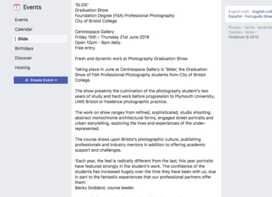
Description on Facebook about our exhibition.
0 notes
Photo
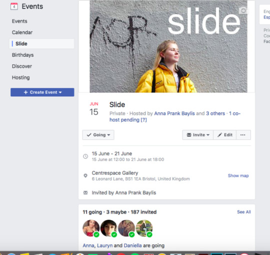
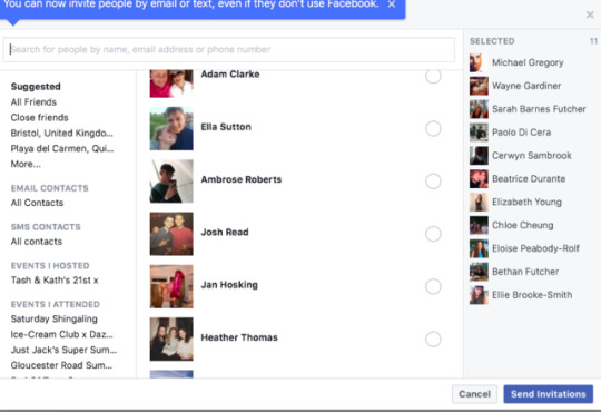
As a group we decided it would be beneficial to make a Facebook page four our exhibition. This way we can invite our friends and family to visit centre space. On the page it shows us who is going and who can’t go which is useful as it gives us the idea how many people will be attending.
This is a good idea as it gives the people direction to where the gallery is, what time it is on for and a brief description about the course and what is it about.
0 notes
Text
Evaluation- Professional Development
When we first started this module we were set to contact an independent fashion brand to photograph in Bristol. As I am not very confident in approaching and talking to strangers I found this a bit challenging. I found the courage to find a model and a company to photograph and by the end of the shoot I found that I had built the confidence to do this in the future. I was very pleased with the outcome of my images how the company posted my images on their social media, publishing my photography. For the future I would like some more practice in lighting in different locations as this is something I have less confidence in.
Our next task for this module was to find a professional mentor. After phoning up and emailing a variety of photographers in the Bristol area I managed to find a photographer from Salisbury, named Simon Ward. I spent nearly half the day with him and found his advice extremely helpful. He taught and showed me many interesting things that I didn’t know about the photography business such as, how he got his name out there, how he publishes his images and promotes himself etc. He also gave his opinion on the images i’ve taken and my social media accounts, offering thought on how I could improve them. We exchanged numbers and Facebook accounts so we could stay in touch. I will be going on a few shoots with him over the summer so he can give me more tips and advice.
This module has helped me finish putting my final portfolio together; I have included my favourite images that I have photographed within the two years of this course. I have made adjustments to my portfolio throughout the year by the advice of professional photographers Simon Ward, Kirsty Mackay and Joe Coleman. I decided I wanted to include mostly architecture images as this is what I have explored the most and enjoyed throughout this course. My portfolio also links into my three exhibition images as they are all architecture. I wanted to include a few of my portraits I have photographed in my location module because they show the message of ‘student living’ from my location module.
For my portfolio I decided to print my images off on A3 oyster paper as I liked the way it brought out the colours on my images. I included a 5mm white frame around my images to fit into my A3 portfolio box nicely. I have placed my architecture portfolio images in order from the oldest photograph to the newest. I liked this sequence as they start from old architecture buildings to modern buildings. I have then decided to leave my portraiture images last which tell a story about my ‘location’ module I did last term. Our last task of this module was to get ready for our graduation show. This was something I found exciting yet challenging. I have had many questions to myself about how I would present my exhibition, what lighting I would use and what materials I would need.
For my exhibition I wanted to try something different and unique to what I have done before. I wanted to make it look interesting to myself and the viewer. There were many ways I was thinking of doing this; such as using acetate, layering images on each other and using different size wooden boxes as a frame. In the end of experimenting on what worked and what didn't I decided to print my images on acrylic plastic as these were a lot more stronger and sturdier that acetate. I got these framed especially to how I wanted them so they could stand up on a plinth.
I got these printed at hello blue printing company in Bristol. I wanted to print these separately so I knew what one would look like before printing the other. I also printed them in advance so that if anything went wrong I could get it changed in time. I was extremely happy with the outcome of these images more than I thought I would be. I have kept my idea from the start of making an object into an image and found new ways in creating this. For lighting wise I have decided to use an LED lamp from college and reflecting it on the wall where my acrylics would be.
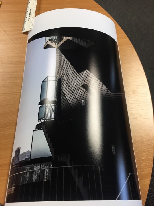
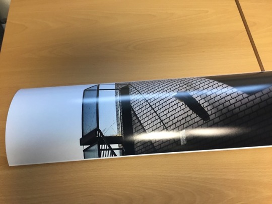
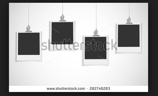
My last photo for my exhibition is an image I have photographed very recently and very proud about. This is also an architeure image which I took in Kingsdown. This photo was a challenge to print as it kept getting a discolouration in the sky, but after tutorials on youthbe I managed to fix this problem. I will be presenting this image A1 on Oyster paper and hung by bulldog clips.
0 notes
Text
Evaluation - Independent Practice
At the start of the project I knew I wanted to continue photographing architecture after exploring derelict buildings from our exploratory practice module. Although I enjoyed photographing derelict buildings I wanted to do something different and find new, unique and modern buildings which I haven’t yet come across before. I became fascinated in the images of modern architecture photographers including Simon Kennedy and Jim Stephenson. I became interested in the lines, shapes and compositions that are shown within their images, which I would want to re-create.
When first beginning my project I had the idea of making an image into an object. I experimented by printing out my photographs, cutting them up and then placing them back together in different ways so it makes an abstract image. I wanted to find more inspiration in making an image into an object by looking on Pinterest. I came across Judy Barrass who has made a sculpture by using her images and other unique paper models. I wanted to photograph new, modern buildings. I decided to walk around the Bristol Harbour and photograph the buildings from different angles and focus on the horizontal and vertical lines. I preferred most of these images in black and white as it seemed to emphasise the dark shadows and lines of the buildings. For my project, I wanted to re-create a 3D model to have an idea of what I would do for my final piece. For this I ordered three wooden boxes, and printed a series of my images on A4 acetate. I overlapped them together and stuck them to the boxes. I photographed these images in the studio while stacking the boxes in different, creative ways. I placed a light box on the left side so the details would be more vivid.
After this shoot, it really inspired me to explore turning an image into an object and an abstract image. After going out on a variety of shoots photographing more modern architecture in places such as London, Amsterdam and Bristol. It made me think more about the shapes and compositions of the building. After this I decided I wanted to keep the idea of making my images translucent and forming an abstract image.
I continued my idea for my exhibition and ended up printing two A1 size images through acrylic as this worked a lot better than acetate which was too thin and flimsy. I was very pleased with my two main acrylic images as they show a lot of form, texture and shape. I liked the idea of one being in black and white and then the other being in bold colour. This shows a vast difference between my architecture photography. My technical worked involved me to think about composition and how I would crop my images. By also photographing the buildings in different angles which will suit my subject better.
Lastly, my final image is an image I took in Kingsdown, Bristol. I wanted this image to be in my exhibition because I was interested in the type of lighting that has bounced of the wall creating unique shadows while the sky is in a light blue. This project has definitely inspired me to photograph more architecture in the future and inspire me to read up more about the different architecture there is.
0 notes
Photo
Printing my image off after correcting the sky in lightroom by changing the grain. This seemed to work and the sky seemed to be all the same colour.
I did a test strip in A1 to see if they sky was still the same and how sharpening the image on screen would look like after printed.
I was very pleased with the outcome of my A1 image to be shown in the graduation show.
0 notes
Text
Evaluation - Mediation and Promotion
My exhibition role was social media. This included me to control our Instagram and Facebook making sure enough photographs were going up daily. As well as selling our selves by talking, and emailing different people to see if they would be interested in joining our exhibition and centre space. I also had to keep count on many people will be attending our event via Facebook. I hugely wanted all my friends and family as well as the people who I have met during the course to look at all the hard work we have achieved throughout the two years of the course. I have also had to give people a ring such as my mentor as they may have been too busy to answer emails. This gave me the opportunity to talk more about what our exhibition consists of.
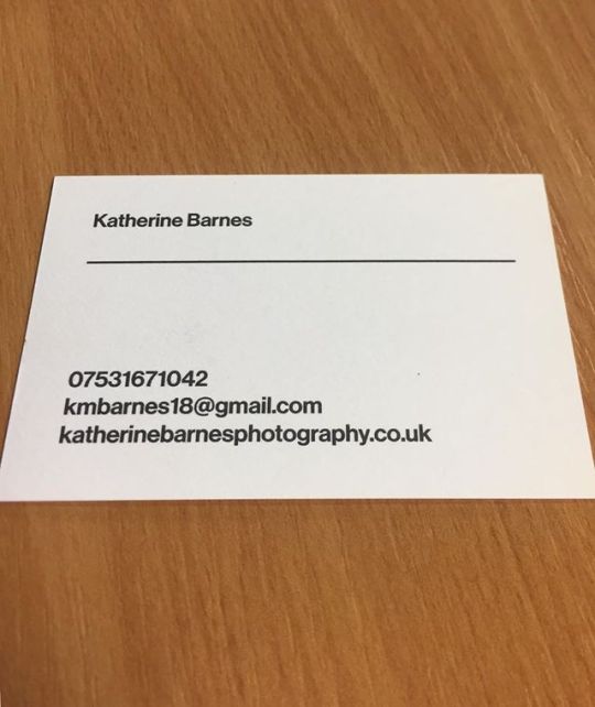
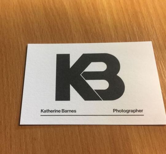
To promote ourselves for our module we were asked to make personalised business cards. While looking at various of cards that Anna brought into college, and online I decided I wanted to use cotton fabric cards. These were the best for the environment and I liked the feel of them. I decided I wanted to keep my business cards simple but still effective. On my card I placed my logo in the centre on the front page, while having my information on the back in bold writing.
Before making my cards I knew exactly how I wanted my logo to look like by looking at different designs on google of my initials. I got my friend who is a graphic designer to create my logo. I was really happy with the outcome with the K and B joined in a really effective way. I wanted my cards to be in black and white as it relates to my website which has a black and white and modern theme.
Before joining this course I had never made a website before. By discovering Wix which is a website maker I found this extremely easy to get around and build a website. I continued to make changes to my website during this term, such as changing the font to be more stylish and modern.
I wanted to have one of my strongest image as my homepage on my website to draw viewers in and make them curious of the type work I produce. This photo is of architecture that I have taken showing its one of my interest in photography. I have also used my logo right in the centre which is also on my business cards so people would remember who I am. I then decided to use three headings at the top which are nice and simple to read. On my portfolio page I have created three categories which I photograph the most including ‘architecture’, ‘portraiture’ and ‘commissioned’. I have also included one of my favourite image as a cover photo so people would be intrigued to look at more. I have decided to make my images go from old to new as I like keeping them as sequence in the new photography I have produced.
When coming to social media, before this module I didn’t have anything on social media to do with my photography except a few photos on Facebook. I decided to create a new Instagram account especially for my Photography named ‘KatherineBarnesPhotography’ I continued to post photographs of my latest work and got a fair few followers. I thought this was really inspirational as I got to find out new photographs who I didn’t know before. I also managed to create a Facebook account for my photography where I got family and friends to follow me, I thought this was a good idea as you can be reviewed by stars that can sell your self to the public.
0 notes
Text
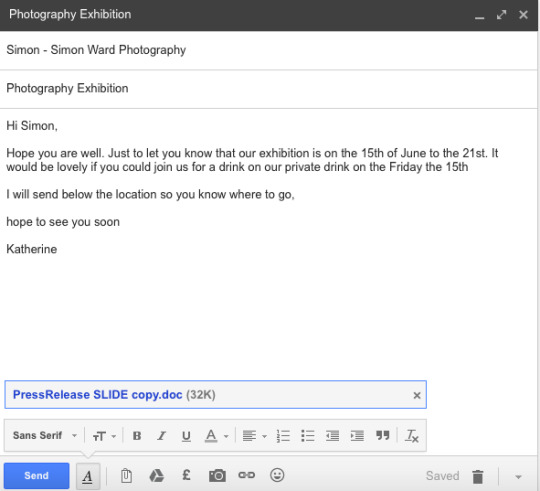
Messaging friends and family to invite them to the graduation show.
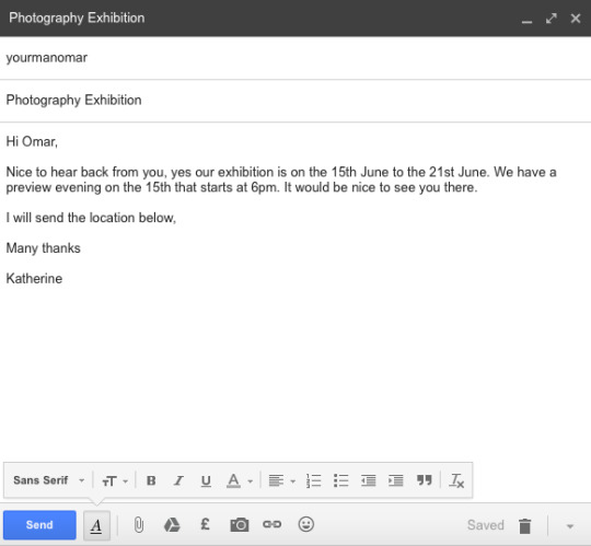
0 notes
Photo
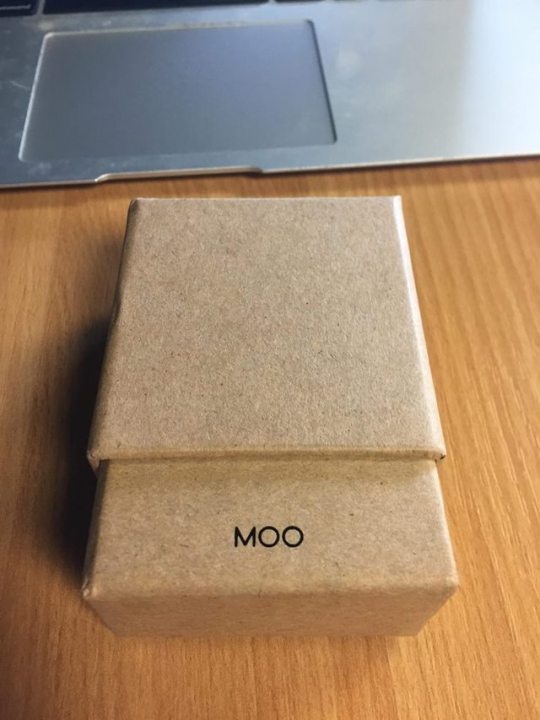
My second batch off business cards I ordered after making a spelling mistake of my website.
0 notes
Photo
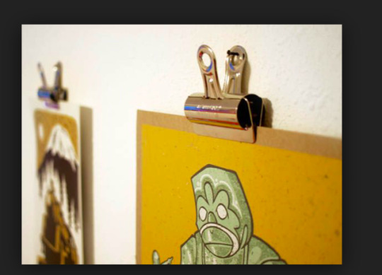
For my final image that I will be printing on oyster paper at college. I am wanting to hang this image by using bulldog clips that I have ordered on Amazon.
I looked up on Google different ways to hang images up using bulldog clips. I have decided to use a nail in the bulldog clips to hang them.
0 notes
Text
Project Proposal - Professional Development
For my graduation show at the start of this module I was thinking of using acetate to print my images out on. I realised that they will be do too flimsy and thin to frame. They will also be very difficult to print ink onto in a professional printing company.
My second idea, which I am now doing for my exhibition is to print two A1 acrylic prints of my two favourite architecture work I have produced this term. I am printing one black and white and a colour one which are both very striking to look at. I have got these printed by hello blue in Bristol. At first I was thinking of hanging them as it would look very effective and creative but when visiting the centre space exhibition I realised this will be too difficult as the ceilings were too high and it would cause a risk of my acetates braking which is what I don’t want.
I am now going to get them both framed in white with a fixed stand so they can stay free standing on a plinth without falling over. I am wanting the plinths with my acrylics on to be in front of each other but not directly in front so the viewers can walk around each acrylic and be able to see the image as a whole as well as having an abstract effect. Both of these images are going to be on the biggest wall of my corner so they would be the first thing people will see. I am going to be lighting these with an LED lamp facing the wall so they get the same amount of light on each image and so the lighting isn’t too harsh.
On my second wall on the left hand side corner I am going to hang up my image I took in Kingdown on A1 with bulldog clips. I have measured the wall and worked out that A1 will fit nicely.
For my portfolio I will print between 12-15 images that I have produced between last summer and now. I wanted a variety of my favourite images including architecture and portraiture. I have decided I like the oyster, semi gloss paper the most as it brings the colours out a lot more than being in matte. I have printed these images A3 size to fit into my portfolio. The portraiture images mostly consist of my projects I have done this year from college including ‘location moduke’. I have included more than one image of the same project so they tell more of a story behind the image. My images will be in order of architecture to portraiture so they have a simple layout of the type of photography I do and what goes together.
Lastly, for my mentor I wanted to choose a photographer who doesn’t just focus on one type of photography but who photographs on portraiture and architecture as this is what I enjoy the most. I want to ask questions of what it is like to be in a photography business and tips I will need in the future.
0 notes