
kathleen travers | art & design student | please scroll down to "SDES2406 sem 1 2017" image
Don't wanna be here? Send us removal request.
Statistics
We looked inside some of the posts by kathleentravers-blog and here's what we found interesting.
Average Info
Notes Per Post
2
Likes Per Post
2
Reblog Per Post
0
Reply Per Post
0
Time Between Posts
1 day
Number of Posts By Type
Photo
17
Last Seen Tumblr Blogs


Fun Fact
Tumblr was named as a finalist in Lead411’s New York City Hot 125 in Aug 2010.
Photo

Refining the designs proved a fiddly process for all of us. We all kept sending files back and forth between us to get feedback and to keep colours/fonts/layouts consistent. Kim had provided all of the beautiful 3D illustrations and was working on the digital pdf publication. Juli had written all of the text and had put together all the components of the publication - she also printed and formatted it together. After working a lot on the layouts and branding aesthetic I brought together our ideas for the client in the form of the 3 A2 boards and printed them.
1 note
·
View note
Photo


As a group we have been continuing to develop the booklet design - Juli has taken it into an indesign format so that we can be lining up the text consistently.
We introduced circles and white borders to see if that would work across the publication and boards. Because of the shapes and sizes of the illustrations we thought this would help unify and bring together the items on the page. - we had a lot of difficulty when fitting in the accessories to the page, but we felt it was important to present them with the design graphic/bike design as a complete package.
0 notes
Photo


I have continued to develop the layout for the A2 boards and social media approach. Above is a mockup for the bus shelter advertisement, as well as some layout ideas for the Instagram posts. We are really wanting to keep a consistent aesthetic across the design approach.
0 notes
Photo


tote bag accessory addition. as a new approach to embrace social media, we have included a design for a limited edition VESPA X SEAFOLLY tote bag. It will be a prize for those that use the product hashtag #EMBRACEYOURSURROUNDINGSVXS.
I have also been researching the sort of images that seafolly use on their Instagram - we want to keep consistent with their contemporary aesthetic, and bring the look of Vespa in line with a more Australian appearance.
0 notes
Photo


colour palette decisions and swatch experiments were key in establishing the aesthetic of our design solution. despite the colourfulness of vespa’s branding - we wanted to pull back a lot of the colour and approach it in a really contemporary minimalistic form. The seafolly website has fewer colours and it keeps a very consistent mood. I continued to experiment with this aesthetic in the booklet layout and began initial layout ideas for the A2 boards.
0 notes
Photo

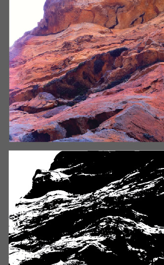


when developing my mountain graphic I was having difficulty with how smooth to make the line work - I vectorised some rock photographs I'd taken to see if that would be a form I could go off.
to begin the booklet process we took inspiration from both the seafolly website and the vespa website. above are a few initial layout options that I experimented with for the booklet design, bringing together each of our design graphics and Kim’s illustrations.
0 notes
Photo


INSPIRATION
Above I have collected a range of images, designs and artworks to use as inspiration as I polish my own design for a Vespa surface sticker.
I remember learning about contour lines in yr7 geography and initially finding it such a strange way to map landscapes - but there is something so beautiful about the patterns of these maps that show the highs and lows of the Australian landscape.
I enjoy that the maps include the numbers and scale bar etc - these aspects remind me of orienteering and hiking. The lines and shapes not only reflect the height and depth of the mountain but also create a similar design to the rings of a tree trunk that show age.
I included the marbling artworks as they remind me of these topographic maps but also the textures of rock walls which you are likely to see in Australian mountain landscapes.
I have grown up and currently live in the Blue Mountains so exploring this design feels particularly personal and relevant for me as I am used to bushwalks, lookouts and long drives up the mountain
0 notes
Photo

MOUNTAIN DESIGN SKETCHES
After individually sketching our graphics we brought our designs back to the group for feedback. The design on the bottom right received the most positive feedback for me so that is what i have decided to continue to work on for the mountain-inspired graphic.
0 notes
Photo


MOUNTAIN MOOD BOARD
A visual exploration of the colours, shapes, textures and tones of mountain landscapes.
0 notes
Photo


GROUPWORK DESIGN SOLUTIONS
Coming together in class we discussed as a group how we were going to redesign the Vespa for Leah (our chosen persona). After discussing solar panel options and dashboard upgrades we decided to focus on surface treatment and the partnership with Australian brand ‘Seafolly’. ‘Seafolly’ are all about “expressing yourself through colour” and finding a print to match your “unique personality”. This will align well with our theme to ‘EMBRACE YOUR SURROUNDINGS’.
The surface treatment for the bike will consist of three environment-inspired designs. Juli’s design will be based off the beach, Kim’s will be from the city and mine will be mountains inspired. We wanted each design environment to reflect the Australian landscape as well as the passions of every citizen.
0 notes
Photo


I’m very interested at promoting the Vespa as a chance to adventure - enjoying the beauty of the outdoors even in the inbetween moments. An accessory idea is a ‘selfie-stick�� type attachment (obviously one that won’t interfere with vision), one that is compatible with a go pro - encouraging the filming of adventures or daily journeys and commute.
1 note
·
View note
Photo


UPDATED CHARACTER PROFILE / MOOD BOARD.
We have broken up into groups for the final assessment. Leah is the persona and direction which we are going to explore further. I would like to see how we can cater to her love of the outdoors and keen eye for contemporary design.
Juli & Kim are my group partners and we discussed what our skills are... we are all capable at using indesign. Kim has a gift for illustration, Juli loves narratives (she wrote the above persona description!), and I enjoy layout and typography. I think these skills will compliment each other well!
0 notes
Photo


Urban mobility challenges:
Sydney traffic.
Cramped & uncomfortable in car.
Windy roads/narrow lanes.
Too many large vehicles on road.
Population increase in cities.
Pollution.
HOW DOES THE VESPA RESPOND?
> The Vespa is dynamic in shape with clean front shield enriched by chrome plated elements - its very shape perfect for tight corners, narrow lanes and traffic travelling in between larger vehicles.
> The Vespa will carry you comfortably with a passenger footrest, and PMP 2.0 for communication with smartphones/bluetooth devices - so that you can stay connected, have access to music streaming and utilise voice command or handlebar intercom controls while on the go.
> The Vespa has improved stability with a lower center of gravity, with an assisted breaking system - perfect for navigating Sydney traffic.
> The Vespa maximises fuel economy and minimises emissions, making it a more sustainable vehicle choice.
> The Vespa includes a led immobilizer to reduce motor vehicle theft wherever you are.
0 notes
Photo


What makes a Vespa different?
I think one of Vespa’s strongest qualities that sets it apart from other scooters is that it is so iconic. People have strong associations that they link with the Vespa (thanks to Hollywood classics) and so emphasising those connections and making them relevant and attractive to Australian 21st Century buyers is important.
Above I have also included some screenshots of other international scooter companies, to compare the web design and layout. The bikes are similar in style, shape and colour - the marketing strategy varies widely.
The Vespaaus Instagram is an opportunity to utilise each image in highlighting the relevance of Vespa’s to Australians. I think having a specific Australian audience and highlighting the contemporary aspects of the scooter is important (the ‘classic/classiness’ is already there because of the associations with the shape/style/brand).
0 notes
Photo


Core values / characteristics and benefits of the Vespa.
The coloured squares above are from the brand book, in the white square are some thoughts I had in how the Vespa can respond to 2017 Australia while still upholding the brand’s attributes. I also like the idea of the Vespa being an extension of self and as technology is getting more and more personal, this is a key idea to explore and push in product design.
The Vespa brand design is extremely consistent, contributing to its unified and professional appearance.
0 notes
Photo


Background and history of the client.
Piaggio Group:
Europe’s leading manufacturer of two-wheeler and three- wheeler motor vehicles.
Piaggio Group operates globally worldwide in the light mobility vehicle industry:
• two-wheeled vehicles (consisting of scooters and motorcycles)
• commercial vehicles (both three- and four-wheeled light commercial vehicles).
The above images show how Vespa embraces and celebrates their product longevity. The Piaggio Group website also has many photographs of their Vespa designs, proud of its popularity.
I have also included Piaggio’s sustainability responsibility outline as it illustrates the companies’ priorities for the future.
0 notes
Photo

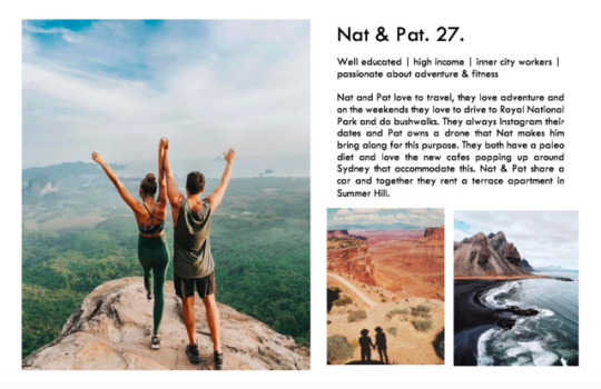

character profiles / mood boards
In thinking about the third assessment the whole class began understanding demographics by developing personas.
Above are the three that I created. The feedback was strongest for the centre couple, Nat & Pat. I think their need for a Vespar is quite realistic - they have one car that they share, so a scooter would allow one to get to work or a nearby cafe while the other has the car. They also love the outdoors and adventure, so the exposure to the elements while on a scooter is a welcome bonus when coming to or from their indoor jobs.
0 notes