katjameyer-graphicdesign
New Media: Design and Production
Assignment 1 - A showcase of my work and progress: Album Cover, Logo and Poster Design
20 posts
Don't wanna be here? Send us removal request.
Last Seen Blogs
nonsenselists
نقل العفش
ljct
Justice League

immigration986-blog
Untitled

yusravisaalofficial-blog
Yusra Visaal

oscarhaas11
Untitled
Text
Presentation of my work
Dear reader,
the following blog is a showcase of my work in the module ‘New Media: Design and Production’ as part of my Media and Communication course at De Montfort University. I will present and reflect on the artistic process of creating a logo for a fictional company, a album cover and a film poster. The posts are in chronological order from the bottom to the top, so please scroll all the way down to start from the beginning.
Enjoy!
0 notes
Text
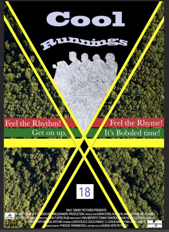
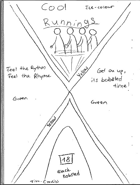
Film Poster - Final Design
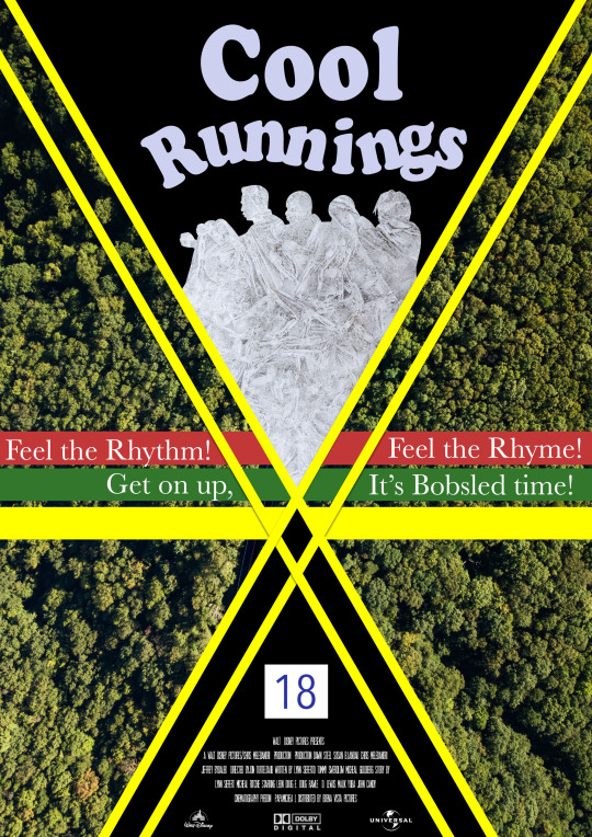
The final poster is coming together. Creating the headline was quite challenging. I wanted the word ‘Cool’ to look very steady in big block letters and the word ‘Runnings’ in a wavy line, loosely aligned with the heads in the silhouette. It represents the slope and brings dynamic to the headline. The challenge was to find a font that incorporates both the steadiness and coolness of ‘Cool Runnings’ and that fits into the black triangle without either word looking too big or too small. The chose found mixes both these aspects well.
I changed the film credits in the bottom so they would fit into the black space to a) be more visible and b) don’t negatively impact the composition. I also added some logos of movie production companies such as Disney.
All in all, the poster came together well. On the first glance it may look complex, but the clear layout and subtle pieces of information communicate the message of the film well.
0 notes
Text
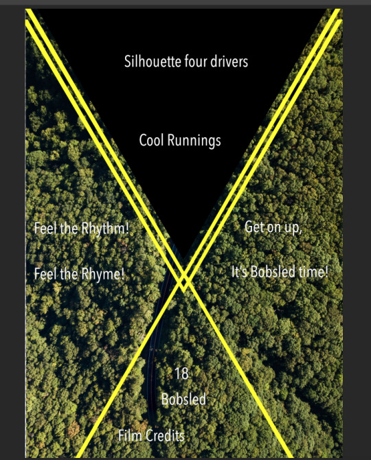
Film Poster - Development

As planned I cut out the silhouette from the bathtub scene and cut it into a triangle shape at the bottom. I then found a picture of frozen water that makes up the colour of this shape. It creates a nice pattern and represents the aspect of ice and snow of the film well. I put the number 18 (in the original colours white and blue) in the bottom black triangle so it looks like a bobsled about to be going down the slope. The yellow lines make the poster more dynamic and create the illusion of movement. The quote in the middle of the poster is a song that the four main characters make up during their training. It becomes a chant that is sung every time before they start a race. It also sums up the films message and content well. I created 3 stripes in different colours (within the colour scheme red, green, yellow) so make the quote stand out more.
0 notes
Text
Film Poster - First Attempts in Photoshop
Instead of using 2 big green shapes I decided to fit in a background picture of trees. This suits the colour scheme well in a subtler way as I didn’t want the entire poster to be composed of just shapes. It makes the poster look more natural and suits the setting well as the winter Olympics are being hosted in Canada, the colours of the competition ground are mostly white and green.
Instead of 2 big stripes of yellow I chose to use 4 thinner ones so the yellow wouldn’t be too dividing and imposing. I then want to fit 2 black triangles in at the top and at the bottom.
0 notes
Text
Film Poster - Original Poster
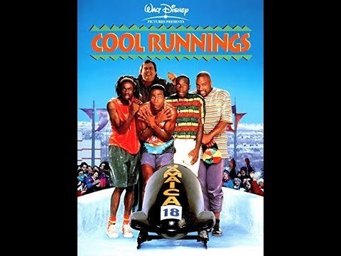
The film Cool Runnings, published in 1993, follows the story of the first Jamaican bobsled team that participated in the Olympics in 1988. The film was produced after a true story.
Derice Bannock is one of Jamaicas best sprinters and dreams of qualifying for the Olympics. However, due to unforeseen circumstances he doesn’t win the race. Together with 3 other men and former winter sports star Irving Blitzer he starts training to become the first Jamaican team to participate in the winter Olympics. After many obstacles and doubted by other teams they succeeded in making a name for themselves and their country.
The original poster is fairly straight forward. The 5 main characters and their bobsled are in the foreground, shivering as they are not used to the cold. The background shows Ice and some spectators.
The poster and its style are fairly old so I want to try to create a more modern and abstract version that really showcases the main themes of the film. Moving away from showing any specific characters.
0 notes
Text
Film Poster - Ideas and Sketches
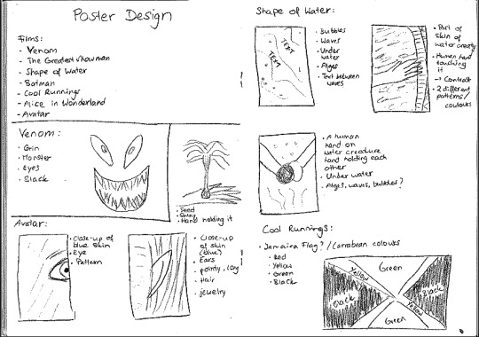
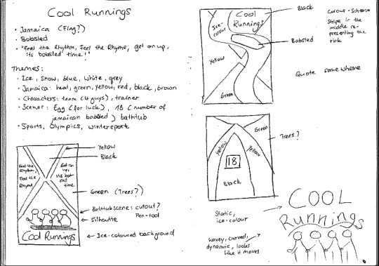
I started by searching on IMDB for films that I had recently watched and whose film posters had room for creative exploration. I sketched some ideas out (see picture and notes) and decided to design a film poster for the film Cool Runnings. As the film and its poster are about 25 years old I wanted to design a more modern version of the poster.
Themes of the film:
- Ice, Snow
- Winter sports, bobsled (18)
- Jamaica, Music, Heat
Colours:
- Ice-coloured, white, grey
- Jamaica: green, yellow, black, red
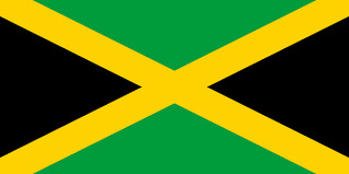
I want to design the poster following the outline and colour scheme of the Jamaican flag. Patriotism to their country and 4 main characters identity as Jamaicans plays a central role in the film so I want this to stand in the foreground. A scene in the film shows the 4 men sitting in a bathtub practicing for their bobsled race the next day. I want to use this scene to cut out a silhouette of the characters and fit this into the poster. Another aspect will be the Jamaican bobsled. It is black and has the starting number 18. This will substitute well for one of the black parts of the flag.
0 notes
Text
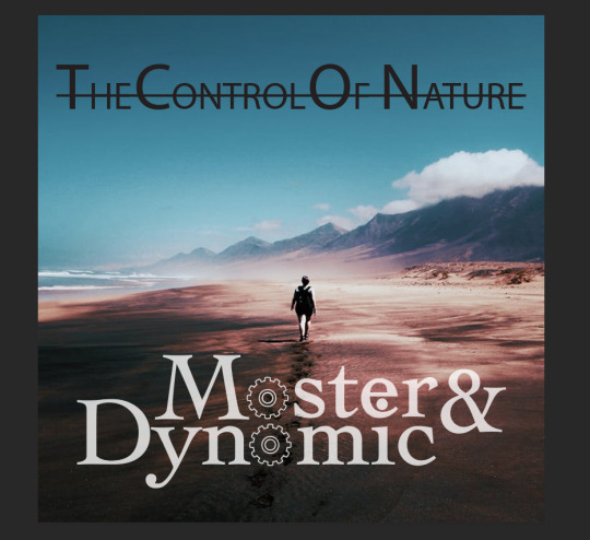
Album Cover - Final Design
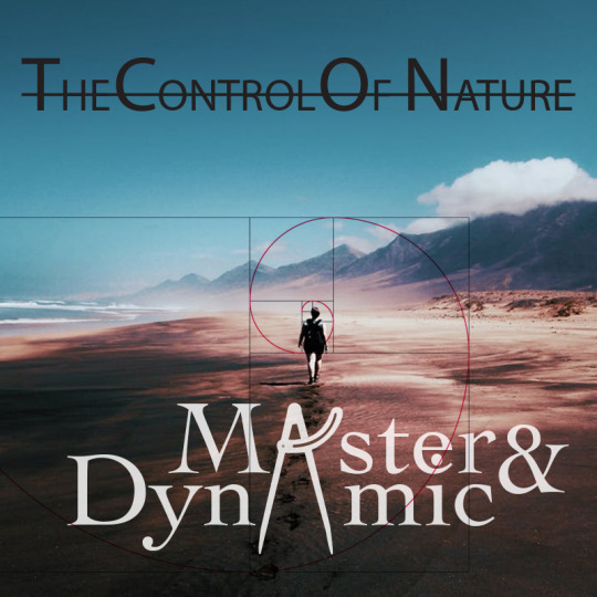
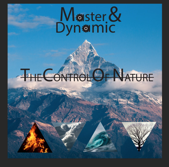
The problem was still that the cogs instead of As looked like Os so I thought of different things that could substitute for an A. An old pair of compasses seemed to be the right choice as it looks like an A and also fits the meaning of the Album cover (leading a way, natural forms, control). I then put a drawing of the golden section over the picture. The lines intersect with the tips of the pair of compasses so it seems like the compass just drew that shape. The circle focuses directly on the person walking down the beach. This creates a strong focus point for the Album cover. The golden section underlines the theme of ‘control of nature’ and combines all components into one picture.
0 notes
Text
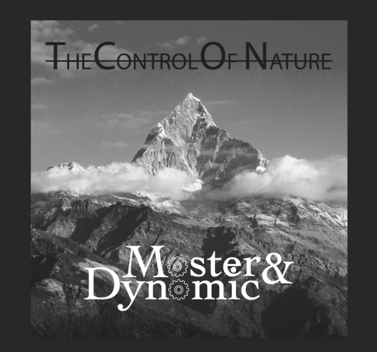
Album Cover - Alternative Idea
I started looking for other pictures and change the purpose of the album. I needed a picture that would support a focus point more and that gives the album direction. The title and band name suited the above image very well as it seems like a person is making their way through deserted nature, somewhere where nature took control, but still confidently walks onwards (Master). I decided to work with this picture.
0 notes
Text
Album Cover - Black and white?
To solve this problem I tried to bring more simplicity into the designs by turning it into black and white. However, the triangles did not work in black and white as these elements of nature expressed themselves through the vibrant colours. Turning the background black and white only worsened that problem of losing a focus point. Removing the triangles completely works better in terms of colour harmony but also makes the layout boring and not visually entertaining enough.
0 notes
Text
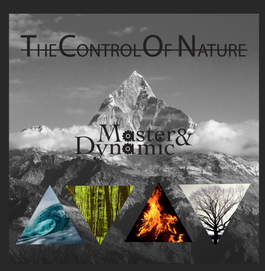
Album Cover - Putting the components together
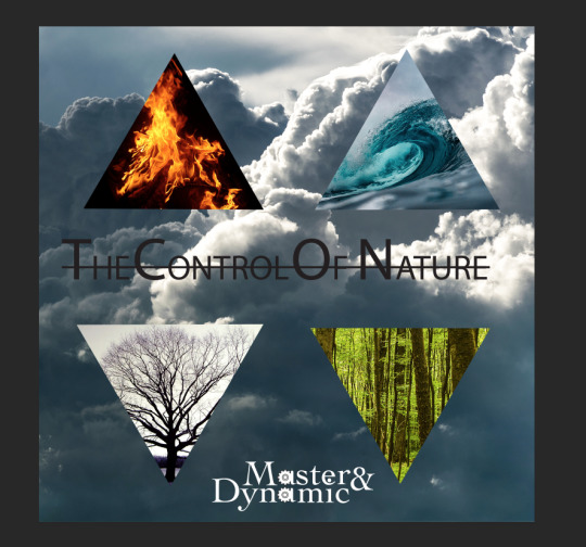
For my first designs I tried a triangle theme. I wanted to incorporate all four elements of nature into the picture. I arrange the triangles in different ways and tried different backgrounds but what I envisioned originally did not work out on screen as well as I thought. The different colours of the triangles didn’t harmonise well with the rather grey backgrounds so focus points got lost and there were simply too many things going on in one picture. Especially in the second design the album title didn’t stand out enough and gets lost between the triangles.
0 notes
Text
Album Cover - Research, First Attempts in Illustrator and Photoshop
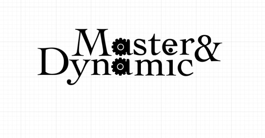
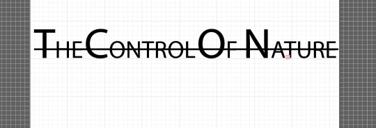
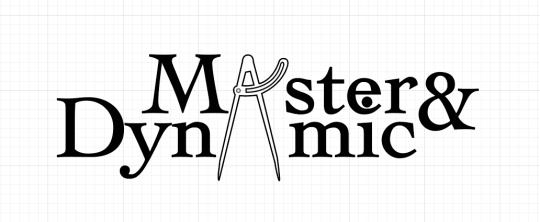
I first designed the band name and album title. I replaced the letter a in Master and Dynamic with cogs. However, just using a cog makes the letter look like an O so I added a shape to match the font and make it look more like an A. That does take a bit of the original meaning away and is not as visually appealing as I thought. The Control of nature has a line going through the title. It adds some ‘control’ to the untamed nature.
0 notes
Text
Album Cover - Ideas and Sketches
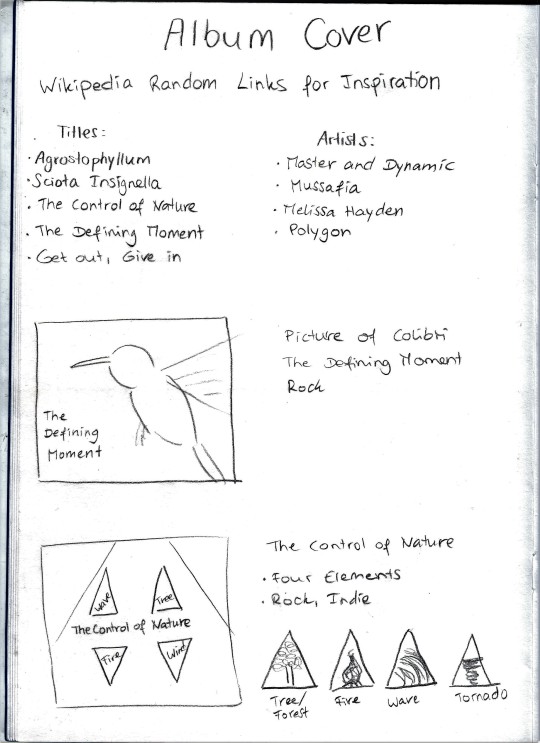
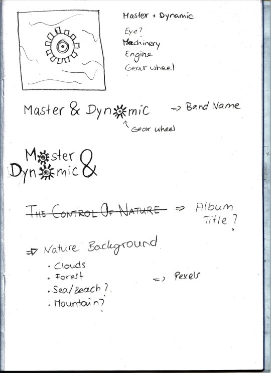
To design the Album cover and gather ideas I used the exercise sheet we were given. With the help of random Wikipedia links I gained inspiration for Album titles and band names. On the website pexels I searched for pictures that suited the title of the Album. Out of the generated links I chose the Album title ‘The Control of Nature’ and for a band name I chose ‘Master & Dynamic’. I imagine this band to be an Indie Rock band. I want to design the band name specific to the name, it should communicate dynamic and action. A cog instead of round letters would be an option.
0 notes
Text
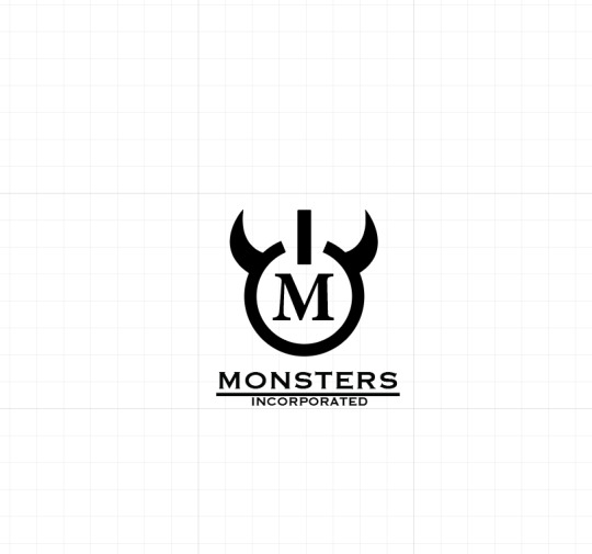
Logo Design - Final Design
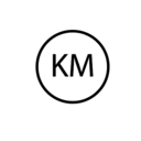
For this logo I kept the same colour scheme, but I used different shades. Lighter shades of green and blue represent the film in a better way as it is still related to children and youthfulness. These colours seemed more suitable for the target audience. The logo communicates the message of the brand in a clear way. The viewer will associate the logo with a brand that is power or energy related even if they are not familiar with the fictional company. I chose this particular font for the M (with serif) because it correlates well with the horns. The serifs are where the horns are rooted with the letter. For the company name below, I chose a simpler font as I didn’t want the writing to distract from the logo. The logo could stand on its own as well, but the writing is a good addition to support brand identity. Depending on how the logo will be used and market it can be added or not. Ultimately, the final version of the designed logo represents the company well.
0 notes
Text
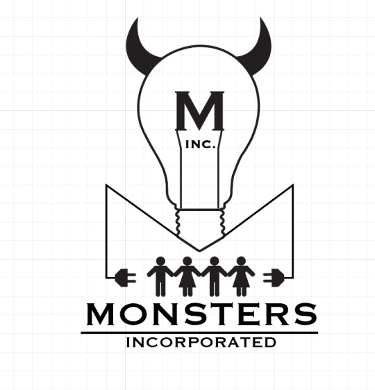
Simplifying my Original Idea

As I didn’t want to give up on my original attempt yet I tried to simplify the light bulb version to try and reach the standard of the other logo. I removed everything from inside the lightbulb and placed only one human figure inside to stand in the focus together with the M. I also minimised the bottom part of the light bulb and exchanged the wavy lines for straight lines to make it look more straight forward.
I then tried out colours on the design to see how the final logo would look like. The colour theme of the film is mainly dark and light blue and light green (Sullivan and Mike are blue and green and the factory is blue themed as well). I coloured the horns and the stroke of the lightbulb in two different shades of green and chose a dark blue for the M and the persons figure to stand out in the logo. The colours worked well together, however, next to each other my alternative design was still more convincing and visually appealing than the light bulb version.
0 notes
Text
Logo Design - Alternative Idea
By reviewing my sketches I decided to revisit another of my ideas that is simpler. With the shape tool I created a power sign that relates to the company. I then copied the horns from my previous designs onto the power sign to, again, link it to the monster world. The name of the company in the bottom divided by a line represents the corporate and professional brand. This idea also relates to the original theme of the round logo but reinterpreted in a different way. It is more convincing due to its simplicity compared to the lightbulb logo.
0 notes
Text
Logo Design - putting the components together
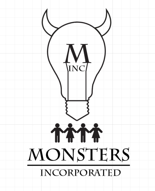
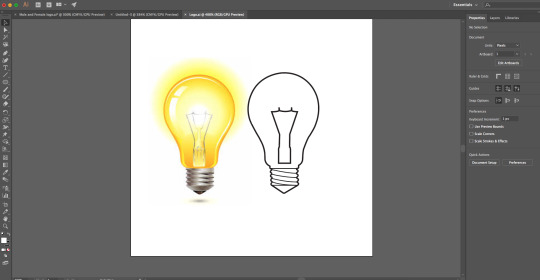
I then put the components together and experimented with different ways of putting them together to create a logo. I worked in black and white to see how impactful the logo is and will add colours to it later. I decided to get rid of the small lines in the bottom of the lightbulb as it distracted too much and wouldn’t be very visible from far away. The lightbulb represents energy and electricity while the horns connect the logo to the Monster world. I decided to fill the horns in black to stand out more. The human figures below the lightbulb signifying that the light bulb draws its energy from people. I then added another feature by having plugs on either side of the 4 people connected with the lightbulbs through lines. The “cables” form a second “hidden” M.
Even though I like the design it is not simple and eye-catching enough. I tried to get rid of the 4 people and put them into the logo as really small hidden feature in the bottom of the lightbulb but that had the same effect as the lines. It was distracting and not visible from far away.
0 notes
Text
Logo Design - Research and first Attempts in Adobe Illustrator
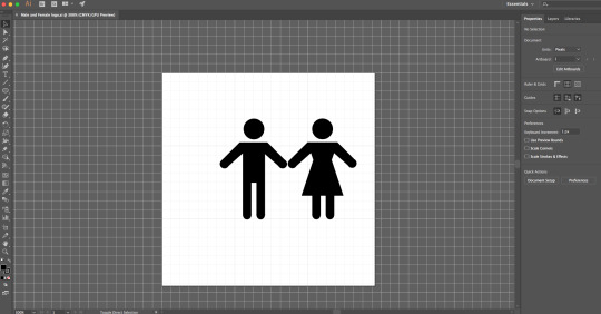

I started designing components of the logo in Adobe Illustrator. With the help of the pen tool and shape tool I drew a shape of a lightbulb and simplistic human figures.
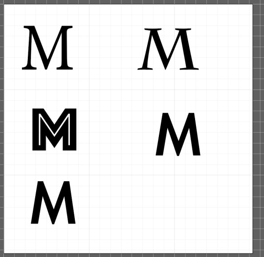
I also experimented with different fonts for the letter M. As this will be the central part of the logo it has to stand out and really capture the viewers attention. As the rest of the logo already has a few detailed features I wanted the M to be very simple and expressive so I chose the fonts Copperplate and Minion Variable Concept for two versions of my logo.
0 notes