
Don't wanna be here? Send us removal request.
Statistics
We looked inside some of the posts by kaylamae2023 and here's what we found interesting.
Average Info
Notes Per Post
1
Likes Per Post
1
Reblog Per Post
0
Reply Per Post
0
Time Between Posts
18 days
Number of Posts By Type
Text
6
Last Seen Tumblr Blogs


Fun Fact
Tumblr Inc. is using 66 technologies for its website.
Text
I Find Comfort In Change (Final Exam)
Art has always been a part of my life; ever since I was 3 or so. As soon as I could pick up a marker, was when I started. I drew on everything; furniture, walls, my cat. When I started school is when I had my first art class. It was easily the highlight of my day. Since then, every Christmas or Birthday I've been gifted art supplies, such as canvases and paint, colored pencils, charcoal, even an iPad and Apple pencil specifically so I could do digital art. I'm fortunate enough to have a family that is so supportive, including my extended family. My aunt Ksenia went to a school called the Minneapolis College of Art and Design. It's a school dedicated to all forms of art, and last summer I was given the opportunity to do a stay on campus solely so I could immerse myself in photography, which she paid for. I'm so lucky my family could afford to give me all of these opportunities, because I was able to flourish and I know most can't relate. I'm incredibly grateful for my family and their encouragement.
My art process is a little chaotic. Normally when I make art I either have a reference, a prompt, or a picture in my mind I want to create into the physical world. When I'm not drawing from a reference, a lot of it is trial and error; I think part of me suffers from perfectionism, which is why I tend to prefer drawing from a reference. When I draw from a prompt or an idea in my mind, it's harder for me to detect what exactly it is if something looks off. That's why drawing from an idea was more of a challenge for me.
I didn't want to draw from a prompt that was too cliché. It seems like almost everyone suffers from some sort of issue, whether it's anxiety, depression, ADHD, anger issues, addiction problems, etc. and naturally, a lot of people create art around it. When I try to make art that surrounds an internal issue, I just feel awkward. Most of my life I've felt like whatever mental issues I went through were not significant enough to complain about. Instead, I decided to center my prompt around me changing my appearance. Within the past year or so, I cut bangs, then my bangs grew out and I got highlights done, then I dyed my whole head blonde, and about a week ago I dyed it back to my natural color. I also gave myself a few ear piercings, and my clothing style changed and still changes a lot. I like to change my appearance a lot, it makes me happy. I think life is too short to be afraid of change, because it helps people grow and builds character. I've gone through a lot of change in my life, and even though some of it is hard, some of it benefited me.
This sketch is a memory from when I was 13 and it was the very first time I started experimenting with my style. I dyed my hair blue with some box dye I bought at Walgreens. I didn't really follow the directions I just went nuts.
The media I decided to use is colored pencils, mostly because it's the most accessible but also because I'm most familiar with it.

This is the general idea, I had a lot of refining to do, as well as add more intricate details. I tried to replicate my old drawing style, which was very cartoony. Like I mentioned earlier, my style now is more of a realism approach. But I like that my style had a very bubbly, happy vibe.

The original sketch is finally done, I decided to add a Smashing Pumpkins shirt my dad gave me :).
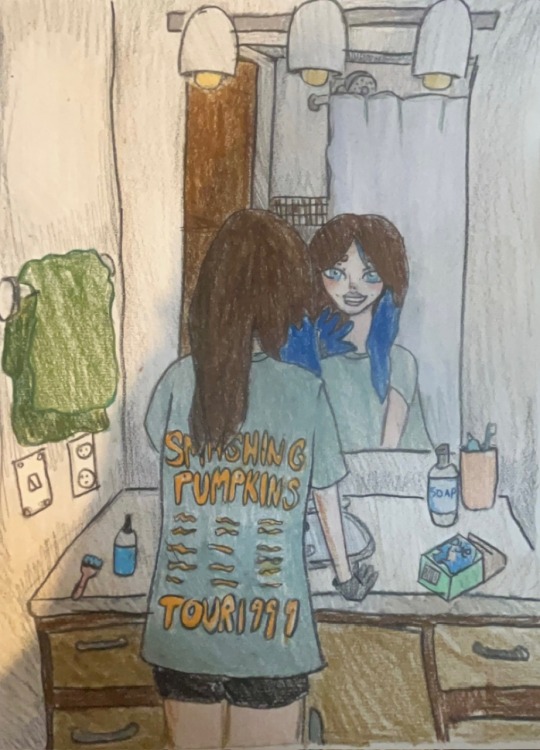
Finally, the sketch is colored in. I wanted to approach it with a very "doodley" feel. I tried to draw my actual bathroom at my old house before I moved, which is where it all took place.
Overall, taking Art Appreciation has definitely shaped my perspective about art a lot more. I am a big fan of the renaissance era, which I'm happy this class focused in on a lot. However, I also now have a new appreciation for modern art and sculptures, as well as performance art. I even discovered interactive art which I didn't even know was a thing. I think this class has also shaped how I'll do art in the future, especially with my creative process itself.
0 notes
Text
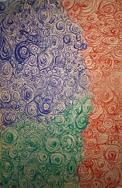
Virtual Sketchbook 4
Jackson Polluck was an extremely famous artist located in New York. His style was abstract and unique, with haphazard splatters of paint being his trade mark. Polluck’s popularity was partially due to Thomas Hart Benton, who was a mentor to Jackson Polluck at the age of 18. Benton has a distinctly different style compared to Polluck, where his paintings typically express a sense of realism. They branched away from each other eventually, as Polluck found his true art form. Although some critics say his work didn’t take much skill, others highly disagree. A big part of his art was the performance itself, where Polluck is said to enter a trance like state, and would very meticulously plan out each splatter. He would use certain colors, control how much the paint splattered or how thick each stroke was to convey his inner emotions and thoughts. Some paintings had many strokes, some had jagged edges, some had smooth. It was all very deliberate, but at the same time natural and not necessarily particular. His work is still held in museums and subject to many conversations and debates, which shows his legacy is still alive and well.
——————————————————————————————————
Abstract Art
0 notes
Text
Virtual Sketchbook 3
Agony in the Garden by Francesco Bassano
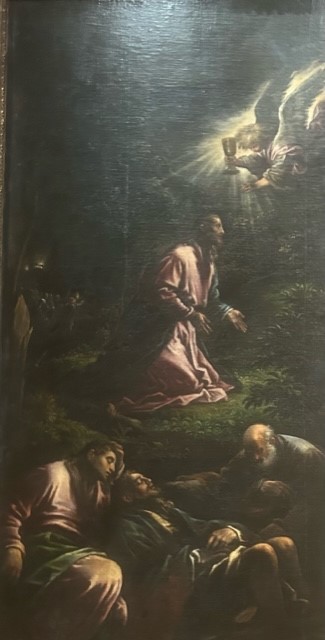
1582-84
Oil on Canvas
264.2 cm x 129.5 cm
In this painting, Jesus Christ is depicted in the Garden of Gethsemane looking up at an angle while preying. The angel is shining and holding a chalice towards Jesus. On the bottom of the painting, three of the apostles John, Peter and James are laying and falling asleep.
The painting uses a technique similar to Rembrandt, which is the intense contrast between light and dark to cause dramaticism.
This painting was commissioned for a church in Brescia, Italy. The scene is based on scripture where Jesus Christ is about to be arrested, and it takes place after the Last Supper. The Garden of Gethsemane was described in all four gospels.
The painting is balanced in a very stunning way. Christ is in the very center of the painting, and Jesus, John, Peter and James are facing towards the angel which is the source of light. Peter, John and James are at the bottom of the painting, also in the center maintaining symmetry. The light illuminated from the angel shines from the right and highlights the faces and fabric of the apostles and Jesus Christ.
The most emphasized part of the painting is Jesus Christ and the Angel, because Jesus is in the center and the angel is the only source of light, which highlights its importance in the scene. If the angel wasn’t shining so brightly, it wouldn’t be noticeable, and its role wouldn’t be as relevant.
As I mentioned earlier, the contrast is a very defining feature in the painting. It adds to the intensity of the scene, and it evokes more sad emotions in the viewer. Even without knowing the specific story that this painting is illustrating, the contrast and lighting creates a sense of despair.
---------------------------------------------------------------------------
This piece brings out a sense of sadness in me, mostly due to the story and background behind the scene. As most people know, the last supper is the last meal with the apostles and him. In the Garden of Gethsemane, it is right before he gets arrested and eventually crucified. My family is religious and I grew up going to church, so I understand the story well. Although I choose to be agnostic now, I can still feel the emotions this piece is supposed to convey.
---------------------------------------------------------------------------
Using Artstor, Wikipedia, and the book Ringling: The Art Museum
Francesco Bassano (also known as Francesco Bassano the Younger) is an Italian renaissance painter, born in 1949 near Venice, and died in 1952. He and his family were all painters, and he often painted in the family workshop. He created many paintings, and almost all of them had a religious theme or background. He was prone to depression and passed due to suicide after his father died.
The painting is from the renaissance period, and this piece was part of a collection of 9 commissioned for a church in Brescia, Italy called Sant’Antonio Abate. The entire Bassano family was religious and centered their practice around it. It is said that Francesco Bassano could have been inspired by the print Agony in The Garden by Benedetto Montagna which was created in 1506. Bassano was trying to illustrate the scene described in the Gospels, while focusing on conveying the agony Christ was going through. Most very religious people would probably recognize the scene, which shows that the message Francesco Bassano tried to incorporate into the painting was executed well.
---------------------------------------------------------------------------
Use what you learn in your research and by looking closely at the artwork to form your own critique of the work (your informed opinion) based partly on the FACTS. Make sure you think about and answer this in your conclusion: based on your research, and everything you have learned so far about art and artists, what is the importance of this work of art to society and/or the world. Be specific. Why did YOU pick it?
After going to the Ringling Museum and viewing all the pieces, Agony in The Garden stood out to me the most. I am a big fan of renaissance art, so I am already slightly biased. Even before I read the painting description, I could clearly feel the emotional weight it gives the viewer. After reading the description and doing research, it was even more moving to me. The use of color theory even helps bring out that sadness the viewer is supposed to feel, where the scene uses cool shades versus warm shades. My only critique is on how accurate Christ’s appearance is. In the renaissance era, it was popular to make Jesus look more European, even though he would’ve looked middle eastern. However, this version of Jesus is the most identifiable/recognized, so it makes sense.
-----------------------------------------------------------------------------
------------------------------------------------------------------------------
Citations:
Bassano, F. (n.d.). Artstor. library.artstor.org. https://library.artstor.org/#/search/francesco%20bassano;size=48;page=1;sort=0
Merling, M. F. (2002). The Garden of Agony. In Ringling The Art Museum. John and Mable Ringling Museum of Art.
Wikimedia Foundation. (2022, August 29). Francesco Bassano the younger. Wikipedia. https://en.wikipedia.org/wiki/Francesco_Bassano_the_Younger
0 notes
Text
Virtual Sketchbook 2
______________________________________________________________
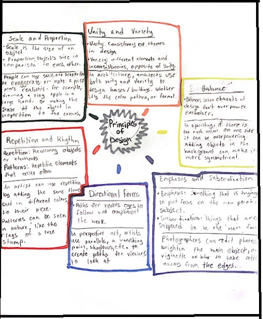
Unity, Scale and Proportion, Balance, Emphasis and Subordination, Directional Forces, Repetition and Rhythm, all make up a piece's composition. It makes the piece look more appealing and draws your attention longer.
______________________________________________________________
5.2 Art Criticism - Figure 5.7 - Clothing and Customized Citroen B-12
Sonya Delaunay-Turk

______________________________________________________________
As you can see, the white lines are the highlighted directional forces. There are a lot of parallels and, with most of the lines being vertical. It makes the photo look consistent and pleasing to look at.
The green lines are highlighting how things are balanced so that there isn't too much action going on one side and not the other side. The car is dead center which shows symmetry. The woman is on the right side and the pillars are on the left side. If the woman was standing on the left side it wouldn't look as good.
One of the biggest things I noticed with this piece is of course the patterns. The boxes on the car match the woman's jacket. The photo could also be showing unity, with all the box like shapes.
The light colored building also contrasts with the bush, the window, and the the dark colored car and shadows. Because this is in black and white, and a film photo which means it had to be developed, there must be a lot of contrast so that the shapes are easy to make out.
The last thing I noticed was that the scale of the car is the size of the whole image. It also puts more emphasis on the car and less on the background.
_____________________________________________________________
Color expresses life in so many ways. Whether it's tied to emotions, time of day or year, color themes, pastel or neon, etc. In my opinion, I think pastel colors like pastel pink, pastel blue, sage green, and neutral colors like beige, white, greys, browns, etc. describe my life the best. I don't really like saturated colors as much, in fact my whole wardrobe is mainly neutral and pastel shades. I used to live in Minnesota, and the color pallet was always very neutral forestry colors. Most of the time Minnesota is cloudy, but I like when the leaves turn orange and brown and it becomes sweater weather. I love when it snows and going ice skating. In Florida, I do like the scenery, but it's a lot different than Minnesota. I love the sunny weather and going to the beach, but the more muted tones of Minnesota are comforting to me.
-----------------------------------------------------------------------------

Medusa is usually portrayed as an evil villain who turned people to stone. However, there is actually more meaning behind her character. Medusa represents empowerment and strength, and a lot of people get tattoos of her because of this reason. I've always admired what she represents.
----------------------------------------------------------------------------
0 notes
Text
Group 4. INTERACTIVE DESIGN– What is it?
Interactive Design is when viewers can involve themselves in the art. Interacting with the art can help viewers understand it better and provide insight or a deeper meaning
Fine your TOP FIVE BEST INTERACTIVE DESIGNS.
Top Five Interactive Designs, According to me.
https://www.youtube.com/watch?v=ergNitz381I - https://artincontext.org/rhythm-0/
"Rhythm 0" is a performance art piece by Marina Abramović in 1974. Mariana stood in a room for 6 hours next to a table with 72 objects; it included things like a gun, a bullet, a scalpel, wood, a rose, a candle, an apple, cake, olive oil, salt, etc. People would come in and have the option to do whatever they pleased. Initially, people were nice. One person fed her cake, another gave her a rose. Soon, things got more and more violent. One person cut off her clothes. Another took a blade and sliced her skin on her neck. By the end of the 6 hours people were fighting and someone held a gun to her head. This piece is said to be one of the most controversial because of how violent it became and how her life was threatened. It goes to show how far people can escalate when they have free will.
"Madness is a Part of Life" is an exhibition that was in Tokyo, Japan until 2013 created by Ernesto Neto. It involves a bridge-like path that people can walk on and climb. It's made out of netting and plastic balls. People are allowed to walk and climb on it. Neto said madness is a quality that runs through everybody, but is constricted by societal standards. He created this piece to let imagination run wild and break limiting boundaries.
http://weavesilk.com/ - https://theabsolutemag.com/6727/art/create-interactive-art-with-silk/
"Silk" by Yuri Vishnevsky is a website/app that anybody can use. You simply drag around your mouse and it creates silk like patterns using symmetry. Even people that lack an artistic touch are able to express creativity, because everybody is creative in some way.
"Cloud" is an interactive piece made by Caitlind r.c Brown and Wayne Garrett originally installed in Canada in 2012. It's made with 6,000 light bulbs, and viewers are able to walk beneath the cloud and pull chains to turn the bulbs on and off. The piece moves all around the world, currently it is in KooHouse Museum (Seoul, South Korea).
"Illusion" created by Laia Cabrera, Isabella Duverger and Aniol Saurina Maso is a piece that uses augmented reality to let users interact with the art. People can do different motions like raise up their arms and the art will mimic the person.
___________________________________________________________
What makes a good interactive design to YOU? What is the intent for the site/app you chose? Does it fulfill its purpose?
It depends what perspective you look at interactive design from. From a UI/UX point of view, good interactive design is when an app or website is easy and intuitive for a person to navigate. From an art perspective, the interactions the viewer has should enhance the art experience or deepen the understanding of the art. My favorite interactive art piece has to be "Rhythm 0". When I thought of interactive art that was the first that came to mind. It's one of the only art pieces that makes me emotional. It definitely fulfills it's purpose, where like I said it shows how the human mind can escalate into violence. It can also show how other's actions can influence people. People started out friendly to Abramovic. Once one person became physical, other people decided it was okay for them to do harmful things as well. Once people's mindset was "if he can do it so can I" things quickly turned downhill from there. In a way the art was an experiment, which is why I think it's so interesting.
0 notes
Text
"The Liberation of Aunt Jemima" Project
My name is Kayla DonFrancesco and a little known fact about me is that I used to do modeling when I was younger.
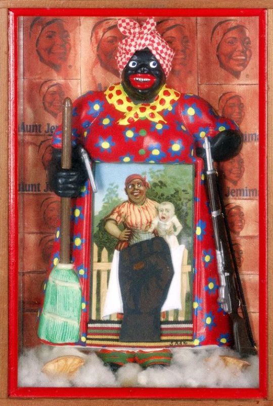
Betye Saar 1972 The Liberation of Aunt Jemima. Mixed media; 11 ¾” x 8” x 2 ¾”
1. The creator of "The Liberation of Aunt Jemima" Betye Saar, was a black artist who collected items with derogatory images, such as matches, tooth paste, a can of beans, etc. Some of the items she found she included in this piece, like the postcard in front of the Aunt Jemima figurine (the figurine she also found).
2. Betye Saar wrote that "The Liberation of Aunt Jemima" was the first piece she made that was politically explicate.
3. Saar said her goal in her art is to reclaim the derogatory images and reclaim them to be empowering.
4. The reason she created this piece was for an exhibition at a place called "The Rainbow Sign." and her piece had to be based around a hero. She wanted her protests to be heard through this piece.
5. "The Liberation of Aunt Jemima" is Saar's self proclaimed signature piece, meaning it's her most famous and well known.
My first reaction to this piece was almost shock, I thought it was made in the 50's to be racially motivated and push negative stereotypes. After doing research about the piece I learned it was quite the opposite, Betye Saar's goal was to be empowering. Now that I've done research, I see some things differently, like the pancake box logos in the background. It's interesting that the Aunt Jemima logo stemmed from this character, and the company didn't think to change it until pretty recently.
-----------------------------------------------------------------------------

Over the summer I took a photography class at a small private college called “Minneapolis College of Art and Design”. I stayed on campus for three weeks and learned a lot about photography, like the difference between film photography and digital photography. I also learned how to use photoshop, how to develop pictures, create cyanotypes, etc. Our final project was about self-expression. I used a digital camera and took this photo in a grey studio. After, I edited it in photoshop and changed the hue. After that, I outlined some of the flower pictures I took while I was at MCAD and pasted it into the same image of myself. I forget the exact size, but I’m pretty sure the poster is 22in /36 in. After everybody was done with their final project, we had an art exhibition where we hung up our work and let our family members view it. Overall, the experience was super fun and I still have the poster hanging up in my room.
--------------------------------------------------------------------------
Usually when I draw portraits, I like to do a complete side profile angle or a straight on angle. My favorite thing to sketch is people because I like designing outfits and drawing unique features. I’m about to turn 17, I go by she/her, I’m half Russian which plays a big influence in my life, I was born in Minnesota, and I now live in Venice, Florida. My current favorite things to do are work out, volleyball, skateboarding, swimming, reading, and sketching although I don't draw as much anymore.
---------------------------------------------------------------------------

Self portrait
1 note
·
View note