
Statistics
We looked inside some of the posts by kedebyle and here's what we found interesting.
Average Info
Notes Per Post
1
Likes Per Post
1
Reblog Per Post
0
Reply Per Post
0
Time Between Posts
7 days
Number of Posts By Type
Text
14
Last Seen Tumblr Blogs


Fun Fact
Tumblr’s reach among the 26-to-35-year-olds in the US is 11%.
Text
Week 15 - Final Thoughts
I foresee a couple things for the future of design.
I’ve talked about my work in user experience design a lot in this class, and one evolution I have already slowly begun to see that is evolving from user experience design is that large companies with a multitude of different technological solutions are now faced with the challenge of seamless integration to create a consistent user experience with their employees across all their technological platforms. If you think of Microsoft for example, they have designed a user experience across every solution they offer: Teams integrates with Outlook and SharePoint and All the O365 tools like Word and PowerPoint. And all of these tools integrate with each other as well. This is a very complicated relationship that requires massive research and analysis in order to make sure that the transition from one platform to another is seamless, while still allowing the user to understand the differences in each platform so they know where they are at all times in that technological ecosystem. (Something I argue Microsoft hasn’t just yet perfected). But Microsoft is sort of, a unique example. By that I mean that they are making all the tools they develop and sell work with, their own tools. This gives them control over these tools and how they work together. But companies who don’t develop everything they use, say a financial company, may develop some software for their employees, but they may also use 3rd party software as well to save time and costs. They do not have control over how those tools integrate with each other as freely as Microsoft. User experience is now exploding beyond just designing for the user experience of one platform within a company, to designing for the entire employee experience across all the companies tools they utilize. From selecting a solution, to implementing it as seamlessly as possible. This is something I think we will see a lot more of in the future.
Another user experience related thing I believe will be big later is user experience for virtual reality/augmented reality. Right now, most of the user experience work I see done is with 2 dimensional platforms, mainly websites and mobile applications. But as we continue to integrate VR and AR into our everyday world, user experience designers are going to need to be trained in a whole new host of design principles related to 3 dimensional.
Third, I think that in the future we will no longer have single discipline designers or developers. This is already beginning to happen as employers realize how important it is to have interdisciplinary developers and designers. In the past, if you were a developer you knew how to code and plan the architecture of a system to support functionality. Purely functional. Now we need developers to understand how to not only make something functional, but usable. And it goes both ways, as a designer we need to understand the code, the structure all of it. This is why some designers are beginning to learn how to develop technology as well as design for it, and why many entry level UX positions require you to have coding knowledge. But I see this becoming more blurred, and everyone eventually will be trained in User Experience design and it won’t be a separate field but rather, essentially dissolve into every other field it touches. It will become a fundamental requirement that you understand these concepts in order to be hired as a developer, marketing specialist, etc. Everyone will be cross-trained in user experience design in some way.
0 notes
Text
Week 14 - Your Choice
Some design related thoughts/ideas I have are how I can use the information in this class to create better designs in my own career in User Experience design. Although my work doesn’t necessarily focus on making things “look good”, visual appeal is part of the user experience and I think that because I can now recognize different design and its origin, I can then better understand what works or doesn’t work visually by learning from the mistakes and triumphs of past designs and designers. For me, this is something I was hoping to get out of minoring in design because as far as the other parts of the user experience design I do (information architecture/heirarchy, user research, etc.) I felt my fundamental understanding of design and why things are the way they are was lacking. I am happy to say I no longer feel that is the case however I know there is much more to learn.
Questions I still have are numerous, because I will never stop learning. I guess though a big question I still have is how can I incorporate more of the design we learned about in class into my own work. This tends to be difficult as my work is so professionally oriented that sometimes creativity is a bit lost. What i mean by this is, much of the design we do is for corporations using different design systems such as Web Fluent, or Semantic UI and when using these design systems, the actual design work itself is already done for you. At that point you're just changing a couple colors to match branding, and deciding where the elements will go, not how they look. I want to be able to do more “building from scratch” in order to push my creativity and my skill further. Learning how to do that while staying in the confines of the client needs and project requirements is something I am still learning the boundaries of and may not be something that can be taught in class, but nonetheless its what’s been on my mind lately.
As far as items or products that have captured by attention as a result of a heightened awareness of design, I have been noticing design that contains elements of Art Nouveau literally everywhere. Specifically when I was shopping for a new bed set.
0 notes
Text
Week 13 - New Media
The “digital aesthetic” is a new movement that gained traction in the early 1990s. As designers began focusing more on futuristic, texture-less, aesthetics similar to those depicted in virtual worlds in video games, the old aesthetics of the 1980s were phased out and no longer desirable.
I think this idea of “digital aesthetic” has influenced many of the current aesthetics I see around us and has led to several sub-aesthetics. Atom-punk and cyber-punk aesthetics for example, are very much derived from these digital and futuristic worlds depicted in video games. Fallout for example is entirely atom-punk. However the difference is that these aesthetics are usually generated from post-apocalyptic beliefs rather than the hope for a better society that the original digital aesthetic had generated. But regardless, technology has entirely reshaped design and has a very striking difference in aesthetic from the design of the past.
I also wanted to talk about how in the book, on page 392, the author says “the tendency for styles to come and go and then be revived as historicist, or retro, only a few years later is an important development in recent design” I 100% agree with this and feel that although we have this new “digital aesthetic”, designers continue to utilize design movements and concepts of the past in this “digital aesthetic”. I also believe this is because design is iterative, and we will continue revisiting the past to improve the future of design. As our technology improves, we can take these old design movements and ideas and improve them with the new technology we have. I think for me, this is my favorite part of the “digital aesthetic”; the ability to continue learning from past design to continue adding to the “digital aesthetic”. But adding on to that, I think a big reason these old movements get revived is due to the fact that with the internet, we have at our fingertips a massive archive of history. Designers can access images of past movements in design and become re-inspired by things of the past and I think this is going to continue to be very influential to design in the future.
0 notes
Text
Week 12 - New Media
As someone who works in User Experience, I would have to say that new media of course is the only reason this field exists and has had a huge impact on interactive design.
With the invent of the internet we now have the ability to share information, collaborate and communicate in ways never previously thought imaginable. And with this technology there is now a serious need for designers who understand how this technology works, and how people interact with it. Understanding the relationship between people and technology is going to allow us to improve and design better interactions and experiences with these new technologies.
This is made possible, like I stated before due to the invention of the technology but also is made easier to design for because of new tools available to us such as the Adobe Creative Cloud tools like Illustrator, Photoshop and XD. We can now not only design the experience, but the user interfaces of these technologies with greater ease and finesse and also collaborate with other designers to continue streamlining the process. Gone are the days where websites and interfaces had to be built from scratch and now we have access to design systems for throwing together a consistent and aesthetically pleasing user interface, but also we can build these interfaces faster with frameworks like React and View. This allows us to then focus more on the information architecture and hierarchy, navigation and flow, and the user experience as a whole because we can spend less time on appearance and the actual build of the technology, and spend more on the user experience.
This ultimately is going to allow us to discover new technologies and new ways of doing things that we never thought would be possible as we continue to uncover more about how humans and technology interact and as we discover better ways of designing these technologies based on passed experiences and research. This is an exciting area of new media, or emerging media, and may be a bit abstract in that it can encompass all the new media that is emerging right now, however user experience is something that should be integrated into every new media and any existing medias and as user experience matures we will continue to see it integrated into everything that is designed and built.
0 notes
Text
Week 11 - Graphic Design
This weeks reading discusses the citizen designer. A citizen designer is a designer who seeks to address social issues either through personal projects, commercial work, or both depending on the designer. The idea comes from the realization that designers have become confined to working on purely commercial design work and many designers believe that design can be used to promote change and serve as a beneficial social force to enact change.
This idea is incredibly relevant in our current age. As designers have to find ways to continue promoting change in a society where things seem to be controlled by unseen or uncontrollable sources and circumstances. Capitalism is a pervasive force that controls what we do, where we work, the type of work we as designers (and people in general) do, and it can be easy to lose sight of what is important in our society when the way the world we know is controlling what we do in life. We can use design to promote more important social issues such as Climate Change, LGBTQ+ rights, political advocacy, and many other issues. But even those in non-capitalist societies such as ours need design to help promote other social issues such as living under the rule of a dictatorship, poverty, etc.
Citizen designers can help shed light on the issues that really matter, and help encourage change and inspire others. But I think an interesting caveat to this is that in the wrong hands, this idea could be used to manipulate the vulnerable, and spread oppression and misinformation. This is why it is so important that as designers we are conscientious in what we attempt to say through our design which is also relevant in the age of social media. What we try to say as citizen designers could be used against us, or send a mixed message.
But nonetheless, the citizen designer is arguably more important now than ever as we are bombarded with ideas from all sides. As the world gets more and more polarized we as designers have an opportunity to try and unite everyone, to promote change where it matters, and to continue to inspire others to do the same.
0 notes
Text
Week 10 - Graphic Design
I had no idea how much went into the design of typography. The anatomy of type was very interesting. I think knowing the anatomy of type would be very important in web design, as I can think of several different CSS stylings that deal with manipulating fonts, but also knowing the anatomy of typography can help make decisions about what type of typography to use and I know there is a whole range of topics around how different typographical styles convey different messages to your audience, as well as impact the usability of a design, which is something I deal with in User Experience design often.
For example, we rarely use serif fonts in our designs as they can appear crowded and difficult to read, and typically go for using sans-serif fonts such as Roboto or Segoe due to their clean and readable design. I have designed a couple of logos and reserve using serif fonts for logos and letterheads but typically I see these used in logos and letterheads for financial companies and other institutions and companies with a long history with the public. Northwestern Mutual for example has a serif font in their logo and letterheads.
By reading about the history of typography I got to see how typography has evolved over time and the difference is amazing. But this weeks readings also made me think about something I learn in my major (information science and technology) which is called information scent. Basically, the idea is that if the information is conveyed in an easy to find and readable manor, people will stay on your platform or website longer, or continue using your product. I think this is also true in printmaking. For example, if I went to pick up a newspaper and the entire thing was in blackletter I probably wouldn’t read it as blackletter tends to be crowded, dark and harder to read. Over time, designers have learned this as typography has evolved and now many newspapers stick to simpler and easier to read text in order to help their audience and keep their attention.
I think this weeks lessons and readings in anatomy of typography will help expand my knowledge in design greatly and will help me in the future. Its interesting to see the evolution of typography and read about it as well as relate it to the work I do and the things I learn in my major.
0 notes
Text
Week 8 - Industrial Design
1. Starbucks Mug with Floral Design
I have a re-usable mug from Starbucks with a floral design pattern on it. Its sort of an art nouveau style pattern with a modern twist. It has a figure on it as well with blue hair and gold colored leaves within her hair. The cup itself is designed for functionality, and have a lid with a lip for drinking out of.
2. Chapstick
I have this chapstick from Bee Bella. It has a heart with some typography in it for the brand, and a bee inside of that. Under the heart is more text saying what it is. The container itself is made of bamboo and has a cap and a is designed around function and simplicity of use.
3. Handles in my apartment

These handles in my apartment are in our bathroom and have an art deco style. Our apartment is in an old house and is very old (landlord said it was built in 1890) and I am guessing these handles were installed sometime later. They have the straigt lines and geometric tier shape that I have seen in many art deco style designs.
4. Mousepad

This mousepad I have had for a while is yet another thing I own with sort of an art nouveau style. It isn’t as art noveau as a lot of the other things I have, but I believe it still counts as many floral patterns seem to hint to art noveaus use for floral and plant patterns. Looking at this I realized how much my tastes are influenced by art noveau.
5. Cup

This cup I have is very mid-century modern, which is another design style I have a lot of. I don’t think we discussed it in class much, but I really love mid-century modern and this cup features that heavily with the gold and geometric shapes and the shape of the cup itself. It is, a reproduction of that style however as I got it at Target.
6. Mid-Century/Retro cabinet

Here is a sketch of a midcentury/retro style cabinet I have in my apartment. It is cherry wood with sliding plastic doors that feature these circles that are formed on top of the plastic. They look exactly like the bottom of glass bottles. The plastic is a brownish/orange color similar to the cherry color of the wood and they have 2 handles made of metal the color of rose gold. The plastic is semi see through, so you can sort of make out the shapes inside the cabinet when closed. Inside it has a shelf that runs the length of the cabinet. Finally, it has some little white feet that hold it up and have anti-skid rubber on the bottom.
7. Retro Chair
I have this chair, that everyone says it absolutely hideous but I love it. It is another vintage/mid-century/retro item I own. It features a high back with pleated fabric (I think is the correct term). The buttons create pleates in the fabric so there is some shape to the back of the chair. It has wooden arms and legs, with a padded seat and back sewn to the chair. The fabric is army green and mustard yellow floral pattern.
8. Mid-Century dining chair.

More midcentury furniture I own; a dining chair. I only have one and I found out it is part of a whole set. It is made of metal and has a gold finish. The seat has been replaced from the original (found original photos online) and is now orange vinyl. Originally it would have had a white vinyl seat.
9. Small container
On my desk I have this small container. It has a hinged lid, and is round. It is about 2 inches wide and on top has a floral pattern in white ceramic and inlaid gold trim around the lid and the flowers. It gives off an illusion of stained glass but in ceramic. The rest of the container is gold metal.
10. Incense Burner
Another thing I have on my desk is an incense burner. It is very small, and only holds one cone of incense at a time. It has a little lid and is cone shaped. It has 3 little legs to hold it up, the lid has 3 stars for vents, and one more round vent at the top of the cone, cutting off the top of the cone slightly. It is brass/gold colored.
0 notes
Text
Week 7 - Architecture
Principle 1: Tolerance for error - Tolerance for error is the design principle of designing in a way that minimizes hazard or room for error and helps reduce accidental or unintended actions.
Principle 2: Simple and Intuitive Use - Simple and intuitive use is the design principle of designing in a way that allows for easy understanding of the design regardless of ability, experience, or effort put in.
Examples in real life:
One example would be the location of delete/cancel buttons in user interfaces. When I am designing a user interface, I NEVER put the delete/cancel or any other undo-able action next to important things like save, new, etc button. This is based on the tolerance for error principle. By putting delete in a different location than say, save, it helps the user to prevent accidental deletion when they go to save something.
A similar example to this is when you give a user the option to cancel an action, or delete something, you ask them to CONFIRM that that is what they want to do. This also allows the user to back out of an action they didn’t intend to make. This relates also to the design principle of tolerance for error.
There are many examples of the design principle of simple and intuitive use, one such example is a pair of scissors I have on my desk. The intention on how to use it is very clear given the relationship we have with such a mundane object. But the designer also chose to play off the fact that most people know what scissors are, and not add a bunch of weird features that would mask its intended use. By keeping the design simple, it helps highlight its use and allow us to immediately recognize its purpose. It also has a very intuitive design, so if you didn’t know what scissors were, you could easily figure it out.
Another example of simple and intuitive use is a button. Buttons just automatically infer that they are to be pressed. This is actually a principle of interaction design that I learned in another class, but it also applies here. We use buttons every day and they inherently make us want to push them, and that is the intuitive part. But they are also usually simple enough. When buttons are used in design, such as in a user interface, it helps to simplify the user interface and keep it intuitive because we all are familiar with buttons in the real world, so they can help in a user interface to signal where an action can happen.
0 notes
Text
Week 6 - Architecture
1. Lubar Entrepreneurship Center

The new Lubar Entrepreneurship Center on campus and reminds me of Bauhaus style architecture. Utilizing lots of windows with cross sections and a block style. The awning is also very similar to the awnings seen on the Bauhaus school building we see in our lecture and readings. I did some research and it was designed by a group of architects at Contiuum Architects + Planners.
2. Merrill Hall

Merrill hall on campus is one of the older buildings on campus. It has red brick and a Neo-Gothic style architecture which I really enjoy.You can tell by the use of pointed arches over the windows, front facing gables, steep pitched roof, decorative crowns over windows and doors, and castle like towers.
3. Milwaukee Intermodal Train Station
The Milwaukee Intermodal train station has a very modern style architecture. The entrance is entirely glass, with large white beams behind the glass windows crossing in different directions to create a geometric pattern. The use of glass allows for a lot of natural light to permeate inside the building making it feel larger and more welcoming inside.
4. Milwaukee Art Museum
The Milwaukee Art museum is arguably one of the most beautiful examples of Milwaukee architecture. The most iconic part of the museum, the Quadracci Pavilion was designed by Santiago Calatrava. It has a huge vaulted ceiling and movable sunscreen. The vaulted ceiling is made of glass and metal and allows for light to enter the museum naturally. It overlooks lake Michigan and offers really stunning views of the lake and is one of my favorite places to visit in Milwaukee.
5. Northwestern Mutual

The new Northwestern Mutual building is a really cool example of architecture as well. At my internship, we have done projects for Northwestern Mutual and I was fortunate enough to be able to go there and shadow for a day. It is as stunning inside as it is outside. It is an amazing skyscraper that is 550′ height, making it the second tallest building in Milwaukee, next to the U.S. Bank Center. The old Northwestern Mutual building was a neo-classical style building, and inside the new NM building, they actually have an area where they I think built around the old building, so now the entrance to the old NM building is inside the new building and you can see the neo-classical architecture. Its really cool. They tried to preserve the neo-classical features throughout the building as well and it is also in their logo so its a big part of their branding. I think the old entrance inside the new building goes to the administrative offices if I remember correctly.
SOURCES
Jannene, Jeramey. “Friday Photos: UWM's New Home for Entrepreneurs.” Urban Milwaukee, urbanmilwaukee.com/2019/01/25/friday-photos-uwms-new-home-for-entrepreneurs/.
“List of Tallest Buildings in Milwaukee.” Wikipedia, Wikimedia Foundation, 22 Feb. 2020, en.wikipedia.org/wiki/List_of_tallest_buildings_in_Milwaukee.
Museum, Milwaukee Art. “Architecture.” Milwaukee Art Museum, mam.org/info/architecture.php.
0 notes
Text
Example 1: Perfume Bottle

This perfume bottle I have from Victoria’s Secret features flowers that are strikingly similar to some of the floral patterns found in Art Nouveau style designs. In particular, the red flowers look much like the red flowers in Alphonse Mucha Gismonda found in our textbook on page 64 (Eskilson 64) The bottle also uses a more modern inspired typeface that is similar to the art nouveau examples in the book by using semi-cursive font and also by having the curves at the end of the m and n.
Example 2: Book Cover


This book cover uses a similar style to the example in the book Royal Aquarium, Change the Great Chinese Giant (Eskilson, 47) It also utilized large, different typography in its design. Going from larger at top, to smaller at the bottom. In the middle, it uses red to create emphasis and contrast in the design to draw the users eye into the middle. We read about how this was a common (using many different typographies) in our book. I think what is cool is that this style is still being used but has evolved to be a bit more cohesive and thought out. I say this because there are some examples in the book that are a bit jumbled and disjointed, such as this example (Eskilson, 40):

The designer of this book cover used similar styles, with more thought to the use of varying typography styles and sizes.
Example 3: Box

The floral pattern on this box is very similar to the floral pattern in this example in our textbook from William Morris called The Nature of Gothic (Eskilson, 52) The large curves in the branches/vines of the plants and the floral patterns are very similar. The box comes from Morris & Company which was started by William Morris, so it makes sense that the designs are similar. But it is interesting to see how his designs have permeated well into the future in 2020. I have cited their website below, as on the front page they state that it was founded by William Morris. I think it is really cool that I happened to have something from his company laying around at home at the time that I took this class. The box came with a tube of hand lotion in a similar style.
Citations
Eskilson, Stephen. Graphic Design: a New History. Yale University Press, 2019.
“Morris & Co.: The Official Home: Style Library.” Morris & Co. | The Official Home | Style Library, www.stylelibrary.com/morris&co/.
0 notes
Text
Week 4 - Found Object

My found object is this railing in Mitchel hall. I really liked its design, which may be somewhat simple but for me it was interesting and effective in adding some interest in such a mundane object that we normally don’t notice. I like the use of vertical lines, but especially how some of the vertical lines have white space under them in those sections. I also like how in those sections the bars end with a spiral. This section is separated by that big bar and on top is a section with a big bendy long horizontal bar. The color is like a deep red and I am not sure if that is original to the building or not but its nice and to me is a nice mahogany color. I am not sure what style of design this would be classified as, but I found a document about the buildings on campus and Mitchell hall is a classical revival. Further reading of the document I found says that “The entry halls, stairs, and the corridors in the north addition retain this historic configuration and materials”. This picture of the railings in this area match the one I took a picture of. I can see the hints to classical architecture and design through the use of the columns in the middle of the railings (with the spirals) but its been modernized and simplified. Classical design and architecture is very ornate and this is more simplified which I like. I personally find some classical architecture to be a bit gaudy and over the top and I think this is a great use of the themes of that kind of design and architecture, while giving it new life and modernity. And even though Mitchell hall was built in 1908, I think that this use of classic and modern together is why Mitchell hall still has a lot of building design elements even 100 plus years later. I know some students who say its the worst building on campus, but I find little bits of charm in it whenever I go in, such as this railing.
SOURCES
https://www4.uwm.edu/master_plan/planning_materials/upload/Section-3b_Historic-Campus-Assessment.pdf
0 notes
Text
Week 3: History of Design
No. 1: Shoes
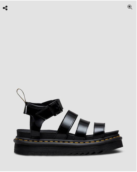
https://www.drmartens.com/us/en/p/24192001#
These shoes I just purchased from Doc Marten. They are beautiful, and also support comfort and durability. By designing an arched footbed, the wearer is supported as they walk and the raised footbed gives height which provides a sense of power. They’re also sandals, so your feet won’t get too hot in the summertime which can be a problem for many people. It made from leather and what Doc Marten sites is “goodyear welt” which I am assuming is part of the footbed.
No. 2: Guitar

This is my guitar that I nicknamed “Hornet”. It’s a beginner guitar that didn’t cost much but its yellow with a strat body, which is a very popular style body for a guitar. It’s a 6 string guitar with a standard fretboard. It has a hole for tremelo bar and has a 5 way pickup selector. The design is classic, and very standard for a lot of guitars. The yellow gives off a lot of energy and for me really pumps me up to make music which is why I chose it.
No. 3: Lamp
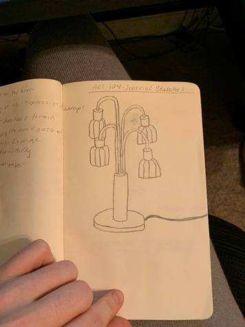
This is a drawing I did of my Mid-Century modern lamp I got at a thrift store. It is gold, and has a tall base that has four bent necks extending from it with glass shades on the end. The shades are a cream color and are ribbed. The peak of the ribs has gold lines going down the length of them. As I mentioned, it is a mid-century lamp and features a lot of the styles of the time. I looked up this lamp online and found out it is from the 1950s and is now worth $300-$400!
No. 4: Deck of Cards

This deck of cards was purchased through a Kickstarter campaign. Every card features a different reptile or amphibian in this graphic design style. This is an interesting case though for is it design, or is it art. Because to me, the graphic on the card and its style enhances the enjoyment I get when I play with them, so it is design because it improves the entertainment value of the card.
No. 5: Lotion

This bottle of hand lotion I have by my bed has a very ornate floral pattern on it that I couldn’t easily replicated through drawing, since I am not very good at drawing. The design is very Scandinavian in its style. The tube is shaped like a standard hand lotion tube to allow the user to squeeze the lotion out easily. The cap is octagonal so that the user can easily get the cap on and off.
No. 6: External Battery
I have an external battery that I use often. It is black, and rectangular. It is about 2 inches wide, an inch deep, and 5 inches long. It has a brushed metal finish and a screen on the face of the battery pack to show you how much battery is left. It has two USB connectors on top to allow you to plug in your devices.
No. 7: Google Mini
We have a Google mini. It is charcoal in color, and like a rounder hockey puck. The speaker itself faces up (or out if you have it mounted on a wall) to better project the sound. The speaker has a screen under the mesh that lights up with dots to tell you when it has turned on, when Google is listening, and to indicate the volume controls.
No. 8: Butterfly Knife
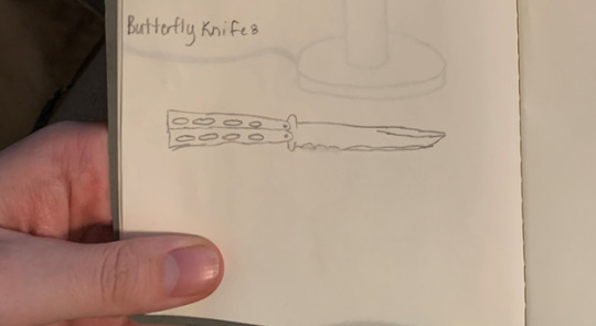
My boyfriend has this training butterfly knife (not a real knife, it isn’t sharpened so it is made to allow you to train yourself before you attempt to use a real one). He got it at Wall-Drug when he was like 10. For some reason he always keeps it on his desk, so I see it everyday when I walk by. It has handles with holes in them to make it lighter and easier to maneuver, and the hands are on hinges so allow for the swinging tricks you see people do with these knives.
No. 9: Desk Speakers
I have a pair of desk speakers on my desk for my computer. The look nearly identical, but the right speaker has a knob on it to allow you to turn the volume up and down. They are about 9 inches tall and 3 inches wide. There are two speakers each, with a white rim around them. On the back, they have a stand that sticks out from the speaker so they will stand upright on your desk, or you can take them off to mount the speakers on the wall.
No. 10: Waterbottle
I have a water bottle I like. It is black, about 10 inches tall and 3 inches in diameter. On the front is the hydroflask logo. The mouthpiece has a loop for holding it, or hooking it onto a backpack. It has a straw nozzle that comes out the top of it so you can easily drink from it.
0 notes
Text
Week 2 - Design Thinking
I would define design as something that is more intentional and purposeful than art. While someone may use an artistic approach in their design process, design serves a specific purpose and solves a problem. Right now, design incorporates the human aspect more, through things like human-centered design. Which I think speaks to how design has changed. It is no longer just about what I said previously, with design being used to solve a problem, but that design is now meant to improve or change existing solutions to problems, or completely re-design those solutions we designed for the problem at hand by integrating a more human centered approach to the design process to make the solution more valuable and personal to the user. This is what design-thinking is, and it goes beyond just a design-process by incorporating the human factor.
I have first hand experience with design and design thinking due to my internship in User Experience Engineering. There are a myriad of tools we utilize in our design processes and design thinking strategies, but one of the ones I have a ton of experience with is Google Analytics for user research purposes. By analyzing Google Analytics data on user behavior, we gain insight into how our users behave and interact with our design solutions. We then take that information and analyze it against the insight we gain through conducting user interviews, usability reviews, and discovery sessions with clients (where we gather insight into their current system usage, their pain points, and their vision for the future) and we then have design sessions to brainstorm wire frames and eventual prototype and build final solutions.
There is design thinking all throughout Google Analytics. The reason we use Google Analytics, instead of other tools like App Insights from Microsoft, or Adobe Analytics is because they took into consideration the needs of marketing, data analysts, and user experience research when deciding what sort of analytics to offer. This is an approach that offers us insight into things about our users beyond the generic statistics on how many users there are, or how much traffic our sites get. We can get analytics into what users are searching for, where they go when they leave our sites, user journey mapping based on real interactions, etc.
Although, I am not sure if this is what was meant when I read this weeks journal posting, this is what I thought a lot about when doing the readings this week and for me the most significant concept I gathered was the realization of how human centered the design process is, which I have been using in practice and in theory, but never actually gave much thought to. The human centered approach is what I believe to be a big difference between what design is and what design - thinking is.
Also, I am unsure what to cite for this posting since I mostly talked about my design process at work, and my own experience with design thinking and products that support my work in design, here are some resources on Google Analytics if you are interested:
Google Analytics Academy (Can get certified in Google Analytics and is a good place to start)
https://analytics.google.com/analytics/academy/
Google Analytics for UX
https://uxdesign.cc/google-analytics-ux-alice-emma-walker-958d6f0f0af3
0 notes
Text
Week 1 - About me
Hi! I am a junior studying Information Science and Technology with a minor in Art and Design. I took this class for my minor but am interested in learning more about design because of my interest in graphic design (which I was hoping to learn more about by minoring in Art and Design). Right now I work as a User Experience engineer and design user experiences and user interfaces so I have a little experience I think. Much of my work involves doing user research and then designing wire frames and high fidelity prototypes based on the feedback and research gained through user interviews, analytics, personas, and other methods.
Music is probably one of my biggest inspirations, and it seems to permeate everything I do. I spend a lot of time listening to music and have recently picked up violin again. I played violin for four years in high school. I have also been learning how to play guitar after becoming inspired by the song Jumper by Third Eye Blind. The guitar solo in that song is fantastic!
Artistically I am very inspired by collage art, and lately have been exploring different ways to make digital collage. This passion started in high school when we were asked to create collage using old National Geographic magazines. When I got a Creative Cloud license through work I began exploring different ways to make digital college, usually now using Illustrator and Photoshop.
I actually recently bought a guitar and although price was the biggest factor, design was the second biggest. I ended up choosing a really awesome yellow strat bodied guitar that I named Hornet, even though it cost a bit more than some of the other beginner guitars I was looking at! None of the other beginner guitars I found had the cool yellow body I was looking for, and since yellow is my favorite color I of course had to pay a little more to get what I wanted.
1 note
·
View note